I’m on Quilting Daily
What a nice way to start the day! Reading my morning email, sipping my cup, and there’s Quilting Daily from Quilting Arts editor Vivika DeNegre, so I click on it. It’s about my forthcoming article on the difference a background makes! You can see it here:
Thanks to my friend Pat D. (Waving across the US to Mill Valley, California!) who suggested I submit this article concept. I’d been sharing with my small, wonderful, essential-to-life online sketching group, trying to decide which background to use for my Tea with Milk quiltlet,
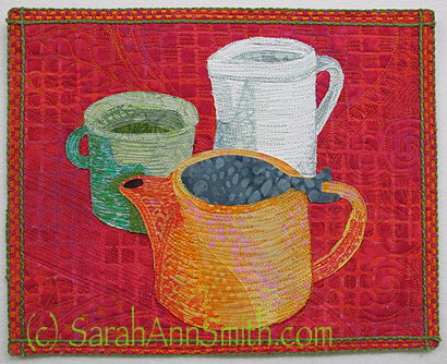
Tea with Milk, published in the recent Quilting Arts Coffee or Tea? Challenge. Of course the answer is tea! From the time I was in grade school, my Irish-American papa fixed me tea for breakfast. Still have my cuppa daily!
which was included in Quilting Arts a couple of issues ago. Pat thought my decision process would make a good article, so I submitted it and …WOOT!… Quilting Arts accepted it. I’ll share the whole little quilt once the magazine is published. Until then, here is “Tea with Milk” and an option or two when I made it.
Dark is good for contrast, but this lovely deep blue just looks kinda dead here.
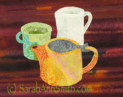
Love the contrast, like a table when you are snug indoors in winter, but that’s not the feel I wanted for this quiltlet.

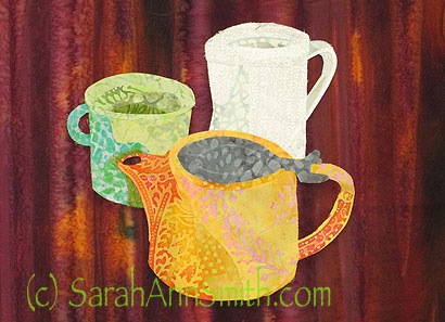
- Love the contrast, but don’t like the vertical: looks like the items are going to slide off a table that has been tilted up!
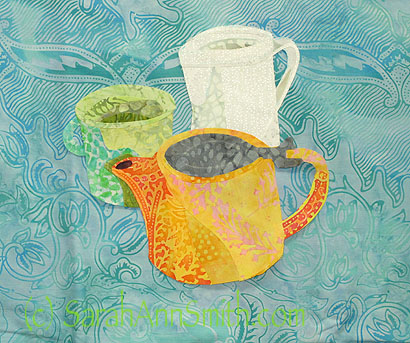
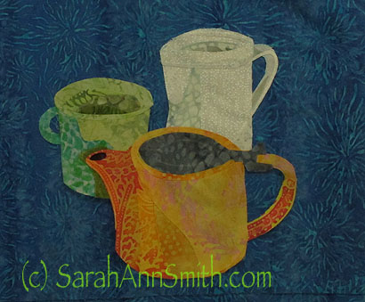
Love the feel of this breezy aqua, but the cup gets lost along the edges. One option would have been to use this, but then darken the left edge of the cup with thread.
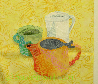
The yellow is so cheerful and “morning”, but the top edge of the white pitcher gets lost, and I didn’t want to darken it with thread. An alternative would be to outline with an ochre just a tiny bit to create an edge.
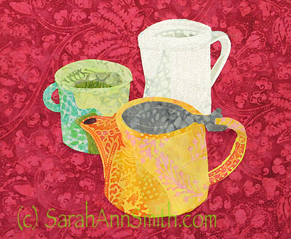
Getting closer. Good contrast with all three elements, but the value-change in the print distracts from the items.
June 13th, 2013 at 12:21 pm
love all of your examples. yes, this is a great topic to get quilters consciously thinking about the choices they have when it comes to backgrounds and how to make (better) choices! and i love your tea with milk!
June 14th, 2013 at 2:20 pm
Looking forward to reading the article, the examples you have here and on the blog are really good illustrations of your process.