email Youtube

Home
Galleries
Blog
Workshops & Calendar
Store
Resources
About
Contact

Author Archive

Eli gets his Green Belt

Wednesday, February 28th, 2007

Here, Eli waits his turn to test.

And Joshua racks up a few more wins at Saturday’s wrestling meet. (An aside: tried to post this yesterday, but blogger wasn’t cooperating! Hope to add quilty /fabric content on Friday– I made a new blouse from quilting flannel, and today I head to Mount Desert Island to speak to quilters from SouthWest Harbor, the rest of Mt. Desert Isl –home to Bar Harbor and Acadia National Park– and from Ellsworth, just over on the coast.)

Monday night, however, was Eli’s night. He and several others, kids and adults, tested for new belts at Tae Kwon Do karate. Stripes, intermediate ranks as you progress from one belt to the next, may be awarded during regular teaching sessions or at testing sessions. Here, Eli is performing a kata, a series of steps simulating moves one would take against multiple attackers:

Then, the students perform one-steps with a fellow student (in this case Adam, who also got his green belt and is Eli’s class at school!):

Eli is also studying Ishinriyu Japanese style karate with 4-th degree black belt Sensei Pete Bishop. This is a great honor for him, since Eli is really the first kid Pete has invited to study with him; usually he works only with red belts (which is one under black) and above! The two worked on what is called “environmentals”, a sequence of steps practiced with an “attacker” so you can see exactly what situation is being simulated. Here is Eli with Sensei Pete:

When you need to re-tie your belt, or get a new belt, it is considered respectful to turn one’s back to the ranking belt to make any adjustments. Here, Eli has been awarded his green belt, and is tying the knot:

Then, everyone bows to the newly advanced practitioner:

And for an update on wrestling season:

Saturday was the six-team meet (most are 3-team meets), including the ever-awesome Mount Ararat school. Of Joshua’s five matches, one was a default (no one in his weight class on the opposing team, counts as a “win” for Camden-Rockport), one was a loss to the boy from Mount Ararat—not only do they have a huge team, they are all good, and THREE were pins! Yeah Sport! Here’s the opening move in one match:

And here’s a slightly blurry “win” (they move too fast!)

Design! A Lively Guide to Design Basics for Artists and Craftspeople

Saturday, February 24th, 2007

For today’s post, I thought I’d review Design! A Lively Guide to Design Basics for Artists and Craftspeople by Steven Aimone (If you click on the title, it will take you to the listing for the hardback at Amazon; I notice that it is due out in April in paperback, but the cost difference –$4– is so little, go for the hardback!).

The thing I like most about this book is that Aimone goes beyond traditional art media (oils, acrylics, watercolors and sculpture) to look at design EVERYwhere: the endpapers have a photo of a stovetop! Items used to illustrate various design principles include: paintings, sculpture, masks, jewelry, hair, olive oil can, chairs and flowers, baskets, mud huts, quilts, advertisements, toiletries, architecture, the Apple iMac, photographs (including one of a decorated camel), even food!

I can’t decide if this is supposed to be a textbook or a coffee table book: the production values are so good that it is eye-candy as well as informative. I have long said good sewing is good sewing, whether you are making a garment, a quilt, or household items. Similarly, good design is just that: good design. It doesn’t matter if it is a painting, a quilt, a landscape, an interior, a building. The basic principles of design apply across all media.

The book covers:

  • Introduction
  • 1. The Purposes of Design
  • 2. The Design Process
  • 3. Visual Elements
  • 4. The Design Space
  • 5. Repetition of Motif
  • 6. Rhythm
  • 7. Symmetrical Arrangements
  • 8. Asymmetrical Arrangements
  • 9. Focal Emphasis
  • 10. Underlying Shapes
  • 11. Critique
  • Glossary of Design Terms
  • Artist Index
  • Index

Many quilters are intimidated by terminology from the art world, but (pet peeve / soapbox moment coming) it is just words! Just as we learned what Log Cabin, fat quarter, scant quarter inch and Baltimore Album mean, we can learn color vocabulary: complementary, analogous, tint/shade/tone, and we can learn art vocabulary: focal point, rhythm, harmony, line and more. It’s just words, we’re all smart, so we can learn to use the art terminology and better understand our own art form.

I loved Aimone’s straightforward description in the introduction: Simply put, design is the arrangement of visual elements in a space. (p. 10) And the illustrations for that page are a quilt and an oil painting by Piet Mondrian!

Unlike many traditional design books, Aimone also talks about texture: actual and imaginary, as pattern, as weight and emphasis, and as subject. Pages 54-55 are part of that discussion:

If you’re interested in learning more about why some designs work, some don’t, how to create better compositions, and how to troubleshoot your own pieces, this is a fantastic book that really gets you to thinking beyond the quilt world. And, it gives you exercises to try to help implement what you’ve just learned.

Highly recommended!

Publishing information:

Aimone, Steven. Design! A Lively Guide to Design Basics for Artists and Craftspeople. 2004 Lark Books, New York. ISBN 1-57990-349-5 (hard cover).

Reverse Auction for Cancer Research

Wednesday, February 21st, 2007

Fiberart For A Cause, fundraising for the American Cancer Society, is back
in action with the 2007 Invitational Reverse Auction.

http://www.virginiaspiegel.com/NewFiles/ACS/ReverseAuction2007.html

Featuring fiber art donated by Jane Davila, Jamie Fingal, Mary Beth Frezon,
Lynn Krawczyk, Heidi Miracle-McMahill, Carol Moore, Scott Murkin,
Cynthia St. Charles, Sarah Ann Smith and Elin Waterston, the Reverse Auction
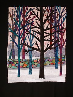
runs March 12-16. The quilt above is my donation to the cause. Surf in to the link above to see all the fabulous pieces!

Artwork begins at a fixed price and is reduced by a fixed percentage each
day. Wait too long and the artwork you want will be gone. 100% of the
proceeds are donated to the American Cancer Society.

Blatant bragging…

Monday, February 19th, 2007

Mom alert: blatant bragging about number one son, Joshua!

Saturday was the first wrestling meet of the year. Last year, Joshua’s first year wrestling, was a bit rocky, but ended on a good note. Middle school kids in grades 6 to 8 wrestle each other based on weight class. This year started off with a resounding BANG on Saturday:

*Three matches.
*Three pins (that’s the best..an instant win when you pin your opponents shoulders to the mat for a length of time)
*Three pins all in the first round (of three) of the match.
*Total points scored against Joshua in all three matches: Zero!

Way to go sport!

What to do with those scraps, the little ones!

Saturday, February 17th, 2007

On one of my e-lists, someone asked (hi Janice in WNY!) how to deal with small scraps. Well, I’ve got a good one that works well for me. Do you do fusible applique? If so, this is what I do–this of this as a mini-tutorial. If not, omit the adding fusible part. First, I fuse up the scraps.

FUSING:
Set out a “chunk” or length of fusible web on your ironing surface. I prefer Misty Fuse or Wonder Under, with the “business” (fusible) side facing UP. (If using Misty Fuse you’ll need to lay down parchment paper or a non-stick applique press sheet first, then put the Misty Fuse on top.)

Lay your scraps out wrong side down on the fusible, fitting the odd shapes together like a jigsaw puzzle.

Lay a non-stick applique press sheet or parchment paper (Reynolds brand seems to work best—the “organic” / “green” varieties don’t seem to have as much release coating on them and can stick) on top.

Iron.

Carefully pull the scraps apart.

Or, if I want to create “yardage” I’ll cut a few lengths off fabric in the stash cupboard and fuse them up

NOW…SORT AND STACK

Get a stack of small boxes. I use Clementines boxes (mandarin oranges of a sort), but shoe boxes, boot boxes, Amazon boxes or even nice Rubbermaid would work. Sort the scraps by color family. Here’s some of the contents of the “warms” box:

I keep my stack of Clementine boxes in Eli’s walker-wagon from when he was a toddler (please tip head sideways…photo shows vertical in iPhoto, but loads sideways…sorry!). Since the Clementine boxes have these little “pokey up” posts on the corners, I can stack them criss cross in a neat (well…sorta) tower by my work table.

Currently I have:

Earth-black-white (this includes everything from snow to sand to rock to dirt to black)
Greens
Blues and purples
Yellows, oranges and reds
“Fancy stuff” (this includes sheers, silks, sparkly nonsense, tulle, etc)

When I want to put together a postcard, or am working on a project with fusible, then I have a stash with a wide array of colors. Sometimes I even cut a chunk of fabric (instead of using just scraps) maybe 9×12 or 7×14, and fuse that up and add it to the boxes. Here’s a small project in its early stages. I’ve set out the boxes in an arc around my groady cut-n-press (it was SO decrepit I fused some ironing board cloth to the top!):

Cheers, Sarah