email Youtube

Home
Galleries
Blog
Workshops & Calendar
Store
Resources
About
Contact

Author Archive

IQA Festival Houston, 2006–part 1

Wednesday, November 8th, 2006

This year has been a good one…in addition to the dyeing workshop with Carol Soderlund, I got to attend Festival with Marie, my bestest buddy who still lives in Washington state. Here we are on preview night at her Garden of “A” quilt, a combination of blocks from the Dear Jane and Dear Hannah books by Brenda Papadakis. Marie designed the original setting on this huge quilt, and it was juried into the “In Full Bloom” exhibit, her first time ever being juried into Houston. I’m thrilled beyond belief and so proud of her. The first time we went to Houston, 3 years ago, was when we did our first journal quilts and I got juried in for the first time. It’s fun to take turns!

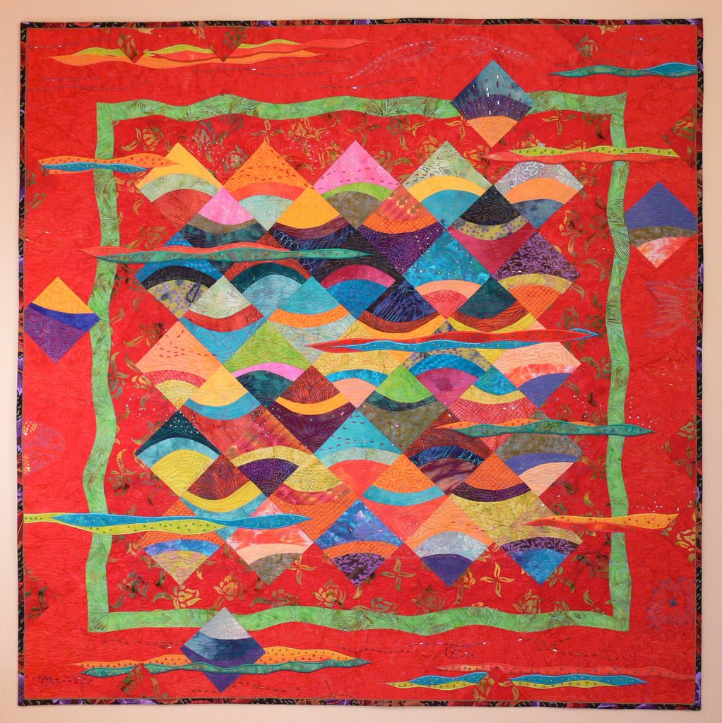
As always, Festival was HUGE, inspiring, overwhelming, led to sore feet and back, and the determination to try harder and do better than ever. For this first post, I’ve shared Marie’s first quilt in Houston already, and here is my quilt The Tide is Hire in the Viking Exhibit,

As a dyed-in-the-cloth art quilter, but with roots firmly planted in traditional quilting, I was surprised that my all-time favorite quilt of the show was La Avena Romantica, by M. Mizuno of Japan.

and here is the “blurb” sheet on this quilt:

Usually I am drawn to bright, clear colors and loose, free style. But I just loved this highly structured, muted piece. The tiny grains on the barley stalks are individually appliqued…each one the size of a pencil eraser! The white circles around the sheaf of barley are embroidered, and it looked like the whole piece was made of fine woolens (though the information says it is all cotton). Here are two details shots:

In the coming days I’ll share more of my favorite things from Festival, including the awesome journal quilts and book. In the meantime, if you’d like to see more, click on the ruby slippers at the Quilts, Inc., website here or click here to go directly to Festival coverage. I’m proud that both my Viking entry and one of my journal quilts are featured on the webcast. To see the Viking entry, click on the link at the top of the page for Husqvarna Viking Gallery (it’s alphabetical order so I’m on the last screen), and for the February 2006 journal quilt click on the Journal Quilts 2006 link–on the second page of images.

Journal quilts–July, August and September

Tuesday, November 7th, 2006

The color series continued throughout the summer. For my July Journal, I took a picture of my son playing his guitar. I used my favorite method: size picture on the computer screen and trace! Although his left hand seems distorted it atualy looked just like that in the photo. This is an analogous warm scheme: orange-red-warm tan on black. It is bound with cloth on the sides, and the edges top and bottom are finished with a couched black chenille yarn.

The August journal is my favorite of the entire series. When we were in Sarasota after our Disney cruise, visiting Paul’s aunt and uncle, the hotel we were in had an outdoor pond with koi. The one with the fluttery fins and tail enchanted me. I swapped pond-scum green of the pond for the complement of red-orange: turquoise! ZING! I love the way this turned out so much, using the fused sheers and the layered background, that I want to make a huge, oversized quilt with koi….larger than life size…what revelling in joyful color!

The last journal, for September, is the “Y” trees. This is a shaded (darkened) secondary triadic colors: purple-green-orange. The fabricds are my hand-dyeds except for the two smaller trunks and the orange slivers. Since there was a lighter, sun-doing-down spot on the sky, I highlighted / backlit the trees from that side with the orange. Then I “ghosted” in more trees in the intermediate spaces. This journal is a study for a larger quilt, and both are based on…ge this! The backs of the chairs in the Lumiere Dining Room on the Disney Cruise Ship Magic! Very art deco, turned into landscape…. almost a cathedral of the Nightwood……the branches of the trees like the flying buttresses on Gothic Cathedrals….

Journal quilts–April, May and June

Monday, November 6th, 2006

I’m now home from Festival in Houston, which was WONDERFUL. I filled a 1 Gig memory card, but alas have only about that much space left on my hard drive so this is going to be interesting… I’ll post about it as soon as I can get the computer to work (hah!). And I need sleep….went out today only to go to the post office, and forgot the thing I needed to mail at home. Yep, sleep. In the meantime…..

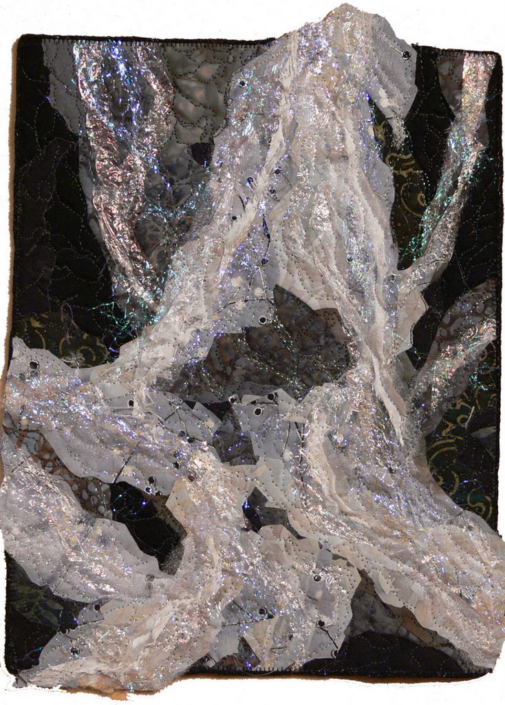
April: After looking at the January non-achromatic quilt for three months, I decided I needed to do it right. So, I made a second attempt at doing achromatic, or black-white-gray. This time, I got it. I took a close up photo of the rushing water at Camden Falls, where the Megunticook River spills into Camden Harbor. The river is actually fairly small, a large stream in some ways, and the falls aren’t that huge, either, but they sure are beautiful. I used every single black or gray fabric I had (which is obviously not a lot). Even at that, I ended up using a deep navy/forest batik and some others that stretch the achromatic scheme.

May: When I was visiting my mom in California, I took more photos of birds of paradise and other flowers in the grounds near where she lives. She had never seen a digital camera, or a photo processing program. I had Paul’s laptop with me, so I showed her how I could take a walk, come in, upload photos, adn then tweak them in Photoshop. I liked this particular tweak so much, it became the May journal. This is basically a primary triadic combination: red (fucshia), yellow and blue (turquoise).

May:

June: I have been mulling over some ideas about patterns and designs, so decided to do a contemporary twist on the traditional Moon Over the Mountain block. The combination here is complementary: purple and yellow. Or, if you’d prefer, split complementary: pale yellow and deep dark purple and its neighbors on the color wheel, including deep navy.

June:

Journal quilts–January, February and March

Saturday, November 4th, 2006

Hi all…uploading this post from Festival in Houston! If you click here, you can go to the Quilts Inc website and take a loot by clicking on the Ruby Slippers. I’ll post lots more when I get home… until then…..

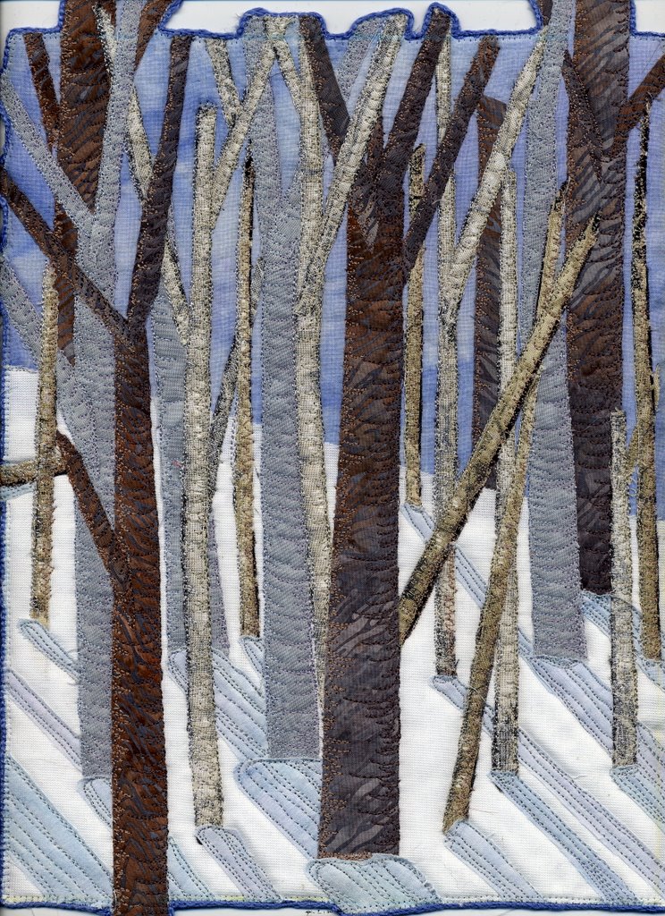
At LONG last, I can share the journal quilts for this year, since Festival is now officially open! Remember that tutorial series I did a while back on color? Well, I wanted to continue the color studies with a more “art-y” set of journals. For my first attempt, I wanted to do achromatic, meaning no color or black-white-gray. Obviously, I didn’t quite manage. Doing no color is very hard for me, so this ended up being a wintery monochromatic of sorts…white, pale blues, grays, a bit of taupe:

January:

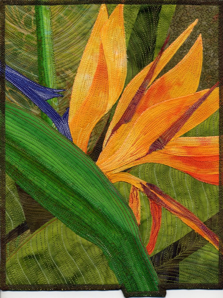
In February, I decided that I’d do a bird of paradise, which happens to be a perfect split complementary. The flower itself if the complementary pair of orange and blue, while the stalk and leave are green with slivers of red.

February:

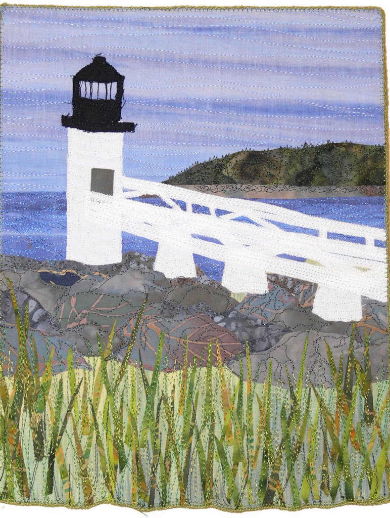
Deborah, one of the Frayed Edges, moved to Dallas in February. The rest of us had hoped to have a farewell gift for her. Ahem. Things slid due to the holidays and life and hecticness in general. So she got a house-warming gift in May! We made journal sized quilts and hung them from a piece of driftwood (to see more about this, click here). This month’s piece is what I call “natural” colors. If I were to head to the color wheel, I guess I’d call this analogous colors..green and blue are next to each other on the color wheel.

March:

The January and February journals are two of five (the others are from previous years) that were included in the Creative Quilting: The Journal Quilt Project book, which is now available here. Yippeee!

The Tide is Hire

Thursday, November 2nd, 2006

At LONG last, I can share! I was thrilled beyond belief to have my quilt, The Tide is Hire, juried into the prestigious Viking Masterpieces exhibit which will be in Houston, Chicago and (I think) the next Expo in Europe in 2 years. Reflecting on it, I don’t know why this exhibit is so prestigious, and I can still barely believe I made it in, but I did…..a new internet friend who is at Market confirmed for me before I got to Houston that indeed my quilt is there and on p. 95 in the accompanying show / exhibit catalog! Now that the exhibit is public, I can share this quilt here and on my website (that’ll come next week).

The picture above is, of course, the full quilt. I used a technique I learned from Dianne Hire for “curvaceous squares” for the center blocks, then went on from there. I wanted to use the blocks for the Viking entry, but the quilts must be 51 x 51 inches, and the blocks were nowhere near that big. So I added red! and the inner border, and it worked, especially once I added the “waves” appliqued and satin stitched to the top.

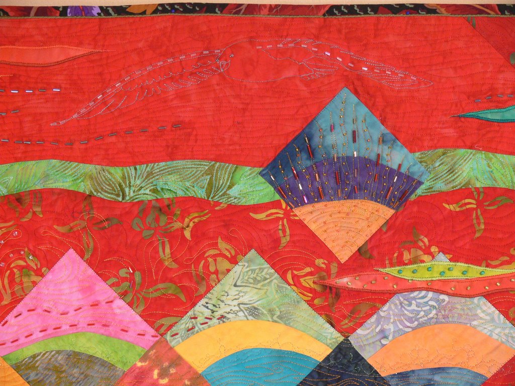
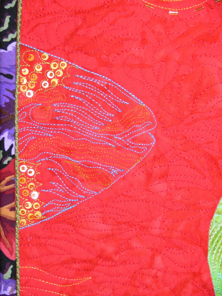
I did beading and sequins on this quilt…more than I’ve ever done before, and I’m in LOVE with the sparkle and glint of bugle b eads (the long ones that look like colorful chocolate sprinkles). I also learned from Eco (a friend from an on-line group) that using larger b eads, size 6 and 8 instead of little 11 seed beads, gives a great impact with fewer stitches! So I used them, too, inside the appliqued waves.

I thought the squares on point looked like the surface of the ocean. The show theme is “Imagine That,” so I imagined a technicolored ocean. The color of the thread ranges from yellow at the top to deep blue at the bottom, and I quilted in a seagull (see detail photo), a parrotfish swimming into the quilt, and swimming out of it on the other side, an anemone on a rock, a starfish and lotsa wave froth and bubbles. FUN!