email Youtube

Home
Galleries
Blog
Workshops & Calendar
Store
Resources
About
Contact

Author Archive

Circle Templates

Monday, June 19th, 2006

Elaine asked a great question–where did I get my circle templates, and I thought others might enjoy the info, so here you go. In a small miracle, I actually have the info on the makers of all three sets. In a nutshell, I used to have a sort-of-retail-shop where I used to live on San Juan Island, Wash. We didn’t have a quilt store on the island, so I set up a wholesale account and sold thread (literally out of the back of my car!) so we didn’t have to wait two months to go to the mainland to buy thread to quilt the quilt. That led to doing special orders for folks from the wholesaler (nice small income for me, a small discount off retail for them), and I got to troll through the wholesale catalog. Which meant I got to see all SORTS of cool stuff … like circular templates!

Here’s the picture from an earlier blog entry that happens to show all three varieties that I have:

The “solid” ones (that don’t have a hole in the center) are from Creative Grids. They come in 2 1/2 to 6 1/2 inch sizes (one inch increments), and have the Creative Grids “grippy” sanded area on the bottom. Here’s a link to the company’s site and product list; they do not sell to the public. As far as I know, Checker Distributors still have an exclusive contract with Creative Grids to sell these tools in the US, so your quilt shop would need to order from Checker, or you’d need to find a catalog that carries them. I didn’t find a google link (a quick search!) for a company I know, so will let you do your own searches. I like these a lot.

The skinny circles are from Quilters Rule. They are a set of 12 nested circle templates ranging from 1 inch to 12 inches. The tan color you see is the paper on the clear plexiglas that I just haven’t peeled off. They are marked in 1/8 th’s around the circle, and have the inch size staped/cut into the under side of the ring. According to the paper strip, mine are the 1/8″ acryic, but they are also available in 1/4 and 3/8 inch acrylic–I’m guessing those are designed for long-armers to use. Here’s a useful review of them at this link. And here’s a link to the Quilters Rule website where you can buy them.

I actually like these the best, I think, because I can use the circle as a “frame” and see clearly what will be in the “picture” when the circle is cut out. I can use the one-size-larger circle to frame the area I want to cut out, then I place the next-size-down circle inside it. I remove the larger circle, and cut on the outside edge.

The dayglo yellow-green circles are from The Gadget Girls and are called “Remarkable Circles”. These rings (nested also) are 1 inch thick, so the largest one is 12″ diameter on the outside of the ring and 10″ on the inside. I’m guessing I bought the Quilters’ Rule set after I bought these, because that gave me the intermediate 7-9-11 inch sizes.

MARKING AND CUTTING:

I usually just cut around the template with my 18 mm Olfa cutter…that’s the itty bitty one with a blade the size of a dime. I put off buying it forever, thinking sheesh.. how many rotary cutters can you need? Well.. the answer was one more. I LOVE this little baby–it’s great on curves, especially tight ones, and greast for free-form cutting because it is so maneuverable.

If I mark around the template, a chalk pencil works best, but I manage to make the Chaco-liner (seen in the picture above) work, too. Check out that link above (ok…here it is again: Link) to the review of the Quilters Rule nested templates. It has some great hints and tips!

The final hint…I’ll bet there are LOTS of cool templates out there…really useful, versatile ones, sold to the long-arm crowd. Those of us who quilt on home machines could do well to learn from them!

And stay tuned…. if I can get photos today, the nativity quilt is almost DONE! All I have left is to sew down the bottom half of the hanging sleeve, add the documentation pocket and label, and it is DONE! Hope to have pictures up in a couple days.

Cheers, Sarah (and sorry this got so long!)

Marking quilts, part 4 (4?!!!!)

Friday, June 16th, 2006

Sheesh I get verbose. OK, marking quilts part four. You can also use things like cookie cutters, puzzle parts and whatever for templates. In Part 1, I shared pictures from Circular Paradox, including the “moon rabbit.” The Japanese believe there is a rabbit in the moon, not a man. Once you look at the moon and find the rabbit, you wonder how you ever saw a person’s face there because it looks MUCH more like a rabbit.

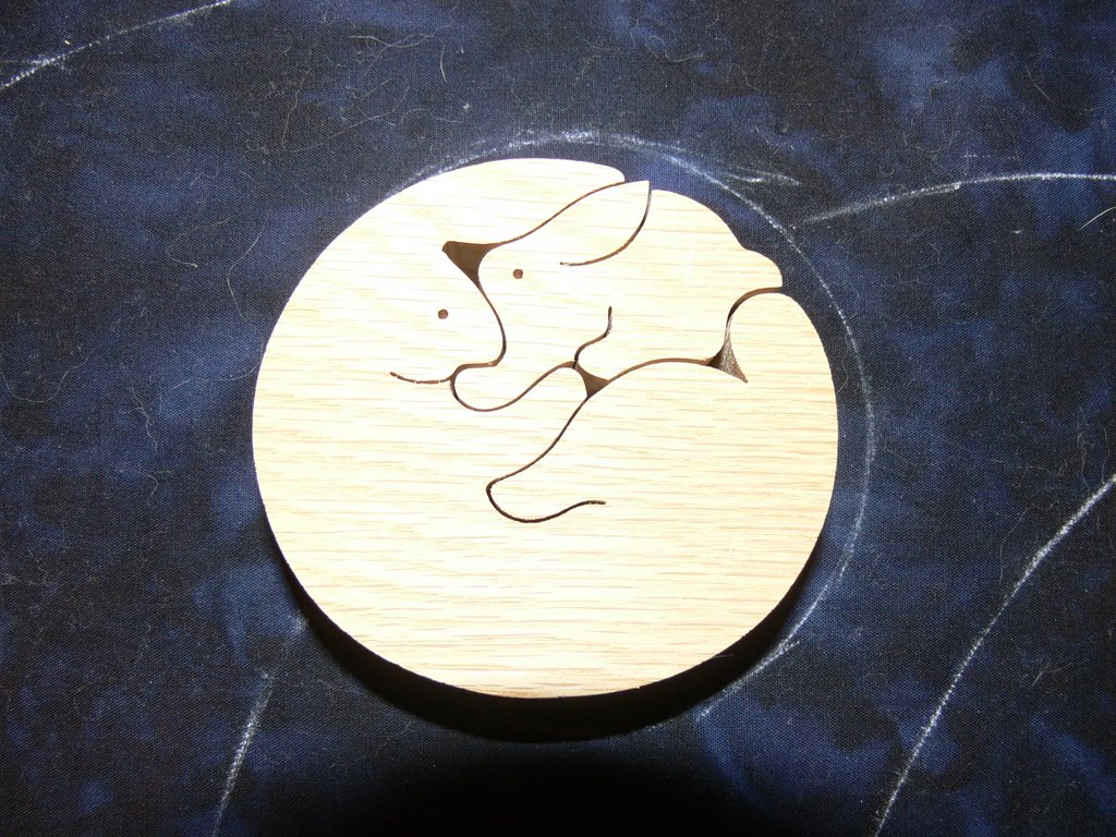
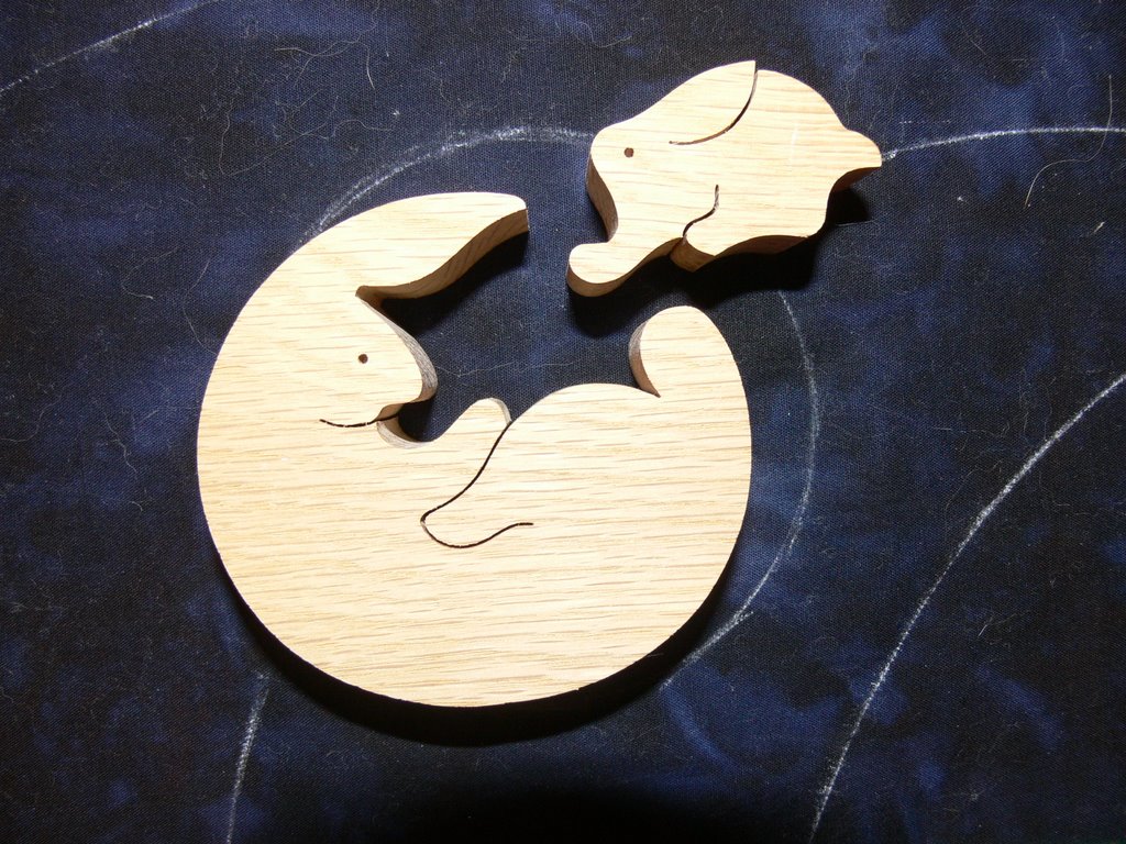
When I visited Japan in 1996 with mom, I fell in love with this 2-piece “puzzle” of a mama and baby rabbit (my oldest, and then only, son was 3 at the time).

I traced around the outside edge of the puzzle using a marking pencil (the Clover or Roxannes would be ideal for this on the dark fabric). Then quilt.

Well, I think that’s enough for now. If you have any questions about specific marking issues, problems, or things you’d like to do, but aren’t sure how to start, ask away! Brainstorming together comes up with the best solutions!

A brief digression: Aboard the Heron

Thursday, June 15th, 2006

Today is the next to last day of school, and Eli asked me to go with him on his second grade class trip aboard the Heron, a schooner which calls Rockport Harbor home. The trip was rain-delayed (it has been a season worthy of Noah), but we got to go out today despite gray skies and 2-3 foot swells outside the harbor.

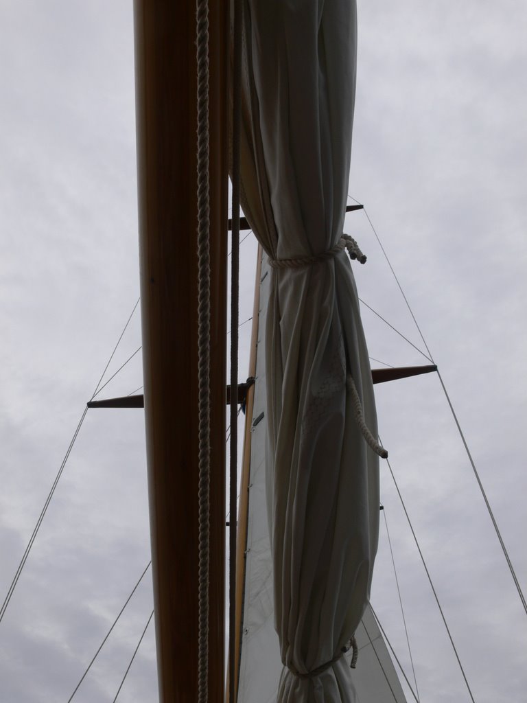
We motored away from the dock, then at the entrance / exit to the harbor, stopped to raise the sails. I took these two photos (the one at the start of the post and the one immediately following) before and as two of the sails were raised. Because of the bluster and chop, they only raised these two:

On the way out of the harbor into Penobscot Bay, we passed Indian Island, and the de-comissioned Indian Island light (taken out of service in the 1930s, and now private property–the owners are apparently summer folks). What a gorgeous spot! Maybe someday I’ll win a lottery and live in a lighthouse!

Despite the choppy waters, and the cold breeze (I was wearing a t-shirt, polartec, and gore-tex jacket snapped shut) which made it decidedly chilly, especially for kids dressed in shorts and just a shirt, it was glorious to be out on the water. The imp with the dimples on the far right (aka my son) clearly failed in his attempt to avoid being photographed!

We saw an osprey’s nest on a derelict boat in the harbor (that pile of sticks on the bow):

And a bald eagle in a tree (trust me, it was there…even with my super zoom though couldn’t get a photo worth posting). And seals on the rocks….brown shapes indistinguishable from the rock until they moved! And, my first ever sighting of Eider ducks. Now, if I could find my Peterson’s Birds of the Eastern US, I could add another bird to my pathetic “life list” of birds seen.

The Camden Hills are well-known hereabouts, and the state of Maine is known as “Vacationland” for a reason… folks from Boston and other muggy points along the Eastern seabord have been coming up here for well over a century to escape to blissful summer weather (we get a few nasty days each summer, but then the weather improves and we’re back to heavenly). Here is a view of “the hills”…. Mount Battie and Mount Megunticook in the distance. These are clearly mountains that surrendered to the superior force of the glaciers umpteen thousand years ago:

By the time we turned around to head home, two girls had huddled under a blankie for warmth.

In the meantime, I was mesmerized by the water, and actually managed to get a decent shot (and numerous not-so-decent ones) despite the movement of the boat and the water and my hands).

Then it was snack time…smiles returned, heads popped out, and even those who weren’t in love with being on the water smiled. The imp is mine–the one in the center of the boat, red sleeve, yellow life vest, talking to the girls:

And of course as soon as the food came out, a seagull–the ultimate scavenger?–decided to join us:

The lighthouse looked just as good on the return trip as on the way out.

And finally, back to Rockport Harbor:

Marking quilts, part 3–fussy marking

Wednesday, June 14th, 2006

Sometimes you need to get really, really persnickity when marking a quilt…it needs to be absolutely precise. The lettering on my nativity quilt is a case in point. I wanted the lettering to be the same font and the letterhead / logo for my school:

I asked someone in the the school’s alumni and development office, who told me the exact font (there were actually three, two of which I had on my computer–yeah!). I played with those until I had the look and size I wanted (font size was 208!), then printed them out on paper. First, I trimmed the paper to 7/8″ under the bottom line of the printing so I could line it up with the inner border.

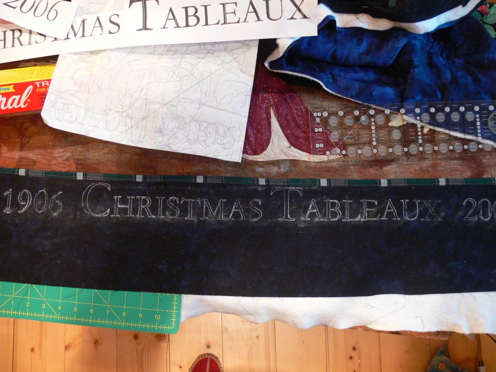
Then I realized I needed to have done that on the top for the writing on the bottom border (the part that says 1906 Christmas Tableaux 2006), which was already trimmed shorter than that. Oops. So I just measured 7/8 inch above the smaller letters and eyeballed it to have the same “breathing room” between the lettering and the green plaid inner border.

Next step: Saral Transfer paper. Place a section of the transfer paper under the printed lettering (or design…whatever you are using). Using a stylus (a pen like thing with a small round metal ball on the end–a dead ballpoint pen, knitting needle or dull pencil work equally well) or a somewhat dull pencil, trace the design. In this case, I outlined the letters and numbers.

When you remove the printing / pattern template and transfer paper, it looks like this…dusty! However, the transfer medium stays in place better than chalk, but less well than quilter’s pencils. You can eliminate some stray dust by placing the transfer paper so that the extra bits are out the top instead of under your arm / wrist / writing hand. Then you don’t get transfer from your hand and arm moving across the paper. I like the Saral Transfer paper because I don’t have to fuss with making a zillion templates (or cutting stencils) to trace around which I would have to do to use the quilt marking pencils (to dangle whatever part of grammar that is), I can look at it right side up, trace on top and move on to the stitching.

Then, to the sewing machine! At arms’ length, or less, like when sitting at the machine, I was getting pretty critical of my stitching, thinking I’d need to pick out at least some of the letters (the “o”s and “0” — letter “O” and zero — especially). But once I got the stitching done, the thread tails pulled to the back, it looked pretty good, so think I’ll just leave it be. I’m also really relieved that the gold metallic thread and writing didn’t overpower the center of the quilt; instead, the outline works just right I think. It says what I want, but without being too in-your-face or detracting from the quilt. I hope.

I also managed to do the “logo” “d”… I wasn’t sure I could manage that really fiddly bit in the center. I think I held my breath until the whole thing was done… the center part is maybe 1×1 inch or less…really small! If you right click on the photo, a larger view should open in another window.


Wisdom from Twyla Tharp

Wednesday, June 14th, 2006

And for a brief detour from marking quilts….

Although I usually dislike (intensely) self-help books, I know many folks gain a lot from them. I finally decided I’d take a close look at The Creative Habit by Twyla Tharp, the choreographer. What a wonder! This book is FULL of wonderful things for the artist. A quotation I read on Sunday resonated especially:

“Without passion, all the skill in the world won’t lift you above craft. Without skill, all the passion in the world will leave you eager but floundering. Combining the two is the essence of the creative life.” (p. 173)

That’s IT in a nutshell!