email Youtube

Home
Galleries
Blog
Workshops & Calendar
Store
Resources
About
Contact

Author Archive

Minou!

Thursday, March 2nd, 2006

Minou…tried to reply off-blog, but it got bounced…see the comment after Color Study 10…thanks for writing!

For everyone….I try to reply to each comment, because I so appreciate your taking the time to visit my blog. If for any reason you don’t hear from me, it’s probably because something went astray in the ether……

Cheers, Sarah

Maine Sunset

Wednesday, March 1st, 2006

Hi all….still fighting that cold, so just a beauty break tonight. The past two days we’ve had SPECTACULAR sunsets! Since I was feeling horrid (my cold has, as usual, morphed into a sinus infection), I convinced Joshua to run outside and take pictures.

Instead of quilting today, or working on my blog or anything else remotely fun, I did data-entry for my business /bookkeeping for the past 8 months (UGH…although you can tell that I have put the SMALL back in small business if I can enter all my expenses in one day! and a day when I’m sub-par to begin with!). So tomorrow, I’m hoping to have one last installment in this section of color studies.

OK…I CAN make this color related…..what color scheme is that sunset up above? Triadic/Primary —pink (a pale red) and yellow and pale blue!!! And below…the close up? How about analogous, running from blue to red-violet? Who cares…Mother Nature does it best.

Color Study 10: Thread!!!

Tuesday, February 28th, 2006

Ooooh….if there is anything I love as much as color, and fabric, it is thread! There are bazillion different threads available to quilters now, and you can use them to great effect. You don’t have to stick to cotton, cotton, cotton. Nor do you have to stick to same-color, same-color as in blue thread on a blue quilt.

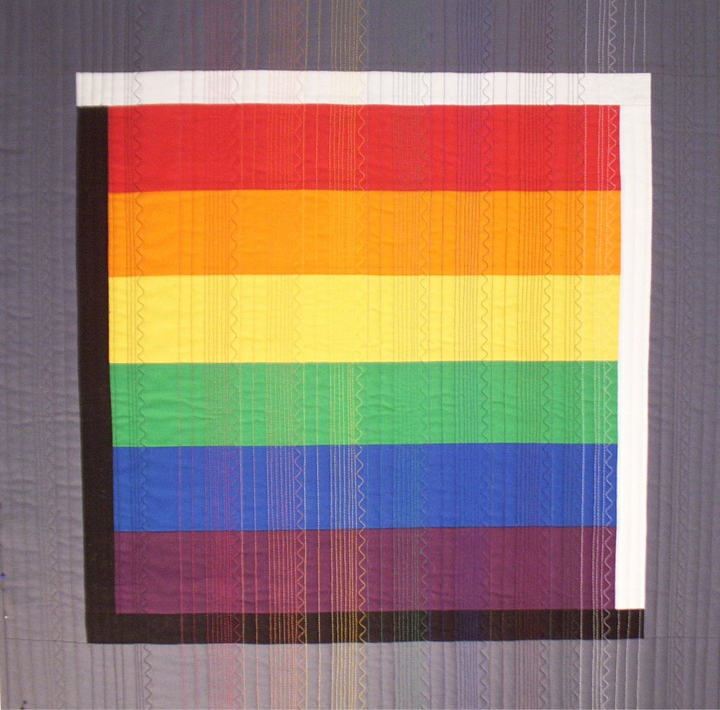
Now, I almost NEVER use solid colors in my quilts, but for the colorblock side of the studies I decided it would be a simpler, more clear lesson if I used solid. I decided to take things one step further and make a simple piece to illustrate the effect of mixing different colors of thread on a quilt. Please note, the effect is more obvious when machine quilting because you have a continuous line of color; if you are hand quilting, every other stitch is on the under side of the quilt, which mutes the effect of the color of the thread.
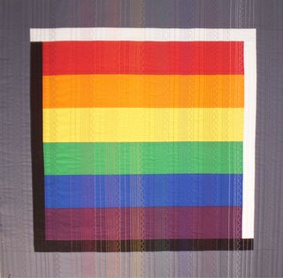
I quilted straight lines at varying distances from each other, then a serpentine stitch to simulate free-motion but keep things consistent.

I used gray thread on the left and right borders. Then in order from left to right used black thread (on the black and the first inch of the colored stripes. I left an inch unstitched for so you can compare the actual color of the fabric with the apparent color once stitched. Then, left to right, the thread colors are red, orange, yellow, green, blue, purple, gray, and white.

This close up may show better. Or, either click on the photos or right click to try to open in a new window and see a larger image (and hopefully the thread will show up better!).
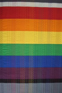
The easiest thing to notice is that same color thread on same color fabric (blue on blue, red on red) “disappears.” The greater the value (light versus dark) contrast, the more the thread shows. For example, yellow thread shows up a lot on purple, not as much on green or orange.

Next, look at one horizontal band of color and see how your perception of the color changes depending on which color of thread is used. In my Split Complementary (see Color Study 7–scroll down or click on the February 2006 archive button on the right) quilt, I think the dark red-violet tulips are too dark, so when I quilt it I plan to use a lighter magenta or plum thread to decrease the contrast / lighten the perception of the color.

Here’s an example from “Bedtime”, a quilt that is currently travelling to Spring Quilt Festival in Chicago and then (yeah!) on to Quilt Expo in Lyon, France, with the I Remember Mama exhibit. Here’s the full quilt:
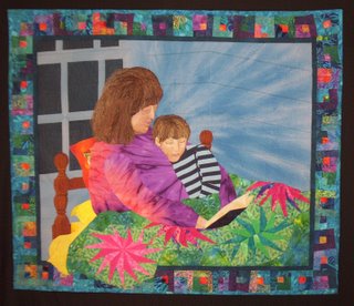
Below this photo is a cropped section of the bedpost. I used only one fabric…all the shading is done with thread (and I hope the quality of the photo isn’t awful). Since I don’t have the quilt here, I can’t go take a better picture …drat! Here, try this link to see this quilt on the Quilts website; the color is off–very garish, but it is a sharper photo than mine and you can see the detail better.

Hollis Chatelain is a MASTER of using thread to color her work. In recent years she has been working in monochromatic color schemes with dye: all blue, all yellow, all green. Any additional color that you see is ONLY from the use of thread to color the work. Go browse her site….you’ll be amazed. She is one of my all-time favorite artists.

And a copywright caveat!

Oh…sorry about this. An inquiry today made me think that I ought to note that all the writings and images on this blog are copyrighted (by me). I’m thrilled for you to read them, take notes, even print a copy for your personal use. But please respect my work and copyright and do not use these to teach, hand-out, etc. You know the drill. Thanks!

Joshua’s wrestling

Tuesday, February 28th, 2006

Time for a break for a minute from the color thing….. Earlier, I posted about Eli’s karate (he’s in 2nd grade, and has earned his yellow belt and two stripes). Well, now time for equal billing for his big brother, Joshua (6th grade). To our combined parental utter astonishment, Joshua announced in early February that he wanted to be on the middle school wrestling team. Up to this point, he has wanted nothing to do with any sport other than skateboarding or riding his bike. To make this even more amazing, Paul was in the top three in Connecticut in high school wrestling (back in the Cretaceous when we were young…). Here is the start of his first match last Saturday…Joshua is on the left, in the red.

Joshua absolutely LOVES wrestling, and it’s so fun to watch Paul teaching Joshua extra moves after practice. It’s a demanding schedule: every single day after school from 3-5 pm for all of February and March, including during winter break/vacation, meets most Saturdays, and a couple Wednesday afternoons, too!

So far, Joshua has won only one exhibition match, but even in the space of one week from the first meet to the second, last Saturday, he improved dramatically. In his first match, he was leading 10 to 4…..right up until he gave his more experienced opponent one opening and got pinned! Oh well…..he’s really doing well no matter what, and is learning and having fun…way cool! In this photo, Joshua is going in to pull his opponent down onto the mat.

Another cool thing that just about blew Paul out of the gym…there are GIRLS (go girls!) on the wrestling team, and they get out there and grapple with whomever is in their weight class. Even more cool, this week THEY WON! against boys their own weight class! Yeeehaw! Things have improved in the past 35 years! Paul keeps saying, I never saw such a thing. Yeeeeeehhhaaaaaawwwww! Girls kick a*s! And Joshua’s cool!

Joshua’s addition: I woulda had the kid on the first match as mom said it was 10-4, I was ahead by 6 and I had the kid pinned for 5 seconds (you need 5) and the ref “apparently..” didn’t see that I had him… oh well… (-L-)

Mom’s note: Joshua did have the other kid nearly pinned, but in the stands we couldn’t tell how much of his shoulders were on the mat, and I guess the ref couldn’t either…Joshua is convinced he did…cool! We have, though, reminded him that it’s not a pin unless the Ref says it’s a pin!

Color Study 9: Rainbow

Monday, February 27th, 2006

Well…..we’re almost to the end. And at the end is everyone’s favorite, the rainbow or full-spectrum. From kindergardners to grownups, there is something so inherently pleasing to the eye, that this color run is used far and wide. Here’s the color block side of the quiltlet:

Now, I guess I must have been living under a rock somewhere most of my life, because I was in my 40s before I learned the memory-trick of Roy G. BiV (which my oldest son learned, and therefore so did I, when he was in pre-school!). It used to be hard to remember what color was on the inside of a rainbow, and what was on the outside. Well, starting with the inside, you have

R–Red
then, in order
O–Orange
Y–Yellow
G–Green
B–Blue
i–indigo (not really, or only sorta, but it makes the mnemonic work)
V–Violet

or (drum roll for the dense, like me) ROY G. BiV! And since the colors run all the way around the color wheel, a circle as the symbol seemed the obvious choice.

If you’ve ever been to the mall…look at how shirts are arranged in stores like the Express Limited, or towels in the Department Store. They look good because even though each t-shirt by itself my be kinda plain, the color run is enticing—it calls out “buy me because I’m beautiful.” Harrumph! Anyway….back to color. Store designers *use* colors because they cause us to react in certain ways. Spas use soothing blues and greens and sea colors. Fast-paced, get-em-in, get-em-out restaurants use bright warm colors…it isn’t an accident that McDonald’s and Burger King both use red and yellow! There’s a whole ton of color psychology information out there, most of which I don’t know, but it sure is fun.

For my quiltlet, I used a diagonal grid composition in all the colors, and in the color progression, of the rainbow:
I didn’t put the medium toned gray into this one…yet. I may bind the center-sides with gray, just for comparison. I still haven’t decided how to finish the edges….couched yarn, gray binding, not sure…..need to quilt them first, then I’ll decide. Any suggestions?

I haven’t yet made any “brown” shades in these studies, nor have I really gone into the tints (add white), shades (add black) or tones (add gray) issue of colors, though I touched on it some in the earlier quiltlets. Should I add some of these or not?

Tomorrow, I’ll show a very simple sampler showing the impact of different colored threads on horizontal bands of color…think plaid made with cloth and quilting thread! Then I’ll yabber a bit about how I choose color, and how and when I leave the intuitive selection and use the color wheel to help me when I’m stuck. Thanks again for surfing in to visit!