email Youtube

Home
Galleries
Blog
Workshops & Calendar
Store
Resources
About
Contact

Author Archive

Site Meter

Monday, February 27th, 2006

Just wanted to let all of you know how much I enjoy having you visit my blog. I recently added a “site meter”, a little rainbow-colored box at the very, very, very bottom of the main blog page. It doesn’t give me any private information about you, but it does tell me how many folks have visited my site, and where you are from in general terms. I’m thrilled to see folks not only from North to South and East to West in North America (including Canada with the U S…will have to check soon to see how many states and provinces!), but from (!!!!) the UK, New Zealand, Australia, Korea, Norway, the Netherlands, Turkey, Finland, Brasil, Italy….this is SO cool!

As a former US diplomat, I love being home and setting down roots in a community and being in one place. But I miss that international input, seeing and meeting and talking to folks from around the world. Well—have I said recently how much I love the internet? —with this blog and the information from my site meter, I know now that I can still talk with all of you! WOW! I’m thrilled you have surfed in, and hope that you find something that helps or entertains you, or just makes your day a bit better. Thanks for being out there at the other end of the ether!

Color Study 8: Tetradic or Dual Complementary

Saturday, February 25th, 2006

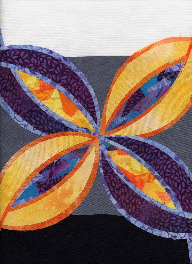
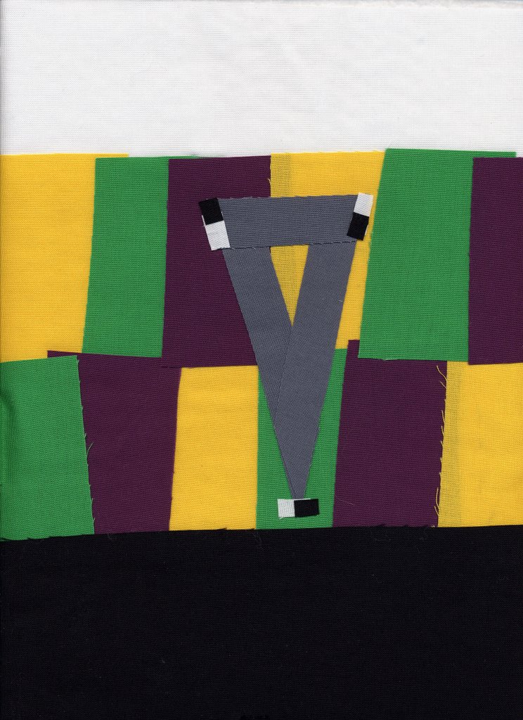
So what comes after triadic / three (3)? Why four (4), of course….or tetradic color schemes. Another way of saying that, but a lot more simply, is dual complementaries (2+2)…either way it adds up to four. For the colorblock side of this quiltlet, I selected blue, purple, orange and yellow. If you take a quick look at the color wheel again, you’ll see that yellow is the complement—on the opposite side of the color wheel—of purple (a mix of red and blue). Similarly, orange ( a mix of red and yellow) is the complement of blue.

One way to remember the meaning of complement (thanks Terry Grant for reminding me of this great etymology) is that complement comes from the same root word as “complete.” To quote Terry: “A pair of complementary colors “completes” the primary triad.”

For my “symbol” for tetradic I chose the square, but a rectangle works just as well. Basically, take any two pairs of complementary colors, and you have a tetradic or dual complementary scheme:


I returned to a semi-abstract composition for the quiltlet side, using a symmetrical composition. If you slice the quilt on either diagonal, it is a mirror image (more or less…the snippets in the centers of the petal or pod shapes vary). Look at how the snippets in the centers pop–that’s your complementary color scheme at work!

Also, I set “Value” to work here, too. You may remember that value is the relative lightness or darkness of a color. I used a light or pale blue for the blue, and a deep dark purple for the purple. Yellow by its nature is hard to make dark, but I picked a yellow that ranges from almost white to bright, but a reasonably intense (i.e. darker) orange.

Now it’s time to introduce a new concept:

Warm colors advance / move forward.

Dark colors recede / move backwards.

Look at the petals/pods again. Notice how the yellow and orange petals seem to pop forward? The blue-purple ones seem to be in the background. As well, the blue-purple centers of the yellow pods seem to really be retreating into the distance, while the yellow-orange centers on the purple pods are almost bursting out of the center.

If you want something to “pop” or look as if it is in the foreground, using a warm color will help create that effect. If you want to tone down, or move something into a subordinate position, see what happens if you use a cool color instead of a warm one.

Tomorrow, I’ll bring in the perpetual favorite–the “rainbow” or full-color-wheel, and the next posting will be a thread sampler I made to illustrate the effects of different colors of thread on the same range of colors (that’ll make a lot more sense when you see the picture!). Then I’ll talk a bit about how I choose colors, and how I use the color wheel in real life.

Thanks everyone who is reading and following this discussion!

Cheers, Sarah

Digital Camera query

Friday, February 24th, 2006

Hi all….not feeling so hot tonight, like I’m coming down with something (my sons love to hug me, which is wonderful, except when they share their germs….) so will keep this short and resume the color studies tomorrow or Sunday.

In the meantime, I’m on the hunt for a good digital camera that will take pictures of my quilts with high resolution for entering into shows AND take good action shots of my kids at wrestling meets (guess where I’ll be tomorrow) and karate, as well as the usual assortment of stuff. I’m considering these:

Fuji 5200
Panasonic DMC-FZ5
and
Canon A620

The Fuji and Panasonic are extra-long zooms (12 x !!!!! equivalent of a 35-400 zoom on a film camera….wowza!) and get rave reviews; both are 5 mp.

The Canon is a 4x zoom, but 7 mp.

Any thoughts on these, or anything else, related to buying a new digital? I can afford to spend $350-400 I think, including batteries and memory card…..

Now I’m going to bed EARLY…..stayed up way too late last night watching the skating, and tonight everything aches….nitey nite,
me

Color Study 7: Split Complementary

Thursday, February 23rd, 2006

Remember complementary colors? Ones that are directly opposite each other on the color wheel, with a straight line as the visual memory-clue? Well, a split complementary is similar, but instead of going straight across the color wheel, the line splits into a skinny “Y” on one side, like this:

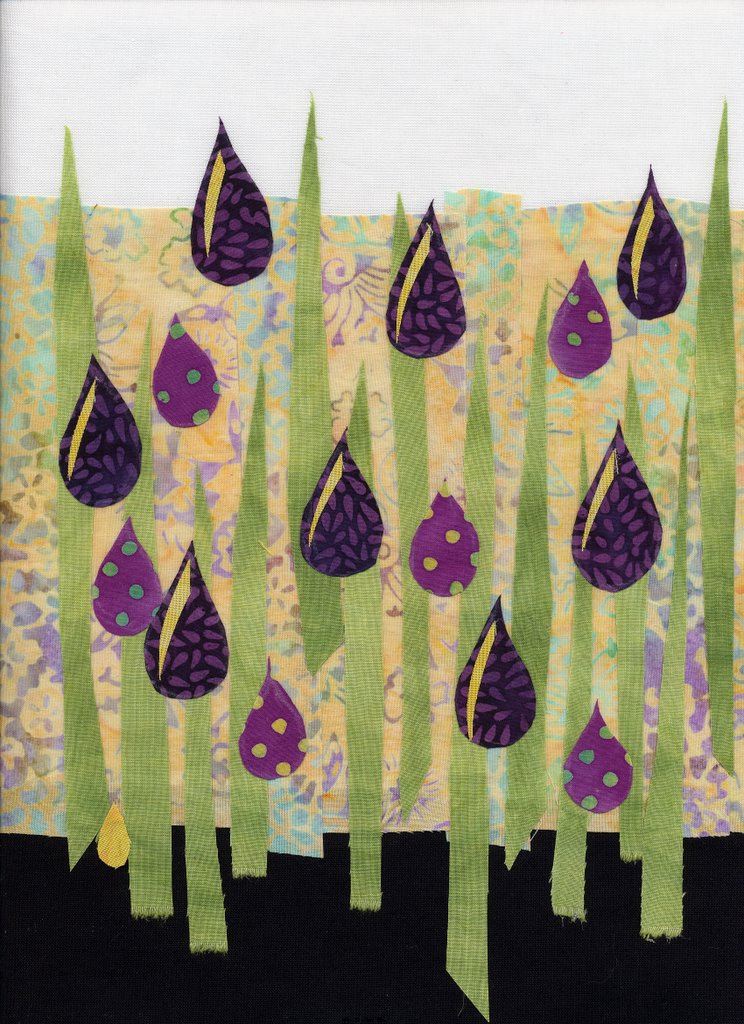
I selected red-violet (a very dark shade of it). The complement—the one just opposite on the color wheel–is yellow-green. If you make a “Y” instead of an “I”, you’ll get a skinny triangle that touches red-violet, yellow and green. I have a couple of traditional quilts I’ve made using this combination, but I think it is because it is a combination found often in nature, including my Gramma’s favorite, pansies!

Well, piffle! I just looked in my files, and I don’t have any digitals of my purple-yellow-green quilts in digital! Over the next few days I’ll try to dig them out and take pictures to share. Anyway, for the “quiltlet” side of this lesson, I finally gave in to my urge to do representational. Using a “vertical” composition, I made flowers out of pale yellow, deep and deeper darker red-violet, and green. I plan to “meld” the colors of the flowers with the quilting thread, so it will be interesting to see the difference between the quilted and unquilted scans.

Color Study 6b: Warm and Cool colors

Wednesday, February 22nd, 2006

Martha mentioned in a comment that she had never understood what was meant by warm and cool colors. The easiest way to think of it is this:

Warm, the colors of
–fire
–embers
–the sun
–morning
–summer
–autumn leaves

Cool, the colors of
–night
–ice
–cold places / winter
–many shadows (though the Impressionists had a lot to say on that one!)

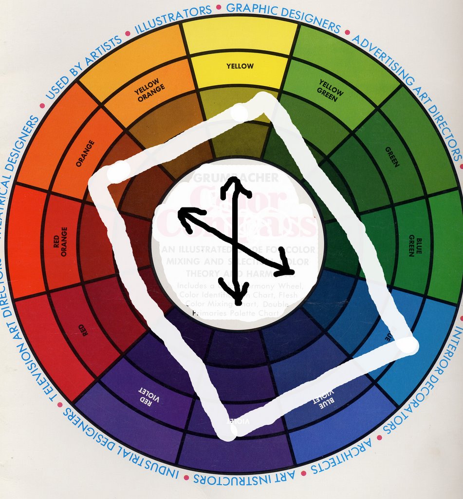
Another way is to look at the color wheel. Here are scans of my favorite color wheel (I have at last three!), but alas I can’t find it anywhere on the web for sale….It is the Grumbacher Color Compass, item B425, has a 1972 copyright date on it, and Third Edition 1977:
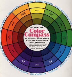
If the color wheel were a clock, yellow would be at high noon. The colors before noon, the “morning” colors are “warm”—starting with red-violet at 7 am, through red at 8, into orange at 10 and yellow at noon. The afternoon colors are “cool.” The early afternoon is starting to cool, but you still get a “warm green” in the yellow-green at 1 pm. Then you move through progressively “cooler”, more blue shades of green to green and at 6pm, dusk falls and you reach violet. Isn’t color wonderful?!!!! It is SO much fun.

That brings me to dual primaries. Michael Wilcox’s book Blue and Yellow Don’t Make Green first introduced me to this concept: there is no such thing as pure red. A red pigment is either a blue-red or an orange red. After all, who’s to say what is “true” red? How do any of us know that what I see and call red is the same color you see?
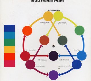
This color wheel in the Grumbacher Color Compass is a guide for artists who use Grumbacher paints. If you click on the photo, you can have a window open with a larger image; then you might be able to read that there are, for example, two reds: Grumbacher Red has an arrow that points to orange, indicating that it is on the orange side of things. Alizarin Crimson points to violet, indicating that it is a blue-red.

Try pulling a wad of one color fabric off your shelf, then really look at it: if you’ve picked red, is it kinda blue-y? Or could it be more towards tangerine (a red-orange)? If you have pinks, does the color veer toward fuschia or even a violet (cool), or is it more peach (warm)?

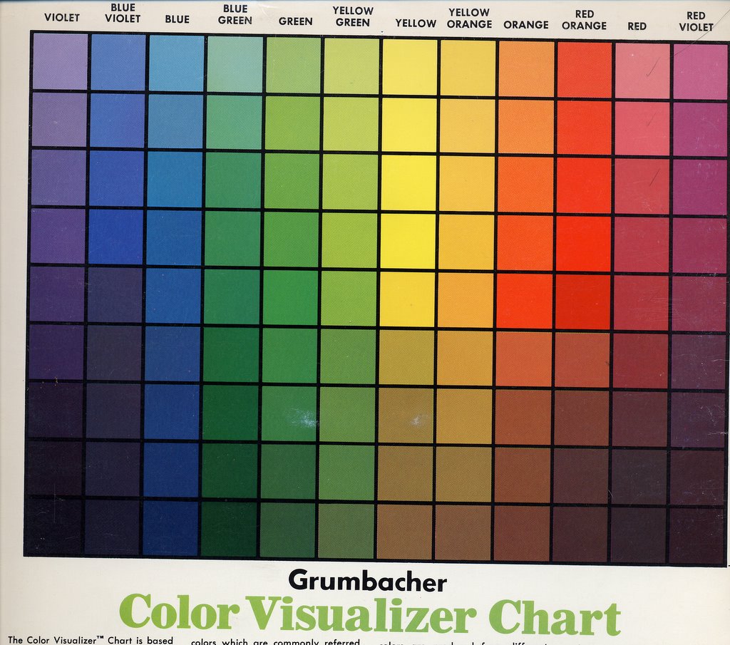
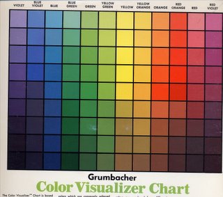
And since I had the color compass on the scanner, here’s the Color Visualizer Chart…which shows what happens when you mix white or black with a given color. There are nine lines of colors on the chart below. The one smack dab in the middle is “pure” hue / color. The ones above it are the color mixed with white, the ones below mixed with black. At the end of the series of color studies, I’ll talk a little about tints (mixes with white), shades (mixes with black) and tones (mixes with gray added), and about tertiaries.
BUT, I’m going to force you to wait a couple months for color samples….I have three small deadlines in the next two weeks to finish entries for various things, then I have a HUGE quilt I want to make and finish by May, and I really need to get cracking. Well, huge by art quilt standards, small by bed quilt standards…about 40-54, but with lots of detail and embellishments. I’d like to finish it in time to enter in Houston (so done by June 1 at the latest so I can photograph, etc.)

And now, I’m going to go add a little more quilting to my February Journal quilt (which alas I can’t share, even here on my blog…sigh) so I can get it e-mail off to IQA by the due-date!

Hope this helps! Tomorrow, ummm…what comes next…….tetradic I think…….nope–not yet, we’ve done one-color quilts (monochromatic), two-color (complementary), three color (analogous and triadic) and next: another “3”, split complementary. Stay tuned!