email Youtube

Home
Galleries
Blog
Workshops & Calendar
Store
Resources
About
Contact

Author Archive

Color Study 6: Triadic / Secondaries

Wednesday, February 22nd, 2006

Hi all! Thanks so much to all of you who are surfing in to read these “lessons” on color….you give me confidence that maybe I am on the right track! I was going to include a discussion on warm versus cool colors in this post, but decided to make it into two posts tonight. So for our first installment:

You’ll recall that primaries, red, yellow and blue, are colors that can’t be created by mixing something else. Secondaries, however, CAN be mixed from equal amounts of the primary colors….and I’ll bet every single one of you remembers mixing tempera paints in your first years in school:

Yellow plus Red makes Orange
Red plus Blue makes Violet (aka Purple)
Blue plus Yellow makes Green

And if you mix them all together, you don’t get black… you get that lovely shade known to artists and fingerpainters the world around: mud!

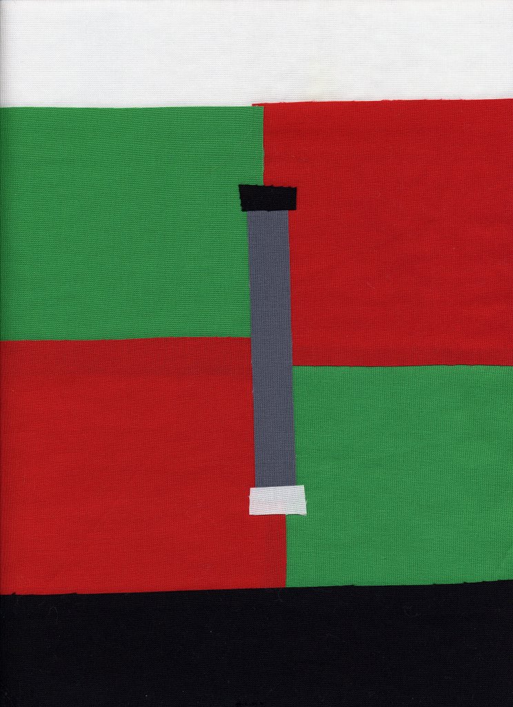
Here’s the colorblock side of the quiltlet, once again with the equilateral triangle to denote a “tri” / triadic color scheme:

In most western cultures, these secondary colors (and then the tertiaries, the ones that are blends of the secondaries and primaries, and their muted or paled versions…such as burgundy and pink are variations on red) are often perceived as more “sophisticated” or “grown-up” than the primaries. All I know is that I found it MUCH easier to work with these three colors and create a pleasing composition than I did the red-yellow-blue combination. Here’s the “quilt” side, again an effort at abstract using a diagonal composition (although honestly I think of this as treetrunks on the crest of a hill!), mixing in gray among the vertical bits.

As in earlier quilts, since I’m working from my stash to make these pieces, it was virtually impossible to create something without a bit of “other” colors creeping in…there is a bit of blue in the green fabric in the upper right, there are some caramel browns in the purple. But I figure that makes it a more true-to-real world experience, right?

Color Study 5: Triadic / Primary Colors

Tuesday, February 21st, 2006

So why am I going through all these combinations you might ask. Gee…maybe I should have started these lessons with this thought….the joy of writing before you edit your brain!

A lot of folks are scared of color; they don’t understand it, and they don’t understand how to make the colors work (or play) well together. Do not be afraid—of color that is! By understanding how the colors relate to one another, you can make quilts, art or outfits that look good. Or, if you want to create a jarring image, you can use colors that fight one another to help create that effect. Once you understand how colors work, you can get them to work for you!

Today’s quiltlet is about the triadic color combination. Here’s the color block side of the quiltlet:

As you might guess, it means there are three colors evenly spaced around the color wheel. That means you can have a threesome of red-yellow-blue, or orange-green-purple, or the “tertiary” colors…remember them? the ones that are–for example– a combination of yellow and orange make yellow-orange.

If you look at the color wheel in yesterday’s post, the primary colors are in the center, and look like colors we associate in the US with children—colors that little kids just love. The center of the color wheel is an equilateral triangle, one where all three sides of the triangle are the same length. So, drum roll along with a flash of the obvious, I chose a triangle as my symbol for triadic combinations.

For the “front”, I chose a radiating design, again using the white top and black bottom borders, with my medium gray salted into the swirls. You can see on both sides that the gray seems dark compared to the yellow, yet lighter than the medium blue. This is the value of “value”–the comparative lightness or darkness of a color.

Tomorrow, the secondaries in a triadic / triangle combination!

Color Study 4: Complementary

Monday, February 20th, 2006

Opposites attract…or, colors on the opposite side of the color wheel make each other “pop.” Hmmm….think I’d better upload a color wheel, hunh? OK…here you go, same as yesterday:

Look at the colors on opposite sides of the wheel….no matter which two colors you pick, as long as they are at the other end of a straight line on the other side of the wheel, they are complementary (note: this in not a compliment, which is a nice thing said about someone/thing!).

Christmas red and green are the classic example, so that’s what I used for my sample (though I may do a couple more of these using other “opposites”). On the back, I illustrated the concept with the straight line:

For the front, I used a “framed” composition, and just a smattering of reds and greens in different values…another color concept.

Value: in color theory, this means how light or dark a color is. White and yellow have a light value. Deep purple and black have a dark value. Medium gray is….ummm… duh…. medium.

If you use one of the “ruby beholder” type tools available in quilting colors, this is one way to determine if fabrics have similar or contrasting value, that is if they are lighter, darker or the same as each other. Another way to determine value is to lay an assortment of fabrics on a photocopier and make a black and white copy. It’s an easy way to determine if you will have sufficient contrast in your quilt (and only you can decide if you want a lot or a little).

Back to the sampler….using assorted values of red and green helps give some life to this piece, making it look like an impressionist garden (it’s that thing I have about representational art…I’m working on it!).

Another one of my wall quilts also illustrates a different set of complementaries on the color wheel: orange and blue. This is why everyone loves the screaming oranges of autumn…the stark contrast with the blue skies is a perfect complement:

Tomorrow, I’ll talk about Triadic / Primaries as a combination.

Color Study 3: Analogous

Sunday, February 19th, 2006

An analogy in writing is where you compare something–you relate them to each other: giving birth is like trying to shove a piano through a keyhole, is one example (which is a lot more fun than the SAT test “tree is to cone as ball is to circle”). In color, analogous colors are colors that relate to the ones on either side of them. Here’s a scan of page 31 in The Elements of Color by Johannes Itten, one of the classics of color analysis:

Primary colors are the ones we often associate with kindergarten and young kids, at least in the US: Red, Yellow and Blue. They are called “primary” because you need a fairly “pure” pigment to get those colors. Here, they are at noon, 4 pm and 8 pm on the wheel and in the very center.

Secondary colors are orange, purple and green; you can get those colors my mixing red and yellow, red and blue, or blue and yellow, respectively. By combining equal amounts of two primaries, you get a second, mixed color–they come second, after the “first” or primary colors.

Tertiaries are, then, the third colors. Take one of the secondary colors made of equal amounts of two primaries, than add more of one of the primaries. Using orange as an example, add red or yellow to make yellow-orange or red-orange.

Looking at your handy dandy color wheel, and sticking to with orange, you can get an anologous color run by looking at the colors on either side of orange: yellow-orange-red. Or, you can limit the color-run to the tertiaries, as in the example just given. For yellow, a similar color run would be yellow-green, yellow, and yellow orange. You can “bridge” the warm and cool colors by going through the greens: yellow, yellow-green, green, blue-green, blue. Or have a similar run on the blue side of the wheel: green-blue-violet.

For my “quiltlet” example, I used a primary / secondary color run: red-orange-yellow. Here’s the color-block side of things; I selected an arc to represent analogous colors, since they are side-by-side in an arc on the color-wheel:

And here is the “quilty” side of things (inspired by a wonderful ephemeral artwork by Andy Goldsworthy–I don’t remember which of his books it was in, but he whorled fallen autumn leaves around a hole dug into the earth….vibrant reds surrounded a seemingly black hole, then orange, then ochres and yellows, until you reached the brown bare Earth…here’s a link on the web to that picture , and on-line art site with pictures of his works, and a link to some of his books at Amazon. Here’s the quiltlet:

Obviously, the dominant composistional element is the circle. As before, I bordered the top with white, the bottom with black, and salted some medium-gray into the center. Try holding your hand or a piece of paper over the white border and see how that affects your perfection of the color. Now try blocking out the black border on the bottom. White mutes the color; black intensifies or makes the color more vibrant. Depending on what you want to do with the color—you can change the colors next to it to punch it up or tone it down.

If you’re interested in an academic approach to color, but one that isn’t too dense or daunting, head to the library (or Amazon) and look at The Elements of Color by Johannes Itten (still in print after all these years, and for a reason…). ISBN 0-442-24038-4. In the quilting world, an older book by Mary Coyne Penders, Color and Cloth, is very good at dealing with how to use the color in commercial prints, the way most of us work. Joen Wolfrom’s books, ColorPlay and The Magical Effects of Color, are outstanding, but may be a bit art / academic oriented for some readers, but I loved them. To jump up on the soapbox a bit….go ahead and learn the art world’s terminology….it’s just words. Learn the definitions, and you’ll be way ahead of the game, and you’ll understand better what you are looking at when you walk into the fabric store. If I can learn color, ANYone can!

Color Study 2: Monochromatic

Saturday, February 18th, 2006

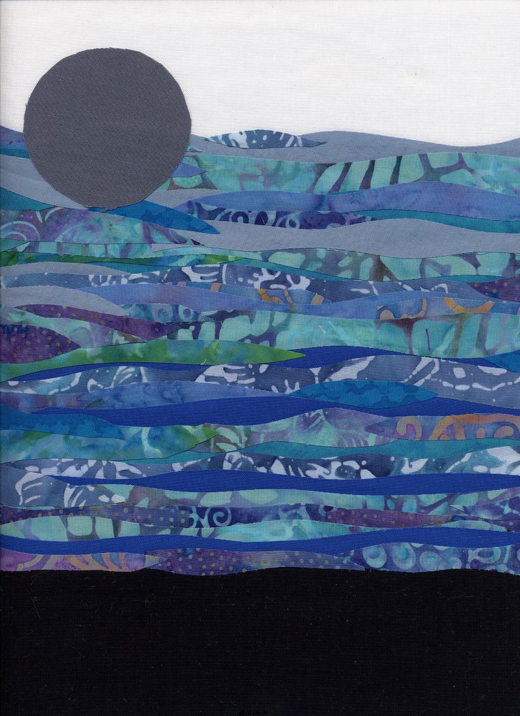
The next concept is the one-color or monochromatic quilt. I chose blue since I have a lot of blue fabrics, but any color can be used. An achromatic quilt is monochromatic using shades of gray/black. Here, I chose a horizontal composition. I’ve tried VERY hard to work more abstractly since I prefer representational stuff, but I can’t seem to move away entirely. In my head, this is waves, shading from lighter at the top to darker at the bottom.

Here’s the back of the quilt–simple: white top, black bottom, solid medium blue in the center, with a number 1 as the symbol for this type of quilt.

The front of the quilt isn’t strictly monochromatic…some of my batiks had some blues that really ranged into the green area, but at least they are blue-green, and into the purples, but a very deep blue-y purple (or is it a purple-y blue?). This is one thing you have to contend with when working in commercial fabrics (as opposed to dyeing your own)….what you have in your stash or available for sale determines what you’ll have in your quilt. But you get the idea:

Some of the most striking traditional quilts are monochromatic. I fell in love with a Mariner’s Compass pattern by Mary K. Ryan that, a few eons ago (the 80s) appeared on the cover of Quilters’ Newsletter Magazine. That became my second quilt, and I still totally love it and the monochromatic color scheme:

But it seems to me that the majority of art quilts use other color principles. I know that monochromatic art quilts exist, but they seem to compose an even smaller percentage of the genre than in traditional quilts. What do you think?

And just because I couldn’t resist, and because this Mariners’ Compass quilt is probably one of maybe two full sized quilts I’ll ever quilt entirely by hand (the other will be my Dear Jane, if and when I ever get back to working on it….ahem), here are two close ups. The first is of the dolphin quilted into the front (there are also orcas). The second shot is of the white back, where you can see how much quilting there is…MILES!