email Youtube

Home
Galleries
Blog
Workshops & Calendar
Store
Resources
About
Contact

Author Archive

Color study 1: another note

Saturday, February 18th, 2006

Caz mentioned that the second photo worked better for her for illustrating the color principles, and that she ended up distracted by the shapes in the first “front” photo in my previous post. It occured to me that I should explain what I’m hoping to do with the pieces.

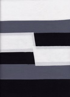
In writing or in a lecture, I would show the back “color block / color ‘principle'” side first…the main, solid, color blocks. Then I’d turn the quilt over to show what it would look like in a contemporary style quilt. A lot of times, folks can’t make the visual translation from solid color blocks (in paint or cloth) to cloth in a quilt. This is the only piece where I used the solid fabrics on the “front” / quilt side; in all the others I used batiks with some solids….I’ll post Monochromatic tonight, and maybe that will help illustrate where I’m going? Thanks for the tip, Caz…it helps me know how to explain things.

Color Study 1: Achromatic

Friday, February 17th, 2006

Addendum, July 22, 2006: Hi everyone! I’ve added a link on the sidebar to this post, which is the first of an extended series of tutorials on color. If you’d like to read the rest of the series, look in the sidebar to the right that says “Archives.” Click on February 2006, the scroll down to the 17th. Read from the bottom up to follow the posts in sequence. Thanks and cheers!

OK…you guys (presuming rashly that anyone is reading!) get to be my guinea pigs. This is the first of 9 or 10 posts in a series on color. I’d love feedback, so please read on!

Background: last fall I gave a talk for my local guild chapter, then a paid lecture for the Clamshell Quilters down the road a piece in Damariscotta, on Color for Quilters. I think the talks went reasonably well, and I was able to illustrate most of the concepts with my quilts, from journal to large wall sized. But, I decided what I really needed was some “show and tell” specifically geared to teaching quilters basic color theory. So…….I decided to make a series of two-sided journal quilts to illustrate various concepts. Just to get you reading, I’m putting one quiltlet here, but read below for details.
I started the talks like this:

Learning about color is a lot like learning about quilting. You need to learn the words so that you can understand what people are saying. How many of you know what a fat quarter is? (Virtually every hand in the room is raised.) How many of you know what a scant quarter inch means? (Ditto) And if I say a log cabin, do you think of a building in the woods, or a quilt? (guess what…) What about a Baltimore Album. I’m guessing folks are not thinking of a black vinyl disc played on an antique known as a record player. And I’m guessing they’re also not thinking about a photo album. We have all learned the words to explain quilty things.

Well, it’s the same thing for understanding color. If we define the words and illustrate them, including interpreting them in cloth, then they are easier to understand.

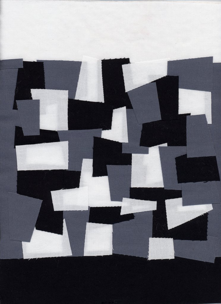
This post is about the first term: achromatic, which means without color or, more simply, black, white and shades of gray—something that lacks color. This photo is the back of the quilt (which isn’t actually quilted, yet…stay tuned!):
And the photo at the start of the post is a simple assortment of the black, white and gray sorta-square shapes. I decided to put white borders on the tops of all the pieces, black on the bottom, and tuck grey into the center portion to illustrate the effect of placing a “color” (or lack thereof) next to black, white and gray. You’ll see in future posts how the gray seems dark when placed next to yellow, but light next to dark violet. It’s the same gray in all of them…..

Anyway, I’d really appreciate feedback on these pieces as teaching tools. Stay tuned, keep reading, and let me know what you think. I want also to teach folks about using thread to manipulate the appearance of the color of fabric…more on that down the line.

Project Runway…down to three

Thursday, February 16th, 2006

Good! For once, they got rid of someone who really wasn’t in the same tier. Of course, that means we still have Santino, but they did have a point….he has a “voice”…a distinctive style, and vision inside his head wanting to come out, even if it is accompanied by a 747-sized ego.

This past week or so I came across the Blogging Project Runway blog (duh)…. from there, you can see the collections for Olympus Fashion Week, including Kara’s, which she had to do as the “ringer” so that no one would know who were the final three. I was fascinated….I thought Kara’s collection was derivative—very “Jay” in the headgear, but on the plus side she had the best use of color. It was interesting, then, to hear her talk about being a surface design type and a colorist, something which didn’t come out in the garments she made for Project Runway.

I was really surprised with Santino’s work: his dresses weren’t over-glopped with stuff, and he handles multiple layers of sheers and chiffons beautifully. The gowns just FLOAT, in a really good way. But, I wasn’t wild about the “nearly nude” color schemes…very muted, and not colors that can be worn successfully by most women.

Chloe’s pieces were disappointing to me…I’ve liked much of the clean lines of her work on PR, but her collection left me underwhelmed. There were a few nice pieces…the two dark blue dresses (short and long) were gorgeous, but didn’t like the print fabric pieces at all. However, the collection was cohesive, with a set color pallette and repeating motifs like the pleats, shoulder shrugs/bolero sleeves, it worked, just not as well as I would have liked.

Daniel’s collection was classic, and monochromatic (black, cream, dark chocolate, taupe). What’s odd is that I liked the styling on the cream pieces best of all…the collar on the cream coat is fantabulous, and I loved the wrap top with satin edgingm and the cream pleated skirt. I’m wondering if perhaps there are construction details in the dark pieces that don’t show up well on screen? I would have liked the collection even better if there had been some COLOR, though; I’m SO sick of the revenge of the drab people: enough with the black, taupe, brown, dingy yukky no-color yuk! Not to put too fine a point on it LOL!

And now, ta da, I can go read other people’s blogs now that I’ve watched the taped show and blogged it!

Color Inspiration

Wednesday, February 15th, 2006


The other day I was driving home when I glimpsed the most incredible colors through the trees on the rise facing west. My camera isn’t very good, and the zoom is pathetic so the “close up” is kinda blurry, and the color got washed out a bit, but who cares…look at those COLORS! I actually turned the car around, drove back a few hundred yards and turned back towards home just to take the pictures…. Makes me want to dye fabric and sew!

It also reminds me of some of Judith Content’s quilts. Here are a few at Thirteen Moons Gallery and some more at Audart Quilts .

Busy! Lots of little bits….

Sunday, February 12th, 2006

Hi all….what a crazy few weeks it has been. Since January 28, I think I’ve put over 800 miles on my car! Usually I get one or two tanks of gas a month …that’s about 250-400 miles a month…..
Anyway, I’ve been working on a series of journal sized quilts about color, which will be teaching samples. Here’s what my design wall looks like:

A bulletin board is more like it! I want to get the color studies fused up, then take a break before quilting, make up the samples for my Fine Finishes class (an assortment of binding techniques), and finally get started on my Tableaux quilt……phew!