email Youtube

Home
Galleries
Blog
Workshops & Calendar
Store
Resources
About
Contact

Author Archive

Friendship Sampler Quilt Show

Monday, October 24th, 2005


This past weekend I was lucky enough to get to go to a quilt show with a friend. We left our sons (her 3 and my 2) with their respective dads and drove to Belfast, a town about 30 minutes north of me on the shores of Penobscot Bay, right where the river runs into the bay. We ate lunch out….imagine, no interruptions, good food someone else cooked, no “mommy can I have” or “mommy will you get me”…. heaven!

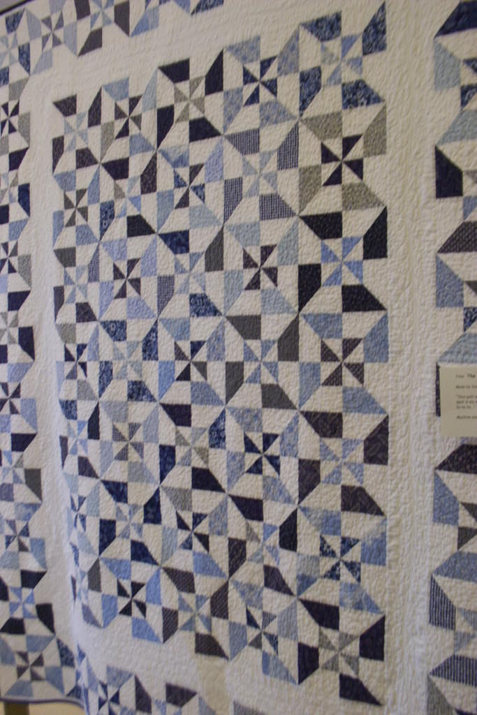
Then we went to the annual show of the Friendship Sampler Quilt Guild, which is a chapter of Maine’s statewide organization, the Pine Tree Quilt Guild. It was held in a building called “The Boathouse” right on the bay, and they packed in a ton of quilt…well over a hundred of all sizes, from large bed to small wallhangings. Here are a few of my favorites. The one at the top is Joan Herrick’s bed quilt…wouldn’t that be just the perfect summer quilt..crisp, bright, cheerful? Joan, if you ever tire of it, I’d be happy to take it off your hands!

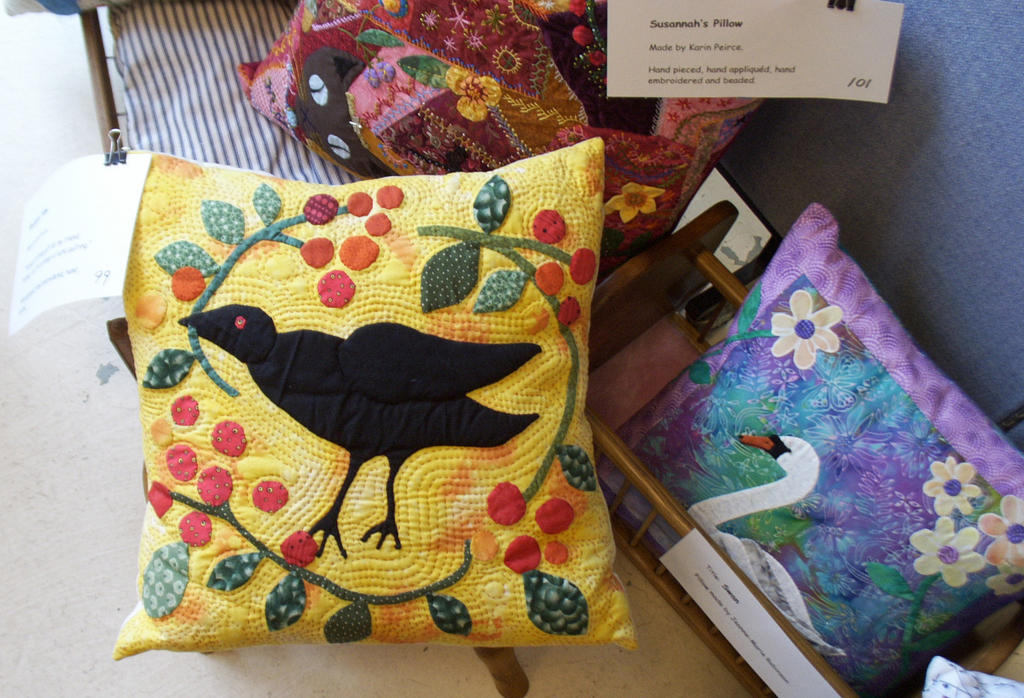
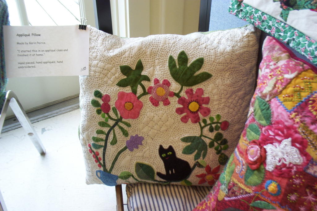
Then I discovered the work of Karin Pierce, who is a guild member, doesn’t teach, doesn’t sell, just makes the most amazing quilts with the most wonderful, whimsical (without being sappy or sacharine) quilting. I think my favorite piece in the whole show is her crow pillow (which shares a photo with one of her crazy quilt pillows and Jeanne-Marie Robinson’s swan pillow).

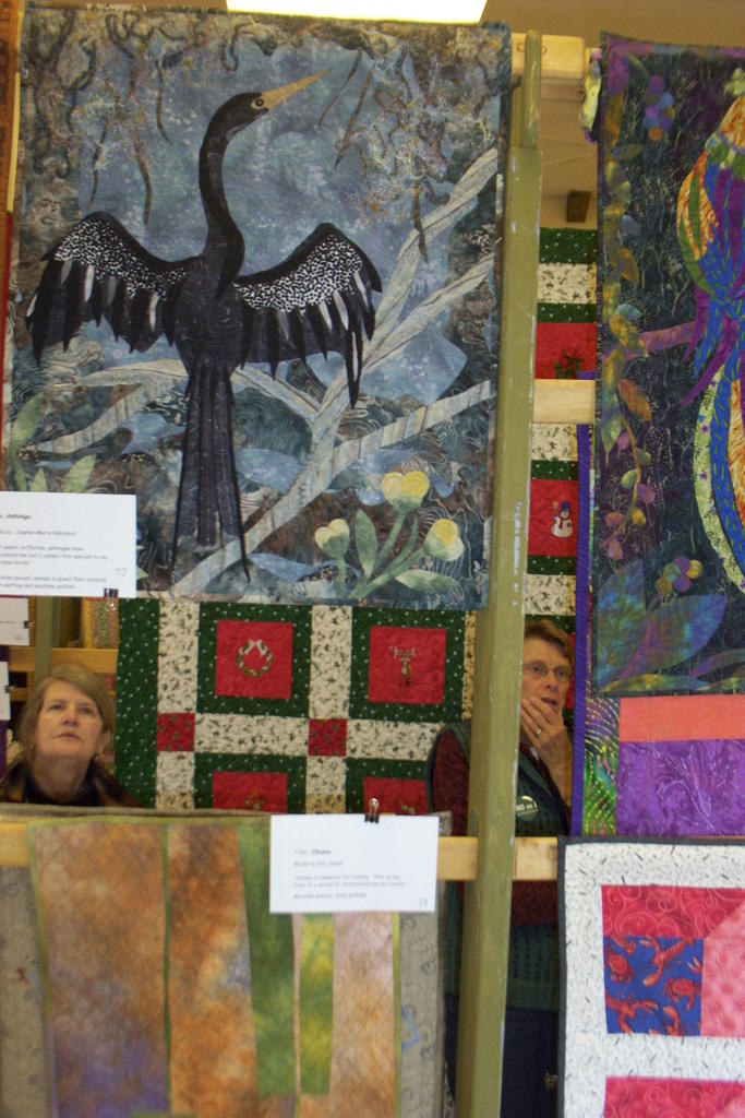
Jeanne-Marie Robinson is an incredibly talented quilter who is also a member of the local chapter in Camden, the Coastal Quilters. A former ballerina from Switzerland, she and her husband are “snowbirds” and spend at least the worst of the winter in Florida, which is where she found the inspiration for her anhinga quilt (bird sunning its wings, below). You can always tell one of Jeanne-Marie’s quilts because they are wonderful, beautifully executed, and almost always have some sort of critter (or many) in them. The pelican, below, is hers too, with wonderful dyed cheesecloth, miniature lobster buoys, driftwood…… I’d take that one too!


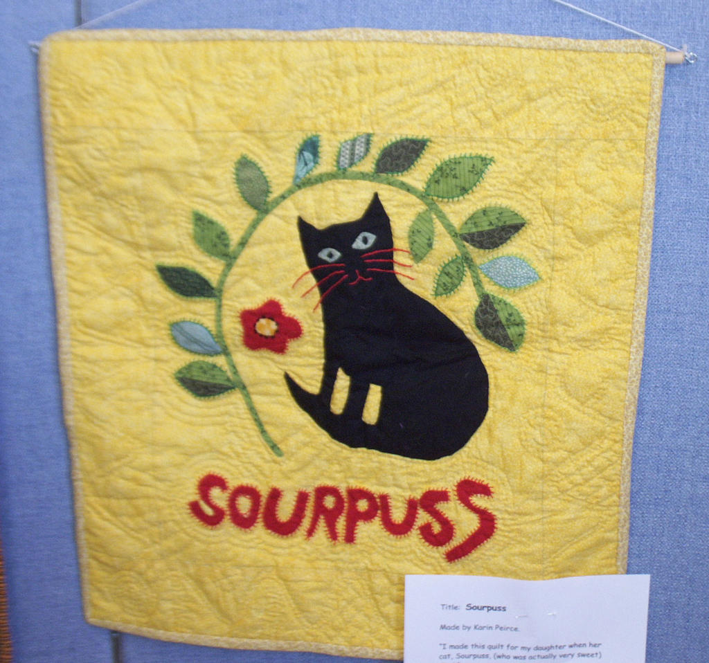
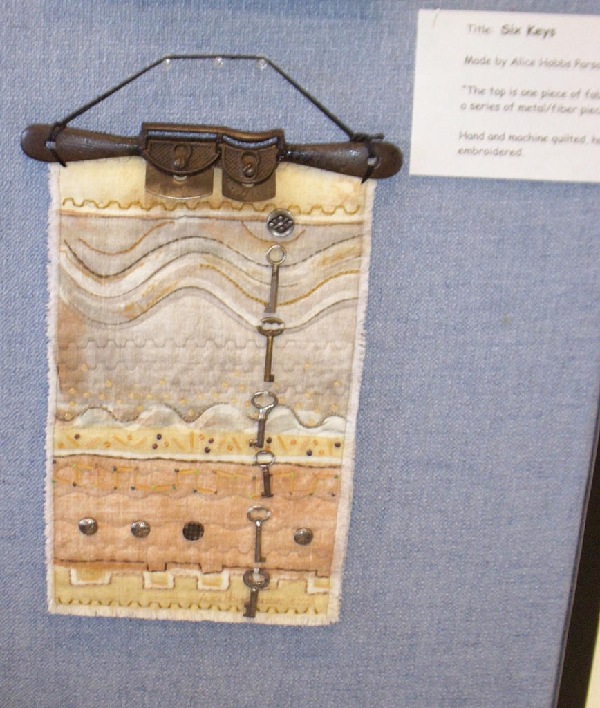
More of Karin Pierce’s whimsy…Sourpuss the cat, quilted with red thread and just plain fun, along with the funky cat with the cool eyes on the white background-pillow. The last two pieces are the improvisational piece by Deb Small (sure hope I got her name right…if anyone from Friendship quilters has a correction, please let me know!), and a wonderful piece by Alice Hobbs Parson called Six Keys. Alice told me she loves metal, has all sorts of metal “stuff” on the walls at home, and is now incorporating it into her textile art. Deb B…sound familiar?

Two good things……

Friday, October 21st, 2005

Or, at least for the first one, why I love the internet….

In my in-box today was a note from an avid birder, who must have somehow pinged on ivory-billed woodpecker. He saw my latest quilt, and even mentioned it on his blog —thanks Cyberthrush, whoever you are. And did I say I love the internet?

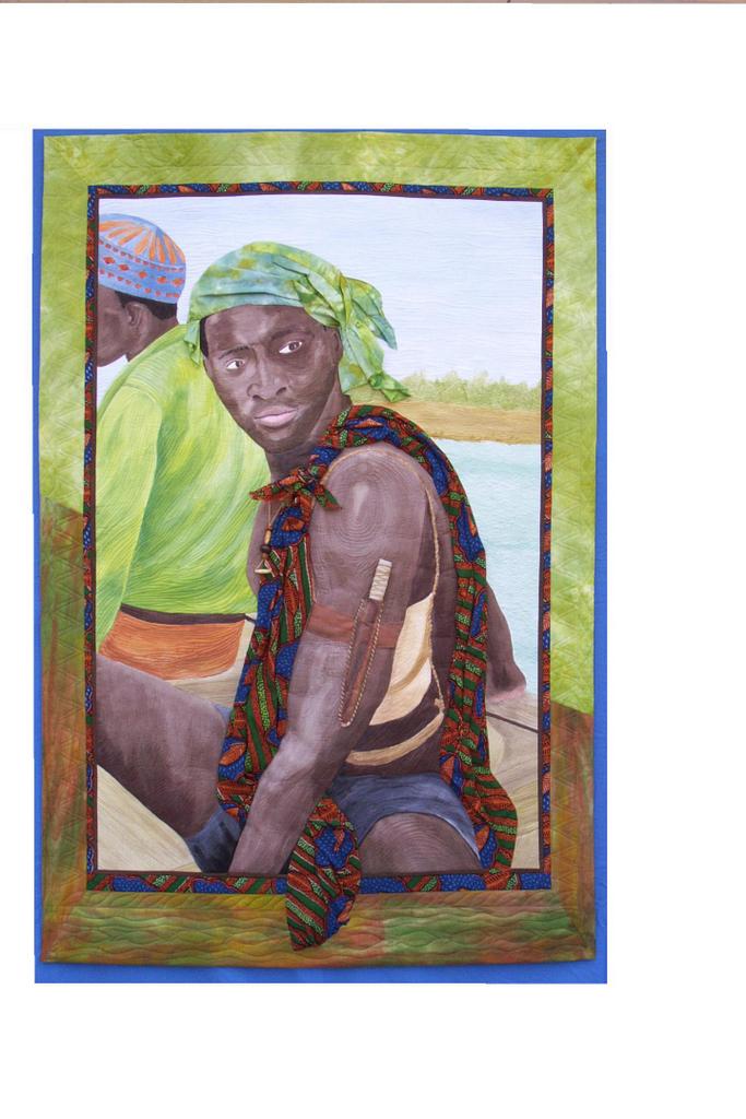
Another really great thing happened, but alas it looks like I won’t be able to take advantage of it. See, I’ve entered Bijagos Warrior into two shows…one that isn’t over until Jan. 23, another that requires the quilt to arrive by March 15. I won’t know if I am accepted into these shows or not until late November. Well, the President of the Pine Tree Quilt Guild (the statewide Maine quilt guild) called and said they would like to submit MY quilt (!!!!!) to be the Maine / PTQG entry into a juried show (to be juried…not a certain thing) at the New England Quilt Museum! WHAT an honor, as a newcomer to Maine, to be asked to represent the state in a show that is to be called something along the lines of “The Best of New England.” WOW! The bummer is that the show runs January 21 to April 1. If I get into either of the two shows I have already entered, I’d overlap.
This is where I’d like to add a photo of Bijagos Warrior, but I can’t get Blogger to respond when I click on the add a photo button, so I’ll have to settle (for now) with adding a link to the quilt on my website: Here.

It is HORRIDLY bad form to bail on an entry after you have sent it in, so I can’t really withdraw my application / entry form. The PTQG just learned of this opportunity, which is why the late notice. I’m so bummed. If I had known, I would gladly have skipped the chance to show Bijagos Warrior in either of the two shows I entered (both fairly nice ones….Road to California and the AQatS, Art Quilts at the Sedgwick) for the privelege of being considered as the Maine state entry.

So, I’m taking great big gulps and telling myself this stuff has to happen for a reason, that it IS an honor to be asked, and maybe I’ll be lucky enough to have another such opportunity come my way. Sigh. But I sure would’ve liked to be able to say yes to the PTQG… Now, repeat to self: something else good will come of this, something else good will come of this, there IS a reason why you applied to those two shows……. So, I am intensely grateful to the PTQG for thinking my work deserves such an honor, and really, really sad I can’t offer up “my guy.” Sigh.

Re QNM—or how to mess up a good magazine

Wednesday, October 19th, 2005

Wow…just surfed into DebR’s Red Shoe Ramblings to see that she and Caitlin had each written to Quilters’ Newsletter Magazine in the past couple of weeks to lament the new editorial slant…or, in my book, how they took the pre-eminent magazine, which deserved its reputation for being the best of the best in general quilting, and (basically) trashed it. Here’s what I wrote, which (as usual) was more long-winded, and perhaps a bit more blunt…..
October 19, 2005

Ms. Mary Leman Austin

Quilters’ Newsletter Magazine

741 Corporate Circle, Suite A

Golden, Colorado 80401 .

Dear Ms. Leman Austin,

With twenty-one years of QNM back-issues on my shelves, I think you could say that I have been a devoted fan and subscriber to your magazine for a long time. It is therefore with great sadness that I write to express my extreme disappointment with the new look and content of QNM. I was appalled at what had happened to what I once considered the “best of the best” of quilting magazines. I withheld judgment, however, hoping the next issue would improve. It was worse. Today, I received my November issue. It is just as bad as the last two, and has 42 pages of ads and patterns taking up nearly half the periodical. Bluntly, I’m afraid, yuck. If I wanted a mass-market pattern magazine with a clunky layout, I could go to the grocery store and pick up any of at least half a dozen magazines. You should know, however, I never buy those kinds of magazines, and if QNM continues in this vein, I’m afraid I won’t buy QNM either.

Criticism does no good if it is not supported by examples, however, so I would like to offer constructive suggestions for several specific things I would most like to see remedied. First and foremost, get rid of the patterns. The thing that QNM does best is report the news of the quilting world—no other magazine does what QNM has done, nor with such class and style. Yet, in 21 years, I have never been tempted by a single pattern in your magazine ….that is simply not why I subscribe to QNM. No matter what else you do to “fix” the damage to QNM, if you continue to use up nearly half of the magazine for patterns, I will cancel my subscription. I would do so with great sadness due to two decades of loving QNM, but subscribing to what QNM has become is a waste of my very scarce subscription dollars. Let people go to Quiltmaker, McCall’s or any one of the other ba-zillion pattern magazines, and restore QNM to what it ought to be: a magazine about the quilting world.

Secondly, the new format for section headers and style appears, alas, to be an example of what not to do in typography and page layout design. By using large font in the text and small font (relatively speaking) in lower case for the section headers you de-emphasize the importance of the section breaks. One recent article had SIX different fonts / sizes / colors within two paragraphs! With the visual clutter from the ads, a clean, bold style for the headers will bring attention to the editorial content of the magazine. As it is now, the columns and headers merge visually with the ads, which in turn detracts from both the articles and the advertising.

For examples of outstanding style, I’d like to suggest Threads magazine and Quilting Arts from within the fiber world and Martha Stewart Living from the general magazine population. Each magazine has a distinct style; titles, headers, and sidebars are all clear, easy to find and read. The particular style QNM selects is not as important as the fact that there IS a clearly identifiable, clear, clean style. You want to attract your readers’ attention, not repel them with visual clutter that makes them toss the magazine aside in frustration or apathy. Robin Williams (the lady who writes about websites, design and typography, not the actor / comedian) is an excellent resource, and her books are available from www.amazon.com. A quick review of these books will explain far better than I can here why I think your current layout is an example of “what not to do.”

When I first “found” QNM, I loved to read where the quilt shows were; the list has grown gloriously long, so I understand why you opted to move most of that information to the web. Nonetheless, you cannot easily use your computer from the seat of your car…you can take your QNM with you and travel from one show to another (which I did in 1991 from LA to
Seattle to Montana to NH to Washington, DC—my QNM my guide for my next quilty stop). If you got rid of just one of those unwelcome patterns, you could still include this fun information which I still love to browse.

I also really miss Myrna Giesbrecht’s column about websites worth visiting. Every issue, I take my copy to my computer and look up the sites. However, I have absolutely NO interest in futzing around the QNM site to read her column or anything else—I have no desire to spend even more time on the computer needlessly. I want her column in my magazine where I can read it at leisure on the sofa at night, then when I want to look things up on the web. I understand the logic of having the hotlinks right there from your website, and that’s a good addition to her article in the magazine, but it isn’t a substitute.

Please, please, please—FIX what you did to QNM! I love your magazine, and really want it to do what it has done so well. Thank Heavens Helen Kelley’s column is still there! We don’t need another pattern magazine—there are too many already. We NEED what QNM used to be, and can be again. Someone who once wrote articles for you urged me to write, saying that QNM listens to its readers. So despite misgivings about writing a critical letter, I’ve done it. I hope you accept my letter in the spirit it is intended: support, encouragement, constructive dialogue. I have three years to run on my current subscription, and I’d hate to have to cancel it. Without a sea-change in the current style and content of QNM, however, that is exactly what I’ll do. Please give us back the QNM we love, the QNM that deservedly earned a reputation as the best quilting magazine in the world. Thank you for taking the time to read this long letter.

Sincerely,
Sarah Smith

What Secrets Does the Forest Hold?

Monday, October 17th, 2005

It’s DONE! And with great thanks to a motley crew for their input….. I had wanted to do this quilt of the ivory-billed woodpecker on a large-scale….say 4×6 feet. Then, I discovered the yarn company wanted the piece I said I’d do for them for Quilt Market….which opens on Oct. 22. Well…..I had planned to try out the yarns for the woodpeckers and the treetrunk, so I decided to do a smaller “study” so I could meet the very-soon deadline (this ended up 28 in. wide by 32 long on the tree trunk). Then, once I’d made the male ivory-billed woodpecker, I lost my urge to do it a second time on a larger piece. Someone on this e-list suggested I try to incorporate as many details I had planned for the larger quilt into this one so I’d like it better, and that’s just what I did. And I’m happier with the results.If you’re curious, scroll down a bit to see what this looked like late last week—worse! I worked more on the tree trunk (thank you to the Frayed Edges for observing kindly that it just wasn’t “finished” yet….sure enough, they were right…). I was browsing around Lorraine Roy’s website
and saw a description of how she works….using chopped up bits of cloth, thread, whatever, under tulle. So I took a couple yards of each of the colors of yarn I had and chopped them up with the rotary cutter, sprinkled them across the treetrunk, spritzed with basting spray, then pressed a black tulle with a spiderweb pattern (which happens to look like the crenelations in bark when layered) on top. Then tore strips of brown tulle and layered them in vertical strips on top, and quilted the whole shebang.

Then, I added the female poking her head out of the nest hole. Finally, I quilted words into the borders on the sides. For the “big” version I had planned on using a dark brown or near black for the borders so the lettering would be visible, but I really liked the batik I had put on this one, so stuck with it. That means, however, the words are VERY subtle. Like I souped ’em up a bit by coloring in with spring green prismacolor pencil. If you are close and look, you can see the writing. In some ways, I like it…it’s a secret the quilt holds only for those who look closely (and alas, you may not be able to see in the photos). On the left side it reads:

What secrets does the forest hold?
And on the right:
The Lord God Bird Still Lives (and in smaller letters) campephilus principalis


It’s odd…I’m a bit ambivalent about this working with companies thing. It has been REALLY good for me to work with first Bali Fabrics, then Janome. The doors it has opened have been wonderful and very helpful to me. But now, I’m wondering if I need to distance myself a bit…make it more on my own. I don’t know. Anyway, my main contact at Janome changed jobs and is now working for Lion Brand Yarn company, and she contacted me asking if I’d be interested in working with them, thinking that of the folks she had worked with via Janome, I’d be a likely suspect for incorporating yarns into quilts. To be undiplomatically blunt, Lion doesn’t always have a great reputation…mostly I think because they sell through Wal-Mart and JoAnns and such. And some of their yarn really is kinda shiny- acrylic-y. But some of it, to my pleasant surprise, is really nice…the “eyelash” (Fun Fur) and suede-look chenilles. I used the fun fur, couched down and quilted intensely, for the birds’ feathers, and used the “suede” and one of the homespun yarns on the tree trunk. I really liked the quality and look of those yarns…they worked well, and who needs to spend more $$ than necessary to embellish a quilt….

So anyway, I’m pleased that they asked me, pleased that the quilt turned out well and will hang in their first-ever booth at Quilt Market. But I’m still wondering about the working with companies……I also am having a bit of a reaction to the Quilting Arts Magazine trends of putting anything and everything onto a quilt….I have a more spare, “clean” style. I’m wondering if I need to stop, re-think, and maybe return to the fabric and the thread. Generally, I use whatever technique or material I need to get the look that is in my head (and don’t let a technique drive the idea), but still wondering if I need to re-group a bit.

What I really need to do, though, is get that damp laundry out of the washer, so enough blathering and back to reality! Thanks for reading, and let me know what you think.

Whoooosh and A Silk Scarf

Monday, October 17th, 2005

The sound you just heard was me, deflating with relief. What an INSANE few days. But, I did it! I got two pieces in the mail a day ahead of schedule (which means tomorrow I’ll actually be able to prepare for teaching machine applique on Weds…what a concept…being ready!)–the one for Bali Fabrics and the one for Lion Brand Yarns. Also, got the scarf in the mail for the scarf challenge. So, I think I’ll make this a couple posts (just to make uploading photos easier…..”Hello” from Picasa is supposed to be easy but just makes me nuts, so bear with me…).

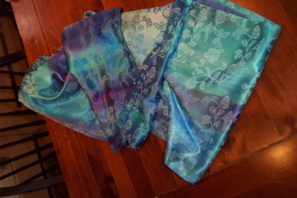
OK, the silk scarf challenge. On the Dyers’ List…a listserv for folks interested in dyeing fabrics and fibers, one list member was able to purchase a bolt of silk (actually a cotton-silk blend, more on which in a sec)…65 yards or so by 80 inches wide! jacquard (a rose pattern—not my thing, but what the heck) for a pittance. She challenged us to dye the fabric and make two scarves…one to keep, one to swap. This is an odd-angle photo–like me holding the camera over the table. The actual color is closer to the second photo (below), but this one shows the back side of the scarf—that light area in the center.

I decided to keep it simple, given the chaos of my life. I used Pebeo Soie silk dyes, which require steam setting. I hung the silk over an adjustable shower curtain rod rigged up over the tub, then dripped / painted dye (using a sponge brush) onto the silk. Then, when dry, time to steam.

Alas, I don’t think I took pics of the steaming set-up…looks kinda like a still. Put hot-plate on floor and plug in. Set canning kettle on hot-plate, fill with 6-8 inches boiling water. Set two sections of stove pipe (total height, about 5 feet) INTO water. Make “tent” out of aluminum foil…tape to stove pipe and tent over outside edge of pot…this funnels the steam into the stove pipe and not up the outside. Roll silk inside paper (or cloth). Tie roll. Hang inside stovepipe, making sure roll of silk and paper doesn’t touch the insides of the stovepipe. Place towel over top. Place canning pot lid on top of towel. Why the towel? So the condensation on the inside of the lid doesn’t drip and stain the silk…..

Anyway, I didn’t read the paper that came with it very well, and missed the part that said this was a silk BLEND, as in partly cotton. Because I used an acid-dye, not a fiber reactive dye, only the silk “took” the dye. This was not planned, but I actually like the way the cotton stayed white, and makes a stronger contrast with the silk, which is vibrant. I make my swap scarf 12×80 inches, and hand-hemmed. Then, because it was fairly plain, I added some beads to the ends to help weight it, though the scarf is surprisingly weighty on its own. It is large enough that you could use it as an evening wrap. However, given the last time I needed an evening wrap or anything fancier than a denim skirt was about 8 years ago, well……I think I’m going to save the rest of the silk and use it in a quilt. As a friend said…does fancy schmancy silk go with polartec and jeans to the grocery? It’s not like there is a high demand for fancy duds in a mom’s life!

So that’s it for the scarf. I’ll let you know what I get in exchange, when I get it………