email Youtube

Home
Galleries
Blog
Workshops & Calendar
Store
Resources
About
Contact

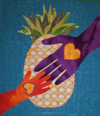
Heart in Hand, plus pineapple

October 24th, 2005

Disclaimer: if your name is Kate and you’re part of Frayed Edges, do NOT scroll down and look at the picture in this post!

OK….three friends and I formed a mini-art-group in January, and promptly got our first show at a coffee house near Deb’s house, thanks to Kate’s meanderings in Brunswick. Over the course of the year we meet once a month, and DebB has blogged about our meetings (with lots of fun photos). Lately, we’ve been doing “books” for each other. Each of us picked a size and a theme, and of course I’ve been horrid about keeping photos of what I’ve done, what’s in my book, and so on. Well, I’m trying to correct that, so here’s a first….

This month it was my turn to do pages for Kate’s book. Her theme is “hands,” and the size is 9.5 x 11 inches (or so). Her book hinges at the top, like a steno pad or tablet of paper. I’ve done the first side of the page, and have a fun idea for the second side (though which will be the first page and which the second is still up for debate). I liked the heart in hand block I did for Tristan and Jon’s wedding so much (if you’re curious check the posts for Aug. 28 by clicking on the August 2005 archive tab in the sidebar to the right), that I decided to do a variation on the theme for Kate. She and a friend, another Kate if I have it right (and given my memory for names, that is by NO means a sure bet), started Kitchen Table Cards . Their company is geared towards adoptive or adopting parents, so I wanted to make a page along those lines (and if they like it, they can even use my page for a card).

This time, it is a grown-up hand reaching down to a small child’s hand that is reaching up. Like Tristan and Jon’s quilt, both hands have hearts, and this time the stitching that outlines the hearts is the color of the other hand—because the love makes each a part of the other. Inside the heart is another stitched heart, and the word love repeated to fill the space. Behind the hands is the pineapple, the traditional symbol of welcome and hospitality even back to federal times. And quilted into the background are the words : The pineapple is the traditional symbol of Welcome and Ohana means family (thanks to watching MANY episodes of Lilo and Stitch the series and the movie!).

Now, if I ever get enough time, it would be fun to do a bigger heart in hand quilt jazzed up for the 21st century……

First Machine Applique Class

October 24th, 2005

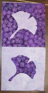
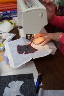
What FUN! I got to teach my new Machine Applique with a side helping of Hawaiian class this past week at Quilters’ Cottage in Camden for the first time. I was thrilled that we were able to go through all three techniques—fused and satin stitched, freezer-paper underneath (to be removed when applique is done) and fusible interfacing underneath (remains in the quilt) using the gingko pattern with I developed to teach the class, AND still have enough time to go through the basics of cutting out a Hawaiian-style block.

The first photo is Sally’s blocks….I love seeing other people’s color selections on my patterns…colors I might or might not use and see how the pattern looks that way…way fun!

The gingko leaf pattern is for a 6-inch block…that way not a lot of time and materials invested if the student doesn’t want to finish the series (though they seemed to!). In the second photo, Pat is completing the statin stitching on her fused block…bold red thread with a pale gray and black combination, and she has a really cool red with kanji on it for the inner border on the wallhanging (pattern on my website, just scroll down)…it’s going to look awsome!

Then, I got to show the ladies how to use my freezer-paper snowflake technique to cut out a Hawaiian design, using the optional itty-bitty rotary cutter (the one with the blade about the size of a dime). My Hawaiian style patterns–Halekala–teach how to do that, but basically instead of folding fabric into 8 layers (remember cutting snowflakes in grade school from folded paper) and then–ouch on the aging knuckles–trying to cut through eight layers…well, even with new, sharp Gingher scissors, my hands would ache. So I trace the pattern onto freezer paper, cut that out, iron it to the applique fabric, then cut around the freezer paper. This works for either fused OR turn-under applique (hand or machine). It requires cutting each edge, but I’d rather spend more time and not have my hands ache for days than try to cut eight layers at once. Anyway, I’m hoping the class fills up in Bangor, because I’d really like to do a lot more with the Hawaiian style patterns.

Friendship Sampler Quilt Show

October 24th, 2005


This past weekend I was lucky enough to get to go to a quilt show with a friend. We left our sons (her 3 and my 2) with their respective dads and drove to Belfast, a town about 30 minutes north of me on the shores of Penobscot Bay, right where the river runs into the bay. We ate lunch out….imagine, no interruptions, good food someone else cooked, no “mommy can I have” or “mommy will you get me”…. heaven!

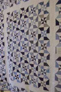
Then we went to the annual show of the Friendship Sampler Quilt Guild, which is a chapter of Maine’s statewide organization, the Pine Tree Quilt Guild. It was held in a building called “The Boathouse” right on the bay, and they packed in a ton of quilt…well over a hundred of all sizes, from large bed to small wallhangings. Here are a few of my favorites. The one at the top is Joan Herrick’s bed quilt…wouldn’t that be just the perfect summer quilt..crisp, bright, cheerful? Joan, if you ever tire of it, I’d be happy to take it off your hands!

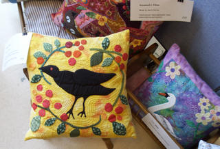
Then I discovered the work of Karin Pierce, who is a guild member, doesn’t teach, doesn’t sell, just makes the most amazing quilts with the most wonderful, whimsical (without being sappy or sacharine) quilting. I think my favorite piece in the whole show is her crow pillow (which shares a photo with one of her crazy quilt pillows and Jeanne-Marie Robinson’s swan pillow).

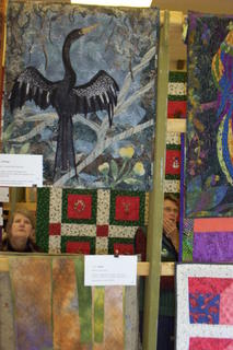
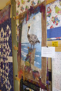
Jeanne-Marie Robinson is an incredibly talented quilter who is also a member of the local chapter in Camden, the Coastal Quilters. A former ballerina from Switzerland, she and her husband are “snowbirds” and spend at least the worst of the winter in Florida, which is where she found the inspiration for her anhinga quilt (bird sunning its wings, below). You can always tell one of Jeanne-Marie’s quilts because they are wonderful, beautifully executed, and almost always have some sort of critter (or many) in them. The pelican, below, is hers too, with wonderful dyed cheesecloth, miniature lobster buoys, driftwood…… I’d take that one too!


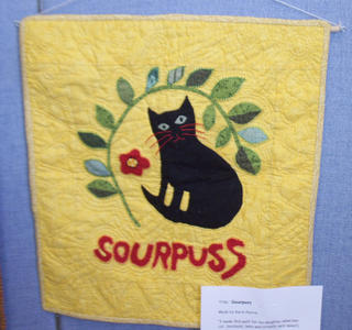
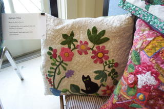
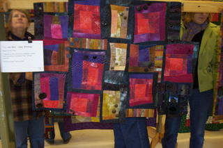
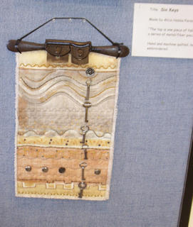
More of Karin Pierce’s whimsy…Sourpuss the cat, quilted with red thread and just plain fun, along with the funky cat with the cool eyes on the white background-pillow. The last two pieces are the improvisational piece by Deb Small (sure hope I got her name right…if anyone from Friendship quilters has a correction, please let me know!), and a wonderful piece by Alice Hobbs Parson called Six Keys. Alice told me she loves metal, has all sorts of metal “stuff” on the walls at home, and is now incorporating it into her textile art. Deb B…sound familiar?

Two good things……

October 21st, 2005

Or, at least for the first one, why I love the internet….

In my in-box today was a note from an avid birder, who must have somehow pinged on ivory-billed woodpecker. He saw my latest quilt, and even mentioned it on his blog —thanks Cyberthrush, whoever you are. And did I say I love the internet?

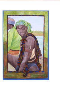
Another really great thing happened, but alas it looks like I won’t be able to take advantage of it. See, I’ve entered Bijagos Warrior into two shows…one that isn’t over until Jan. 23, another that requires the quilt to arrive by March 15. I won’t know if I am accepted into these shows or not until late November. Well, the President of the Pine Tree Quilt Guild (the statewide Maine quilt guild) called and said they would like to submit MY quilt (!!!!!) to be the Maine / PTQG entry into a juried show (to be juried…not a certain thing) at the New England Quilt Museum! WHAT an honor, as a newcomer to Maine, to be asked to represent the state in a show that is to be called something along the lines of “The Best of New England.” WOW! The bummer is that the show runs January 21 to April 1. If I get into either of the two shows I have already entered, I’d overlap.
This is where I’d like to add a photo of Bijagos Warrior, but I can’t get Blogger to respond when I click on the add a photo button, so I’ll have to settle (for now) with adding a link to the quilt on my website: Here.

It is HORRIDLY bad form to bail on an entry after you have sent it in, so I can’t really withdraw my application / entry form. The PTQG just learned of this opportunity, which is why the late notice. I’m so bummed. If I had known, I would gladly have skipped the chance to show Bijagos Warrior in either of the two shows I entered (both fairly nice ones….Road to California and the AQatS, Art Quilts at the Sedgwick) for the privelege of being considered as the Maine state entry.

So, I’m taking great big gulps and telling myself this stuff has to happen for a reason, that it IS an honor to be asked, and maybe I’ll be lucky enough to have another such opportunity come my way. Sigh. But I sure would’ve liked to be able to say yes to the PTQG… Now, repeat to self: something else good will come of this, something else good will come of this, there IS a reason why you applied to those two shows……. So, I am intensely grateful to the PTQG for thinking my work deserves such an honor, and really, really sad I can’t offer up “my guy.” Sigh.

Re QNM—or how to mess up a good magazine

October 19th, 2005

Wow…just surfed into DebR’s Red Shoe Ramblings to see that she and Caitlin had each written to Quilters’ Newsletter Magazine in the past couple of weeks to lament the new editorial slant…or, in my book, how they took the pre-eminent magazine, which deserved its reputation for being the best of the best in general quilting, and (basically) trashed it. Here’s what I wrote, which (as usual) was more long-winded, and perhaps a bit more blunt…..
October 19, 2005

Ms. Mary Leman Austin

Quilters’ Newsletter Magazine

741 Corporate Circle, Suite A

Golden, Colorado 80401 .

Dear Ms. Leman Austin,

With twenty-one years of QNM back-issues on my shelves, I think you could say that I have been a devoted fan and subscriber to your magazine for a long time. It is therefore with great sadness that I write to express my extreme disappointment with the new look and content of QNM. I was appalled at what had happened to what I once considered the “best of the best” of quilting magazines. I withheld judgment, however, hoping the next issue would improve. It was worse. Today, I received my November issue. It is just as bad as the last two, and has 42 pages of ads and patterns taking up nearly half the periodical. Bluntly, I’m afraid, yuck. If I wanted a mass-market pattern magazine with a clunky layout, I could go to the grocery store and pick up any of at least half a dozen magazines. You should know, however, I never buy those kinds of magazines, and if QNM continues in this vein, I’m afraid I won’t buy QNM either.

Criticism does no good if it is not supported by examples, however, so I would like to offer constructive suggestions for several specific things I would most like to see remedied. First and foremost, get rid of the patterns. The thing that QNM does best is report the news of the quilting world—no other magazine does what QNM has done, nor with such class and style. Yet, in 21 years, I have never been tempted by a single pattern in your magazine ….that is simply not why I subscribe to QNM. No matter what else you do to “fix” the damage to QNM, if you continue to use up nearly half of the magazine for patterns, I will cancel my subscription. I would do so with great sadness due to two decades of loving QNM, but subscribing to what QNM has become is a waste of my very scarce subscription dollars. Let people go to Quiltmaker, McCall’s or any one of the other ba-zillion pattern magazines, and restore QNM to what it ought to be: a magazine about the quilting world.

Secondly, the new format for section headers and style appears, alas, to be an example of what not to do in typography and page layout design. By using large font in the text and small font (relatively speaking) in lower case for the section headers you de-emphasize the importance of the section breaks. One recent article had SIX different fonts / sizes / colors within two paragraphs! With the visual clutter from the ads, a clean, bold style for the headers will bring attention to the editorial content of the magazine. As it is now, the columns and headers merge visually with the ads, which in turn detracts from both the articles and the advertising.

For examples of outstanding style, I’d like to suggest Threads magazine and Quilting Arts from within the fiber world and Martha Stewart Living from the general magazine population. Each magazine has a distinct style; titles, headers, and sidebars are all clear, easy to find and read. The particular style QNM selects is not as important as the fact that there IS a clearly identifiable, clear, clean style. You want to attract your readers’ attention, not repel them with visual clutter that makes them toss the magazine aside in frustration or apathy. Robin Williams (the lady who writes about websites, design and typography, not the actor / comedian) is an excellent resource, and her books are available from www.amazon.com. A quick review of these books will explain far better than I can here why I think your current layout is an example of “what not to do.”

When I first “found” QNM, I loved to read where the quilt shows were; the list has grown gloriously long, so I understand why you opted to move most of that information to the web. Nonetheless, you cannot easily use your computer from the seat of your car…you can take your QNM with you and travel from one show to another (which I did in 1991 from LA to
Seattle to Montana to NH to Washington, DC—my QNM my guide for my next quilty stop). If you got rid of just one of those unwelcome patterns, you could still include this fun information which I still love to browse.

I also really miss Myrna Giesbrecht’s column about websites worth visiting. Every issue, I take my copy to my computer and look up the sites. However, I have absolutely NO interest in futzing around the QNM site to read her column or anything else—I have no desire to spend even more time on the computer needlessly. I want her column in my magazine where I can read it at leisure on the sofa at night, then when I want to look things up on the web. I understand the logic of having the hotlinks right there from your website, and that’s a good addition to her article in the magazine, but it isn’t a substitute.

Please, please, please—FIX what you did to QNM! I love your magazine, and really want it to do what it has done so well. Thank Heavens Helen Kelley’s column is still there! We don’t need another pattern magazine—there are too many already. We NEED what QNM used to be, and can be again. Someone who once wrote articles for you urged me to write, saying that QNM listens to its readers. So despite misgivings about writing a critical letter, I’ve done it. I hope you accept my letter in the spirit it is intended: support, encouragement, constructive dialogue. I have three years to run on my current subscription, and I’d hate to have to cancel it. Without a sea-change in the current style and content of QNM, however, that is exactly what I’ll do. Please give us back the QNM we love, the QNM that deservedly earned a reputation as the best quilting magazine in the world. Thank you for taking the time to read this long letter.

Sincerely,
Sarah Smith