Feedback Mysteries
So I recently sent a couple quilts out to be in national juried shows. Let me begin by saying that I truly do respect the judges and the difficulty of the judging process. But I thought that some folks new to entering shows or who might consider entering shows would like to know what comments are like. I’ve waited a while since receiving these two quilts back so folks couldn’t really guess (or do a lot of work) to figure out which shows and which judges because I DO respect them and their job.
The comments on this quilt are the one that most mystify me.
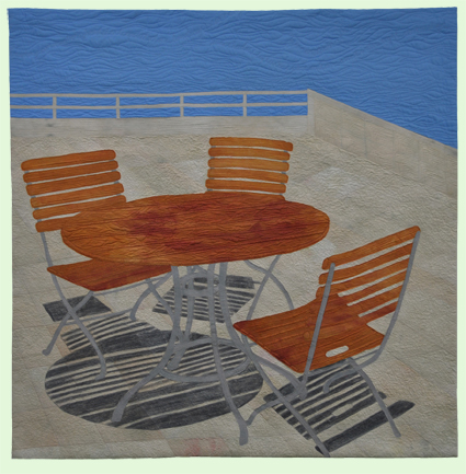
Conversations 1 (c) www.SarahAnnSmith.com
The comments received were:
- Best Features:
- Raw edges work well done
- Piecing in background
- Area(s) to Improve:
- Value Changes to emphasize depth and shadow
Best features: OK: Thank you for the compliment on raw edge work, which is usually disparaged. Thank you for the compliment on piecing; however, there IS no piecing. It is all fused. I will take that as a compliment that the fusing was so well done that they thought it was pieced.
Areas to improve: I am utterly perplexed. HOW could I have further value changes? The pale color of the stone and dark of the shadows is about as extreme as it gets this side of black and white. The only thing I can figure out is that perhaps they want some shadow on the wall versus the surface of the patio. I will note at this point that this is a composite image from several photos, but with the angle of the sun used from the first photo with two chairs and the table, a corner of the patio as in this scene would have been utterly flooded with light and have no shadows, just perhaps a bit of grunge where ground met wall. This scene is from the Getty Museum in LA, and the sun was screaming blue sunny sky–flooded with light. ????
I take comments seriously (most of the time) because I want to learn and improve. So my question to all of you is:
Can you figure out where they want me to improve value changes to emphasize depth and shadow? I’d love suggestions. Please, be kind to the judges.
Then I got this quilt back.
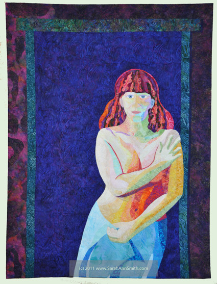
Clothed in Color (c) www.SarahAnnSmith.com
The area to improve was that (I’m paraphrasing as I don’t feel like rooting around to find the comment sheet) “the off-center composition is good, but there is too much negative space.” This comment I am utterly ignoring. The figure (me) is in a doorway. That is how much negative space there IS in a doorway. And the amount of space is intentional: it conveys the feeling of isolation and tension I wanted to express about that time in my life. So I’m chalking it up to “they just didn’t get it.” I’m OK with that.
June 12th, 2014 at 9:55 am
Sarah, these quilts are awesome. I’ve seen the self portrait before but not the “Conversations 1” quilt–and I really like it. You and I have had numerous conversations about the crap-shoot nature of judging. I admire that you continue to “go for it” nevertheless. It does take courage. And because you are so brave, you’ve got, that I know of, three quilts in major shows this year alone–including Houston. I am so looking forward to see your quilts hanging in Houston in person this year.
June 12th, 2014 at 10:02 am
I too have been mystified by judges. Now, as the sunny first quilt, I find it delicious! Its really funny about the fused/pieced bit…. I ‘m sorry judges, but right there might that be a clue that this judge may not know as much about quilting as one would expect? I mean that is so obvious… And the composition balances well for me, depth and dimension but the only place they could possibly be referring to has to be the corner where the rail and wall meet and then along the wall. Try adding some shadow there (just test, not actually sew, and see if this makes it better to you) It might, it might not, but I think it is a very successful piece.
As to the girl in the doorway, it is a good balance of the negative space and the subject, sort of a yin and yang. Only the artist can say if there is too much negative or not, it is her interpretation. Sounds a little like the quilt police were well, suited up and ON DUTY. Here is my question for you, how much of an “art” quilt show was this as opposed to a “traditional” quilt show? These sound like comments or judgements from someone without much of an art background. Your work is beautiful!
Sharon Buck
sharonbuckart.weebly.com
June 12th, 2014 at 10:29 am
You work is truly a wonderful new concept of how to allow the shades and highlights to emerge in your quilt. Maybe there needs to be a new category the quilts shows need to add to allow artists to explore in this area. Some Judges may not be aware of techniques that could be used to give more dimension to the quilt….
June 12th, 2014 at 11:08 am
Judges are always confusing. But I think what they’re talking about is that, at least in this picture, the wall/railing seems to be the same value as the ground, so the perspective is confusing. Photos lie. A plane that is at right angles to another plane should have a distinctly different value.
June 12th, 2014 at 11:12 am
Hmmm… I see you met the same judges I met.
Conversations 1: I wondered about the tiniest shadow at the base of the wall, but really! Light near the beach can be harsh in SoCal. It is possible that your camera did not see that little shadow because of all the blinding “whiteness” in the picture. One little drawback of our digital cameras.
“Clothed in Color”: my first impression was that you were looking at a reflection in the mirror, instead of a doorway. For all the realism of the figure, I would expect “something” in the background of the negative space–blurred out, nonspecific colors denoting something out of focus.
And, I agree. Sometimes “they just don’t get it”.
As a clerk/helper at a very small fair, the judges that we had only judged on the techniques used in constructing the quilt. Nothing on the “art” of the quilt. And after several years of listening to mean remarks because I’m biased and can make mean remarks and nobody can stop me, I raised the roof to get new judges. Nobody wanted to enter anymore.
June 12th, 2014 at 2:20 pm
Ok, why do we need judges for quilts? Why are there awards? Does it improve quilting and quilts? What is the purpose for shows?
I make quilts to bring comfort and joy and encouragement. I make quilts to exercise creative muscles and learn to follow through. I love color and texture.
I don’t think judging adds and enhances quilts. I show quilts to share my art and go to shows to learn from others. There are lots of people who create quilts just for shows and to win awards and recognition. That would stop me from sewing pronto. Even the most lowly quilt can teach me lots, even if it is what not to do.
I decided I was done with judged quilt shows when I got comments that my dense quilting (love lots of quilting, it is ok if you don’t) distorted the fabric. Hello? That is what I was doing on purpose.
Let us show quilts to push our abilities, share new and old ideas, educate viewers, and ENJOY making them.
June 12th, 2014 at 7:11 pm
Sarah, I love your quilts. I believe that the reference to value in the judges critique may mean the gray used for shadows is too close in value to the table. Maybe a lighter shade of gray would have pleased them more?
June 13th, 2014 at 3:20 am
I agree with Lyric’s comment on Facebook – enter art shows and then you don’t get feedback. Quilt shows are very rooted in the traditional, so take their comments on technique, but read their comments on your design principles with reservation.
However, you’ve asked for help in figuring out what they mean, so here goes. In the first quilt, perhaps they are talking about the wood and metal of the chairs and tables. In the chair closest to the viewer, the back slats and seat blend into one another. Perhaps they do in real life too, but to make it easier for the viewer to discern the parts, some value change here may have worked. The metal legs of the table seem to be cut from one piece of fabric. But maybe these would look a little more shaped if there was a value change from under the table (darker) to the foot of the leg (lighter).
I think comments can be really useful, but they have to be a bit more specific than what you got. And I know that there are time constraints with them going through all the quilts etc and having scribes write for them, but even a couple extra words can help. Eg, value changes on the …… ……… to emphasise depth and shadow!
June 13th, 2014 at 8:28 am
In regards to the patio table quilt, my only thought is that
The area where table legs meets shadow might be the area in question. If the table legs were say, aqua in color, the shadow would have definitely more distinct than the grey you used. But hey, one man’s trash…..right? I like the great job you did and if you are happy that is all that matters. I bet if this quilt goes to another show to be judged by a different person it would get rave reviews. Sincerely, Paula K.
June 13th, 2014 at 9:44 am
I took the classes, did the work judged for a long time and stopped because many of the remarks are personal feelings. Maybe they don’t like the colors you used, the fabrics you used, or 10 other feelings entered into it. Big shows have certain rules they are required to follow. Keep doing what you love. It’s your work. It is nice to have the ribbons but your thoughts are yours and work is your style do not change that.
June 14th, 2014 at 3:00 am
Boo to the judges!
June 16th, 2014 at 11:31 pm
I think that some delineation on the wall/rail would be what they’re talking about. Sometimes when working from real life or photos, it’s hard to “overrule” what you know is right in order to give your viewers a bit more information. In this case, it would probably be good to give us (the viewers) a bit more reference to how the walls and railing abut each other. This may be obvious when seeing the quilt in person, but from the photo you posted, it seems like a bit of shadow, or conversely, a highlight would help. Lovely work!
June 19th, 2014 at 7:47 am
I wonder how they would have judged Picasso!