The Frayed Edges, July 2011–Part 3: The Letters Challenge
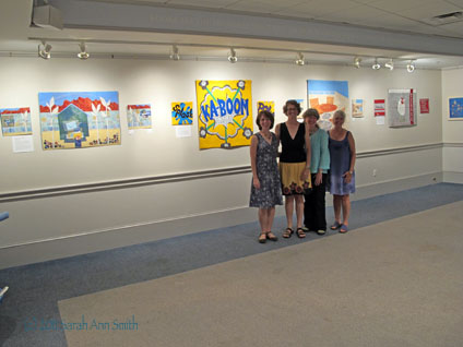
Back in early 2010, Kathy, Kate, Deborah and I started talking about having another show. Since we had a fun time with the five-by-five challenge (see blogpost here), we decided to do another special set of quilts for this show. Here are the four of us in front of the twelve pieces.
Using the wonderful press release that Deborah wrote as my start, here’s what I wrote to accompany the exhibit:
Letters
The Frayed Edges Challenge, 2011
For our first group show in 2006, also held here in the Picker Room, we worked on a group challenge which was a great success, so we decided to try it again. This time, we chose the theme Letters, to celebrate the written word, our shows in the Camden Public Library, and our love of letters which all of us have used (some more than others) regularly in our art quilts.
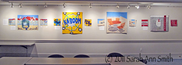
The centerpiece of the collection is a set of four triptychs designed especially for this exhibit. Each artist created two small art quilts with a third larger piece in the center. The artists embraced the theme “Letters” in many different ways. Kate, the Bowdoinham town librarian, used graphic novels (cartoon-books) as her inspiration, while Kate Daniels was inspired by the children’s book Tillie Lays an Egg (and received the permission of the author to use the name and image inspiration). Deborah explored images of letters in envelopes and words on cloth. Sarah’s more subtle approach uses words as shadows on the table and chairs and in the quilting to explore the idea of conversations.
We opted for a single larger art quilt about 36 inches wide but of varying height to permit design flexibility, and two 12×12 inch squares on either side. The size of the smaller pieces were inspired by Deborah’s work and participation in a very successful group, Twelve by Twelve, (blog: http://twelveby12.blogspot.com/) Their collection of quilts was published in a book this spring. A display copy of that book is on the glass case by the doors, along with a non-circulating copy of Sarah’s book ThreadWork Unraveled and a non-circulating copy of Creative Quilting with Beads, which features projects by all four of us.
And a photo of the four sets without us in the way (click to see larger):
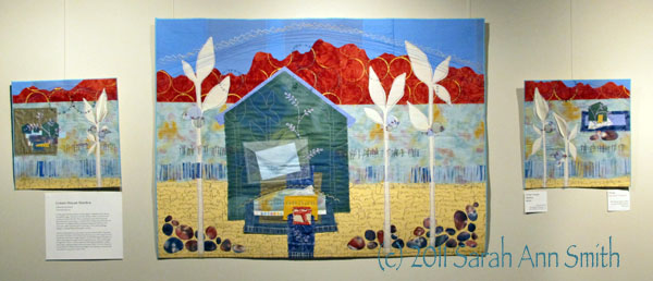
Green House Mantra by Deborah Boschert
To fully explore the theme “letters” for this triptych, I wanted to include obvious, but symbolic images. This led me to the idea of letters written to loved ones and envelopes received in the mail. There is something so personal and expressive about this kind of communication. I created a sheer envelope with just the idea of a letter inside. The collage of fabrics and shapes leading up to the house in the center piece might represent a porch or doorstep. There could be packages waiting or a message whispered through the windows.
I also love exploring letters, words, stories, voices and ideas in books. Tiny books are nestled in the leaves of the tall plants on the side pieces of the triptych. It’s as if the leaves are unfurling a message of growth. Several of the images, techniques and motifs in this triptych are regular parts of my artistic lexicon. I return to them again and again like a mantra. I love the repetition of stitching tiny wild flowers, cutting stone shapes, stamping painted circles and writing on fabric. The house shape acts as a foundation for these techniques and images. In the same way, a home provides a foundation for many other aspects of life.
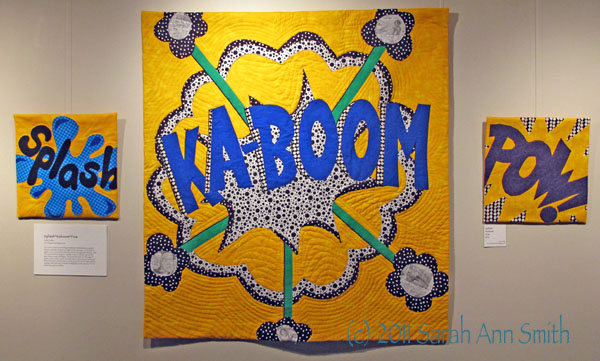
Splash*Kaboom*Pow by Kate Cutko
barnofopportunity.blogspot.com
The “Letters” theme had me thinking immediately of individual letters as graphic elements, each letter having its own negative and positive space. In the world of graphic novels (comics) letters often stand alone as strong graphic elements. While I do not pretend to be a huge fan of graphic novels, as I librarian I see that this genre draws in readers of all types. I do love to look at the art in the pages of graphic novels. In these 3 pieces I went with classic comic book action words, and direct, bold color so that the letters could be as powerful as their shape and their meaning. In the center piece I included a small glimpse into the artwork of Tin Tin, Zita the Spacegirl, and Jellaby.
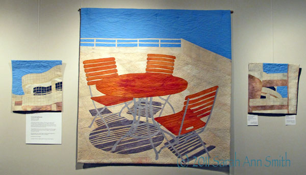
Conversations by Sarah Ann Smith
you’re here at my link!
Letters make words make conversations. These pieces were inspired by the stunning architecture of the Getty Museum in Los Angeles, where there are conversations between buildings and sky, architecture and art, friends and sisters, landscape and architecture, sea and sky and stone and seabreeze, and in my case, artist and cloth, cloth and thread, friends and art.
I began with photos from my visit, words to recall that day, white cloth and dyes to create the colors of the sky and stone and wood and glass. The words include those specific to that day:
Sea breeze sister friend Leonardo dragon teaching aching feet dragons lunch bougainvillea rough smooth stone water sound shadows…
And words about art and design:
Line shape form function rhythm repetition harmony contrast unity space ….
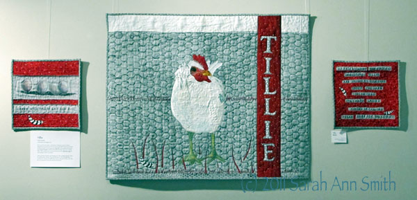
Tillie by Kathy Daniels
Which came first, the chicken…or the letters? In this case, it was the chicken, observed at a country fair and stored in memory until called forward and committed to fabric and stitch. As she hung on the design wall, a chance statement from my 6-year-old granddaughter turned her into what she is today: “Nana, you’re making Tillie!” Tillie is a chicken from our favorite book at the time, Tillie Lays an Egg, by New Hampshire author Terry Golson.
Letters, printed and written, are showing up more often as design elements in fabric art as well as other mediums. They can stand alone, as Tillie does, BOLDLY, or can be part of a story as the smaller 12×12 side pieces attempt to portray. With Tillie, there’s no guesswork in who she is and what she’s about!
In a while, I’ll share the process of making my series. Stay tuned!
July 25th, 2011 at 8:19 pm
You guys always inspire me. I would LOVE to see this exhibit in person Sarah….one day WE WILL MEET!
July 25th, 2011 at 9:16 pm
I am so happy I could join you for the show!
September 5th, 2011 at 1:22 pm
Thanks for sharing your photos and the statements from the artists. Looks like it was a great show.