email Youtube

Home
Galleries
Blog
Workshops & Calendar
Store
Resources
About
Contact

Working on texture when dyeing

February 14th, 2008
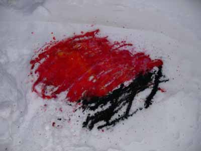
Dye on snow

Happy Valentine’s day everyone… in celebration of the day, I bring you reds and roses….and to find out why there is dye in the snow, keep reading!

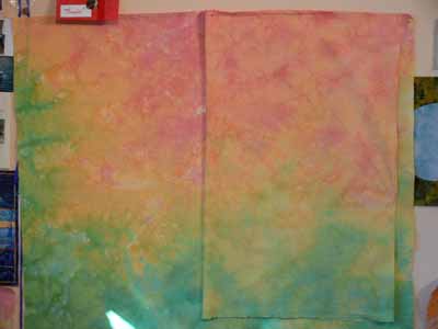
One of the things that has frustrated me is getting the visual texture I want in my dyed cloth. I know how to get intense scrunch and markings, but a lot of the time, fabric like that is too visually busy for the way I work and make quilts. I want a softer, more subtle color shift. So, over Christmas (yes, that long ago), I did an experiment using four different red dyes and one yellow on a 12×21 inch piece of fabric. Where the fabric is striped, the dyes were painted on in the same sequence across the cloth (even the vertical piece…the stripes are just skinnier)

Here is the whole bunch:
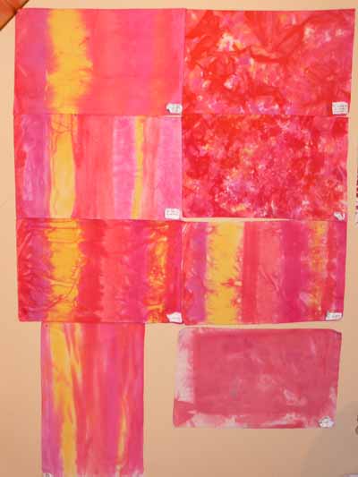
Texture study samples

The techniques I used are as follows….. in the next photo,

–top sample is dry cloth, set flat, with dye painted on, left for 30 minutes, then soda ash solution painted on

–lower sample is dry cloth, set flat, using activated print paste mix (in other words, mix up print paste, add soda-ash-solution and dye) painted on with a sponge brush
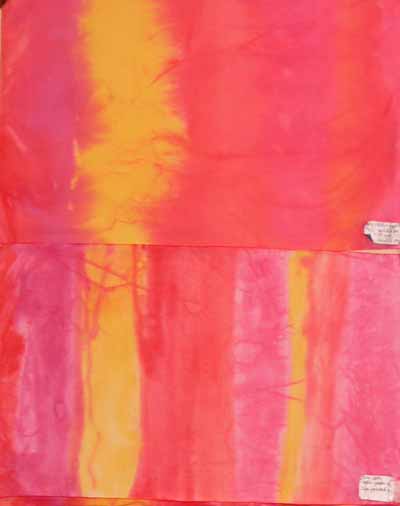
Texture studies 1 and 2
In the next pair,

–the top sample is fabric soaked in soda ash solution, placed flat on the table, and dye painted on; note the sharper patterning than in the painted-on version above

–the lower sample is “snow dyed.” Good thing I did this in December as it has been warmer in January than in December! Anyway, you are supposed to pour dye on snow, let it freeze, pick up the chunks of dyed snow and place them on your cloth. Bleach. This is a candidate for the rag bag… an interesting concept but boring results I think…
Texture studies 7 and 8

In the next photo,

–top sample is dry cloth placed (sorta bunched) in tub, dye poured on, set about 30 minutes, soda ash solution added

–lower sample is cloth soaked in soda ash solution, scrunched, and dye dribbled on (note a sharper pattern of crystals)
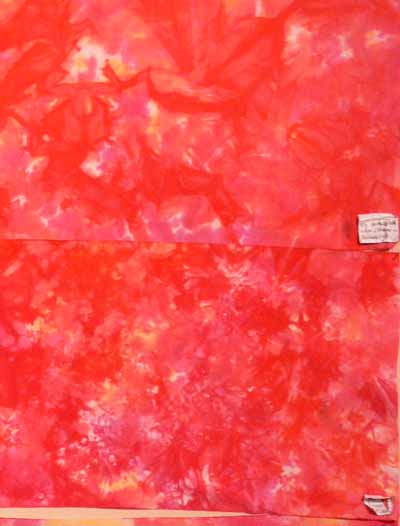
Texture studies 3 and 4

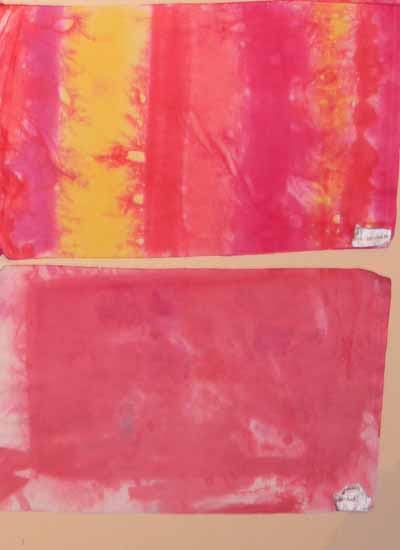
Saving the best for last…..

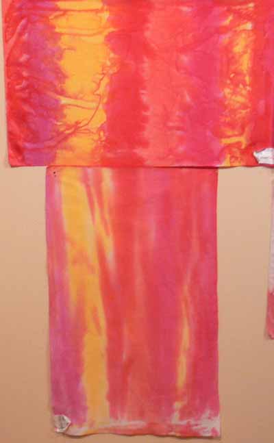
–the upper photo is fabric that was soaked in soda ash solution, then allowed to dry completely. Then it was laid flat on the table and dye was painted on.

–the lower photo uses Robbi Eklow‘s drip-dye method, featured in her book Free Expression (available here at Quilting Arts) in one of the most useful appendices to a quilt book in a long time (and great stuff on my favorite, quilting, in the rest of the book!).
Texture studies 5 and 6

I really like smooth transitions and soft color, so it is no surprise that the first piece and the last are my favorites (in the overall photo at the top of this LONG post, the top and bottom pieces on the left side). I also rather liked the texturing from painting on soda-soaked-and-dryed.
Caribbean color, part tres OR, what to do with leftover dye

February 11th, 2008

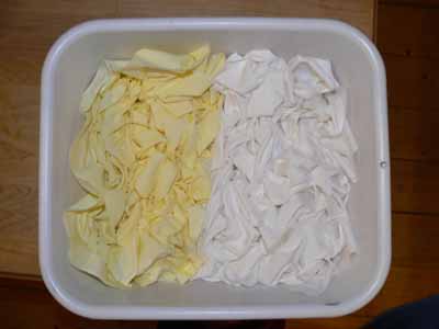
You can’t just throw out extra dye, you have to use it… it’s an immutable law of nature. So I grabbed a yard of pure white PFD (Prepared for dyeing) fabric and a near-yard of lemon yellow fabric someone gave me, which I wanted to overdye as it was a plain old solid. Here’s how they looked to start:

yellow and white in tub

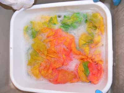
Then I added dye…. yellow all over (a warm yellow) and let it set and soak for a while. Then I dribbled a blue on one long side and a red on the other long side and let them work their way towards the center. I placed two small pieces of cloth flat on the top, too, to wick up the color. After batching for a while, I poured off the excess dye and added the soda-ask-solution to “fix” the dye. I poured off the excess dye first because I didn’t want it to “float” and homogenize the color. Finally, I washed them out…. here they are in a synthrapol wash in the sink:

washing out the yardage

After rinsing and nearly drying, I ironed them up and put them up on the design wall… I’m in LOVE!
what to do with leftover dye

The fabric on the right is the one which was initially pale lemon yellow. The fabric on the left / underneath is the white fabric. From the difference in tone and shading, I’m guessing the yellow cloth wasn’t mercerized, as the colors aren’t quite as bright… I really like the subtle difference.

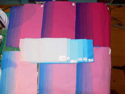
I liked them so much I decided I’d dye a dark purple (made from the same three primary dyes) and a pale colorwash version with more turquoise showing on the edge. There’s a quilt in this… I don’t know what or when, but it’s there…..

Caribbean color, part deux

February 7th, 2008

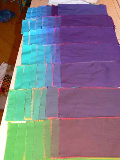
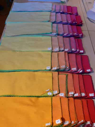
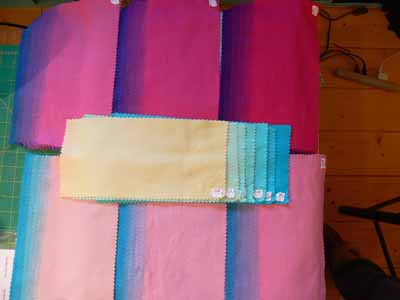
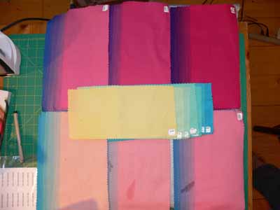
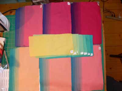
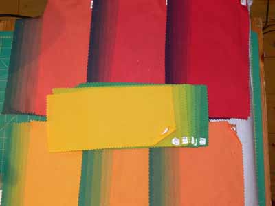
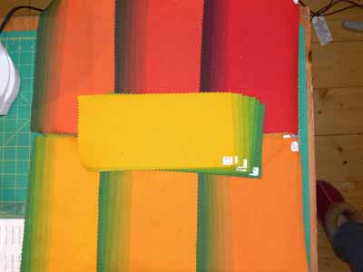
OH MY… they’re even BETTER ironed and stacked….and please ignore the stacking oops on that top stack….the dark one is obviously out of order!

Stacked, dark side up

Stacked and sorted, dark end of the piles showing….

Stacked, light side up

Stacked and sorted, light side of the piles showing (the greens and browns are in the center of the piles).

Here’s what the piles look like before they are stacked:1

2?

2

3

4

6

deepest shade of yellow

Aren’t those colors heavenly…. now, where to find the money and time to buy 350+ yards of fabric, dye, auxiliaries and dye a yard of each…the make quilts!

If you want to learn how to dye like this, please don’t ask me, go to the source: Carol Soderlund. She’s a whiz a teaching and a whiz at dyeing…. a great combination! She is so good that folks literally travel from around the world to take classes from her… no one else teaches how to get consistent reproducible results like she does! In my two classes, I’ve had classmates from across the US, Australia, France, The Netherlands and France… the word has obviously spread!

The Frayed Edges, January 2008

February 4th, 2008

Our Monday meeting in late January was a welcome respite from the chaos that is my life these days. So much so, that I headed out Route 1 south I found myself talking to myself with glee: “yipppeeee! Girls day out! Girls day away!” Ya think I needed the break? Yep.

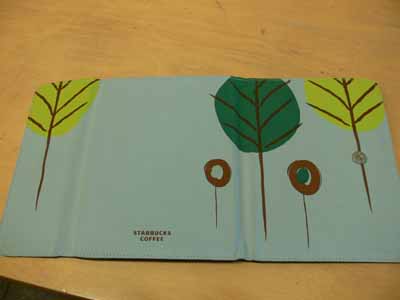
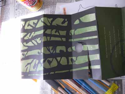
Starbucks are notebook cover, opened

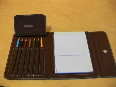
The day started nicely, and I stopped at the Starbucks at Cook’s Corner en route to Hannah’s. I went in instead of through the drive-through (and found a gift for hubby for Valentine’s), and found this “art notebook” (above). The trees remind me a bit of Deborah, and I loved the inside (below). But I think I can make a nicer quality one…this was really neat, but I can make it even more fun (and all mine!). Still, I liked it enough to snap pics, and I really liked the embroidered detail on the flap covering the pencil points, which alas you can’t see because I lifted the flap for the photo—smack self upside head!

notebook inside

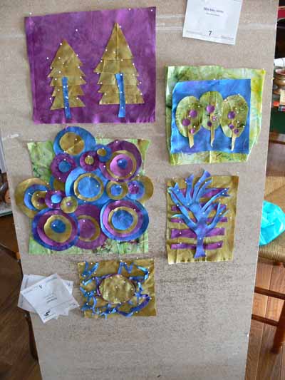
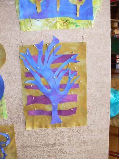
We met at Hannah’s house, where her youngest took a long nap (and the babysitter was there to boot!), we shared and talked and ate and played, pretty much in that order, except we also ate while sharing! Kath brought muffins and I brought juice (I have fallen in love with the Simply Orange, which tastes like fresh…and the jars are great for mixing dyes, too.) Kathy brought her being-quilted chickadee quilt which she has discussed over on her blog, here. I brought my in-progress Hawaiian style quilt that will be in my book (which will be delayed again as I deal with mom’s decline), and Hannah had these incredible delectables tucked away, but we found them anyway…. I am in LOVE with that tree piece (second photo)!

Hannah’s pieces

Hannah’s tree

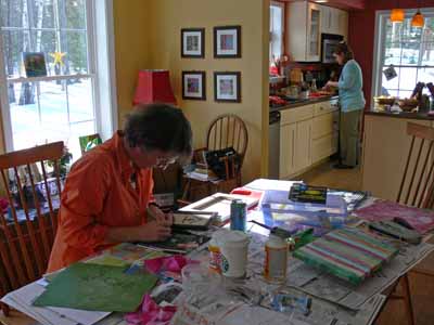
Hannah had a project she wanted us to try and even had all the supplies… she had seen on Martha how you cover a canvas with your own cloth, Mod Podge it to seal it and glue it to the canvas. Then you take a mask or a stencil and paint around a shape. Here’s Kate working on hers as Hannah starts on our Italian sub sandwiches for lunch:

Kate working, Hannah fixing lunch

Of course I couldn’t do what the instructions said…. I decided to tear strips of cloth and have a striped background….

And I was SO inspired by this flyer from the library in Brunswick (or was it the local film / cinema group? It was about movies)… aren’t these incredible graphics? I think I’ll tear masking tape to mask off trees and birds on my striped cloth one before I paint…. but what color? Deep navy? Teal? Silver? That last hadn’t occurred to me until I just typed it, but maybe that’s it…. or a dark metallic gray?

the brochure

And then there was Kate’s rum cake for dessert….. *almost* needed to worry about a breathelyzer test after that one….grin! And, sigh, we missed Deborah, who always took photos of our feast…..

Caribbean colors

February 1st, 2008

Hi all…. it has been a crazy week. My mom, who is 89, is not doing so well, so I’ve been trying to help her and care for her long distance (I’m in Maine and she’s in California). That means I may not be able to post as often for the next month or two, so if I appear to vanish, I’m OK…just swamped with life. It looks like everything is going to work out and that she will be able to move to Maine in a month or so. Keep your fingers crossed.

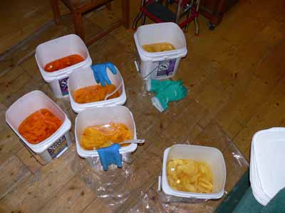
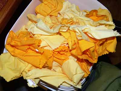
Yellow in buckets

In the meantime, I have some glorious color to share with you! In the pursuit of perfect color for my art quilts, I’m engaged in a color-swatch-swap (try saying that three times fast! pphhhttt!) with Carol Soderlund and some fellow students. The 8 students were in Carol’s totally awesome dyeing workshops (I’ve blogged about them in the past) either this past October or in August 2007. We are in Australia, The Netherlands, Denmark, and across the US, and are each dyeing a different color family. I chose to use a warm yellow, a red  and a blue, and I may have one of the best color families known to procion MX dyers! The photo above is of the first round of dyeing . Here is the yellow after it got out of the dye buckets, washer and dryer:

Yellow, dried

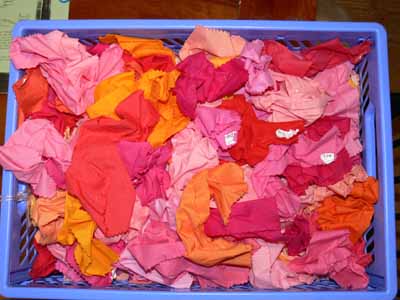
Then, you add red:

Red overdye

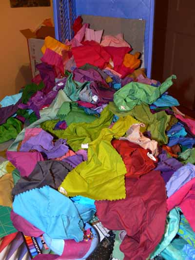
Then turquoise:

Turquoise overdyed

Overall the values (light to darkness) are light… the “black” is really a deep eggplant… the colors of the fabrics in the dyebath was awesome. If I take the darker range and go deeper by having more dye powder per ounce of fabric, I can get some really intense blues…. the colors remind me of tropical fruits (citrus, papaya, mango), flowers (hibiscus and fuchsia and orchids), foliage (lush moist as well as arid climate plants) and the sea… from a stormy day to deep Caribbean ultramarine to those glorious aquas in the shallows….

I’ll add more pictures once everything is ironed and sorted by color range….. WOOOT!