email Youtube

Home
Galleries
Blog
Workshops & Calendar
Store
Resources
About
Contact

Foto Friday (on Sunday, sigh): Week 39–B&W Dreamscape, plus Endocrinologist

October 11th, 2015

This week’s lesson is Black and White Dreamscape in my online class with Ricky Tims.  Earlier in the year we learned the dreamscape technique (a process in Photoshop) which makes an image (often a landscape type of scene) look, well, “dreamy.”  This time, instead of both layers being in color (which intensifies the color), one is in black and white.  This leads to a somewhat old-timey, hand-tinted photograph image.

Also, in the last paragraph, I have a question if anyone knows of a good endocrinologist in Maine.

I took a TON of photos, but settled on this one of my husband.   He HATES having his picture taken.  To the point that he scowls and grumps at the camera so much that folks who don’t know him would think, erroneously, that he is a seriously grumpy old man.   So while I was taking a bazillion photos of last week’s cross country meet, including both landscapes and runners, I snapped a few of hubby.
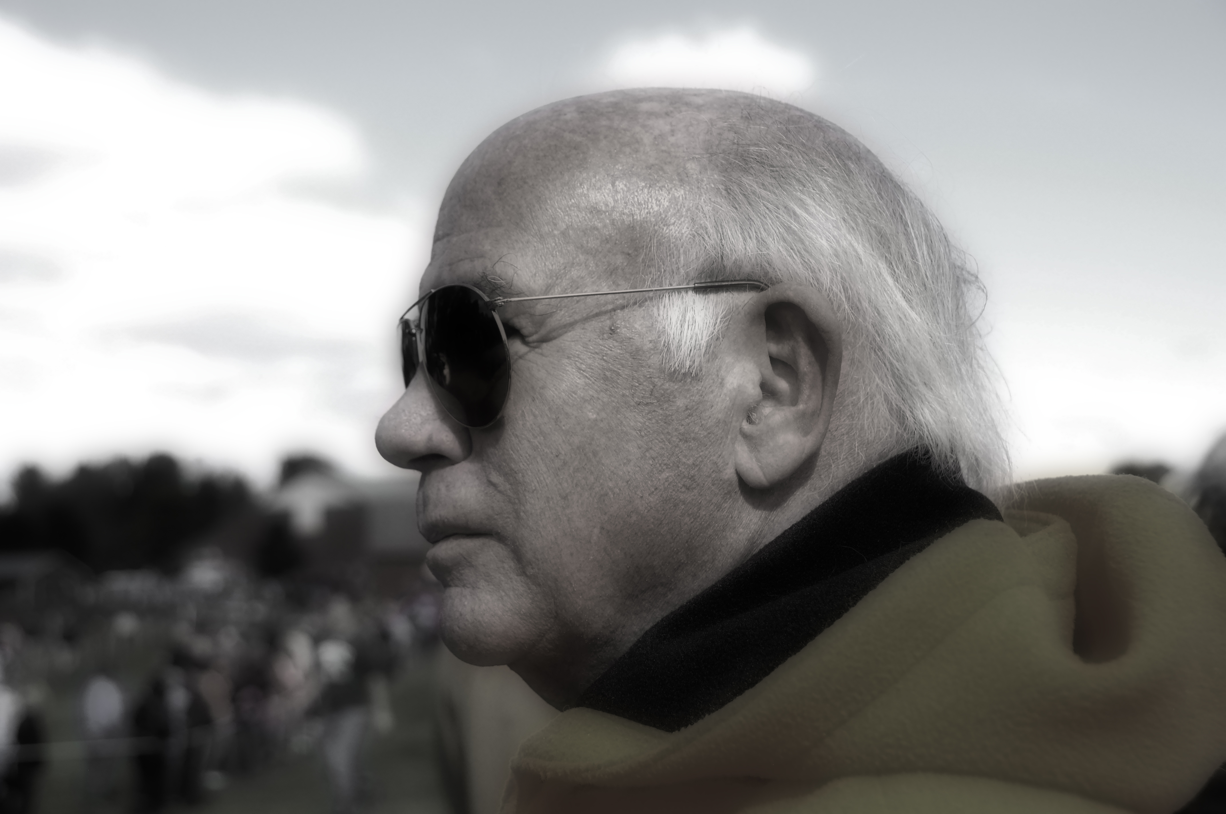
Used desaturate etc per class instructions. Still quite colorful after merging/flattening, so used Hue/Saturation menu to knock down the yellows, reds, and blues. Hubby is notoriously awful about getting his photo taken, so glad I got this one.

Used desaturate etc per class instructions. Still quite colorful after merging/flattening, so used Hue/Saturation menu to knock down the yellows, reds, and blues. Hubby is notoriously awful about getting his photo taken, so glad I got this one.

Of course I got the runners, and for once managed to get a good one of Eli.  I don’t know why (because he is pretty fast????) but I can get OTHER kids sharp and in focus while moving quickly, but I always seem to mess up with Eli.  This time, it worked!
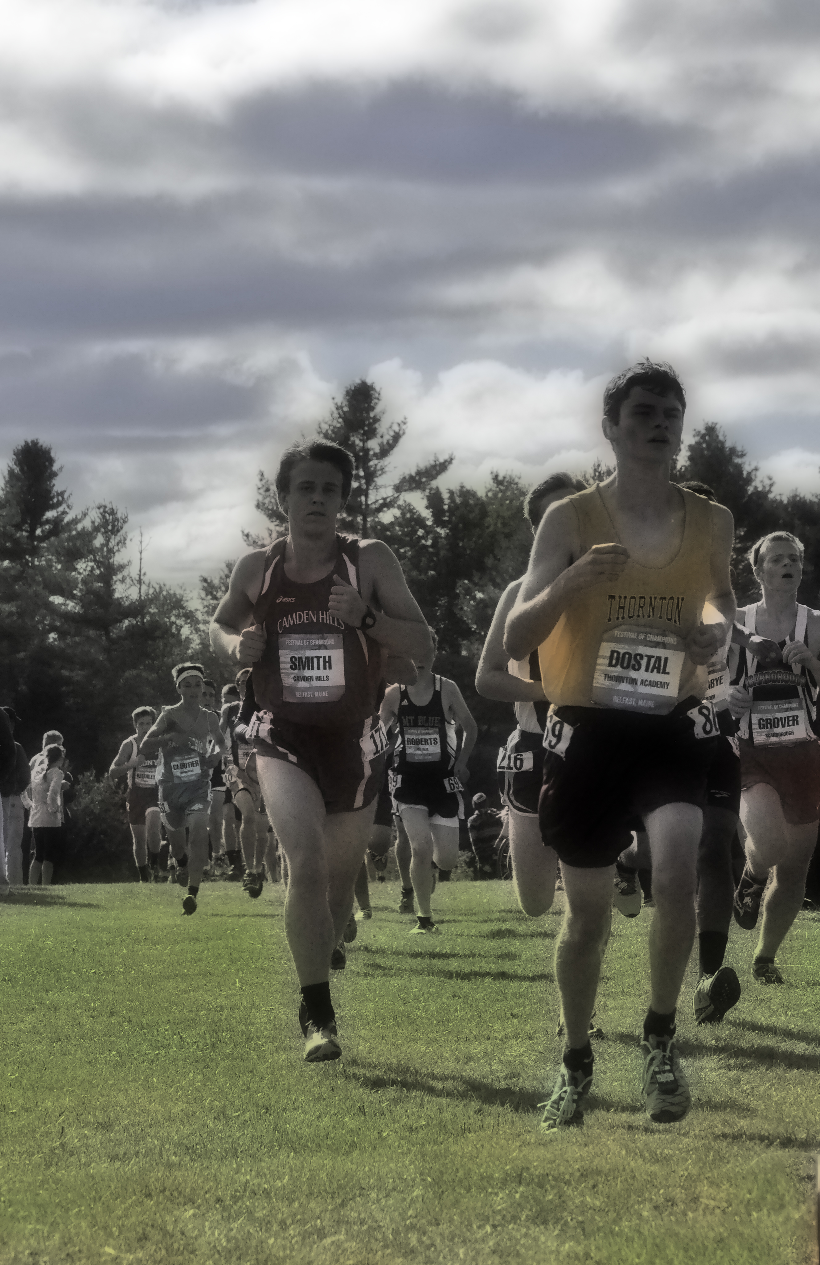
B&W Dreamscape technique. Used Desaturate and Merge Visible (instead of flatten). That’s my senior on the left (in the red). As with Dreamscape, I don’t think this technique is me, but I can see where it could be interesting for a hand-tinted-photograph kind of look. Will try various shots and see if a particular sort of image (wintry village scene for example or portrait) is more suitable than the vibrant glorious autumn day for the Festival of Champions race in Belfast, Maine this weekend. So proud of my student-athlete!

B&W Dreamscape technique. Used Desaturate and Merge Visible (instead of flatten). That’s my senior on the left (in the red). As with Dreamscape, I don’t think this technique is me, but I can see where it could be interesting for a hand-tinted-photograph kind of look. Will try various shots and see if a particular sort of image (wintry village scene for example or portrait) is more suitable than the vibrant glorious autumn day for the Festival of Champions race in Belfast, Maine this weekend. So proud of my student-athlete!

I also tried the view from our house.  However, autumn is to me all about the glorious color, so while the photo is fine, I really prefer the “regular” version!
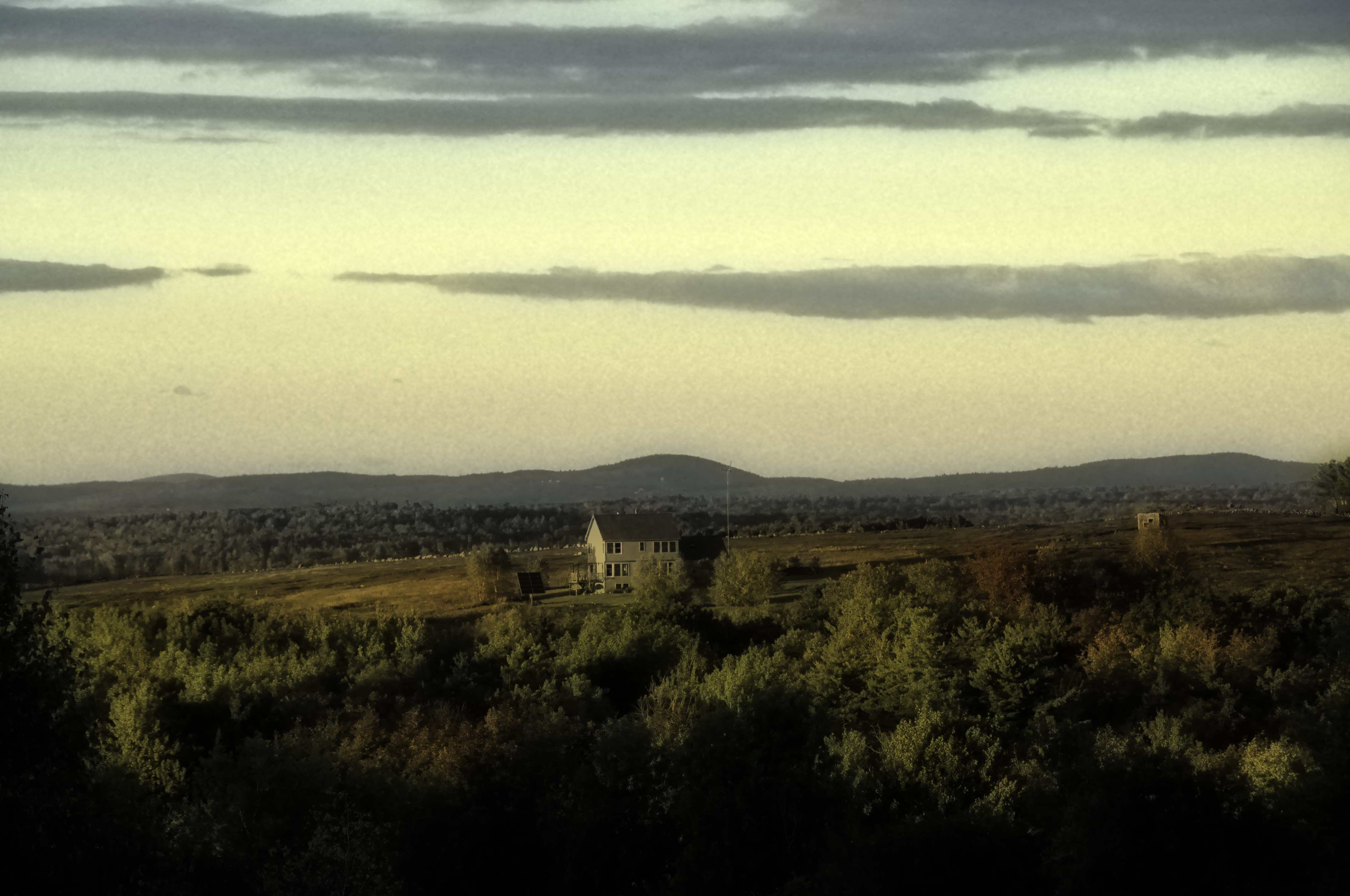
Meh. Not a fan. The whole point of autumn is vibrant color, not muted. Wrong scene for the technique. DID discover than on the Adjustments>BW layer, you can toggle to Infrared or Blue or Neutral Density and get different variations on the theme of B&W which could be useful in the right application.
Meh. Not a fan. The whole point of autumn is vibrant color, not muted. Wrong scene for the technique. DID discover than on the Adjustments>BW layer, you can toggle to Infrared or Blue or Neutral Density and get different variations on the theme of B&W which could be useful in the right application.

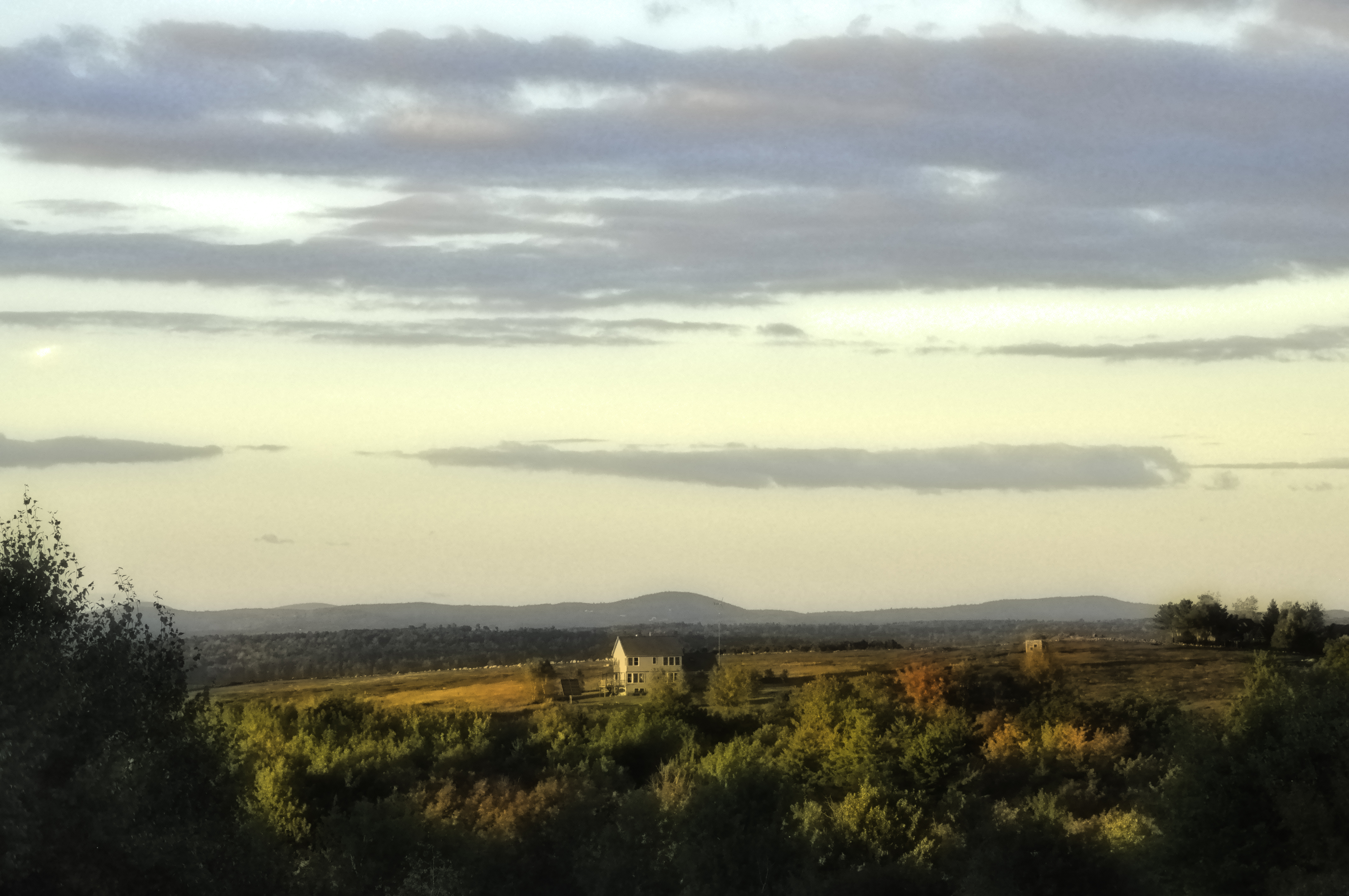
Dreamscape B&W. Used the B&W (not desaturate) on this one. In adjustments / Shadows-Highlights, cranked up the color, because autumn is about the color (tho this lesson is less so). Used Dodge tool to lighten the nearly-black trees in the foreground (western light on the trees in the yard was blocked by intervening woods). I don’t think this shot was quite the goal of the lesson, but I like this image betterwith more color. And of course love the Golden Hour light.
Dreamscape B&W. Used the B&W (not desaturate) on this one. In adjustments / Shadows-Highlights, cranked up the color, because autumn is about the color (tho this lesson is less so). Used Dodge tool to lighten the nearly-black trees in the foreground (western light on the trees in the yard was blocked by intervening woods).
I don’t think this shot was quite the goal of the lesson, but I like this image betterwith more color. And of course love the Golden Hour light.

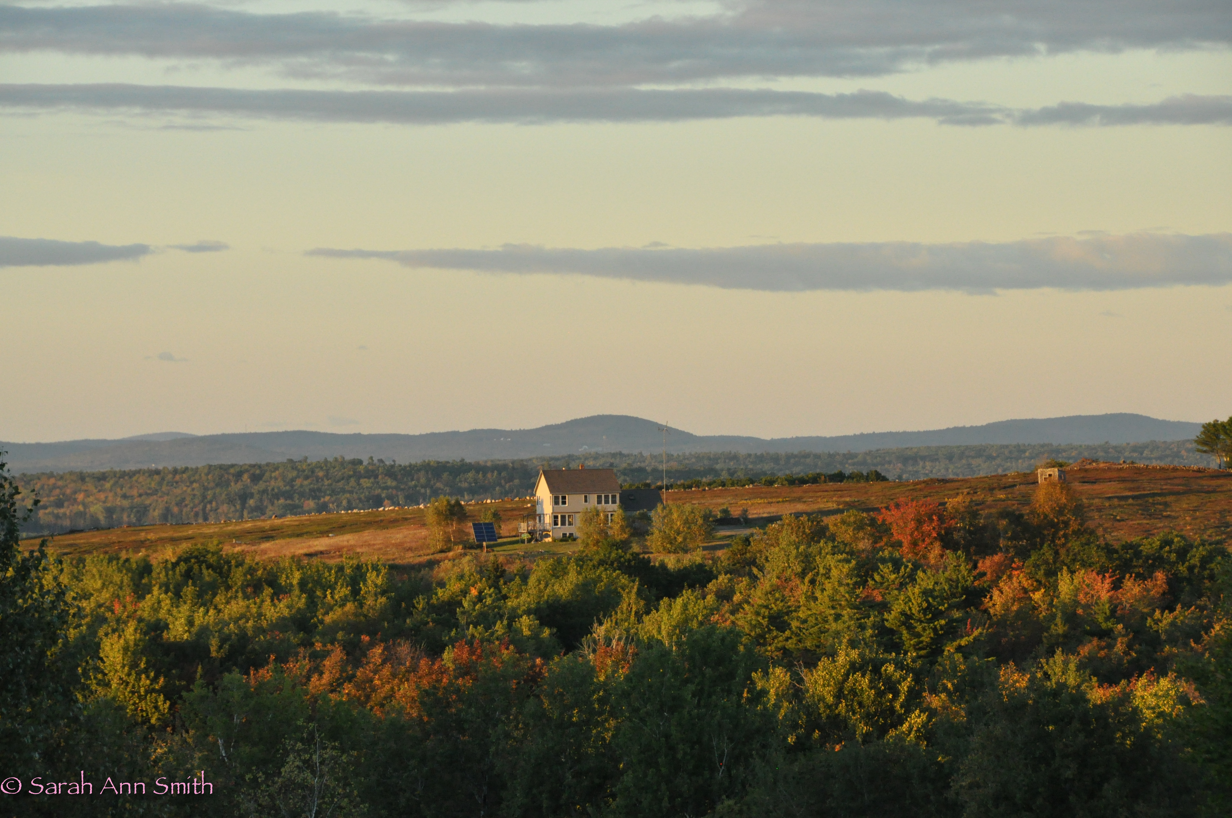
This is the non-dreamscape.....

This is the non-dreamscape…..it’s a subtle difference, but somehow more crisp and bright.

Also, I’m getting close to fed up with my current care for thyroid disease.  If anyone knows of a good endocrinologist in Maine, or even possibly in Massachusetts north of Boston, I’m almost frustrated enough to drive 8 hours round trip.  We’ve been trying to get my dosage right for ELEVEN freakin’ MONTHS.   I’m so sick of this!   I realize it is hard to get it right, but really?  Nearly a YEAR?   Mine is not a “routine” case obviously but if anyone has pearls of wisdom, please comment or contact me via the (duh) contact page.  THANKS!
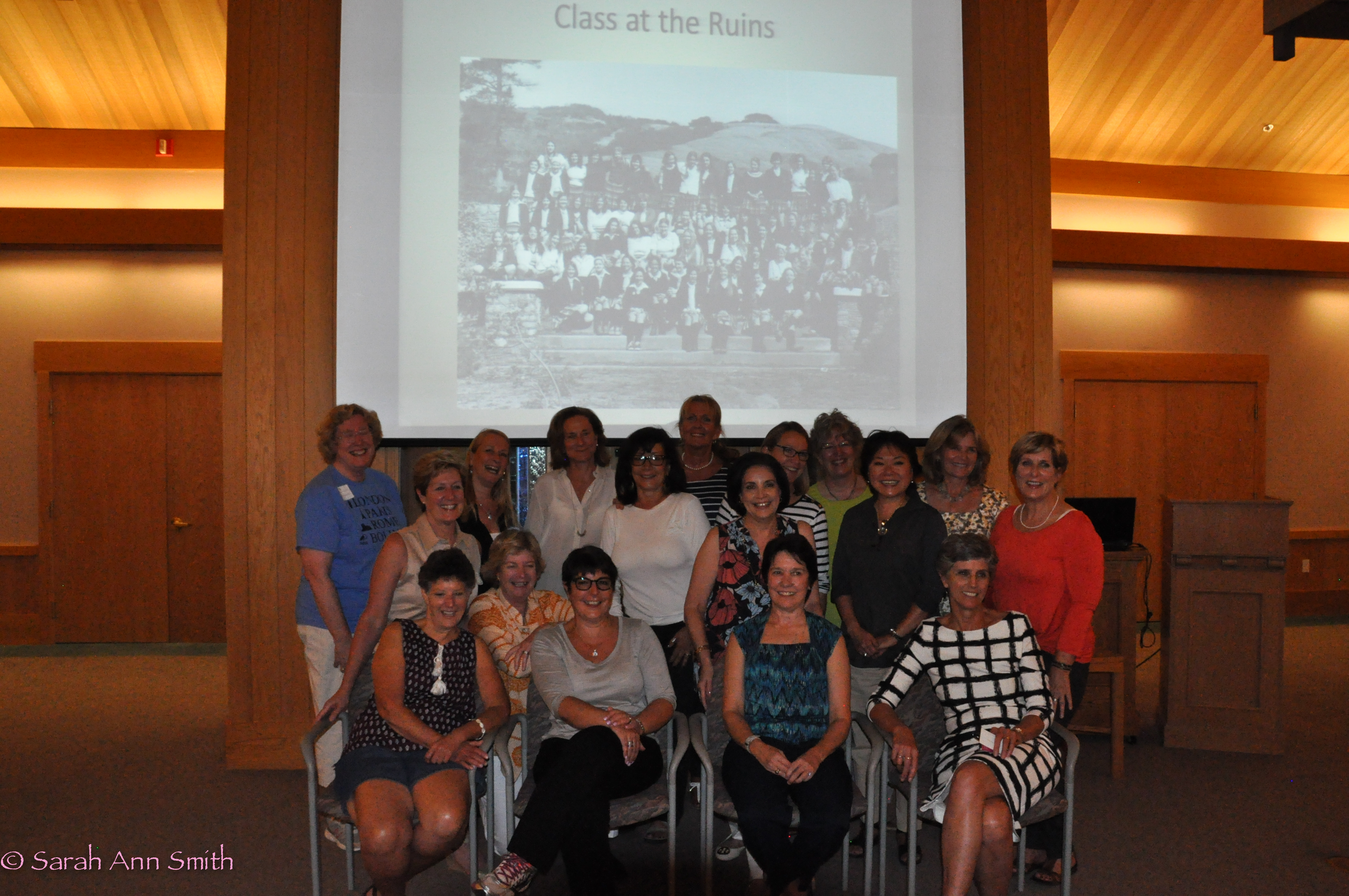
40th Reunion–San Domenico School

October 2nd, 2015

The past couple of weeks have been a whirlwind!  We took Eli on an official (NCAA) visit to his top choice for college.  He spent a good part of the weekend with the wrestling team, while Paul and I got to have dinner with two dear friends from college (who married each other) and moved to a retirement home 20 miles north of the town where Eli hopes to attend college.  We’ve seen them just the once since about 1981, so it was so wonderful to visit in person.

About 1/3 of the San Domenico School Class of 1975--at a class supper at the Dominican University Campus

About 1/3 of the San Domenico School Class of 1975–at a class supper at the Dominican University Campus–I think it was Monica’s husband who took this photo–thank you!  (I’m in the back row to the right of center, in green)

Then 2 days after getting home from that trip, I headed to California for a San Domenico School Alumni Council Reunion (I’m on it) and my 40th High School Reunion.   When picking the category for this post, I chose Family because that is really what we are.  I was so, So, SOOO incredibly lucky to attend San Domenico School in San Anselmo, California. The school (finally!) turned co-ed in high school this year, admitting boys to 9th grade, as well as Lower School, and that change has revitalized the school and interest in it.  It is both day and boarding, so if you are looking for a superior school I can recommend it without reservation.  Cecily Stock graduated two years after I did; she is now head of school and *my* what an impressive woman she has become.  She is the leader and focal point for a team that is saving one of the best schools in the country.   THANK YOU!

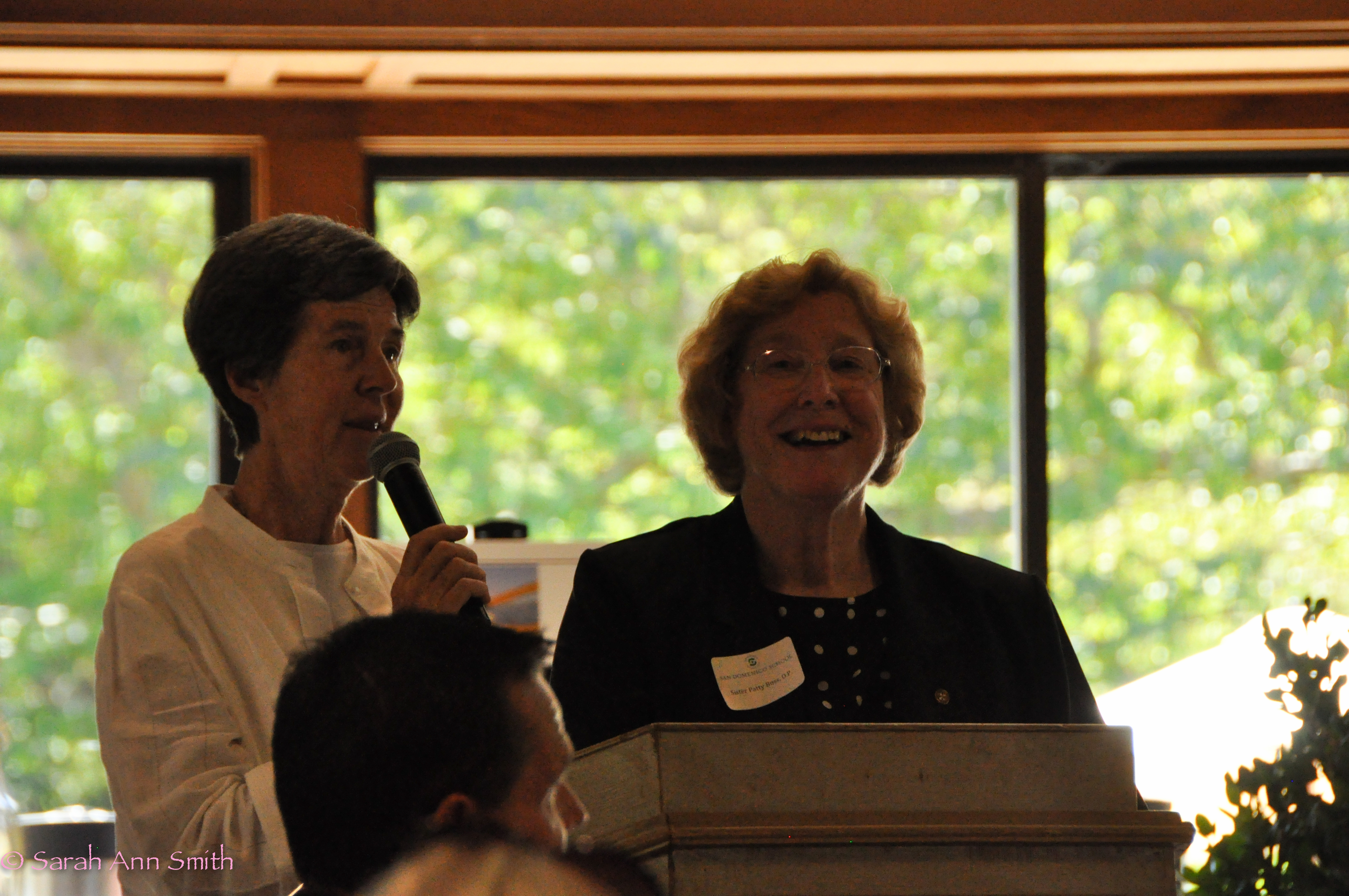
There are two other phenomenal women who were at the Reunion and Dinner, and who had a profound and lasting impact on my life.  I love them both dearly.  The gifts they have given to the school and to the children who attended the school cannot be overstated.  Sister Gervaise is on the left, Sr. Patricia on the right.  Along with the late Sister Maurice who is a towering figure of importance to the school, Sr. Gervaise’s far-thinking mind, gentle spirit and intelligence give us a legacy that is ever-giving.  She has lived on campus and dedicated her life to SD and her students for 50 years.  One of her most cherished possessions is a photo of her when she met the Dalai Lama:  that tells you what amazing, independent, strong, compassionate, tolerant, loving, open-minded women are our Dominican sisters.  Sr. Patricia was our class sponsor/moderator.  She was our “grown up in charge of the Class of ’75.”  Except she was only 23 when we started high school!  We thought she was so old and grown up, and she was so young.  She is ours and we are hers.  Period.  And before I seriously need a kleenex, I’ll just post the picture and say THANK YOU!

Sr. Gervaise and Sr. Patricia announce the Distinguished Alumna for 2015: Hoonae Kim, Class of '75, who has dedicated her life to improving lives in the third world, working for the InterAmerican Development Bank, World Bank and UN. Hoonae ROCKS!

Sr. Gervaise and Sr. Patricia announce the Distinguished Alumna for 2015: Hoonae Kim, Class of ’75, who has dedicated her life to improving lives in the third world, working for the InterAmerican Development Bank, World Bank and UN. Hoonae ROCKS!

Final words:  The Class of ’75 is (in my highly biased opinion) probably the best in the history of the school, and in a biased but well-informed opinion, San Domenico is one of the best private schools in the country.  Thank you Mother for making sure I got in and working to pay my tuition.  I got the best education of my life there:  they taught us to love learning, how to learn, and to love.  It doesn’t get any better. Here’s to getting even more of the Class of ’75 on campus for our 50th!

Foto Friday, Week 38: Text Overlay

September 25th, 2015

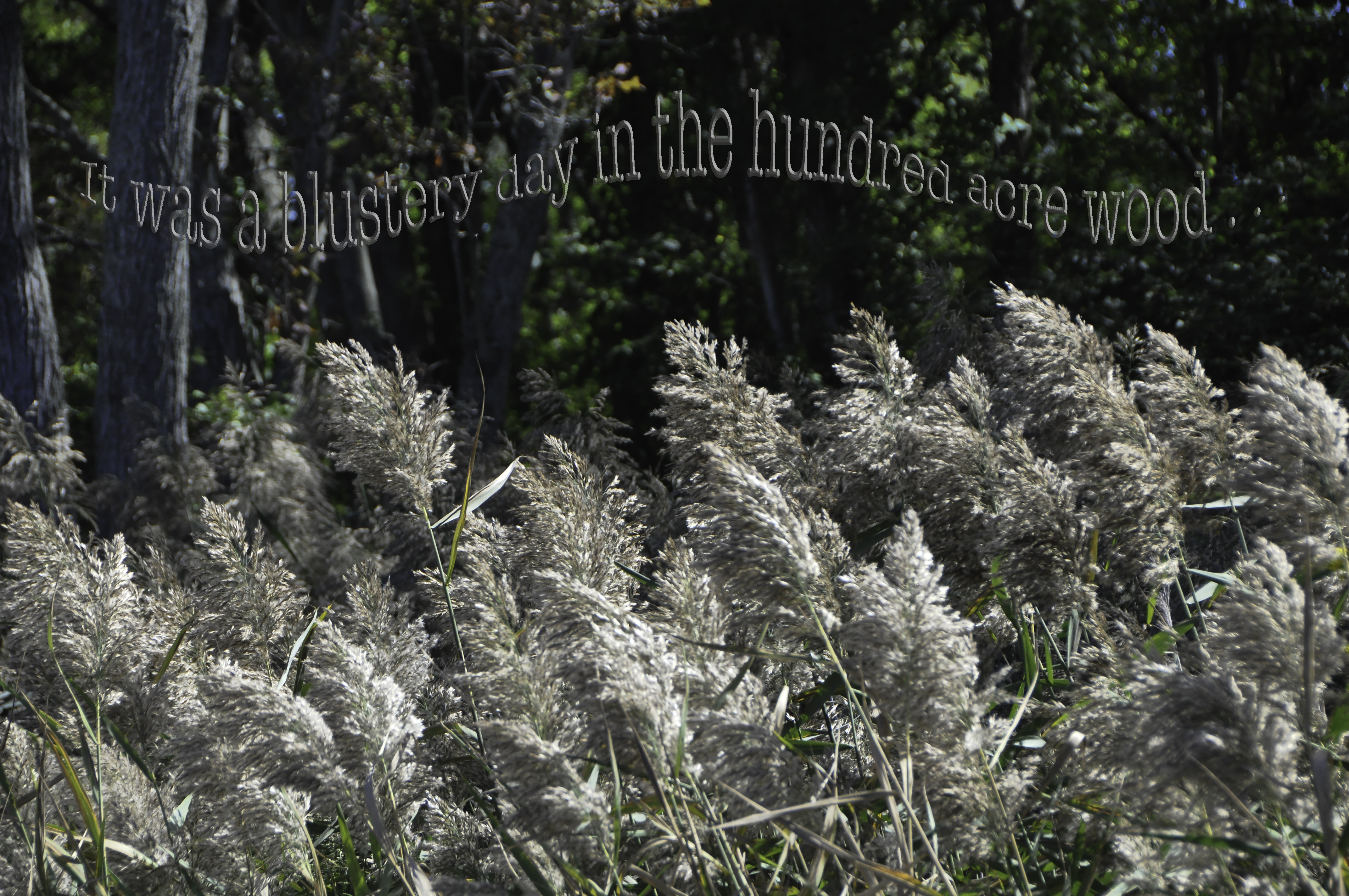
This week’s lesson was to create a text overlay, but rather than simply have text on top of the photo, to make it “transparent” and “embossed” so that you can read it, but it is really just the photo with a bit of distortion to create the lettering.  Of course, I pushed the envelope a bit.  I was short on time, too!   We get lessons on Sundays…OH!

NEWS FLASH:  Ricky Tims will offer a 52-Week Photography Challenge course again next year!  Not quite sure what form it will take, ditto for the “Year Two” for those of use in this year’s challenge.  Anyway, if any of you have been interested in really learning to USE your DSLR or Photoshop, boy is this a great class and challenge!   You learn something every week.  Sometimes it is design and composition, sometimes photoshop, sometimes both, and the time required for the assignments isn’t crazy busy.  You can squeeze it out in a little time or, if you really want to plumb the depths, take lots of time.  So it works for busy schedules.  Anyway, FYI!  Keep an eye on Ricky’s FB feed/announcements, and I’ll post here and on FB when he/we know more. 

What FUN! I (sorry Ricky) veered a tiny bit from the lesson by using the lighten and multiply plus color overlay (tho the color doesn’t realy show). I used Inner Bevel, Chisel Soft, 300%, Lighten (white) 59%, Multiply (dark rust not black) 30%. Color Overlay was a bright rust foreground color ostensibly at 75% opacity. Still I like how the lettering repeats the colors of the grass fronds. Only two days home between trips plus laundry plus son’s high school stuff means one chance only to play on this during the week. Will try more when I get home, but after I sleep! Ricky, I don’t know how you do your schedule! OH, to get the wave I used Arc high and Arc lower, separating the quote from Winnie the Pooh into three segments.

What FUN! I (sorry Ricky) veered a tiny bit from the lesson by using the lighten and multiply plus color overlay (tho the color doesn’t realy show). I used Inner Bevel, Chisel Soft, 300%, Lighten (white) 59%, Multiply (dark rust not black) 30%. Color Overlay was a bright rust foreground color ostensibly at 75% opacity. Still I like how the lettering repeats the colors of the grass fronds. OH, to get the wave I used Arc high and Arc lower, separating the quote from Winnie the Pooh into three segments.

OK, back to Sundays:  the lesson shows up in the wee hours of Sunday, and this week we were driving Eli home from a college visit in Pennsylvania.  I took photos from a mostly moving car.  Right.   At least I know enough now to know I need a wicked fast shutter speed.  But we were slowed down at an exit going from one interstate to another (THANK YOU Deirdre and Timi for the info about taking I-84 to avoid the Tappan Zee and near-NYC traffic!), and I was able to get several good shots of these waving grasses.   Since it was downright brisk (night temps into the mid 40s) when we got home to Maine, I felt the Winnie the Pooh quote was apt.

I didn’t make my lettering as transparent as Ricky’s example, which is kinda what he wanted.  But I got the concept.  I wanted mine to stand out a bit more.  I also added the “wave” by breaking the text into three sections so I could arch them in a wave, like grasses blowing in the wind.   Anyway, this photo won’t win any photography competitions, but it was a good lesson, and one that I can see using again, and in a way adapting to my art quilts, too.   FUN!

Foto Friday, Week 36: Re-Do #3

September 21st, 2015

Um yes… things are out of order.  That’s what happens when you try to blog away from home, using an iPad to blog, grabbing images from your Flickr feed instead of photo files on the laptop and generally not paying attention.  So LAST week I posted Week 37’s challenge, calling it Week 36, when it was in fact NOT Week 36.  So now, following Week 37, we are going back to Week 36 which was “Re-Do.”   Got that?  Moving on!

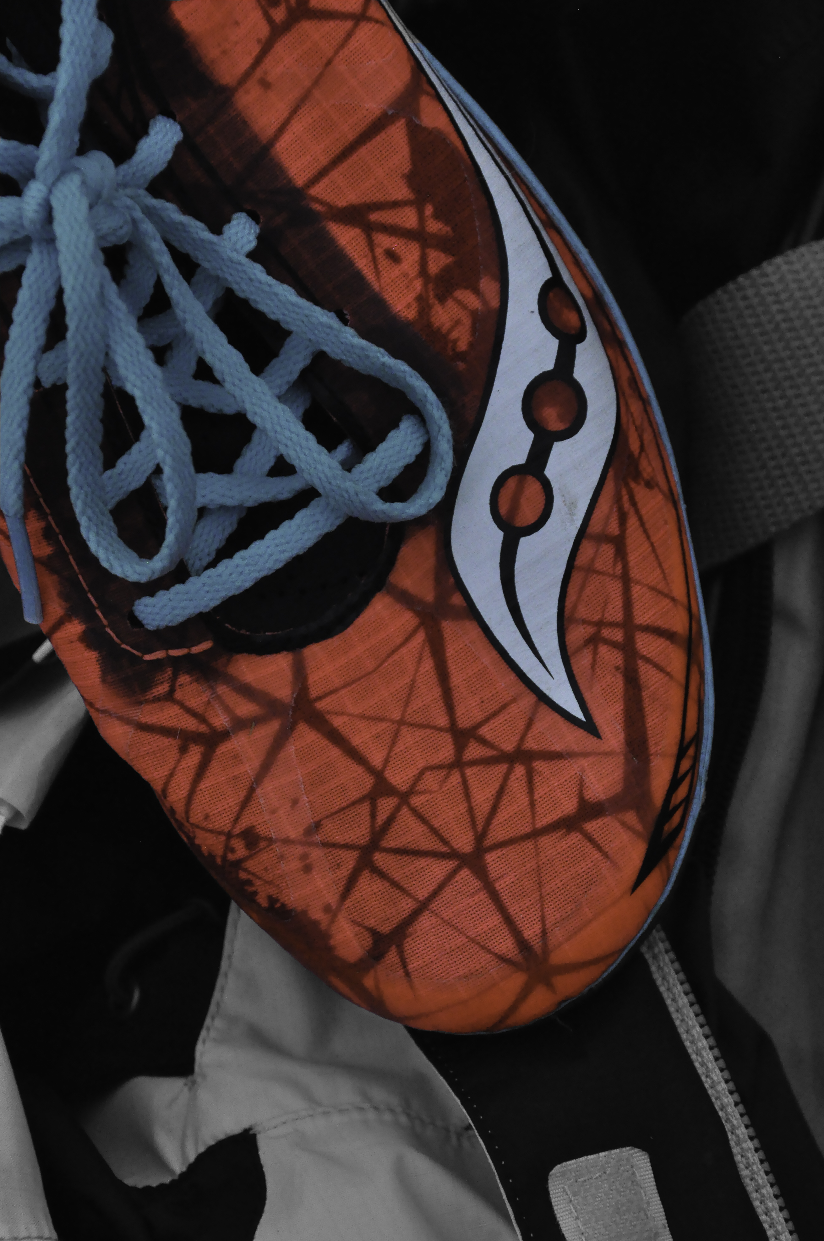
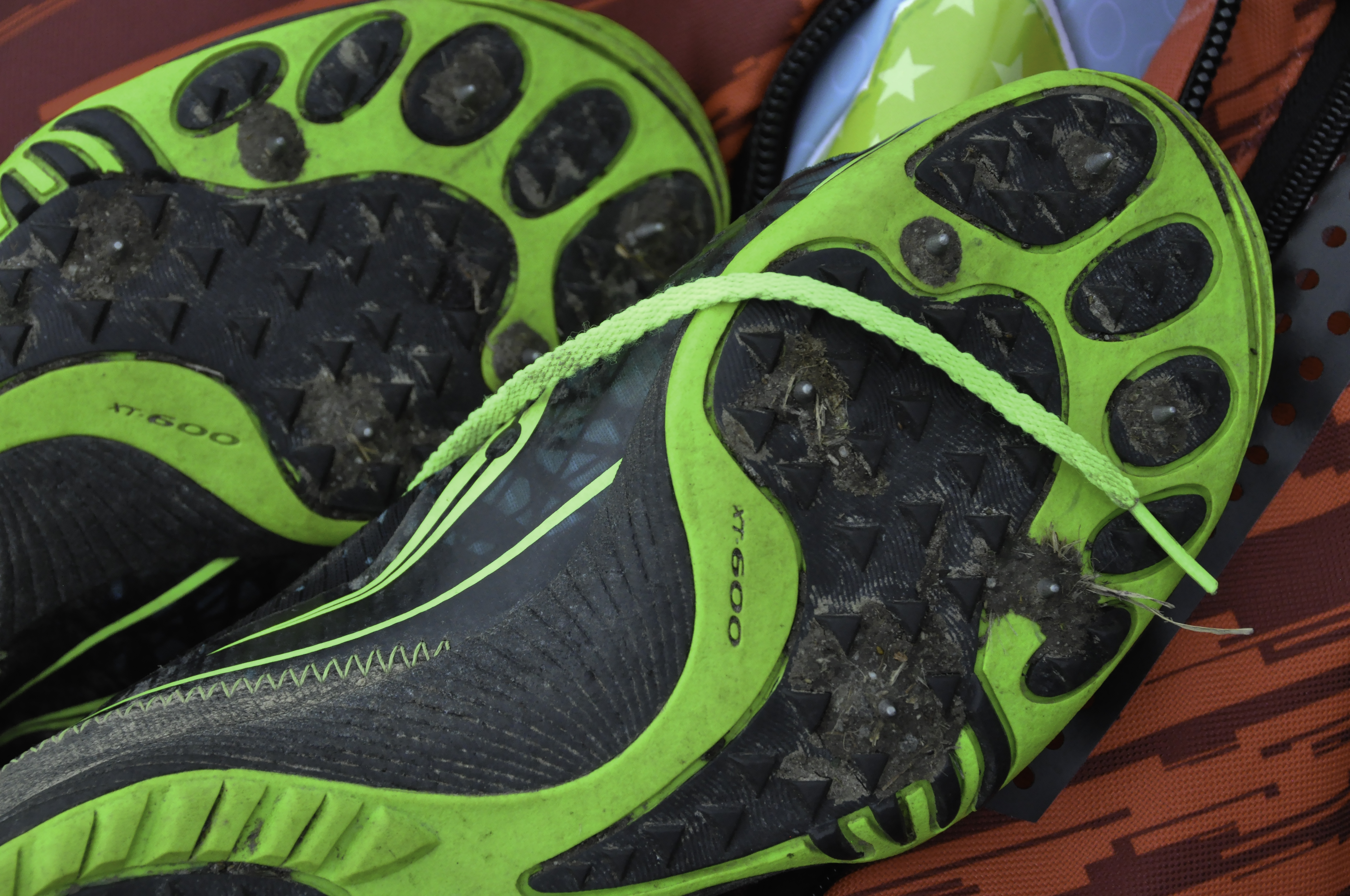
Re-do of footwear.  Wasn’t a successful week for photography.  Tried to re-do several weeks:  Footwear, Power of One, Silhouette.  Sigh.  This was the best of the bunch.  Used magnetic lasso (for the first time, successfully) to isolate shoe on duplicate layer.  Converted base layer to monochromatic.  Slight crop retaining proportions.

Re-do of footwear. Wasn’t a successful week for photography. Tried to re-do several weeks: Footwear, Power of One, Silhouette. Sigh. This was the best of the bunch. Used magnetic lasso (for the first time, successfully) to isolate shoe on duplicate layer. Converted base layer to monochromatic. Slight crop retaining proportions.

This is our third and, apparently (sigh) final “re-do” of the year.   The timing was good…Ricky was traveling and teaching in Europe, his dad died, his mom asked him to take care of things and do the eulogy, and all in all it was time for Ricky to take a break with all our encouragement to do so.   I had several things I wanted to re-do, and not much time.  And then the weather didn’t cooperate.  So I ended up re-doing “Footwear” which was from before I started sharing these photos here.

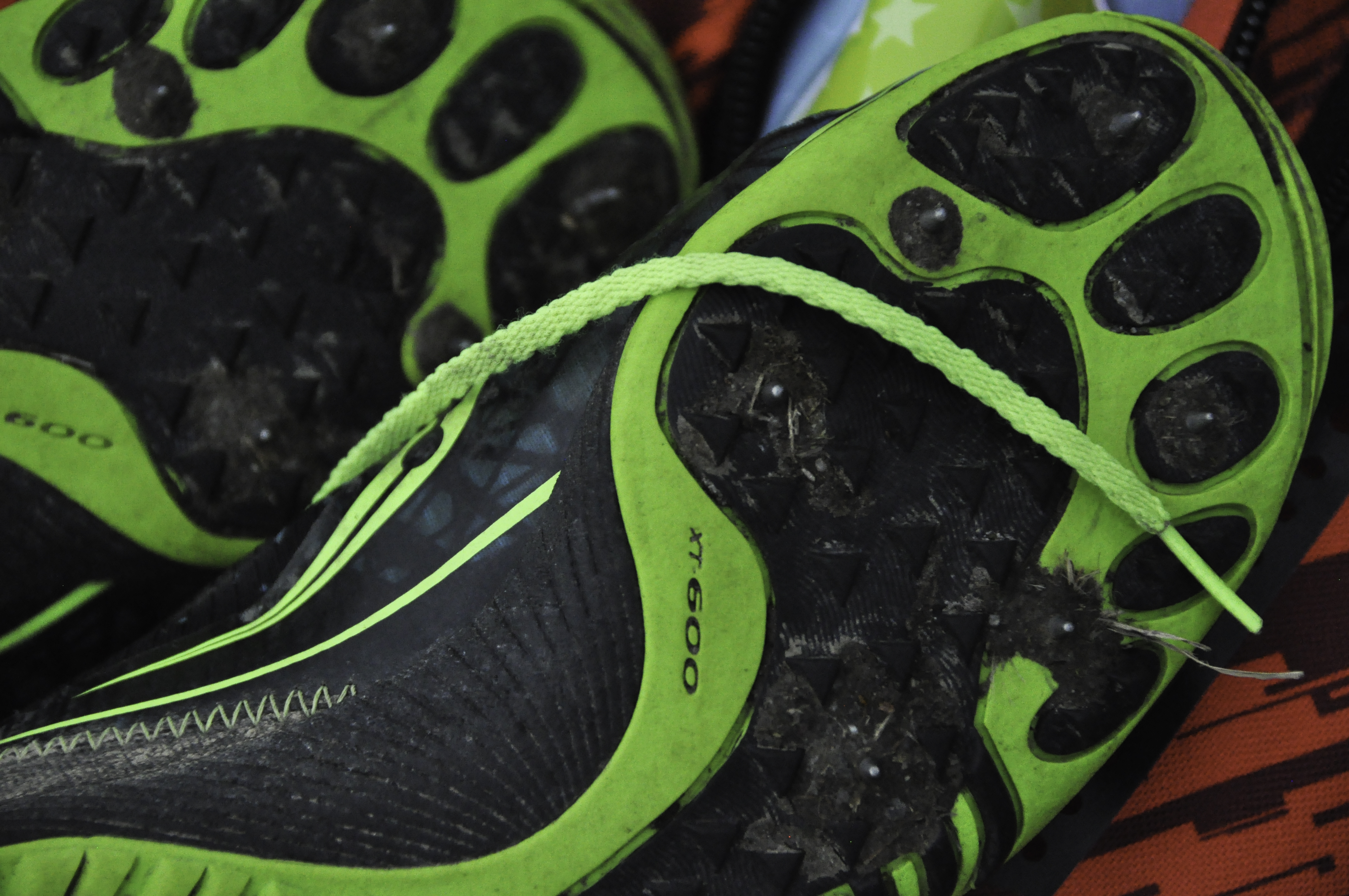
These photos are from the heap of stuff the kids left on the edge of the Cross Country course when up at Belfast Area High School.  In the photo above, the jacket was pink, the bag handle dark magenta.  And red?  Ick!  Photoshop to the rescue! Then for the “toe print” shoe soles I couldn’t decide which framing I preferred.  Clearly I was having a “dithering” kind of week!

Not a successful photograhy week.  Weather didn’t cooperate for the silhouette I wanted (night shot of the stars), and the dark skies at the cross country meet meant I couldn’t get a fast enough shutter speed AND depth of field to get non-blurry runners.  Saw the piles of shoes at the end and decided maybe I’d re-do footwear!

Not a successful photograhy week. Weather didn’t cooperate for the silhouette I wanted (night shot of the stars), and the dark skies at the cross country meet meant I couldn’t get a fast enough shutter speed AND depth of field to get non-blurry runners. Saw the piles of shoes at the end and decided maybe I’d re-do footwear!

Slightly different framing on the green shoes.  Not sure which I prefer.   Despite the aperture, I think the depth of field is probably too shallow for this shot.

Slightly different framing on the green shoes. Not sure which I prefer. Despite the aperture, I think the depth of field is probably too shallow for this shot.

OK, I am now going to prepare NEXT week’s blog so that it is DONE, properly, on time.  What a concept.  Harrumph! (and grin)

Foto Friday on Saturday, Week 37: Selective Color

September 19th, 2015
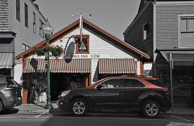
Submitted this one as my class photo. I kept two colors, the red and the green. I keep thinking of the Wizard of Oz with the black and white world.

Submitted this one as my class photo. I kept two colors, the red and the green. I keep thinking of the Wizard of Oz with the black and white world.

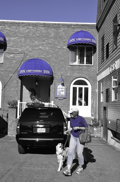
This week’s challenge was to take a photo, any subject, keep one color, then edit the rest to black and white.  I didn’t think I would like the results, but I can see where they would get interesting.

Lady, dog and blue

Lady, dog and blue

My favorite food group!

My favorite food group!