A sampler of background quilting
At long, LONG last, I’ve been able to make some headway on completing the last section of the manuscript for my book. Over the last few days of the boys’ vacation, I was able to complete a sampler quilt showing the effects of using different threads and different background quilting. I used the same wreath pattern on all eight “blocks”:
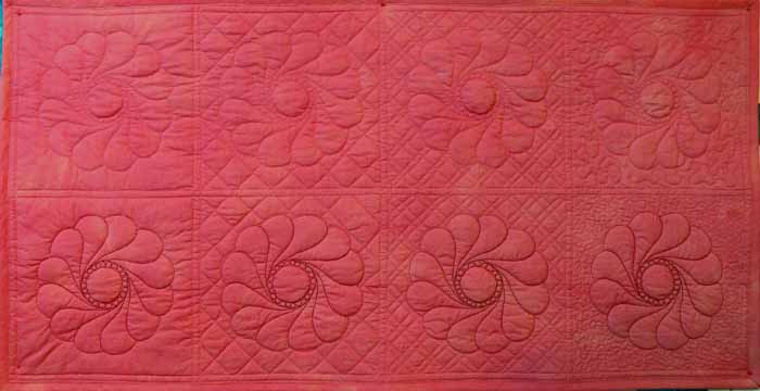
I used a matching 40-wt. trilobal polyester thread (shiny and beautiful like rayon, but stronger and more lightfast), Superior Threads Living Colors # , for the top row. I used a darker 40-wt. polyester thread for the wreaths in the second row, Superior Threads Nature Colors # . For the background I used Mettler 60-wt. “embroidery” cotton in a matching color, and in the bobbin I used Superior Threads The Bottom Line. If you click the photo above, it will open and enlarge.
As you can see from the overall shot, from a distance the matching color-thread quilting nearly disappears. The dark color stands out a lot, though, especially with the “pearl” circle in the center. If I were quilting a real quilt, I personally would choose something in the middle of these two colors. I think the reddish color is too strong, but the matching color doesn’t stand out (so why do all that hard work if no one can see it?!).
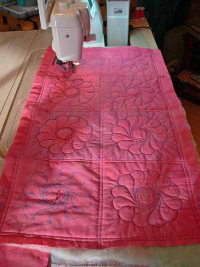
Here’s a picture of the quilt “in progress” under the sewing machine. As you can see, I used the easy-on-the-eyes blue marking pen (the thick one). If I had had the fine-point blue pen, I would have used it. The line on the Dritz wash-out pens is so thick (nearly 1/16th of an inch) you have to choose whether to quilt on one side of it, the other side of it, or aim for the middle!
The next part of the experiment was to illustrate how different background quilting blends in with or causes the main motif to pop out. From left to right (in both rows) I used:
- no background quilting
- cross-hatching (a grid) in a size similar to the large end of each feather in the wreath
- cross-hatching in a smaller scale
- stippling; on this one, I varied the size of the stippling. On the top row I used a fairly large stipple; on the bottom row I used a very small stipple to help the wreath stand out.
Between thee and me, I detest stippling most of the time. It has become SO overdone with the advent of machine quilting. There are lots more interesting ways to compress the background, but it does have its place (though infrequently!), and in this instance using a simple background quilting gets the point across better than something more creative.
Here’s a close-up of the no-background quilting blocks in the close up below…on the left. Boring and I think the background ripples some. I don’t personally care for this look, but certainly understand why some folks choose it, especially when hand quilting a big quilt!
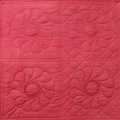
On the right you see the cross-hatching in a similar scale as the wreath. By using contrasting lines (curved and straight), you get some differentiation between the motif and the background. Especially when looking at the block quilting in dark thread, it works.
When you reduce the scale of the cross-hatching, you get further contrast of scale as well as line. This really helps accentuate the motifs. In antique quilts, this is how they got those beautiful wreaths and feathers to stand out and be noticeable, even though they were usually using white thread on muslin. This photo will enlarge if you right-click and open it in a new window or tab.
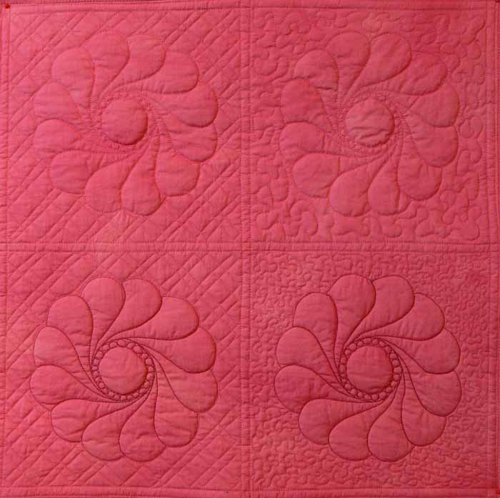
In the stippling examples, boooorrrrriiiinnnngggggg, the larger stipple doesn’t do much AT ALL for me. The scale is too similar to the curves in the wreath. No significant contrast in line or scale. In the second block, the small scale of the stippling really helps “pop” the motif, as well as the small-scale cross-hatching. However, I still think there are lots more creative ways to deal with the background than boring old stippling. You can see the nearly-no-mark sampler I teach in my intro machine quilting classes here or here. That sort of background quilting is a LOT more fun (and visually interesting, at least to me!).
Finally, here’s a picture of the back. I used three fabrics on purpose to illustrate how the back looks when you have
- a solid (ish) fabric that matches the front
- a busy print
- a solid fabric that contrasts with the front
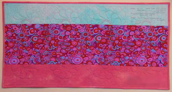 If you right click on this image, you can open it up larger to see more detail (I hope!).
I prefer to use a bobbin thread that matches the needle thread so that small variations in stitch tension and balance aren’t noticeable. Some quilters REALLY don’t like it when the bobbin thread contrasts with the backing. Personally, I really like the line-drawing appearance. As you can see from these photos, the bobbin thread is visible (but not very) on the matching solid, disappears completely on the busy circle print fabric in the center, and makes a nice picture (to me anyway) on the blue:
When I finish my Hawaiian-style jumbo 9-patch quilt, Nourish the Body, Nourish the Soul, I’ll share the background quilting on that and on a couple of my pattern quilts.
January 9th, 2008 at 2:10 pm
Fantastic post ! Great job -as always !!
January 9th, 2008 at 3:52 pm
Lots of good information there. I’m always at a loss when I get past stipple (or meander as it usually turns out) and you have given me some ideas here.Thanks.
January 10th, 2008 at 11:04 pm
Your quilting is very nice! I could never had done that well on my domestic machine! I enjoyed looking through the rest of your blog, especially the snow pictures. We’ve had one measureable snow in the past 35 years!
January 11th, 2008 at 2:20 pm
Thank you for the great pictures here and great info. I really like the smaller scale cross-hatching — that’s the look I’m going to be aiming for. (And I’m with you — don’t like the stipple stitch).
January 12th, 2008 at 8:18 pm
GREAT post, SA! I can’t wait fro your book – it’s going to be so PACKED with info!
January 21st, 2008 at 9:21 am
Wow, Sarah, I am very impressed at your work. I really like the snowflake concept. And I’m definitely going to check out your book recommendations! (from a fellow Pickle-head)
July 13th, 2008 at 8:01 pm
[…] blogposts about the book, in reverse chronological order, are here and here and […]