email Youtube

Home
Galleries
Blog
Workshops & Calendar
Store
Resources
About
Contact

Author Archive

Conversations, Part 3: the smaller pieces and fixing it…

Friday, August 12th, 2011

By the time I got to making the two small pieces, I had ONE week left, and lots of other stuff to do during that week.  Can you say work fast?  Under pressure?  SHeesh!  I really hope life slows down, because I can’t take too much more of this!

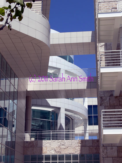
One of the architetural photos I took and used for the small pieces

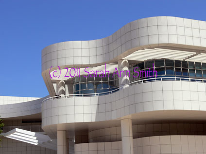
The other of the architetural photos I took and used for the small pieces

These two photos were the ones whose lines shadows most inspired me.  I love the interplay between straight lines and the curved, the grid of stone and the undulating shapes, the blue sky and the white stone, and the shadows.  I love how the architect used bands/lines of (metal?) whatever to create de facto louvers to shield the galleries and interior spaces from the bright sunlight, and how those bands create striped shadows on the pillars and walls.

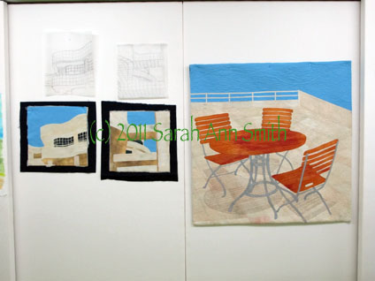
Here are the two smaller pieces, with batting and backing sticking out, and their sketches/tracings above.

Due to lack of time, I quilted both small pieces at once… I’d thread up on say ivory, quilt those areas, switch to cream and repeat, then to tan, etc. on both quilts, working my way to the dark of the windows and the sky and, finally the facings!

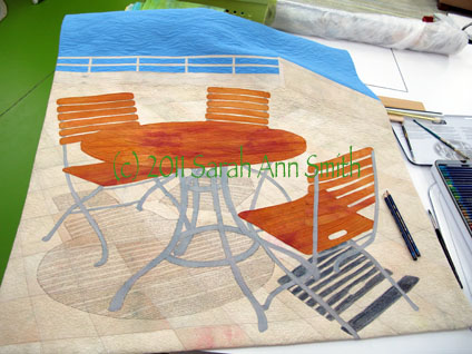
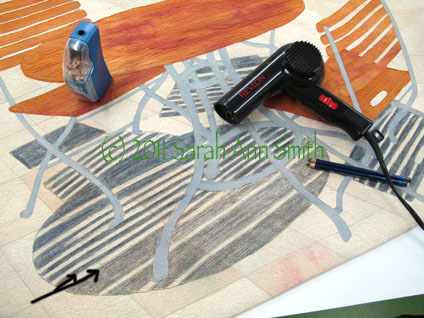
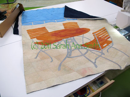
But I still wasn’t happy with the shadows from the table and chairs, so I went back to the now not-quite-done central piece.  In the next photo you can see the two pencils plus the paintbrush.

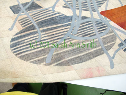
I still wasn't happy with the shadows (or lack thereof) on the main piece, which was ostensibly finished. Guess not. So I took out my Inktense by Derwent pencils (the Payne's Gray and a neutral gray) and took a deep breath

This picture shows the table shadows partially done....

Using the pencils was a bit of a "thriller" moment: I used two colors of gray to get the shade I wanted. The lighter gray on the bottom is where I have colored over the gray quilting threads with the pencil (see black arrow marks on the photo). You can then dampen the pencil marks to create an ink and intensify the color. However, I didn't want the color to bleed into the sunny stripes that came through the slats of the table. So I took out the hair dryer! I used a damp paintbrush in my right hand to moisten the ink, and the hair dryer in my left hand to dry as I painted/wet the pencil-ink. I had very little bleeding into the sunny stripe as a result, and what I did have doesn't really impact the image much at all. PHEW...time for a nice glass of wine after that... I could have totally ruined the whole, finished thing...with just days to go before hanging the show!

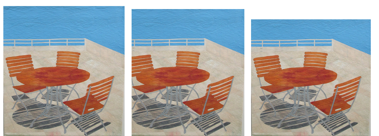
The quilt was getting better and I was disliking it less.  But it still wasn’t quite right to me.  There was too much blue at the top.  So for the show I “cropped” it by folding the top to the back… I’ll decide how much to trim off the top and re-do the facing and hanging sleeve after the show comes down.  So here is a question for those of you who have slogged through these blogposts:  how much should I remove from the top?  Here are three VERY similar versions:

So I do I leave it alone (far left), crop a little (center) or crop a bit more (right)? Photo is clickable to see it larger...

So do I leave it alone with lots of blue, crop a tiny bit, or crop a little bit more?  The photo on the far left is as made.  The way it is hanging is about where I photoshopped it in the center photo, and the one on the right is close to square (think symmetry with the proportions of the two small pieces).  So do I crop?  How much?

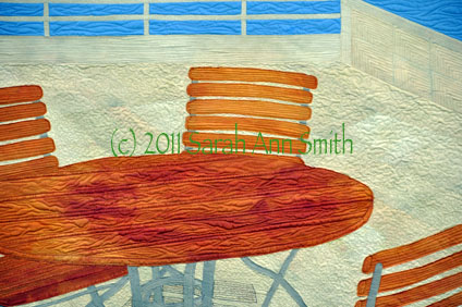
And just to remind you…here are the three pieces done and in the show:

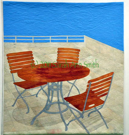
Conversations by Sarah Ann Smith -- click to see larger

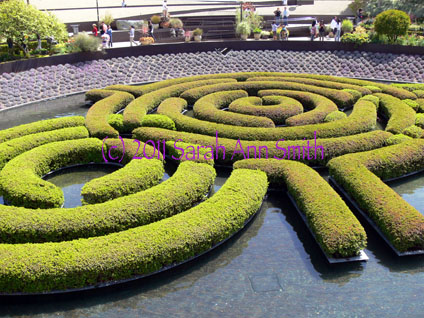
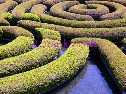
And yes….I might maybe do another quilt or two… I mean, look at this water-maze-garden-hedge…  how cool is that?  and the cropped version below?

the green is hedge, the dark in between is water!, and beyond are plants on the "bowl" shaped slope in the gardens that surround this water feature.

I just LOVE this rhythm and repetition....

Conversations, Part 2–starting the quilting

Tuesday, August 9th, 2011
The last time I wrote, I shared the ideas and dyeing the cloth and assembling the top to Conversations.  In this post, I’ll share the quilting, or at least the first part of i
I guess you’ll have to believe me when I say that in the narrow channels on the table, where the wood goes down vertically, there is writing to create the “shadow”

The path to finished wasn’t exactly smooth.  I dyed the fabric…several times.  I was having a bit of a brain scramble, and not once but twice mixed up the proportions of red-yellow-blue.  At least I have some lovely browns, and fortunately I managed to make just enough of the creamy stone to make all three pieces!  The sky fabric is the first time I’ve tried a vat dye (versus low immersion) where you stir the fabric to get a smooth, even color.  But since the Los Angeles skies are screaming blue, I was so happy when this turned out just right, and on the first attempt (thanks to taking a few dyeing fabric workshops with Carol Soderlund).

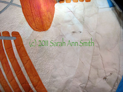
For this piece, I decided to try something different…instead of fusing the entire top, shifting my piece of non-stick press sheet as I work (I LOVE my Goddess Sheets from MistyFuse!), I thought I’d fuse everything to water-soluble stabilizer, often used in embroidery or thread  sketching.  What I didn’t think through is that because the top is FUSED, the stabilizer wouldn’t disintegrate when wet.  In fact, it ended up looking like a crumpled paper bag.  Erg.

I used a small stipple on the paving stones to simulate the porous texture of the stone (usually I stay far away from a “regular” stipple!). As you can see from the unquilted part, the fused-to-stabilizer area looks hideous!
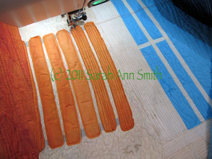
The slats on the chairs also just looked rumpled. I had wanted to leave them unquilted in the center so they would have more pop or loft to them, but they just looked icky. So when in doubt, quilt it to death! Here’s the in progress picture…


Some quilting done, but not all…yet.  Size will be 36 wide by about 40 tall….
And at the same stage, but the back. As you can tell, I haven’t begun work on the sky or the chairs/slats.  Why do I so often prefer the backs of my quilts?


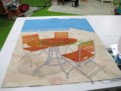
Shadows quilted, sky quilted, squared up.  I don’t really like it.  (Don’t worry…I made it better…at least I think it is better….)
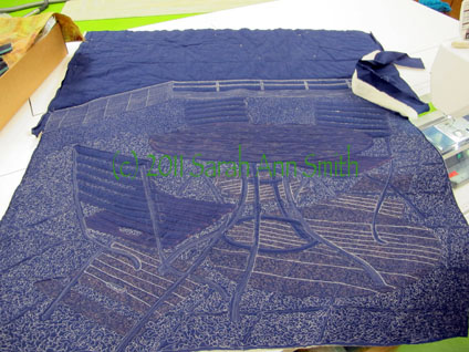
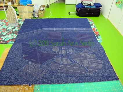
The back, with the quilting done.
Facings and hanging sleeve are on, and up on the design wall. Still not happy…the shadows aren’t bold enough. It was those striking lines and contrast that grabbed me, and that impact isn’t there.

In the next post on this series, I’ll share what I did to fix the quilt (well, I hope I fixed it and didn’t make it worse!) and the two smaller pieces.  More coming soon!

Conversations, Part 1–the idea, the photos and starting work

Saturday, August 6th, 2011


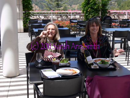
When my fellow Frayed Edges and I started talking about the “Letters” challenge (see the posts in July about our Frayed Edges show at the Camden Public Library), I was working on my online lino-cutting class with Dijanne Cevaal (posts here and here and here and here).  I wanted to use writing on the fabric similar to how Deborah does, and also to perhaps make some linoleum blocks or screen prints to print onto the fabric. As I thought about the title for my pieces, I thought about the conversations that happen at the lunch tables at the Getty Museum…
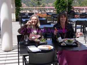
Lunch was lovely! (and I have NO idea why the watermark is now smack in the middle of the photo!)

and realized that words make letters  make conversations.  Then I realized that it wasn’t just about the literal conversations, but about the interplay, or the conversation, between the sky and stunning lines of the architecture, between the museum patrons and the artwork, between the straight and curved lines in the buildings, between the buildings and the equally stunning landscape.   Conversations among the elements and principles of design–line, shape, form, harmony, rhythm, contrast, repetition….  and finally, the conversation between me and the materials:  white cloth,  dyes I used to color the cloth, and  thread.

Here are my three pieces (click to see larger):
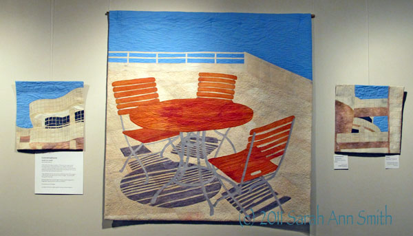


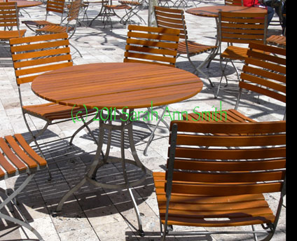
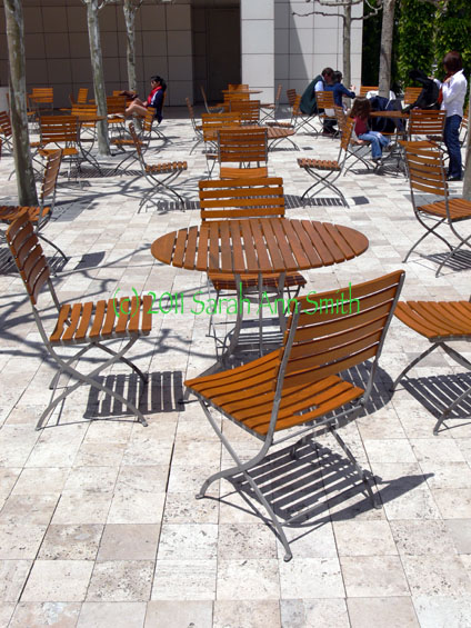
I based the center piece on two photos:
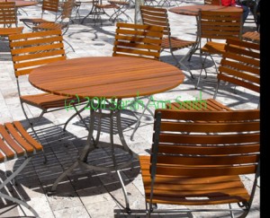
This was the main photo; I used the two chairs on the far side of the table, but didn't like the position of the chair close to me
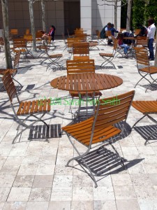
The chair in the foreground became the one on the near side of the table, but I had to account for the change in the location of the sun

And the smaller pieces were based on photographs I took of the buildings.

It is the contrast in straight and curved line, stark stone against the brilliant blue sky, and the shadows cast by the lines of the architecture and the lines of the bistro tables and chairs in the patio that sang to me.  At first I was going to make the center piece based on one of the buildings.  Then I realized I’d really to have a least a snowball’s chance in a very hot place of selling my work, and the chances of selling a quilt of the Getty Museum (located in Los Angeles) while based in Maine was pretty much less than zero.  So I switched gears and focused on those wonderful tables and lines and shadows.

With all the tumult in my life, the lino-cutting and screen printing, which I thought I would use to texture the cream colored cloth for the stone used to face the buildings and pave the courtyard,  just didn’t happen…I ran out of time and just didn’t get to explore the use of letters in the way I had hoped.   But I did write on the quilt to create the shadows on the table and chairs where there are vertical surfaces on the slats.  It is *really* subtle now that it is quilted…I’ll confess even I have a hard time reading the words! But I promise…the words ARE there (maybe it’s the way conversations fade and vanish into dim memory?).

Before I got to the writing, however, I had to make the cloth.
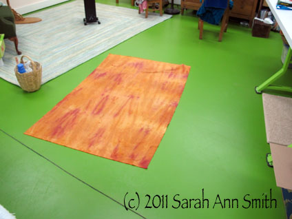
The fabric dyed for the tables and chairs, on my green-painted studio floor

Then I had to mess around with the cloth.  I couldnt decide how to make the shadows.  I tried darkening the light stone cloth.  I tried lightening the dark gray cloth.  I used various methods.  I didn’t like them!  It looked like paint on the paving stones–not shadows.  Somehow I needed more transparency, and any sheer fabrics in my stash were to shiny/cheezy-prom-dress stuff.  So I decided to try doing the shadows with thread at the quilting stage.  Hmmm.
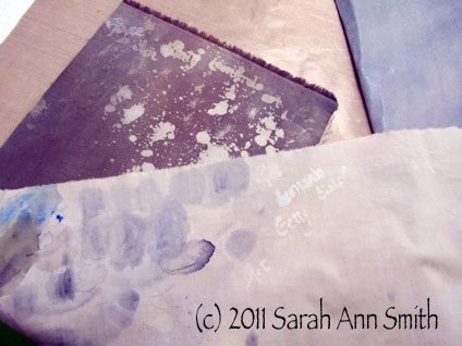
I tried paint, pencil, ink, assorted other painats, bleaches and discharge agens. Nothing quite worked for the picture in my head. Hmmm....

Then there were the table legs…here, the freezer paper patterns for all the table and chair components that were metal.
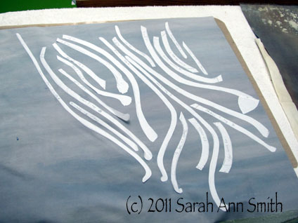
No, not white spaghetti, but to-be table and chair legs

Then the construction process began.  I decided to try something new.  Having tried it, I can tell you I will NOT do this again!   Usually when I create a fused top, it is an independent thing… I fuse the top on my non-stick sheet, moving around as needed.  This time, I decided to try fusing things to a base, in this case a large piece of embroidery stabilizer.  This stabilizer is (when used under embroidery or applique) water-soluble and turns into little bits of polyester fiber, which helps add loft to the applique or become a bit more batting.  What I didn’t think was that by fusing the fabric to it, I would make it impossible for the stuff to “dissolve”.  Erk.  Not so great.

Here’s the top in progress:
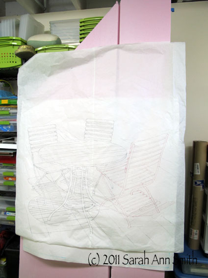
The initial "sketch;" I used my digital projector to project the photos onto the paper, then outlined and created the composition from a couple photos.
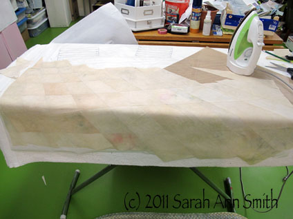
The fusing begins. I cut freezer paper patterns for the paving stones, then cut from various light and dark areas of the hand-dyed cloth to get the varied appearance of the terrace.
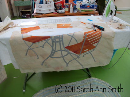
Placing the chairs and table top.
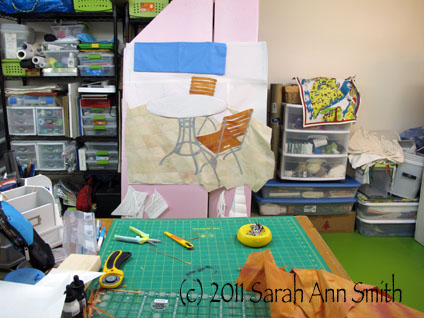
Checking out the sky fabric. This railing and table scene doesn't really exist... but I so wanted the contrast of stone and sky, and most of the tables are in a courtyard area. So I made up a terrace that has a railing and sky in the distance!

Next, I had to figure out what my made-up railing and side wall would look like.  Straight across was too boring, so I added the angled wall.
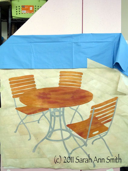
This looks like it can work

Finally, the top is done:
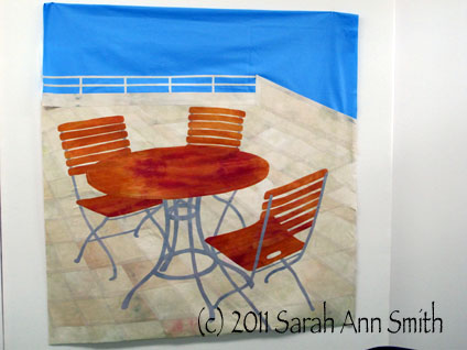
The top, done, before it started looking like a brown paper bag, wrinkled!

Next post I’ll talk about the quilting, at least the first part of it.


Leaf Table Runner

Wednesday, August 3rd, 2011

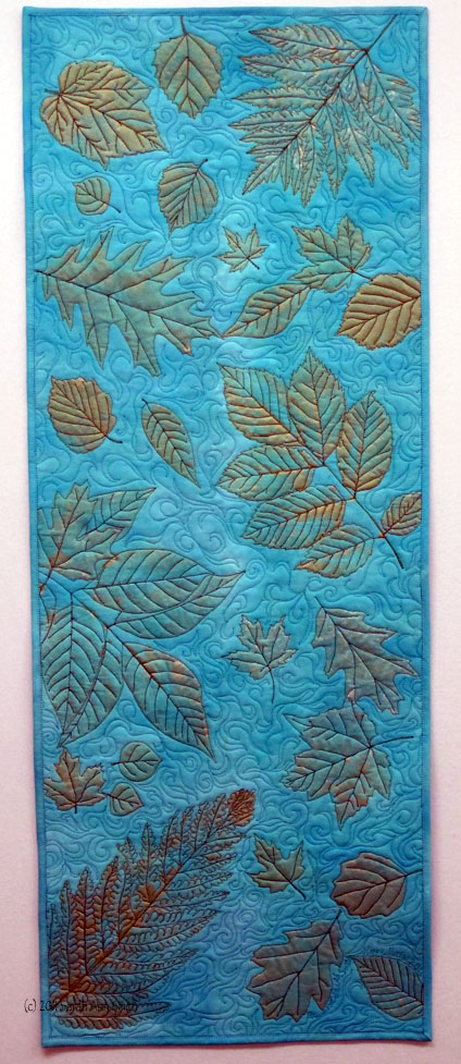
This summer our younger son was invited to be a part of People to People’s trip for middle school kids to Australia!  The kids are apparently nominated by teachers, school staff, even other “alumni” of the program.  We don’t know who nominated Eli, but are thrilled he was able to go.  As part of the trip, the kids stay with a family for two nights and typically take a gift from their home state.  Eli took some Maine honey and Maine maple syrup, but we thought we’d add a special something:  a quilted piece made by Eli and me.

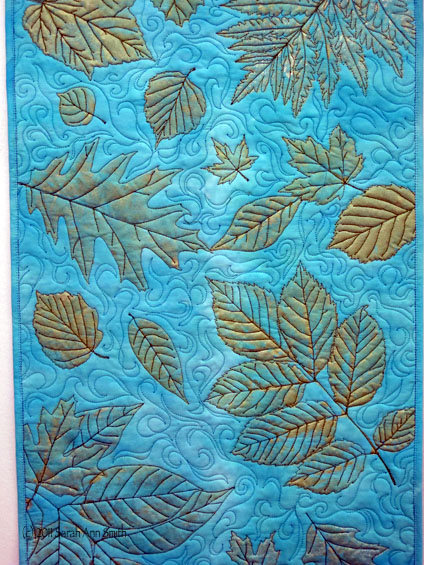
The finished piece. Aqua hand-dyed fabric by me, gold/green leaf prints by Eli and me, quilting in green by me (mom)

Eli picked the leaves from our land in Hope, we printed the fabric together, then I quilted the piece.

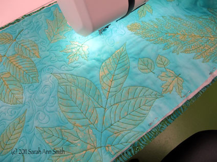
The wall-hanging/table-runner while being quilted

Originally, I thought this could be a table runner, but despite heat-setting the Jacquard Lumiere paint when I did a test rinse and dry (I like to wash to-be-used gifts so folks aren’t upset by the change from never-washed to the way a quilt looks after washing), some of the paint came off.  Wonder if I didn’t heat-set enough?  Anyway, it still looked nice….and in looking at the before and after washing pictures, maybe it didn’t lose as much paint as I initially thought.

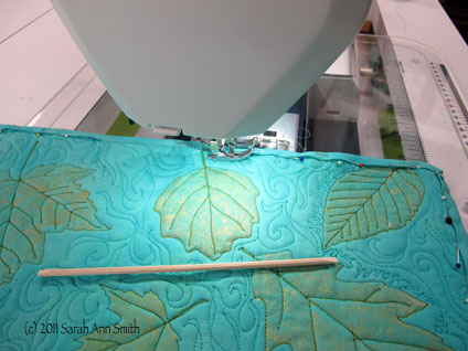
Sewing down the binding by machine; I first stitch the binding to the back, then turn to the front. The wooden thingy is (I think) a cuticle stick; it was included to help piece a John Flynn miniatures kit, and it works even better than a skewer in some instances because of the blunt tip. I will now be recommending this tool along with the skewer to my students.

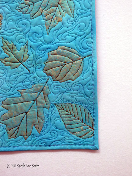
A close up of the bottom right corner; for some reason, the thread looks red in this photo...it is actually green!

Close-up, center left

Teaching in Floyd, Virginia

Sunday, July 31st, 2011

On Sunday between teaching in Harrisonburg and teaching in Floyd, I used my morning to work on my final two pieces for the Frayed Edges Letters challenge.  I knew which photos I wanted to use, but needed to do my tracing and drawing.  I then slowly tootled my way down to Floyd, only a couple hours south of Harrisonburg and maybe 30-35 miles north of the North Carolina border.  Talk about beautiful country!   I turned off the interstate to a rural highway to a rural road to my hostess’s house, and snapped this view:

Virginia is so beautiful....

In Floyd, thanks to quilt artist Susan Brittingham, we were able to work with the Shenandoah Valley guild to share the expense of my travel so that I could teach in both venues…way cool!  There are some pretty impressive artists and quilters in the Floyd guild, the Old Church Gallery Quilt Guild (I was only a tad nervous ahem!).  Again, we did a lecture, a half-day (Balinese Garden) and full-day (Tame Fiddly, Fussy Threads).

I love it when students look this happy!

Here, a student is testing various stitches on her sample on the left, then decorating her block at the machine

I encourage students to make a practice sample, then if you don't like the stitch or your thread choice you don't have to pick it out! This student was smart, saving fabric by using the cut-out bits (the darker blue) for practice


After the end of the first day, a few of my students kidnapped me and took me for a drive along the Blue Ridge Parkway....thank you Sallie and co.!!!!! Here we stopped at the Chateau winery

Looking east from the parkway to the Piedmont (which in French means foot of the mountain)...sigh...so beautiful!!

Stenciling with paint...some new variations

LOVE the copper on black

Two ladies busily painting; we start the class with the painting, then do the talking about threads and needles and tension and fussy thread while the paint dries, then move on to stitching

Several of the students were in both classes, and decided to combine the projects into one...cool!

The students cut out leaf shapes from the freezer paper, then stencil


Another "combined" project with bright happy colors

The silvery green is lovely!

Stitching with the "cranky" threads isn't so difficult once you learn the tricks and tips

That green one, stitching begun

Remember the lady who used the cutouts for practice stitches, ditto for the stencils; you may be able to see she has written notes to herself about stitches and threads


Quilting happens! I like how the color-printed black cloth works with the metallic paints

More quilting

And my hostess's piece...wonderful! (PS...Hi Pauline!)

Here's a soul who loves quilting as much as I do!

Another practice piece...fun to see the differences in the stitches

Stunning colors and stitching

And on the start of my trip home, I was headed toward the rural  highway that would take me to I-81 and rounded the bend to see this…luckily no one was behind me and I could stop and grab the camera!

Leaving the Floyd, Virginia, area

Thanks so much to Fran Miller and the Shenandoah Valley Quilt Guild and Susan Brittingham (who teaches for QuiltUniversity.com by the way! You’ll see the gorgeous countryside in her quilts) and the Old Church Gallery Quilt Guild for inviting me, their hospitality and kindness.

As we packed up on the second day in Floyd, one student came to me to say thanks.  She had told me earlier that her husband had died last summer, and at the end of class she told me that her sister had passed away a  month before, and this was the first good day she had had since then.  What a gift she gave me by sharing that…  that’s what quilting is about.  Sharing, comfort, joy in the making, learning–and it’s not just quilting that you learn.  Here’s to more good days.