email Youtube

Home
Galleries
Blog
Workshops & Calendar
Store
Resources
About
Contact

Archive for the ‘In Progress quilts’ Category

Joshua, the quilt in process, #5

Monday, April 26th, 2010

Some time ago (that great whooooshing and sucking sound is time roaring past us), I blogged about having my Naiads quilt critiqued at QuiltCritique.com.  A joint venture with Lisa Chipetine and Sandra Sider (who also happen to be the current president and vice President of SAQA–Studio Art Quilt Associates), this is an online process where you send in your jpegs to Sandra two weeks before an appointed date.  She ponders and comes up with suggestions to improve your quilt.  She has that great skill of asking questions that make you think, that are open-ended and help you learn as you talk about something.

(I promise…there are pictures below!)

Well, the process was SO educational–I think listening to the critiques of the others on that evening’s session were maybe even more informative because I wasn’t invested in the outcome, but an observer–that I really wanted to have Sandra look at this piece.  So I SLAMMED to get it done in time to have her review it and still have enough time to make changes (if needed) to the top and then get the quilting done by the deadline.    It was worth every penny of the modest fee and MORE!  Best of all, Sandra had only three relatively minor suggestions:

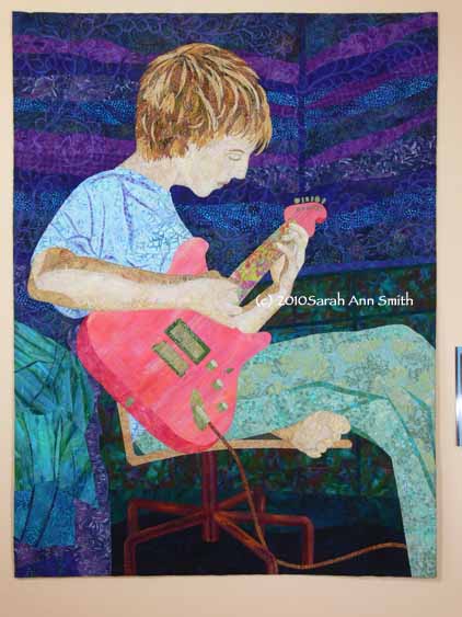
1.  Add details to the face; I told her the entire face would be added in the stitching… I left the face just as a single piece of cloth at the top stage.  Problem solved.

2.  There was a tiny bit of dark wall showing between Joshua’s hand and the neck of the guitar–it really bugged Sandra and pulled her eye, distracting her.  This was not a good thing, so even though it was true to life, it needed editing.  So I moved his hand a bit to be more closely curved around the guitar neck.  Problem solved.

3.  The initial lines at the bottom of the dresser and the wood on the bed came together at accurate but odd-looking angles.  So I added a bedskirt and more bedding to change the lines and better lead the eye up to the focal point.  Problem solved.   Here’s the before, as I was testing out floor and chair base:

Then, with more in place (note, the purple vertical is the bedpost):

and after:

In the next post about this quilt, I’ll finish up the process with the quilting, sharing some of the background quilting and showing you the array of threads used in the entire piece.  See you soon!


Joshua, the quilt in progress #4

Friday, April 23rd, 2010

Once the torso was complete, PHEW!, it was time to tackle the guitar.  With the shirt and pants a medium-light value in cool colors, I wanted the guitar to be a medium-light warm, especially since both of Joshua’s guitars are red (he has this cool idea that he will keep all his guitars and have a gallery of them, and hopefully all red!).  I didn’t have quite the right colors–I tested out a couple of options.  Here you can see me “color-blocking” early on:

I found a couple fabrics that were close, but not quite.  A hand-dyed-look batik fabric was too pale, and a batik was too contrasty.  Solution?  Pull out the textile paints and fix them!

The fabric in the upper left corner is the “before”, the piece on the upper right is the “after” that became the main body of the guitar.  The contrasty swirly lovely batik on the bottom became the lower edge of the guitar.

The neck of the guitar proved to be one of the coolest moments of the construction process.  Initially I pulled some stripey batiks, thinking to use the stripes to simulate the frets on the guitar, but I just didn’t like how they looked.   Then I found this awesome batik (another one that I wish I had yards of…), a lime green with weedy flowers (or flowery weeds) in coral and pink.   I was a bit nervous about the color choices, but the neck was SO COOL in this fabric with a single stem running up the center!

The night I got the guitar fused, I showed Joshua the progress, more than a bit nervously.  His reaction: “that is SO COOL… if I could find a guitar like that I’d BUY it!”  WOW!   It doesn’t get any better than that!  And if I win the lottery (better buy a ticket, eh?), maybe I’ll just get him one custom made.

You can also see the wall in progress.  In real life the walls are a lovely celery green, but I needed a deep dark, so I raided my stash of blues and purples.  Although the walls are shiplap siding (wood, painted), I decided to be a bit more freeform and cut wavy-edged strips.  I like the sense of motion it gives to the entire piece…like the room is rockin’ with him!

Here is the quilted guitar, with the sounding board (or whatever that stuff is on the bottom) fused on, but the strings weren’t stitched until the very last.

And of course, I have to share the back side with you.  I think the guitar is the most densely quilted part of the entire piece… about 1/16″ apart over the entire surface!  In the photo above, again you can see the colors of thread used for quilting.

Hope you’re enjoying the journey as much as I enjoyed making this piece,

Cheers, Sarah

Joshua, the quilt in process, #3–hair!

Tuesday, April 20th, 2010

The feature that gets the most comments on this quilt is the hair.  Would you believe it is made from batik fabrics that are trees, shrubs, thickets, flowers and whatnot! Astonishingly, I actually remembered to take in progress photos, including of the fabrics (before I used them up)!  Here is some/most of the cloth:

And here is a bit more:

Then I started creating the base of the hair.  I slipped a pattern under an applique press cloth as a guide.  I cut larger chunks to begin:

Then I cut slivers, collaging them on to the surface–notice on some how I feathered the ends:

I kept adding:

And adding, until it was Joshua’s hair, and I fused the hair to the face:

I use one of those itty-bitty 18mm rotary cutters.  For years I delayed buying one…after all, why did I need another?  I had my trusty 45mm!  OH BOY do I love the little ones.  The jumbo that some folks use, the 60mm, is like a school bus:  large, does a lot, but cumbersome.  The 45 mm I use most of the time is the all-purpose mini-van.  The 18mm is the Mazda Miata, that nifty little sports car that corners and twists and turns in tiny spaces.  It pivots on a dime… it is great for freeform cutting (not so great with a ruler though).  So I set out a chunk of pre-fused (with MistyFuse of course) fabric, and slice up curves and slivers.  Even with the layering, this hair stayed pliable–not stiff at all!

Finally, I quilted it.  The 16 threads on the surface are the ones used in his face, arms, foot (not seen in this shot) andhair:

In the first attempt picture, Joshua has a dark patch under his right eye and a too-pale bulb on his temple.  Those stitches got picked out and re-done alternating two colors of thread since of course, even with hundreds of spools and probably two dozen browns I still didn’t have enough of a smooth color range! But as you can tell, it turned out right in the end.

I always love the back side of my quilts, so I have to share this picture, also in progress:

And a bit more of the back:

I’ll have more soon…the guitar,the background, the furniture…..stay tuned!

Joshua, the quilt in progress, #2

Wednesday, April 14th, 2010

So last post on this topic, I said I’d share how I began the quilt itself:  the hardest part first.  That, of course, would be Joshua!  The face, head, hands, then body.  When I first thought about this quilt, I had thought I would do something like I did with the quilt of our pug, Pigwidgeon, and it would be in totally NOT realistic colors.  If I wanted to stick to light values for the skin tones, that meant I had the following not-realistic options:  pale pink (nope), pale yellow (nope, sallow), pale green (the Green Giant?), pale blue (nope, sickly), pale purple (BLEAH! NO!).  So I revised my plans and decided to use real skin tones and tweak all the other colors.

I found a batik that was pale beige and golden scrolls, and decided that would be my base for his face and neck, selecting a darker part of the fabric for his neck.  I underlined it (fused it to) a solid white to prevent the dark walls (which would go behind his head) from shadowing through on the “seam” allowance.  By the way… I should add that this entire quilt top is fused applique, using my favorite fusible,  MistyFuse.  Even when you have multiple build up layers, like his hair, it stays supple and fabric-like…unlike some brands the feel and sound more like cardboard once you get two layers or more!

For his arms, I used five values of cream to dark tan for the shadowy side of his arms.  The rest of the shading was done with thread.  Note the bottom of his foot, down low on the wall.  For the clothing, I used three values:  I picked the main fabric for the t-shirt, then found a lighter blue and a darker one for the highlights and shadows of the folds.

Next, the hair!

Joshua, the quilt in progress, #1

Saturday, April 10th, 2010

A short while ago, I was able to share the finished results of my most recent “big” (36 x 48 inches) quilt, a portrait of my son Joshua.  I love seeing quilts come to life, and watch the creation process when other folks make things, so I thought I’d share how this one came together.

First, several months before I finally got to cut fabric, I took photos of Joshua playing guitar (after asking nicely for a few weeks, I finally pinned him down one evening).  Sitting on the floor to get a not-the-usual angle, I took about 60 or 70 snapshots, many of which I was able to rule out immediately (mostly due to closed eyes, mouth hanging open, blurry fingers).  I narrowed it down to three:  one for the position of his head (mouth closed, eyes open–on the right, below), another for the position of his hands and body (on the left), and a third for some extra details on the room.

Then, I fiddled around in Photoshop to come up with a line drawing.

I sized this so that it would fit four times on a piece of paper and did what is called a value study.  I learned about this from an online educational resource (pay to play–thanks Deirdre for sharing this one with me!), www.artworkshops.tv , an online tv/classroom site.  I watched the video by Polly Hammett on Design with the Figure.  One of the things she showed was doing quick thumbnails (quickie outlines) of her intended composition, then using ONLY black and white, blocking out what would be light and what would be dark.  By using only black and white, you get immediate, stark visuals on the shapes and negative spaces (the shapes between), which gives you an idea how the composition will work.

This exercise was INVALUABLE!   Since I never went to art school (last class was my one and only year in art in high school), I’d never heard of this, though it is probably a basic! Here is a snapshot of the value sketches I did, except I “cheated” took a shortcut by using the Photoshop Elements outline.  The two on the far right are the “blanks.”  The one I ended up using is the bottom row, third over:  Joshua’s face and arms are light, the background is deep dark, the guitar medium in value (again, I fudged a bit on the black-white only and expanded it to include a gray).  PS–this one photo is clickable for a larger view:

This helped me decide on my colors.  I knew that I wanted Joshua to be the focal point, with his guitar as the secondary focal point.  That meant if Joshua’s skin was to be light, the wall needed to be dark, not the celery green it really is.  If you look again at the value studies, you can see how much more his face pops when it is against something super dark, not just “gray” or medium value.  I also darkened up the dresser, bedding, and eliminated details (posters, books on dresser, clutter!) to make my life easier and to make the composition more focused.

Next, I used my laptop, hooked up to my digital projector, to project the main photo onto the design wall, where I had taped up paper (medical exam table paper, long, cheap, taped together–bought a roll from my doctor for $5 and it is 3+ years old and still plenty left) and traced out the outlines.  Here’s a photo of the drawing on the design wall with preliminary fabric ideas pinned to it:

Next, I’ll show how and where I chose to begin…the hardest part first!

PS:  Norma asked what process I used in Photoshop Elements.  I’ve tried to duplicate it and I THINK this is what I did:

I think I converted it to grayscale first; Go to Image, then Mode, then click on Grayscale.

Then,  under Filters/Sketch/Stamp, click on stamp and adjust the light/dark slider to about 2… I think.

I just tried to re-do this, and that is as close as I can get.  Shoulda taken notes!