Published in Inspirational Quotes Illustrated; More watercolor lettering with Val Webb
Two years ago I was taking a lettering class online with the wonderful Val Webb. One of the exercises was to choose and illustrate a quote. Back then I wrote about it. Then in late 2013 Lesley Riley put out a call for entries, North Light wanted to publish an expanded version of her self-published Quotes Illustrated. The new book is called Inspirational Quotes Illustrated and is available at Amazon and directly from Lesley here (don’t forget to check out other good stuff from Lesley here).
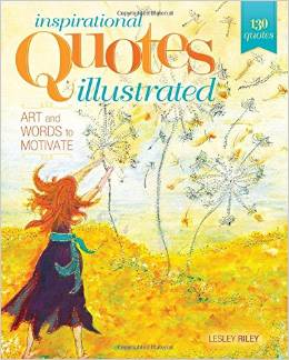
Lesley’s new book really is inspirational!
I have loved lettering since I was required to write with an Osmiroid Italic nib pen in junior high and high school (gotta love Catholic schools!), and I love reading and good quotes, and I love art. All of these come together in this book. There are some new-to-me quotes that may become favorites, there are some wonderful artists whose work I have admired included, some friends (waving at Deborah Boschert, Norina Morris and Jamie Fingal!) as well who are wonderful artists.
One of the things I really love is that the pages are perforated so you can easily remove a page to mat / frame and enjoy on the wall. The page numbers are tucked into the center of the book and remain there–they aren’t on the part of the page that comes out to otherwise detract from the artwork should you wish to frame it. Cool beans!
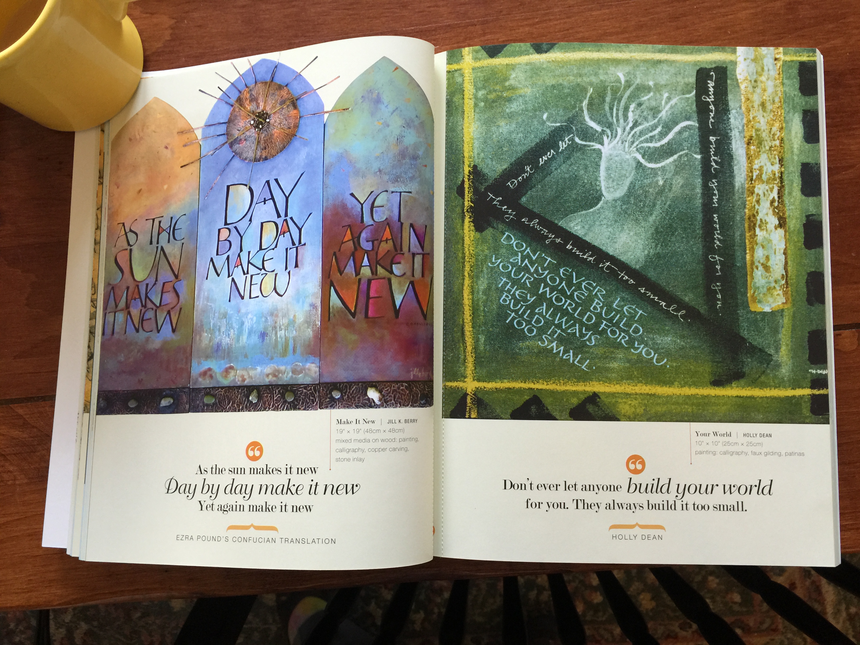
A two page spread featuring artwork by Jill K. Berry (left) and Holly Dean. If you look closely in the center, you’ll see a small bit of orange…
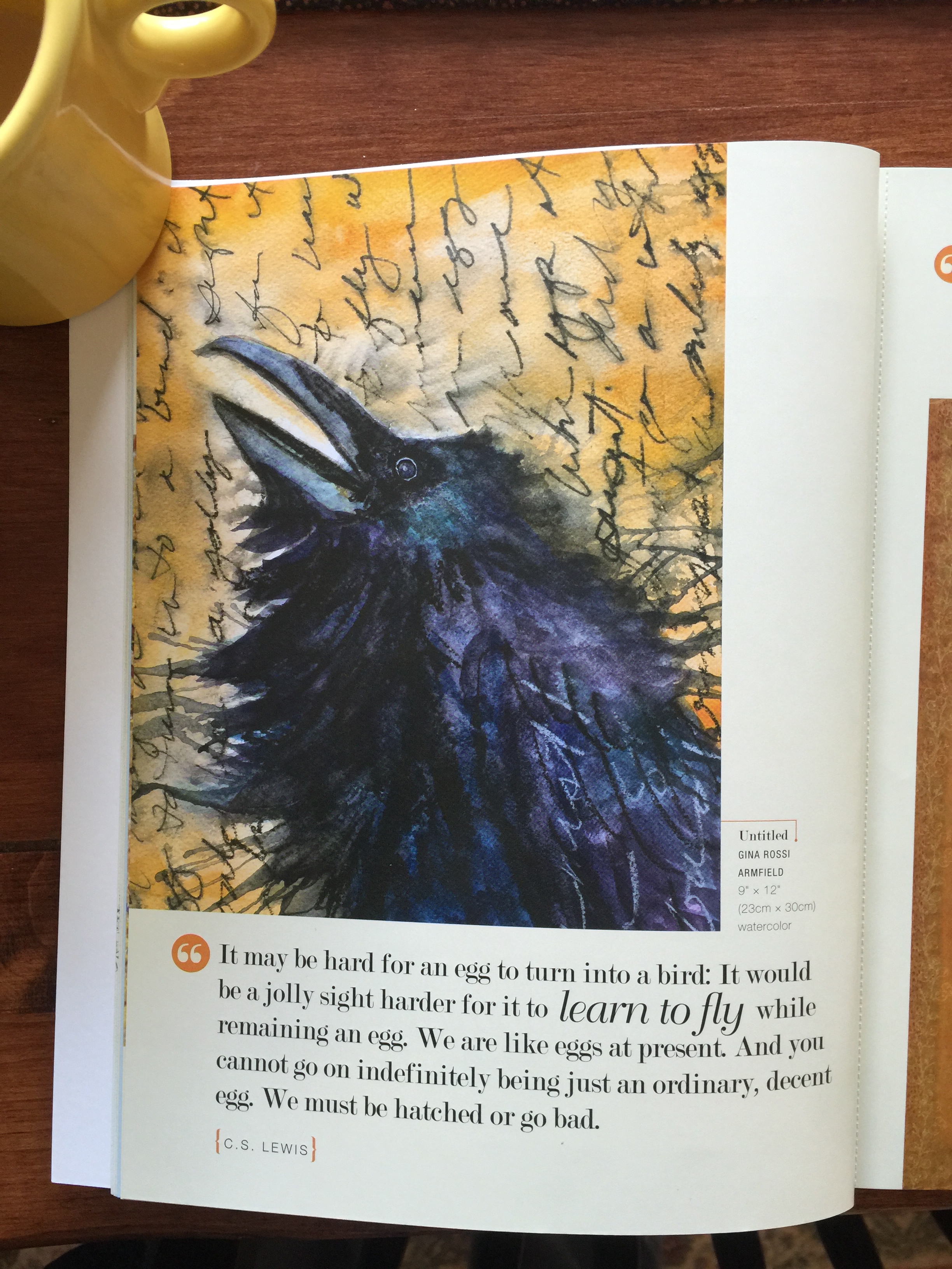
Gina Rossi’s crow/raven takes my breath away!
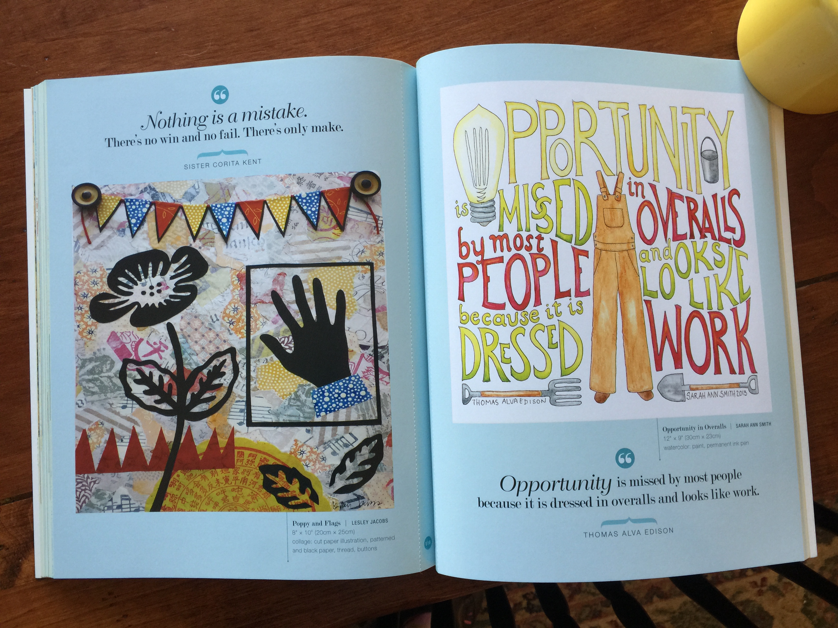
And here’s my page, on the right, with a collage by Lesley Jacobs on the left. If you right click this image, you can see the perforations and the page numbers in the center.
Original blogpost from February 8, 2013:
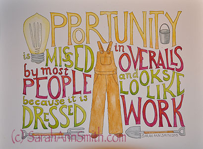
Quote by Thomas Alva Edison. Class by Val Webb, more info here.
Oh my but I am having fun. Of course, it is also a ton of work to make a page like this one (it took all day), but if you had asked me when class began back in late November if I would be able to do this in just a couple of months, I would have laughed! But lookit! I did it! I can’t hardly believe it! This lesson is what Val Webb (click here for her blog) calls “crazy quilt” lettering, with rolling lines and many colors and little bits of art insterspersed with the writing. Fortunately, I’ve been a bit behind and have benefitted from Val’s constructive comments for others pieces before I got around to working on this. I had the wit to send Val my “first draft” before I spent a ton of time painting only to discovered I should have done something different.
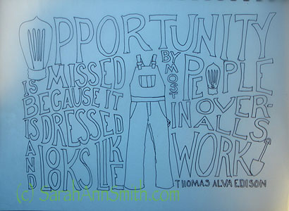
First draft of the Thomas Alva Edison quote with the lettering going all the way across the page.
Val commented that when you have a wide motif in the center as with the overalls, it is hard for the eye to jump across to continue reading. She suggested re-working the design to read as if it were two pages in a book. Brilliant! Took time, but I got it done. Here’s the series of photos shoing my progress:
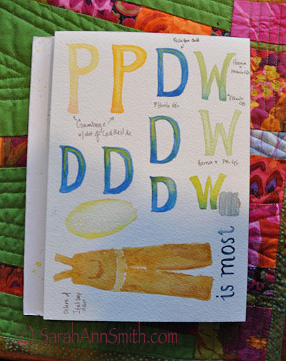
Testing out colors, letter shapes, and so on. Since I live in Maine and the guys wear Carhartt overalls, I opted for the Carhartt color instead of old fashioned demin. As you can see, I originally intended to do the letters in yellow, green and blue. I also tested out a color for the silvery metal at the bottom of the light bulb, and getting a yellow fade for the light bulb.
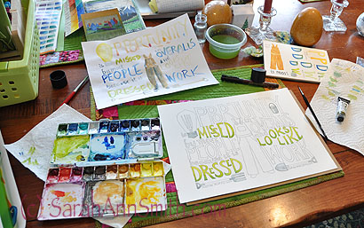
Working away at the dining room table. I even managed to NOT blotch and drip or smudge! And I’m happy I was able to lift the color on the knees to make the fabric look faded and worn by work.
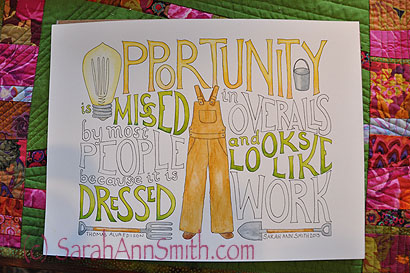
The yellow and green letters are done, so I decided to break for a late lunch. When I took the photo, I realized I had picked up the colors in the placemats I made, and decided I liked the idea of the warm plummy-red better than blue, so changed my color scheme. So glad I did!
And one more time, the photo from the top, repeated for comparison here:
Quote by Thomas Alva Edison. Class by Val Webb, more info here.
I like the way this turned out so much I am tempted to get a custom mat to fit into a standard sized frame and hang it in my studio!
February 12th, 2013 at 10:25 am
Love it! I’m going to have to take this class myself. I love letters and this piece is wonderful! You could also take this to a copy shop and make notecards as well. I had an art teacher who did that with her little pieces and they turned out very nicely.
February 13th, 2013 at 12:51 am
You are just the smartest kid! Keep having fun. Dorothy.
February 13th, 2013 at 8:01 pm
This is very cool Sarah. You should hang it in your studio. I can tell you are enjoying the class, and I look forward to seeing what you do next.
Happy Lettering,
D~~~~
January 1st, 2015 at 3:12 pm
I especially enjoy reading about your process-love the serendipity that happens!