Don’t know that I’ve ever seen #1 come up before! Well done!
Update: comments are now closed. I used a random number generator and astonishingly, No. 1 came up! So I will be contacting Susan to let her know. Lyric will send the DVD out directly, as will I.
Well, you aren’t going to want to watch this once–you’ll want to watch it several times, at least! I can’t believe how much Lyric has managed to pack into about 65 minutes of instruction on her new video workshop Thermofax 101: screen printing made easy, from Lyric Art Publishing. You can order it here, http://lyrickinard.com/2015/02/thermofax-101-instructional-dvd/ . OR you can enter the giveaway–for both this DVD and my own Art Quilt Design: From Photo to Threadwork (here). Read to the end to find out how.
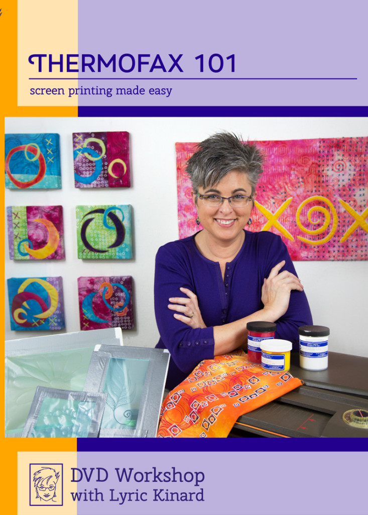
Thermofax 101, Lyric Kinard’s new DVD workshop, is totally worth getting. I can’t believe how much she packed in. Plus, how can anyone not want to spend time with someone with enthusiam and a cute smile?
I was thrilled when Lyric asked if I would like to be part of her bloghop. Not only do I have fun running into her at various fun places like teaching at quilt shows around the country, in Houston, at Quilting Arts TV taping in Ohio, and admire her art (made while being an uber-busy mom) and teaching, I’m also getting more and more into my own surface design. I tend to use surface design differently than many—-for most who are really “in” to it, the cloth is the end product. For me, it is something that goes into my artwork as a supporting player, not the star of the show. So I was curious to see the “hows” and how what she teaches would fit in with my somewhat different approach. The answer is it’s a fabulous DVD!
I watched the video as soon as I got home from about 3 weeks of being on the road, and learned a lot on the first run-through. But I was pretty obliterated by all that travel, so I figured I’d better watch it again: my goodness gracious but there are more and more gems salted in throughout.
There are four segments:
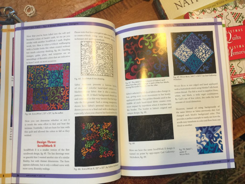
1. What’s a Thermofax, which tells you just that, explains how the machine works and how you prepare the screen for use, including advantages and disadvantages of both ways.
2. Creating Imagery: the key here is to play. Only YOU can figure out what makes you happy, what makes you itch to get to the studio and create. The best way to do that is to mess around. And then Lyric gives you about a bazillion ideas. For those really itching to get deep into how to create your imagery, this section may be frustratingly brief. Honestly, that’s because you could have 100 hours of video, from 33 different instructors, and you’d barely scratch the surface (ahem….pun intended).
3. Printing Techniques. For the FIRST TIME I’ve seen someone explain WHY you want canvas/cloth on the top of a print surface, not plastic. Makes total sense—-why has no one in all the books I have on printing EVER explained that simple, logical (once you’ve heard the explanation) fact? It’s at about 21:20 in the video. And I recommend chocolate pudding, re-purpose the dishwasher detergent. You’ll get it if you see the video LOL! Lyric also shows how to hold your squeegee (as well as explaining what kind of squeegee or stand-in object) to get the best print, including demo-ing to you can see from various angles. Helpful!
Lyric talks about the kind of paint you want, and mentions her favorites, but wasn’t fond of Speedball or Versatex. I agree on the Speedball, but quite like the Versatex. To Lyric, she doesn’t care for the hand of the cloth. However, I have liked it on the small pieces I have done. It’s one of those “try it all (before buying a bunch of any one product) and see what you prefer” things!
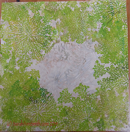
For the nest piece, I took some pale beige batik, my Queen Anne’s Lace thermofax screen and paint to create this cloth, which I love so much I can see making yardage of this to use! You can buy Sarah’s Thermofax Screens at Fiber on a Whim at Fiber on a Whim. To read more about my “nest” please see this blogpost.
4. Designing Cloth. Throughout the DVD Lyric salts in bits of wisdom about various elements and principles (E&P) of design. I was SO clueless when I began art quilting. I then got lucky and took a class at a local community college/extension service while living in Friday Harbor. Since then I’ve looked hard at things, studied them, to internalize the “E&P” of design. As you work with them, you get better so you don’t need to look so hard, but Lyric brings them up in an integrated manner that will help you have better results, sooner. And she shares a tip I discovered the long way around: if you have a yucky piece of cloth, or don’t like what you did, just add more layers. After all, is it going to get worse? No. And it might well get better.
You also get a PDF on the disc with
- a list of supplies,
- where to get screens made in the US, Canada, Australia, England and Germany
- info on suppliers of machines, screens, frames, textile paints and surface design supplies
- footnotes for each chapter with internet links
- plus Lyric has some helpful free tutorials on her website that will supplement the information on the DVD
I wish I had had this video when I started out. Some videos about printing are Graduate Student level, and overwhelm you. Some are so basic you could have gleaned all the good stuff from a four-page (with lots of large photos) article. Lyric’s is correctly titled Thermofax 101 (so Lyric, will you do a 301 or 401 for us too?); it’s aimed at the newbie. But those of us who have been doing this a bit can still learn plenty. So I’m going to go play, then in a month or two view my copy again.
To win a copy of this DVD AND a copy of MY DVD,
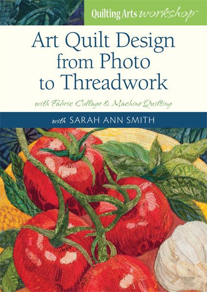
my video workshop that takes you from your photo to a finished art quilt
leave a comment by 7 a.m. May 21st East Coast Time. I’ll use a random number generator and whoever left that comment (please keep it to one comment per person, please) will win both copies. Lyric will mail hers out directly, as will I. International entries are OK!
Check out the other reviews on this bloghop:
May 14 Deborah Boschert http://deborahsjournal.blogspot.com
May 13 Jamie Fingal http://JamieFingalDesigns.blogspot.com/
May 12 Desiree Habicht http://myclothesline.blogspot.com
May 11 Susan Brubaker Knapp http://wwwbluemoonriver.blogspot.com
May 9 kathy york http://aquamoonartquilts.blogspot.com
May 8 Carol Sloan http://carolbsloan.blogspot.com
May 7 Liz Kettle http://www.textileevolution.com/index.php/our-journey
May 6 Jane Davila http://janedavila.blogspot.com
May 4 Linda Stokes www.lindastokes-textileartist.com
May 2 Judy Coates Perez http://www.judycoatesperez.com
May 1 Susan Price & Elizabeth Gibson http://pgfiber2art.blogspot.com/
April 30 Judy Gula http://www.artisticartifacts.com/blog/
April 28 Sue Bleiweiss http://www.suebleiweiss.com/blog/
April 27 Melanie Testa http://melanietesta.com/blog/
April 25 Leslie Tucker Jennison http://leslietuckerjenison.blogspot.com
April 24 Cheryl Rezendez http://www.cherylrezendes.com