email Youtube

Home
Galleries
Blog
Workshops & Calendar
Store
Resources
About
Contact

Author Archive

Sketching and playing

Wednesday, June 25th, 2014
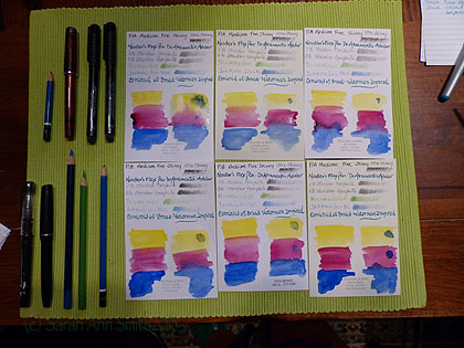
Playing with the Stillman and Birn paper samples

Playing with the Stillman and Birn paper samples.  Pens and pencils I used in my test are to the left.

First up:  my apologies–this post got REALLY LONG.  But I have a feeling I may be referring people to it so wanted ALL the info in one blogpost.  So here goes:   many moons ago, the generous folks at Stillman and Birn sent me a sample pack of their six papers because I didn’t know what to order in a sketchbook, and the sketchbooks aren’t exactly inexpensive so I didn’t want to buy six.   I decided to do a controlled test on the samples using various pens, pencils, inks and watercolors.  The paper comes in two weights:  100 lb and 180 lb, two colors: white and ivory, and three finishes:  vellum, cold press, and smooth.  Vellum is a velvety finish (not like drafting vellum which is like a heavy duty tracing paper); smooth is comparable to hot press.  Here’s the S&B information:
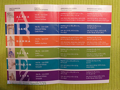
Stillman and Birn chart with the differences in the papers (alpha through Zeta).

Stillman and Birn chart with the differences in the papers (alpha through Zeta). Paper specs are on the S&B site here.

And some useful links:

  • Stillman & Birn website
  • Dick Blick offers S&B sketchbooks here and here.
  • Binders Art Supply in Atlanta carries the sketchbooks AND the paper!!!!  Awesome customer service (see below)
  • Goulet Pens has great fountain pens, a massive selection of inks, a billion instructional / informational videos and (DRUM ROLL of epic proportions please) they sell SAMPLES of the inks.  You can get about two cartridges worth out of each sample…so I have ordered and used about TWENTY samples.  But that is a separate blogpost for later.
  • Online classes with Val Webb, probably the best art teacher I’ve ever had; she helps all of her students achieve more than we could ever dream!
  • Online classes at Sketchbook Skool with Danny Gregory, Koosje Koene and various guest teachers

Here’s a photo of the six pieces of paper in my Stillman & Birn sample pack:
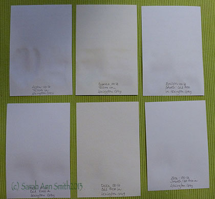
The six papers from Stillman and Birn

The six papers from Stillman and Birn.  I’ve put on the back the name of the paper, weight, finish, and the ink used (Noodler’s Lexington Grey).  Top row is 100-lb, bottom row is heavier 180-lb.
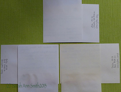
Here I've got the paper criss crossed with the 100 weight on top so you can see the effect of very wet watercolor on it and the show-through (or lack thereof)

Here I’ve got the paper criss crossed with the 100 weight on top so you can see the effect of very wet watercolor on it and the show-through (or lack thereof).  For lighter weight paper, the lack of ghosting and bleed through is good.
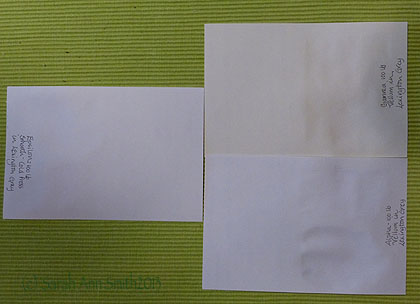
Another

Another view of just the 100-lb papers while still damp (the ones on the right) from watercolor

Here are close-ups of each of the six papers showing how my favorite pens and pencils behave on each offering:
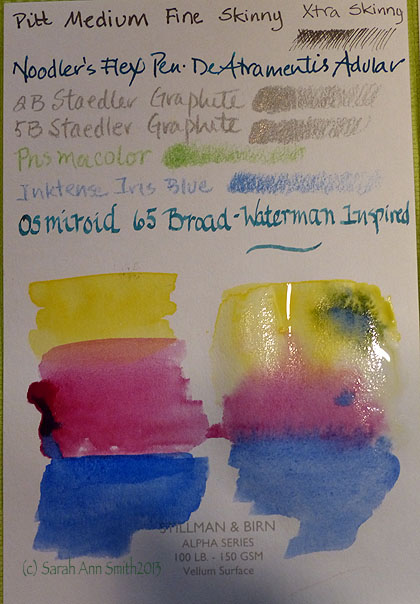
Still wet!

Still wet! Alpha series 100-lb. Vellum surface.  You can see that I did the “evil” test with LOTS of soupy watercolor to see how far you can push this paper.  The answer:  a long way!  I did find that for me the Vellum surface papers were a bit “skittery” with the extra fine Pitt Artists pens, which I didn’t enjoy.  Personally I preferred the Epsilon (below), but that is totally a matter of what each person likes.
Alpah

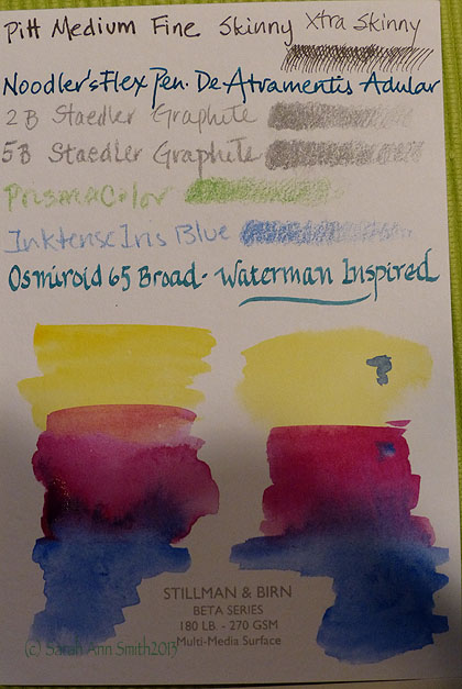
Close-ups of the various papers.  This is the white Beta series, a cold-press finish sized for multi-media
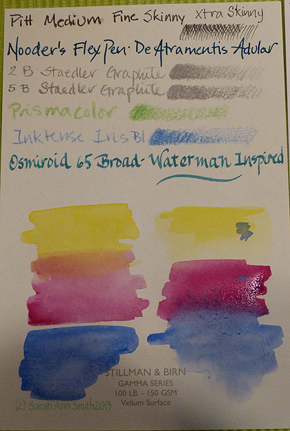
Gamma Paper, 100-lb Ivory, Vellum finish
Gamma Paper, 100-lb Ivory, Vellum finish

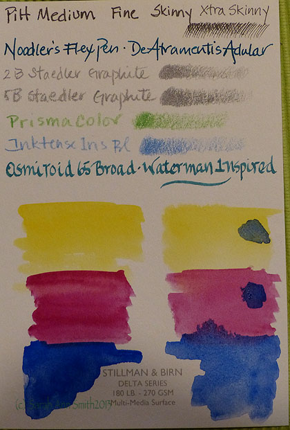
Delta?

Delta Series, Ivory, heavier weight 180-lb paper.  Suitable for very wet media.
Delta?

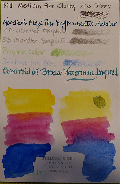
Epsilon:  this ended up being my favorite because of both the surface and the fact that you get more pages per sketchbook.  If I were endlessly wealthy, I might (or might not) choose the Zeta.  But since many of my pages do not use heavy water, I chose Epsilon knowing full well I could end up with some buckling.
 

Delta?

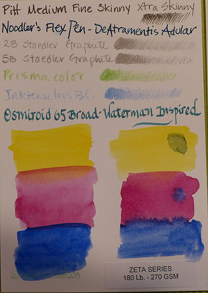
Zeta paper.  White, smooth finished.  Suitable for wet media and more.

I’m just finishing up my first S&B sketchbook, an Epsilon 7 x 10 wirebound.   I LOVE IT!  So much that I ordered some individual sheets to customize my sketchbook for my trip to England.   Before that though, here are some sample pages from my Epsilon sketchbook so you can see how it handled various media.
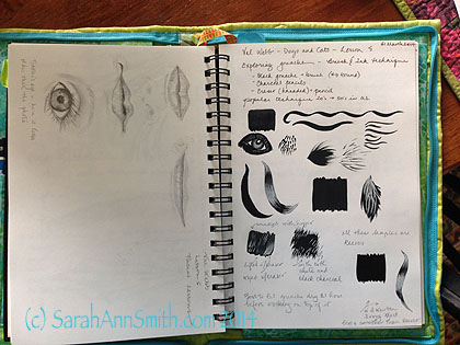
Epsilon 7 x 10 sketchbook, pencil on left page.  Charcoal and water on right page with white charcoal pencil.  Exercises from an online class with Val Webb.

Epsilon 7 x 10 sketchbook, pencil on left page. Charcoal pencil and water on right page with white charcoal pencil. Exercises from a **fantastic** online class with Val Webb.
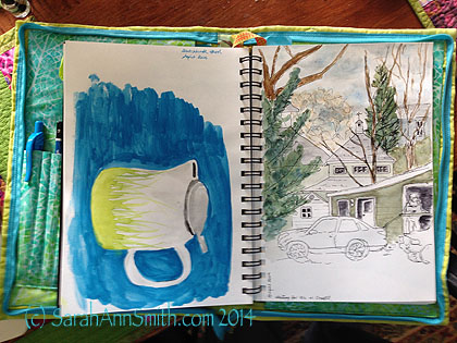
My rudimentary watercolor, form the first two lessons at Danny Gregory's Sketchbook Skool. Pen and ink with watercolor.  The heavier usage on the left ripples a bit, but I'm ok with that.  And I could, quite honestly, iron it flatter if I wanted to!

My rudimentary watercolor, from the first two lessons at Danny Gregory’s Sketchbook Skool. Pen and ink with watercolor. The heavier usage on the left ripples a bit, but I’m ok with that. And I could, quite honestly, iron it flatter if I wanted to!
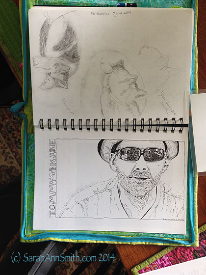
More lessons from Val Webb (cats in pencil) and a portrait of Tommy Kane from one of the videos in the Sketchbook Skool class. Done in Pitt Artists pens S and XS.  I roughed in the general shapes with pencil, inked, erased with kneaded eraser, then filled in and stippled and cross-hatched.   Excellent paper!

More lessons from Val Webb (cats in pencil) and a portrait of artist and Sketchbook Skool teacher Tommy Kane from a screen capture image from one of the videos in the Sketchbook Skool class. Done in Pitt Artists pens S and XS. I roughed in the general shapes with pencil, inked, erased with kneaded eraser, then filled in and stippled and cross-hatched. Excellent paper! 

I also got lucky:  I emailed Stillman and Birn  (they are SO responsive!) to ask if they had ever considered making a “sampler sketchbook” as the samples were small, but I didn’t want to buy six sketchbooks!   Turns out they had, but they didn’t sell well so won’t be making more of these samplers.  The guy told me that Binders in Atlanta might still have some, so I called them up a couple months ago since none of the sampler sketchbooks were listed on the website.  The nice lady at Binders (which also has OUTSTANDING customer service) went to look in the shop as the computer showed they had four left.  I bought three of them, two as gifts, one to use myself.
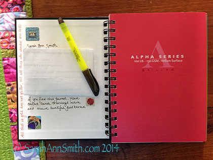
Contact info on the inside cover of my Stillman & Birn sampler sketchbook--alas these are no longer made!

Contact info on the inside cover of my Stillman & Birn sampler sketchbook–alas these are no longer made!

The sampler sketchbooks are the small size (6 x 8 ish, with 5 1/2 inches of usable width on the page) with four sheets/eight pages of each of the six papers.  Sometimes I like wide–enjoyed the format of a Moleskine accordion fold, but not that paper.  .  So I bought some of the Epsilon and Zeta paper sheets and make myself some 2-page and some  accordion fold “extensions” to tape into this journal in the sections I’ve reserved for art.  I’m not as fond of ivory paper, so I used the vellum ivory Gamma pages to write down essential information for my upcoming trip:  lodgings, emergency contact numbers for insurance, lost credit cards etc.  I’ll do some watercolor washes on the Delta cold press and may use that for both watercolor and collaging in trip ephemera.  The Alpha pages will be for my trip “calendar.” The Beta, Zeta and Epsilon pages will be for artwork.
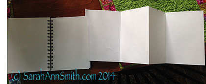
I made a few "page extensions" (the size of 2 sheets) and a few "accordion or Z-fold" extensions to add to my book should I feel the urge to do a really wide landscape or a funky train-journey thing

I made a few “page extensions” (the size of 2 sheets) and a few “accordion or Z-fold” extensions to add to my book should I feel the urge to do a really wide landscape or a funky train-journey thing.  I purchased individual sheets of both the Epsilon and Zeta paper, then cut and folded these extensions.  I’ll take some glue or tape to affix them if I decide to use them on my trip.  This is my work-around to not wanting to make a complete journal on my own and them not having the exact thing I want–just modify!

And using more of the single sheets of paper I’m going to draw a map and then illustrate it as the journey progresses.  I’ve cut it to about 11 x 14 inches so I can glue one corner to the inside cover for opening out easily.  On the last page, I’m taping in a printed-out map, also that can be folded up nicely.
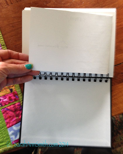
Taped in printed-out map of about half of England, folded, glued to last page in sketchbook.
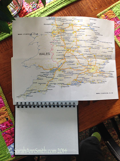
Taped in printed-out map of about half of England, folded, glued to last page in sketchbook.

Opened up printed map.

Opened up printed map.

Then my hand-drawn illustrated map will be taped/glued to the inside of the back cover.  With the wire-bound, there is enough room to add these extra pages without having the rigid covers “splay out” much if at all.

So thank you if you’ve manged to read through this massive tome!   Really loving my Stillman and Birn, as well as great classes from Val Webb and in the Sketchbook Skool, and the fabulous customer service and responsiveness from S&B, Goulet Pens and Binders.
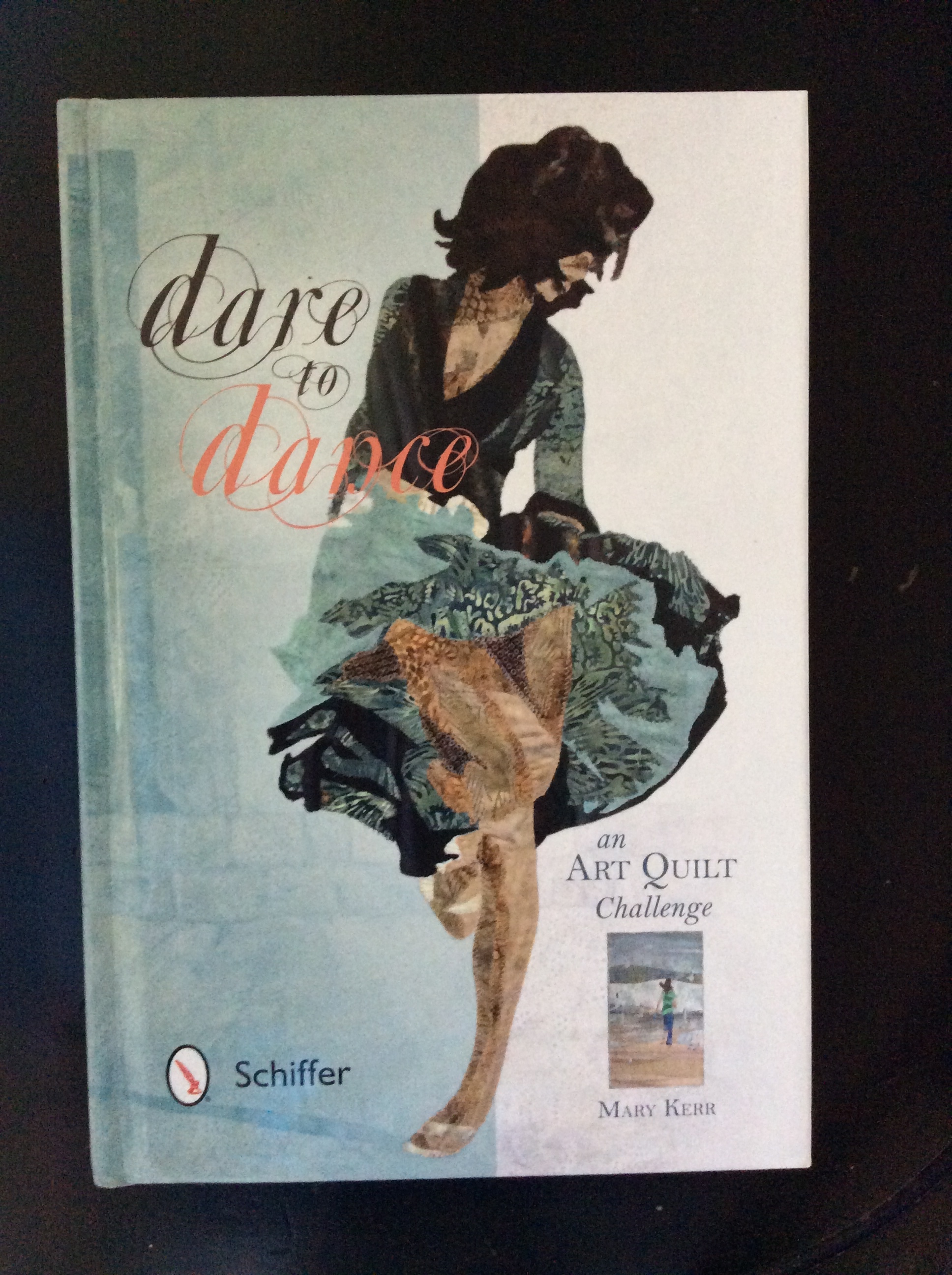
Dare to Dance!

Sunday, June 22nd, 2014

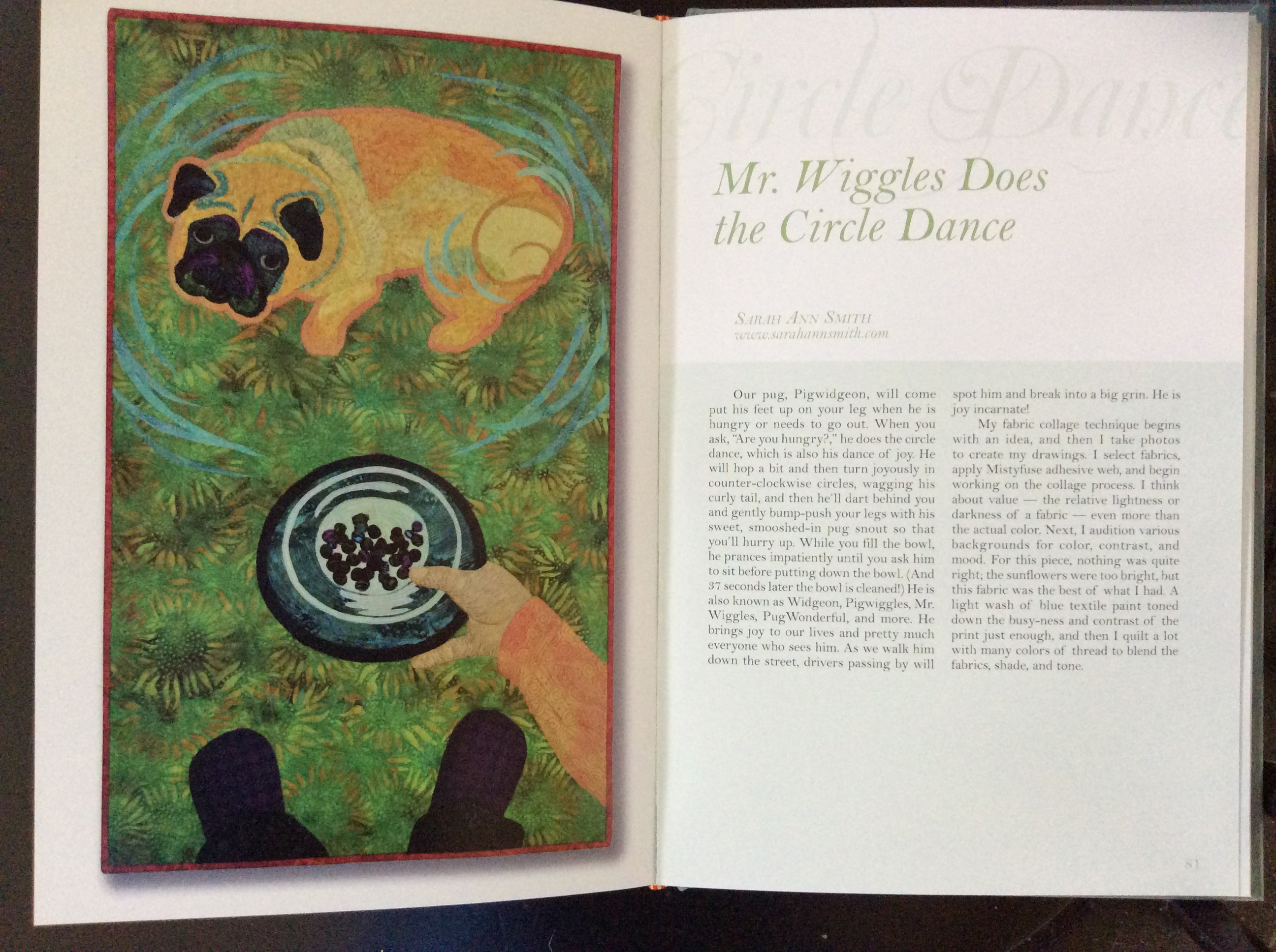
Hi all!  Thrilled to report that I am one of the artists in the Dare to Dance exhibit and book!  Dare to Dance is now available from Mary Wilson Kerr or Amazon.

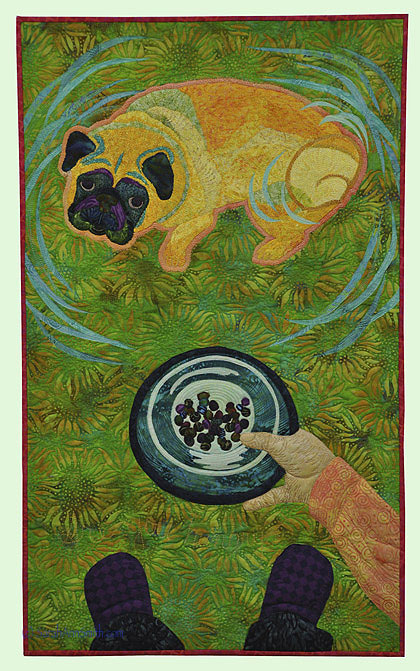
Mr. Wiggles does the Circle Dance, in Dare to Dance by Mary W. Kerr.  (c) 2014 Sarah Ann Smith

Mr. Wiggles does the Circle Dance, in Dare to Dance by Mary W. Kerr. (c) 2014 Sarah Ann Smith

The quilts were to be 18 inches wide by 30 inches long reflecting the theme “Dare to Dance:  An Artist’s Interpretation of Joy.  This exhibit began as a local one in northern Virginia, but expanded into a wider call for entries from across the United States.  In the end, 60 quilts were selected; of those, 30 are on tour including mine.  To see the long list of venues for this exhibit over the next two years, please visit this page on Mary Kerr’s website.

Dare to Dance by Mary W. Kerr

Dare to Dance by Mary W. Kerr

When I first read the call for entry, immediately I thought of our pug’s exuberance when asked “Are you hungry?” (which is quilted into this piece between the dog dish and my feet, even though it is hard to see in a photo). The quilts are presented in alphabetical order by title.

When my copy of the book arrived, I was surprised, expecting the usual size of art quilt book.  This hardback is smaller, 6 x9 inches (approx), but each quilt gets a full page, allowing you to see delicious detail.

My pages in Mary Kerr's Dare to Dance.  Quilt and text (c) Sarah Ann Smith 2014

My pages in Mary Kerr’s Dare to Dance. Quilt and text (c) Sarah Ann Smith 2014.  Click for a larger view.

The facing page includes the title, Artists’ name and website, plus the story of the quilt.  I can’t wait to sit down and savor this book, dipping into to it for vicarious glimpses of joy.   Thank you, Mary, for including me in both the book and the traveling exhibit!

MQU: Getting rid of the ouch

Friday, June 20th, 2014
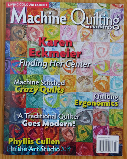
The new MQU issue.  Order at www.mqumag.com or find it at Barnes and Noble (among other places)

The new July/August 2014 MQU issue. Order at www.mqumag.com or find it at Barnes and Noble (among other places).  The Quilting Ergonomics article on the cover is mine! WOOT!

Editor Kit Robinson asked me, a while back, if I would like to do an article on ergonomics at your sit-down sewing machine, and I jumped at the chance.  I’m not a physician, and I start the article by saying that “no one size fits all,” so be sure to check with YOUR health practitioner, but I have learned some things that will make your life easier when you are quilting.  I talked about quilting aids in the last issue (which I apparently in my busy-ness forgot to blog about…coming soon!   Naughty Sarah!) and in this issue I talk about making your space work for you.

After all, if you are thinking “Ouch” or “oh my aching back and shoulders” you’re not thinking about where your next stitch goes.  So that’s what this article is all about!

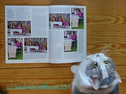
Thumper decided to read the article while I had the camera out to take a picture.  Ahem.

Thumper decided to read the MQU ergonomics article while I had the camera out to take a picture. Ahem.

So for this article, I put on make-up, sucked in my gut, and got hubby to come down and click the shutter after I set up the tripod and lighting for all these photos–so now hubby is published as a photographer!   Thanks Paul and Kit for the byline for him!  It was much easier than using the timer and me trying to dash and get into position before the shutter tripped.  I’ve clearly got pictures of what NOT to do as well as what you should do.  Speaking of which, I really should get back to doing those crunches and stretching exercises!

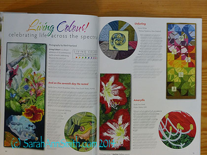
Another big thrill was seeing as I flipped to my article that Brenda Gael Smith had an article on the hanging system used in Australia that has artists putting velcro on the backs of quilts to adhere to the rigid walls used there.  Helps the quilts hang beautifully!   So then I went to see what all was in the magazine, discovered there is a companion article about the Living Colour Textiles exhibit and one of the quilts included was mine!!!! (and yes, I still need to do that blogpost about dyeing the fabric and making this quilt…too many things to do, not enough time…it will come, I promise!).   Anyway, here’s that page–what a delightful, welcome surprise!

Living Colour Textiles exhibit curated by Brenda Gael Smith.

Living Colour Textiles exhibit curated by Brenda Gael Smith.  Amaryllis, bottom right, is my entry.  To see the exhibit, go to livingcolourtextiles.com/gallery.html 

Gotta run:  today is the last day of Eli’s sophomore year, and it is a busy one.  Exam this morning, memorial service for a cross country teammate who died of a brain tumor just days after receiving his diploma (thank heavens the school graduated him, he missed most of the school year); I’m planning on a LOT of kleenex.  After that there is a picnic at his house and the runners are going to run his practice course in his honor and memory (and I’m tearing up just thinking about it).  Then, finally, the delayed wrestling team potluck and awards.   Phew!  But we get to sleep in tomorrow.  More anon!

How Batik is Made video

Thursday, June 19th, 2014

I came across this video somewhere through some list that I’m on, and thought I’d share as it is one of the most detailed explanations I’ve seen of the batik process, particularly about the discharge process which removes color after the first round of dye and wax.   Hope you enjoy!

NYC! The Bowery Savings Bank, and the way home….

Sunday, June 15th, 2014
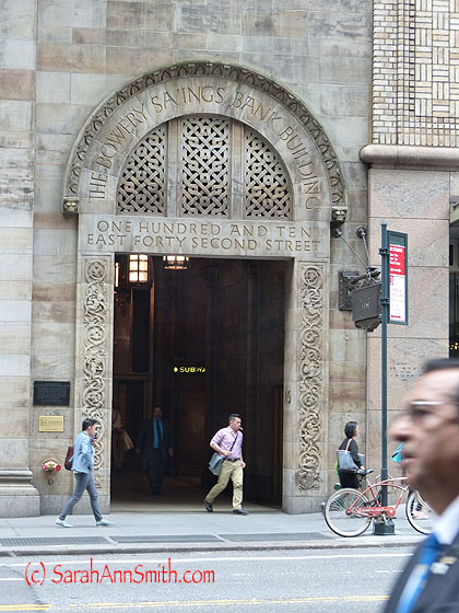
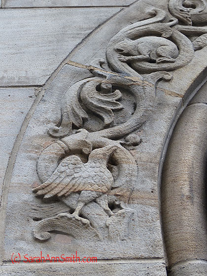
Across from (or near?) Grand Central is the Bowery Savings Bank, and the stonework and carving was another source of incredible inspiration.

Across from (or near?) Grand Central is the Bowery Savings Bank, and the stonework and carving was another source of incredible inspiration.

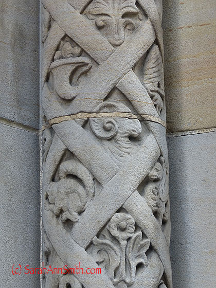
Here is a close-up of one of the stone pillars just to the left of the doorway  pictured above:

How lucky we are that the titans of industry 150 years ago poured money into buildings that are art!

How lucky we are that the titans of industry 150 years ago poured money into buildings that are art!

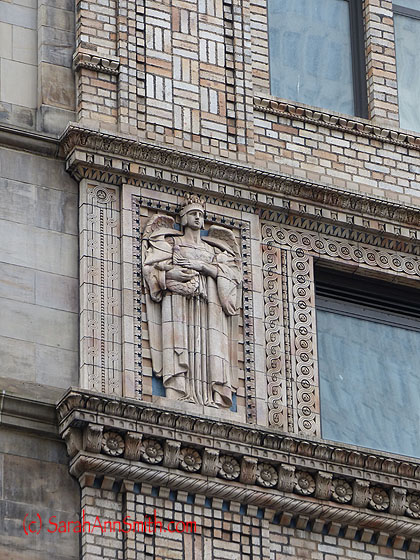
Marie Z. J., I had to take this photo just for you:

An angel for Marie

An angel for Marie

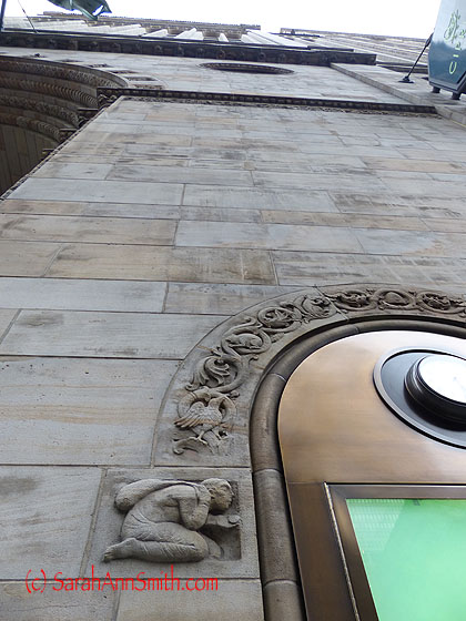
Looking up the facade of the buidling

Looking up the facade of the buidling

and a closer view of the carvings

What a fabulous quilting design or applique this could become

What a fabulous quilting design or applique this could become

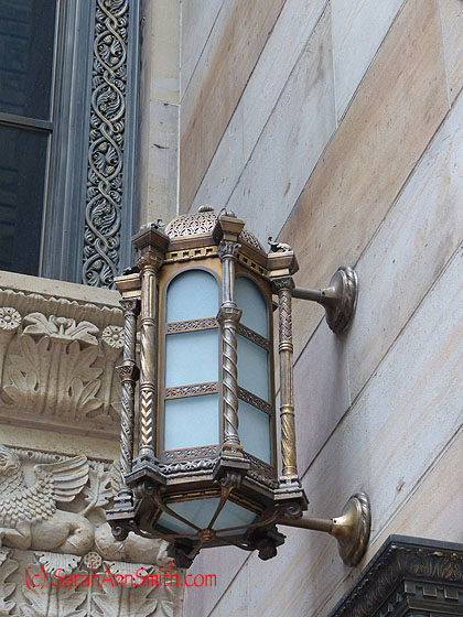
The lanterns/lights are just as fabulous.

The lanterns/lights are just as fabulous.

There simply isn’t enough time to make all the art that is inside of me!

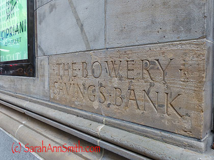
And perfect lettering...sigh....

And perfect lettering…sigh….And it looks like this place is now an ultra chi-chi restaurant.   Hmmm.

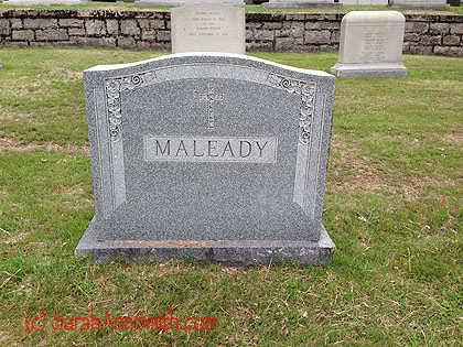
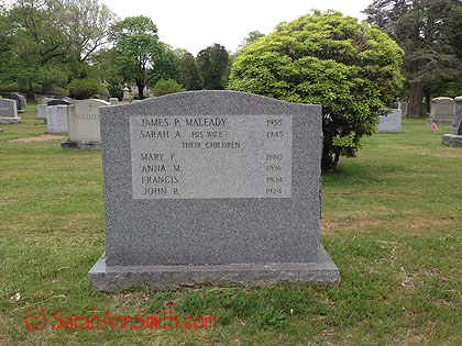
On the way home, I stopped off in Fall River, Mass.  My father was born there and I recently discovered (in a well DUH SARAH, of course they are) my grandparents are buried here, as is my Aunt Mary M., whom I remember, along with two brothers who died young.  So I sought out the Catholic cemetary and after a lot of wandering around trying to decipher the mystery of how the plots are numbered (I had called written a couple months ago to find out the plot numbers, etc), I found the family monument:


Apparently plots were sold with 6 spots--there are many such "family" monuments with names on the back in this cemetery.  Frankie died as a baby and was apparently buried in a different part of the cemetery where there is no marker to show him...so sad, but at least they added him to this stone.  It appears from family records that when Johnnie died in 1924 they purchased this spot (which was paid up in full in 1926).  The stone was erected in 1961--not sure if Aunt Mary did that, or perhaps my Dad.  He did stuff like that for his family, but there are no records now and anyone who knew is long since gone.

Apparently plots were sold with 6 spots–there are many such “family” monuments with names on the back in this cemetery. Frankie died as a baby and was apparently buried in a different part of the cemetery where there is no marker to show him…so sad, but at least they added him to this stone. It appears from family records that when Johnnie died in 1924 they purchased this spot (which was paid up in full in 1926). The stone was erected in 1961–not sure if Aunt Mary did that, or perhaps my Dad. He did stuff like that for his family, but there are no records now and anyone who knew is long since gone.

The back is weird:  it shows ONLY the death dates!  I asked but it isn't possible to change and add the birth dates, or I'd take teaching income from a gig or two and add the birth dates.  My grandparents, born in the 1880s, are at the top, followed by Aunt Mary, Aunt Nan, Frankie and Johnnie.  All but Mary were gone before I was born.

The back is weird: it shows ONLY the death dates! I asked but it isn’t possible to change and add the birth dates, or I’d take teaching income from a gig or two and add the birth dates. My grandparents, born in the 1880s, are at the top, followed by siblings in the order of birth: Aunt Mary, Aunt Nan, Frankie and Johnnie. All but Mary were gone before I was born.

On the way home, the GPS always wants me to go 95 and 93 through downtown Boston.  Which has some of the worst drivers in America.  And a couple interchanges near the Big Dig tunnel and the bridge that are white knuckle experiences for me.  Usually I take I-495 around Boston which nominally takes a half hour longer.  This time I decided to try 95/route 128, the inner ring road around Boston.   Now I know why I will never do that again.  I started to go around Boston at 2 pm.  It was 4:30 before I cleared it…bumper to bumper.  UGH.  It would have been at least an hour faster to take the “long” way on 495–and it wasn’t even rush hour!  And no accidents.  One roadside info sign said next major highway interchange was 12 miles ahead.  Time to get there (mid afternoon!!!!) was FIFTY , 50, MINUTES!!!! SHRIEK.  Was really glad to get home to rural, not-busy-roads Maine!

On route 128, the ring road around Boston.  Horrid.

On route 128, the ring road around Boston. Horrid.

So that’s the trip!  Fun, except for the driving in Massachusetts!