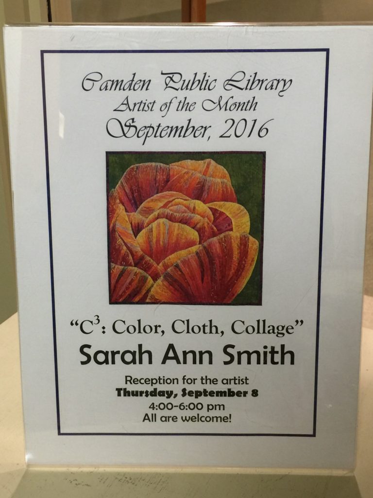
A virtual visit to C3: Color, Cloth, Collage
Saturday, September 10th, 2016Well, I promised I would blog about the Artist’s Reception and take pictures. So I remembered to take a picture of the food table (so boring it isn’t here), and as I was packing up I realized I hadn’t taken a single photo as I was busy talking with people, being the gracious hostess and…..I forgot. But I CAN share the one photo we did get (thank you Terri Tooley!) plus the others I took not-during-the-reception. And just for Patricia W, at long last a detail photo of the peony (OK, I was gonna share it anyway, but Patricia has asked and I’m happy to share now)! Thank you so much to everyone who came on Thursday, has been, has visited virtually here and on Facebook, and will get here later this month. For all the Library photos, if you click on them you can see them larger.
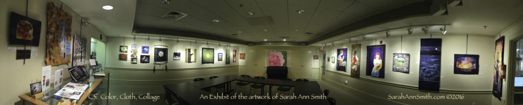
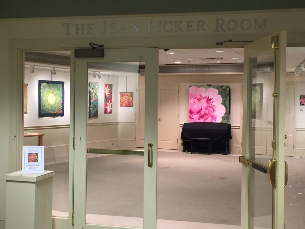
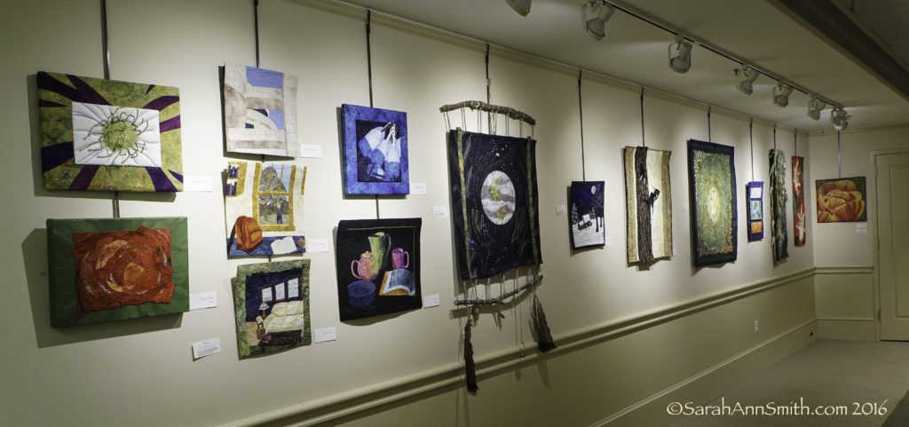
Click on the image to view larger! I’m standing in the doorway to the Picker Room and got it all!
When I finally realized I had forgotten to take pictures, friend and fellow wrestling mom Terri Tooley was still there. She stepped in to take a photo…Paul said, “this isn’t going to be shared is it?” to which I replied, of course it is! So here is a RARE photo of Paul, and he’s even smiling!
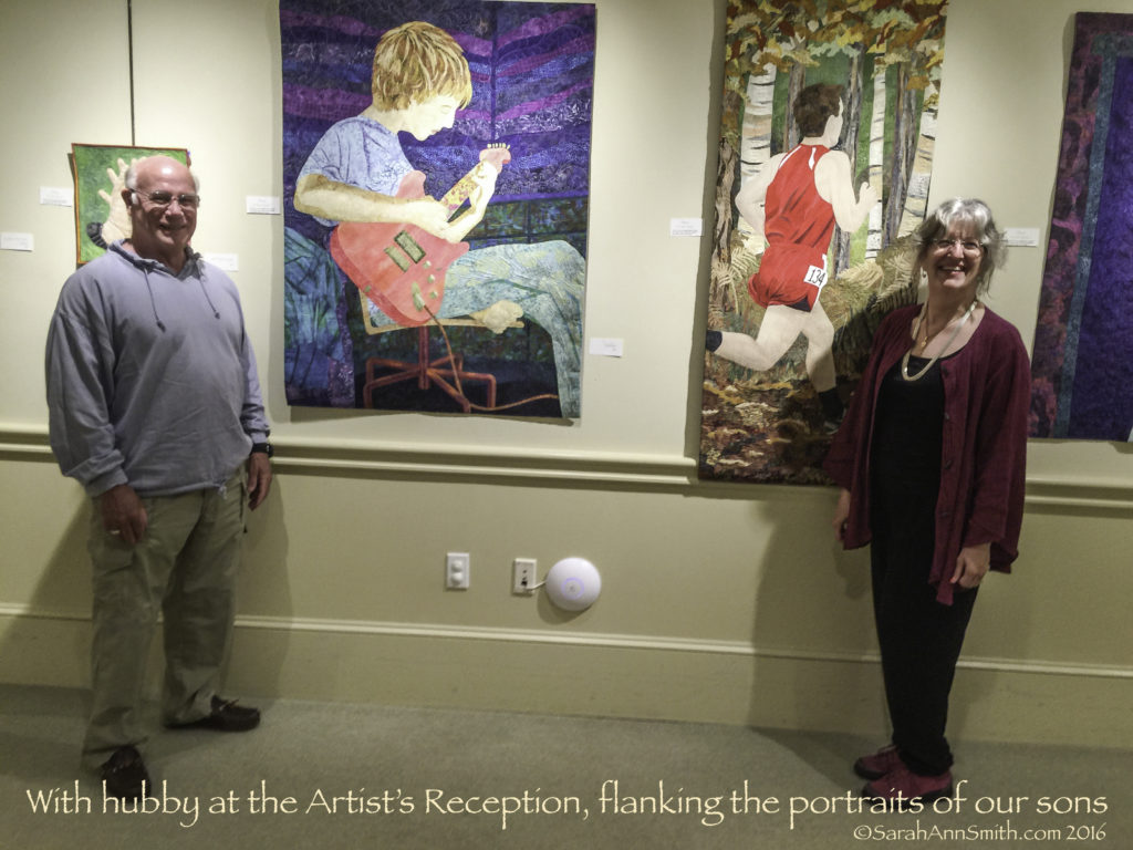
Husband and wife, flanking their sons (in cloth). Both quilts were of the boys at age 16. Joshua is on the left, Eli on the right.
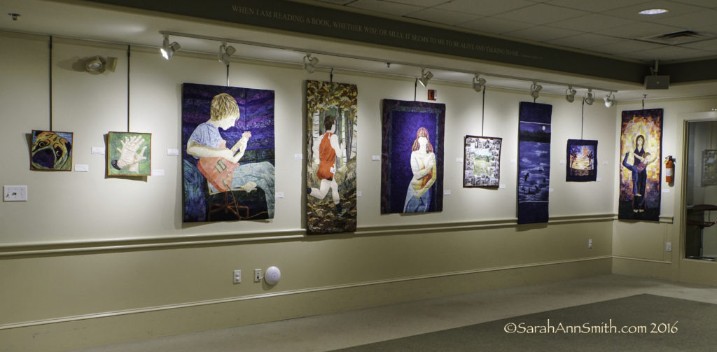
This is the Rogue’s Gallery, also known as the Family wall (and seen above). From left to right you’ve got Pigwidgeon (of the dog walkies photos on Facebook), my hands, Joshua, Eli, me, a family “scrapbook” quilt called the Two of Us which was in the book and exhibit Inspired by the Beatles, the blue orcas quilt, an older painted silk sunset, and the “yoga” quilt. Unofficially, I am also calling this the Dinner@8 wall, since the five large pieces were all made for juried invitational exhibits put on by Leslie Tucker Jenison and Jamie Fingal. You can learn more about those exhibits and this year’s here. My best work over the past six to seven years has consistently been for this exhibit, and I’m honored to be a part of it again this year.
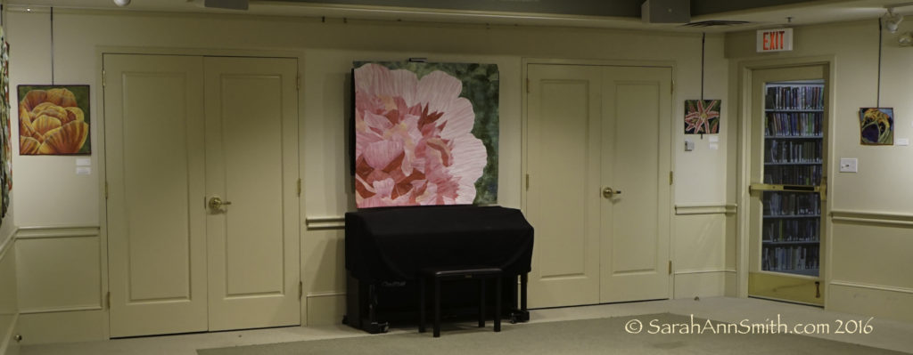
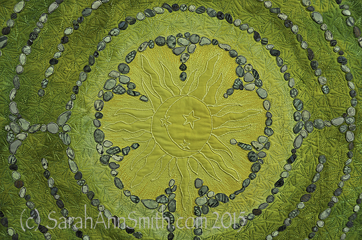
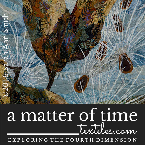
The far wall has two small pieces and my newest, the Peony. The center is challenging to hang, since there is a TV behind the quilt that is used a couple times a month, but it is THE most eye-catching spot.
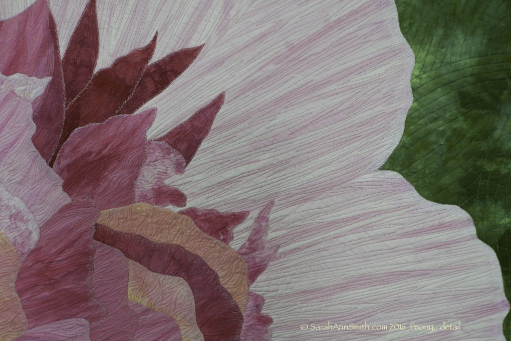
Detail, Peony. I think I need to take more and better detail shots! I believe I used 12 pinks, a white, and a couple variegated greens in this quilt.
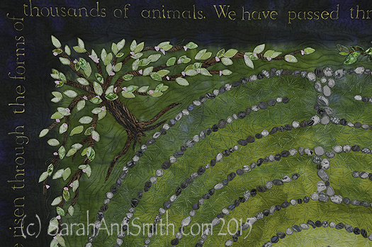
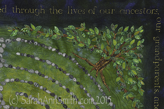
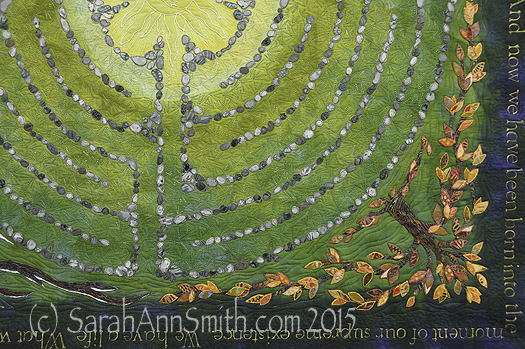
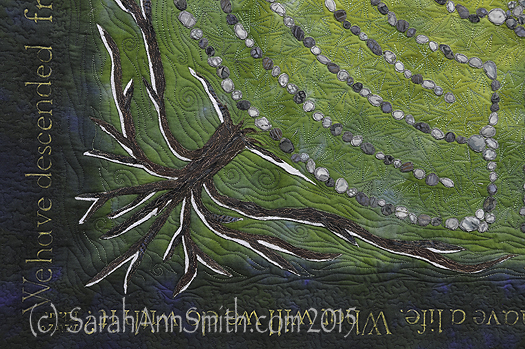
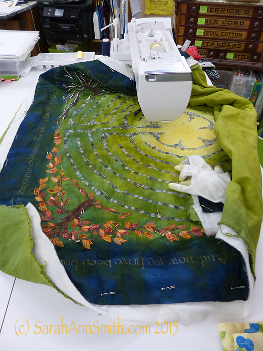
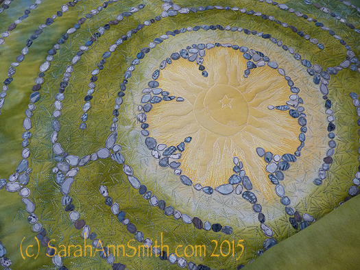
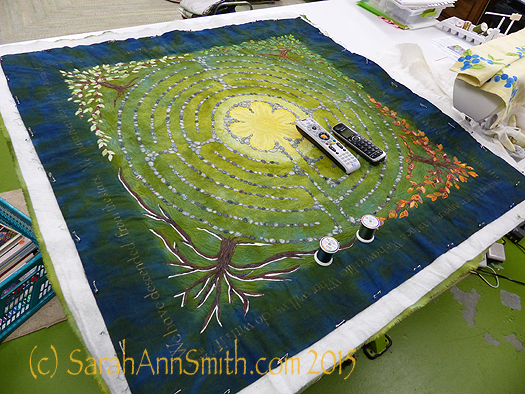
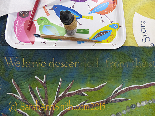
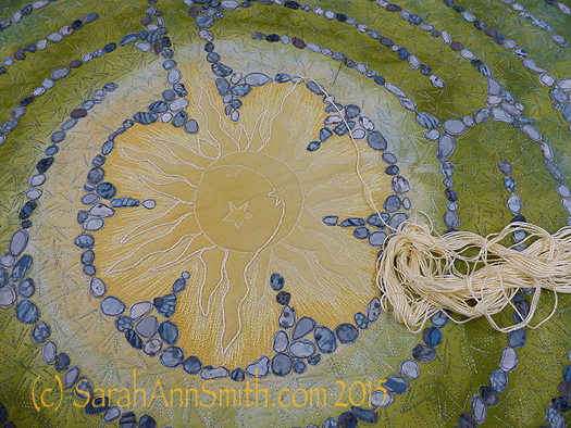
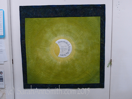
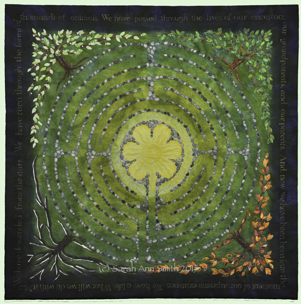
The left wall as you enter is the second most visible spot after over-the-piano/in-front-of-the-tv. I knew I wanted my labyrinth, Descended From the Stars, to anchor that wall. This side of the room is really about my life, and my life in Maine and nature.
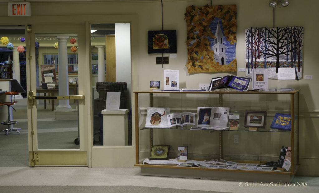
Between the entrance and the mini kitchen area, is a cabinet with a bit of wall.
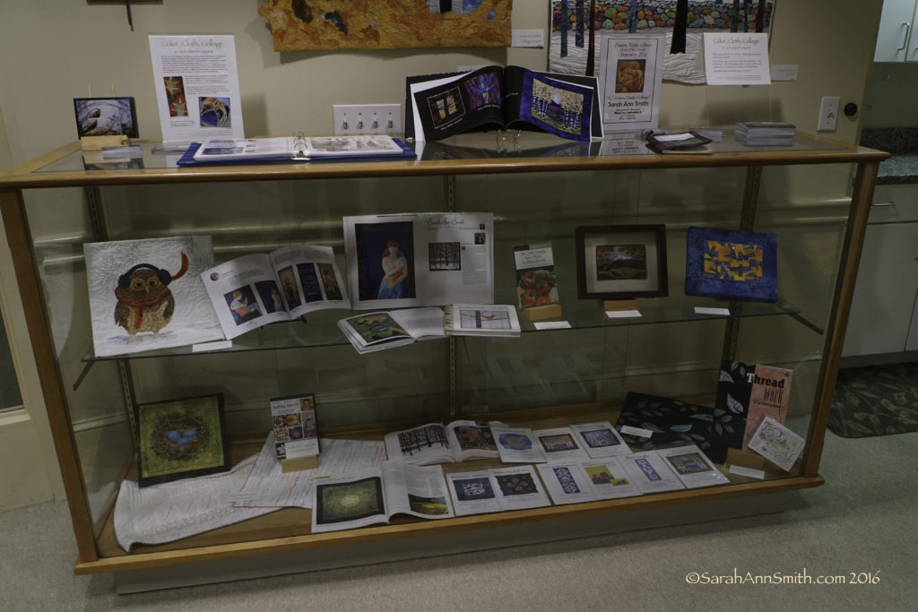
In the case, I put a few of the many books and magazines in which I have been published inside the case, along with my book ThreadWork Unraveled, my DVD workshop, patterns, some class samples and smaller pieces.
So there we are!
Thanks to all who could come in person, and to all who are visiting virtually. I’m so delighted, relieved it looks good, and pleased. Thank you to the Camden Public Library and Ken Gross, who is in charge of the exhibits among many other duties, for this opportunity. Thanks go to Jamie Fingal and Leslie Tucker Jenison of Dinner@8 Artists for the opportunity to create works for their fabulous juried exhibits.
And last but decidedly not least and so very important, MANY thanks to the companies whose products I use and who have supported me over the years including MistyFuse, Janome America and Superior Threads. I couldn’t do what I do without quality materials and machines! I appreciate your support and encouragement more than you can know.