Why I love vultures!
When we lived in Camden, I learned to love vultures. At some point in March, they would arrive, heralding spring. Eventually I learned that they ride the thermals, which carry the scent of supper up to them. If it isn’t warm enough, not enough scent. So that means when they arrive, winter is indeed ENDING. Also, they are FUNNY–they may be a bit on the ugly side, but gosh they are just comical. They are gregarious, live in tight family groups (the ones that roosted at the end of our driveway numbered around 30!), are large, squabble like most families, and when you hear them flap in the pitch dark when you are walking the dog late at night they sound REALLY REALLY BIG! But they are just under-appreciated (anyone else ever felt that way?).
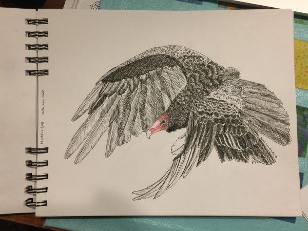
So for this weeks Journey Through the Natural Year lesson–well ok, the lesson from two weeks ago, I’m behind–I decided to NOT do the pileated woodpecker teacher Val Webb selected and see if I could do a passable job on something else dark with a red head, my much-adored funny vultures. I’m rather pleased–I can now see a couple small areas where I didn’t get it quite right: beak a tad too long, curve on the upper wing needs a couple of bends in it, but I am really pleased. Well, I was until the blotch.
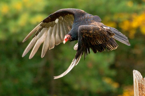
I used this photo, which is part of the WikiCommons meaning I can use it as long as I give credit–Thanks Peter K. Burian! https://commons.wikimedia.org/wiki/File:Eastern_Turkey_Vulture_in_flight,_Canada.jpg#/media/File:Eastern_Turkey_Vulture_in_flight,_Canada.jpg
turkey vulture By Peter K Burian – Own work, CC BY-SA 4.0, https://commons.wikimedia.org/w/index.php?curid=63275338
Here is the sequence…and the remedy to the blotch:
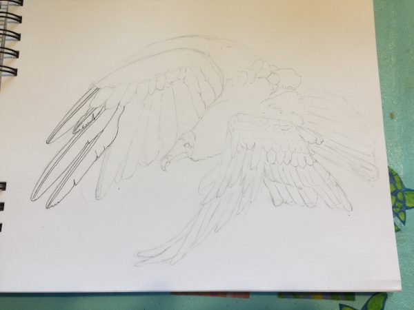
Step one: pencil things in. I am sketching in a Daler-Rowney dry media sketchbook that has paper that I really dislike. It is good for pencil and not a whole lot more!
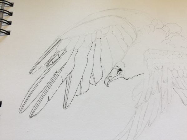
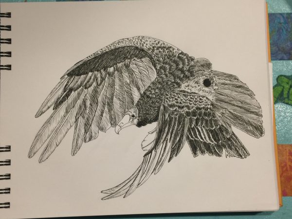
Getting the face and eye in helps so much. I used a crow quill dip pen and deAtramentis Archive Black Ink.
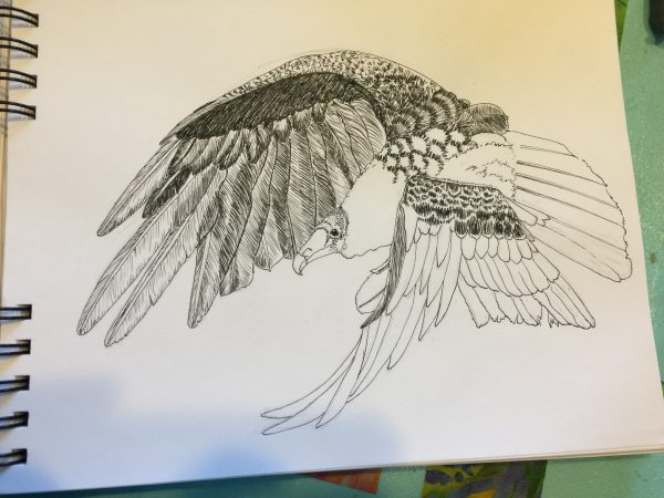
Progress. You kinda get lost in the feathers, but I’m pretty pleased with the shadowing through the long wing tips and the value changes.
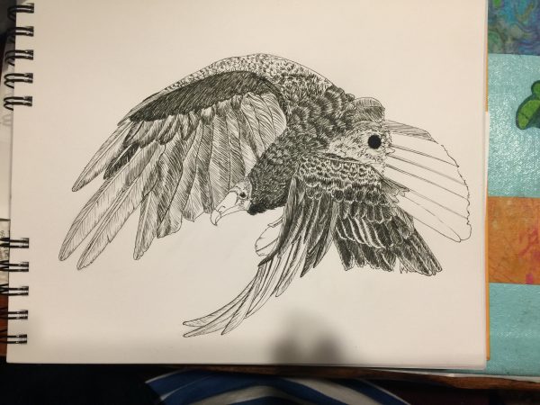
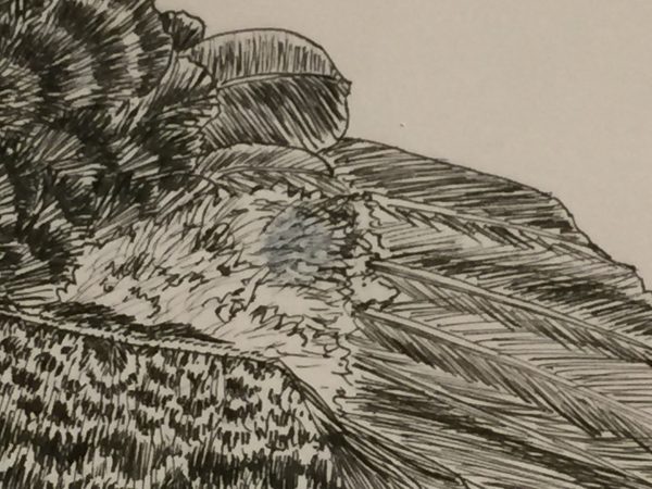
Then karma smacked me upside the face: BLOT. After 4+ hours of work, a BLOT. And with this miserable paper NO chance of scraping etc. I was so proud of what I’d managed to do. But I kept going. And asked sketching friends and teacher Val Webb for possible solutions.
SOB! I got lots of good suggestions, and (gee imagine that) had pretty much all of the suggested art supplies. The only thing I didn’t try was Val’s suggestion to use gel medium to glue down a piece of paper over the blotch, because this paper is so awful I knew it would have been futile.
Being an impatient sort and loving my Signo Uniball white pen, I added some of that and it helped…a LOT. That and other suggestions I received were
- Gouache (tried both Talens white and Schminke Titanium White, the Schminke worked better)
- Prismacolor white pencil (too weak)
- Signo pen (worked perhaps best, but is tricky to manage as it is a rollerball and sometimes leaves a track or blank space in the center of a line)
- Watercolor ground
- Acrylic ink in white–had both Liquitex and Daler Rowney; applied with both dip pen and brush
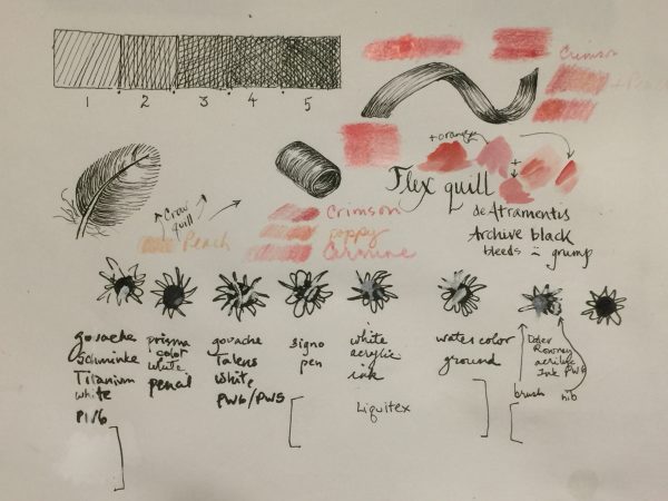
My test-drive page. The colors are from watercolor–this paper precluded using it–and colored pencil. I ended up using a combination of the Carmine and Crimson and a colorless blender.
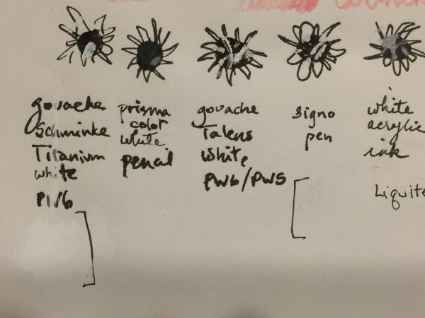
The left side, close up. I made a blot of ink, then some squiggles to approximate where I blotched on the vulture.
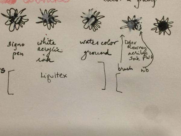
The right side. Definitely like the way the Signo pen worked, and also the Daler Rowney FW acrylic ink…look at the right side where I dotted it on with a dip pen. The one on the far right is my untouched for comparison.
Observations:
–Both the white gouaches and the Daniel Smith watercolor ground looked yellower than the bright white paper when wet, but when dry that tint disappeared. In fact, the Schminke titanium, which seemed to work the best of the two, is even brighter white than the paper–a tiny drop of something to match the color of the paper would make it work.
–The Signo pen worked best, but you kinda need to add it in dots because the pen itself can “railroad” meaning you get edges of white and not much in the center due to the rollerball tip. However, a couple coats worked well.
–The Daler Rowney FW acrylic ink worked better than the Liquitex Ink! . It took a couple coats, but it could be a viable option.
I’d like to try a controlled test of my favorites, the Signo pen, Schminke Titanium White gouache, and the Daler Rowney FW white acrylic ink, on a few watercolor papers to see how it looks AND what happens if you then ink or watercolor OVER the “fix.”
Here’s the offending splotch after touch up with both Signo and the Acrylic Ink in white:
And once again, here’s the final result–not bad at all! I’ve always said that the difference between a beginner and the advanced/pro is knowing how to fix your mistakes. I’m moving out of beginner range!

October 22nd, 2018 at 10:56 pm
You don’t need to convince me. The vulture is my favorite bird! I have several pieces of vulture art.
October 23rd, 2018 at 12:25 am
Thank you so much for sharing your experimentation and for not giving up! I love Val’s class too–and vultures! Your description of hearing their wings flap in the dark gave me goosebumps!
October 23rd, 2018 at 10:26 am
I’ll tell you, the first time I heard those huge wings flapping about 15 feet above my head I jumped! Thanks for reading and commenting!
October 23rd, 2018 at 10:27 am
Vicki….I knew I liked you! I don’t know if I have a single favorite. Grew up with California Quail, and the win for being funny. I love crows and ravens for being smart. I have had an affinity for owls since I was a kid. The bluebird makes me happy, and I love the bobolinks that visit our land, the glint of yellow with the sharp black and white. And redwing blackbirds, the bicolor ones near San Francisco especially……
October 24th, 2018 at 4:59 pm
Great save on a wonderful sketch Sarah! And thanks for the ‘save’ lesson. As you say, it is just as important to know how to fix a mistake as to do the original sketching.
October 25th, 2018 at 9:44 am
Thanks for surfing in Franki! I’ve always said about quilting, the difference between beginners and advanced is we’ve made the mistakes and either learned how to avoid them or how to fix them. So I’m in the process of learning with the paint and sketch!
November 9th, 2018 at 8:44 pm
I just love your vulture drawing….you have some serious talent Sarah Ann! We just adore our turkey vultures here in Western Oregon. They are a regular on my blog. Here is a link to my images and videos of these sweet and gentle birds. https://luannkessi.blogspot.com/search?q=turkey+vultures
My Best To You,
LuAnn Kessi
luannkessi.blogspot.com
November 12th, 2018 at 9:32 am
It’s so good to hear from you LuAnn! On the fenceposts…I LOVE IT! It’s interesting how the top of the wings is brown and the underside white. And gosh what a beautiful spot! Thanks for sharing with me.