A little more lettering
I blogged earlier about a wonderful lettering class I’m taking with Val Webb online; it was SO outstanding that I’ve also enrolled in an Herbs Drawing and Painting class. I thought I’d share a few of my lessons, some good, some not so much. All I need is a 37-hour day, with the extra hours for art!
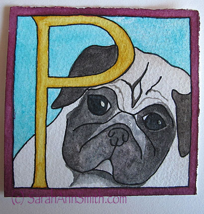
P is for Pigwidgeon the Pug
One lesson was to create whimsical letters. Val offered a pdf of a cat alphabet, but of course I had to attempt my dear (well, Eli’s dear dog) Pigwidgeon. I didn’t spend a ton of time on the sketch so it isn’t quite spot on, but I love his little peeping face anyway! This one is 3×3 inches. And while not expert by a long shot, my control of the paint is improving!
Another lesson was Art Deco style. Didn’t know what word, didn’t want something too long, and finally decided on Zelda, as in wife of F. Scott Fitzgerald (had to add that bit… Eli asked why Zelda, as the only one he knew was from the videogame Prisoners of Zelda!). I was elated at how well this turned out. The width of each section of letter is about 1/2 inch, they are about 3 1/2 or 4 inches tall:
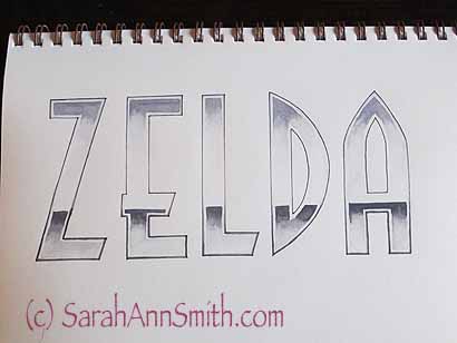
Art Deco style lettering to simulate chrome–inked outline, watercolor, used a teeny tiny size 1 brush for the shadows on the outer edges that are maybe 1/32″ wide!
Another WOOT was the “Decorated Versal” lesson. Val had us try white ink with a crow quill dip pen. Since I’m comfortable with nibs and dip pens, this wasn’t terrifying to me, unlike getting large smooth washes of watercolor (without blotches, which are HARD). Here are some practice bits using the white ink over a wash of blue watercolor:
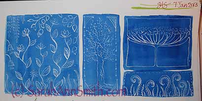
White ink from a dip-pen on blue.
A Versal is a fancy initial capital letter at the beginning of a verse (had to learn that one ). I wanted to do something William Morris-ish, so I created the vines behind the letters. I wasn’t sure what I would do to decorate the letter until I was actually muddling around, and decided to have the green vines turn to white on the letter to break up the space:
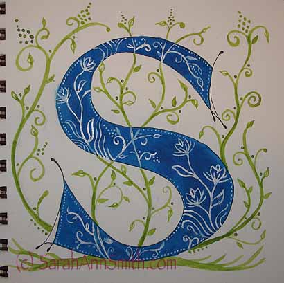
A decorated versal “S”. I like this, but thinks it needs something more to “weight” the S on the bottom. Awaiting feedback from Val!
Another lesson was to do letters that recede into the background. You begin with a wash of a lighter color over a large space, wait for it to dry, then go back in with a darker color to create the negative space. Instead of working within the box or rectangle in the class sample, I wondered what it would look like to offset the text and have illustrations on the edges. Not so great is the answer! You kinda loose the idea of perspective–of the darks going back to a vanishing point. But it was fun anyway:
A less than brilliant effort.
But it is all about learning, and I am learning SO MUCH! Now… I need those extra dozen hours a day to do more classwork, work on that quilt, exercise, sleep….. EEEK! So with that I’m getting OFF the laptop and down to the studio! Be back soon!
January 26th, 2013 at 2:05 pm
Looks as though you are having a lot of fun — and producing some lovely work Can’t wait to see how this translates to your quilts.
January 27th, 2013 at 10:44 am
I love lettering and yours is awesome! I think you did a fantastic job sketching Pigwidgeon too. All the pieces are great but my favorite is the S.
I have taken two online lettering classes in the past, and I am about to take another (Joanne Sharpe’s Letter Love class). I look forward to seeing more of your lettering too!
I hope you’re having a great weekend.
D~~~~