Let there be blue
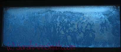
Went to turn on the lights in my chilly studio this morning, and saw this: totally frosted windows! I don’t think it has been that cold here before since we moved in. Temps this morning have warmed up two degrees to -2, wind chill now only -15. At least this is pretty!
OK…so I’m working on a new quilt, and nothing on the shelf was quite right, plus I really wanted the sheen of silk for the water. That meant it was time to bring out the dye-buckets and implement some of what I learned in Carol Soderlund’s Think Silk workshop last April. I knew that I wanted deep blue water with glints of moonlight on it, so I checked my dye swatches and found I wanted a color made of Navy dye and a tiny tiny bit of red. In my stock of dyes, I had two containers of Navy, one from ProChem (with hardly any dye in it…not enough really for the yardage I wanted to dye) and one from Dharma Trading, so I used the latter though it was old–there was plenty of it, so if I used a high percentage of dye to water, I could still get the deep values I wanted. Right.
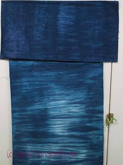
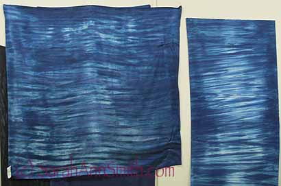
This photo shows cotton on top (overdyed) and silk on the bottom.
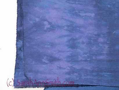
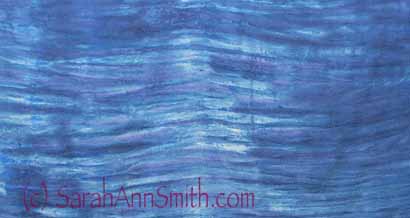
This close-up of the top fabric is washed out because of the camera flash, but it shows how PURPLE the cloth became…from navy dye from Dharma.
It took a while to figure out what went wrong….I was getting way too much red! I KNEW I was using the proper method to fix the dye to the silk: an acid bath using citric acid (not soda ash as on cotton). I thought at first that the purplish color was because my Dharma navy was old and the red was doing what Procion MX reds do: overpower. So I tried a second dyebath with ONLY the Dharma navy.
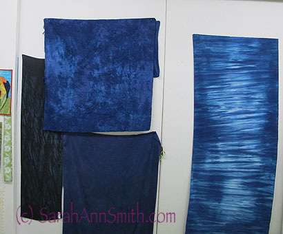
Round 2 of dyeing. Nice, but not what I wanted. Yet. The long strip on the right is close, but that is the cotton. The black shibori on the far left is an overdye of a black dye-vat I did in the Think Silk class, but hated the green cast from the dye (YUK). Better now. The center top is a scrunch of cotton, where I over-dyed the original cotton because it was too purple. The silk on the bottom center is an overdye of one of the first two pieces of silk, again to cover up that purple.
So I dyed with ONLY the Dharma Navy, and I STILL was getting purple. Then I noticed that the dye powder, when it touched a paper towel, had RED specks in it! I had thought the Dharma Navy was the same as the ProChem Navy. NOT. The ProChem Navy is a pure dye, meaning it won’t split or “halo” red or any other color, whereas the Dharma Navy is a mix of pure dyes. AH! Light bulb flipped on! There’s nothing wrong with the Dharma dye, it’s just not what I wanted or thought I had–I thought the “navy” was a pure dye, not a mix. Now I know to check more closely!
The striping is OK, but TOO much purple still showing. Silk (left) and cotton (right). I wet out the cloth with plain water, then “pleated” by hand into tucks. Next, use a sponge paintbrush to brush on the dye, trying to keep white bits. And this was my last piece of sandwashed satin silk. Erk.
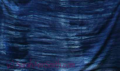
Close up of purple halo-ing from the red in the Dharma Navy (a mix, not a pure dye I learned).
It took about 2 yards (OUCH, kaCHING) to get exactly the color I wanted. Plus on my first go-round, the print paste or the cold wax resist (which I had used to preserve some white areas for moonlight glints) mix did not want to leave the fabric. I called ProChem’s technical staff (LOVE that business) and spoke with one of the chemists, who confirmed my suspicions about the navy dyes. She told me that the manufacturer had offered the navy mix to them, also, but they wanted the pure dye so folks like me would be happy and not get “splitting”. She also suggested using Metphos, a water softener that is one of the ingredients in Calgon water softener, to try to remove the stiffness I was getting from the print paste and/or cold wax resist. Some of that stiff feeling went aweay, but on another test, I still couldn’t get it out of the silk, so I’m glad that when I got to my last piece of silk, I opted for careful painting of dye!
After speaking with Nancy at ProChem (waving hello!), I then took out my small remaining bit of ProChem PURE navy and went back in to the last piece of silk and tried one more time. FINALLY! Some purple still shows, but I can knock that back when I go in with the quilting thread. PHEW!
I also wanted some specific deep-dark hues for another part of the quilt, and my batiks were too contrasty. What to do? Paint! I tried both acrylic inks and Setacolor paints thinned with water and settled on a Setacolor to darken this black-and-charcoal:
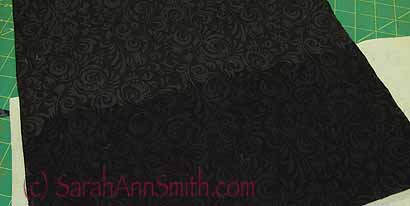
Charcoal and black batik with the contrast minimized by a thinned coat of blue-and-black Setacolor paints thinned, mixed and applied to the cloth.
And a lighter mix of blue to gray and darken this lighter batik:
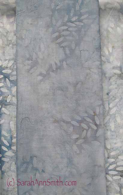
And a lighter wash on the “rice grain” gray batik. As the cloth came from the bolt it is too bright, too distracting. This muted over paint is just right!
Some folks love the hunt for the perfect fabric. Not me. I am too busy and stores are too far flung. And I don’t want THAT much stash! I’d rather get a good selection, then modify when I can and dye my own when I can’t! Next on the fix-the-studio agenda: a deep sink in the basement so I don’t have to dye in the kitchen. The bathrooms are too small, and I don’t want the dye in the food prep area! So if there are any guilds out there that would like to hire me for 2014 and 2015, I’d appreciate the donation to the studio-improvement cause! <GRIN>
January 24th, 2013 at 8:43 am
What fun to be able to play with colors! A dyeing corner in your studio would be perfect!
January 24th, 2013 at 11:11 am
beautiful blues!
January 24th, 2013 at 1:34 pm
Love the water!
January 24th, 2013 at 2:13 pm
great playing the Blues!!
The chill is here too in Southern NH
I have a nice large utility sink I got from home depot
it actually came in a lovely white cabinet so it looks like a ‘regular’ sink but is deep as a utility.
good luck!
January 24th, 2013 at 6:58 pm
I’ve used both Dharma and ProChem Navy too with the same results. I ended up choosing to add some blue-black (sorry I can’t remember WHICH black it was, but it was a blue-black) and that really did the trick. I love the colors you did end up with though…even though it’s not what you wanted.
January 25th, 2013 at 6:34 am
I love your persistence! The end results look great and I’ll bet you end up finding the perfect piece for the other blues… purplish fabrics!
February 6th, 2013 at 11:38 am
I routinely pre-soak all my scarves (silk, rayon, cotton and bamboo fibres) and PFD fabrics with soda ash before snow- dyeing with Procion MX dyes . Most of the scarves are silk of various weights. The dye colour takes differently depending on the fibre. I have not seen any ill effects from using soda ash instead of acetic acid for this process. I wouldn’t use soda ash with wool though.
Thanks for the info about the navy dye powder. I mostly use Dharma or G&S dye powders. I may look at the Pro Chem colour chart to see if I should order some of those to round out my dye pallet. The navy I’ve used so far has been a nice dark navy but I mix it into a dye concentrate then dilute according to the colour value I want to use. i have been wanting to try using the dye powders with acetic acid to see if it makes a difference. Once I get the dye studio unpacked and set up here in my new location, I will have to try it.