email Youtube

Home
Galleries
Blog
Workshops & Calendar
Store
Resources
About
Contact

A sampler of background quilting

January 9th, 2008

At long, LONG last, I’ve been able to make some headway on completing the last section of the manuscript for my book. Over the last few days of the boys’ vacation, I was able to complete a sampler quilt showing the effects of using different threads and different background quilting. I used the same wreath pattern on all eight “blocks”:
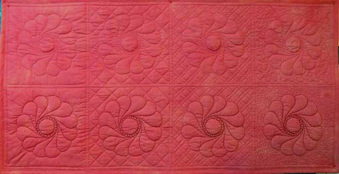
Full… coral Background QUilting sampler

I used a matching 40-wt. trilobal polyester thread (shiny and beautiful like rayon, but stronger and more lightfast), Superior Threads Living Colors # , for the top row. I used a darker 40-wt. polyester thread for the wreaths in the second row, Superior Threads Nature Colors # . For the background I used Mettler 60-wt. “embroidery” cotton in a matching color, and in the bobbin I used Superior Threads The Bottom Line. If you click the photo above, it will open and enlarge.

As you can see from the overall shot, from a distance the matching color-thread quilting nearly disappears. The dark color stands out a lot, though, especially with the “pearl” circle in the center. If I were quilting a real quilt, I personally would choose something in the middle of these two colors. I think the reddish color is too strong, but the matching color doesn’t stand out (so why do all that hard work if no one can see it?!).

Here’s a picture of the quilt “in progress” under the sewing machine. As you can see, I used the easy-on-the-eyes blue marking pen (the thick one). If I had had the fine-point blue pen, I would have used it. The line on the Dritz wash-out pens is so thick (nearly 1/16th of an inch) you have to choose whether to quilt on one side of it, the other side of it, or aim for the middle!
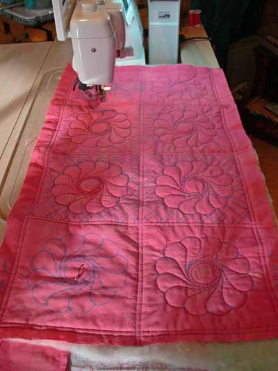
Coral Background Quilting Sampler while being stitched

The next part of the experiment was to illustrate how different background quilting blends in with or causes the main motif to pop out. From left to right (in both rows) I used:

  • no background quilting
  • cross-hatching (a grid) in a size similar to the large end of each feather in the wreath
  • cross-hatching in a smaller scale
  • stippling; on this one, I varied the size of the stippling. On the top row I used a fairly large stipple; on the bottom row I used a very small stipple to help the wreath stand out.

Between thee and me, I detest stippling most of the time. It has become SO overdone with the advent of machine quilting. There are lots more interesting ways to compress the background, but it does have its place (though infrequently!), and in this instance using a simple background quilting gets the point across better than something more creative.

Here’s a close-up of the no-background quilting blocks in the close up below…on the left. Boring and I think the background ripples some. I don’t personally care for this look, but certainly understand why some folks choose it, especially when hand quilting a big quilt!
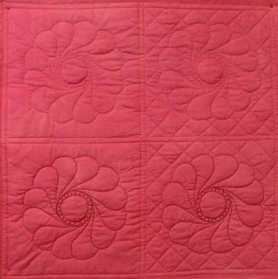
Background sampler, left side

On the right you see the cross-hatching in a similar scale as the wreath. By using contrasting lines (curved and straight), you get some differentiation between the motif and the background. Especially when looking at the block quilting in dark thread, it works.

When you reduce the scale of the cross-hatching, you get further contrast of scale as well as line. This really helps accentuate the motifs. In antique quilts, this is how they got those beautiful wreaths and feathers to stand out and be noticeable, even though they were usually using white thread on muslin. This photo will enlarge if you right-click and open it in a new window or tab.
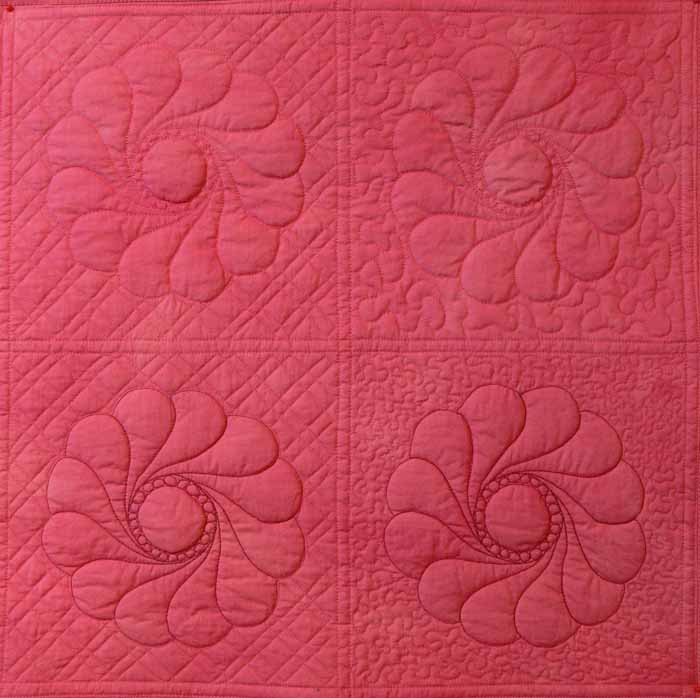
Coral Background Sampler, left side

In the stippling examples, boooorrrrriiiinnnngggggg, the larger stipple doesn’t do much AT ALL for me. The scale is too similar to the curves in the wreath. No significant contrast in line or scale. In the second block, the small scale of the stippling really helps “pop” the motif, as well as the small-scale cross-hatching. However, I still think there are lots more creative ways to deal with the background than boring old stippling. You can see the nearly-no-mark sampler I teach in my intro machine quilting classes here or here. That sort of background quilting is a LOT more fun (and visually interesting, at least to me!).

Finally, here’s a picture of the back. I used three fabrics on purpose to illustrate how the back looks when you have

  • a solid (ish) fabric that matches the front
  • a busy print
  • a solid fabric that contrasts with the front
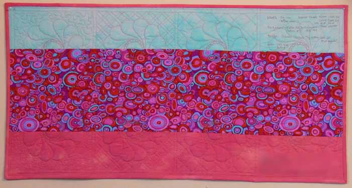
Coral Background Sampler, backIf you right click on this image, you can open it up larger to see more detail (I hope!).

I prefer to use a bobbin thread that matches the needle thread so that small variations in stitch tension and balance aren’t noticeable. Some quilters REALLY don’t like it when the bobbin thread contrasts with the backing. Personally, I really like the line-drawing appearance. As you can see from these photos, the bobbin thread is visible (but not very) on the matching solid, disappears completely on the busy circle print fabric in the center, and makes a nice picture (to me anyway) on the blue:
When I finish my Hawaiian-style jumbo 9-patch quilt, Nourish the Body, Nourish the Soul, I’ll share the background quilting on that and on a couple of my pattern quilts.
Blauviolett — or Procion MX RX-7

January 6th, 2008

Aljo Dyes in NYC has the elusive (and expensive) Procion MX dye Blauviolett! Usually available only in Europe, this dye has a mystique built up around the color, which I had never seen. The color has been described as an unbelievable blue, not achieved through any other combination. Alas, it also has a reputation of fading hideously quickly. When I ordered it, Aljo also advised it has a much shorter shelf-life than the usual two years for procion mx dyes… it should be used in six months or less they said.

Blauviolett.. all of them folded

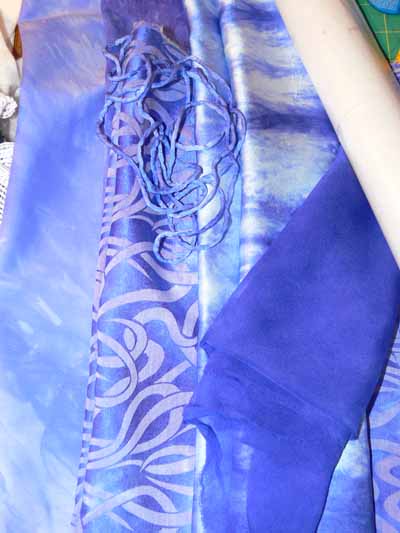
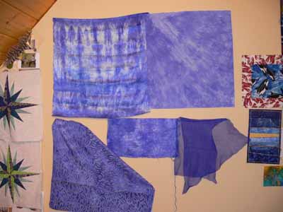
However, I got wind of the availability of this dye in the US for the first time in EONS, so I ordered a fairly small quantity (which I shared with some folks I met in Carol Soderlund’s dyeing classes) just to try. Through Paula Burch and Deb Harowitz of Scarlet Zebra, I learned that the dye might fade quickly on cotton, but that it seems to be MUCH more lightfast on silk. Hmmmm… so I not only dyed a fat quarter of cotton, but several different types of silk (I also finally broke out the citric acid crystals to use instead of the soda ash, which can have a negative effect on the hand and sheen or silk). The photo above shows cotton, silk jacquard (which appears not to be pure silk), sandwashed silk (from Dharma), and a silk chiffon, plus some silk rattail cord (also from Dharma). Here’s what they look like pinned to my design wall–

top row L to R: Sandwashed silk, mercerized cotton,

bottom row L to R: silk (and something) jacquard, silk dupioni, silk rattail cord, silk chiffon:

Blauviolett on wall

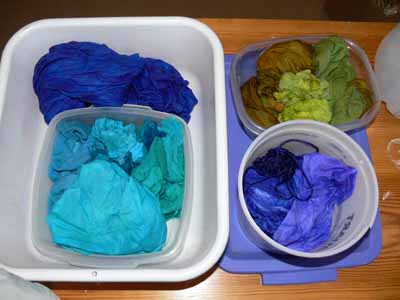
ALL fabrics were dyed with the same concentration of dye stock–all the silks were batched in the same container which you can see — the round tub on the bottom right! As you can see clearly, the chiffon and the silk portion of the jacquard “took” the dye very deeply, the dupioni and sandwashed silk (heavenly on the hands!) is less intense, and the cotton is lightest of all.

Batching–blue pots

Now that the holidays are behind us, I am planning to cut two swatches of the cotton and the silks. One set of swatches will go inside an envelope and be tucked away inside a drawer or inside a book–thoroughly protected from exposure to any light. The other set of swatches I’ll tape to the inside of my window. Then, if I can actually manage to do this, every month (hopefully regularly, like on the first) I’ll take side-by-side photos to document fading due to light exposure.

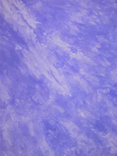
Here’s a close-up of the cotton…sigh. Sad to think that in three months this will probably be a dingy purplish pale gray…….

Blauviolett cotton FQ

If the silk remains light fast, I’ll buy up some silk and use up the rest of the dye… stay tuned!

MORE snow pics

January 4th, 2008

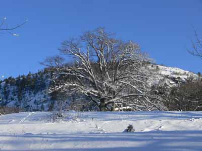
Can you tell I love snow? And taking pictures… here, some more winter inspiration, starting with the tree in the cemetary (not that you can tell with all that snow), Mt. Battie in the background:

Cemetary tree

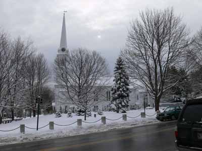
Here’s the Village Green:

Camden Village Green

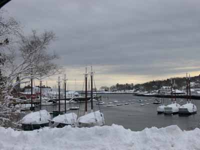
And the Harbor, from in front of the library:

Camden harbor

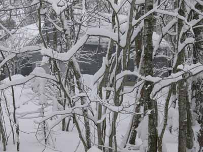
I love the “dinosaur ridges” on the tree branches (near our house):
“dinosaur ridge” trees

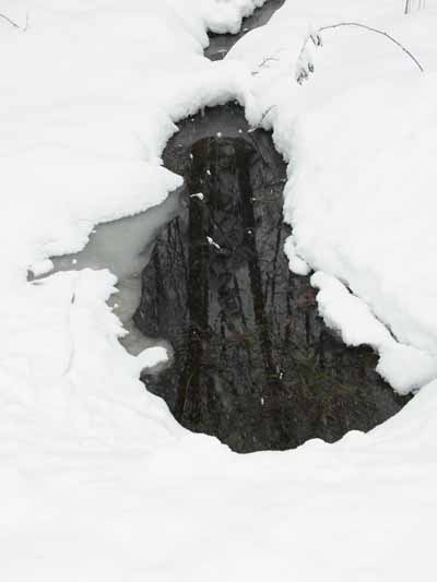
The reflections in the not-yet-frozen run-off creek near the house:

Reflection in the stream

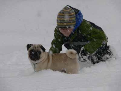
Eli playing in the snow with ‘Widgeon:

Eli playing with Widgeon

and Joshua playing in the snow, too:

Joshua in the snow

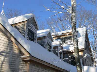
And the snow at least a foot deep blanketing my studio over the garage:

Garage roof

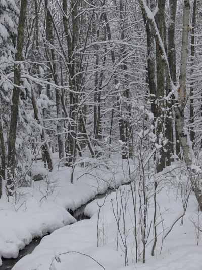
The snow-bound creek (which will freeze over before too long):

Creek

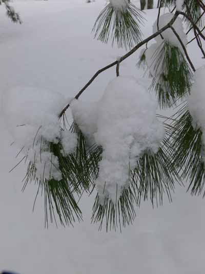
And the laden pine boughs alongside the driveway:

Pine bough

Let it snow, let it snow, let it snow…..

January 3rd, 2008

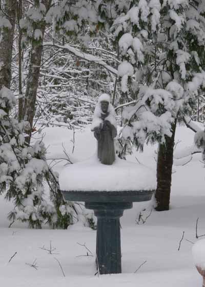
Let it snow:

St Francis

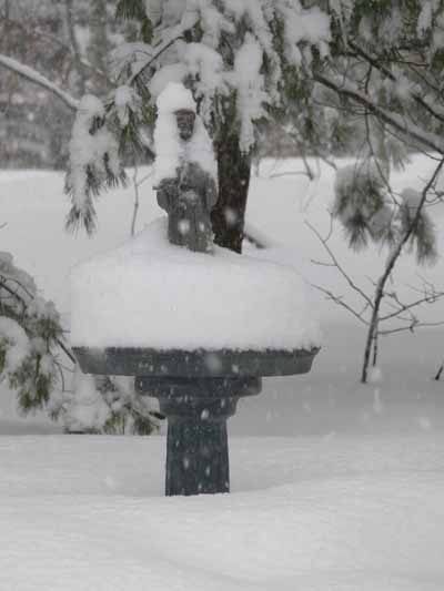
Let is snow (some more):

2nd St Francis

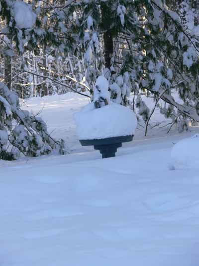
Let it snow (even more!):

3rd St. Francis

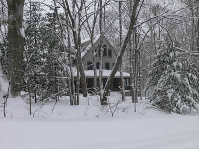
We had a White Christmas this year in spite of the warming weather last week, mostly because there was about 22 inches of snow on the ground. Quite a bit melted off before New Year’s Eve day, when we got more. Then the night of New Year’s Day, we got even more….. We now have more snow than I’ve seen in our short 3 1/2 years here. The snow plow ridge at the end of the driveway is SO high I can’t see over it to look for oncoming cars! So of course, since I love the winter and the cold (and being snug inside our house and quilting and reading and fixing tea and listening to the kids …well…. most of the time listening to them), I took pictures. LOTS of pictures! Here you go! Plenty of inspiration for art quilts, I think…. (a late note…too many pics! will post more tomorrow!)

Here’s our house:

The house

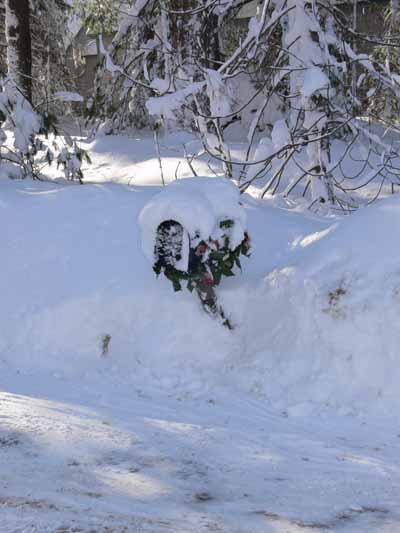
And the mailbox:

mailbox

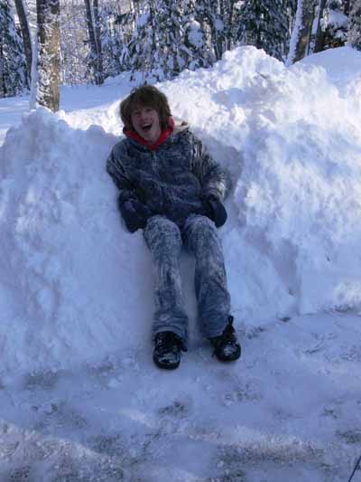
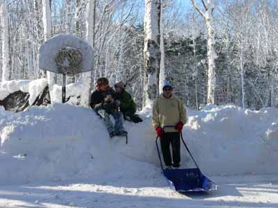
The house end of the driveway after being plowed and shovelled…notice how high the pile goes compared to the basketball hoop!

The guys by the basketball hoop

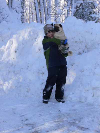
And here’s Eli at the street end of the driveway…Widgeon loves the snow, at least when it is in the 20s. Today it was around 0, yep, ZERO Fahrenheit (which is well below zero centigrade!), currently with a windchill of minus 10! That was a bit too cold on his little tootsies!

Eli with Widgeon by the plow pile at the end of the driveway

More pics tomorrow, including ones of town and the neighborhood.

Dyeing, December 2007

December 31st, 2007

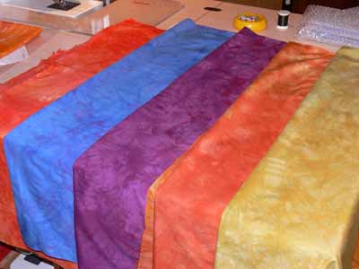
Gifts for the Frayed Edges were home-made and recycled this year… the best kind! I had found some gorgeous ribbon at Rock Paper Scissors, a store in Wiscasset. Deborah always loved to stop at Smitten, owned by the same person, and I had never been despite the fact that I drive through Wiscasset at least twice a month on my way to and from Frayed Edges meetings. So one time, on the way home, I finally stopped. And bought YARDS of this gorgeous ribbon, with the idea of making a gift for my fellow Frayeds. As Christmas approached, I thought…do they really need ANOTHER bag with this ribbon on it? Why not let them make something they like/want instead? That led to the decision to dye fabric.

Frayed and Marie fabrics

I got home from Mom’s in California on Dec. 11th. Over the next couple of days I dyed about 16 yards of fabric! I did two yards each of five colors (one for each of the other Frayed Edges and one for Marie. Each person received a half yard of “their” color plus a fat quarter yard of the other four colors. While I was at it, I decided to also dye some wonderful PFD (prepared for dyeing) fabrics Marie gave me for Christmas last year: silk organdy, gauze, lawn… plus some cheesecloth and also some silks. Oh MY!

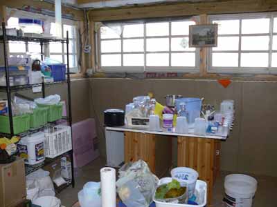
Dyeing set up

I moved my “table” (two old cabinets plus styrofoam insulation and a 4×4 piece of scratched up shower board) over by the basement windows. A vast improvement to being on the other side of the basement. Still no sink downstairs (I had a plumber give an estimate….$1200 not including sink, counter, faucet…to install….not gonna happen), so am hauling water, but at least it is space and I don’t need to worry about dye or soda ash splattering on the cement walls and floor. The shelving on the left is new and wonderful! All my dyes, auxiliaries and pots and beakers and whatnot in ONE place!

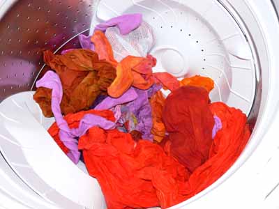
Batching and just rinsed fabrics look so wonderful (too see larger, click on the photo):
Batching–blue potsRinse out…oranges in washer

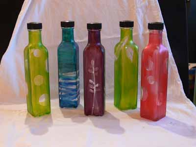
Then…. I took some raspberry syrup jars and painted them with glass paint. I used Pebeo Vitrea 160 (available here at Dick Blick) . I picked colors and a motif for each person….green for Marie, sea blues for Kathy, purple for Deborah, green for Kate, and deep coral for Hannah. The purple one for Deborah, for example, has the stalk with buds on it which she has used so often in her work, Kath’s has waves for the sea. I used contact paper cut into shapes and stuck on the bottles, then painted, allowed paint to dry. Paint is supposed to cure 24 hours (I cut it a little close on a few! as usual ran late on time) before baking. You put the glass in a cold oven, turn on the temp to 325. When the oven reaches 325 you “bake” for 40 minutes, then allow to cool inside the oven. It worked! Wouldn’t these look great in a window? I think we need to have more raspberry syrup on our waffles so I can make some for us!

Glass painted bottles

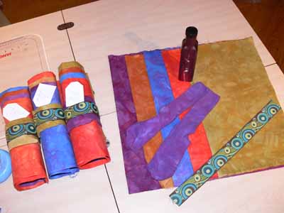
Finally, I wrapped everything up…. the bottle got wrapped with a pair of hand-dyed socks, which got wrapped with the 1 1/2 yards of hand-dyed , which got rolled with that ribbon from Rock Paper Scissors!

Frayed and Marie gifts…. rolled and ready to wrap

In the interest of having good materials to work with for my art quilting, I dyed a lot of fabric… I’ll have more to share over the next week or two.