email Youtube

Home
Galleries
Blog
Workshops & Calendar
Store
Resources
About
Contact

FiberArt for A Cause

November 11th, 2007

Virginia’s tulips

Need good ideas for holiday gifts (or just because?)?  Well, have I got two great things for you–an e-Book to delight and inspire and beautiful items to use, enjoy art AND fundraise for cancer research all at the same time!

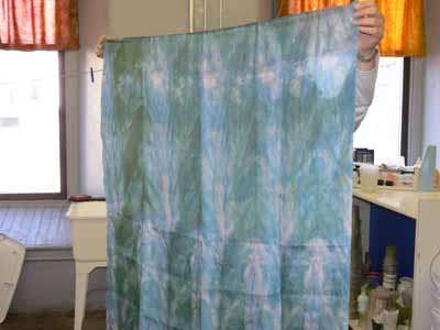
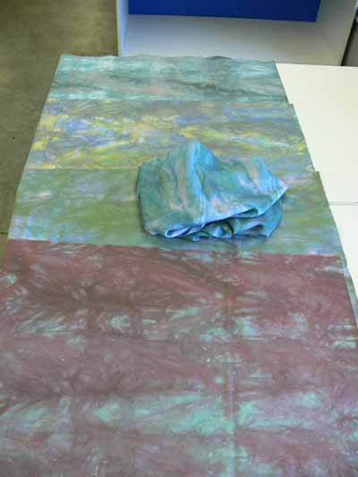
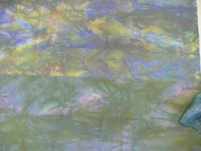
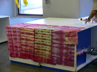
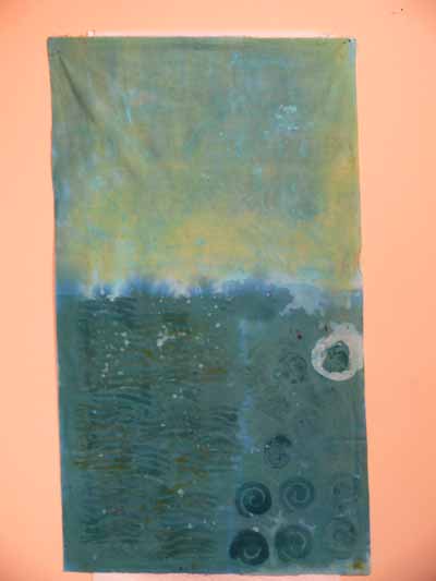
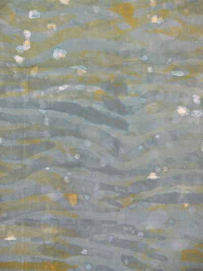
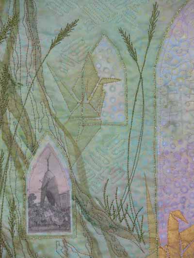
Virginia Spiegel had an idea: to raise funds for cancer research, one fabric postcard at a time, through a project she called FiberArt for A Cause (FFAC). That little idea grew and grew and grew, and to date she (with a lot of support from a lot of artists, happy customers and supporters, and a lot of hard work) has raised over $135,000! Yes, that is ONE HUNDRED, thirty five THOUSAND dollars donated directly to the American Cancer Society. The tulip photo above is one of Virginia’s (all photos used here with permission) that is featured in both her e-book and at her Cafe Press store to continue her fundraising efforts…read on for more info!

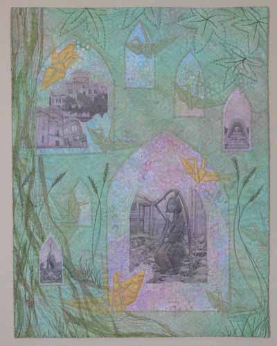
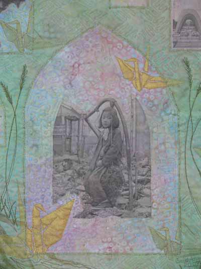
Next, Virginia has had several on-line auctions of art, and I was proud to donate a piece in honor of my dad, half-brother, and friend Linda. You can read more about The Wall here and here. And you can see the gallery from the 2007 auction here.

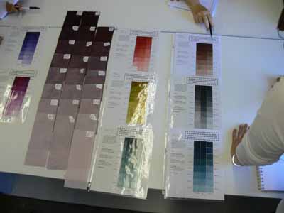
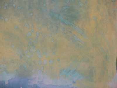
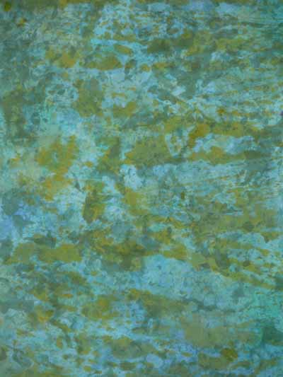
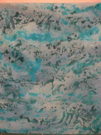
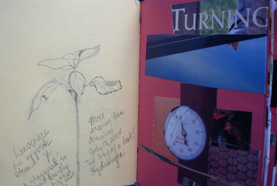
Now, Virginia has two more projects to help raise funds to fight cancer! First, she has compiled some of her newsletters into an e-book “Art Nature Creativity Life.” To read a sample chapter, click here. I am not normally a fan of e-books…I’m sort of old fashioned and like things on paper (it is that tactile thing that draws me to cloth, too!). But this book is glorious, and features not only her art quilts but also her photography–I’m so glad she posted a chapter online because now I believe! Here is one photo from a chapter of the e-Book, showing a bit of Virginia’s art journal:

Virginia’s journal

Every year Virginia and her sister go camping and canoeing in the Boundary Waters, and it is a chance for me to escape with them. The book has received rave reviews all around, and it would make a perfect Christmas gift for the person in your life who has everything, has been touched by cancer, or could use a momentary escape to beauty and art (and who doesn’t need that?)!

Her latest endeavor is another treat: FFAC gift items from CafePress, here. I’ve already ordered my Boundary Waters shirt and am starting my Christmas shopping list.

Boundary Waters shirt

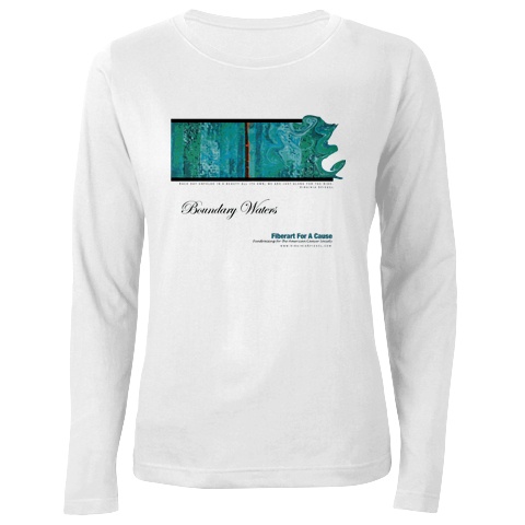
There are shirts, mugs, mousepads and totes in three different designs. All the profits from each item ($5) are donated directly to the American Cancer Society. Thanks to Virginia for her dedication to this cause, and for making it possible for all of us to share in her art and joy in the beauty of nature.

Color Mixing for Dyers, week 2, continued… one last time!

November 9th, 2007

In the grand tradition of saving the best for last, here are pictures from our final day when we got to share our work. Some of these pieces (not mine alas) easily qualify as art cloth; others, like mine, will wend their way into art quilts.

Sarah’s sequence pieces, wide angle view

On days three and four, we did an exercise with four (or more) pieces of cloth. In all four cases, we used the same dye mixture–in my case a plum-magenta-ish color. Your color needed to be one that used at least a tiny bit of each of three primaries in a color family (i.e. you had yellow, red and blue in the dye-mix). The first piece of cloth in this sequence was dyed with the complete mix of the color. First you needed to manipulate your fabric (I pleated mine simply by making tucks along the bias), then coil it up in a plastic container, then apply the dye.

For the second piece in the series, you selected a highlight color. You then applied the highlight to the cloth first, let it set a spell and then add dye activator, then add the final color(s). The next two manipulations were similar, with the fourth one using the color’s complement as the “highlight.” The photo above is of my four pieces. I also dyed two scraps of silk and a scrap of cotton using the poured off, activated dye from the various sequences. As expected, the color was pale to non-existent compared to the main samples. Here’s a closer view–the silks may be two of the ugliest pieces of cloth I’ve made in a long time, but there is always over-dye and paint!

Sarah’s sequence pieces, closer view

Now that I know what Carol was after, I know I would choose my starting color differently, and it would be a LOT more like what Wil Opio Oguta and my table-make Lasha (from Denmark) did. Here is Wil’s sequence…heavenly!

Wil’s sequence?

And Wil holding up one of the pieces…luminescent!

Wil and one of her sequence samples

Lasha dyed a large piece of lightweight china silk in addition to her cotton pieces; it is remarkable that the piece went home with her… I was sure it wanted to come home with me!

Lasha’s silk dyed using her sequence dye

And here is Lasha’s sequence:

Lasha’s sequence pieces, with the silk one on top

And finally, a close-up (can you tell I love the fracturing that happened?!):

Lasha’s … close up

One couple attended, both of whom weave and dye yarn. The same principles used to dye cotton cloth apply to any cellulose fiber, like yarn! Lew used a different colorway and manipulation that gives a very different effect:

Lew’s sequence pieces

Finally, here is one of Nancy’s pieces. She rolled the cloth from the corner, then twisted, then coiled and ended up with a wonderful wavy rolling texture. The more white area is from what was in the center of the roll. I can see doing this, perhaps on the lengthwise grain, to create a sea texture that shades from light to dark. You could do one round of dyeing to get the waves and coils and shading, then overdye the entire piece with a lighter value of the same (or a related) color to create a real “Seascape” for use in an art quilt. All it takes it time!

Nancy’s cool ripples

And, alas, I’m not sure whose pieces these are, but I wish they had jumped in my suitcase too!!!!  (Update…these are Beth  Polvino’s…  gorgeous!)

Wil’s (?) sequences

So you wanna go take a class with Carol? It is expensive…class fee, materials, kit fees, transportation, lodging, food, purchases of dyestuffs and auxiliaries you just can’t go home without, but my oh my is it worth it. I’m now trained for years…all I have to do is make time to put it into practice and begin to master the processes!

Color Mixing for Dyers, week 2, continued… yet again!

November 7th, 2007

Here is some flotsam and jetsam from the workshop. First, a photo of the loading dock which oh-so-conveniently backs onto the classroom area and has some clothesline trying areas:

the clothesline

One of the most valuable exercises for me during the entire five days was doing gradation tests on the same 5 percent dye concentrate when used in full immersion dye bath (well, as close as you can get with a 3×8 inch sample in a 16 ounce plastic cup), low-water immersion (ditto), and print paste mix. Here’s a photo of some of Carol’s samples:

gradation sheets

And this photo is of the gradation sets Nancy and I did–the pale gray to nearly black runs on the left:

Gradation sets for class

The bottom line is that print paste tends to come out about one step lighter than comparable pieces dyed in full and low-water immersion processes. What this means is that if one wants to dye-paint (like I want to do, and like Hollis Chatelain does with incredible skill and artistry), you can actually get predictable and repeatable results. Since fabric appears darker when wet, and since all dark dyes look black when wet, it is as if you were (literally) painting in a cave with no lights. By understanding and being able to predict your when-dry color, you can actually paint with the dye and get good results. Now, to finish writing my book so I can go TRY this for real!

Color Mixing for Dyers, week 2, continued… again!

November 5th, 2007

On the first day of the workshop, Carol invited us to pick a color which would be our “base” color to play with. Since I knew I needed to make some fabric for an art quilt destined to an invitational exhibit, I knew I wanted blues and greens, so I selected a somewhat teal blue. Here are some of our pieces batching on a work table. Please don’t ask me WHY I had never thought of something as simple as this: just lay your pieces flat, layer with a plastic drop sheet, add more pieces on top, another piece of plastic, etc.

Class work batching, layered with drop sheets

This piece is one where I tried a variety of techniques on a half-yard length:

Blues1–all

Then we started playing with resists: Elmer’s washable blue-gel school glue, cold wax resist, and Presist.

Blue glue-gel

The gel-glue has the virtue of being inexpensive and available just about everywhere. Since I wanted fabric for a pond and stream, I figured I’d make watery-shaped marks and blobs. The drawback to the gel-glue is that it takes a LONG time to dry: even though it was moderately warm (low 70s, which for Massachusetts in October is warm) and not oppresively humid, it took well over a day to dry fully. First I painted over the glue gel with a thickened print paste mix plus dye plus dye activator, and batched it. Then, I wanted to add more color and texture, so I scrunched the whole thing up in a plastic container and dumped on more dye. This partially dissolved the gel-glue which then migrated and formed the “rice” pattern on the cloth…cool!

Presist is a VERY thick gooey stuff that looks like molasses, except thicker. You pour (slowly) some of the gunk onto a plate or other flat, plasticky surface. You either dip your stamp into the Presist or use a small make-up sponge to daub the presist onto your chunky stamp. I did that in the wave area of the 1/2 yard length shown above. This photo (for some reason the color in the photo is hideous–color accuracy on the photo above is better) shows what it looked like after a couple of overdyes and some drips and drops from the cold wax (next item):

Blues presist

I love love LOVE the cold wax! The stuff is a milky white, in both color and consistency, and not inexpensive! You don’t have a lot of control with it but you can get these sweeping brush strokes for subtle overdyes. Here is a close-up of the upper section of the half-yard piece which shows some of the brushmarks and “water drops”. The color doesn’t photograph well (at least not with the time I spent setting up the shot!), plus it is very subtle to begin with. I would love to play with this medium more and see what I can do… I can see some awesome feathery-grass-like pieces in it. As with all wax (hot or cold!) you have to remove it; in this case, you can do the usual iron between newsprint or keep a plastic bucket (an old kitty litter bucket is perfect) for rinsing the wax out. The wax sticks to the side of the bucket instead of going down and coating your pvc water pipes in your house. That is a good thing!

Blues cold wax

Here is the print batching table once again, with three of my in progress pieces. As usual for wet cotton, the colors are deeper when wet.

Blues batching

The piece in the middle in the photo above is shown in detail below: although it is pretty unremarkable as a piece of manipulated cloth, it will be very useful: think forest pond!

pond green monoprint blobby

I made a second “monoprint” from the same leftover blobbies plus some more greenish print paste mixto make this more textured piece; think algae on forest pond!

blues monoprint

The piece on the bottom is one of my favorites. The blobbies are from using thickened print paste mix plus dye on vinyl, letting it separate into globs, taking a monoprint, then batching. After the piece was batched (to permit the chemical reaction between dye and cloth to happen), I allowed the piece to dry, then painted it with a thin wash of activated dye liquid, and here is the result:

aqua monoprint

Next assignment: make some art quilts out of the art cloth!

Windows of Hope, a Journal Quilt for 2007

November 3rd, 2007

As I mentioned last month in my post about the book Creative Quilting: the Journal Quilt Project, this is the final year for this fantastic journey. Instead of making nine paper-sized quiltlets each month, this year’s assignment was to use three (or more) techniques used in journals in the book to create our 17×22 inch (vertical orientation) journal quilt. Here is my journal quilt for this year:

Journal 2007 full

For several years, I have had lurking in my brain a quilt about peace, and the horrors of war, and its innocent victims. The need to create that quilt stems from a visit to Hiroshima in 1996 when my mom invited me to accompany her on a trip to Japan. She had served in Japan in 1946-47 with the US Occupying Forces, and fell in love with the country, its people and its culture. This quilt is a test-run for several techniques which I hope to use on the large Peace Quilt one of these years.

Jnl 2007 detail 2 girl

Mom has a photo album from her two years there, plus her travels to mainland China (before the Communist Revolution, which came two years later), Thailand and Cambodia. One photo in particular, above, was riveting: a somewhat melancholy girl sat on a make-shift swing someone had fashioned from the rubble of a bombed-out building in Tokyo, 1946. Mom purchased the photo from a Western photographer, but doesn’t know any more about it. For my first technique, I took a digital photo, manipulated it to improve sharpness and give a faded “old photo” look, and printed it on fabric. If ANYONE has any idea who took this photo, please tell me!

That photo alone, though, wasn’t enough to carry the quilt, so I decided to include some of my photos of the ruins of the Hiroshima dome, the cenotaph to mark the deaths of all the victims of the atomic bombs and the Children’s Peace memorial.

Jnl 2007 detail 1

That memorial features an origami crane in the sculpture because cranes represent good luck and long life. That led to the second of my techniques: a thermofax screen.

A what you ask? Do many of you remember dittos from school, before we had photocopying machines? We the ditto masters were made with these machines that can also be used with a special plastic-coated mesh fabric and a carbon photocopy (or pencil drawing) to create a stencil. I ended up having to order away for the stencils (fabulous service from Pam Relitz of Flying Images, rockitz@tds.net), but can see that I need to save up to buy one of the antique thermofax machines so I can make my own screens! (If there is anyone out there in blogdom who has blogged the process with photos–Gerrie? Rayna? send me a link and I’ll add it here).

I made my origami cranes, photographed them, traced out the exact lines at the angle I wanted, and had several screens made, then used metallic and regular paints to screenprint onto the background batik fabric.

I was having trouble coming up with a coherent “whole”, however. In browsing the Creative Quilting book (while waiting for hubby who had just had rotator cuff surgery and was at post-op physical therapy), I spotted the ogival window shape in Larkin Van Horn’s piece and new I had my organizing element. I rooted through my sheer fabrics, intending to dye or paint something into which I would cut windows, when I came across a rejected but HUGE painted sheer piece (about 48×60 inches) that was the first attempt at one of the overlays for Tree Spirits 2: Song of the Solstice Grove (can be seen on my website here). As I tossed the piece over the batik the tree trunk landed on the left side of the quilt…PERFECT!

After sketching out the location of the windows on the quilt, getting a nice balance of large and small yet permitting the screenprinting underneath to be revealed, I made a paper pattern which I placed under an old storm window. I used a heat-tool (aka stencil cutter) to cut the windows in the sheer fabric. Since synthetic sheer fabric is notoriously wiggly, I lightly sprayed the sheer with basting spray to adhere it to the storm window before cutting; because the fabric was light, I could see the paper pattern underneath and cut the windows exactly in the correct places (a metal ruler helped on the straight edges!). I then placed the sheer over the background, couched (stitched) gold yarn around the windows, and quilted the entire piece.

The serendipitous placement of the treetrunk on the left led to the overall quilting design, with bark, grasses and leaves and branches. In the background of the overlay I used a basketweave pattern, while I used a swirly cloud motif inside the windows. Finally, I couched two twisted lengths of the gold “yarn” (more like a fine cord) to what would become the edges, added facings which were turned to the back, and stitched down the facings.

I hope you like it…and thanks to all who managed to read all the way to the end!