email Youtube

Home
Galleries
Blog
Workshops & Calendar
Store
Resources
About
Contact

Color Mixing for Dyers, week 2
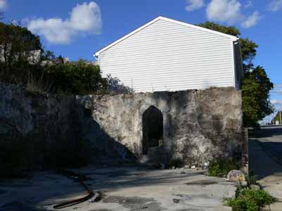
October 26th, 2007

Looking at this old mill building, you’d not realize that a glory of color happens inside! This is the home to dye-provisioner Pro Chemical and Dye….known to quilters and dyers as “ProChem.” ProChem

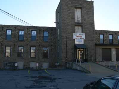
Earlier this month I was fortunate to take a second workshop with Carol Soderlund, Color Mixing for Dyers II. This workshop builds on what we learned in part 1, which I took last year. It was fun as several women returned from last year, so it was great to see familiar faces, meet new folks, AND meet Wil Opio Oguta, from the Netherlands, whom I had “met” online through the Fabled Fibers challenge. If you click on Wil’s name, you’ll go to her blog and can see some of her pieces form the workshop, too.

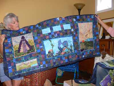
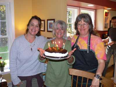
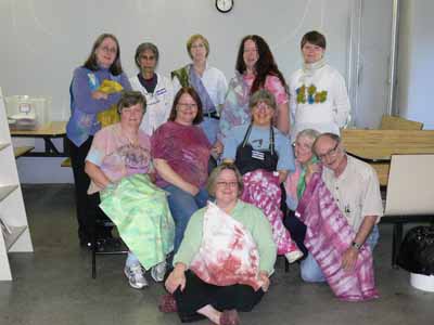
Here’s our “class picture,” with many of us holding something we had made during the five days.  We had folks not only from across the US, but also from Denmark, the Netherlands and France! Carol is in the plum tie-dye shirt in the center, I’m just to the right of her.

Class photo

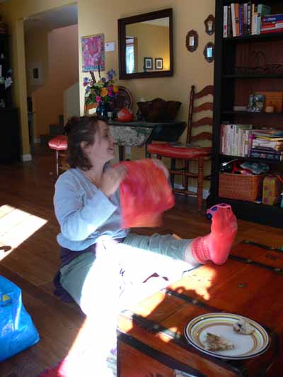
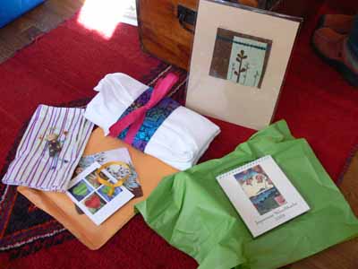
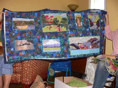
I make MANY different pieces, but will share this one with you today; it is a mix of several yellows (ranging from a cool lemon color to a warm, nearly tangerine, plus two reds, a cool fuchsia and a warmer basic mixing red). Red cloth

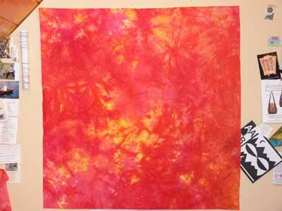
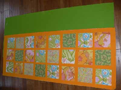
Over the next week or so I’ll add several posts with different things I worked on during the workshop. The first two days were focussed on using thickened dyes (print paste mix), doing many techniques that were familiar to me, having used them with paints of various sorts. It was interesting, however, to do them with dye instead (I MUCH prefer the soft hand of fabric after it is dyed compared to even the most supple of paints).

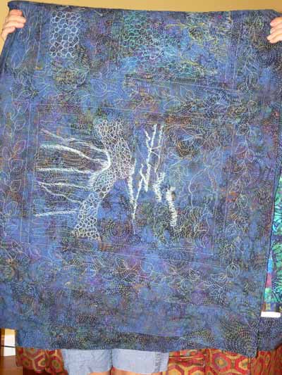
We dyed a fourth “color family” using three new primaries over the course of the whole workshop, then the last three days we worked on layering and overdyeing for specific effects and our own personal projects. As with paint, some blues are warm (think turquoise), some are cool (think glacier blue), some yellows are cool (lemonade), some are warm (sunshine and buttercups). By using primaries with different properties, you can get dramatically different shades of color: a warm yellow, warm red, and shaded/toned blue produce a completely different palette thank a cool yellow, cool red and warm blue. I’ll share a few photos later on of my color swatchbook just to tempt you, but first I have to cut and paste up my swatches from this session!

The Frayed Edges, October 2007

October 24th, 2007

En route, autumn

As usual, it was another wonderful day! Despite the look of autumn all around us, like the photo above which is just a mile or so down the road from Hannah’s house (on the peninsula south of Brunswick / Harpswell), it was a mild and balmy day fit for t-shirts…a last gasp of warm summer air. We had fun sharing, food (of course!), gifts and projects before flying to the winds as kid-duties called us home in the afternoon.

Hannah’s b-day is late September and mine (something like 15-17 years earlier!) in early October both happened since we last met, so we had a double celebration. Deborah sent goodies from Texas, and we exchanged gifts and grins and thank you’s. It is so wonderful to have creative friends!!!! Here is Hannah enjoying some hand-dyed fabric from my recent workshop (I promise, those posts are coming!)… but I had to tell her to keep unrolling to find the socks in the center–she told me she had been lusting after my bright socks and was having a hard time keeping quiet, so it was perfect!

Hannah socks and fabric

And here is my loot… from Deborah’s lovely sprigs and twigs (and LOVE the way it is mounted! off to find a frame!), to Kate’s damask table cloth (ready to dye, of course, from a small treasure trove of old linens she lucked into recently) and batik, to the Japanese desk Calendar (I LOVE and am so inpsired by Japanese woodblocks) from Kath to Hannah’s happy, crazy, jump-roping girl made from found beach glass (near her home) and beads she bought in China when adopting Nina. The crazy lime hair is perfect for my state of life these days!

Birthday loot

I shared my hand-dyes, and Kathy treated us to an in progress visual FEAST. She is making a bed quilt as a commission for some friends, interpreting their vacation photos from over the years. I SO WANT THIS. Aw heck, I want to be Kathy! I want her creativity and vision and color sense and style. But since I can’t have them, I will be more than content to sit and look and learn and enjoy and be thankful she is my friend. She is constructing the quilt in panels and quilting them, then will join them together. Here is one panel:

Kathy2

And another:

Kathy1

And LOOK at this quilting on the back….she’s as nutso as I am about quilting!

Kathy3

SIGH. I also REALLY like the way Kathy combined low-contrast deep-dark batiks in squares for setting the “photos.” Will keep that in mind for the future…. plus it’s a great excuse to buy more batiks… grin!

For lunch, we had calzones made by Bart the wonderful (aka Hannah’s hubby), one tomato-y and sausage and veggies, the other spinach and riccotta (which I’m going to try to duplicate tonight), followed by a true Maine treat: Whoopie Pie. However, this may be the largest whoopie pie on the planet, found and brought by Kathy:

Birthday girls

The “cookie” is a dense chocolate cake, the filling is more like frosting, and it is super rich. Oprah loves these, and her endorsement sent the maker from a mom making whoopie pies at home and then commercially for her friends from local to stratosphere / nationwide. Another Maine mom makes good! So we indulged. Here are the birthday girls with Kathy (Hannah on the left, Kathy plus Whoopie Pie, and me in a shirt I dyed at the workshop).

After our visit to the Botanical Gardens last month, we stopped at On Board Fabrics in Edgecomb and all purchased canvas to make floor cloths or something similar. In a nutshell, you buy heavy canvas, paint it, goop on (Mod-Podge, fusible, glue, whatever) fabric, then polyurethane the daylights out of it. Finally, hem the edges, put non-skid stuff on the back, and have a colorful floor. Well, I figured in my house that’s one more thing to collect or trap cat or dog hair, so mine will be washable placemats (a surprise for the family for Christmas, unless Joshua reads my blog while internet surfing at school when he is supposed to be studying….ahem, sport!). Kate was better prepared than the rest of us and got the most done. Here is a blank green-painted canvas to make a runner, plus that glorious mango color runner on top of it, with some Kaffe Fassett prints on top. Isn’t that enough to just make you smile when you look down at your floor?

Kate’s floor cloth in progress

Finally, on the way home, I actually got stopped for a train (!!!!) at the edge of the Wiscasset bridge and had the chance to snap this picture of the ready-for winter tree and the still-summery screaming blue sky:

Tree branches blue sky

Katazome and Indigo

October 23rd, 2007

Today I have, alas, no pictures to share, but boy do I have two AWESOME links to share that are art quilt and textile related!  The first is about antique indigo…the actual indigo!  The second is about katazome artist Karen Miller.

First, Isabella Whitworth makes incredible silk pieces in the UK which you can see on her website, here. On a recent post to the Dyers’ List (a listserv for folks interested in dyeing fibers, both cellulose like cotton and protein like wool–to sign up visit this site). She mentioned that she had recently been to an indigo symposium in the UK and was able to see some pieces of contemporary cloth and yarn dyed with indigo that is over 360 years old!!!!!! The indigo was retrieved by divers from a shipwreck that dates to 1641; one expert was given some, and dyed the pieces. Totally flippin’ amazing! Click HERE to go to that particular part of Isabella’s website.  And after you’ve done that, be sure to check out Isabella’s gallery pages….sigh….lust for cloth…..inspiration!

The second treat is thanks to Gerrie Congdon, who is an artquilter, dyer of cloth, awesome gramma, and many other things besides, and relates to Karen Miller. Karen Miller is a West Coast artist who specializes in katazome, a dyeing-out-but-not-if-she-can-help-it art from Japan which in one cuts stencils (meticulously, using many, MANY hours) by hand, applies rice paste, then dyes / prints fabric. Karen was recently profiled on an Oregon PBS program which you can find (thanks for the link Gerrie!) at Oregon Art Beat.

For my Friday Harbor and West Coast readers, you may be intrigued to know that not only is Karen a marine biologist / scientist by training, but her parents (or was it her grandparents? I met her at the Assn of Pacific Northwest Quilters show years ago and the details are a bit fuzzy now) helped establish and get-going the U. of Washington Marine Labs at the edge of the harbor that lends its name to the town of Friday Harbor in San Juan Island, Washington. Way cool! I think she sometimes teaches at Coupeville Arts Center on Whidbey… if I were still on the island, I’d be there for a workshop!

If you love learning about fiber, old fiber arts, and contemporary artists, treat yourself to some websurfing and visit all of these links. I’m going back, and I could watch Karen’s segment on Oregon Art Beat many times (as soon as it was over the first time–all 6+ minutes– I immediately hit play again!).

Fall River Burnout

October 21st, 2007

ProChem is in Fall River, Massachusetts, the town literally on the edge of the state next to Rhode Island (to get to ProChem from the highway you drive through a few blocks of a neighborhood in Tiverton, RI). My dad was born there in (get this!) 1899, and no, that is not a typo…he was OLD when I was born, nearly 59!

Fall River burnout, stairs

Anyway, lately I’ve been taken with pictures of falling down houses here in Maine. This burned out shell on Shove Street in Fall River, maybe 2/10 of a mile from ProChem caught my eye every morning as I drove in to class (the motel is in a neighboring town). On the way home on Saturday afternoon, I finally stopped to take pics because I knew I’d really be sorry if I didn’t. The picture above is of an outside staircase, that went from the sidewalk to what presumably used to be the main living level of the former house.

This next picture is of the old basement /ground level. I love the old arched doorway to the stairs curving up… from the way it is made, I am guessing these were inside stairs to a back or side entry.

Fall River burnout, doorway

Here’s a picture of the charred window frame and old plastered stone wall:

Fall River burnout, charred window

And finally, to help you place things, a wide angle view of the arched-doorway wall and the house next door. It is VERY close…less than ten feet so I’ll bet it was scary for the owners of the new house when the old one was going up in flames!Fall River burnout, wide angle view

Autumn Leaves 2007

October 19th, 2007

Autumn 2007-1

It is that glorious time of year again, when the air is crisp, the leaves are on fire, the sky is screaming blue (alternating with stormy gray). I don’t know if autumn is my favorite season because I was born in early October (yep, I hit FIFTY this month…. don’t feel a day over early-30s except for my knees!), or just because autumn is so spectacular. After retrieving two quilts from a local quilt show on Monday, I took lots and LOTS of pics on the way home. The one above is one of my favorites…. as usual, I love the close ups. I totally love the sharp contrast of the nearly-black bark and the bright oranges and reds. I’ve been really inspired by some of Dijanne Cevaal‘s recent quilts of treescapes (click on her name, which will take you to her July 2007 archives and scroll down to July 15 and 7), and after the Week 2 dyeing class with Carol Soderlund, think I have several TreeScape quilts in my future!

While on the way down to the quilts, I spotted this tree and, on my return, pulled over for the first of a series of road-side Driver’s Seat Snapshots:

Autumn 2007-10 Orange glow tree

Then there was a whole string of glorious shots (all from the car! I WAS careful and pulled over to the shoulder, etc). Here’s one of turning leaves–I love to see the progression of color change from the treetop and tips of the branches, flushing back towards the trunk.

Autumn 2007-9 Leaves turningThen of course there are the startling silhouettes of branches laden with red, the deep shadows of the northern woods behind:

Autumn 2007-8 Red maple branch

Here is a wide-angle shot, not so pretty, but it gives an idea of what the roadside looks like on Route 90 in Warren and Rockport:Autumn 2007-7 Roadside scenery

Here is a glorious massing of red:

Autumn 2007-6 Lotsa leaves

And a portrait of a young, understory maple:Autumn 2007-5 Understory maple

And another:

Autumn 2007-4 Red maple, trunk on left

Even the gas station had glorious shots. The best priced gas is at the independent station at Tolman Pond on Route 90 in Rockport. Here is a major zoom picture of the trees on the far end of the pond (in the West something this large would be called a small lake!):

Autumn 2007-2 Tolman Pond view

As I took the picture of the diesel pump, a guy asked me if I was focusing the camera. I said no, taking a picture. He allowed as how he’d never seen anyone take a picture of a gas pump before, but I think it makes a good photograph. Who knows, we all know I’m slightly deranged (said in a John Cleese voice, please! “Deeee-Ranged!”).

Autumn 2007-3 Diesel pump