email Youtube

Home
Galleries
Blog
Workshops & Calendar
Store
Resources
About
Contact

Catching up, more March and April

July 14th, 2013

Gosh, I must say I am thrilled at all the work that fell  out of the sky onto me this past spring, but it is nice to be able to take a breather, blog a bit, sit on the sofa with a bit, sit on the porch and enjoy the summer breeze (ok, so at the moment the breeze is imaginary but I can hope one wafts in soon ans disperses the hot and muggy weather that is doing us all in as I type this…hopefully by the time this posts to the blog the “hot, hazy and humid” forecasts will be done and we’ll be back to glorious Maine summers).

This is a bit of a catch-all post to catch you up on life, so in somewhat random order….
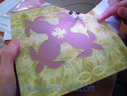
In April I lectured in Massachusetts, then taught in Rutland, Vermont.  As you might guess, the class was Hawaiian Applique by machine which I will be teaching TWICE in Southern California this month!

In April I lectured in Massachusetts, then taught in Rutland, Vermont. As you might guess, the class was Hawaiian Applique by machine which I will be teaching TWICE in Southern California this month!  Didn’t this student do a beautiful job with her satin stitching on the turtles block?
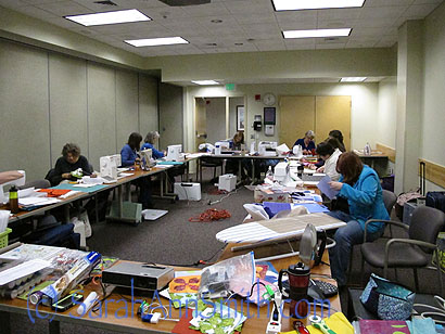
Here's the classroom, on the lower level of a hospital center!

Here’s the classroom, on the lower level of a hospital center! Thanks to all the ladies who came–what fun!
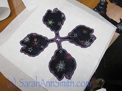
And here's a taro leaf block, another of the "small" options in this class.  Lovely!

And here’s a taro leaf block, another of the “small” options in this class. Lovely!

As luck would have it, my route (yippeee!) took me from Massachusetts right past my friend Jacquie’s house on the way to Rutland, where I didn’t have to be until the evening lecture.  So of course I got to make a small detour and visit, and of course she fed me (Jacquie is a MUCH better and more inspired cook than I am).  When I arrived (late, I’m Sorry jq!) she was on Skype with her daughter Melanie, who lives in Germany, so I got to visit with Melanie too!   We had so much fun yakking and sharing that we forgot to pull out Melanie’s elderflower cordial that she made, so I’ll just have to manage another trip to Vermont.
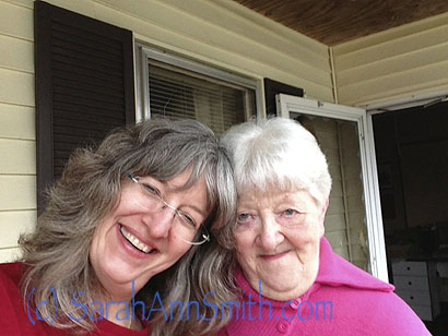
I LOVE this picture...which I managed to take with arm extended.  It only took about three tries to get a decent one, too!

I LOVE this picture…which I managed to take with arm extended. It only took about three tries to get a decent one, too!
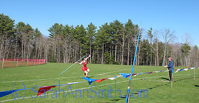
In April, Eli's track and field season began.  Here's an early season meet, with him throwing the javelin.  Look at that glorious sky and that beautiful boy-child (OK, soon to be young man) of mine!  So proud of him--this is his third varsity sport this year, as a Freshman!  And he qualified for States, making it three for three.  Well done, kiddo!

In April, Eli’s track and field season began. Here’s an early season meet (the deciduous trees are still bare), with him throwing the javelin. Look at that glorious sky and that beautiful boy-child (OK, soon to be young man) of mine! So proud of him–this is his third varsity sport this year, as a Freshman! And he qualified for States, making it three for three. Well done, kiddo!

Earlier, in the spring snowmelt and rain, our driveway (3/10 of a mile long…there is this big rectangle with lots all around it, and one long skinny driveway to the lot in the middle which is us) washed out, really badly on the bottom.  So we sucked it up and paid serious money to put in a proper ditch that would deal with all the water.  Cost about as much as (OUCH!) a nice used car! Here are the markings from when DigSafe came to show where NOT to dig:
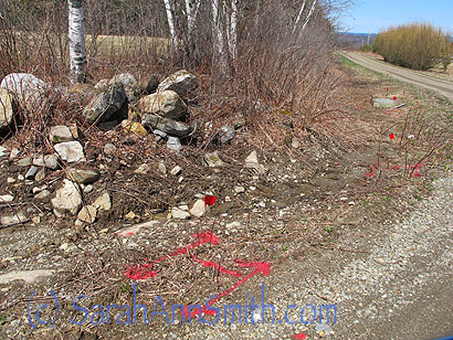
Getting ready for ditching on the uphill side of the long driveway.  The red shows where there are utility pipes (electric and phone/internet) underground.

Getting ready for ditching on the uphill side of the long driveway. The red shows where there are utility pipes (electric and phone/internet) underground.

Then, here are a couple more shots of me prepping for filming the Quilting Arts DVD on May 1 (my full blogpost on that is here):
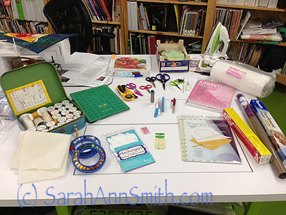
Setting things up as they would be seen on camera, in the "stuff you'll need" part of the DVD at the beginning.

Setting things up as they would be seen on camera, in the “stuff you’ll need” part of the DVD at the beginning.
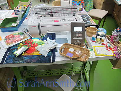
And working on the preliminary quilting for the piece I would quilt on the set.  I needed to have the tomatoes in various stages of being quilted to demo the difference from unquilted to partialluy done, to done, plus one to work on while filming.

And working on the preliminary quilting for the piece I would quilt on the set. I needed to have the tomatoes in various stages of being quilted to demo the difference from unquilted to partialluy done, to done, plus one to work on while filming.

So that’s a bit more of why I’ve been so quiet these past months–LOTS of work and family life.  Life is good!


A Balinese beauty!

July 11th, 2013

You coulda knocked me over with a feather!   I very rarely hear back from students despite my invitation (Plea!) to send pics of projects!  Well Nancy McConnell DID!  THANK YOU, Nancy, and yep, I’m shouting!

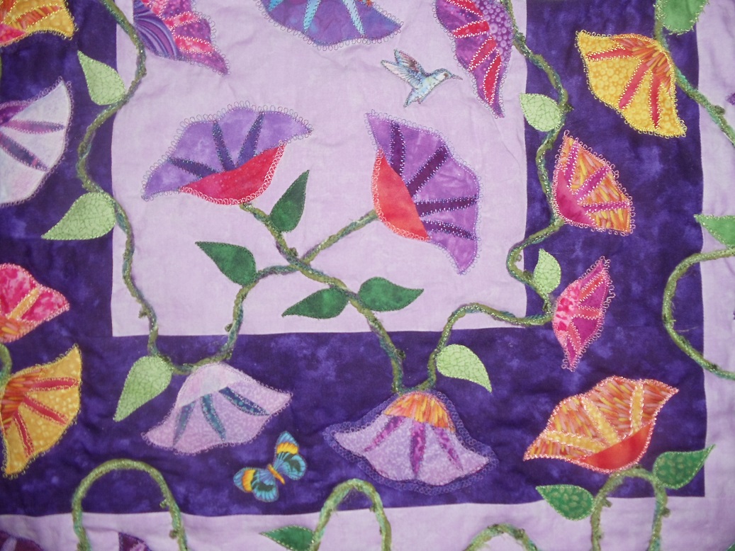
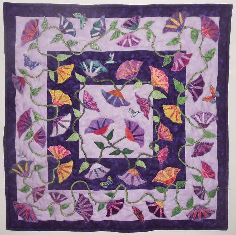
Two years ago in March 2011 I had the pleasure of teaching for Cape Cod (Massachusetts)’s Bayberry Quilters, and Nancy was in my Balinese Garden class.  I always encourage students to do their own thing and adapt the pattern at will, and she did, and I’m so glad!   The pattern, here, is for a pillow or tablerunner.  Nancy let hers GROW into this beauty:

I just love the way the flowers dance across the surface!

I just love the way the flowers dance across the surface!

Here’s what Nancy wrote:

Well, more than two years later, I completed the quilt on May 7th.  I had fun making the flowers and got carried away making
so many, but I had to use them, so “Garden Party” is a bit manic, but I am happy with it.  I used lots of rayon thread that I had in my stash
and was pleased with the results.  I will show the quilt in our annual Quilt Show on August 1, 2 and 3rd.  Hope you can attend.  Here’s the link to it:
http://bayberryquiltersofcapecod.com/

Alas, I won’t be able to go down (will be taking son to running camp in Vermont about then), but if you are in the vicinity, do go!

Here’s a detail photo:

Detal of Nancy McConnell's Garden Party Quilt.

Detal of Nancy McConnell’s Garden Party Quilt.

Thank you so much Nancy for being in the class and especially for sharing your quilt with me and letting me share it, in turn, with all of you!

An Exquisite Moment

July 8th, 2013

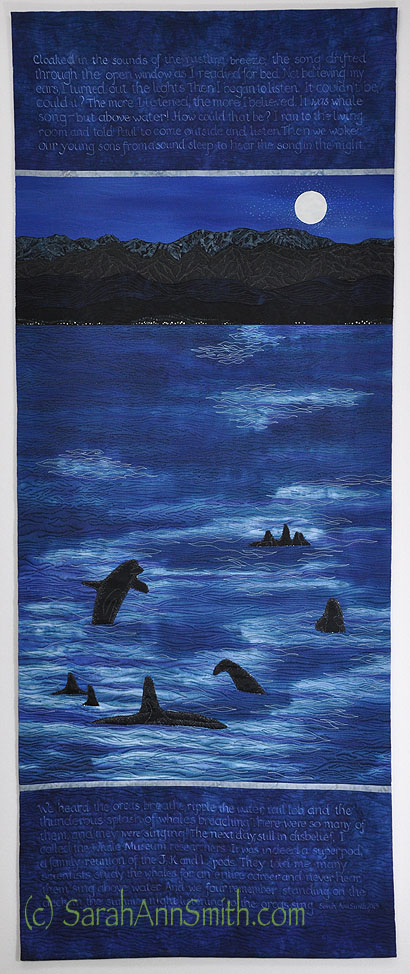
Some time ago, I shared with you “Listen to the Song in the Night,” which has been juried in to this year’s exhibit, An Exquisite Moment, curated by the Dinner @ 8 Artists, Jamie Fingal and Leslie Tucker Jenison.  The exhibit will debut at the International Quilt Festival in Long Beach, California, at the end of this month, then travel to Quilt Festival in Houston in October/November of this year.  I am so thrilled to once again be part of such a wonderful group of artists.  Jamie and Leslie have been blogging and interviewing those of us in this year’s exhibit, here.  Today, July 8th, it is my turn!   So please go visit the blog and enjoy!

Listen to the Song in the Night by Sarah Ann Smith (c) 2013.  24 x 60 inches.  Artist dyed silk and cotton, a few commercial batiks (mountains).  Free motion quilted, ink with dip-pen, paint.

Listen to the Song in the Night by Sarah Ann Smith (c) 2013. 24 x 60 inches. Artist dyed silk and cotton, a few commercial batiks (mountains). Free motion quilted, ink with dip-pen, paint.

Thanks to artist Loris Bogue, we have also had catalogs of the exhibit that one can purchase via Blurb (or is it Snapfish?).  When this year’s is available, I’ll share the information with you.  I so enjoy reading the answers by the other artists.  So I invite you to surf over to Jamie and Leslie’s blog and spend some wonderful lunches and afternoons–after all, it is too hot to work hard, so let’s sit and enjoy the art!–with the talented folks in this exhibit.

And if you’d like to know more about how I made this quilt and the story behind it, please visit my earlier blogpost, here.


Mr. Wiggles Does the Circle Dance

July 6th, 2013

And here, as promised, is the completed quilt!  Imagine, two blogposts in two days…after the past many months that’s nearly a miracle!

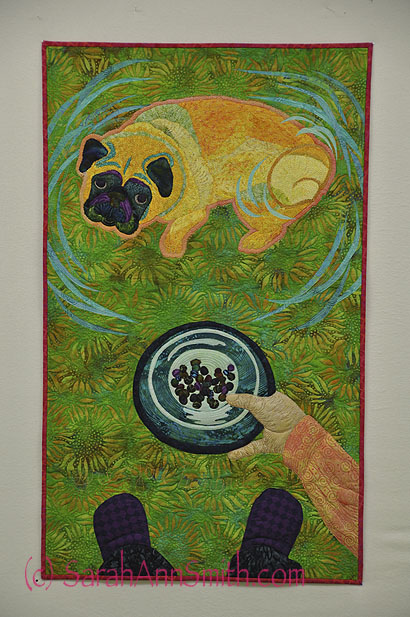
DRUM ROLL:  Mr. Wiggles Does the Circle Dance, complete.  I changed from red strips on the side to the red fabric as binding.  Color me happy!

DRUM ROLL: Mr. Wiggles Does the Circle Dance, complete. I changed from red strips on the side to the red fabric as binding. Color me happy!

Can you tell I totally ADORE that sweet pug face?  I want doggie smooches!   And yes, that pathetically small amount of kibble is all he gets.  Anyway, I hope you love this as much as I do!

Catching up, March

July 5th, 2013
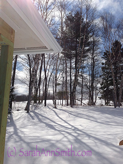
Remember back when the world looked like this?  Yes, that was a bit over 3 months ago--hard to believe in the torrid heatwave right now!

Remember back when the world looked like this? Yes, that was a bit over 3 months ago–hard to believe in the torrid heatwave right now!

Well long ago and many degrees cooler than now (about 75 degrees cooler to be precise), I began work on a piece for a juried exhibit / book, and I’m thrilled to say that my piece was accepted.  Mary W. Kerr, author of Cutting Edge Art Quilts (see my book announcement blogpost here), came up with another great idea for an exhibit:   “Dare to Dance, An Artist’s Interpretation of Joy.”  It worked so well, she sent out an invitation to make a quilt 18 x 30 inches for possible inclusion in a book on that theme.  Immediately I KNEW what my image would be… but it would just need to get squeezed into a very busy time period when I was also writing three articles, doing new artwork for the articles, AND prepping and filming my Quilting Arts DVD (post about that here).

The image:  Mr. Wiggles a.k.a Pigwidgeon a.k.a. our pug!   See every time he gets hungry, he puts his feeties up on your leg.  When you look down at that sweet pug mug and ask, “Are you hungry?” he immediately hops, then drops onto all four feet and begins The Circle Dance.  Always counter clockwise.  Several times.  Accompanied by a hop or three.  Then he scootches around behind me (after I’ve creaked my knees into standing) and nudges me into the kitchen by pushing at the back of my calves with his sweet smooshed-in face, just to make sure I know where to go!

I’m excited to see my article on backgrounds come out in an upcoming Quilting Arts issue (blogpost about that here), and this is yet another example of how backgrounds make a difference.  But first, I needed to get a photo to use as my model for his wiggly body:

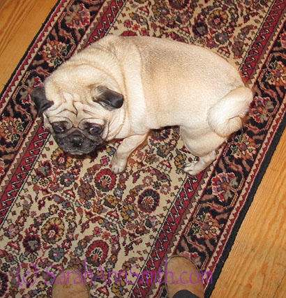
First I had to capture the correct curve of his body.  This too MANY photos because they were mostly blurred because he was moving too fast!

First I had to capture the correct curve of his body. This too MANY photos because they were mostly blurred because he was moving too fast!

Then we needed to get the “putting down the dish” thing:


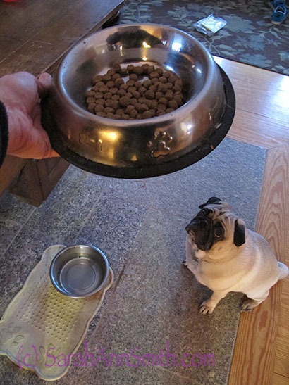
First attempt at putting down the dish.  Decided the proportions and bowl at the top didn't work.

First attempt at putting down the dish. Decided the proportions and bowl at the top didn’t work.

So….

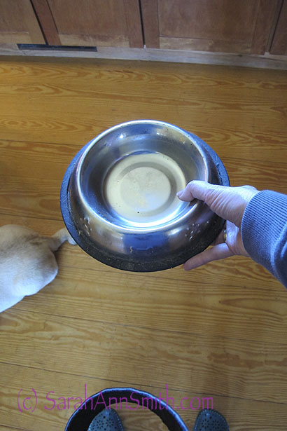
So this time I asked hubby to take a photo from over my shoulder, which would then be at the bottom of the quilt.

So this time I managed to take a photo with my left hand only to get the proper perspective, which would then be at the bottom of the quilt.

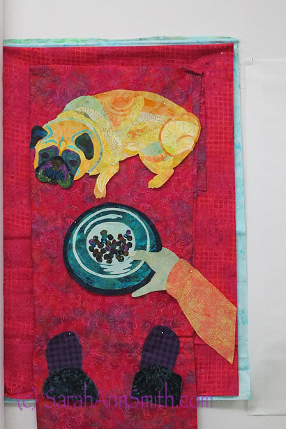
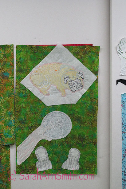
Once I had my working photos, I fuse-collaged the dog, the bowl and my hand, and my slippers.  Next:  choosing a background.   Hmmm.   Let us just say I tried MANY colors.  If a color contrasted with the warm tones, the blues/purples blended in.  If the color contrasted with the purple and blues, the pug got lost.   Some prints were blah.  Some were too visually busy.

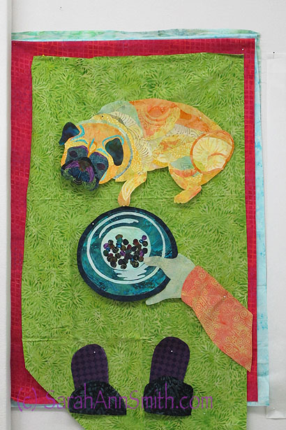
The red contrasts well with everything, but was a bit much for me.  I know this will hang in our home, but it was just too much red.

The red contrasts well with everything, but was a bit much for me. I know this will hang in our home, but it was just too much red.

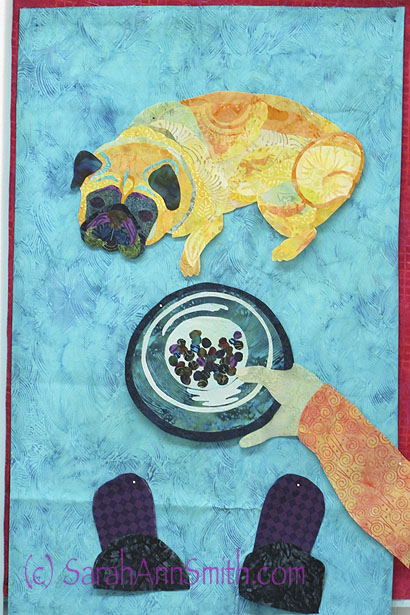
So how about blue? Egads, NO!

So then I tried blue.  Definitely not this one.  Nice batik, but not here--washed out AND busy.  Blech!

So then I tried blue. Definitely not this one. Nice batik, but not here–washed out AND busy. Blech!

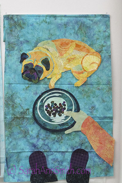
So off to try my favorite turquoises.  Hmmm.  Not so much.

OK, but not great.  The dog and my arm stand out well, as do the dark slippers, but the food dish kinda mooshes into the background.

OK, but not great. The dog and my arm stand out well, as do the dark slippers, but the food dish kinda mooshes into the background.

Tried another turquoise, with more visual texture.  This was NOT an improvement.  OK, moving on....

Tried another turquoise, with more visual texture. This was NOT an improvement. OK, moving on….

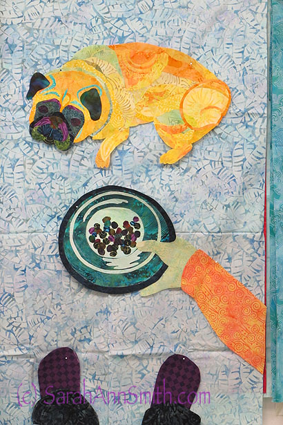
OK, so yellow and orange won’t work for obvious reasons, don’t want browns, red doesn’t work, neither does blue or turquoise.  Don’t want that much purple.  That leaves (drum roll) green.  So how does that work?

Definitely better.   However, this fabric looks much better in the photo than it did in person.  It is a "fractured ice" type of pattern, and it looked pretty flat and dead in person, but the color was definitely working for me with pug, arm, dish and feet!

Definitely better. However, this fabric looks much better in the photo than it did in person. It is a “fractured ice” type of pattern, and it looked pretty flat and dead in person, but the color was definitely working for me with pug, arm, dish and feet!

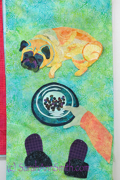
Here's another green.  Again, the "print" of the batik is a bit flat, and perhaps it is a bit too briht, but like the red strips on the side.  For quite a while I planned on vertical stripes of red.

Here’s another green. Again, the “print” of the batik is a bit flat, and perhaps it is a bit too briht, but like the red strips on the side. For quite a while I planned on vertical stripes of red.

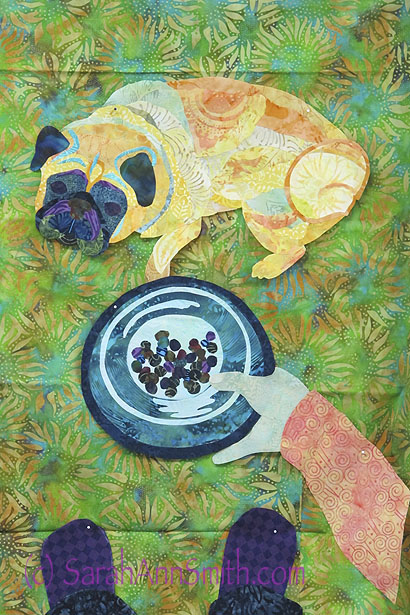
I really liked this print, but the yellow of the sunflower petals was a bit disctracting.

I really liked this print, but the yellow of the sunflower petals was a bit disctracting.

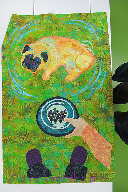
The solution?  PAINT!  A thin (very thinned) wash of blue paint knocked back the contrast a bit.  Just enough visual "life," not too contrasty, not too flat.  The Goldilocks choice:  Just Right!

The solution? PAINT! A thin (very thinned) wash of blue paint knocked back the contrast a bit. Just enough visual “life,” not too contrasty, not too flat. The Goldilocks choice: Just Right!

Then comes the quilting.  A couple of times I have tried this method, and I like it–not all the time, but often.

Here you can see the back:  I do the thread-coloring (aka thread-painting) with a batting behind the figure as a stabilizer.  Once done, I trim away the excess (not trimmed on the pug).

Here you can see the back: I do the thread-coloring (aka thread-painting) with a batting behind the figure as a stabilizer. Once done, I trim away the excess (not trimmed on the pug). Notice the fabric on the left, unpainted, with the painted background…just a bit of difference on the yellow petals.

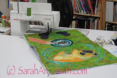
Can you say "LOVE MY JANOME"?  This is the 8900--every time I think they can't make a machine better, and yet they do.  LOVE quilting on this baby (I call him Gandalf because of the silver front, and it has to be a guy because he's so big!).

Can you say “LOVE MY JANOME”? This is the 8900–every time I think they can’t make a machine better, and yet they do. LOVE quilting on this baby (I call him Gandalf because of the silver front, and it has to be a guy because he’s so big!).

Tomorrow, the completed quilt!