Pink Oyster Mushrooms for Dinner@8, Celebrating 10 Years
Tuesday, June 26th, 2018
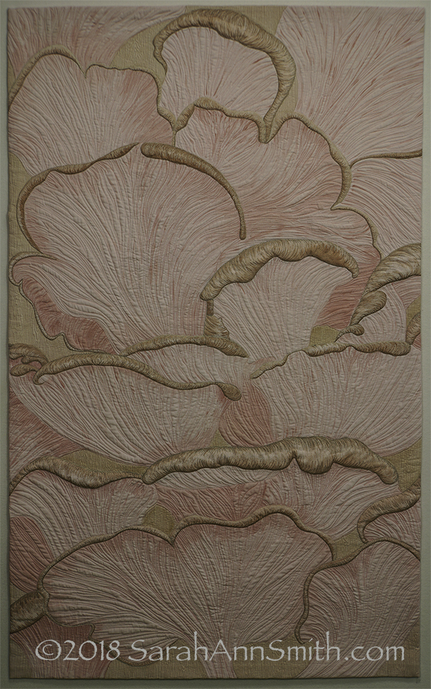
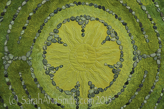
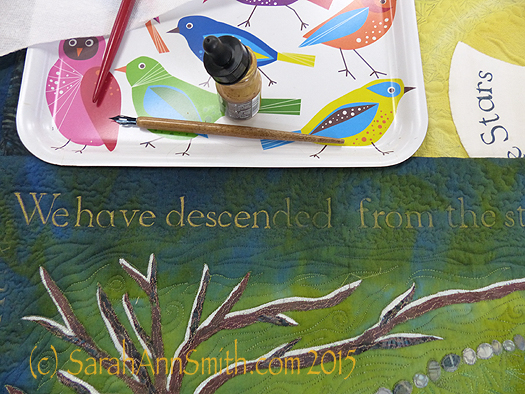
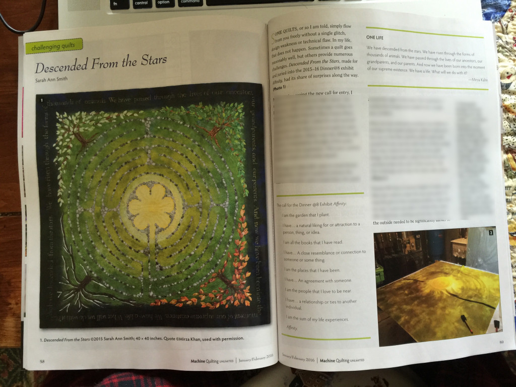
Here’s what I wrote on my entry: Beneath the Surface of the Edges of the pink oyster mushrooms, the Space Between the gills forms rhythmic Patterns of shadow and light. My Affinity for fungi and lichen extends to the inspiration I find in the world around me in Maine, even at at the Belfast Farmer’s Market. Dyeing and painting white cloth is part of my artistic voice, my Personal Iconography.
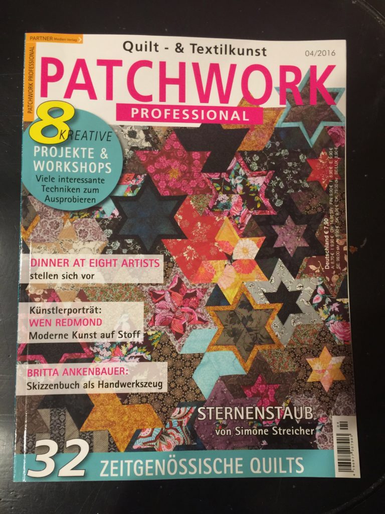
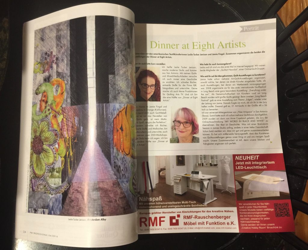
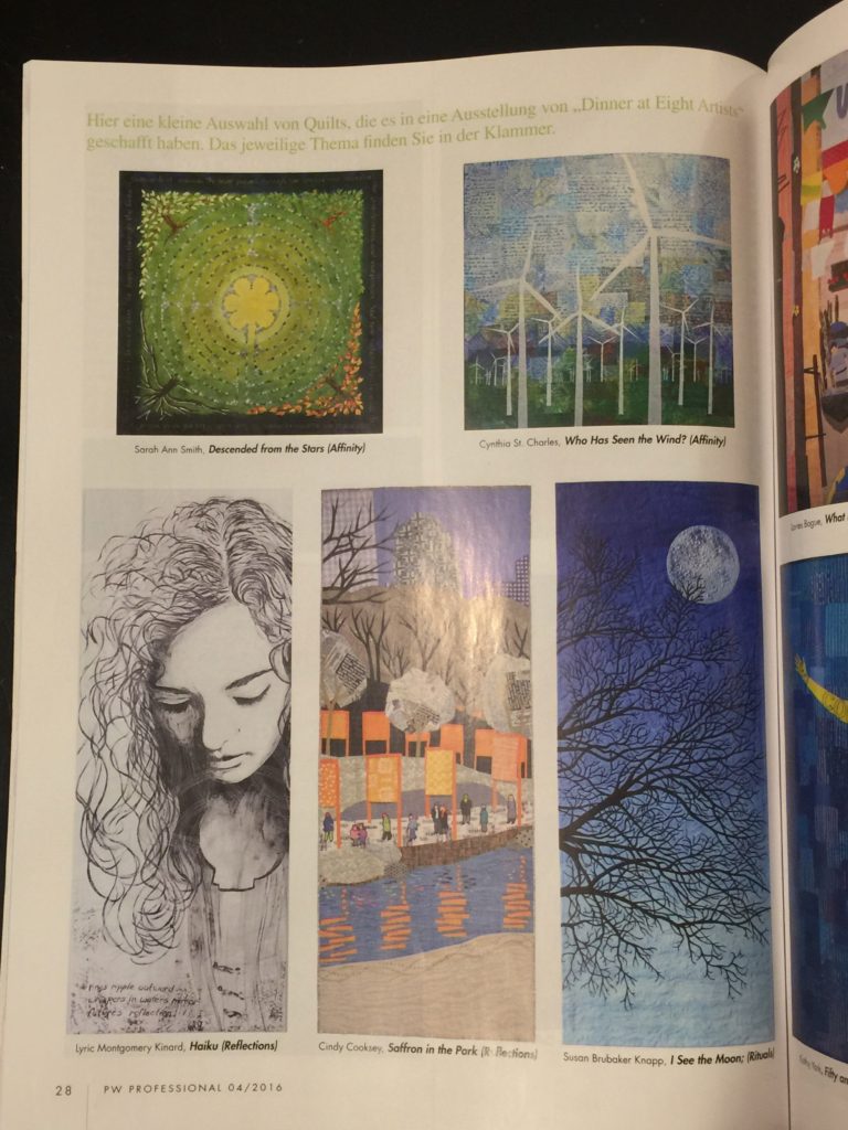
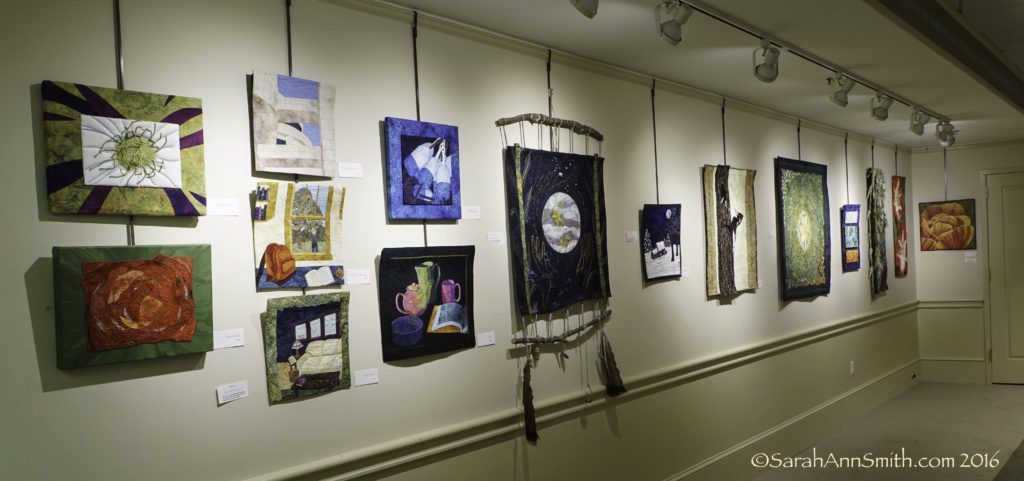
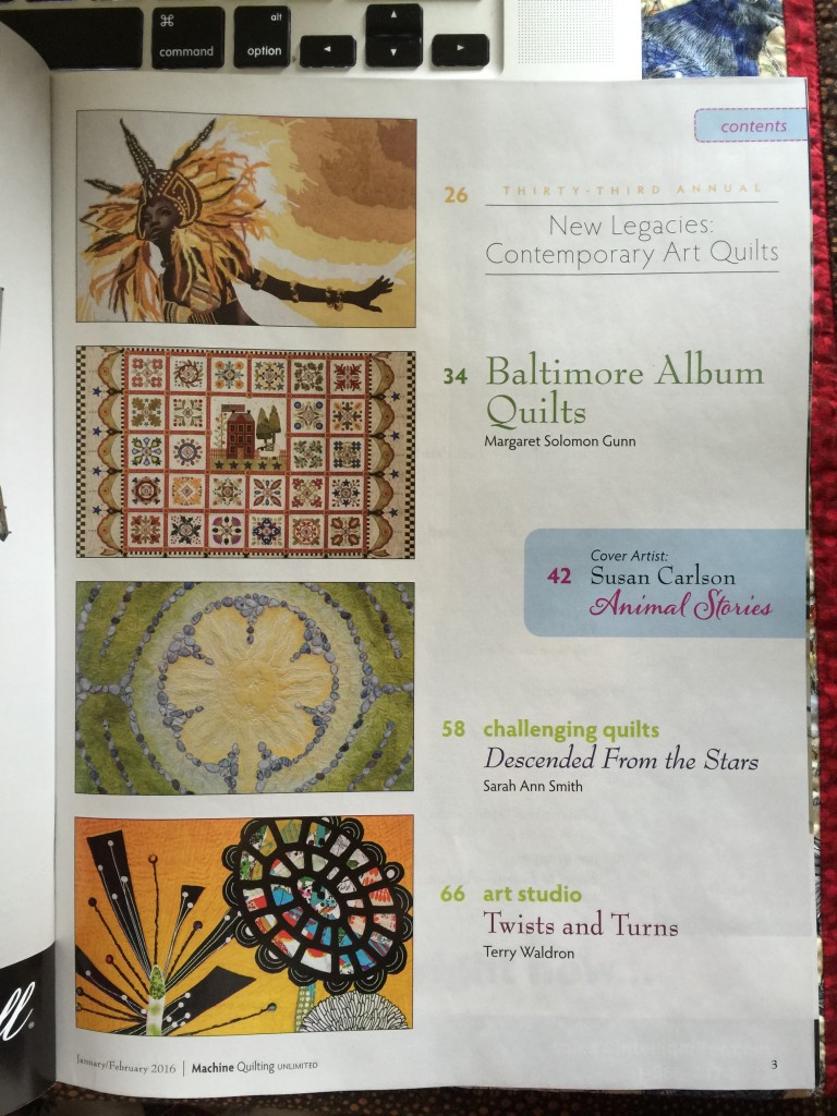
I am over the moon excited that Pink Oyster Mushrooms has been juried in to the 10th and final (SOB) Dinner at Eight exhibit and that I can now share it with you–I made this back in the January to April time frame, and keeping it under wraps has been difficult! From that website, “Dinner at Eight Artists is pleased to present The Best of Dinner at Eight Artists: Celebrating 10 Years of Exhibitions. Each artist selected a theme from the last 9 years for what will be our last exhibition. Quilt size is 30” wide by 50” high. The exhibit is sponsored by Havel’s Sewing.
“Artists considered the following:
We’ve explored the Edges and the Spaces Between
We examined things Beneath the Surface
We all admit that we have Rituals
We shared our Exquisite Moments
We Reflected upon ourselves and the world around us
We expressed our Affinity for certain things
We’ve noted the many Patterns in our lives
and expressed ourselves through Personal Iconography”
First and foremost: Yes, oyster mushrooms really can be PINK! Here’s the photo I took at the Belfast (Maine) Farmer’s Market last September:
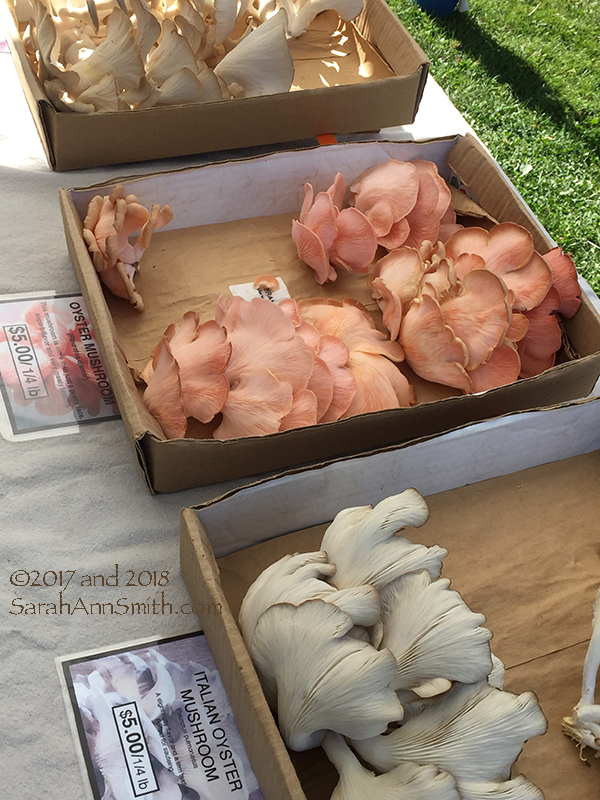
Yes, the mushrooms really grew that color of pink!!!!! The tops are the usual brown, and apparently they lose the vibrant color when cooked, but still….Gorgeous!
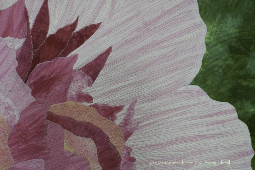
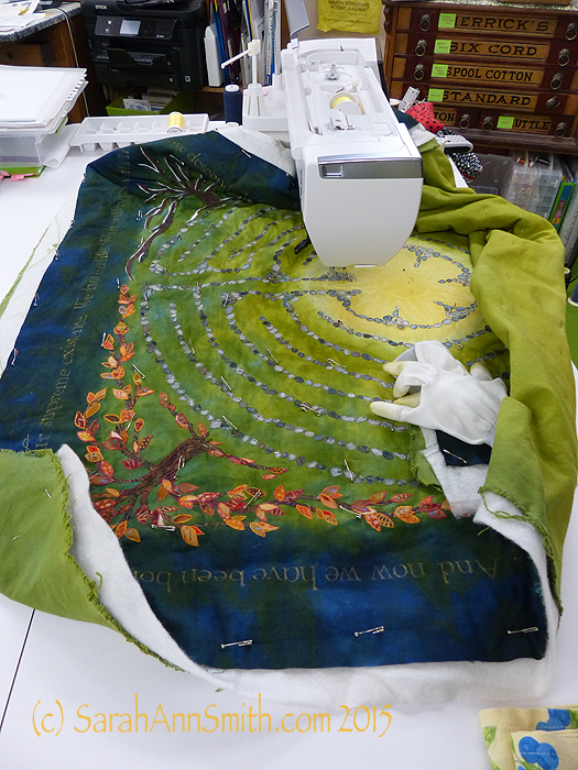
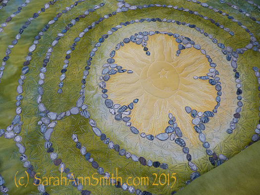
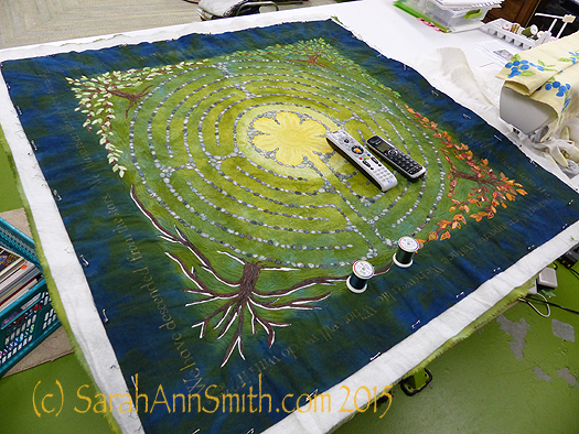
Here are two detail images. For this piece, I dyed the background fabric a very pale, warm pink. Then I used Tsukinenko inks mixed with aloe vera gel (the white kind from the organic food shop that is about 98 percent gel, not the green yuck that is barely 60 percent aloe gel from Rite Aid) and painted the browns and pink shadows on the gills. I used stabilizer underneath and did all the stitching on the curled tops before layering up with batting and backing. I then quilted the wholecloth top, outlined the brown tops/edges, and added a little more quilting where necessary to prevent buckling on the brown areas.
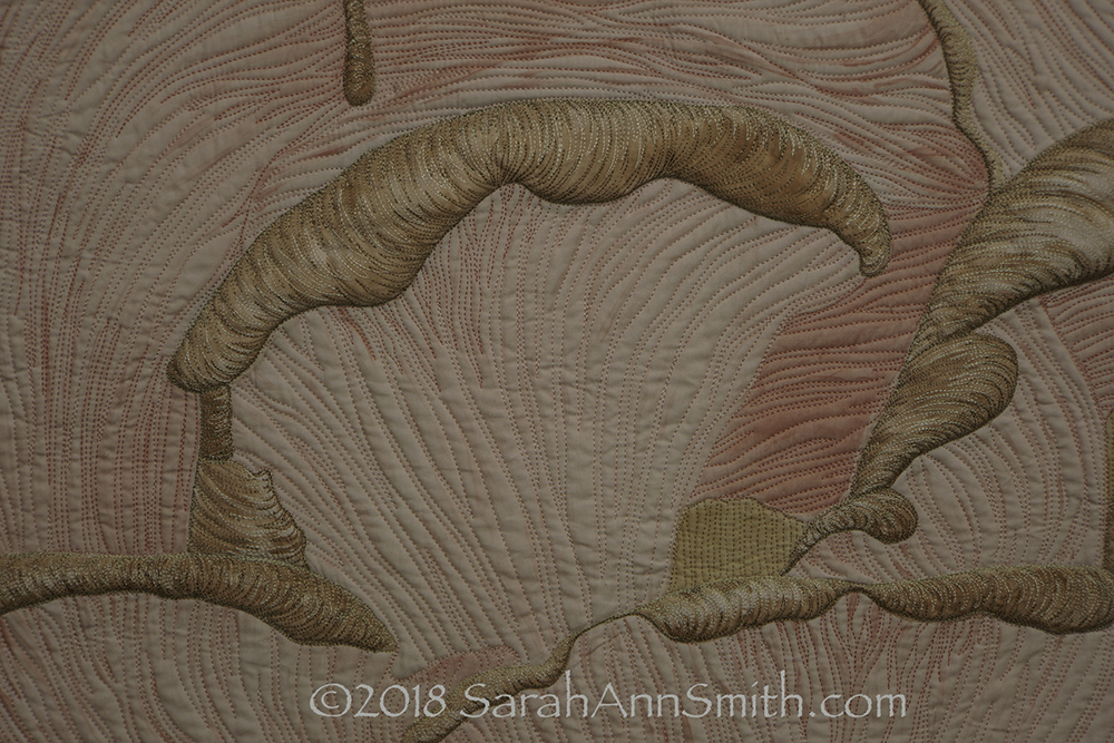
Detail 1
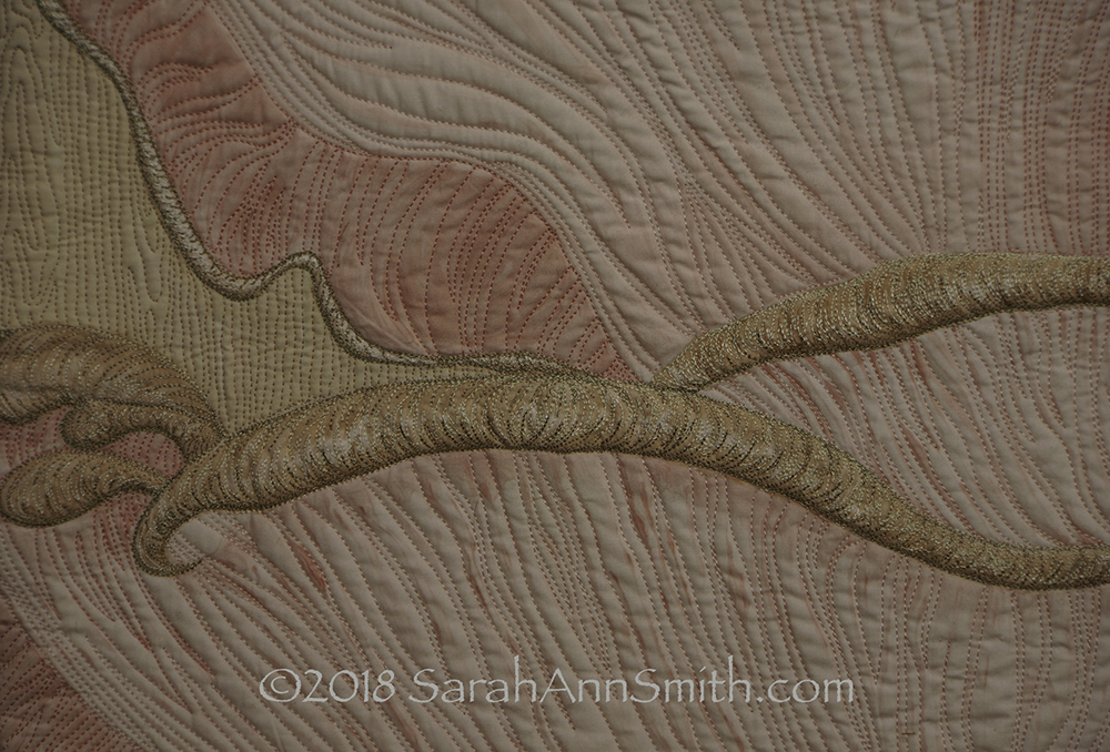
Detail 2
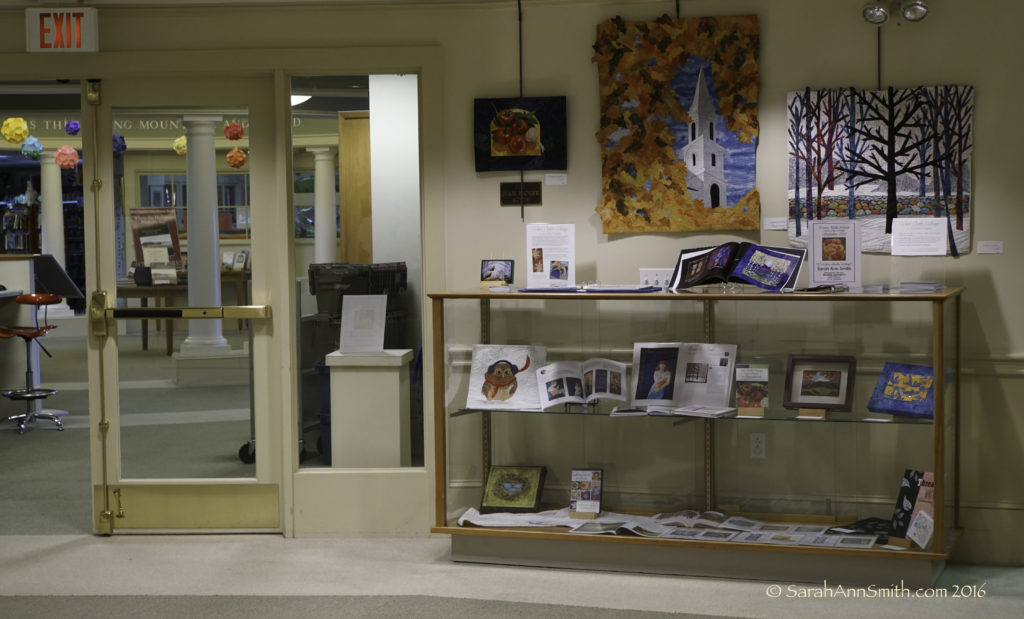
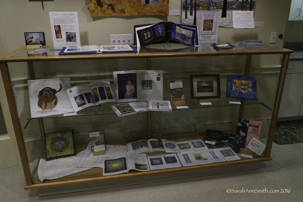
It has been such an honor to be a part of so many of the Dinner at Eight exhibits. I am a better artist and a happier person for having met and worked with and become friends with the strong women involved, starting with Jamie Fingal (http://www.jamiefingaldesigns.com) and Leslie Tucker Jenison (http://www.leslietuckerjenison.com). I am proud beyond belief of the work I have done for these exhibits, which I consider to be the best of everything I have done, and deliriously happy to be included in this final exhibit. THANK YOU, Jamie, Leslie and all the Dinner@8 artists.