email Youtube

Home
Galleries
Blog
Workshops & Calendar
Store
Resources
About
Contact

Author Archive

A delayed Foto Friday

Sunday, September 6th, 2015

So the week got away from me!   Eli has the first official Cross Country meet of the season, and I’ve been working on assorted projects and, well, the week got away from me!   The theme for the previous week in Ricky Tims’ 52 Week Photo Challenge was the Power of One.  I think mine is more the power of Red, but it’s the best I came up with.  Next week’s assignment is Do Over, so I will try either silhouette or Power of One again…… (and sorry, but the reminder that all photos and imagery are (c) Sarah Ann Smith…I forgot to watermark these).  Right click on photos to view larger.
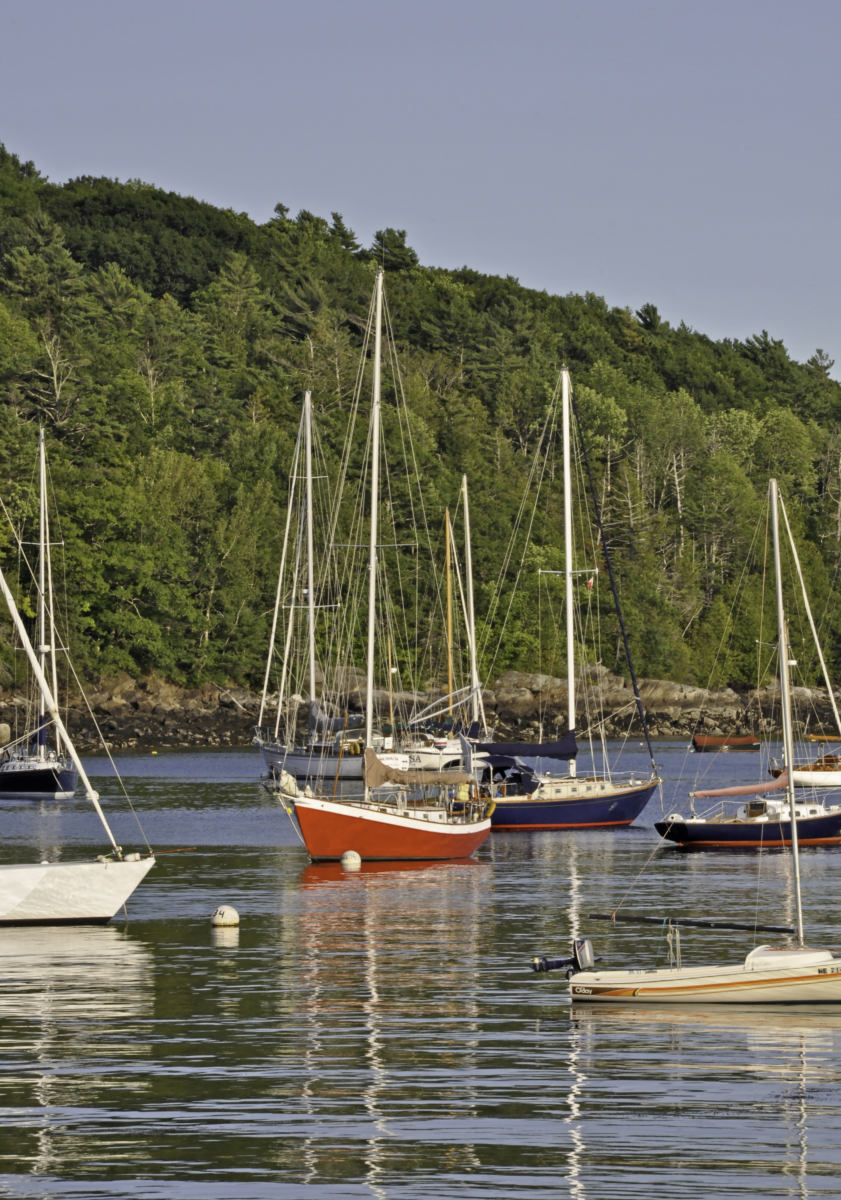
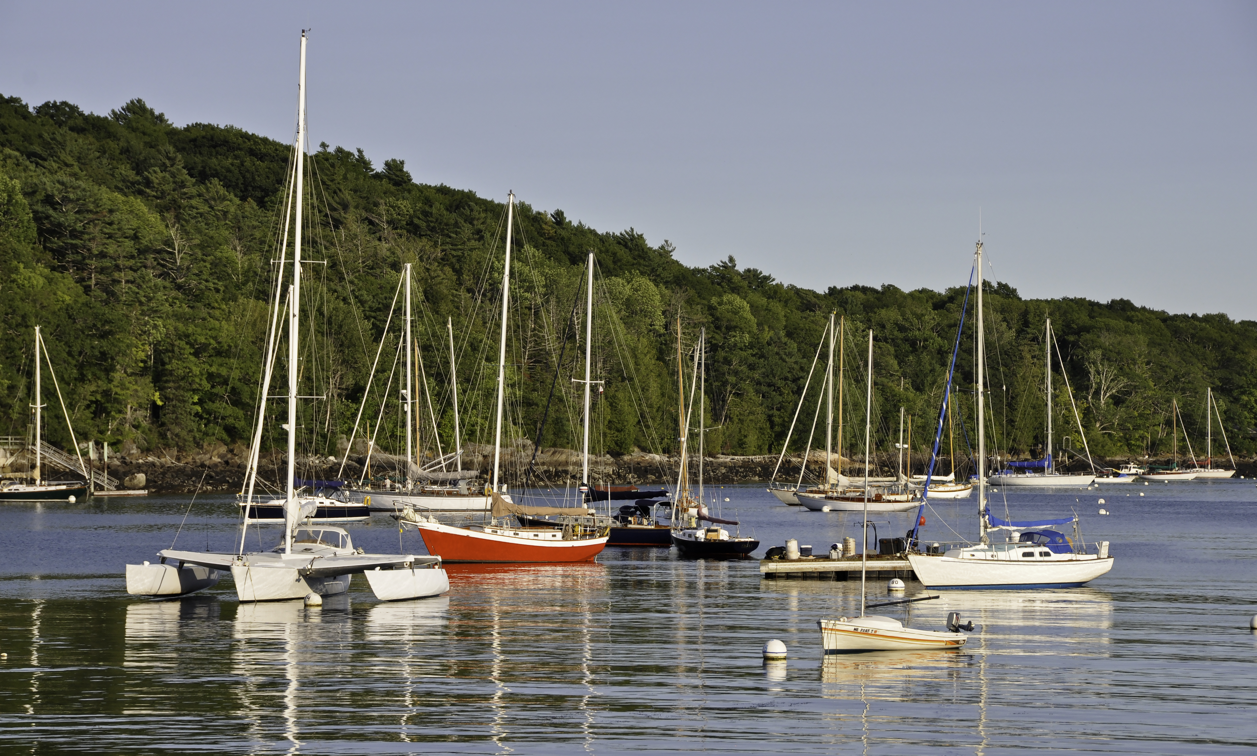
Adjustments to decrease both shadows and highlight (just a little—too much on hightlights makes a bizarre halo on the treeline!), only 3 on vibrance.  Smart sharpen.

This was my class entry.  Adjustments to decrease both shadows and highlight (just a little—too much on hightlights makes a bizarre halo on the treeline!), only 3 on vibrance. Smart sharpen.

I took the same photo as a horizontal, which is more typical for shoreline shots, but I liked the emphasis on the masts and reflections in the one above better which is why I chose to submit that one.
Slight adjustment to increase constrast and lower highlights.  Smart sharpen.  Cropped to eliminate excess sky and water (and the tippy tops of some rocks on the bottom).

Slight adjustment to increase constrast and lower highlights. Smart sharpen. Cropped to eliminate excess sky and water (and the tippy tops of some rocks on the bottom).

And a few more options I considered:
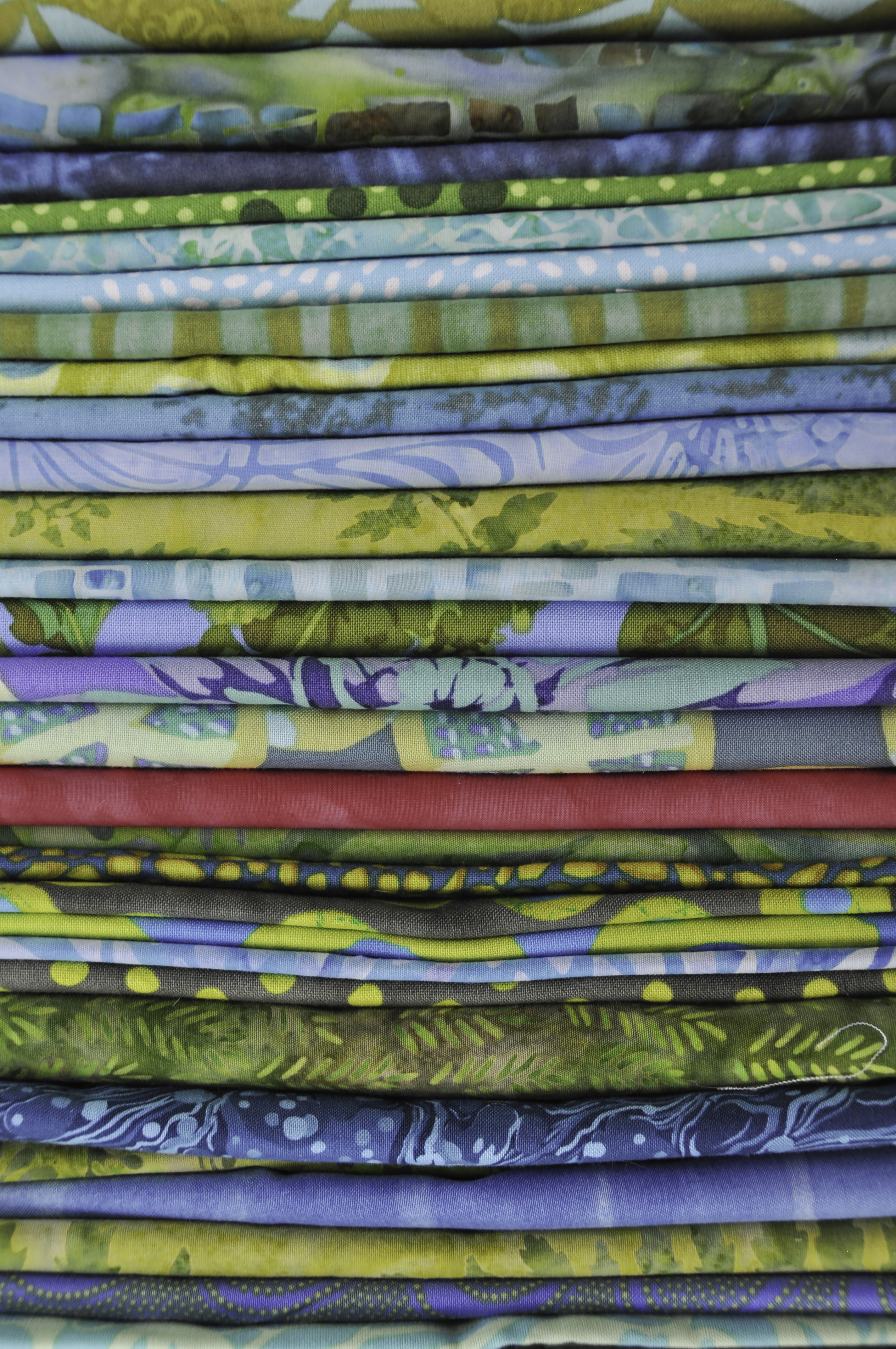
Smart Sharpen, adjustment to red layer to make the “one” more accurate.  Digital cameras mess with reds!

Of course I had to do one that was quilty!  This is part of my stash for a thousand pyramids quilt I hope to make.  The quilt on our bed is over 10 years old and is really starting to look it!   Smart Sharpen, adjustment to red layer to make the “one” more accurate. Digital cameras mess with reds!
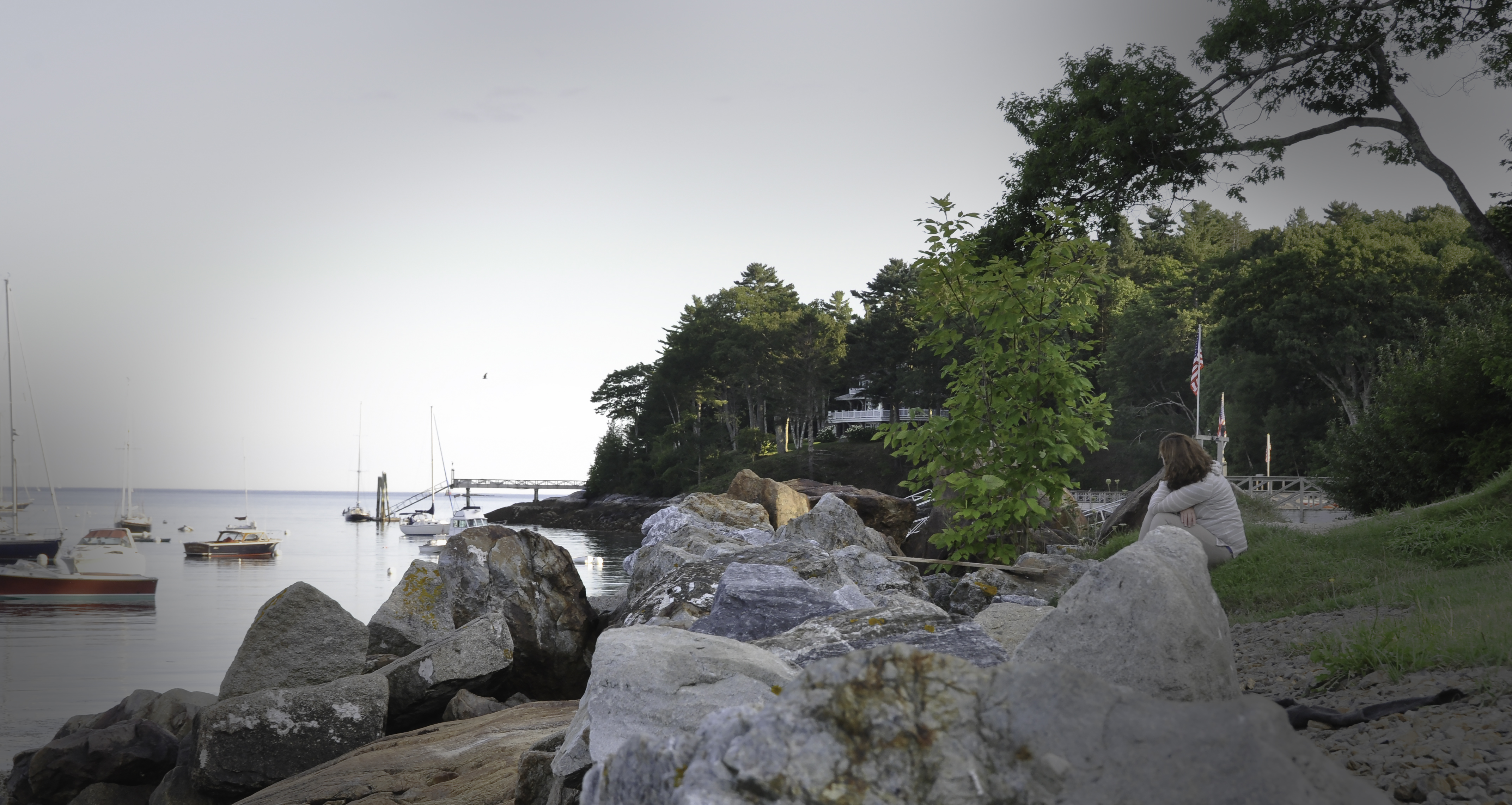
I need to review our lessons.  Tried to do a vignette, but had to resort to using the dodge tool on the corners.   Wasn’t able to highlight the woman without making it look forced.

I need to review our lessons. Tried to do a vignette, but had to resort to using the dodge tool on the corners. Wasn’t able to highlight the woman without making it look forced.  If I had used selective focus, with her sharp and the rest blurred, that would have created a stronger focal point, but I wanted the idea of her looking out on the harbor.   Perhaps I should have moved up hill…….learning, learning!
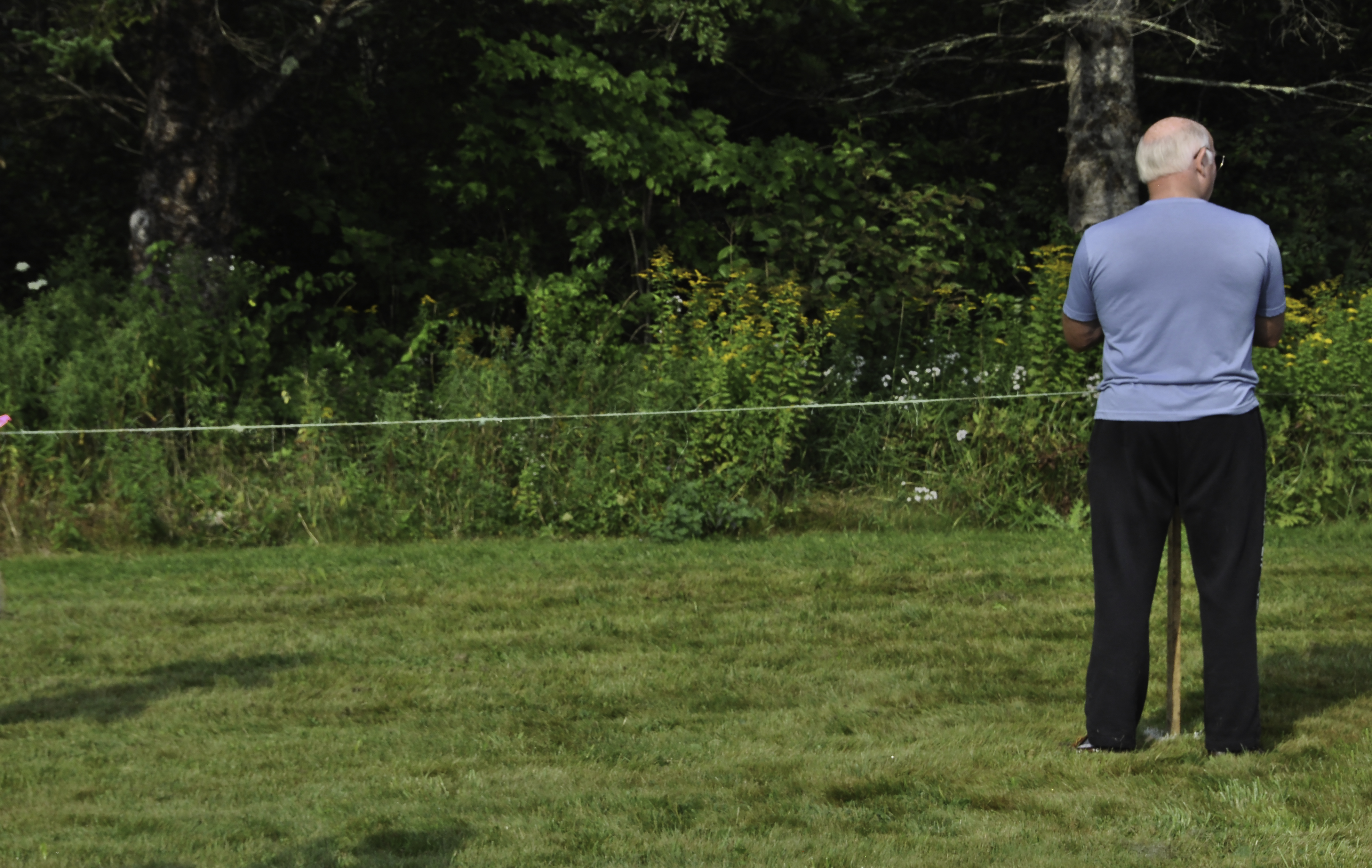
Waiting for the runners at a cross country meet.  Increased contrast a tad, cropped off a bit on the bottom, lasso and content aware fill to remove a sliver of a person on the far right.

A rare shot of the hubby, who usually scowls at the camera.  Waiting for the runners at a cross country meet. Increased contrast a tad, cropped off a bit on the bottom, lasso and content aware fill to remove a sliver of a person on the far right.

Have been busy dyeing fabric, making slacks, making a top, and working on a small quilted thingy.  Must take photos.  Must blog!   Stay tuned and enjoy the last gasps of summer!
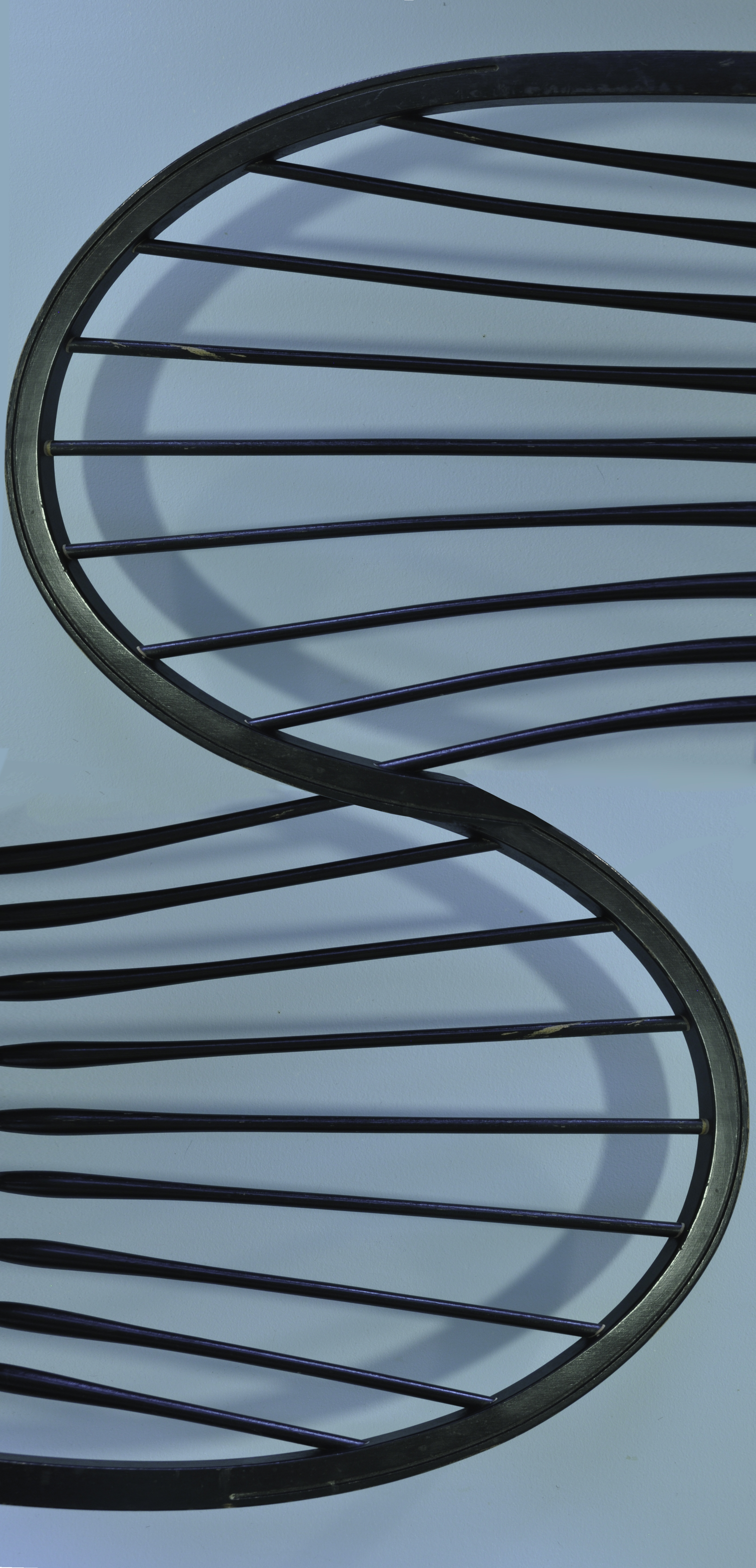
Foto Friday: Found Alphabet

Friday, August 28th, 2015

This week’s assignment was to find a letter in the alphabet–specifically one of your initials–for your assignment.  Since I teach this exercise in my quilting design class, I didn’t want to go with the expected like a creek or shoreline or the neck of the pink plastic flamingo.   So I opted to take a photo of the top of the dining room chair, duplicate, flip, and tweak in Photoshop.  Fun!

Egads what a production!  Such a simple idea:  merge the tops of my dining room chair into an “S.”  Took eons with deleting, blending, re-doing, etc.  Finally used liquify when I couldn’t manage to blend the variations in the blue wall!  But I didn’t want to go find a stream or hose, so here we are!

Egads what a production! Such a simple idea: merge the tops of my dining room chair into an “S.” Took eons with deleting, blending, re-doing, etc. Finally used liquify when I couldn’t manage to blend the variations in the blue wall! But I didn’t want to go find a stream or hose, so here we are!

Been busy dyeing fabric and puttering about the house this week.  Hope to have a few more posts soon!


Dinner@8 Artist interviews–my turn!

Friday, August 21st, 2015

Today is my day on the Dinner@8 blog.  Each year, Jamie and Leslie interview the accepted artists and feature the answers on their blog.  I love reading these interviews, even when they are people I know in real life (as in, in person).   I invite you to visit here for my interview and here for the general blog address.  Tune in every week day now through October 7th!

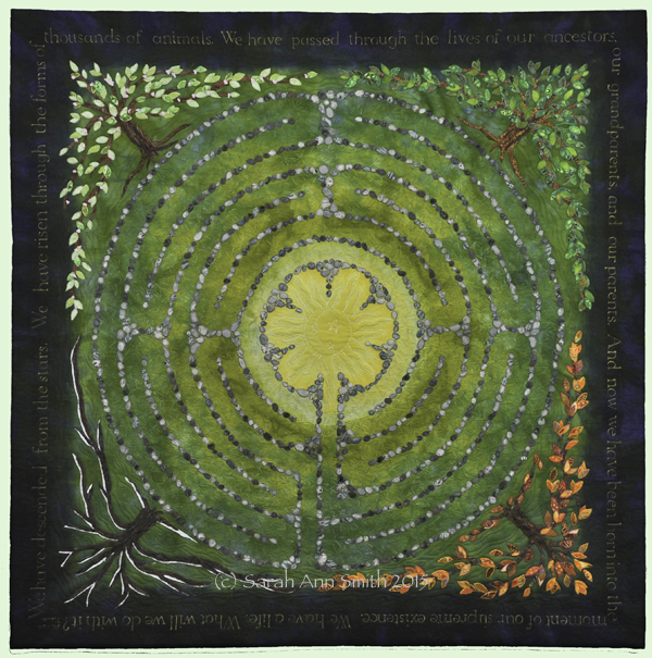
And just as a reminder and so we have a nice picture, here’s my entry for this year’s Affinity exhibit:

(c)Sarah Ann Smith 2015; quote (c) Mirza Khan, used with permission

(c)Sarah Ann Smith 2015; quote (c) Mirza Khan, used with permission

Foto Friday: Old Paint and a Tenth Blog-o-versary

Friday, August 21st, 2015

Hi everyone!  Happy Friday!  It is, according to my calendar, my TENTH anniversary of blogging?  How the heck did that happen, ten YEARS?   So I’m celebrating with TWO posts today.  The first is my Foto Friday from my 52-Week Photography Challenge class with Ricky Tims, and later today I’ll post about my Dinner@8 interview.

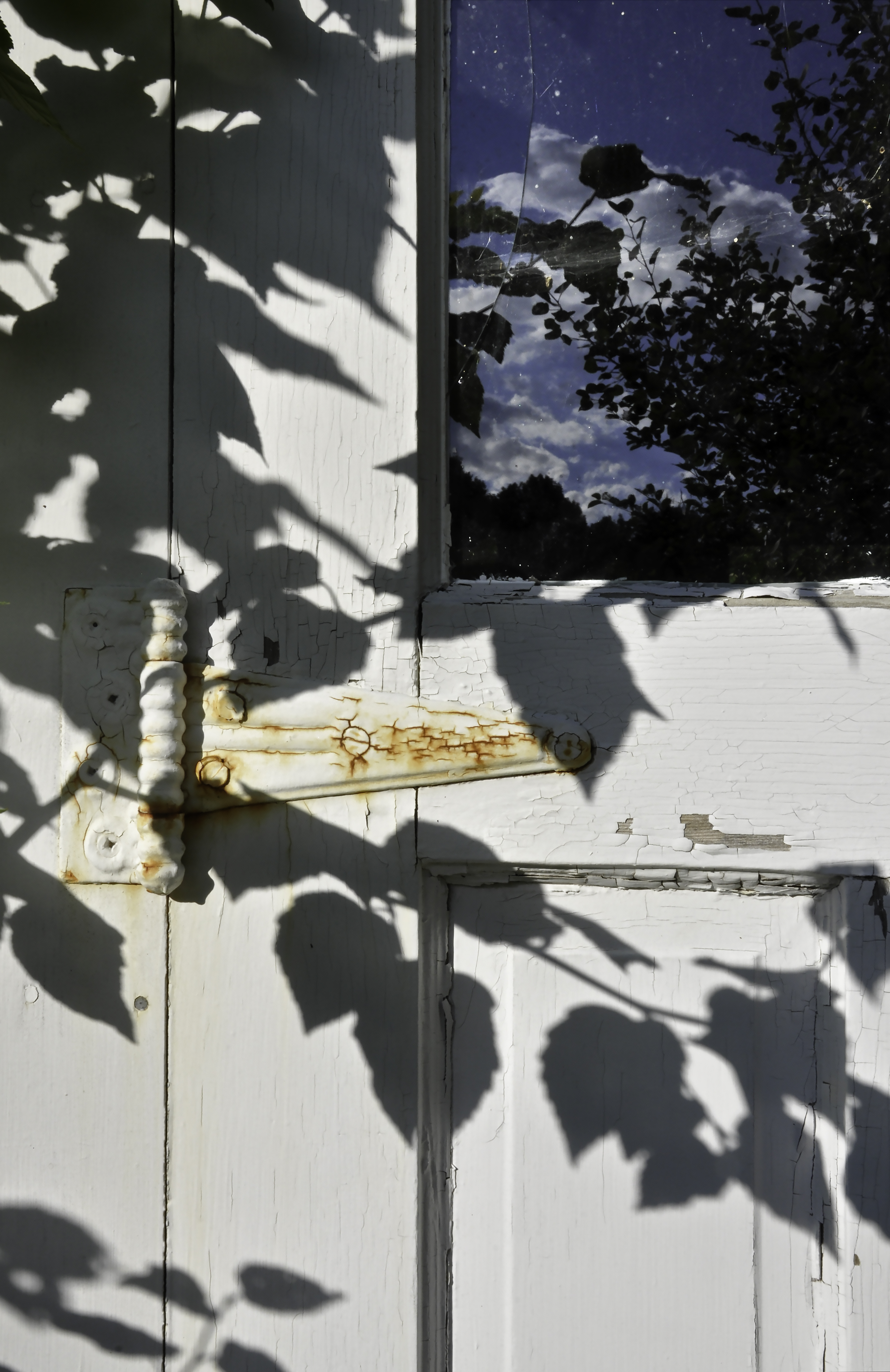
So this week’s challenge was Old Paint.  Here are my top three choices:

This is the photo I submitted as my class assignment. A picturesque (means falling apart) buidling on our property. LOVED this shot but it needed some work. Deepend the leaf shadows, then dodged the shadows on the left part of the hinge so it was more visible. Reduced highlights a tiny bit. Selected the cracked windowpane and lightened as it was too dark—overpowered the rest of the door. Summer in Maine!

This is the photo I submitted as my class assignment. A picturesque (means falling apart) buidling on our property. LOVED this shot but it needed some work. Deepend the leaf shadows, then dodged the shadows on the left part of the hinge so it was more visible. Reduced highlights a tiny bit. Selected the cracked windowpane and lightened as it was too dark—overpowered the rest of the door. Summer in Maine!

Here are a couple more:

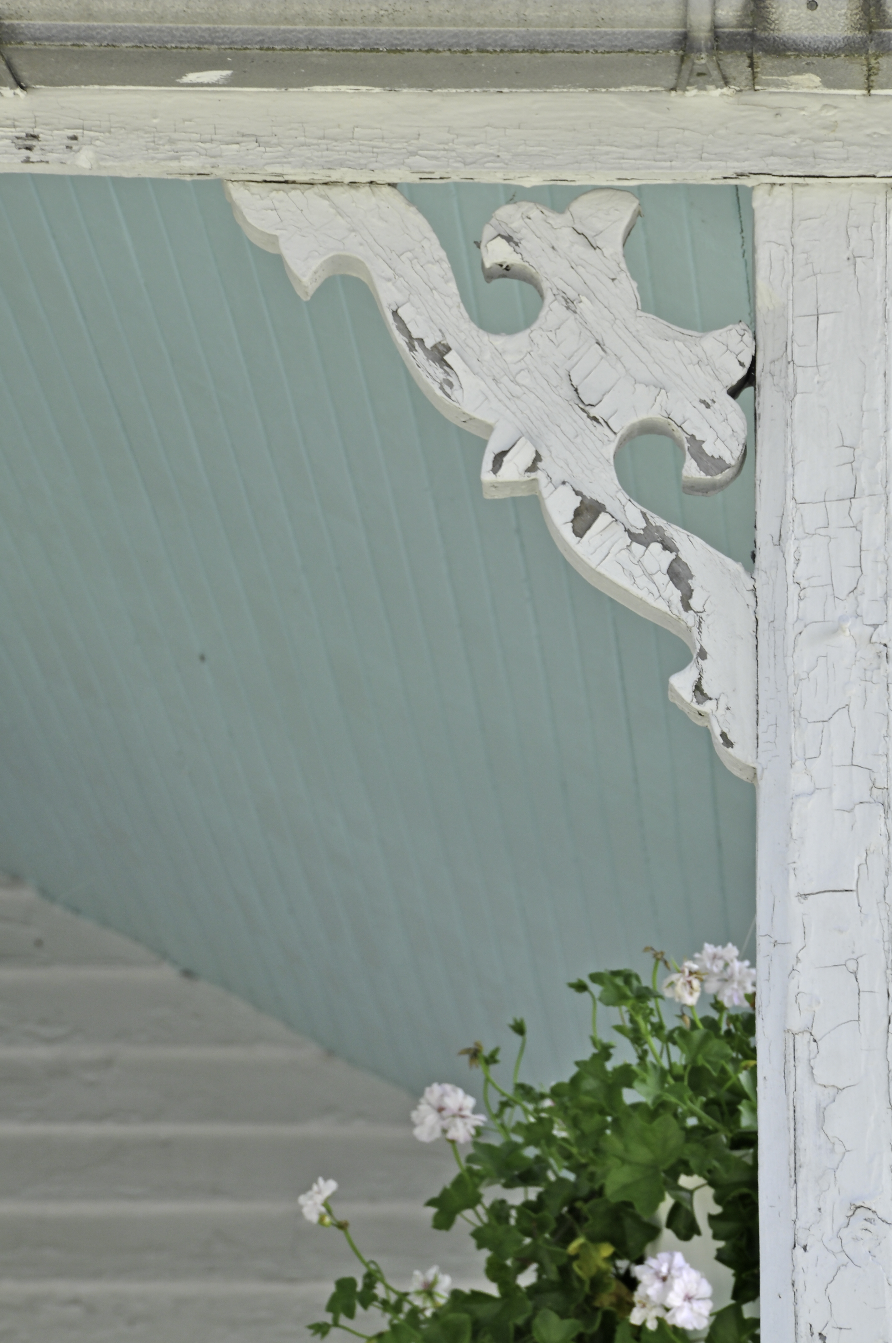
This might have been my choice but once I was home (and didn't want to drive 22 miles back into town round trip). Had high hopes for this one, but disappointed in the depth of field…f/13 not enough. Would have been better with flowers and siding crisp. May try to head into town and try again.

This might have been my choice but once I was home (and didn’t want to drive 22 miles back into town round trip) I saw on my laptop that it wasn’t crisp. Had high hopes for this one, but disappointed in the depth of field…f/13 not enough. Would have been better with flowers and siding crisp. May try again the next time I’m in town with my camera.

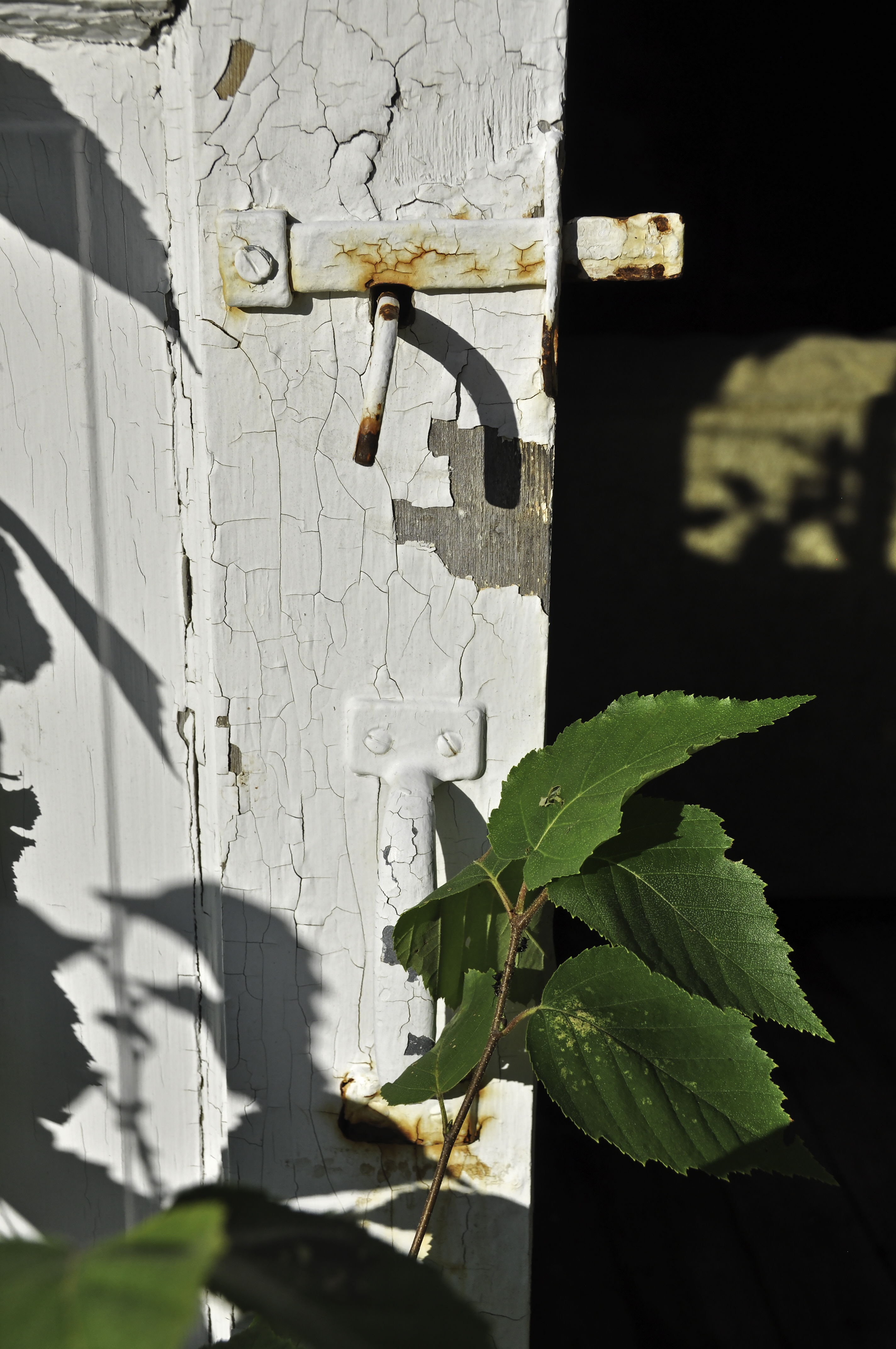
Another shot of the picturesque (aka decrepit) building on our property. Why no door on the right? Because it LITERALLY came apart into a crumpled heap. And the plywood that has covered up the opening blew down late last winter. Need to fix. Soon. Autumn is trying really hard to begin! Decreased shadows a tiny bit, knocked back highlights a bit more. Punched up contrast.

Another shot of the picturesque (aka decrepit) building on our property. Why no door on the right? Because it LITERALLY came apart into a crumpled heap. And the plywood that has covered up the opening blew down late last winter. Need to fix. Soon. Autumn is trying really hard to begin!
Decreased shadows a tiny bit, knocked back highlights a bit more. Punched up contrast.

Other photos from this week are on my Flickr site, here. Happy Blogoversary everyone!


MQU: The Fourth Quilt Layer

Tuesday, August 18th, 2015
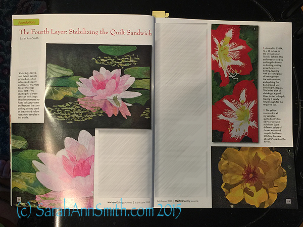
The opening spread of my article on stabilizing the quilt sandwich in the July/August issue of Machine Quilting Unlimited

The opening spread of my article on stabilizing the quilt sandwich in the July/August issue of Machine Quilting Unlimited

Over the past six years, I have been fortunate to have been invited to submit a quilt and to have works accepted in the Dinner@8 Artists exhibits and in Living Colour Textiles.   For those shows, work had to be a specific size.  The problem is that when you quilt, especially when you quilt a LOT, as I do, the quilt shrinks.  And you need to have a good composition and framing once it is done–not chopped off, not too much leftover because the piece shrank less or more than you expected.

It is hard to predict how MUCH it will shrink.  So I decided I needed to tackle the problem and acquire some knowledge.   It was a lot of work to test nearly a dozen stabilizers, so I was thrilled when I proposed an article on my explorations to Machine Quilting Unlimited and they agreed it would be a useful article.

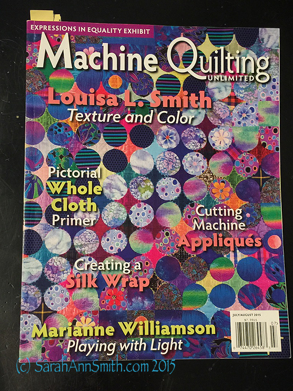
This is the cover of the current issue with my article:

The cover of the issue with my article.

The cover of the issue with my article.

and a bit more:

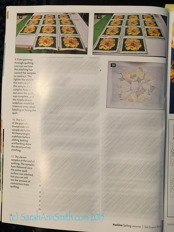
This page shows some of my testing in  progress--yes, there are ELEVEN samples.  All quilted the same.  Can you say TEDIOUS?

This page shows some of my testing in progress–yes, there are ELEVEN samples. All quilted the same. Can you say TEDIOUS?

The issue is still on stands, and is available for order on the MQU website here.  The article also has a link to an on-line Web Extra with all the extensive details of the testing on various stabilizers, interfacings, and canvas/cotton duck which you can print out for your own reference.

Even happier, at the end of the article I mentioned that I would be trying cotton duck, dyed by me, as the backing instead of a fourth layer.  That quilt is made and has been juried into this year’s Dinner@8 exhibit, Affinity.  And in the January 2016 issue MQU will publish my article in their “Challenge Quilts” series about Descended From the Stars.  WOOT!