Foto Friday, Week 38: Text Overlay
Friday, September 25th, 2015This week’s lesson was to create a text overlay, but rather than simply have text on top of the photo, to make it “transparent” and “embossed” so that you can read it, but it is really just the photo with a bit of distortion to create the lettering. Of course, I pushed the envelope a bit. I was short on time, too! We get lessons on Sundays…OH!
NEWS FLASH: Ricky Tims will offer a 52-Week Photography Challenge course again next year! Not quite sure what form it will take, ditto for the “Year Two” for those of use in this year’s challenge. Anyway, if any of you have been interested in really learning to USE your DSLR or Photoshop, boy is this a great class and challenge! You learn something every week. Sometimes it is design and composition, sometimes photoshop, sometimes both, and the time required for the assignments isn’t crazy busy. You can squeeze it out in a little time or, if you really want to plumb the depths, take lots of time. So it works for busy schedules. Anyway, FYI! Keep an eye on Ricky’s FB feed/announcements, and I’ll post here and on FB when he/we know more.
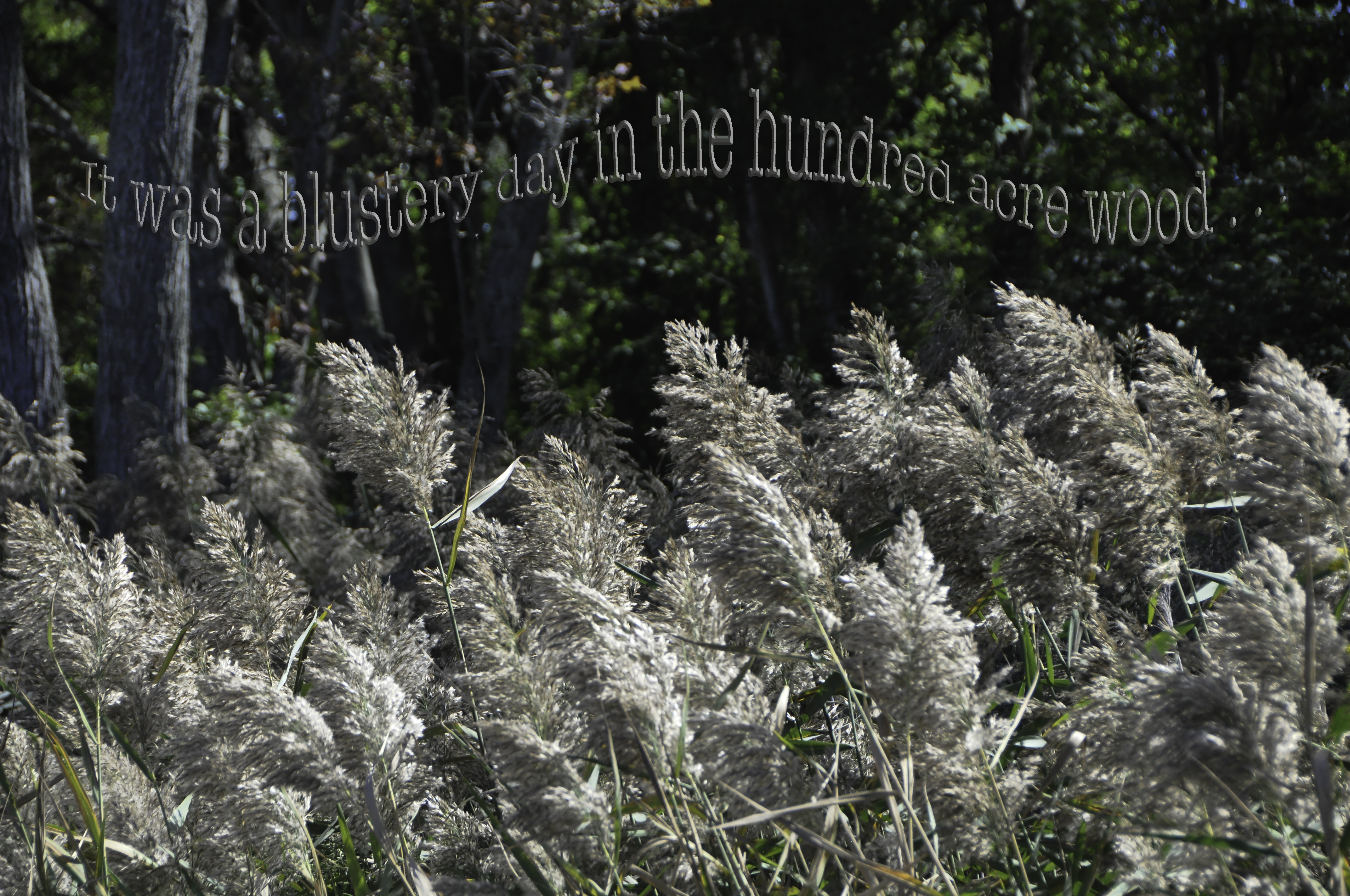
What FUN! I (sorry Ricky) veered a tiny bit from the lesson by using the lighten and multiply plus color overlay (tho the color doesn’t realy show). I used Inner Bevel, Chisel Soft, 300%, Lighten (white) 59%, Multiply (dark rust not black) 30%. Color Overlay was a bright rust foreground color ostensibly at 75% opacity. Still I like how the lettering repeats the colors of the grass fronds. OH, to get the wave I used Arc high and Arc lower, separating the quote from Winnie the Pooh into three segments.
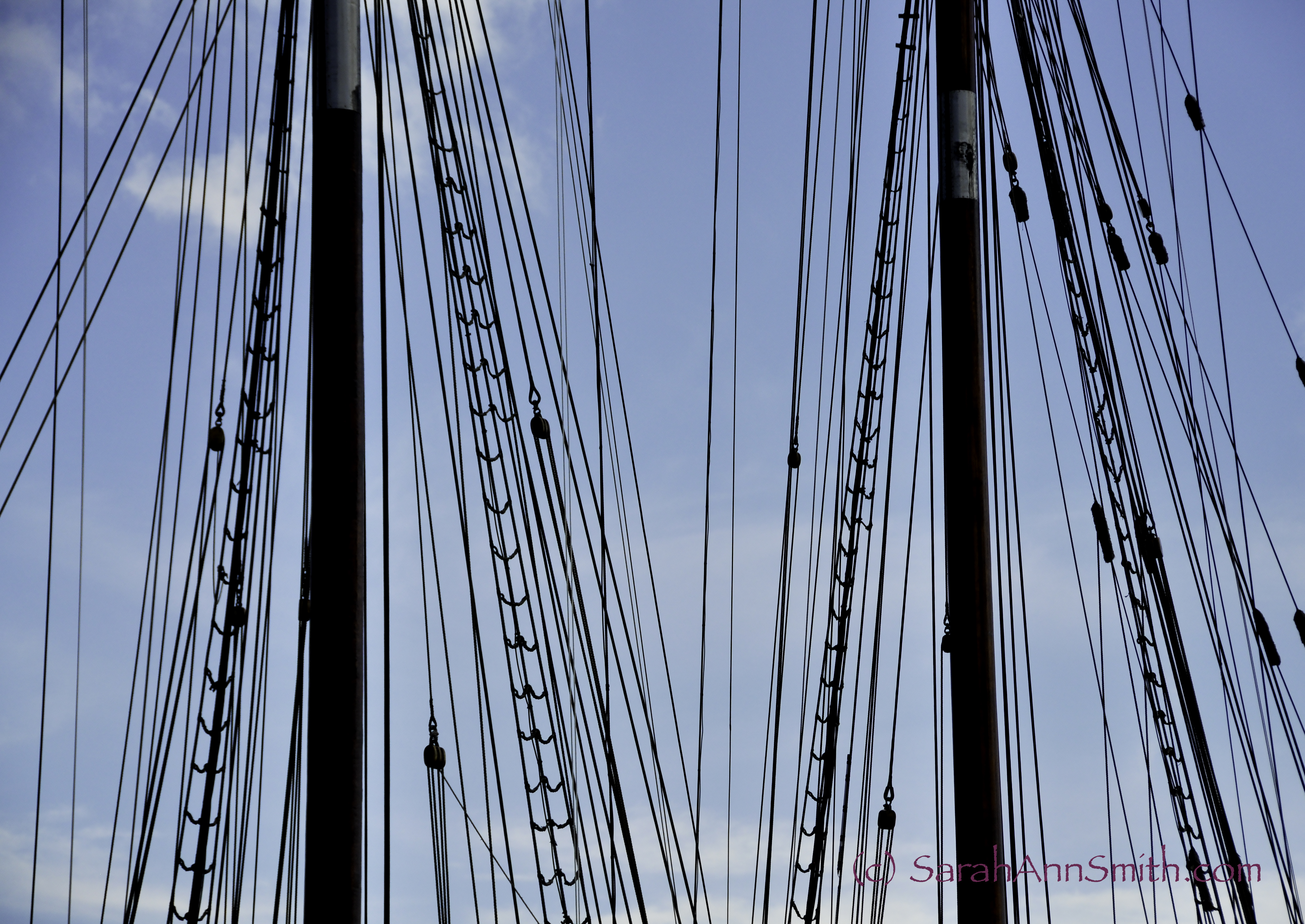
OK, back to Sundays: the lesson shows up in the wee hours of Sunday, and this week we were driving Eli home from a college visit in Pennsylvania. I took photos from a mostly moving car. Right. At least I know enough now to know I need a wicked fast shutter speed. But we were slowed down at an exit going from one interstate to another (THANK YOU Deirdre and Timi for the info about taking I-84 to avoid the Tappan Zee and near-NYC traffic!), and I was able to get several good shots of these waving grasses. Since it was downright brisk (night temps into the mid 40s) when we got home to Maine, I felt the Winnie the Pooh quote was apt.
I didn’t make my lettering as transparent as Ricky’s example, which is kinda what he wanted. But I got the concept. I wanted mine to stand out a bit more. I also added the “wave” by breaking the text into three sections so I could arch them in a wave, like grasses blowing in the wind. Anyway, this photo won’t win any photography competitions, but it was a good lesson, and one that I can see using again, and in a way adapting to my art quilts, too. FUN!