email Youtube

Home
Galleries
Blog
Workshops & Calendar
Store
Resources
About
Contact

Archive for August, 2008

Hawaiian-style quilting at Lowell Quilt Festival

Sunday, August 31st, 2008

One of the most fun classes I taught was Hawaiian style applique by machine.  Normally, this applique is done by hand using the needle-turn method.  It is beautiful, meticulous, and time-consuming.  Some years ago I saw a quilt made by a New Zealand quilter, Donna Ward, that was stunning… similar to Hawaiian quilts in style, and satin stitched!  The stitching became a whole new design element, and I was hooked.  And I must repeat… I love google!  Here  is a link to Donna’s quilt Jewel of the Pacific–scroll down a bit to the blue quilt.

Sally I.’s block, reverse applique

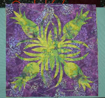
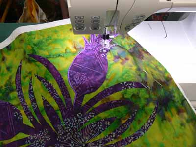
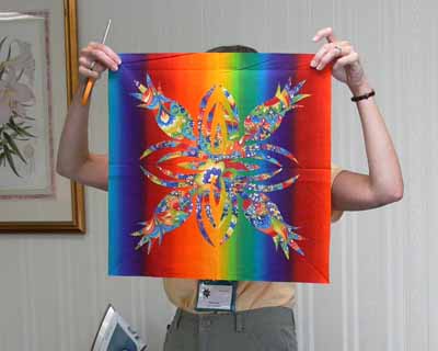
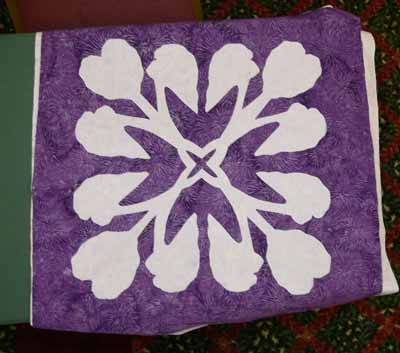
For my book, Unraveling Threadwork, (hopefully due out Fall 2009) I’ve designed a quilt with nine 18 inch blocks using five different designs, as one of the main pieces.  I’ve also designed two smaller “practice” blocks, one of the taro leaf, another of the turtle.  This class was the first time I offered the smaller practice blocks as an option, and it seems to have been a good decision.  Sally was the one person in the class who opted to start with the large block, in her case the pineapple.  Her combination of deep purple and mottled green (above and below) was wonderful. I also recognized her name from the quiltart list…way fun to meet someone you’ve “seen” on line!

A couple tricks to Hawaiian applique:  high contrast in your fabrics works well!  Variegated threads don’t always look so good…opt for a solid color. THEN you absolutely must:

MAKE VISUAL DECISIONS VISUALLY!

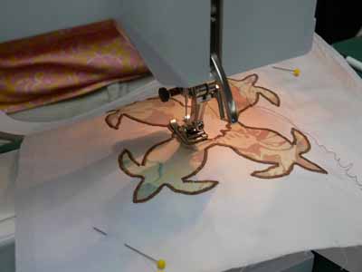
That means make a test, and try your threads to see how the look when stitched out.  Try adjusting width and length to see what looks best.  And if necessary (it probably will be) use a stabilizer under the background fabric to prevent unsightly puckers and uneven stitching.  Here is one student’s thread stitch-out sample.

Stitchout yellow on blue

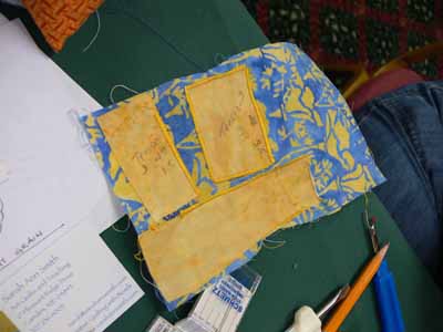
Her print fabric actually didn’t contrast a lot from the background–UNTIL she used the bright yellow thread to outline the design, at which point the subtle change in fabrics became awesome.

Yellow on turtles

Sally had brought a variegated that was PERFECT for quilting her pineapple, but when satin-stitched out, it really didn’t look so great, so a classmate lent her a perfect purple.

Sally’s pineapple

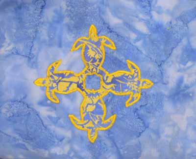
Another student opted for the traditional solid colors in very tropical aqua and yellow.  This simple choice is smashing!

Solids turtle

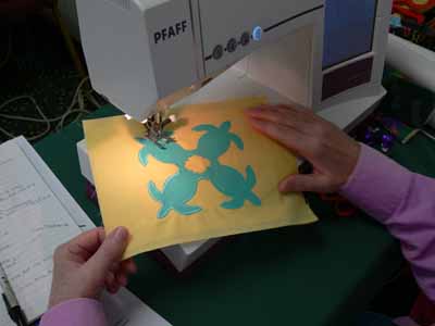
One student brought some VERY bright fabrics which had a stripe, but they worked!  Here are her turtles (before stitching)

Bright turtles with stripe fabric

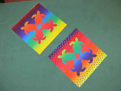
Since she hadn’t brought a varied enough thread selection, she opted to work on prepping a large block, also…talk about vibrant…wow!

really bright pineapple!

When she uses a starkly contrasting thread, like a tangerine or orange-y yellow or turquoise, the bright line of satin stitching will help pop the busy fabric inside the pineapple motif…trust me, this one will work amazingly well!

Other students preferred softer colors.  We were all surprised that this taupe-cocoa brown thread was such a good choice on the soft colors of the applique–sometimes the least expected selection works best:

Turtles with brown thread

And here are her Taro blocks, in purple and soft lavender (which alas looks more white in these photos):

Taro…purple on white

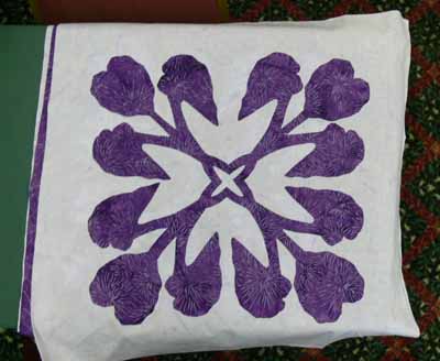
and the reverse applique:

Taro–reverse applique

Here’s what I learned from teaching my class:

  • the small shapes on the turtles are a bit fiddly for beginners.  I need to make another, simply-shaped design, and have both turtles and taro leaf (or whatever) stitched out for students to see.
  • I should say on the supply list that variegated threads generally don’t work so well for satin stitching—be sure to bring plenty of solid colors
  • Also on the supply list, I should say to bring at least twice as many colors of thread as you think you will need!
  • Using the black Misty Fuse (adhesive web…a heat-activated glue for fusing fabrics) for demonstrating is perfect, since it is easy to see the bits that get left behind on the fusing sheets or baking parchment
  • I need to bring more Misty Fuse to sell….I ran out!

So it’s off to update my class supply lists!  Hope you enjoyed this vicarious tour around the classroom.  I sure had fun seeing my blocks interpreted in so many wonderful ways.  I hope the students had as much fun as I did…imagine, I get paid to do this!  WOOHOO!

PS:  I wanted to post a public thanks to the show organizers for the Lowell Quilt Festival.  The teachers were treated like royalty…. we had rooms to ourselves (weren’t required to share with another teacher), were presented with lovely welcome boxes with some snacks, little bottled waters, an a Lowell Quilt Festival badge holder in a color just for teachers…..   the hotel rooms were huge and comfortable, too.   It was a particularly nice experience, so thanks to all who were involved!

Art Quilts at the Whistler Museum (Lowell, Mass.)

Friday, August 29th, 2008

Woven sheers

On a warm summer Sunday, I made my way from the Tsongas Arena, site of the Lowell Quilt Festival, to the Whistler Museum of Art.  The museum is normally closed on Sundays, but the gallery with the art quilt exhibit was open (the rest of the museum wasn’t…rats!) for quilt lovers to stop and savor the work.  This wall is what greeted you… I enjoyed the interlaced sheer panels and the shadows cast on the wall.  If my photos are in order, this piece is called Microdctyom Stechellianum by Nancy Crasco. (Note:  photos in this post are clickable for a larger view.)

January BLooms

January Blooms by B. Sullivan, above,  is one of the most eye-catching pieces in the show.  The weekend I saw the exhibit, local floral arrangers had constructed pieces to go with the artwork…what a cool idea!   A detail photo reveals the modest and effective use of beads to enhance the floral print fabric:

January Blooms detail

Hibiscus is another piece playing with color overlays and sheer fabrics; this piece by Margaret Anderson won the Whistler Award (one of two awards given when I was there…the viewer’s choice was still underway).

Hibiscus

One of my favorite pieces (and the one that got MY viewer’s choice vote!) was Wen Redmond’s Winter Tree.  She has printed photos onto fabric.  The center panel–the darkest, small part in the center– is sheer, and the surface piece is affixed to stretcher bars.  A second printed photo is behind, attached to the back side of the presser bars, so you get this cool window / show-through effect.  Wen had an article a winter or two ago in Quilting Arts magazine that I believe discussed this process, but I didn’t quite “get” it then…It’s hard to see the depth in photos. I’ll have to go back and look for the article now that I’ve seen one of these pieces in the real:

Wen Redmond

Bozena  Wojtaszek of Poland received a Juror’s Choice for her piece, My Way.  In my quest for art quilts with effective beading, this one is definitely a good one…. I’ve only seen one of Bozena’s pieces in the cloth before; I’m so glad she went to the expense to send this all the way from Poland to be in this exhibit!

Bozena, My Way

a corner detail:

Bozena, My Way Corner detail

and a detail from the center…. I love the fabrics, the threadwork, the beads….

Bozena, My Way Center detail

And one last piece, The Good Earth by Nancy Schlegel, shows how effective large stitching and beads can be in creating texture:

Nancy Schlegel

Hope you enjoyed the tour!

Book Review: Digital Essentials

Wednesday, August 27th, 2008

Bottom line:  if you take digital pictures, enter quilt shows, want to print photos onto fabric, want to print photos from your printer at home, want to design quilts on the computer, or learn to manipulate photos, or learn to use your photo editing software more effectively, want to know how to get the color in the photo to look like it does in real life, and THEN want the print to have the same colors…. BUY THIS BOOK!  This book will be an essential reference tool in my library, I can tell already.  It is not a sit down and drool over the pictures book, but it is a book you will use again and again and again!

Digital Essentials

The caveat up front: Gloria is the one person I wanted to design my website, and she and Derry did a fantabulous job.  That probably makes me slightly biased, but as anyone on  the QuiltArt e-list knows, Gloria’s knowledge (and generous sharing of that information) on the list are such that most of us have an e-mail folder entitled “good stuff from Gloria”!

The subtitle to this information-packed book is “the quilt maker’s must-have guide to images, files and more!”.  I couldn’t agree more….   for both MAC and PC uses, Digital Essentials is written by Gloria Hansen, who is not only an award-winning quilter (major ribbons at both AQS and Houston in the past year alone!), but also an award-winning website designer with her partner Derry Thompson of Gloderworks, and a top-notch photographer. In just browsing the book when it first arrived, I learned stuff, was impressed with how well laid-out the book is, and how Gloria makes a seemingly complex subject understandable.   Digital Essentials is published by the Electric Quilt Company, ISBN 1-893824-64-0.  The book is available by mid-September from Gloria here, from Amazon, or ask your local quilt shop to stock it!

At first I intended to review this book in one fell swoop.  But….. There is SO much in the book, and as always I am so pressed for time, that I thought I’d do a synopsis of what is in the book, then later on work my way through a couple of the chapters that teach things I really want to know, and share the results with you as I can get the time to do the work.

The book is in four major sections:

  1. The Fundamentals
  2. Working with Images
  3. Saving for the Web
  4. Reference

Start at the beginning:

Let’s say it right up front:  computer lingo and camera lingo can be really daunting.  But I realized it is the same situation quilters face when dealing with art terminology.   I tell students in my “If you can write your ABCs, You can Draw” class, folks are intimidated by the vocabulary of art:  composition, complementary colors, tangents, value.  But it is just words.  We can all learn what they mean.   When we started quilting we probably didn’t know Log Cabin meant a block, not a building, and Baltimore Album was a style of quilting form the mid 1800s, not a photo album about Maryland!

And that’s how Gloria begins:  by explaining what all those not-really-daunting words mean.  Best of all, she uses pictures and pictures of drop-down screens from commonly used picture software to illustrate.  The book’s layout and color-blocking help organize the text, making it easy for you to scan and find what you need, as well.

p. 22-23

Especially helpful are the red ovals on the screen shots which help you know WHERE on your screen to look!

Red ovals

Getting the color right…from real life to captured image to computer screen to print out… is key.  In Chapter 5, Gloria breaks down what to do into a step-by-step process.  I can tell that this isn’t something I want to do late at night when my biorhythms are at their worst, but I can also tell that if I simply take it one step at a time, I can do this…and there is no way I could have figured it out on my own (well, at least in this century).

The next two sections — images and the web:

I’ve learned some of the things in these sections by doing, by using Gloria’s help to me individually and to the QuiltArt list over the past four years.  But already I have learned there are different ways to crop things that may make my life simpler and faster (more time to quilt, or sleep! is a good thing).  As I have time to work with the book, I’ll come back to these topics.

Resources:

OH how I LOVE a book with a good index…. this one is four FULL pages, which means I can find what I want quickly, instead of having to flip through many pages….

There is a Reference Guide with commonly asked questions…and the pages on which to find the answers!

There is a comparison of Photoshop, Photoshop Elements, and Paint Shop Pro, and also a glossary.  Let’s face it…we can read the definitions but they don’t always imprint (at least on my brain).  Having this mini-dictionary in the back is eminently helpful.

The last test:

I’ll challenge myself right here, in print.  I want to understand a few things.  Let’s see if I can find the answers in the book….

1.  What are layers and how can I use them?

2.  Can I manage to create a somewhat kaleidescopic image on my Mac laptop using Photoshop elements?

3.  How can I (easily?) watermark the photos I post to my website and blog?

4.  How do I get the colors of my photos to be the same as the actual cloth, so that entries accurately reflect the quilt?

5.  When I download photos from my camera to the laptop, why do they come out at 72 dpi and HUGE size (about 35×42 inches)?  I shoot at maximum resolution.  Can I adjust either the camera or the software so they display at 300 dpi and smaller size?

6.  What is Unsharp Mask????? And why do I need to use (or not use) it?

I’ll work through these questions over the next couple of months (I hope), and I’ll share my results.

The Brush Gallery

Sunday, August 24th, 2008

Lowell, Massachusetts, seems to be a very art-friendly town and, given it’s history as a mill-town (lots of textile mills in upper New England in the late 1800s), quite open to the idea of art quilts.  The Brush is an artists’ co-operative and gallery.  Each year when the Lowell Quilt Festival happens, various venues around town have art quilt exhibits or related shows.  The Brush, along with the Whistler Museum of Art (as in James McNeil Whistler, most famous for his painting of his mother….), are two of the venues art quilters want to be in!  (Note:  photos in this post are clickable … you can right click to view larger in a window/tab.)  This quilt is Sod Wall I, by Elfa Jonsdottir of Worcester, Mass.  I’m not usually partial to this abstracted style of quilting, but I thought the use of the hand-dyed fabrics and color was particularly effective.

Sod

I got to meet Debbie Bein, Elaine and Mary from Toronto, all from the QuiltArt list, and to my great surprise and pleasure, my near-neighbor Carrie Hedstrom.  Carrie is a young mom of FIVE (ages 7 to two months…youngest was in a baby sling for the opening reception!)…how she finds time for art is beyond me, let alone time to get the entries done and sent in on time!  Somehow, I managed to miss taking a photo of them (I had just gotten out of class and RACED from Chelmsford, where the classes were held, to Lowell, where the show and galleries are, to be there before the reception ended!) or of Carrie.  But I did get this shot of the wall where Carrie’s quilt was hung, on the far left, and one that I think is Frieda Anderson’s on the far right:

Update:  Rosemary’s piece is titled “Sheer Floral.”  And, it is indeed Frieda’s work on the right, titled “SunSet Pines.”

Wall shot

I’ve only met Rosemary Claus-Gray online, but I love her work.  Sometimes it is abstract, but this representational piece in sheer fabrics is just glorious:

Rosemary Claus-Gray’s

If you look closely at the photo, you can see the stretcher bars shadowing through the sheer fabrics!

I neglected to take a photo of the label on these two pieces… if anyone knows who made them, please let me know!   I love the use of thread in the satin stitching:

Entry set

(Update:  the piece above, thanks to Cyndee who spotted an article in the Lowell newspaper, is Sun Moon Stars by Therese Bliss….thanks Cyndee!)

I’m giving a lecture on beading and embellishments on quilts, so I’m on the hunt for examples to use in my lectures.  I’ve photo’s the labels on all these pieces so I can contact the makers and ask permission to include the photos in my slide show…..  alas, this overall photo of Rachel B. Cochran‘s Imperial Palace didn’t turn out sharp:Overall of Rachel Cochran

but the detail photo did–I’m in love with her hand-dyes:

Cochran, detail

Margarete Steinhauer of Scituate, MA, created The Cork Oaks; she is a plant and environmental scientist, and was inspired by a piece of commercial dye-painted fabric.

Steinhauer

In several days, I’ll share the quilts at the Whistler!  Cheers, Sarah

Koi is in Quiltmania!

Thursday, August 21st, 2008

QuiltMania cover

In mid-July a most delightful e-mail from blog-reader Evy V. in the Netherlands arrived, telling me that “I had to let you know I was very pleasently surprised to see a picture of your beautiful Koy Quilt in the French/Dutch magazine “Quiltmania” when they arrived at my store.”  WOW!   So I promptly surfed in to eQuilter, which I know carries the magazine (since of course no one within a 90 minute drive of Camden does).  They had only just received issue 65, and Koi is in 66…. so I checked last week, and my copy of issue 66 just arrived!

Here is the opening page of the article which, as I had guessed, was about the spring AQS show in Paducah, Kentucky; this show is one of the two most prestigious in the US (along with the IQA show in Houston), so I was thrilled Koi was juried in:

Start of article

Note:  photos are clickable to get a larger, more easily viewed size.  In some browsers you can right click or, on a mac use the applekey + click, to open the photo in a separate window.

I was happy to see another Maine Quilter, Wendy Caton Reed, represented on the second page…her quilt won a top ribbon at Maine Quilts 2008 this year.  It’s the one in the center, red and yellow:

Mary Caton Reed’s quilt

And here, drum roll, on p. 26, is Koi!

Koi

I’m in mighty good company…that quilt just above mine is one of the top prize winners by Diane Gaudynski!

After the many, MANY rejections I’ve had, it is heartwarming to know that out of the many, MANY outstanding quilts in Paducah, QuiltMania selected mine to include in the article!  Thank you to them, and to Evy for letting me know.  By the way, she is a quilt shop owner in the Netherlands, so click here to surf in, and I sure hope some day I get to VISIT her shop!