Photographing your artwork
Friday, February 28th, 2014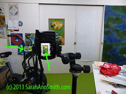
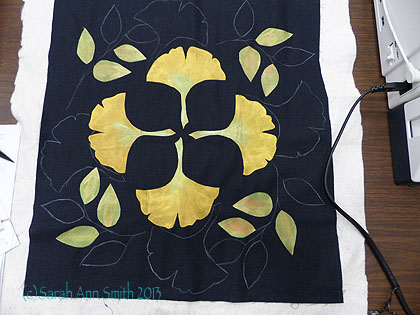
Center focus on center of quilt. Note hotshoe bubble level.
I just read a fabulous article on photographing your artwork here, at textileart.org. I highly recommend it! I was thrilled that they link to Holly Knott’s instruction page for textile artists and art quilters, and they also had embedded a very useful YouTube video put up by the folks at Saatchi Online (see the video at the bottom of this post). Those posts inspired me to share with you how I do my own photography.
I’ve become adept at photography through self-education and practice, and you can too. My photographs have been used in my book (AQS even gave me a photography credit!), in Quilting Arts magazine (which has some of the best photography out there), Machine Quilting Unlimited magazine, and a number of Lark Books including 500 Art Quilts, so I think I’ve reached proficiency–at least with the best of my shots. Here’s a little of what I do in hopes that it will help you!
Set-up and level: In the photo above, I’ve shown how I set things up in my studio. I am very fortunate to have a LARGE (vast!) design wall, which I had built and installed when we moved into this house three (!!!) years ago. I can pin my quilts to the wall and photograph them easily. If you don’t have a design wall, you can create a temporary set-up easily and inexpensively: purchase either foam core or rigid foam insulation. Place the foam core or insulation flat (or as flat as you can get) against the wall (poster tacking putty may be helpful). If you have to tilt the board, make sure the camera lens is parallel to the surface (see the Saatchi video, at the bottom of this post).
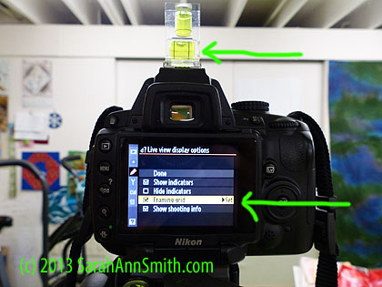
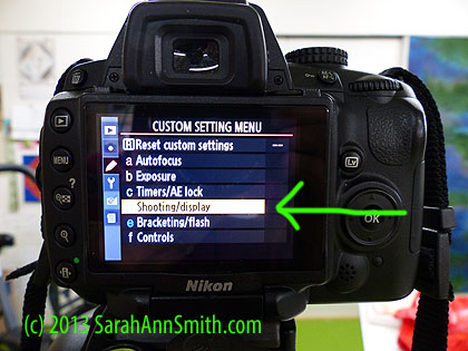
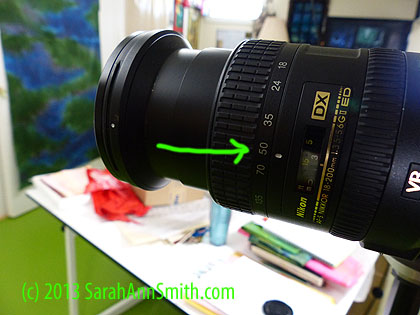
Hotshoe bubble level and first screen on my camera. The hotshoe (if your camera has one) is where one attaches a separate flash mechanism. On my camera, it is on top of the built-in flash. These small bubble levels are inexpensive, about $15. Mine will show you level whether the camera is positioned in landscape or portrait orientation.
I purchased a small “gizzie,” a bubble level that fits into the camera hotshoe (the place where one attaches a separate flash) of my camera so that I can be sure that the camera is perfectly parallel to the vertical wall and also level, because my basement floors definitely are not perfectly level. I purchased my camera level from B&H Photo Video, a vast emporium (a real store and online) for all things photo and video; they have really expert sales people who can help you with expensive decisions (like a DSLR!) and great prices. They are a Jewish business, so they close for the Sabbath (Friday to Saturday evenings) and holy days, so check on the website for special closings. Otherwise, they are there. Type “Camera level” into the search box on the site to find their current offerings. If my eyes are telling me one thing and the hotshoe level is saying another, I often use a small “torpedo” level to double check. When I turn the camera to vertical on the tripod, because the barrel of the lens has ridges, I make certain the front of the lens is level (see photos below).
With this particular lens, I notice that the lower right corner isn’t sharp no matter what the focal length, so when I want ALL the quilt to be super-sharp, I allow extra room around the edges.
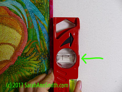
If you want to get REALLY obsessive (guilty!) you can make sure your quilt is exactly vertical using a small bubble level from the hardware store:
Making sure the sides of the quilt are vertical (or that the top is horizontal).
If you have the option, turn on a grid in the viewfinder. This will help you see if the now-truly-vertical sides of your quilt are parallel to the grid on the screen or at an angle. If they are at an angle, you can adjust the camera so everything is squared up correctly.
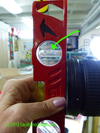
To obsess a bit more, you want to make sure that once the QUILT is vertical/level, that your camera LENS is also vertical/level. The floors in my basement studio (painted that grass green!) are anything but flat and level. So I triple check with not only the hotshoe bubble level, but I use the small red torpedo level (seen in the photo at the side of my quilt and below) to check if the camera LENS is vertical. If the lens tips up or down, you will get distortion called keystoning, where a true rectangle appears wider at the top or at the bottom.
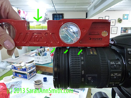
Using the bubble level on the top of the lens is a challenge because of the grip and changes in the surface.
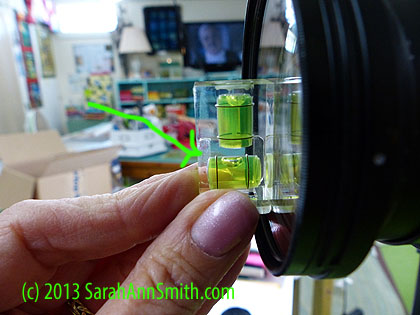
Instead you can use the hotshoe bubble level to make sure the front of the lens is in fact truly vertical (assuming of course that your wall is truly vertical!)
OR
Distortion: Through trial, error, and observation, I have learned that when I use my Nikon DSLR with the extra long zoom lens, the lower right of the lens has some distortion: it just isn’t sharp in that lower right corner. So when I set up and take photographs, I know that I need to have my tripod far enough away that I can avoid having a corner of the quilt in the not-so-sharp zone. Next on my agenda: take out the shorter zoom lens that came with the camera and see how that does.
A focal length on your zoom of about 50 is optimal. If your camera doesn’t tell you the focal length, just don’t do way zoomed in or really wide-angle.
Focal length: I’ve also read that the optimal focal length for still photography like this is 50 mm (well, the digital equivalent of what 50mm was on old film cameras). You definitely don’t want to go wide-angle because you will get distortion: a square quilt will bulge out like a fish eye, the sides will appear to push out in the middle. When I set up the tripod, I set the camera to 50mm, then I move the tripod so that the quilt fills the viewfinder (while avoiding that odd spot with my particular lens) but still allows me room to crop the photo in Photoshop Elements.
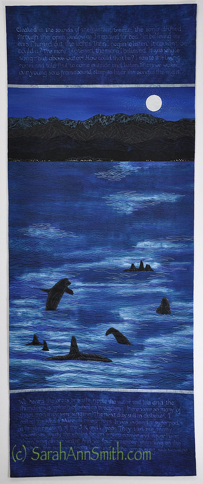
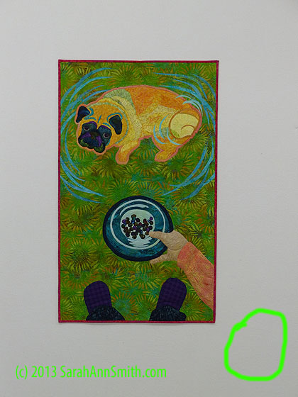
Center focus on center of quilt. Note hotshoe bubble level. Notice that the tripod is about ten feet back from the design wall and the quilt of Pigwidgeon dancing for supper nearly fills the screen, but avoids that lower-right area.
Tripod: I cannot overstate how important it is to have a perfectly still camera. As you push the button, your hand introduces shake to the camera. My first tripod was purchased used for $27. Yep, that inexpensive. And photos from that set-up made it into books! I eventually replaced with an “enthusiast” level tripod, but which still didn’t cost more than $150. Since this is my business, it was a business deduction (and honestly, the only time I’ve ever used it for anything other than work is to film Eli at a few wrestling meets–I can videotape from the tripod and take still pics sitting on the floor!) and well worth it. My tripod head has a built in bubble level on it, too, but I rely on the level on the camera to make sure the camera isn’t tilted on a level tripod. If you don’t have a tripod, find a ladder, chair or other stable surface and put your camera on that. Use the self-timer, press the button, then let the camera trigger the shot; this avoids wiggling from your hands pushing the button.
At the enthusiast level, tripods and heads are sold separately. Some photography books urge you to buy a tilt-pan head, which swivels on a ball head. I have found for photographing a quilt, I prefer the heads that allow you to level horizontally, then vertically, using two separate knobs. I know that once I get horizontal level if I have to adjust for vertical, I would knock it out of level. By having the head have two separate knobs, I can adjust in one direction, get it right and lock it in, then adjust for the other direction of level.
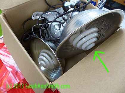
Tulip bulbs in inexpensive shop light reflectors. The bulbs cost about $35 each, so I store them carefully! But they are the most expensive part of your lighting set up and are still far less expensive than hiring someone to shoot your quilts! Unless you drop them, they last a long time.
Lighting is CRITICAL! I followed the information on Holly Knott’s website (paragraph and links below) to purchase the tulip bulbs that give even light when correctly positioned. I screw them into inexpensive shop fixtures from the big-box hardware stores (about $9 each).
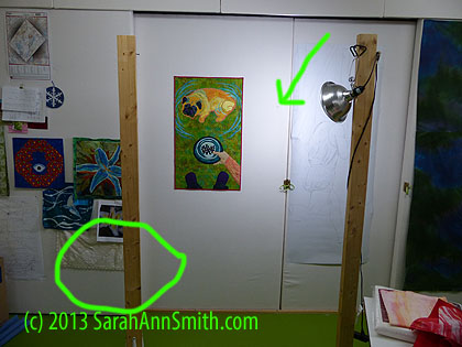
If you use only one light, or have it too close to the quilt as in this photo, you will get a “hot spot” or uneven lighting. Notice how bright the right side of the quilt is compared to the other three sides. This inconsistent lighting does not show your quilt at its best!
Instead, follow the info on Holly’s site and move the quilt stands (made from a 2×4 and four basic shelf brackets each, construction details on Holly’s site) back from the quilt to get good, even lighting. Play with the White Balance on your camera to adjust for the type and color of light in your studio combined with the tulip bulbs. If I recall, they recommend NOT having the overheads on, but I find that my studio is so dark that I really need my daylight-bulb overhead lights on to get a good shot. Experiment to see what settings and lighting give you the sharpest, most color-correct photo.
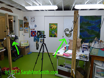
Light stands and tripod set up at a good distance from the quilt.
Holly Knott’s Shoot That Quilt: For fabulous instruction on how to “Shoot That Quilt,” visit Holly Knott’s very helpful site, here. She collaborated with a professional photographer, and I can say unequivocally that her information–especially on lighting–has made a key difference in improving the quality of my photos. In particular, take a good long look at the “Gallery of Wrongs” which shows common errors and how to avoid them.
And watch this video prepared by Saatchi Online, a mongo huge online art gallery. It is very well done, with a lot of good information. I hope you’ve enjoyed this post! Now go make art, then photograph it well!