email Youtube

Home
Galleries
Blog
Workshops & Calendar
Store
Resources
About
Contact

Archive for the ‘Photography’ Category

Speak Up, Speak Out

Thursday, April 27th, 2017

Emerging briefly from the production tunnel to share my latest piece which, thankfully, I CAN share despite the fact I’ve entered it in the Threads of Resistance Call for Entries (Deadline in about 2-3 days)!  As many of you who have known me for a while know, I haven’t usually been politically involved or spoken out.  This is, in part, the legacy of being a federal employee, when you were not allowed to be political (there were ways you could do it, but it was such a fuss that it was easier just to NOT).   However, the last election cycle aggravated me so much I began making political posts and comments on Facebook and getting involved.   Even though I didn’t really have the time, when a group of art quilters got together with this exhibit concept and called for entries, I knew I wanted to try to make a piece.
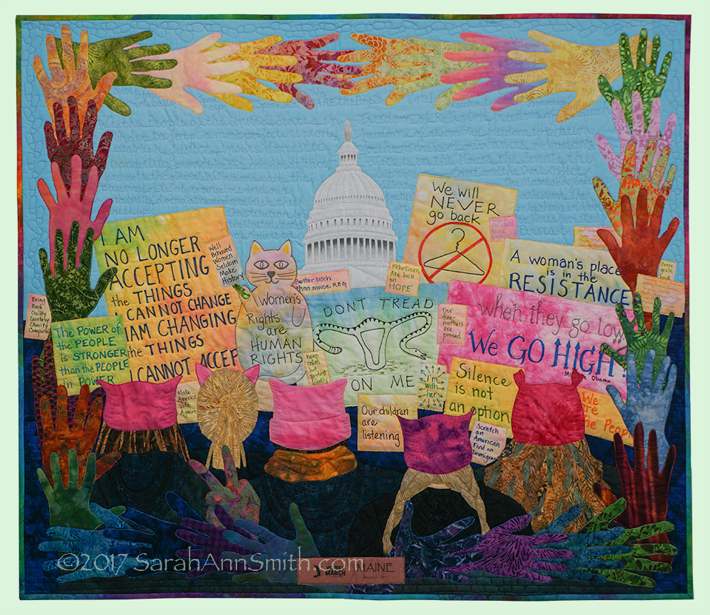
Speak Up, Speak Out © Sarah Ann Smith 2017. Although the Women’s March imagery has become ubiquitous since the March, I decided to proceed with my concept because it was my experience.

It began during one of the debates last autumn (2016).  The then-Republican-candidate (I *refuse* to use his name) kept saying “Make America Great Again,” as if it weren’t great already!   I will be the first to say that we are an imperfect union, this great nation of ours, but that is part of why we are a great nation….or were and must recover from the collective idiocy currently gripping the country.  I started sketching during the debate and came up with two ideas for art quilts, one about Maine, one about our nation.  The latter was to have a border of hands, holding hands, and phrases and words that represented the US, but the center wasn’t yet clear to me.

With my soon-to-be daughter-in-law Ashley G., I traveled to the Women’s March on Washington on an overnight bus (overnight going and returning…LONG nights sitting up!).   I bought a cheap spiral notebook and asked riders on the bus, if they wished, to trace their hands so I could use them as the border in this piece.  Every hand traced is here (one twice, because I needed one more hand to make things fit properly).

At the March, I took many many photos and as the day wore on I knew that being in this sea of humanity, most in some sort of pink hat or cat ears (reference to the-one-who-shall-not-be-named joking that he would grab a woman by the pussy–slimeball! that’s sexual assault you jerk!) I had found my image for the center of the quilt.  The images of women and men marching, protesting peacefully (not a single arrest!), has since become ubiquitous.  So much so that I considered NOT doing this view because it has been seen.  But I decided that since I conceived of the quilt before the march and finalized during the day of the March as the images had barely first been seen on the internet, I decided that since it was also “my” March, I would proceed.

This photo became my starting point–it is the only photo I didn’t take (since I’m in it..someone on the street offered to snap pics for us):
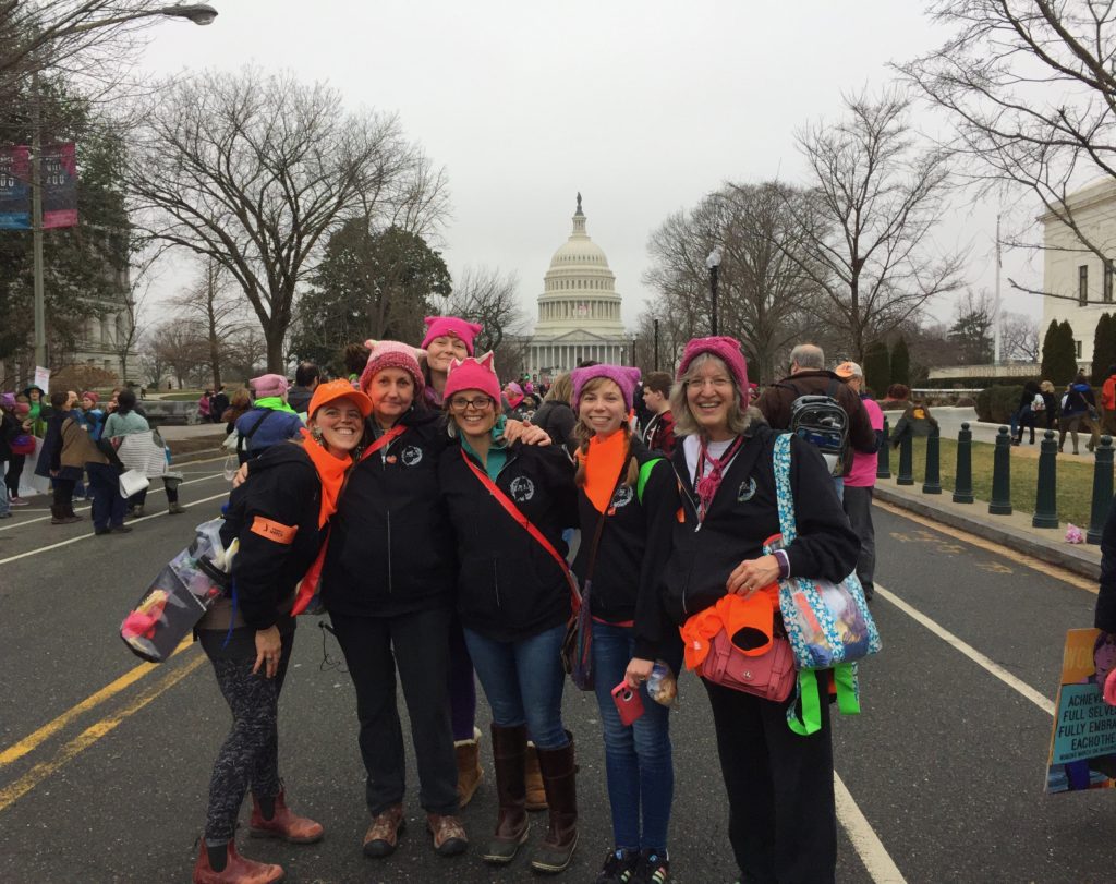
Some of the ladies from the bus. We are on East Capitol Street heading toward the Capitol. Mainers were to wear blaze / hunter’s orange. I’m on the far right standing next to Ashley, who has her orange scarf on, and we’re wearing the hats I made us.  There is an odd aberration in the photo, but so it goes.  I printed this photo on the label.

Usually when you see photos of protest marches, so many of the signs are manufactured, a printed graphic done by someone professional (ish).  What impressed me about this March is that almost all–upwards of 95 percent–of the signs were homemade and many were clever and/or inspiring.   I selected my favorite ones and used them.  One of the signs in the quilt is the actual sign that I made and wore on my jacket during the March.
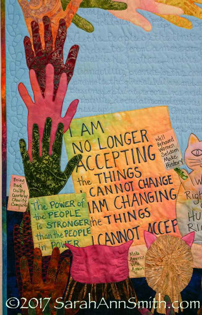
Left side of the quilt. I loved the sign calling for a return to civility, courtesy, charity and compassion.

In the sky above the marchers, surrounding the capitol dome, I quilted the Preamble to the US Constitution on the left.   Brief signs/slogans are under the hands at the top.  On the right I quilted the First Amendment’s four freedoms of speech, religion, assembly, and right to redress the government for grievances (which is what we were doing!  Democracy living and in action!), as well as more slogans and thoughts.

There were three huge signs in the shape of cats, maybe 4 feet tall, so I appropriated one of them to use.
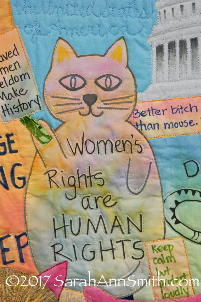
Center left. I LOVED the quote attributed to Supreme Court Justice Ruth Bader Ginsberg (I think I am falling in love with that woman!) and made sure she really did say it before including “Better bitch than mouse” as one of the signs.

By the way, I used Fabrico felt tip pens and Pitt Artist pens (brush and bullet tip) for the signs.

When I graduated from Georgetown University (in DC) in 1979, a t-shirt was popular that said “A woman’s place is in the House, and in the Senate.”  At the time, no woman had been elected (or maybe just one or two…I’m thinking Margaret Chase Smith and Nancy Landon) to the Senate that had not gotten there by taking her late husband’s seat.  It was still common to be told that a woman’s place was in the home and the kitchen, not the office.  Now I’ve said “A Woman’s place is in the House, the Senate, the Supreme Court and the Oval Office!”
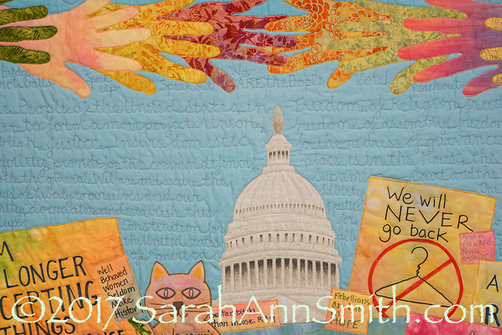
Center of the quilt. I was really pleased at how the dome turned out. I used my photo as my guide and sketched out the pattern, cut the shape (as usual I am using Mistyfuse on fabric and raw edge collage; the dome is a rare case of me using a print fabric instead of a batik. The peach-yellow hand on the left is my dyed fabric, the salmon-pink-purple on the right is Laura Wasilowski’s, from a fat quarter from a class I took with her.  The fabrics in the signs are mostly my hand-dyes.

The coat hanger sign is a combination of two such signs that I saw.   I loathe the idea of abortions. But when I was in my 20s, I was a US visa officer.   I was processing the paperwork for a British man’s visa based on his marriage to a US citizen.  When you do that, you need to establish that the marriage is legal and valid, so you need to see if there were any prior marriages and, if so, that they ended legally.  He was a widower.  To break the tedium, I used to look at cause of deaths when these cases came across my desk.  His first wife died of septicemia (blood poisoning) from a self-induced abortion (because it was illegal in the UK at that time). Ever since, I have stood for freedom of choice because there will ALWAYS be women who are that desperate, no matter how awful I or others believe abortion to be.  Moving on…back to the quilt.
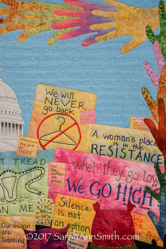
Center right. I loved the take on the Don’t Tread on Me flag from revolutionary war times that turned the snake into a uterus and says Don’t Tread On Me (on left, on Laura Wasilowski’s fabric).  The big pink sign with Michelle Obama’s mantra is what I wore at the January 21, 2017 March on Washington.  That’s my DIL Ashley on the left in this photo, me on the right. I modified a sign carried by a Vermonter to read (in the sky writing) One Maine snowflake in a storm.
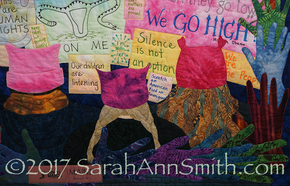
Center bottom right. A bit sharper photo.  In the bottom left, under the copyright, you can see a “ribbon.”  The center woman I think of as “Everywoman.”  Then there is Ashley (DIL) in braids, and me on the far right.  Ashley’s hand is the purple one at her right shoulder, mine is the blue one next to Ashley, one in from the corner.

Some generous unknown-to-me person who couldn’t go to DC made and gave away these ribbons to those from Maine who marched. It was done in the Mainer’s blaze/hunter orange. That was pretty bright for the front of my quilt, and I didn’t want it to distract from the imagery. So I scanned the ribbon into the computer, then in Photoshop darkened the color so that it would work visually on the front. THANK YOU whoever made these!
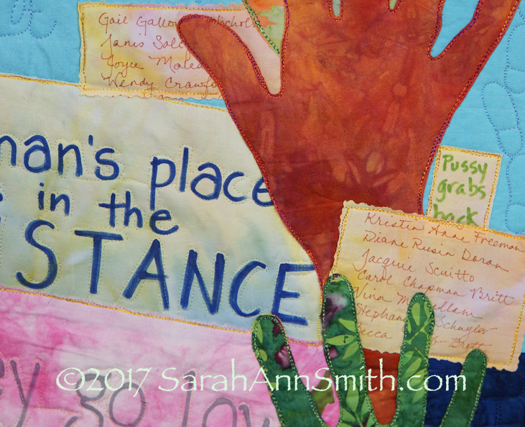
Far right. My friend Gail Galloway-Nicholson used to be the Curator for the Supreme Court so is as familiar with Capitol Hill as I am, if not more so from having worked there for a good bit of  her career..  I worked for a US Congressman for two years, and we also lived just two blocks behind the capitol (yes, I got to see our old house).  She asked me to carry her name in my pocket since she couldn’t go to the March. I did, and added the names of more friends (some I’ve only known via the internet and quilty stuff).  Thank you all for being there with me!   I love knowing you and that you wanted to be there in spirit and on the cloth!

So that is all the details, well, most of them, of what went into this quilt.  Don’t know if it will get juried in–I know there is some awesome art being made for this that doesn’t use the ubiquitous image–but I am glad I made it!

And I have decided to get involved volunteering for my Town of Hope, Maine.  I decided that one needs to put your time where your mouth is, and as the saying goes, all politics is local.   Here’s to giving back to my adopted-shoulda-been-born-here home state of Maine!



Photoshop–Finding the Stamp Tool, Thermofax screens

Tuesday, March 28th, 2017

WAHOOOO!   I’ve discovered something almost as cool as the holy grail!  At least if you want to make thermofax screens…..and yes, you may liberally share the link to this blogpost so that others may learn and play with paint.

If you want to find out how to do this the easy way, keep reading!

So I was on a quest for my next project:  creating thermofax screens using my new (to me) thermofax machine.  I remembered a tool I loved in Photoshop Elements (PSE), but it wasn’t in Photoshop (PS–full thing).  How could that be?  So I opened up my 2010 PSE software and discovered the tools I liked were called Stamp and Photocopy, in Sketches under Filters.   So I googled around to find out how to create actions in full PS to do what those tools did.  Turned out I didn’t need to–Adobe included those tools but then HID THEM.   So here is how to find and use these awesome tools.

Note:  I realize this will sound like gibberish unless you are into PSE or PS….if you aren’t, just skip!  But this is SO AWESOMELY COOL AND USEFUL for those of us who want to make Thermofax screens and use Photoshop! So if you are interested, read on!

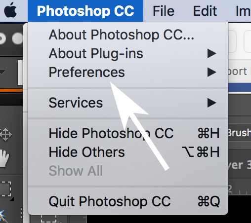
First, you need to install all of the Filters in the Filter Gallery.  Yeah right.  Not as hard as it sounds.  Under Photoshop, find and click on Preferences.

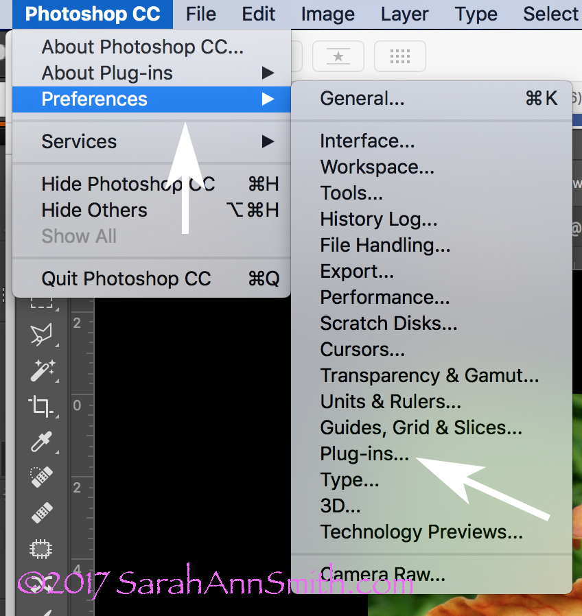
First you need to find Plug-Ins and load the Sketching filters.

That will cause a pop-out to appear; look for and click on Plug-Ins:

The flip-out widow reveals Plug-Ins. Click on it.

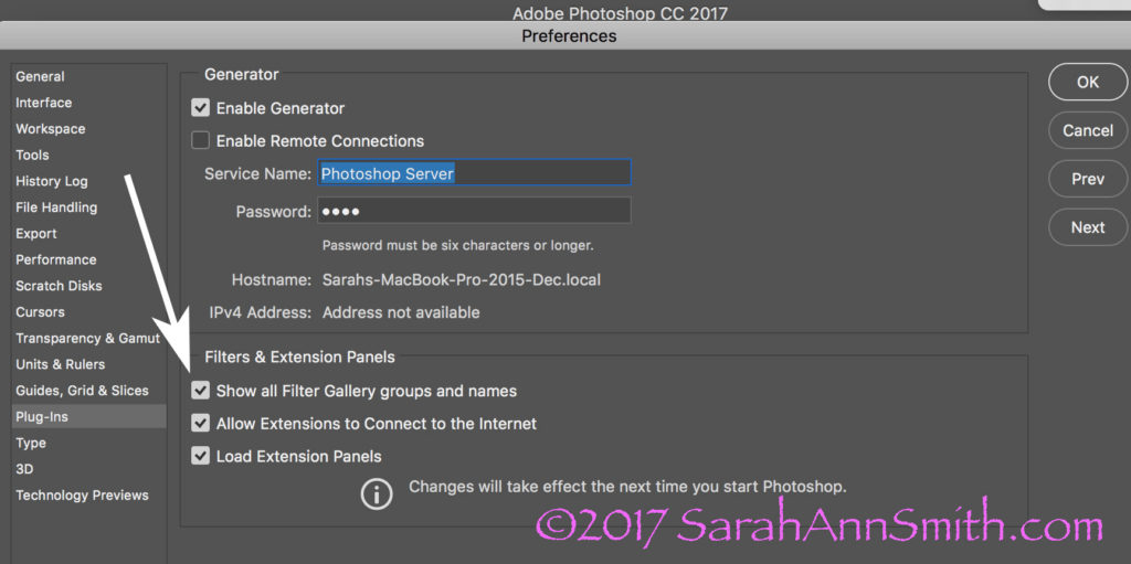
When you click on Plug Ins this window opens up.  Check the box to show ALL Filter Gallery Groups and names.  Sheesh….why was this not the default?????

This window will pop up. The box at the bottom of the arrow will be blank. WHY Adobe? WHY? Check it and the wonder and joy of more filters will appear in your PS workspace.

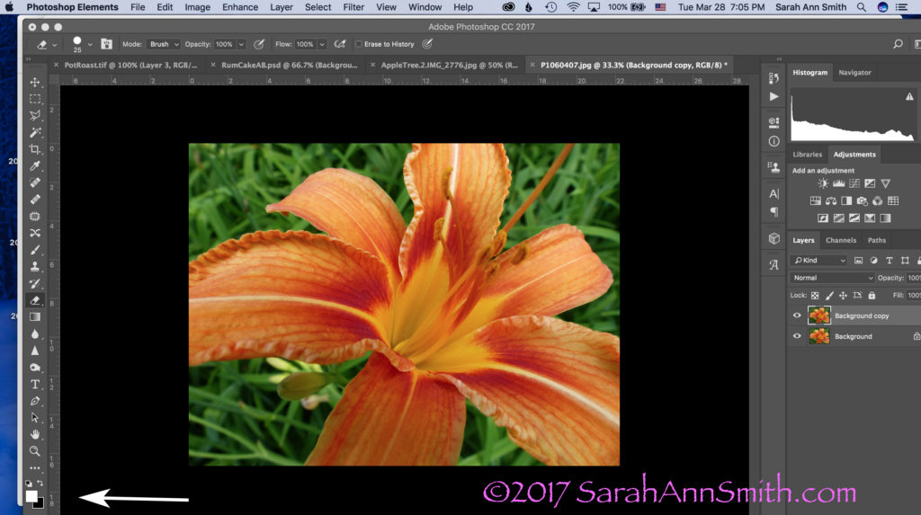
Here’s a colorful photo I use in my Quilting the Garden workshops.  NOTICE the COLORS in the Foreground and Background boxes on the bottom left corner.

Let’s pretend I want to convert this image to black and white to create a Thermofax screen.  Take note of the little Foreground/Background boxes at the bottom left.  They are important.

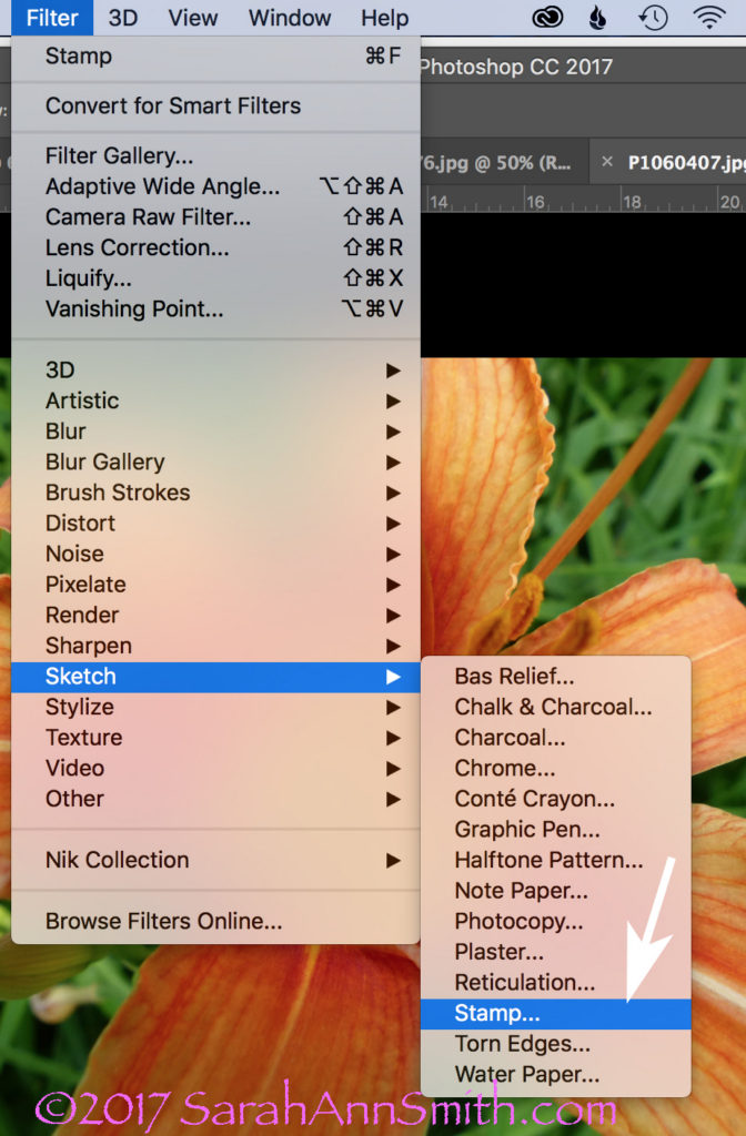
Boxes are important!   The next step is to USE the Stamp tool.  Look across the top of your PS window.  Click on Filter, then Sketch, then Stamp.

To use the Stamp tool, go to Filters (on the menu across the top), select Sketch, Then Stamp (see arrow).

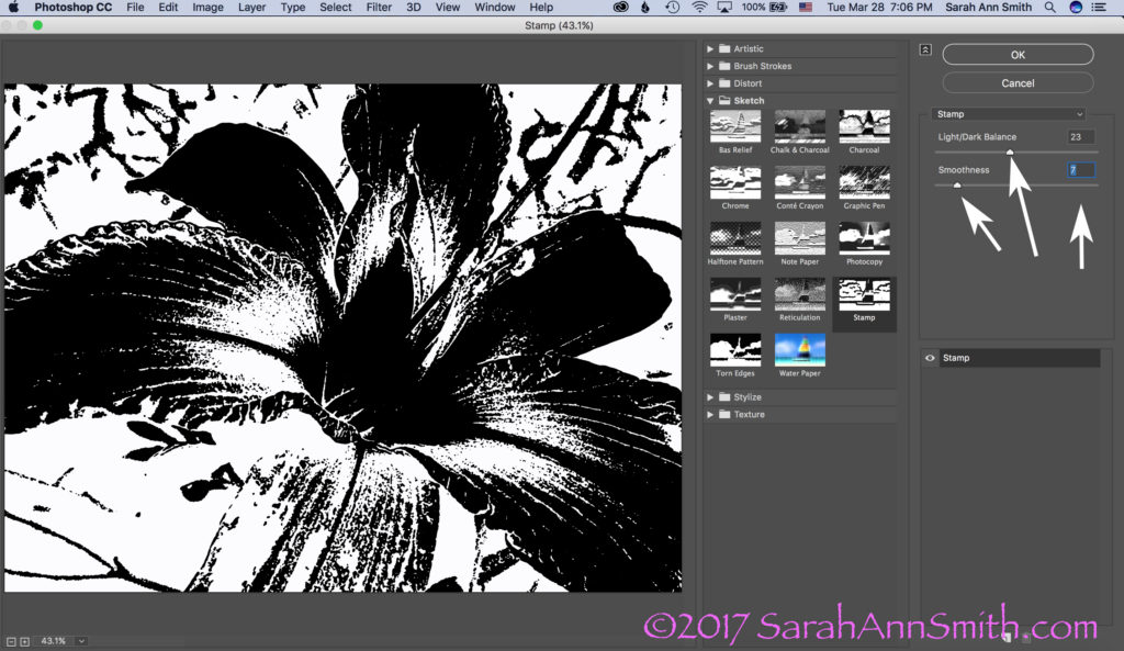
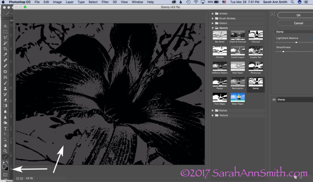
When you click on Stamp, the following window opens.  But I ended up with Grey and Black.  WHY?  It used to be black and WHITE, right?  So what was I messing up?

This was not what I had in mind. Then I had a lightbulb moment (who me? I know, rare, but it does happen sometimes). Remember those BOXES?

YEP…..the Foreground color, due to something I’d done not so long ago, was dark grey, not white.  Aha!  A glimmer of light (pun totally intended).  Groan.  Remember, Boxes are Important!  I switched the foreground color from dark gray (above) to WHITE.  And lookit what I got!

Drum roll……stamp is once again black and white!  Notice the arrows on the right:  use the sliders or the number boxes to adjust the level of black/white and the degree of detail.  Now isn’t it a whole lot easier to get to this point in a hurry, THEN fine tune with the eraser tool to clear out extraneous yuck?

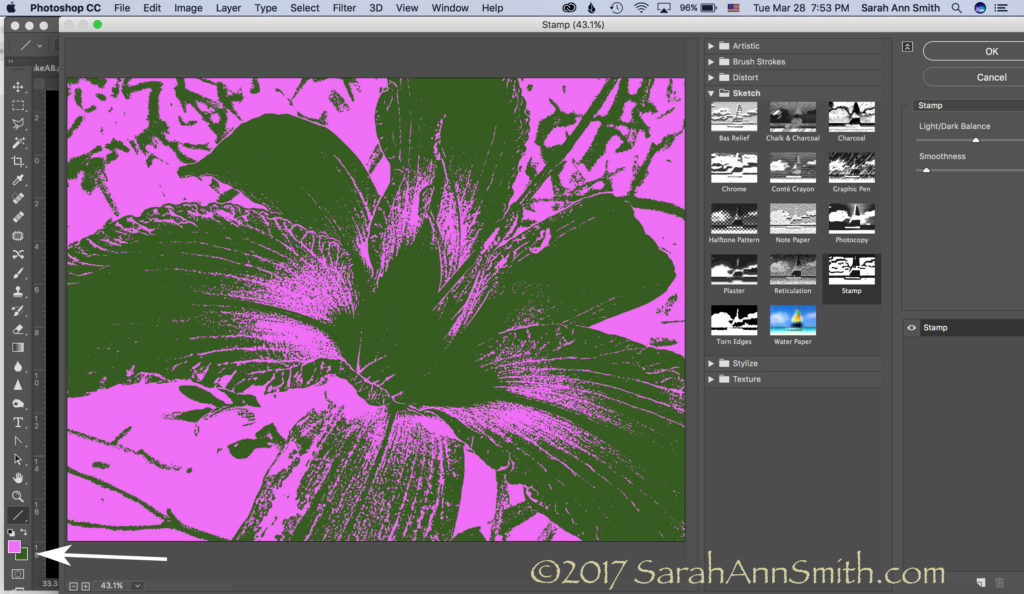
Those arrows on the right point to fun things to play with to adjust the amount of black, white, detail, etc.  But the realization that the foreground/background colors could make a mess make me think….hmmmm……COLOR!  What would happen if….

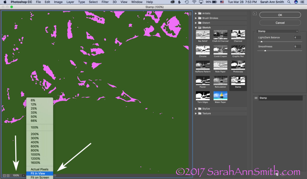
BUT, one more tidbit about what you see in the window.  The one below looks like a lot of nothin’, right?  That’s because is it at 100 percent, which doesn’t fit.

Then I realized I could play with COLOR. When you open this window, however, it opens at 100 percent. I prefer the “Fit In View” option, so check out the arrow once again.

If you click on the little down arrow to the right of 100%, you can switch it to Fit In View or whatever you like to use.  For my pea-brain, it’s a whole lot easier to figure out what I’m doing when I can see the entire picture, like this:

Then you can create a really bizarre two-tone hot pink and green image. Just what you always wanted, right? Not! But you can see the potential, right?

Let’s just say I am ridiculously happy.   I asked for help on FB today and got it…THANK YOU Lynn Krawczyk, Lyric Kinard and Leslie Tucker Jenison among others.   Then I — having learned this lesson before — googled around for online information, including the forum at Adobe, which is where I found the clue that the Sketch filters WERE in full PS.   But I didn’t know the terminology (like where to find the Line tool to create an arrow to illustrate these screen shots), so YouTube search box to the rescue.

SQUEEEEE!     I don’t need to use my antique PSE, I can use full PS and not have to move between the two, AND (best of all) I have my easy-peasy Stamp tool back!   Time to CELEBRATE!  Lynn, I may just have to fling some paint!  And now that I have written this up to share ASAP in thanks, I am going to celebrate, perhaps with chocolate! Or maybe Talenti.  Or some culinary Venn diagram that involves the intersection of Talenti, banana and chocolate.  SQUEEE!

And a PS, thanks Whiskers for asking the questions:  Hi Whiskers!  Yes, I will do a blogpost eventually on thermofax screens.   Not sure when, so the quick response is the Thermofax machine is the predecessor to today’s photocopier.  They were used in the 50s/60s in the office to copy stuff.  They are no longer made (consequently they cost a fortune, it has taken me a decade to save up and make the purchase, $1350! If you buy one be sure you get one that works with the mesh, not just the purple ditto masters!)…but folks have figured out if you use an image with carbon in the ink (laser printer, some inkjet printers, carbon ink, lead pencil) and you run it through the machine with a plastic-backed mesh, the plastic melts where there is carbon.  When you separate the two sheets (paper and plastic mesh) you end up with a screen.  Tape up the edges, then push the paint through.  I actually just taped a segment for Quilting Arts TV on this!


Photo Challenge: Hallelujah

Wednesday, February 8th, 2017

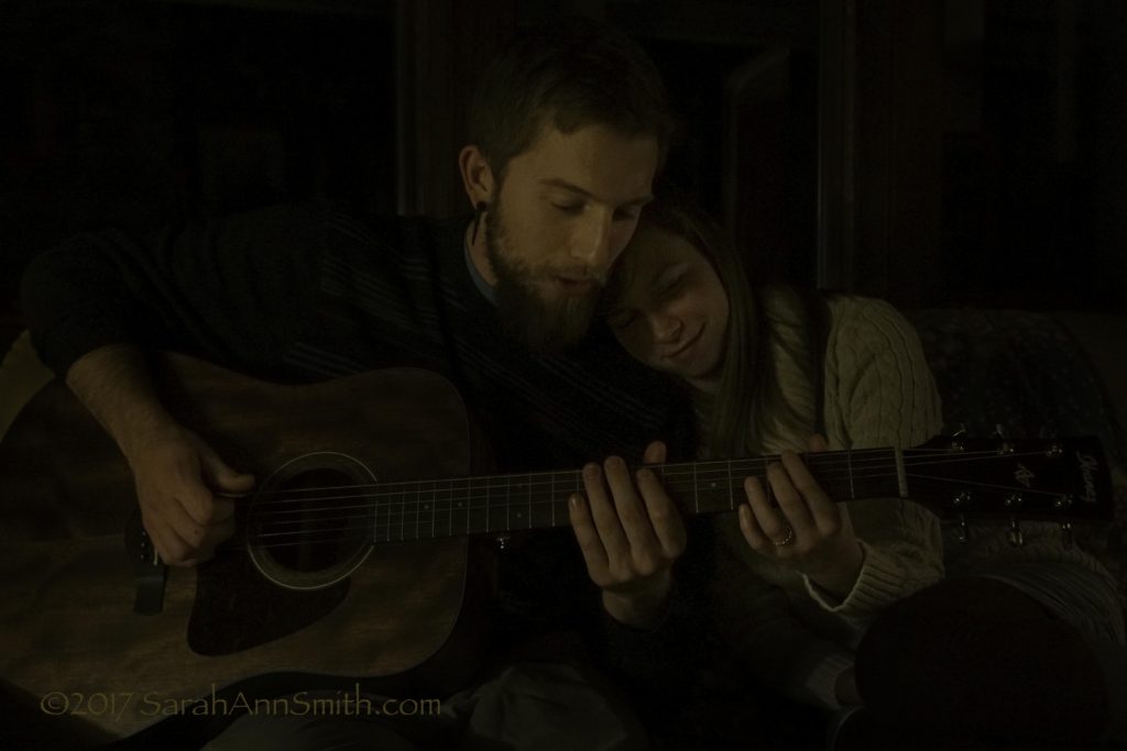
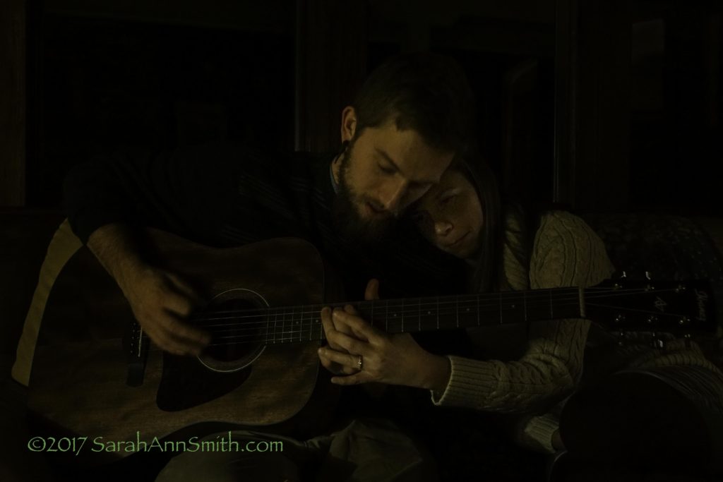
Last week’s theme was Leonard Cohen’s Hallelujah.   I asked Joshua to bring his guitar for family dinner night, perhaps the acoustic.  Thank you dear son for letting me take pictures of you!  And Ashley, thank you for letting me take pictures of you with him…those may be my favorite shots of the week.

I heard there was a secret chord
That David played, and it pleased the Lord
You don’t really care for music, do ya?
Well it goes like this
The fourth, the fifth
The minor fall, the major lift
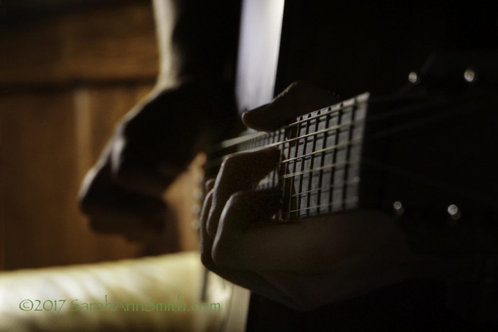
This is the shot I submitted as I felt it best represented the challenge.  My older son Joshua is a brilliant guitarist.  Our living room was exceedingly dark (the low key darkness works for the mood of the song), so even with a crazy high ISO and low F-stop, needed Dodge and burn edits, a crop, and minor adjustments in LR.  I really like the angle of the shot, but because of the lighting think it could be improved. Will try this again during the daytime or with studio lighting to make the best of the angle.

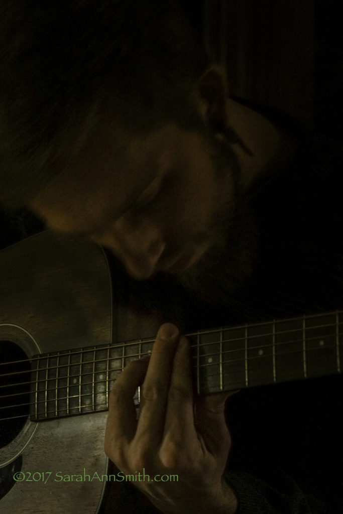
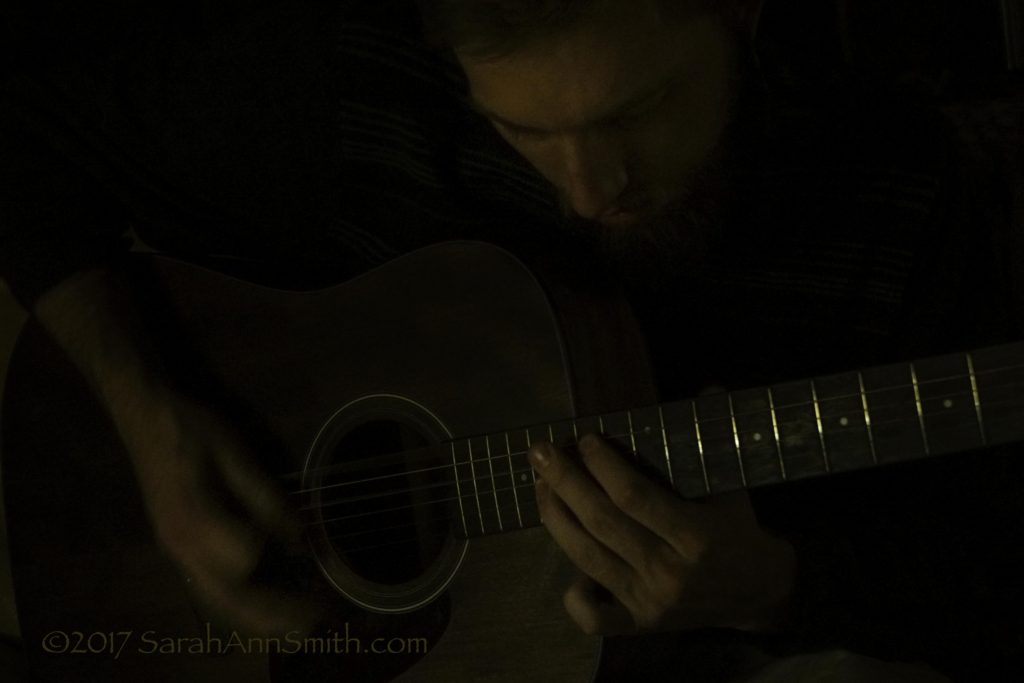
Here are a few more of the better shots, all dark–which actually fits the mood of the song.

This was my second choice, and I think a better composition.  Photoshop edits include dodging and burning, crop, and minor adjustments in LR.

Joshua zones in his music they way I zone in my art.

After a bit, Ashley said, you do the right hand, I’ll do the left. I LOVE LOVE LOVE this photo of them!

And one more…..

One more of Joshua and Ashley…I love these two so much!


2016–a Baker’s Dozen of my best photos

Saturday, December 31st, 2016

I’ve been part of a photography class with Ricky Tims (in 2015) and a critique challenge this past (and coming) year.  For our final assignment this year, we are to pick our favorite image of 2016.  Here are my top 12 + 1 for a Baker’s Dozen.  For lack of a better way, I’m posting them in chronological order. You can click/right click on all photos for a larger view.

Clearly, I am biased about some of these, so tell me–which do you think is The Best of the bunch? Doesn’t matter why–just the one you like the best!  I need to submit one on January 1, so pipe up!

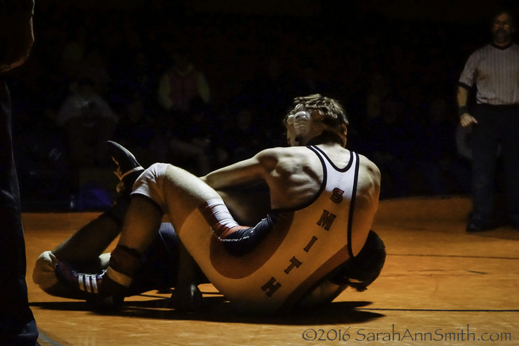
Photo 1:  For the past eleven years, the calendar year begins in the middle of wrestling season, so for both quality of photography and affection/nostalgia, I’ll start with photos of Eli’s last Maine wrestling season.

Here’s another very typical shot:

Photo 2:  Eli, in red, goes in for the pin (and win). I have very, very few photos with Eli’s face, but this one shows the intensity of the sport.

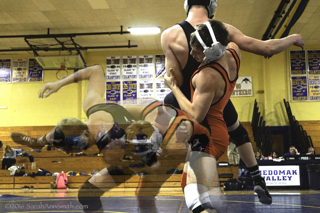
This next image is probably the most technically complex I did all year.  I had three layers at one point, but the boys’ position in the frame didn’t make a logical sequence, so two worked better.  I printed this fairly large and framed it as an 18th birthday present for Eli, and it is in his room with his ***many*** ribbons, plaques and trophies from his sports achievements.

Photo 3: Transparent overlay with Eli in a take-down. I was sitting on the edge of the mat and was maybe 6 feet away from them. Luckily, they didn’t crash into me!

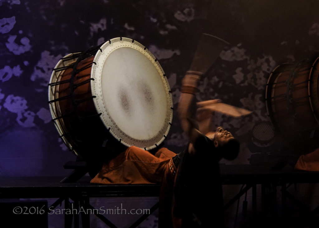
Photo 4:  In March the entire family went to hear the Taiko Drummers that came to perform at Strom Auditorium thanks to the Bay Chamber Concert group. I make a tripod of my arms and the rail in front of my seat and was delighted so many of my images turned out well despite the dark.

Photo 5: I love that the drum and legs are crisp, the face is clear, and the arms and drumsticks are total blur, telling the story of the physicality of the performance.

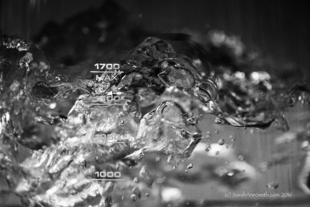
Photo 6:  I don’t know why I like this picture of water boiling in my electric kettle so much, but I just do!

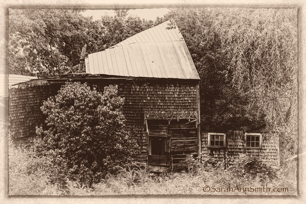
Photo 7: a vintage effect for a summertime photo of a barn near me that has now fallen down (even before the snow).

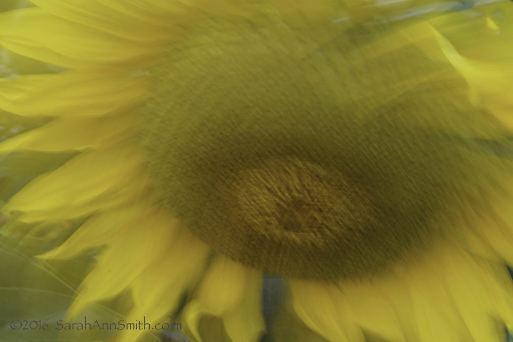
Photo 8: A “panned” image of a sunflower from the Camden Inn garden by the footbridge over the river, just a stone’s throw off of Main Street.

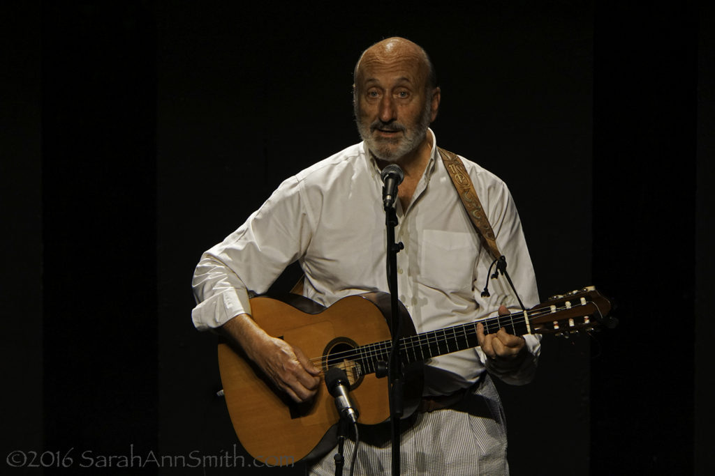
Photo 9: I had missed seeing Paul Noel Stookey when he was here before, so I made sure I didn’t this time, even if I had to go alone. I loved it! I was also pleased that my “tripod on the railing” worked again to get a good shot. The theme was “past prime” which I interpreted that someone might *think* he is past his prime, but really isn’t!

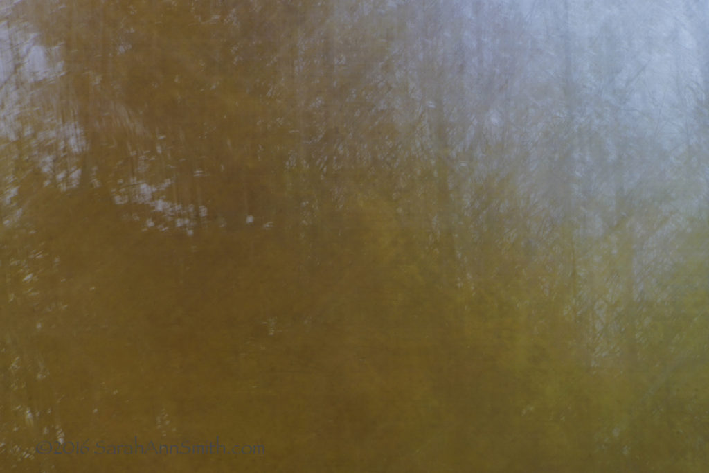
Photo 10: October is always glorious in Maine, and this year was one of the best. I’m not usually in to “artsy” images or affected techniques, but I rather like the painterly effects you can get with some panning. Panning is when you move the camera on purpose while the shutter is open to create a deliberate blur.

Photo 11: I must have taken 200 photos on a not-too-long walk in my neighborhood. One of my favorite spots is across the main road on Blueberry Lane. This is a close-up of the sumac leaves in full glory.  I always like the simplicity of photos like this that celebrate the beauty of the ordinary.

Photo 12: Another “lots of edits” photo, but one that makes me laugh. This kinda describes my entire year. Sometimes I think I ought to make this into a poster and sell it!

And the “Baker’s Dozen” image, from just this past week or thereabouts:

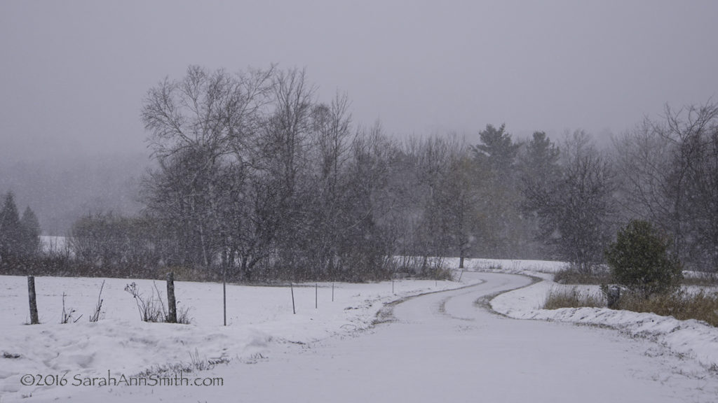
Baker’s Dozen: I took several versions of this, made one black and white, but I like the soft winter colors and the gentle curves of our driveway.


Burning the Candle at Both Ends

Saturday, December 3rd, 2016

Just a quick pop in to say hello, share my latest photo effort, and promise that I WILL blog about Houston and all the good stuff….just as soon as I get a couple more gifts made!

See below for more info.  Right click for larger view.

See below for more info. Right click for larger view.

I was bummed this was a “lot of work” theme as I had no time.  Eyes fell on a flyer.  Lightbulb ON!  Visit to Danica Candleworks in Rockport, Maine.  Lots of beautiful photos (think four tiers of candles at 6, 9, 13 and 16 inches in rainbow handing from their wicks on Shaker style pegs).  Yes, they do mail order!

Took 6 shots to get nearly the full spectrum (omitted the pale cream and the black/grey on the ends).  Tried Panorama merge in Photoshop.  No joy, probably because it couldn’t identify the overlap spots since it is all the same shapes.  Merged the photos manually.  Take pictures of flames against a cream wall to match the wall behind the hanging candles.  Spend way too much time isolating and inserting five different flames on all those wicks!!!! Insanity!  Mirror image the layers.  Add a grey banner to help disguise the merge (got it all lined up, but some of the candles bent as they were hanging at a slight angle, which looked weird).  Add the text.  Share on FB asking Portrait or Landscape?

Next morning, another lightbulb!   Use the landscape but add a “candle” to the text banner that reads upside down and right-ways while burning the candle at both ends.  Yep.  Welcome to my life!  If I had a lick of business savvy, I’d make this a poster and sell it.  My retirement up in flames LOL!  Of course, I’d need to tidy the edges of those flames, my PS is up to meticulous trimming, my attention span wasn’t last night!  Now I’m off to work on Eli’s college quilt (he told me ten days before leaving what he finally wanted, selected colors, etc, so at least he’ll have it for winter!) and some gifts.  Talk to you soon!