email Youtube

Home
Galleries
Blog
Workshops & Calendar
Store
Resources
About
Contact

Archive for the ‘In Progress quilts’ Category

Joshua’s quilt

Saturday, December 21st, 2013

ALERT:  Joshua, if by chance you are reading this, STOP and GO AWAY!  <grin!>  Ashley, if YOU are reading this you may, but please don’t share pics with Joshua!

Please

scroll

down

Yes, I am

trying to keep

the photo

below the screen line!

It’s worth scrolling….

Yes, I am trying to get the photo below the screen line LOL!  In a small miracle, I have made some headway on Joshua’s quilt!  He graduated and got his GED in late Spring.  I started on it in late winter and hoped to have the top done by graduation.  Then I got the chance to make my video workshop (here) and was delayed.  Then I had hoped to have all of Autumn to work on it–but offers of articles and two bloghops to promote the now-out DVD intervened.  But I did get the diamonds made.  Yesterday I FINALLY got to put them up on the design wall, and I AM HAPPY!   If Joshua doesn’t like it (I’m sure he will), I’d love to sleep under this.

Clearly the quilt was inspired by Kaffe Fassett’s quilts.  I actually prefer the Philip Jacobs and Martha Negley prints to Kaffe’s, but had a lovely stash.  There was one print in particular that Joshua liked, so there are ten diamonds in that one, plus I plan to do a pieced “quilt modern-ish” back so the quilt will be two sided.  I think the quilt will be about 87 x 95 when done.  Yesterday I got the pieces up on the design wall (and partly on the floor):

Inspired by Kaffe Fassett's diamonds quilts.  I used the diamond template I had, then cut strips to make 1 inch (finished) sashing/borders for each diamond.  There are not two pairings the same in the entire quilt.  Doesn't the color just make you happy?  Now to get it pieced without messing up the order!

Inspired by Kaffe Fassett’s diamonds quilts. I used the diamond template I had, then cut strips to make 1 inch (finished) sashing/borders for each diamond. There are not two pairings the same in the entire quilt. Doesn’t the color just make you happy? Now to get it pieced without messing up the order!

As I was stitching the edges onto the diamonds, I started popping them up on the wall.  What a muddle!  Wasn’t happy.  So I tried grouping them by center color (large prints) and, when that wasn’t so great, by border color (smaller scale designs/prints).  That worked much better, so I chose a simple rainbow flow:  reds to orange-ish/yellow to green to blues.  When I got to the bottom of the number of rows I needed, I had lots of blues, so used them to fill in the triangles on the tope and sides and really like how the darker strips help contain the quilt.  I’ll use a dark-ish blue for a simple binding.

Now I need to upload a few photos to a transfer site in the cloud for my next article for Machine Quilting Unlimited!  WOOT!


Conversations, Part 3: the smaller pieces and fixing it…

Friday, August 12th, 2011

By the time I got to making the two small pieces, I had ONE week left, and lots of other stuff to do during that week.  Can you say work fast?  Under pressure?  SHeesh!  I really hope life slows down, because I can’t take too much more of this!

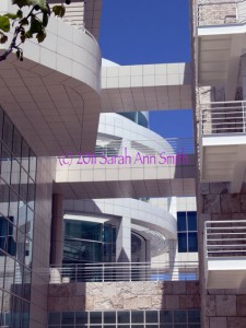
One of the architetural photos I took and used for the small pieces

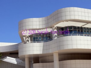
The other of the architetural photos I took and used for the small pieces

These two photos were the ones whose lines shadows most inspired me.  I love the interplay between straight lines and the curved, the grid of stone and the undulating shapes, the blue sky and the white stone, and the shadows.  I love how the architect used bands/lines of (metal?) whatever to create de facto louvers to shield the galleries and interior spaces from the bright sunlight, and how those bands create striped shadows on the pillars and walls.

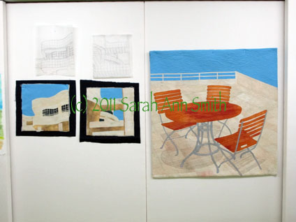
Here are the two smaller pieces, with batting and backing sticking out, and their sketches/tracings above.

Due to lack of time, I quilted both small pieces at once… I’d thread up on say ivory, quilt those areas, switch to cream and repeat, then to tan, etc. on both quilts, working my way to the dark of the windows and the sky and, finally the facings!

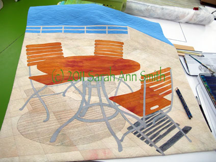
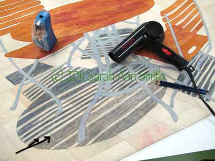
But I still wasn’t happy with the shadows from the table and chairs, so I went back to the now not-quite-done central piece.  In the next photo you can see the two pencils plus the paintbrush.

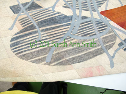
I still wasn't happy with the shadows (or lack thereof) on the main piece, which was ostensibly finished. Guess not. So I took out my Inktense by Derwent pencils (the Payne's Gray and a neutral gray) and took a deep breath

This picture shows the table shadows partially done....

Using the pencils was a bit of a "thriller" moment: I used two colors of gray to get the shade I wanted. The lighter gray on the bottom is where I have colored over the gray quilting threads with the pencil (see black arrow marks on the photo). You can then dampen the pencil marks to create an ink and intensify the color. However, I didn't want the color to bleed into the sunny stripes that came through the slats of the table. So I took out the hair dryer! I used a damp paintbrush in my right hand to moisten the ink, and the hair dryer in my left hand to dry as I painted/wet the pencil-ink. I had very little bleeding into the sunny stripe as a result, and what I did have doesn't really impact the image much at all. PHEW...time for a nice glass of wine after that... I could have totally ruined the whole, finished thing...with just days to go before hanging the show!

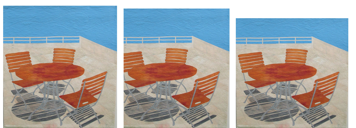
The quilt was getting better and I was disliking it less.  But it still wasn’t quite right to me.  There was too much blue at the top.  So for the show I “cropped” it by folding the top to the back… I’ll decide how much to trim off the top and re-do the facing and hanging sleeve after the show comes down.  So here is a question for those of you who have slogged through these blogposts:  how much should I remove from the top?  Here are three VERY similar versions:

So I do I leave it alone (far left), crop a little (center) or crop a bit more (right)? Photo is clickable to see it larger...

So do I leave it alone with lots of blue, crop a tiny bit, or crop a little bit more?  The photo on the far left is as made.  The way it is hanging is about where I photoshopped it in the center photo, and the one on the right is close to square (think symmetry with the proportions of the two small pieces).  So do I crop?  How much?

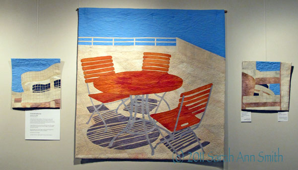
And just to remind you…here are the three pieces done and in the show:

Conversations by Sarah Ann Smith -- click to see larger

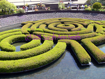
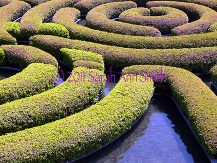
And yes….I might maybe do another quilt or two… I mean, look at this water-maze-garden-hedge…  how cool is that?  and the cropped version below?

the green is hedge, the dark in between is water!, and beyond are plants on the "bowl" shaped slope in the gardens that surround this water feature.

I just LOVE this rhythm and repetition....

Clothed in Color: how I did it….

Thursday, March 24th, 2011

I’m always fascinated by the creative process, especially seeing how someone else did something.  So I figure I’m not the only one with these voyeuristic traits and thought I’d share a bit of “how I did that.”  That, in this case, is my quilt Clothed in Color, which is an entry for “The Space Between” juried exhibit.  I wrote about it here.
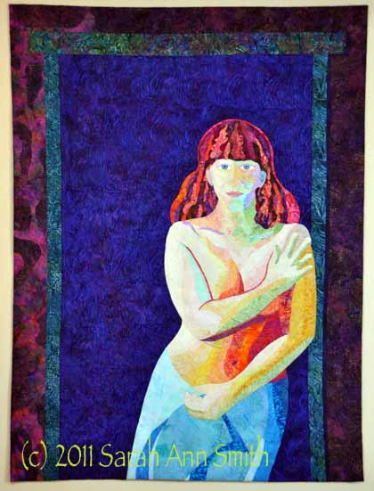
Clothed in Color; 36x48 inches (not quite one metre wide). Made with batiks, hand-dyes and thread.

Over the past few years I’ve been teaching myself about and playing with color, both in the dyepots and commercial cloth.  When I decided to do a portrait of our older son, I wanted to work with value only, the relative lightness or darkness of color, ignoring the actual hue (color).  As I mentioned before, though, I wasn’t too sure he would appreciate his skin being green, blue, pink, whatever.  As a test-run, I tried the process in the portrait of our pug, and it worked, so I set to work on the Joshua quilt (put Joshua quilt in the search box and it will take you to posts from mid 2010 with the process on that one) except that I used realistic skin tones.  Not so for this quilt!

For this quilt, I began by selecting pale batiks and dark batiks in anything other than a tan-brown-skin tone.  OK, an honesty moment.  I began by depositing a large sum of money (with glee, abandon and NO regrets) at Batiks Etcetera last summer.  As I drove to my teaching job at the AQS Knoxville show, I made certain to stop at Batiks, Etc. in Wytheville, Virginia. The shop is even more wonderful than their booths at shows and the service just as wonderful.  It is hard to find the light-light and dark-dark fabrics, so I went hog wild.  True confession:  I have never, EVER spent this much for fabric in one place at one time in my life.  It pretty much used up my fabric budget for the last 7 months of the year.  And it was worth every penny!  (PS…I blogged about it earlier, too, here.)   And I’m planning on doing it again this coming June when I drive past that shop on the way to teaching this year (WHEEEE!  Get ready Carol, make the bag a big one!).  Now here’s the photo of lights and darks:
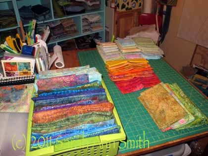
Sorting fabrics by value...light to medium on the table, darker ones and some extra lights in the green bin.

To get the correct pose, I set up my camera on the tripod and used the timer to trip the shutter (and cover myself strategically before anything too revealing got on digital memory card!).  I took a lot of photos until I had the right tilt of the head, expression, curve to my side, placement of arms and hands.  Then I set up the digital projector (which I bought to use in lectures and classes, and now have this use for it, too!) to project the photo onto paper folded/cut to 36×48.
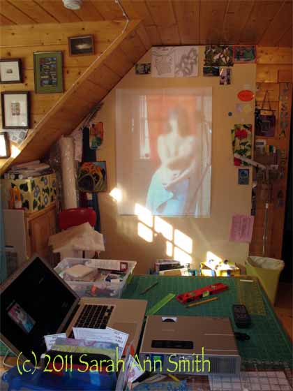
Me, in blurry living color, on the design wall in the old house; you can see the laptop and projector on the work table. PS--notice in the photo I am in our bathroom with a cloth covering the window behind me, not in a doorway at all. That's the camera and tripod on the right reflected in the mirror (which I was using to see how things looked).

Somehow, a photo is much more “revealing” than the same thing in batiks, so while I’m not too uncomfortable with a semi-nude quilt of myself, I decided I had best blur the photo.  Ahem.  And I’m glad I lost that 25 pounds a couple summers ago!   Having carted the weight around since my last pregnancy (the kid is now 13) it was time for it to go!

Anyway, back to quilting.  Or drawing.  Rather than use photoshop to define shapes, contours, etc. I prefer to take a drawing pencil and outline the edges and make my own decisions about where I want shapes and colors to merge and blend and overlap.  I will draw these “interior” lines, too, and often add notes like “medium-dark” on the drawing.

I decided to tackle the hardest part first:  my face.  In the end, the eyes ended up about 1/4″ too close together, and I may be able to adjust that, and they are a smidge too large.  Other than that, things turned out OK.  Once the face was done, I could move to the torso (using larger chunks of fabric), the towel, and the hair.
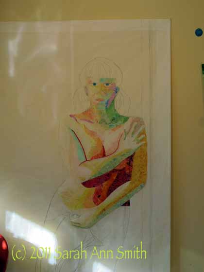
I began with the most difficult parts (face and torso). I ended up removing much of the dark fabric for the strong shadow under my arm..tho the photo was that dark, it just looked weird in cloth, so I reduced the fabric and later added lots of dark thread to create the shadow.

Thelma Smith made some awesome quilts of the Sonoran Desert, and in them used a technique she learned from a painter and then shared with me.  The painter used Cadmium Red Light paint to outline / highlight some figures.  It really makes them pop out from the background, especially when values are similar.  It doesn’t shriek at  you like black would, and despite being a color totally not there in real life, the technique works.  I’ve wanted to try it for quite some time, so I did for the hair, and used a deeper red for the shadows to the right and top of my right arm.  I decided since I selected a deep-dark fabric for the background, there was plenty of “pop” on the body, and didn’t continue the “red halo”, but think I’ll have to do another portrait of someone and give it a try on the entire figure.

Anyway, here is the hair in progress:
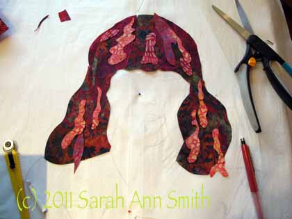
Hair, in progress (early stages)

In this photo, I decided to work on the table, not the wall.  I placed my sketch UNDER some parchment paper; I can still see the lines, and can cut and MistyFuse directly onto the parchment.  As with Joshua’s hair, I cut large, darker chunks to create the overall shape of the hair.  Then I cut highlights (magenta, orange, rust, green!) in wobbles and waves and wiggles, adding until it was “just right.”  Here’s a closer view of the hair when done:
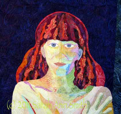
Detail showing finished hair

When I first envisioned the quilt, I thought I would fuse assorted bits of dark fabrics to make the background, as I really liked how the stark, dark contrast worked in the quilt of Joshua.  To get an idea of how it would look, I took one large chunk of blue batik and put it up on the wall, then pinned the fused “me” to it.  I liked it…a lot!  And decided that if I made the background into “boards” like our walls in that house, it would actually detract from the quilt.   So I made my life easier and used one single dark blue batik for the “wall behind the doorway,”  a doorway that doesn’t actually exist.  Then I used other bits to create the door frame and wall around it, preserving the angle of the light / shadows—the light was strongly coming in from windows on the left (and lamps set up to cast strong shadows to make getting the planes and shapes of my body easier in the drawing phase).

I’ll add that the entire quilt is done ONLY with thread, cloth and MistyFuse (my totally favorite fusible web).  There is no paint.  No pens or pencils.  Just cloth and thread.

So that’s how I did it!  Hope you’ve enjoyed the view,

Cheers, Sarah
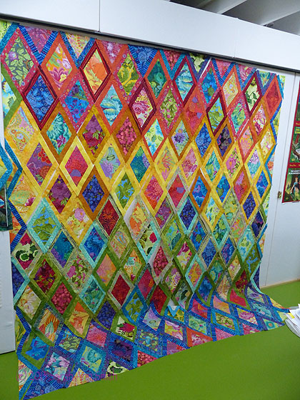
 

The GINORMOUS quilt top

Friday, December 10th, 2010

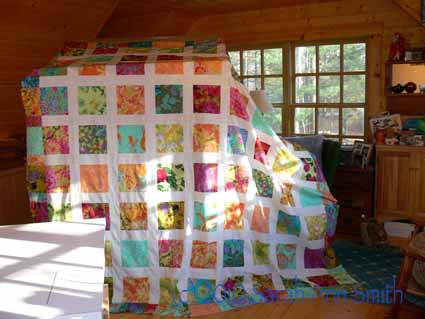
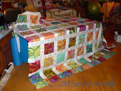
OK...draped over the double-sized antique canopy bed...read on!

So, you might ask, does Sarah EVER make quilts any more?  Art quilts?  Bed quilts?  Lap Quilts?  ANYthing?  Some days it feels like the answer is no, there is so much life happening that I can barely manage to get myself dressed and stumble through a day!  But I have managed a few new class samples and a few other things.  A while back, I wrote about Jenny Bowker’s totally awesome idea (seen in her blogpost,  here) and my riff on the subject here and here.

Well, I had been collecting tropical colored big prints (Kaffe Fassett, Martha Negley, Phillip Jacobs and the other designers from the Westminster Fabrics crowd) for a possible project for a possible (in a couple years) new book.  Well, I had (still have) this totally cool idea, but decided it was probably too complicated for a simple book project and, honestly, was more piecing work that I wanted to do.  Then I made my sample a la Jenny, and had a brainstorm!  A QUILT made with bright squares and simple sashing.  PRESTO–fabrics re-directed to new project.  So I got out my graph paper and charted out sizes for a BIG new bed quilt for us!

I decided to use squares of the tropical prints cut 8 1/2 inches, which meant I could get four pieces plus some leftover from a fat quarter (usually about 18 x 22 inches or thereabouts) of fabric.  A sashing that finished at 3 inches would look good.

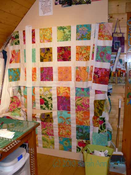
Blocks cut, order set out on wall, vertical sashing on first six rows...

I was VERY careful cutting, and used my AccuFeed foot on my new Janome Horizon 7700.  I even went to the extent of cutting the strips on the non-stretchy lengthwise grain of the fabric because I wanted this to be perfect.  Drat!  It wasn’t!  The white pieces, on the bottom, were coming out 1/8″ too short, and I KNOW (and triple checked) they were cut to the same length.  Luckily, I am on this great Yahoo group for 7700 owners and another one for 6500/6600/7700 owners (a lot of us on the first list are also on the second one, which was the mother list).  Someone (and boy do I wish I could remember who so I can say THANK YOU) mentioned the button on the right of the machine and some instructions in the manual (yes, I had read it, but just didn’t remember this part!).  If your fabric isn’t coming out even, you can turn the knob to fine-tune the dual feed!  PRESTO! Problem piecing solved.  I told the little red guy with forked tail and spear on my shoulder making rude noises at me to go away, that it wasn’t MY piecing at all…I just needed to learn how to be smarter than and adjust my machine!

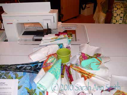
Here’s what it looked like as I was chain piecing lots of blocks and strips:

Adding the horizontal sashing(Notice the lovely “Lemon Grass” Fiesta Ware mug amidst all those lovely prints!)

Here’s the quilt top a bit farther along,

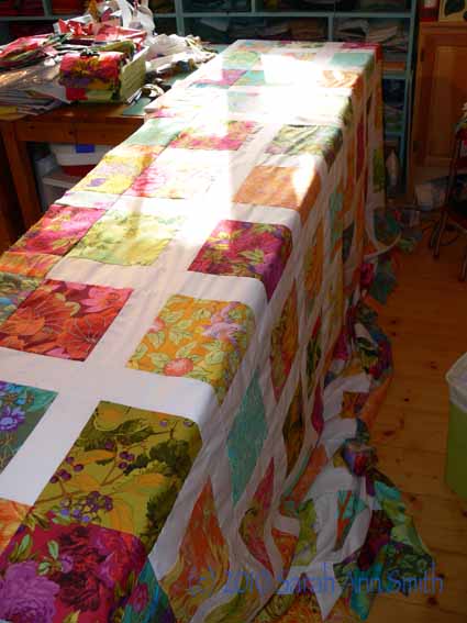
Then I measured.  SHRIEK!  adjust border plans to smaller!  Eliminate the white what *was* going to go all around the center blocks and go straight to the pieced (from leftover bits) border of all colorful prints!  Here it is as I am ironing…. under the top is an ironing board with a 60″ wide Big Board PLUS a 39″ (one metre) wide table….and it drapes over the ends!

Aren’t those colors awesome??????

Trying to get a picture of the enormity of this thing was beyond a do-it-yourself photo shoot, so you’ll have to put up with me!  The finished top is 107″ square!

It's too big to fit...this shot, before all the borders are on, shows only 6 1/2 of the 9 color squares going across and up...so it's about 2/3 of the quilt!

That would lead to some questions:

Q1:  Is Sarah sane?   Answer:  obviously not

Q2:  How do you plan to baste this?  Answer:  I don’t; bless Doris and Debbie at Quilt Divas (great quilt shop in Rockland, Maine), they will baste it for me with water soluble thread on their longarm.  I don’t care what it costs.  I am NOT basting it.  Answer, part 2:  re Q1, perhaps she’s not as far gone as we thought

Q3:  What about the quilting?  Answer:  Yes, I plan to do it, but NOT for a while.  And at least the worst part, the basting, will be done by checking account!  Also, my big treat once we get moved in late January and next year’s teaching is done, is to buy myself an HQ sitdown model for working on very large projects.  I think a quilt 3 yards by 3 yards square qualifies.  Answer to Q3, part 2: ummm…OK, Sarah is clearly certifiable; either that or she has no life
Q4:  What quilting design will you use?  Answer:  I’ll do something similar to the sample I did  up in the links posted above.  When I shared an in  progress picture with a friend, she was concerned that the white is TOO bright.  I agree, it is!  But once it is quilted the starkness will be toned down and I think it will be a lovely summer quilt.

Q5:  Is Sarah insane?  Answer:  Ayuh!

Joshua, the quilt in progress and done! #6

Sunday, May 9th, 2010

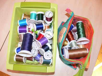
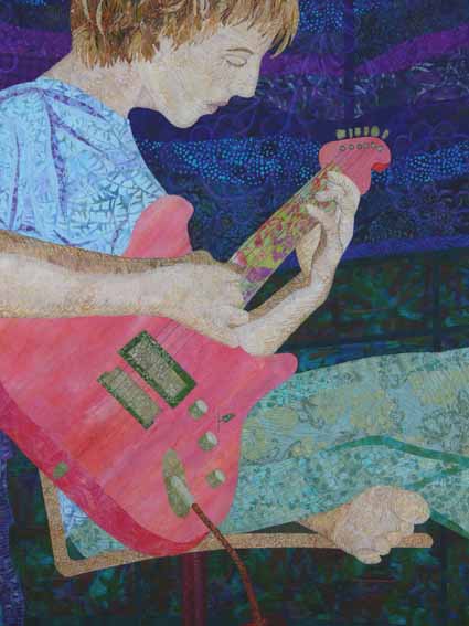
With this blogpost, we will end the series on how I made the quilt of my son playing guitar.  I had fun with the quilting, too.  Here’s the bucket and bag of threads I used for the quilting:

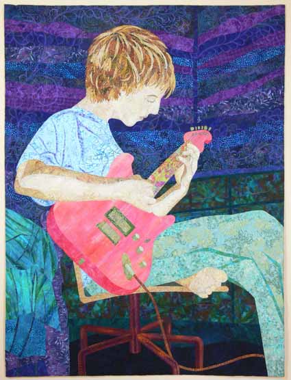
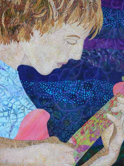
And here is the completed quilt; notice that the proportions have changed a little.  The finished size for the exhibit is 36 inches wide by 48 inches long, so I needed to remove some extra, especially in the length.  If the quilt hadn’t been in this exhibit, I might have let it go a little longer, but I think in terms of design and composition it is still fine the way it is.

While I was mulling over how to quilt the walls, there was yet another discussion on either QuiltArt or SAQA (or both?) about the line between traditional and art quilting.  As usual there were those who want nothing to do with traditional quilting.  I, however, am proud of our traditional roots and proud of this as an art form that began with women’s work.  As someone recently said to me, Quilt is NOT a four-letter word!

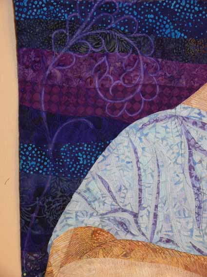
This discussion led me to the idea of using traditional feathered vines for the background quilting.  As you can see from this next photo, though I chose a thread I thought would show up on the background, it was too subtle.  I decided to echo-quilt around the feathered vines, then pencilled in the resulting space/channel to define the outlines of the vines with Prismacolor Pencil (which I later covered with a combination of a textile-friendly varnish and water to seal it to prevent it from rubbing off).

Here is a wider-angled shot of the wall area showing the feathered vines…I just love them!

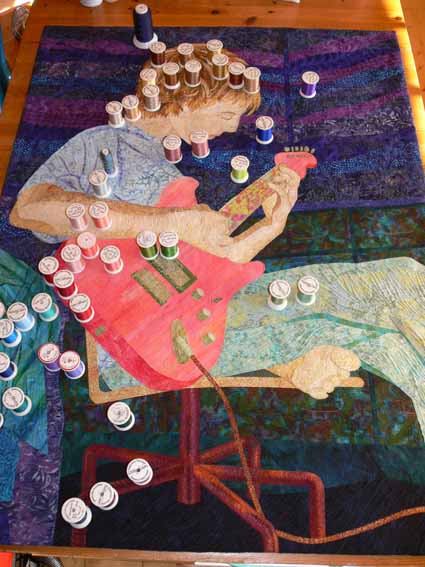
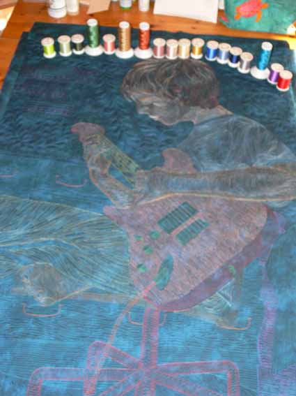
This shows the quilted quilt with the threads distributed over the top where they were used:

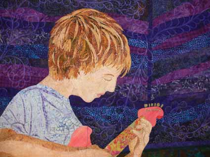
Here are two close-ups of the quilting of Joshua’s face and torso:

I love the backs of my quilts, the line drawing look, so took this (alas blurry) photo–you can see the feathered vines clearly on this semi-solid background fabric, and that the entire quilt is stitched 1/4″ apart or close… a lot of thread!

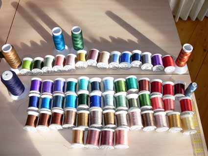
And to end where we began, but arrayed nicely, all those beautiful threads ( all but one of them Superior Threads):

PS–I am reminded by the comments to add that Joshua –hallelujah!– actually likes the quilt!  Given how picky teenagers are, especially of pictures of themselves, I am so thrilled that he of all people likes it.  Hugs to my firstborn!  Now…. what will the years bring that I can do another quilt, this time of secondborn son?