email Youtube

Home
Galleries
Blog
Workshops & Calendar
Store
Resources
About
Contact

Demonstrating at Make It University’s Open Studios!

October 1st, 2008

I’m thrilled to be able to share that I will be demo-ing leaf printing at in the Open Studios part of the Make It University area( — more info is at Make It University (MIU)) at the International Quilt Festival in Houston, currently scheduled for 8-10 pm Wednesday on sneak preview evening!  MIU is sponsored by Quilting Arts, LLC, and is part of their mixed media branch of things (along with the magazine Cloth Paper Scissors which also has a cool article on sketching / journals in the issue featured on the current webpage).
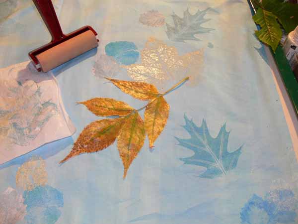
leaf on cloth

For my I-hope-to-finish-it-in-this-lifetime-manuscript my last project to make is for a small quilt I’m calling First Frost.  It will be either a table runner, a wall-hanging or both.  Finished dimensions will be about 15×60 inches.  I wanted to offer a project that would entice folks to play with all the glorious metallic and holographic threads currently available….   so I dyed two-plus a bit-yards of cotton in these beautiful clear, light blues and lavender.   Then I collected leaves …..

The first time I did leaf printing I simply used a sponge paintbrush, daubed on the paint, then pressed the leaf with my fingers.  This time I have better supplies and technique (I hope).  I wanted a smooth, clear print.  To get that, it works a lot better if you pour paint on a piece of glass, roll a sponge brayer, then  roll the paint onto the leaf.
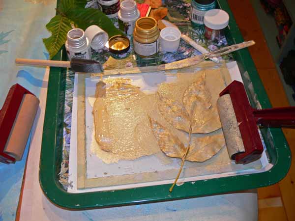
roll the paint onto the leaf

Notice there are TWO brayers in this picture…the one on the right is actually a black sponge brayer with gold paint on it.  The one to the left is a “soft” rubber roller.  In the top photo, you can see a piece of parchment paper on the side.  Place the leaf on the cloth, paint side down.  Cover with the parchment paper, then roll with the soft rubber brayer to get a smooth even print.  It is important (ahem) that you not have wrinkles in the plastic underneath and not be on the crack in the table, else they will show up in the leaf print.  Guess how I remembered that one.  A couple of times.  Ahem. (grin!)

Here’s the 30×60 inch piece of cloth…I will split it down the center to have a two-sided runner/hanging:
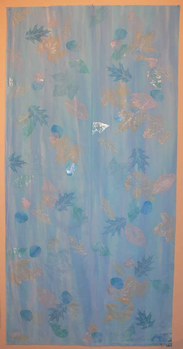
Full length of cloth

The paints are all metallic…blues, silver and gold (mixed with pearl).  Then I plan to quilt from both sides…with metallic in the needle and a matching heavy poly in the bobbin… then when I outline the leaves on one side, it will make a skeleton “print” on the other side…. Can’t wait to see how (if?) this works!)

Here’s a detail:
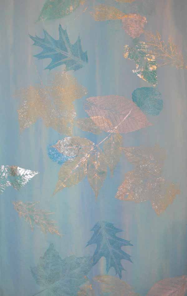
detail

I’ll be demonstrating how to do this, how to preserve leaves for leaf-printing in winter when the trees are bare (I have just harvested leaves for this coming season!) and maybe some Shiva paintstik techniques as well.  Evening is not exactly my best time of day (think snooze) so I’ll bring some chocolate…please come and help me stay lively and say hello!
Fields of Gold is going to Art Quilts XIII

September 26th, 2008

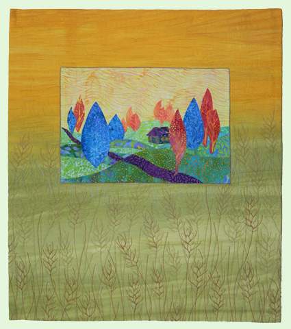
To my utter astonishment and delight, one of my newest pieces–Fields of Gold– (finished in the nick of time) has been juried into Art Quilts XIII at the Chandler Center for the Arts in Chandler, Arizona.  Actually, if I tell the total truth, the facings weren’t even completely sewn down when I took the photos for my entries!
Fields of Gold

I am mind-boggled to find myself in the company of so many of the leading art quilters today…. the list of those in the show is here.

A little bit about this piece:  I had designed the center part, which I called Sunset Trees, for a project / exercise for the applique section of my manuscript.  It is 9×12 inches (or thereabouts) and I intended for it to finish at that size…small and easy to manage as a learning exercise.  Then, I was able to help my friend Lisa Walton of Dyed and Gone to Heaven (Sydney, Australia) get an entry into the IQA / Festival at Houston when she unexpectedly got a quilt finished and photographed in time, but not enough time to mail reliably (i.e. quickly) from Australia to Texas.  I told her not to send anything, but she did anyway…a metre of her glorious hand-dyed fabric that ranged from rust to gold to green.  I pinned the fabric up on my design wall, next to Sunset Trees, trying to figure out how to make a journal entry for this year.  I couldn’t think of anything that wasn’t trite (the black silhouette of an Aussie cowboy and outback house against the glowing sun…been done well by others, and too many times).  Then I realized that if I used one section of the piece, it meshed PERFECTLY with Sunset Trees’ background.

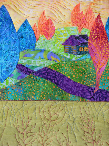
Then I mulled over the quilting… at first I thought of blowing grasses.  Then, in the back of my mind, the song Fields of Gold by Sting came to mind.  I knew I had seen a quilt named after that song somewhere…and when the Frayed Edges got together in early September I mentioned it.  Deborah piped up:  it was on my blog!  I did one!  So here is Deborah’s version!  To me, the wheat fields of late summer /autumn are Fields of Gold, so I googled wheat images, learned that some wheat has the really long whiskers, other varieties have shorter, fewer whiskers, etc.   I think my favorite part of this entire quilt is the wheat quilting!  Once again, I seem to be moving toward nearly wholecloth pieces that are drawn with thread…. Here’s a detail:

Fields of Gold detail

Enjoy…now back to working on the Elusive Crested Batiki Bird, a small piece I’m doing for another Lark book on small quilts.  Cheers!

Mt Washington–inspiration everywhere

September 24th, 2008

Creativity is like bunnies.  All you need is two and a little bit of time, and then you have LOTS, it just takes (ahem) practice.  Even in the few buildings and spaces of the top of Mount Washington and the observatory, I found lots of inspiration.  There is an OLD building half dug into the rocky top of the mountain that used to be an old hotel.  Inside were these gems….

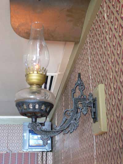
An old lamp:

old lamp

Wouldn’t that scrollwork and fill-pattern be wonderful in an applique or a quilting design?

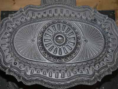
And the woodstove…the top:

woodstove 2 top

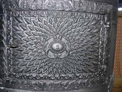
and the front…what a design!:

Woodstove 1

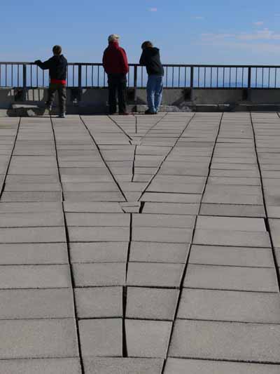
Then there are the converging lines of the observatory rooftop / pavers, with the guys at the railing:

converging lines

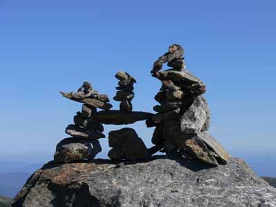
Then there’s that cairn of rocks….

cairn

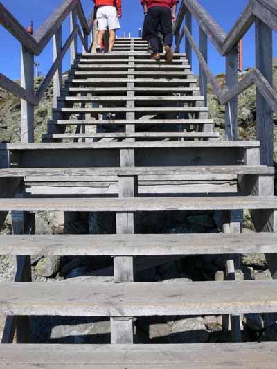
Repeating lines in the stairs:

Going up the stairs from the parking area

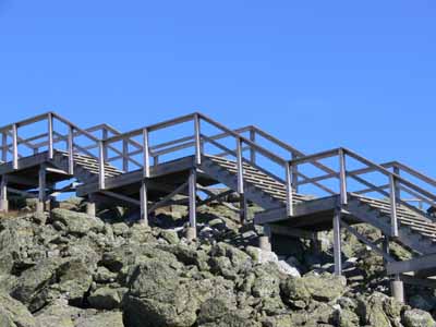
And the stairs from the parking area up to the observatory from the side:

stairs, side view

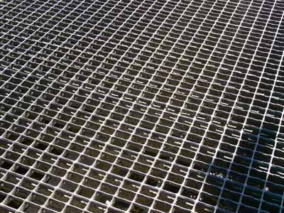
A grate over that stream by the entrance (with part of my shadow):

grate

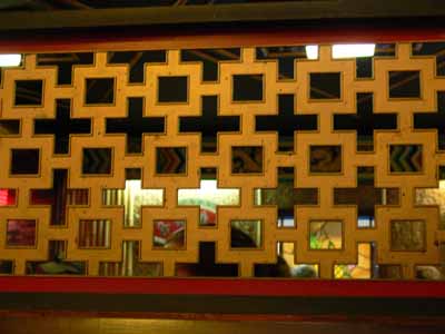
The screen in the Japanese (!!!) restaurant in Gorham:

Screen, Japanese restaurant
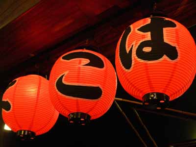
Repeat after me:  harmony, rhythm, repetition….  and again but in circles:

lanterns

I love that photo…the contrast of the red and black, the dark of the background/ceiling, the lines in the lanterns, the round shapes….

It all goes to prove that there are ideas for quilts, applique, piecing and quilting design EVERYWHERE…. once you get into the habit of actually SEEING what is there, instead of passively looking and absorbing, you can find inspiration all over the place…. the creativity breeds like bunnies….. the trick of course is weeding out the good ideas from the bad, but that’s another blogpost entirely!

The Frayed Edges, September 2008–parte tres: Mandalas!

September 21st, 2008

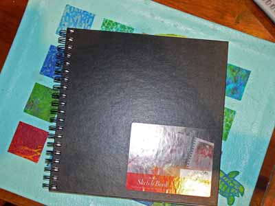
square notebook

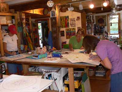
Earlier this year, four of us (Deborah was in Texas) were able to drop in and say hi to Natasha Kempers-Cullen (one of the early leading art quilters, been in Quilt National, website here), whom Kate, Hannah and Deborah know… I blogged about it here.  After that visit, we talked about how fun it would be to do a day workshop when Deborah said she would be able to come visit!  Our schedule and Natasha’s fortunately overlapped on just the right day, so on Monday, Sept. 8, we trooped on over to Natasha’s studio at her house.   Our supply list included a square sketchbook / notebook, and art pencils, pens, pastels, watercolors, whatever.  I brought my Prismacolors, some Aquarelle / watercolor pencils, a waterbrush, a few fine-point sharpies (and went to Target afterwards to buy a whole set….ahem!), some old magazines and papers for collaging, and a lovely Canson square notebook.

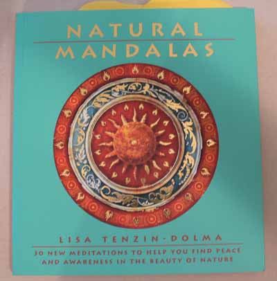
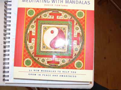
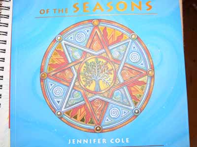
Natasha has some seriously cool books in her library, including these:

Book 1

book 2

book 3

I LOVED the artwork in this last one…good eye candy….

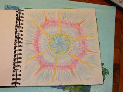
We worked quietly at first…which is of course hard for me.  I enjoy the camaraderie, but our first assignment was to take a half  hour and draw a mandala starting with a free-hand-drawn circle in the center.  Here’s my effort…so-so.  The center is OK, but I clearly rushed to fill in the outside.  Bleah. I don’t work well when rushed.

SAS first mandala

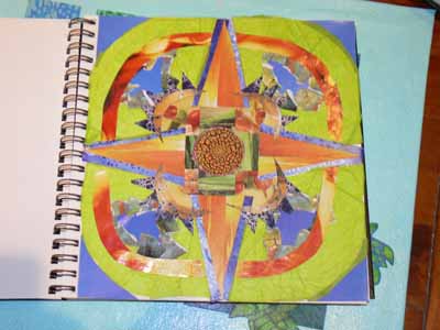
I liked my second one, a collaged piece, better.  Natasha had a selection of small “centers” from which we could choose one.  I deliberately chose one in colors and texture I don’t normally work with.   Here’s how it looks:

collage mandala

I think the green overwhelms (at least it wasn’t where I wanted to go with this one), but it’s not too bad… I really like the shrimp soup bowl I cut into quarter-wedges….Due to the papers I had on hand, it became more of my Caribbean colors and less of the earthy thing I had intended when picking the center….no gardening magazines around, so no good supply of leaf greens and browns!

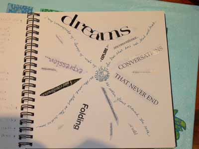
Then my words mandala:

SAS words

So for flexibility my words and phrases are:

(handwritten)

  • as water flows around the rock
  • the tree that does not bend will break
  • as the wind blows as the rivers run
  • be open to change, be spontaneous, live

(from magazines)

  • folding
  • wild
  • resurfacing
  • clarity, smoothness and luminosity
  • explore
  • unconventional
  • conversations that never end
  • of wisdom and knowledge
  • convertible
  • a rare combination
  • rejuvenation

Hmmmm….

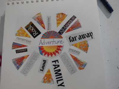
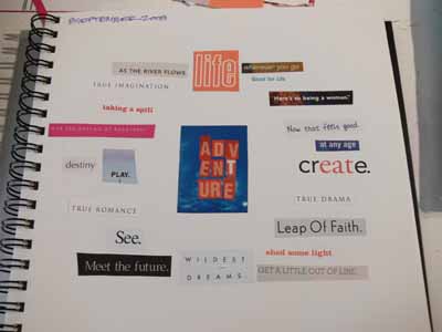
Natasha usually works with longer workshops, not one-day classes, so she had to abbreviate some of our projects, but gave us ideas to do for homework and exploration.  Then she had us pick a word…she has these angel cards with words like Freedom, Adventure, Flexibility, etc.   We had to write the word in the center of the page, then cut other words from magazines that interpreted the angel-card-word.  I got flexibility.  Hmmmm. So I used some very “expanded” definitions of flexibility!  Here’s that page:

Here’s Kate’s–seriously improved with color wedges

Kate’s words:

And I’m not sure who did this one…. ladies….help me out here–if I guess correctly from the handwriting, this is Deborah’s:

?? words

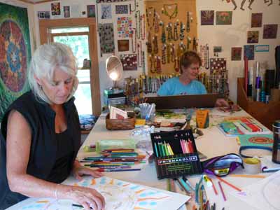
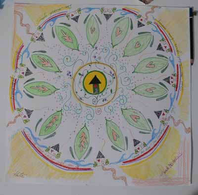
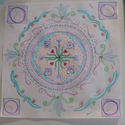
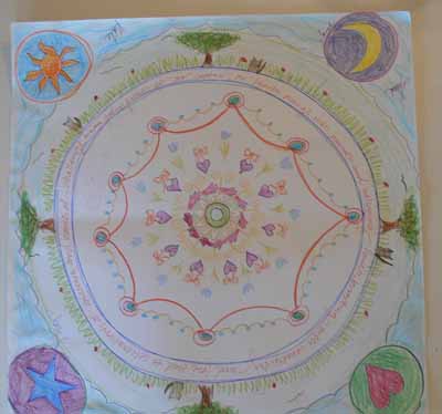
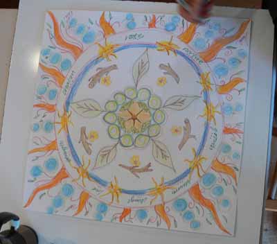
Our final project was a group exercise, with Natasha participating.  She gave each of us a large square of paper (about 20 or 21 inches).  We were each to begin with the center and draw something in our style and/or colors that interprets Friendship.  Then every 5 minutes we switched off the papers, doing two full rounds on each piece.  I think in the exercise book from which Natasha was working, they suggest 7 minutes or ten, but Kate needed to be home in time to meet her first grader at the bus, so we did the up-tempo version LOL!   at each round you pass your paper to the left, and then continue in the vein of the piece you receive.  The longer the process went on, the more freed up we became, working REALLY quickly to try to fill in and make the imagery or colors we wanted.  I was REALLY glad to have my watercolor pencils… I’d quickly scribble in color into a shape, then use my waterbrush to moisten and intensify the color.

I’m NOT good at translating abstract concepts into specific imagery, or at things like this.  Once I got the first part over, tho, it was easy to simply do a round that was a riff on what someone had done before….   For friendship, I fell back on a tried but true:  I made a circle with an acorn in the center, from which five trees (us, duh) grow.  Here we are working madly, towards the end.  This first shot is of Kate, Hannah and Deborah’s table:

Kate, Hannah and Deborah at work

And here’s the table I shared with Kathy and Natasha:

Kathy, Natasha

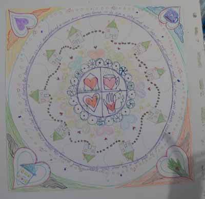
And here is what we had at the end…we all signed all of them…fun!  This one was Deborah’s; she began with the mug, heart, home, and hand:

Deborah’s

Hannah’s:

Hannah’s

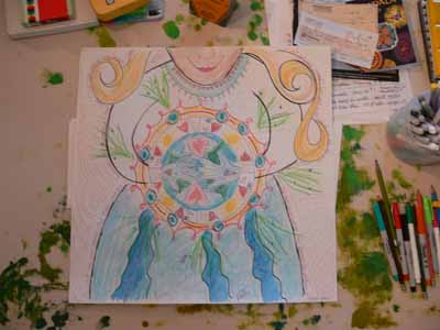
Natasha’s—she began with the hands, Deborah added the arms, torso and chin, so I felt I had to add the skirt… it went from there!

Natasha’s

Kate’s:

Kate’s

Kathy’s:

Kathy’s mandala

And finally mine:

Mine

Then we all split to the winds, kids, families and real life

Mt. Washington

September 18th, 2008

This is a brief interlude to the Frayed Edges fun to return to the summer vacation fun, then I have a ton of stuff I’ve quilted to share… for once!  It has been SO LONG since I’ve been able to make stuff, and it feels SO GOOD… anyway….   after visiting Niagara Falls, we had a full day’s drive to Gorham, New Hampshire.   The weather observatory there sees some of the most wicked weather in the lower 48 states, and the highest recorded wind speed on earth.  It is always fun on the evening local news to see what’s the weather atop 6000-ft. Mt. Washington.

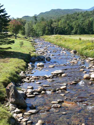
NH Stream

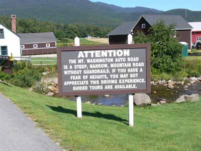
This beautiful stream is just as you cross to the entry gate.  You are greeted by this sign, which I thought was hilarious in a dry-humor sort of way:

Entry shack

And entering the park/facility:

Entry

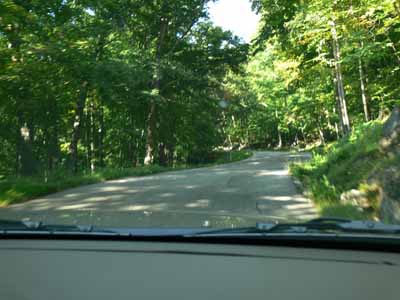
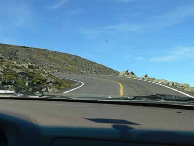
The road up was wonderful, and you passed from forest to alpine zone remarkably quickly…the treeline in the mountains of the western states seems to be at a much higher elevation.  Here’s the lower part of the road, with lots of deciduous trees:

Mt. Wash road, lower portion

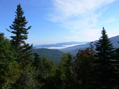
First Scenic view, from passenger-side window:

First Scenic view

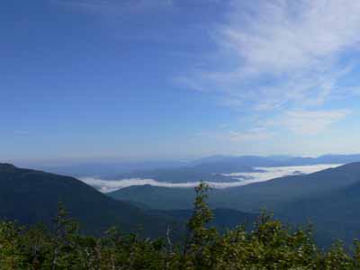
Second scenic pull-out…glorious…the sky went on forever…..

second scenic view

Then crossing above treeline…barren!  You can just imagine the winter winds here….

Above treeline

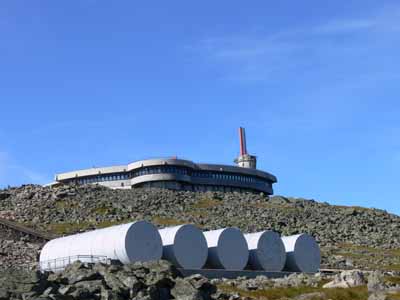
And the first view of the observatory–the low, hunkering, rounded building flat on the top of the mountain:

Mt Wash Observatory

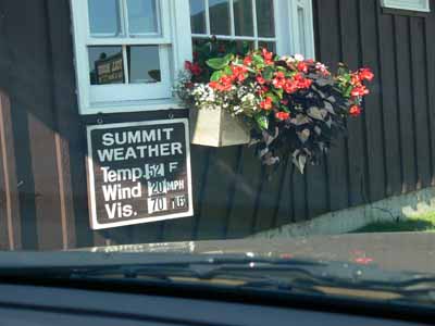
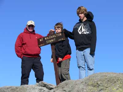
Once you reach the top (we drove, obviously tho you can hike), you can get to the tippy top easily.  Here are the boys and Paul.. it was windy and nippy, about 60, when down at the base of the mountain it was about 80:

P and boys atop Mt. Wash

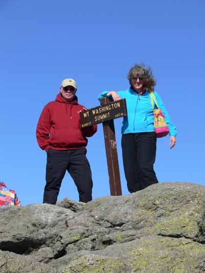
And rarely enough, a photo with me in it:

Paul and Sarah

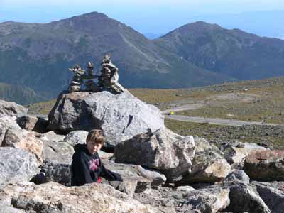
Notice the tote…one of these days I’ll take pics and share… my summer sewing treat was to make it.  It’s not for a book, not for a class, but just for fun!  Anyway, back to the trip…. here’s a picture of Eli sitting next to a cairn of rocks someone had built, with the vista:

Eli, rock cairn, vista

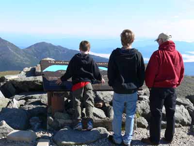
And Paul and the boys looking at the signage and the view:

Paul and boys and signage and view

I’ll share some of the totally cool photos in another post… they just prove you can find inspiration anywhere… quilting lines, abstracts, designs…….