email Youtube

Home
Galleries
Blog
Workshops & Calendar
Store
Resources
About
Contact

Author Archive

Summer Vacation 2008
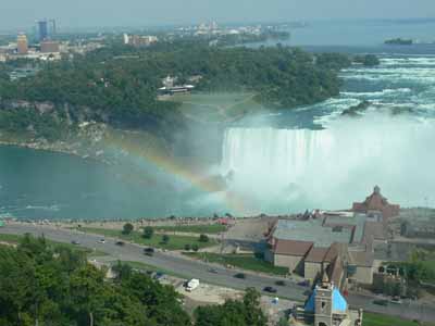
Saturday, September 6th, 2008

We don’t usually do much in the way of vacations, as they are EXPENSIVE.  But we had promised Joshua, the wannabe rock star guitarist, to go to the Rock and Roll Hall of Fame.  When I got a teaching offer for a five day workshop in West Virginia in August, that seemed the perfect opportunity to have the whole family come along, and travel home via Cleveland (for the R&Roll) and Niagara Falls (the requisite family visit).   Well…. as we all know the best laid plans of mice and men often go awry.  Especially when the economy tanks and fuel prices skyrocket.   Not enough students signed up for the workshop, so they had to cancel.  Bummers.  But we went on an abbreviated trip anyway. This photo, a teaser to get you to read on, was taken from our   room overlooking Niagara Falls (on the  Canadian side):

Niagara Rainbow

Here’s what I did in the car (an aside:  Paul and I have been married for 25+ years; after year 1, I refused to drive with him in the car, so now he drives and I read and knit)–if I can find time later in the month, I’ll do a couple brief reviews of some of these….:

Mom’s reading

And here is Joshua (under the “E” in Help) in front of the Rock and Roll Hall of Fame:

Joshua in front of the Rock and Roll Hall of Fame, Cleveland

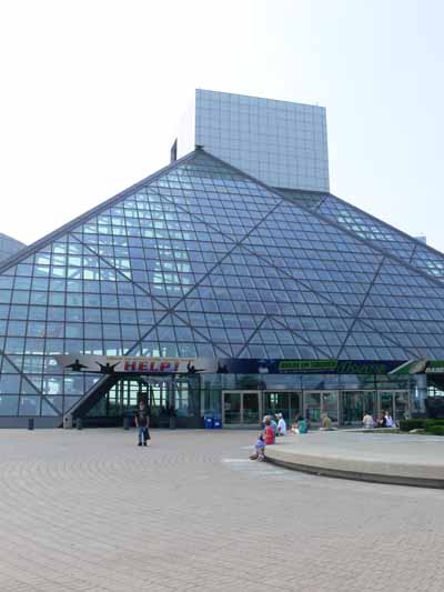
Alas, you aren’t allowed to take pictures inside.  I can see why though…lots of documents on cheap paper that will deteriorate with light, costumes, etc…..and many items are on loan from the artists.   All sorts of cool stuff… envelopes with the lyrics of totally famous songs as they were being scratched down for the first time, outfits worn by Tina Turner, Elvis, Mick Jagger, Elton John, John Lennon (his Sgt Pepper outfit among other things), David Bowie, Madonna, Michael Jackson (pre-freak era…SIGH…I do feel sorry for him…), Janis Joplin’s Porsche, Jim Morrisey’s Report of Death Abroad (death cert issued by the US Embassy in Paris), all sorts of neat things.

In some ways, I think it was more interesting for me and Paul than for Joshua.  He is really into hard rock and heavy metal, and the metal bands were not really represented there (even tho some have been inducted, there were really no artifacts)…it is mostly  the older folks and the musicians and singers and behind-the-scenes people who were represented.

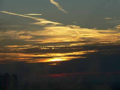
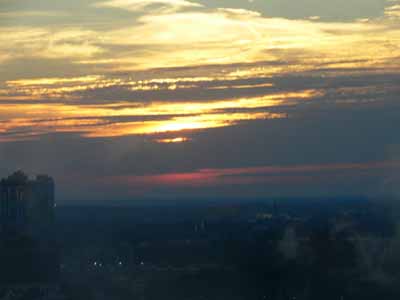
So after an afternoon there, we headed to Niagara Falls the next morning.   We booked a Friday night, and Paul splurged on a room overlooking the falls.  When we arrived (before noon), our type of room wasn’t vacant, so (yippee!) the hotel upgraded us for free to a suite on a higher floor, with two rooms and a palatial bathroom (you could open frosted shutters and sit in the jacuzzi and enjoy the view!).  Here are some shots (don’t know who took these as Eli, Joshua and I all took a bunch) from the room:

Sunset:

Sunset 1

And probably sunset, too…..

Sunrise?

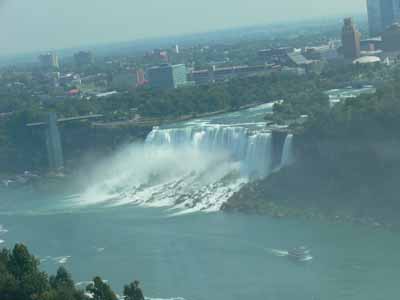
The US side of the falls, as seen from our room:

Falls view from the room 1

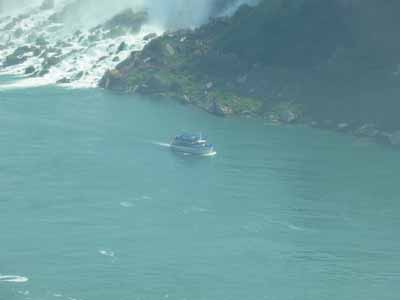
Looking down on one of the Maid of the mist boats:

Looking down on a Maid of the Mist boat

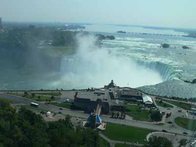
And Horseshoe falls, the Canadian side, with Goat Island in the middle:

Horseshoe falls

I was so tired after that day that I didn’t try to set up for night photos, but they illuminate the falls (spotlights) at night, and at 10 pm on some summer nights they have some fireworks over the falls.  We managed to stay awake until 10 pm for the fireworks, then crashed.  Thanks to a roll-away bed for Eli and a fold-out sofa for Joshua, there were NO sibling squabbles at bedtime!   A ride on Maid of the Mist $12.50 per adult, a fancy dinner for four about $150 (OUCH but good), no fighting kids, PRICELESS….

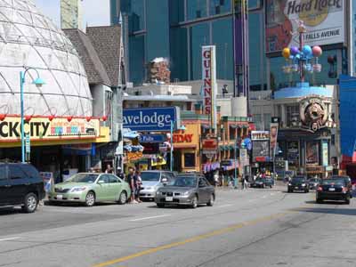
We went on Maid of the Mist, and I walked around town.  I think I’ll save the bazillion falls photos for next post, but here is one of the downtown which, alas, doesn’t have much to recommend it.   Kinda generic North-American over-touristed boardwalk type of stuff.  Blech.  Plus it was hot, steamy and expensive.

The ticky tacky part of Niagara Falls, Ont.

Paul and the boys rode the shuttle back to the hotel while I enjoyed a few blissful moments of solitude and walked home (dripping!).   We had a splendid, major treat for dinner at the steakhouse on the 9th floor, again overlooking the falls.   I don’t think we’ve EVER gone out to a dinner that nice as a family.  YUM.

I’ve been nominated!

Friday, September 5th, 2008

Thanks to Deirdre Abbotts, I’ve been awarded the the

Brillaward

First the Rules:

1. The winner can put the logo on his/her blog.  It’s right up on top

2. Link to the person you received your award from.

You can find Dierdre at Deirdre’s Sloppy Studios

3. Nominate at least 7 other blogs.

4. Put links of those blogs on yours.

  1. A perennial favorite is my friend Marie’s blog…her photography is just ONE of the many things she does wonderfully! Being a good friend is another one!
  2. Dijanne Cevaal’s work and blog never cease to inspire me!
  3. Elin Waterston has been exploring stamp-making this year on Love.Will.Logic, her blog….. I’ll admit to being just a tad jealous of the time she has to make things!
  4. Blue Moon River is Susan Brubaker Knapp’s blog; I met her not too long ago online, and we’ve had a fun time writing back and forth.  I can see her background in graphic design in her work, and not only enjoy it but learn from her work!
  5. Planet Textile Threads isn’t really one person’s blog, but a whole bunch of people (in the interest of complete disclosure, me included).  I love being able to travel the world in one blog, with so many points of view.
  6. Judy Coates Perez makes wholecloth quilts…she paints, then she quilts.  They are amazing, there’s never a dud, and you can see them here.
  7. Even though she was also on Deirdre’s list, I’m also going to name my friend Lisa Walton, in Sydney, Australia!  Her blog is here.  I LOVE that we can live half a world apart, meet on the internet, then meet in Houston (at Quilt Festival of course), and get to be good friends despite not being near each other in person.

5. Leave a message on the blogs of the people you have nominated.

I’m off to do that now.  Hope you enjoy these blogs as much as I do!


And then  I’m off to work…. I’ve been really busy quilting lately, then hope to be really busy working on the manuscript and samples for my oft-delayed book.  This weekend, tho, will be spectacular.  On Saturday Deborah flies in from Texas!   She is staying with Kate, and on Sunday we will all get to have a sleepover at Kate’s neighbor’s empty (summer) house, then go to a workshop with Natasha Kemper-Cullen on Monday.  Get ready for good eye candy… this is going to be SUCH a treat!

Hawaiian-style quilting at Lowell Quilt Festival

Sunday, August 31st, 2008

One of the most fun classes I taught was Hawaiian style applique by machine.  Normally, this applique is done by hand using the needle-turn method.  It is beautiful, meticulous, and time-consuming.  Some years ago I saw a quilt made by a New Zealand quilter, Donna Ward, that was stunning… similar to Hawaiian quilts in style, and satin stitched!  The stitching became a whole new design element, and I was hooked.  And I must repeat… I love google!  Here  is a link to Donna’s quilt Jewel of the Pacific–scroll down a bit to the blue quilt.

Sally I.’s block, reverse applique

For my book, Unraveling Threadwork, (hopefully due out Fall 2009) I’ve designed a quilt with nine 18 inch blocks using five different designs, as one of the main pieces.  I’ve also designed two smaller “practice” blocks, one of the taro leaf, another of the turtle.  This class was the first time I offered the smaller practice blocks as an option, and it seems to have been a good decision.  Sally was the one person in the class who opted to start with the large block, in her case the pineapple.  Her combination of deep purple and mottled green (above and below) was wonderful. I also recognized her name from the quiltart list…way fun to meet someone you’ve “seen” on line!

A couple tricks to Hawaiian applique:  high contrast in your fabrics works well!  Variegated threads don’t always look so good…opt for a solid color. THEN you absolutely must:

MAKE VISUAL DECISIONS VISUALLY!

That means make a test, and try your threads to see how the look when stitched out.  Try adjusting width and length to see what looks best.  And if necessary (it probably will be) use a stabilizer under the background fabric to prevent unsightly puckers and uneven stitching.  Here is one student’s thread stitch-out sample.

Stitchout yellow on blue

Her print fabric actually didn’t contrast a lot from the background–UNTIL she used the bright yellow thread to outline the design, at which point the subtle change in fabrics became awesome.

Yellow on turtles

Sally had brought a variegated that was PERFECT for quilting her pineapple, but when satin-stitched out, it really didn’t look so great, so a classmate lent her a perfect purple.

Sally’s pineapple

Another student opted for the traditional solid colors in very tropical aqua and yellow.  This simple choice is smashing!

Solids turtle

One student brought some VERY bright fabrics which had a stripe, but they worked!  Here are her turtles (before stitching)

Bright turtles with stripe fabric

Since she hadn’t brought a varied enough thread selection, she opted to work on prepping a large block, also…talk about vibrant…wow!

really bright pineapple!

When she uses a starkly contrasting thread, like a tangerine or orange-y yellow or turquoise, the bright line of satin stitching will help pop the busy fabric inside the pineapple motif…trust me, this one will work amazingly well!

Other students preferred softer colors.  We were all surprised that this taupe-cocoa brown thread was such a good choice on the soft colors of the applique–sometimes the least expected selection works best:

Turtles with brown thread

And here are her Taro blocks, in purple and soft lavender (which alas looks more white in these photos):

Taro…purple on white

and the reverse applique:

Taro–reverse applique

Here’s what I learned from teaching my class:

  • the small shapes on the turtles are a bit fiddly for beginners.  I need to make another, simply-shaped design, and have both turtles and taro leaf (or whatever) stitched out for students to see.
  • I should say on the supply list that variegated threads generally don’t work so well for satin stitching—be sure to bring plenty of solid colors
  • Also on the supply list, I should say to bring at least twice as many colors of thread as you think you will need!
  • Using the black Misty Fuse (adhesive web…a heat-activated glue for fusing fabrics) for demonstrating is perfect, since it is easy to see the bits that get left behind on the fusing sheets or baking parchment
  • I need to bring more Misty Fuse to sell….I ran out!

So it’s off to update my class supply lists!  Hope you enjoyed this vicarious tour around the classroom.  I sure had fun seeing my blocks interpreted in so many wonderful ways.  I hope the students had as much fun as I did…imagine, I get paid to do this!  WOOHOO!

PS:  I wanted to post a public thanks to the show organizers for the Lowell Quilt Festival.  The teachers were treated like royalty…. we had rooms to ourselves (weren’t required to share with another teacher), were presented with lovely welcome boxes with some snacks, little bottled waters, an a Lowell Quilt Festival badge holder in a color just for teachers…..   the hotel rooms were huge and comfortable, too.   It was a particularly nice experience, so thanks to all who were involved!

Art Quilts at the Whistler Museum (Lowell, Mass.)

Friday, August 29th, 2008

Woven sheers

On a warm summer Sunday, I made my way from the Tsongas Arena, site of the Lowell Quilt Festival, to the Whistler Museum of Art.  The museum is normally closed on Sundays, but the gallery with the art quilt exhibit was open (the rest of the museum wasn’t…rats!) for quilt lovers to stop and savor the work.  This wall is what greeted you… I enjoyed the interlaced sheer panels and the shadows cast on the wall.  If my photos are in order, this piece is called Microdctyom Stechellianum by Nancy Crasco. (Note:  photos in this post are clickable for a larger view.)

January BLooms

January Blooms by B. Sullivan, above,  is one of the most eye-catching pieces in the show.  The weekend I saw the exhibit, local floral arrangers had constructed pieces to go with the artwork…what a cool idea!   A detail photo reveals the modest and effective use of beads to enhance the floral print fabric:

January Blooms detail

Hibiscus is another piece playing with color overlays and sheer fabrics; this piece by Margaret Anderson won the Whistler Award (one of two awards given when I was there…the viewer’s choice was still underway).

Hibiscus

One of my favorite pieces (and the one that got MY viewer’s choice vote!) was Wen Redmond’s Winter Tree.  She has printed photos onto fabric.  The center panel–the darkest, small part in the center– is sheer, and the surface piece is affixed to stretcher bars.  A second printed photo is behind, attached to the back side of the presser bars, so you get this cool window / show-through effect.  Wen had an article a winter or two ago in Quilting Arts magazine that I believe discussed this process, but I didn’t quite “get” it then…It’s hard to see the depth in photos. I’ll have to go back and look for the article now that I’ve seen one of these pieces in the real:

Wen Redmond

Bozena  Wojtaszek of Poland received a Juror’s Choice for her piece, My Way.  In my quest for art quilts with effective beading, this one is definitely a good one…. I’ve only seen one of Bozena’s pieces in the cloth before; I’m so glad she went to the expense to send this all the way from Poland to be in this exhibit!

Bozena, My Way

a corner detail:

Bozena, My Way Corner detail

and a detail from the center…. I love the fabrics, the threadwork, the beads….

Bozena, My Way Center detail

And one last piece, The Good Earth by Nancy Schlegel, shows how effective large stitching and beads can be in creating texture:

Nancy Schlegel

Hope you enjoyed the tour!

Book Review: Digital Essentials

Wednesday, August 27th, 2008

Bottom line:  if you take digital pictures, enter quilt shows, want to print photos onto fabric, want to print photos from your printer at home, want to design quilts on the computer, or learn to manipulate photos, or learn to use your photo editing software more effectively, want to know how to get the color in the photo to look like it does in real life, and THEN want the print to have the same colors…. BUY THIS BOOK!  This book will be an essential reference tool in my library, I can tell already.  It is not a sit down and drool over the pictures book, but it is a book you will use again and again and again!

Digital Essentials

The caveat up front: Gloria is the one person I wanted to design my website, and she and Derry did a fantabulous job.  That probably makes me slightly biased, but as anyone on  the QuiltArt e-list knows, Gloria’s knowledge (and generous sharing of that information) on the list are such that most of us have an e-mail folder entitled “good stuff from Gloria”!

The subtitle to this information-packed book is “the quilt maker’s must-have guide to images, files and more!”.  I couldn’t agree more….   for both MAC and PC uses, Digital Essentials is written by Gloria Hansen, who is not only an award-winning quilter (major ribbons at both AQS and Houston in the past year alone!), but also an award-winning website designer with her partner Derry Thompson of Gloderworks, and a top-notch photographer. In just browsing the book when it first arrived, I learned stuff, was impressed with how well laid-out the book is, and how Gloria makes a seemingly complex subject understandable.   Digital Essentials is published by the Electric Quilt Company, ISBN 1-893824-64-0.  The book is available by mid-September from Gloria here, from Amazon, or ask your local quilt shop to stock it!

At first I intended to review this book in one fell swoop.  But….. There is SO much in the book, and as always I am so pressed for time, that I thought I’d do a synopsis of what is in the book, then later on work my way through a couple of the chapters that teach things I really want to know, and share the results with you as I can get the time to do the work.

The book is in four major sections:

  1. The Fundamentals
  2. Working with Images
  3. Saving for the Web
  4. Reference

Start at the beginning:

Let’s say it right up front:  computer lingo and camera lingo can be really daunting.  But I realized it is the same situation quilters face when dealing with art terminology.   I tell students in my “If you can write your ABCs, You can Draw” class, folks are intimidated by the vocabulary of art:  composition, complementary colors, tangents, value.  But it is just words.  We can all learn what they mean.   When we started quilting we probably didn’t know Log Cabin meant a block, not a building, and Baltimore Album was a style of quilting form the mid 1800s, not a photo album about Maryland!

And that’s how Gloria begins:  by explaining what all those not-really-daunting words mean.  Best of all, she uses pictures and pictures of drop-down screens from commonly used picture software to illustrate.  The book’s layout and color-blocking help organize the text, making it easy for you to scan and find what you need, as well.

p. 22-23

Especially helpful are the red ovals on the screen shots which help you know WHERE on your screen to look!

Red ovals

Getting the color right…from real life to captured image to computer screen to print out… is key.  In Chapter 5, Gloria breaks down what to do into a step-by-step process.  I can tell that this isn’t something I want to do late at night when my biorhythms are at their worst, but I can also tell that if I simply take it one step at a time, I can do this…and there is no way I could have figured it out on my own (well, at least in this century).

The next two sections — images and the web:

I’ve learned some of the things in these sections by doing, by using Gloria’s help to me individually and to the QuiltArt list over the past four years.  But already I have learned there are different ways to crop things that may make my life simpler and faster (more time to quilt, or sleep! is a good thing).  As I have time to work with the book, I’ll come back to these topics.

Resources:

OH how I LOVE a book with a good index…. this one is four FULL pages, which means I can find what I want quickly, instead of having to flip through many pages….

There is a Reference Guide with commonly asked questions…and the pages on which to find the answers!

There is a comparison of Photoshop, Photoshop Elements, and Paint Shop Pro, and also a glossary.  Let’s face it…we can read the definitions but they don’t always imprint (at least on my brain).  Having this mini-dictionary in the back is eminently helpful.

The last test:

I’ll challenge myself right here, in print.  I want to understand a few things.  Let’s see if I can find the answers in the book….

1.  What are layers and how can I use them?

2.  Can I manage to create a somewhat kaleidescopic image on my Mac laptop using Photoshop elements?

3.  How can I (easily?) watermark the photos I post to my website and blog?

4.  How do I get the colors of my photos to be the same as the actual cloth, so that entries accurately reflect the quilt?

5.  When I download photos from my camera to the laptop, why do they come out at 72 dpi and HUGE size (about 35×42 inches)?  I shoot at maximum resolution.  Can I adjust either the camera or the software so they display at 300 dpi and smaller size?

6.  What is Unsharp Mask????? And why do I need to use (or not use) it?

I’ll work through these questions over the next couple of months (I hope), and I’ll share my results.