email Youtube

Home
Galleries
Blog
Workshops & Calendar
Store
Resources
About
Contact

Archive for the ‘Art Supplies’ Category

Paint on Cloth at ProChem, Fall River, Massachusetts

Thursday, March 14th, 2019

Another SQUEEE–this time ProChem! I am delighted to share that I will be teaching a 3-day Paint on Cloth Workshop from August 5-7, 2020 at Pro Chemical & Dye in Fall River, Massachusetts. Think kindergarten for grown-ups with paint and cloth: silk paint, transparent, opaque and pearlescent textile paints, as both the Movie Star and the Supporting Cast. I’ll be developing course materials over the next 15 months, so if you’ve got something you want to learn, TELL ME! And if you’ve got a brilliant title, I’m sure I’m gonna need suggestions on that, too!

Modify the fabrics that you already have to create your art

I’m not usually an abstracts person, but I love the layers I was able to get from handwriting, screen printing, and stamping…come play with me!

Please let me know what YOU would love to do in a paint-on-cloth workshop. Personally, I want to go to dinner at the fabulous seafood restaurant out on the shore in Rhode Island after class, too! I’ll be back later in the year with more details, but in the meantime, tell me what you’d love to learn from me!

Cross Pollination

Saturday, February 2nd, 2019

Sometimes you need to do something else. You totally love your main “thing” (in my case it is clearly art quilting), but you need a break. And sometimes, that makes your main “thing” even better. I’ve learned over the years that good design is good design, whether it is landscape, interiors, architecture, photography, painting, sculpture, apparel, the principles are the same. So I have taken online classes in drawing and photography and been enriched.

At least ten years ago, I sat down between Christmas and New Year’s desperate to do something creative. The boys were still pretty young so time was scarce. I grabbed a pile of magazines and started tearing out words and pictures and glued them into my sketchbook. That has become an annual tradition…at least most years. This year Widgeon decided he needed to see if the collage passed inspection. Happily, it merited a wag.

I don’t know if I’ve done it every single year, and some years — like this one — it was done in (late) January instead. But I like reading what words have called me to use them and seeing where my head was in a given moment.

This year, I made sure to add information about whose artwork or photo. As with most years, a lot of my fodder comes from Down East magazine. North by East is a monthly column, and in December they featured work by Ryan T Higgins, a Maine Children’s book author. I must now go to the Library and see what they have of his. I was also stunned to see the “Sarah” quote, obviously about another Sarah. I covered up the “big” before dreams, but otherwise I really liked it.
This page got pretty dense…but I liked the quote at the top (from an ad for something). I also liked the bit on the pink, but it was too much pink, so I covered it up. Using blocks of text upside down or sideways works. And I LOVE torn edges…LOVE LOVE LOVE…that exposed white framing the image or words. I also dug out my circle punches. Have some circles and a few squares.

I’ve also taken a number of outstanding art classes from Val Webb over the years, ranging from birds to children to faeries to animals, using pencil, ink, watercolor, colored pencil…I learn so much, both about materials and tools but more importantly about SEEING. Observing. I’ll never want to be a colored pencil artist, but taking birds in colored pencil with Val taught me about patience and layering. I found I now do that with dyes, with paints on cloth, with thread, in my art quilts. And this year I also took a brilliant course at Sketchbook Skool, Watercolor. I always want more watercolor!

Over the past 8 years or so I have learned about the difference between student grade and artist pigments, that using quality paper makes all the difference in the world, and using pure pigments and mixing your own (just like dyeing fabric!). I decided I needed to get a bit organized and SEE the actual colors painted out from each tube. I had bought some icky (Bienfang) cheap watercolor paper that I will never use for a finished anything, not even a class practice piece. So got out my “tag” punch and did a paint out of every tube I have. Then ordered two more tubes! In search of the perfect pink…..and replacing one teeny tiny tube that is almost done. Each tag has the name, code for the manufacturer, and the universal pigment code (PV 42 for example is Permanent Violet 42). Yes, you can go wwwwwaaaaayyyyyy down the rabbit hole with this stuff!
A good mail and watercolor day. Turns out quilting templates and rulers have lots of uses, of course we all know that! I saw the clamshell cases at Jetpens.com and couldn’t resist. When I went to order, I discovered I had left that awesome washi tape in my cart, so it had to come to me also. And then there are those two tubes of watercolor and some empty half pans. That’s another thing I learned: make your OWN palettes with your favorite colors, use magnetic tape that sticks to the bottom of the pan, put inside a palette or metal tin. And then I used my quilting rulers and circles to mark a grid in my notebook/sketchbook.

I used to have both my to-do-etc notebook and a sketchbook. I never had the one I wanted handy. So I said to heck with the cost, and bought a GOOD sketchbook and use that as my “everything” journal. I write lists, take notes at SAQA (Studio Art Quilt Associates) meetings, suss out ideas for quilts, and sometimes even sketch or paint in it! Now I will start filling in the circles with words, quotes, ideas, images/sketches, may fill the white backgrounds with ink textures…we shall see!

So that’s what I’ve been doing…along with quilting. What about you? And here’s an end of the day/blogpost dog walks photo from yesterday:

Sunset from the bottom of our driveway.

Little changes help: Rose Hip

Wednesday, January 16th, 2019
Not quite done yet, but improved and much closer to done and basting

Better. I finally got a little time in the studio (and the hammering on the roof is more muffled down there–we are having a new, metal roof put on–who knew they could do that in Maine in January?). I had thought the Rosehip top was done when I left it on Sunday evening but, I’m learning I need to let things set a spell, after I looked at it with fresh eyes realized it needed some help. I made a small rose hip quilt (below), and when I saw it next to the big one, I realized the large one looked a bit dead.

My Cherrywood “Vincent” challenge quilt just returned home. Just beneath it, on the left, is the 12″ version. See how cheerful those leaves are? The large one was crying out for some life.
I thought I was going to have to dye more fabric as what I had was either too dark OR too light. Then I looked in my stash and found some fabric Lisa Walton of Australia gave me about ten years (!!!!) ago. I had used a bit of it in a quilt that won my only (so far) ribbon at International Quilt Festival, Houston, but otherwise it was safe. So today I pulled out my Rugosa Rose leaf texture thermofax screen, the paints, and Lisa’s fabric. PERFECT!
I also needed to extend the bottom of the quilt–it will end up square, but I decided it needed more breathing room on the bottom and the stem at the top will just be shorter. Since it is the foreground, a larger motif was suitable. The original colors were plum and caramel…too bright and wrong! So I used ProSilk textile paints to fix.
If you’ve ever wondered what to do with a cutting mat that has vastly exceeded its life expectancy, it makes a good surface for painting!

Start Your Art Bloghop

Friday, November 16th, 2018

Hot off the press, Lyric Kinard’s Start Your Art deck of cards / prompts is available as an actual deck or a digital download. You can get it here

Art and quilt teacher and friend Lyric Kinard (website and Facebook and Instagram) delighted me recently when she asked if I’d like to be part of a bloghop to launch her new prompts deck of cards “Start Your Art: 48 Warm Up Exercises to Jumpstart Your Art”…of course!  I shared a sneak preview two weeks ago, here; In that post I shared an exercise done waiting for an appointment on my iPhone. This time it is the official bloghop and giveaway.  Read on to find out how to win a copy of the deck for your favorite art teacher and a digital copy for you!

Update:  Entry period is over and comment number 4 won!  Judy Tucker, get in touch!

The random number generator picked 4!

One of the great and cool things is that Lyric asks you to “Make Bad Art.”  Yup, it is OK to make bad art.  In fact, it is really useful!   There is a story that has been around for eons (and likely true many times over):  A college art teacher divided the class in half.  One half of the students only had to make ONE big project, but it had to be really, really good.  They could spend ALL their time making it their best.  The other half of the class had to make many, Many, MANY things.  Guess who made the best pieces?  The ones that had to make a lot of art.  As one woman I remember from an online chat group said years ago, “make crap (pardon the language). Then make more crap.”  Throw it away.  Keep making.  Then eventually you realize you’re doing better!

Since I have the digital version of the deck of cards, I just randomly clicked on several cards, selecting ones I could do from the comfort of my living room chair–after Houston I’m ready for some random creativity and fun that doesn’t require a lot of scrambling around.  What better than zero-calorie ice cream?  The prompt on p. 60 asks you to tell how to make a sandwich or other food, with no words.  This would be improved with color, but that would require going downstairs to my studio for pencils or watercolor so pen and ink it is!

One prompt is to draw how to make a sandwich or other food with no words. Why have a sandwich when you can have an ice cream sundae?  Notice the happy me?

Another exercise is a variation on the theme of doing a value scale..how many types of marks and ways to create boxes of different value (light to dark) can you create?   Think of doing this with thread on the top of a quilt…..ways to change the color of the cloth underneath!

How to make a value scale….p. 39

And one of my favorite exercises–start with a snippet of something and make it different.  Lyric asks you to start with a copy of a favorite piece of art, but I used the version I teach in my design class:  take a magazine page and select a portion of it.

The original advertisement page from British Country Living.

And here’s a portion of it and my Bad Art.  I was doing OK until I put in one of those checkerboard things on the left side.  Ugh.  Too heavy.  So I had to add some more to balance it out…..

A fun ramble and play in front of the TV last night!  Most of it I don’t like, but I do like the way I did the leaves and love that “dropped spaghetti” railing from the photo that I extended on both sides.  Fun motif–either as a thermofax screen to put paint on cloth or as a quilting or hand stitching motif, or just improv piecing!   See….you make bad art, the brain starts pinging, and you get more and more ideas!


Lyric is offering a real-life deck of Start Your Art Cards to be given to your favorite Art teacher.  To enter to win this deck on behalf of your favorite teacher and a digital copy of the deck for you, leave a comment below sharing memories of your favorite art teacher.  On November 21 Lyric will randomly select a winner and work with you to ship the real-life deck to your favorite art teacher. Please be sure to leave a CORRECT email address so we can reach you if you win!

And if you’d like to play and support an artist (namely Lyric) go HERE to order them directly from her!

Perhaps most fun of all, SHARE your art from Start Your Art here on the Start Your Art Facebook page right here.  

Why I love vultures!

Monday, October 22nd, 2018

The Vulture is Landing!

When we lived in Camden, I learned to love vultures.  At some point in March, they would arrive, heralding spring.   Eventually I learned that they ride the thermals, which carry the scent of supper up to them.  If it isn’t warm enough, not enough scent.   So that means when they arrive, winter is indeed ENDING.   Also, they are FUNNY–they may be a bit on the ugly side, but gosh they are just comical.  They are gregarious, live in tight family groups (the ones that roosted at the end of our driveway numbered around 30!), are large, squabble like most families, and when you hear them flap in the pitch dark when you are walking the dog late at night they sound REALLY REALLY BIG!  But they are just under-appreciated (anyone else ever felt that way?).

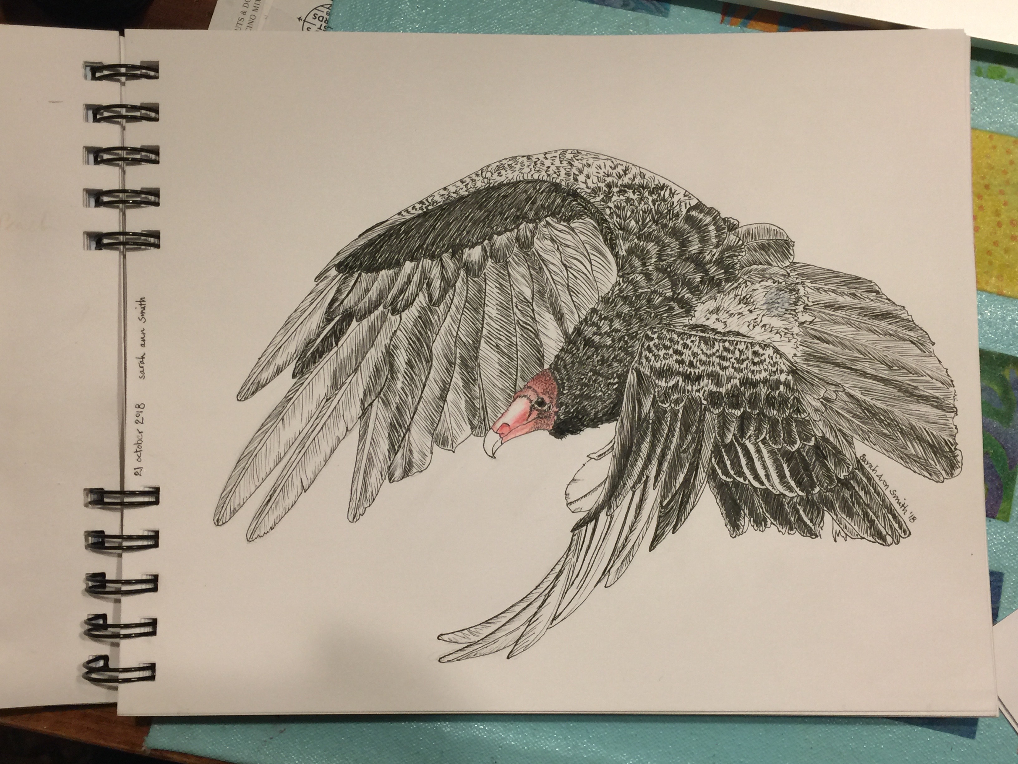
So for this weeks Journey Through the Natural Year lesson–well ok, the lesson from two weeks ago, I’m behind–I decided to NOT do the pileated woodpecker teacher Val Webb selected and see if I could do a passable job on something else dark with a red head, my much-adored funny vultures.  I’m rather pleased–I can now see a couple small areas where I didn’t get it quite right:  beak a tad too long, curve on the upper wing needs a couple of bends in it, but I am really pleased.  Well, I was until the blotch.

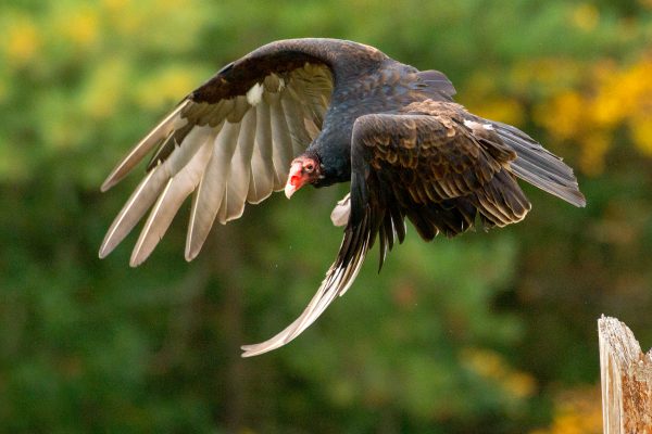
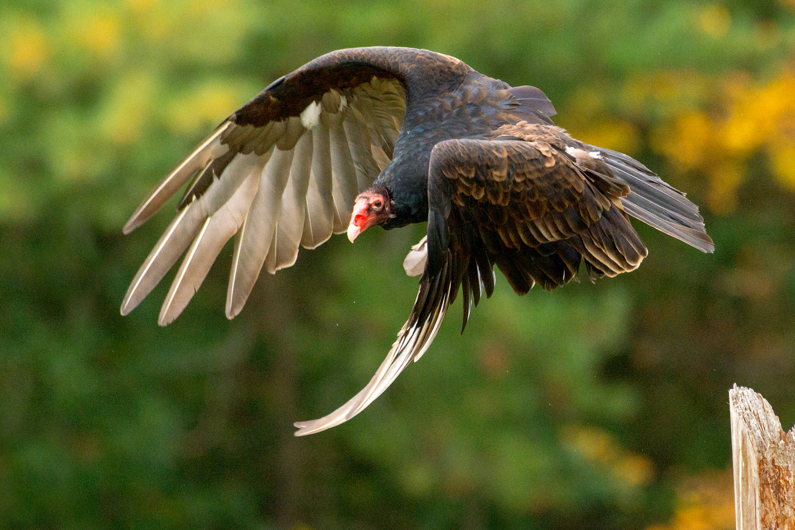
I used this photo, which is part of the WikiCommons meaning I can use it as long as I give credit–Thanks Peter K. Burian! https://commons.wikimedia.org/wiki/File:Eastern_Turkey_Vulture_in_flight,_Canada.jpg#/media/File:Eastern_Turkey_Vulture_in_flight,_Canada.jpg
turkey vulture By Peter K Burian – Own work, CC BY-SA 4.0, https://commons.wikimedia.org/w/index.php?curid=63275338

Here is the sequence…and the remedy to the blotch:

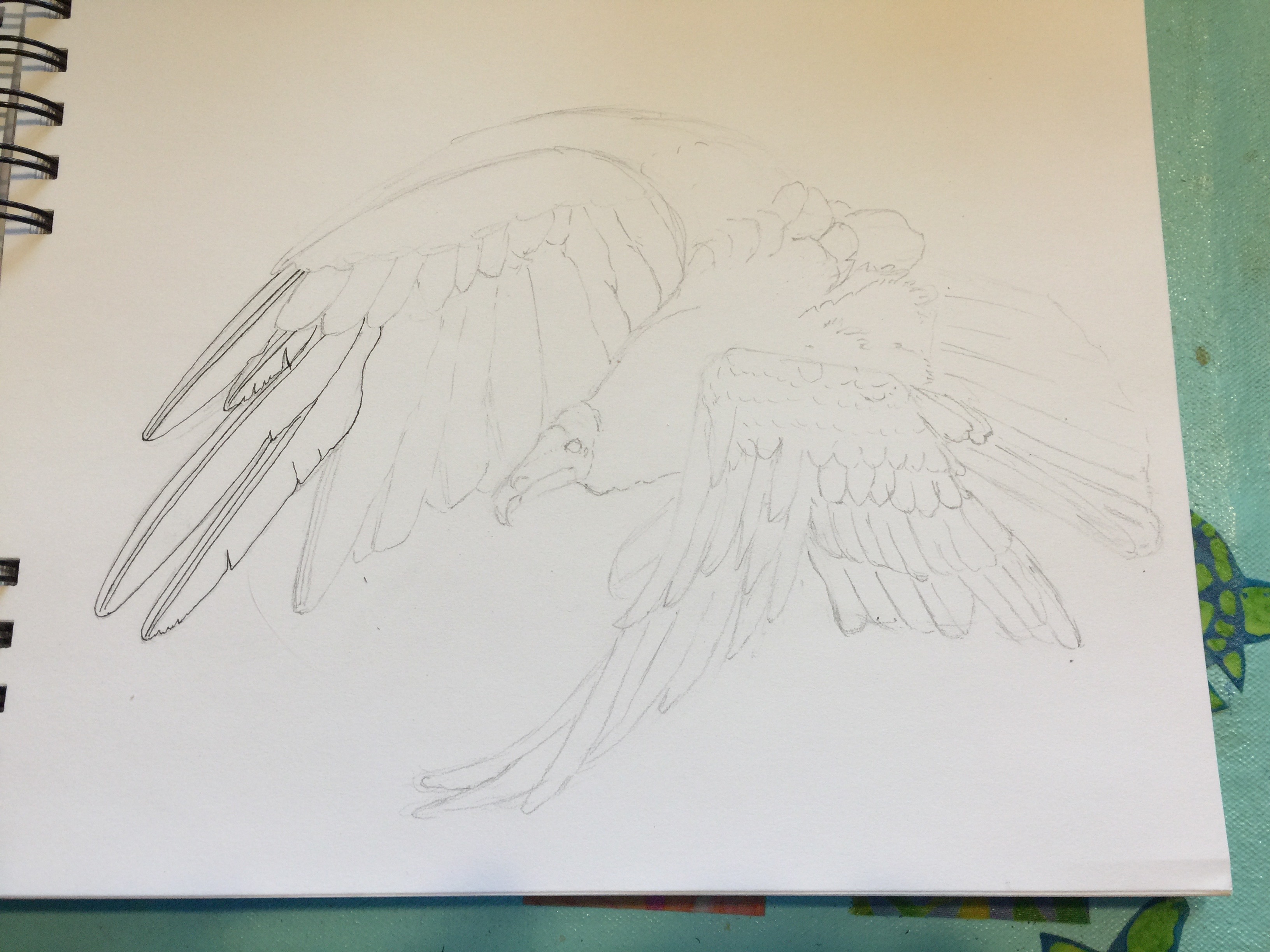
Step one: pencil things in. I am sketching in a Daler-Rowney dry media sketchbook that has paper that I really dislike. It is good for pencil and not a whole lot more!

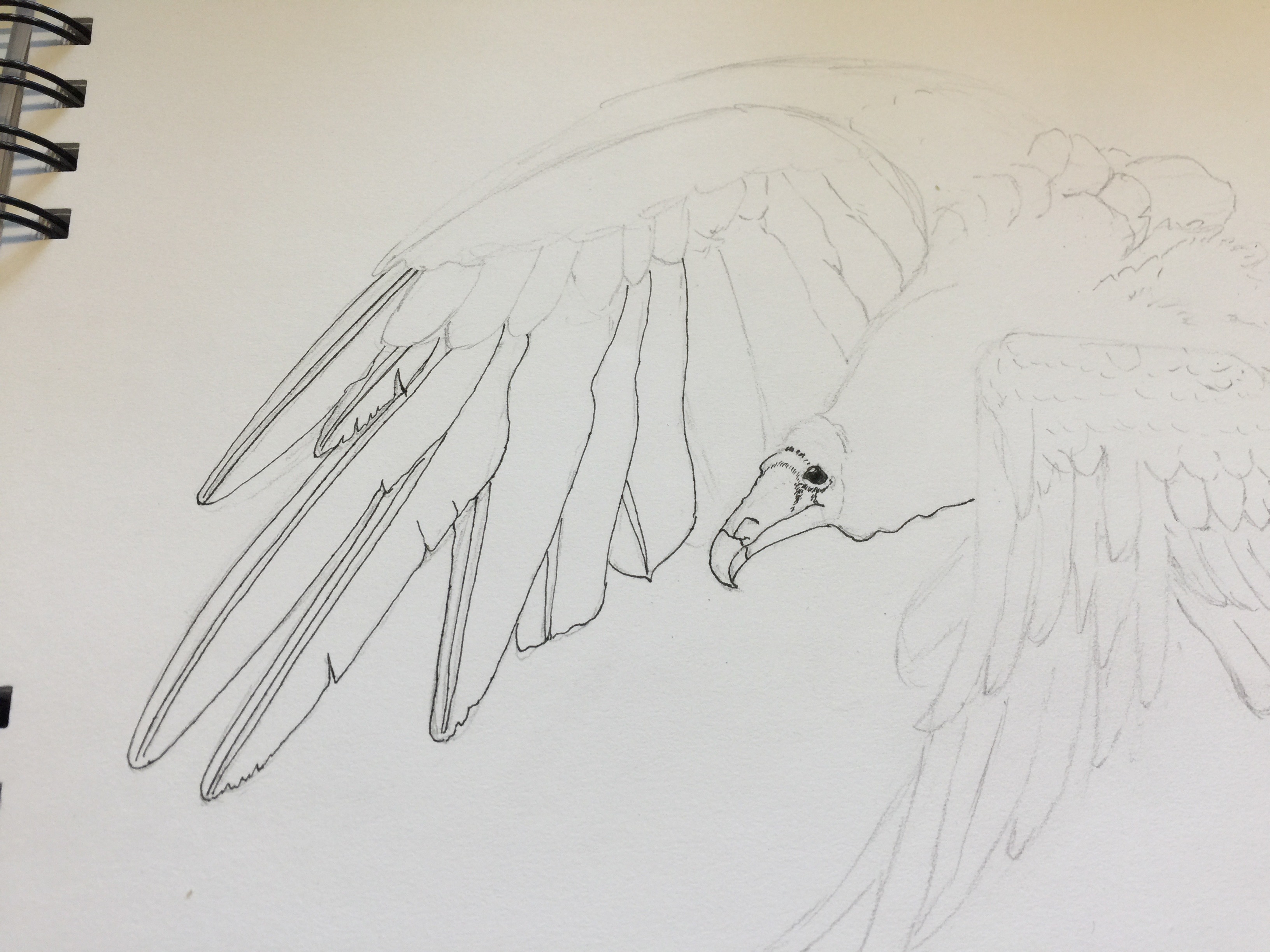
Getting the face and eye in helps so much. I used a crow quill dip pen and deAtramentis Archive Black Ink.

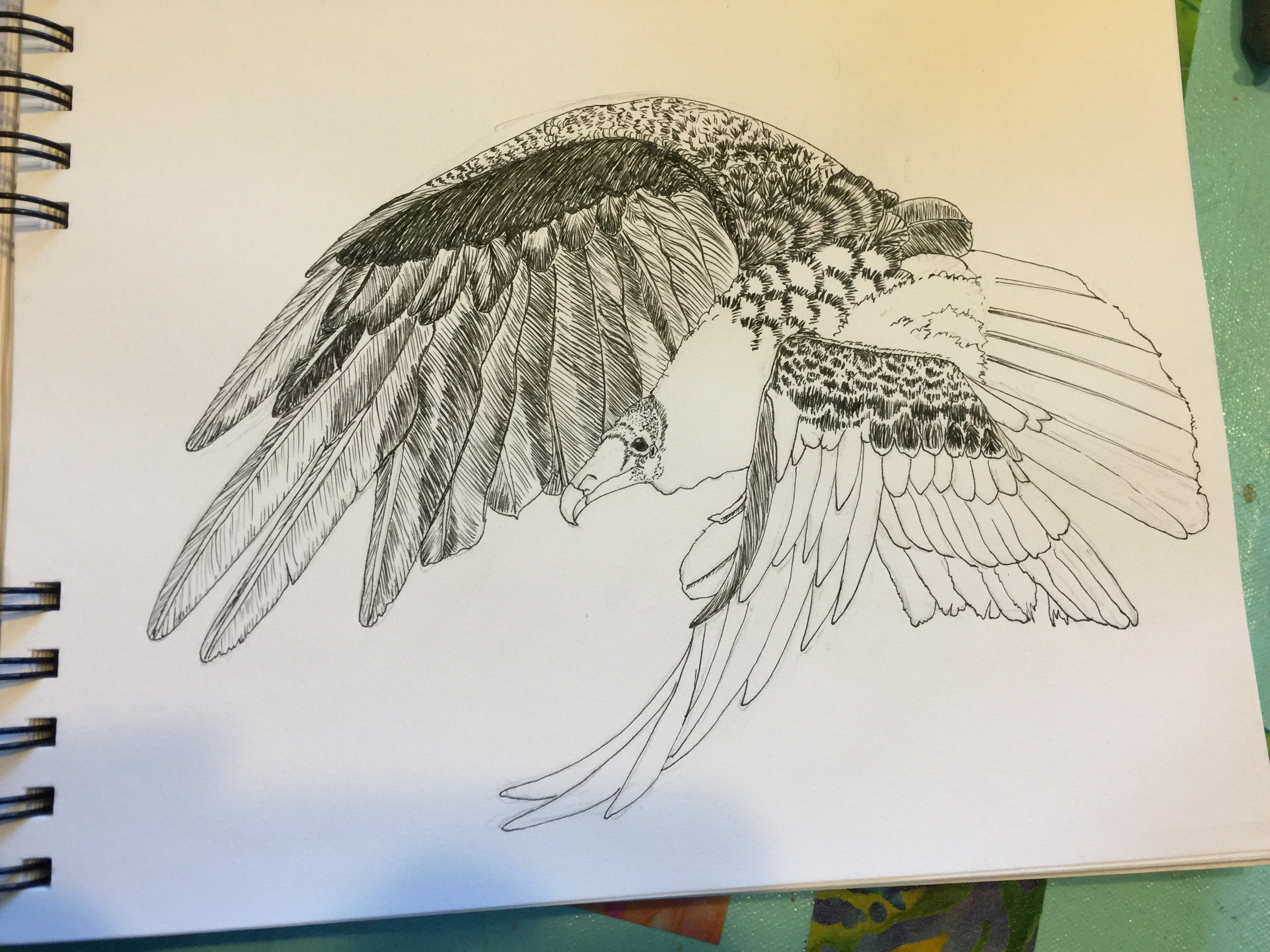
Progress. You kinda get lost in the feathers, but I’m pretty pleased with the shadowing through the long wing tips and the value changes.

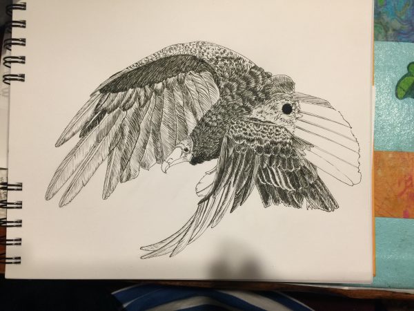
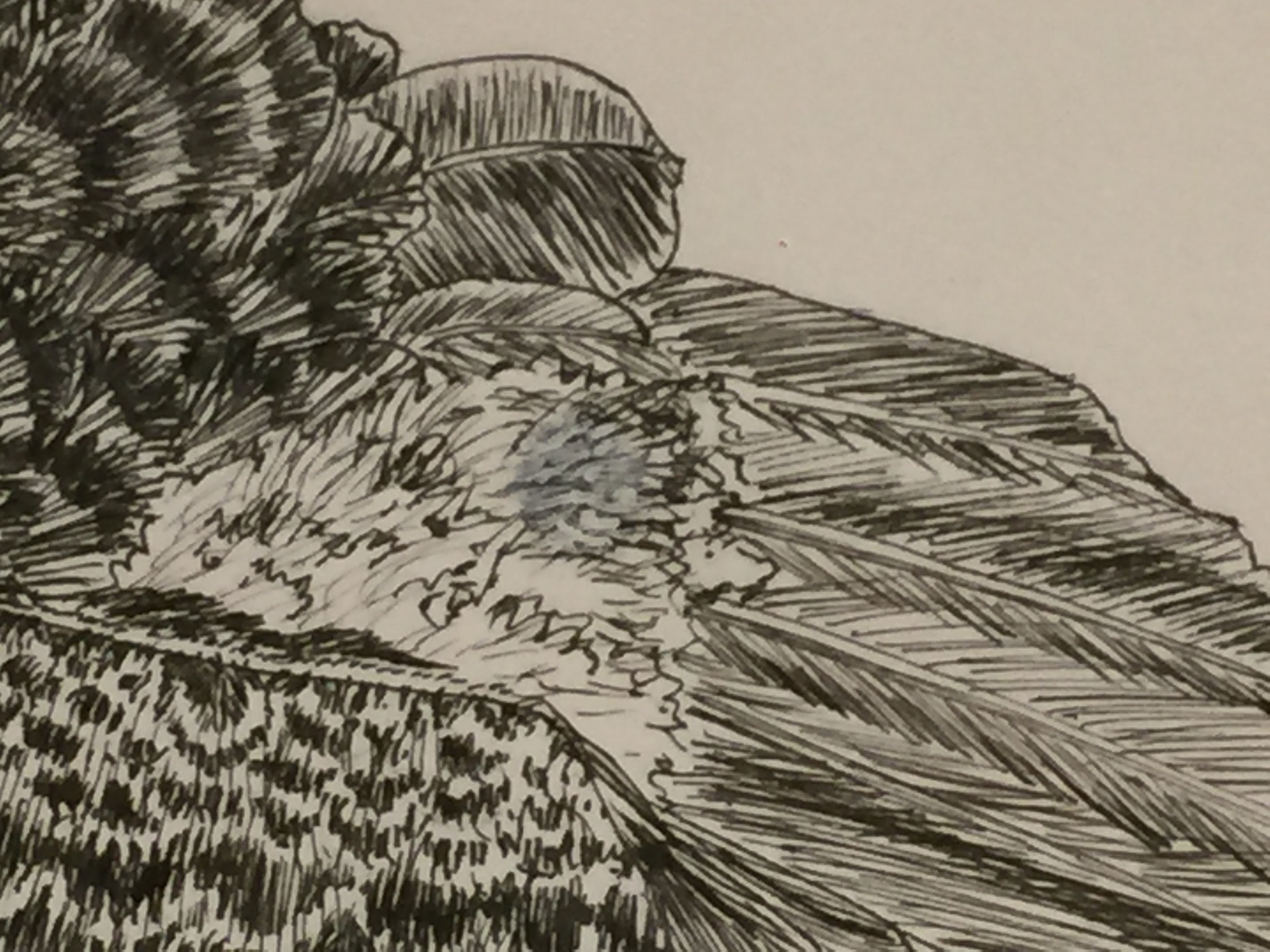
Then karma smacked me upside the face: BLOT. After 4+ hours of work, a BLOT. And with this miserable paper NO chance of scraping etc. I was so proud of what I’d managed to do. But I kept going. And asked sketching friends and teacher Val Webb for possible solutions.

SOB!   I got lots of good suggestions, and (gee imagine that) had pretty much all of the suggested art supplies.  The only thing I didn’t try was Val’s suggestion to use gel medium to glue down a piece of paper over the blotch, because this paper is so awful I knew it would have been futile.

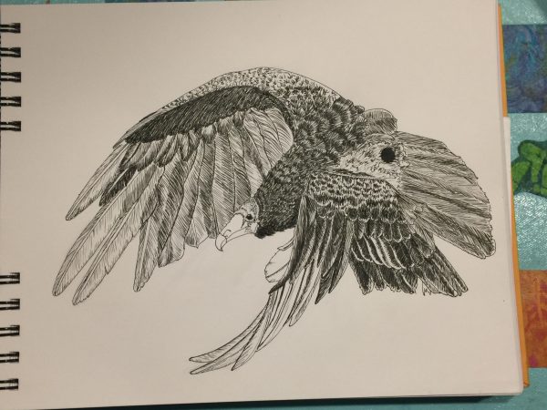
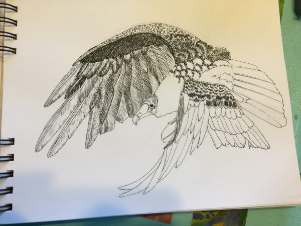
Finished, with blot.

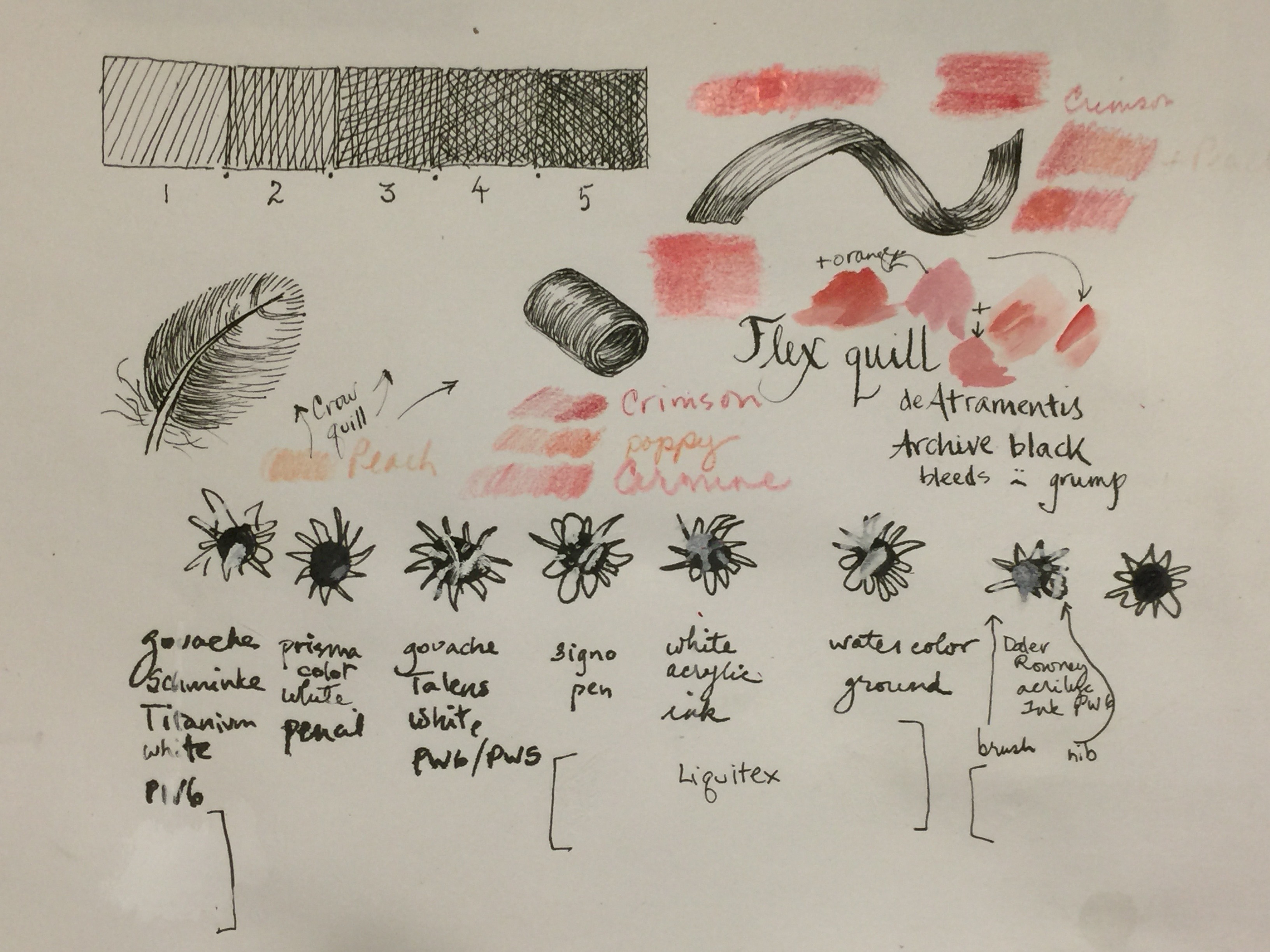
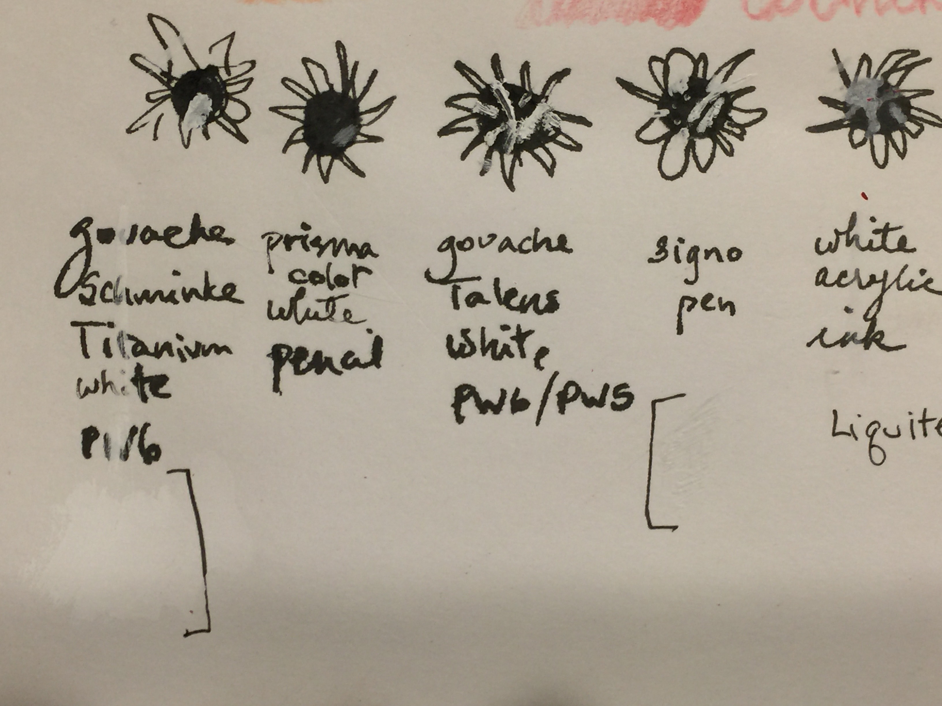
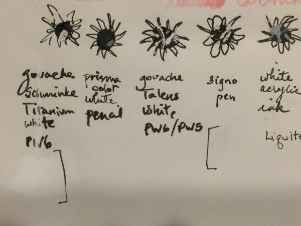
Being an impatient sort and loving my Signo Uniball white pen, I added some of that and it helped…a LOT.  That and other suggestions I received were

  • Gouache (tried both Talens white and Schminke Titanium White, the Schminke worked better)
  • Prismacolor white pencil (too weak)
  • Signo pen (worked perhaps best, but is tricky to manage as it is a rollerball and sometimes leaves a track or blank space in the center of a line)
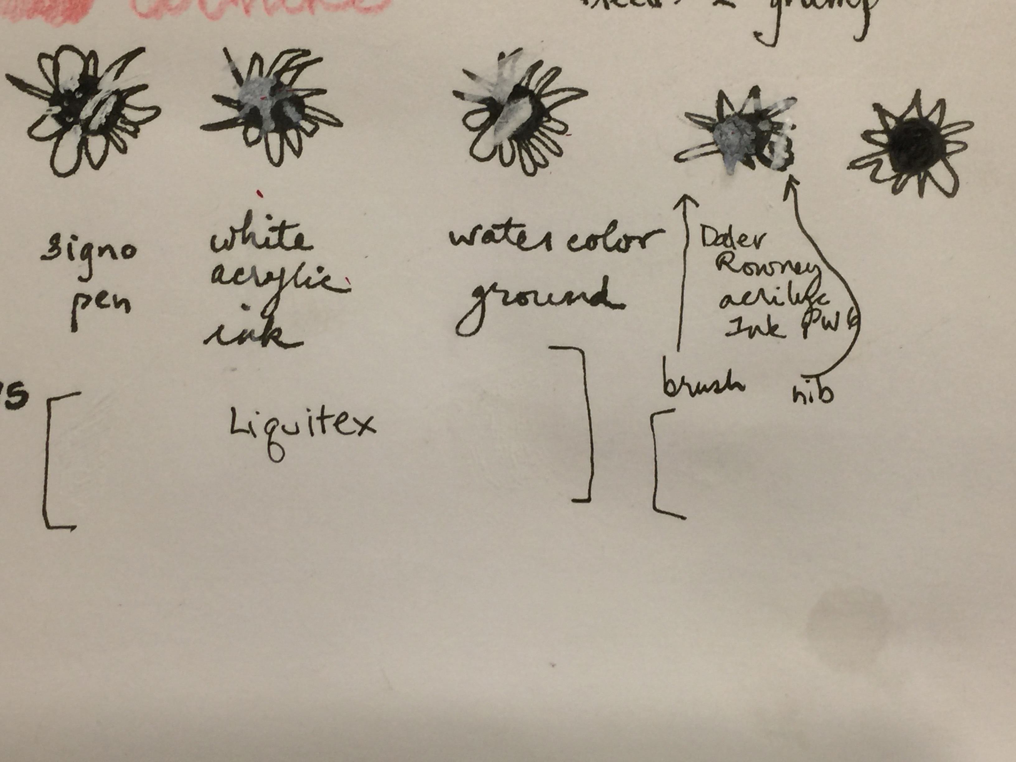
  • Watercolor ground
  • Acrylic ink in white–had both Liquitex and Daler Rowney; applied with both dip pen and brush

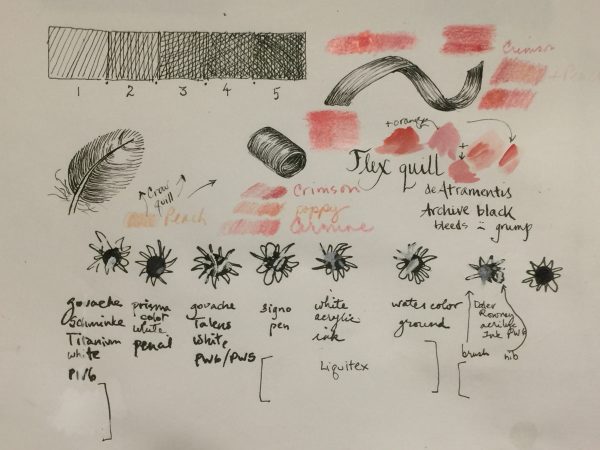
My test-drive page. The colors are from watercolor–this paper precluded using it–and colored pencil. I ended up using a combination of the Carmine and Crimson and a colorless blender.

The left side, close up. I made a blot of ink, then some squiggles to approximate where I blotched on the vulture.

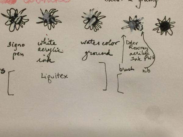
The right side. Definitely like the way the Signo pen worked, and also the Daler Rowney FW acrylic ink…look at the right side where I dotted it on with a dip pen. The one on the far right is my untouched for comparison.

Observations:

–Both the white gouaches and the Daniel Smith watercolor ground looked yellower than the bright white paper when wet, but when dry that tint disappeared.  In fact, the Schminke titanium, which seemed to work the best of the two, is even brighter white than the paper–a tiny drop of something to match the color of the paper would make it work.

–The Signo pen worked best, but you kinda need to add it in dots because the pen itself can “railroad” meaning you get edges of white and not much in the center due to the rollerball tip.  However, a couple coats worked well.

–The Daler Rowney FW acrylic ink worked better than the Liquitex Ink! .  It took a couple coats, but it could be a viable option.

I’d like to try a controlled test of my favorites, the Signo pen, Schminke Titanium White gouache, and the Daler Rowney FW white acrylic ink, on a few watercolor papers to see how it looks AND what happens if you then ink or watercolor OVER the “fix.”

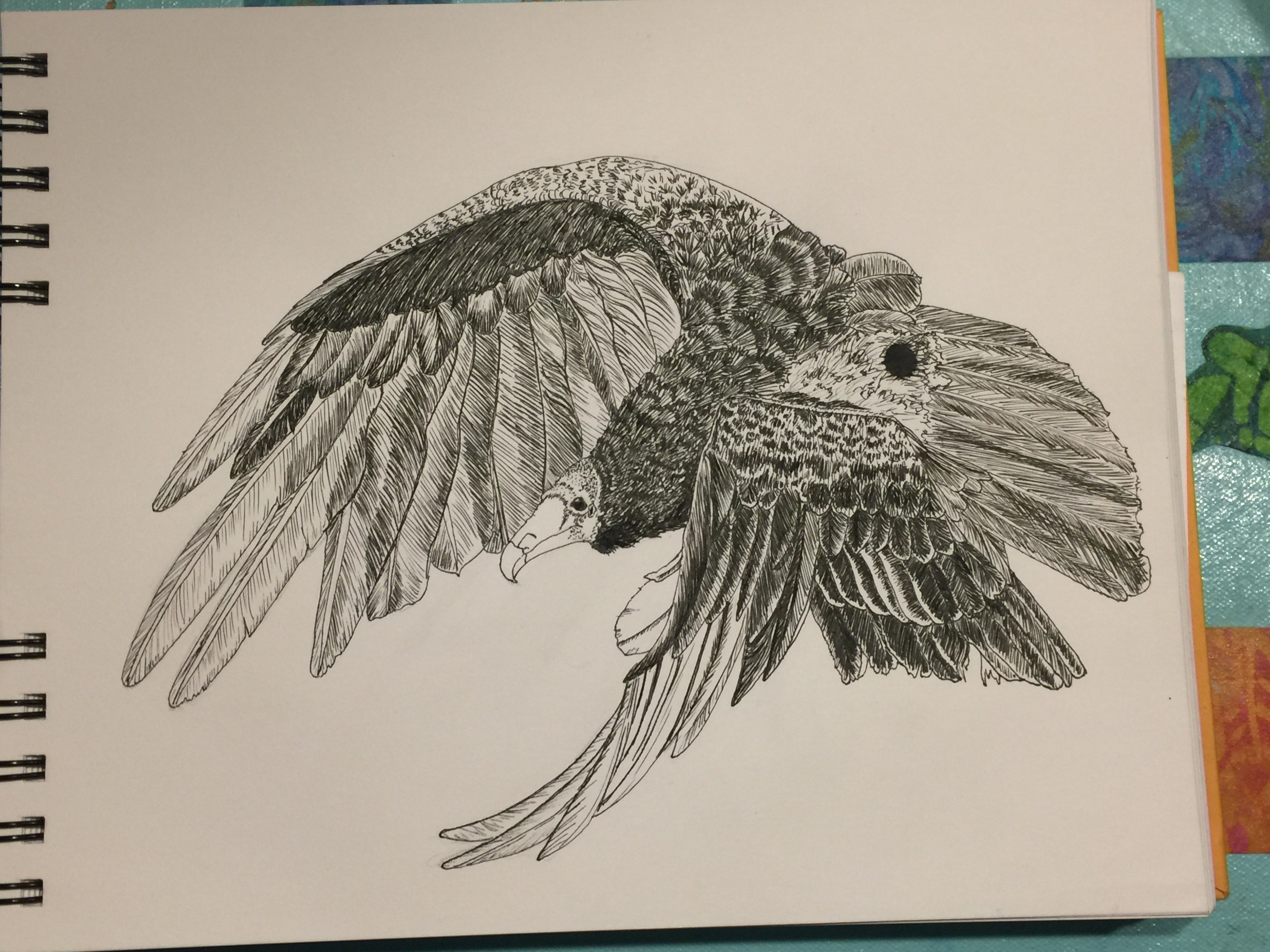
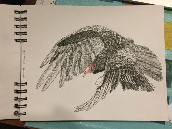
Here’s the offending splotch after touch up with both Signo and the Acrylic Ink in white:

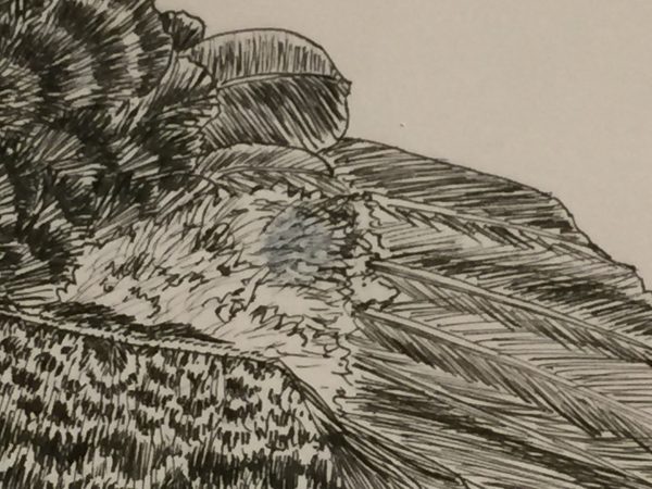
The splotch is visible on close inspection, but really I’m delighted with the result.

And once again, here’s the final result–not bad at all!   I’ve always said that the difference between a beginner and the advanced/pro is knowing how to fix your mistakes.  I’m moving out of beginner range!

The Vulture is Landing!