Looking back on it, this has been an exceptionally good year for getting published! It has also been a bit of a challenge as I’ve had to keep three quilts and one watercolor unpublished for an extended time while jurying of exhibits was done or waiting for books to be published. The first of the quilts was the one of Eli running during Cross Country season, which I wrote about here. This is the second: Two of Us,
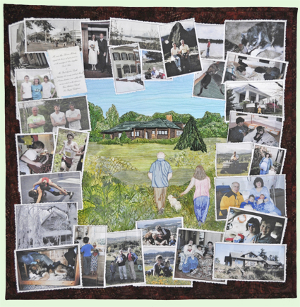
Two of Us, (c) Sarah Ann Smith 2014. Part of the Inspired by the Beatles challenge and an anniversary gift for my husband of 33+ years. Of course, as soon as I gave it to him (late) I then told him he had to give it back for two years because it was going in an exhibit and book!
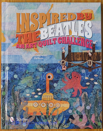
part of the art quilt challenge organized by Donna Marcinkowski DeSoto. The recently released book is Inspired by the Beatles: An Art Quilt Challenge. You can read more about the challenge here and order the book or read more about it here. Even better, if you are lucky enough to be going to International Quilt Festival in Houston this year, selected works from the exhibit will be on display there, including mine!
Donna asked participants to choose a Beatles song title, then make a quilt with that same title, inspired by the song perhaps, but careful NOT to use any copyrighted lyrics, images, etc. I had been wanting to make a quilt like this for Paul as an anniversary gift for a couple years–he is notoriously hard to get gifts as he always says he doesn’t want anything. I wanted a scrapbook feel to this quilt, similar in some ways to the kimono quilt (you can see it here) that is pictured in one of the photos on the bottom right which I gave to Mother for her 80th birthday.
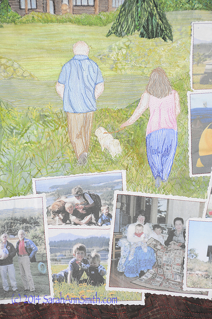
Detail of Two of Us, by Sarah Ann Smith (c) 2014. These photos include the only two grandparents who were alive for the boys to know, Paul’s dad and my mom.
I went through our photo albums and boxes of photos, picking pictures of us from the time we met until just recently. Beginning in the top left corner, you can see photos of Bissau, in the west African nation of Guinea-Bissau, where I met Paul. A bit of our wedding invitation, a wedding photo, our home on Capitol Hill in DC, from Canada, Bolivia, Machu Picchu, Gabon and our first generation of cats run across the top. Moving clockwise down the right you can see our home in Arlington, Virginia (I still love this architecture more than any other home we’ve had), me preggers with Joshua, with the boys when they were little, pregnant with Eli, in the hospital when Eli was just a day old then the first ferry ride home, to our home on San Juan island in the bottom right corner.
Moving right to left on the bottom, pictures of the boys when little and life at home. And up the left side, the boys as they grew, moving to Maine, Joshua with his beloved guitar (and boy is he GOOD) and Eli, honor student and exceptional athlete. Can I just say, Life is GOOD!
Here’s to book, a 176 page hard-bound whopper. Each quilt gets its own page (some get two), with a fun and extensive commentary written by Donna from our replies to her questionnaire that tell about our lives, inspiration and methods. Click on the links in the first paragraph to learn more.
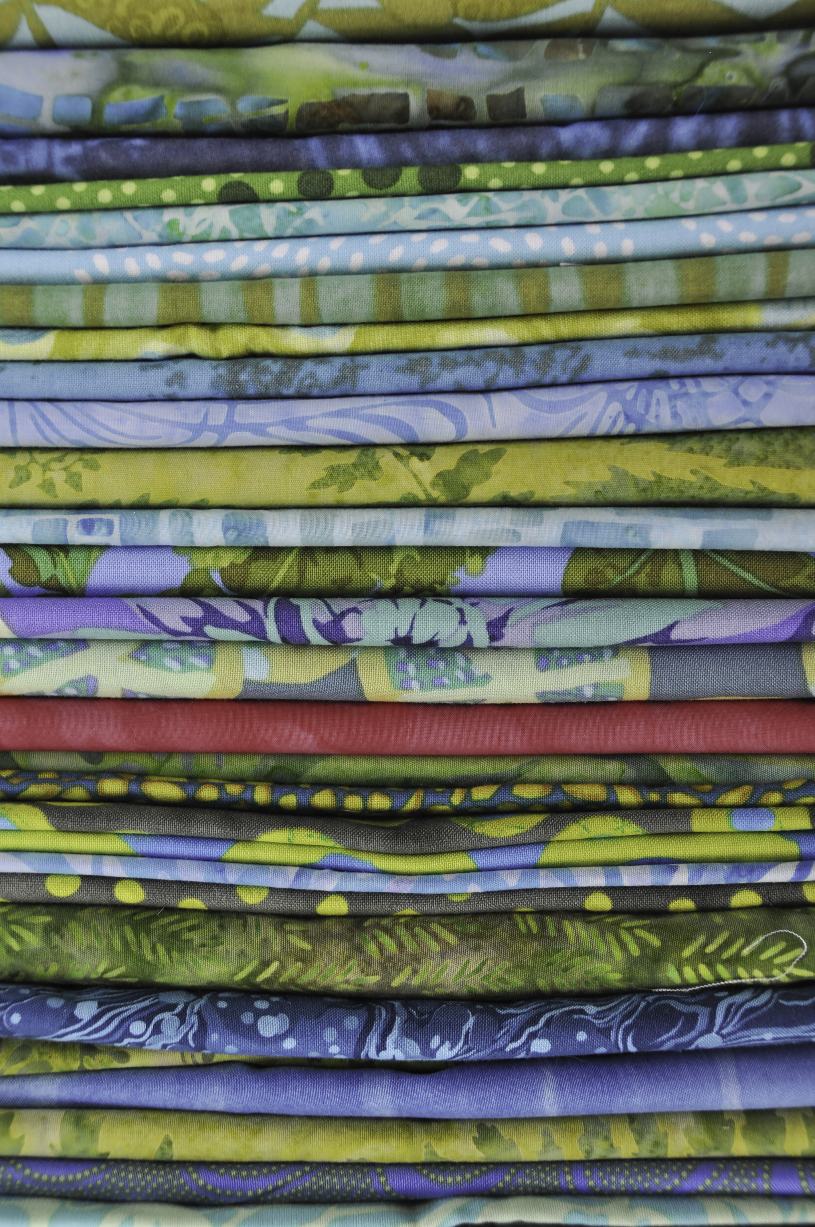
The quilt is made with fused collage. For the house, Paul, the pug and me, I sketched us on white cloth with colored pencils. I hate to admit but since I made this over a year ago, I don’t recall for use WHICH pencils I used–either Prismacolor or Inktense. I have since learned that some of the Inktense colors are not colorfast, so I HOPE it was prismacolor! Total finished size, as required for all quilts in this exhibit, is 24×24 inches.
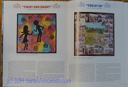
This is a typical two-page spread. The book is organized alphabetically by title.
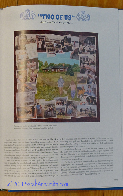
And a shot of “my” page! Artwork (c) Sarah Ann Smith.
And since we are quilters, I must show you the back. I did the threadwork at the top stage and did simple outlining around the photos. But it is the letter and photo I want you to notice:
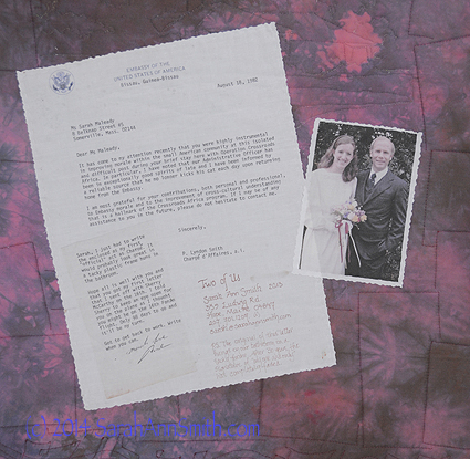
Paul and me on our wedding day outside the church, and a photocopy of the very first letter Paul ever wrote me. Yes, we wrote snail mail.
You see, Paul was working in West Africa and I was in grad school at Fletcher School of Law and Diplomacy near Boston when we met. The letter is hilariously “State Department-ish.” Paul was acting Ambassador (Charge d’Affairs, ad interim) for the first time, so for his first letter to me, he wrote to thank the American (me) for her part in improving morale at post, in particular that of the admin officer (that would be Paul). Then he added a note saying this would probably be suitably framed in something tacky and hung in the bathroom. I vowed upon receipt to do just that–in his first apartment when he was back in the US. Little did I know that in less than 10 months, his first apartment would be OUR condo as newlyweds. The original letter still hangs in a tacky metal frame from the drug store (which is sorta falling apart, appropriately), over the toilet in our bathroom. The signature on the letter has faded to near invisibility.
So that’s the “Two of Us.” Plus kids, cats, pug, and assorted stuff from all over the world.