So stoked! Dishwasher repair and rehab! Complete kitchen re-do!
Thursday, September 13th, 2018Warning: no art or quilty content whatsoever LOL! So I have shared on Facebook about my kitchen re-do, thanks to the wonderful folks at Pine Ridge Carpentry of Hope, Maine. GOSH…I didn’t blog about it I just discovered. OK, this just turned into a comprehensive kitchen re-do post. It’s lotsa eye candy and inspiration, not much reading…just scroll! At the very end I’m putting some of my favorite things / details from the re-do so be sure to go down to the end for the best bits. OK, it’s all good stuff!
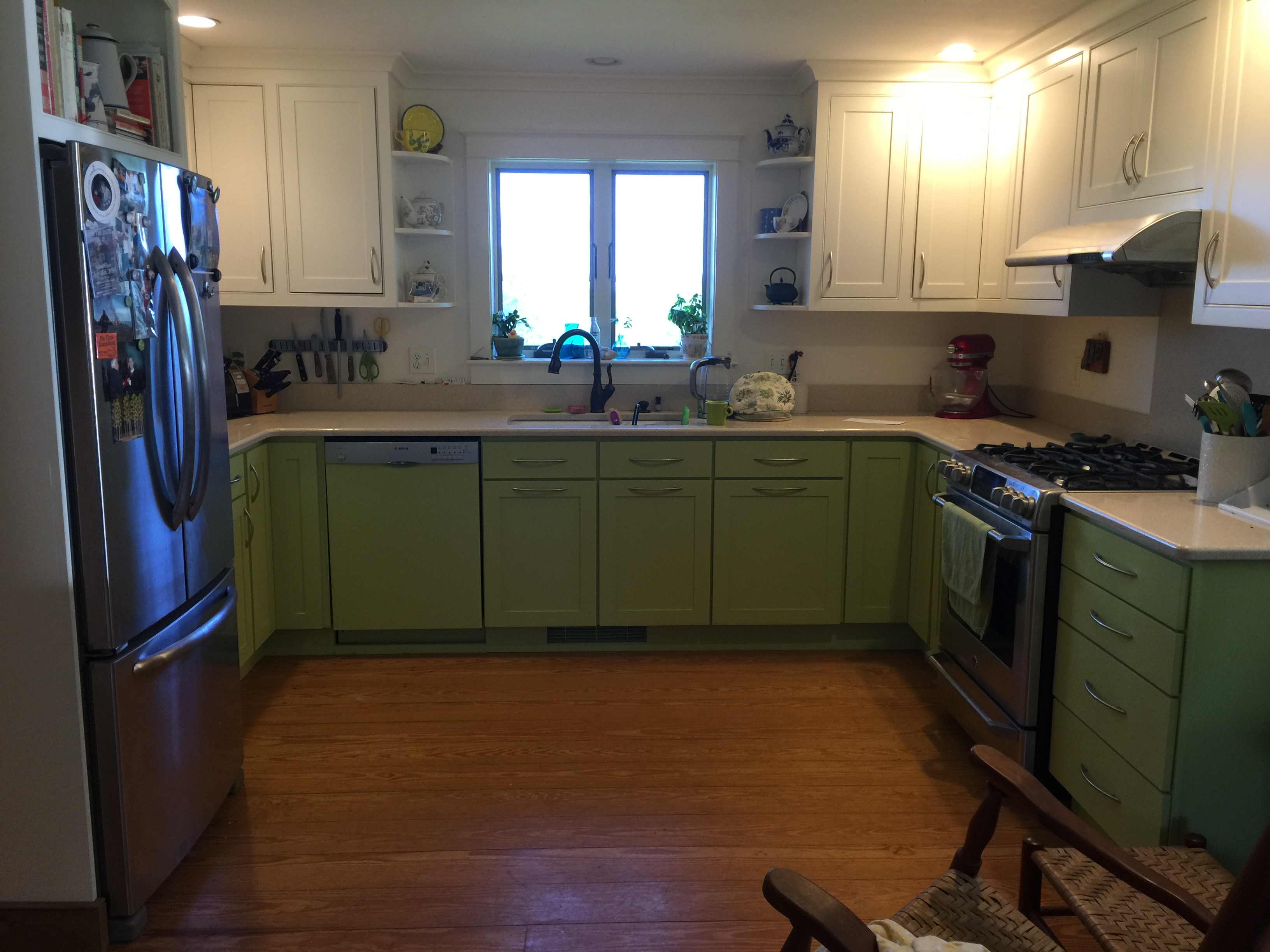
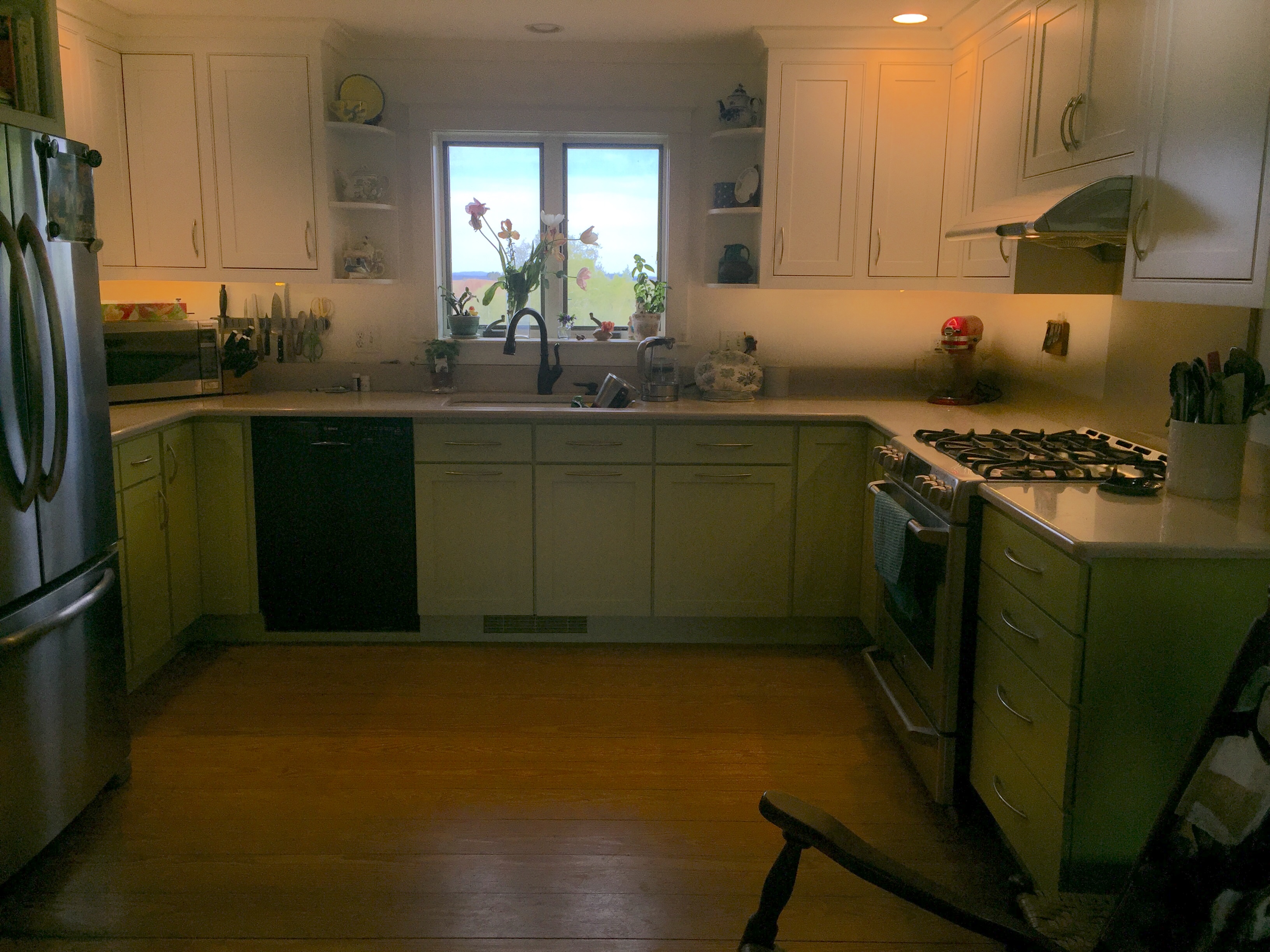
The FINAL, all-fixed-up version… read on for more! Today I finished the last bit: repairing the handle on the dishwasher and painting the black metal front in green to match the cabinets. I am THRILLED with how it turned out. I can’t believe I semi-took-apart the dishwasher, changed out the front control panel and switches, re-did the door and it looks good! Some day I may replace the totally-functional faucet with one that matches the new decor and maybe convert the recessed can over the sink to a small drop light, but that will wait.
Here is what the icky “before” kitchen looked like: DARK. In 2011, when we moved in, the fridge and stove were black, and there was no dishwasher at all. So we removed a cupboard (well, the carpenter did! Thanks JB for a great job back then!) and inserted a dishwasher to the left of the sink. JB had to reduce the size of the corner cupboard–when he was done, you’d never know it hadn’t always been like that. Just found this photo from our first walk-through before buying the house:
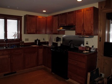
The kitchen at the very beginning…dark counters, dark cabinets, grayish white on the ceiling, black appliances…ugh.
Then, this past late spring/early summer, I took out the dark old ick which included a lot of fading of the color, down to shadow marks!.
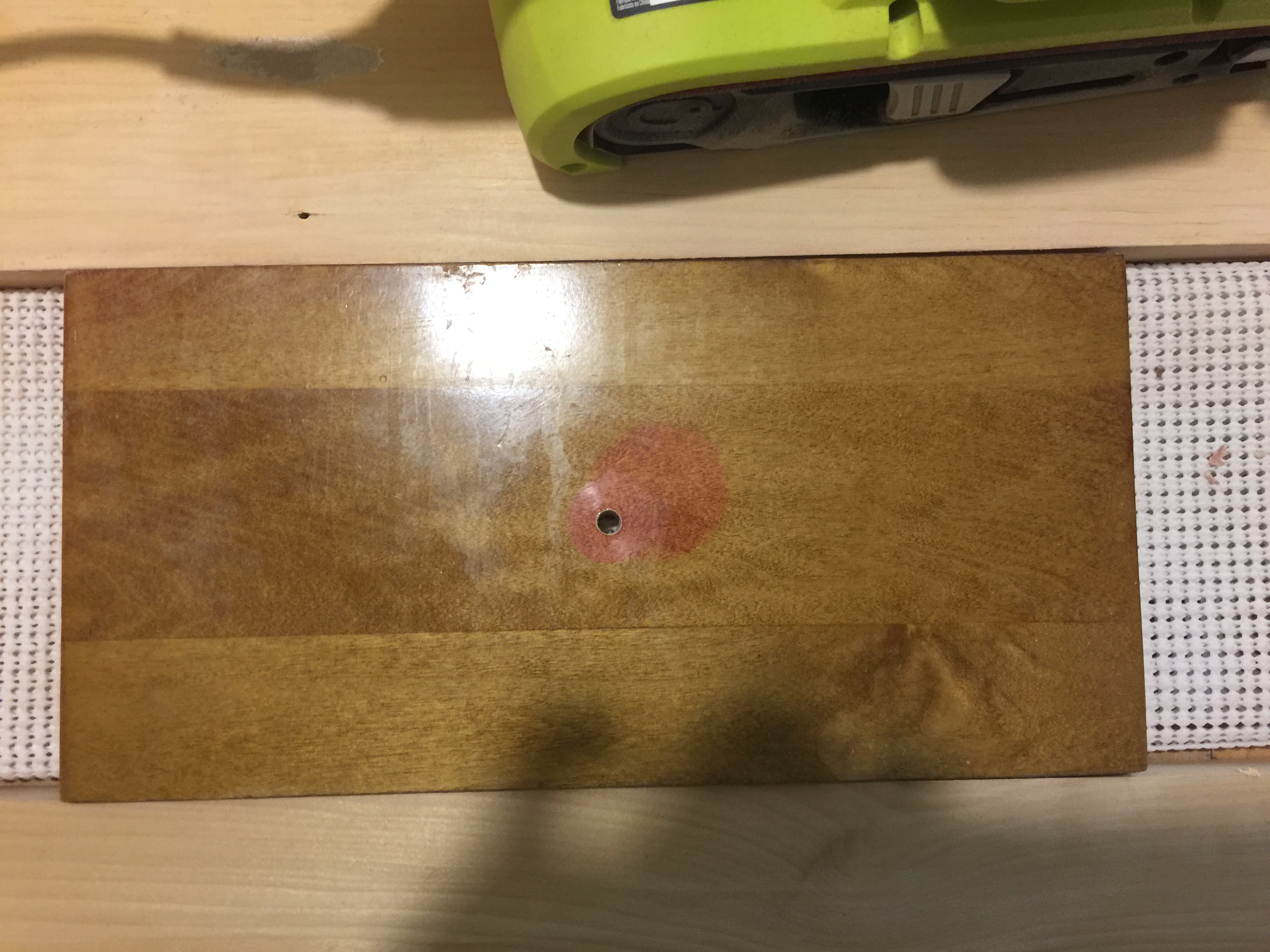
The reddish color was the original cabinet color. The spot is from where the knob cast a shadow and prevented the light from the window distorting the color. You could actually see a diagonal (blurry) across the upper cabinets where the sun bleached it. Yuck!
I couldn’t afford to re-do the whole kitchen. Shortly after we moved in, we got rid of the dark green formica counter (which showed every single grain of salt, mote of flour, dried drop of water) and put in quartz counters. I wanted to get rid of the claustrophobic feeling at the sink where the upper cabinets closed in on me, and love the old fashioned whatnot shelves. I figured (correctly as it turns out) that having these on the ends would open up the window area. Some of the lower doors were also starting to warp…not good.
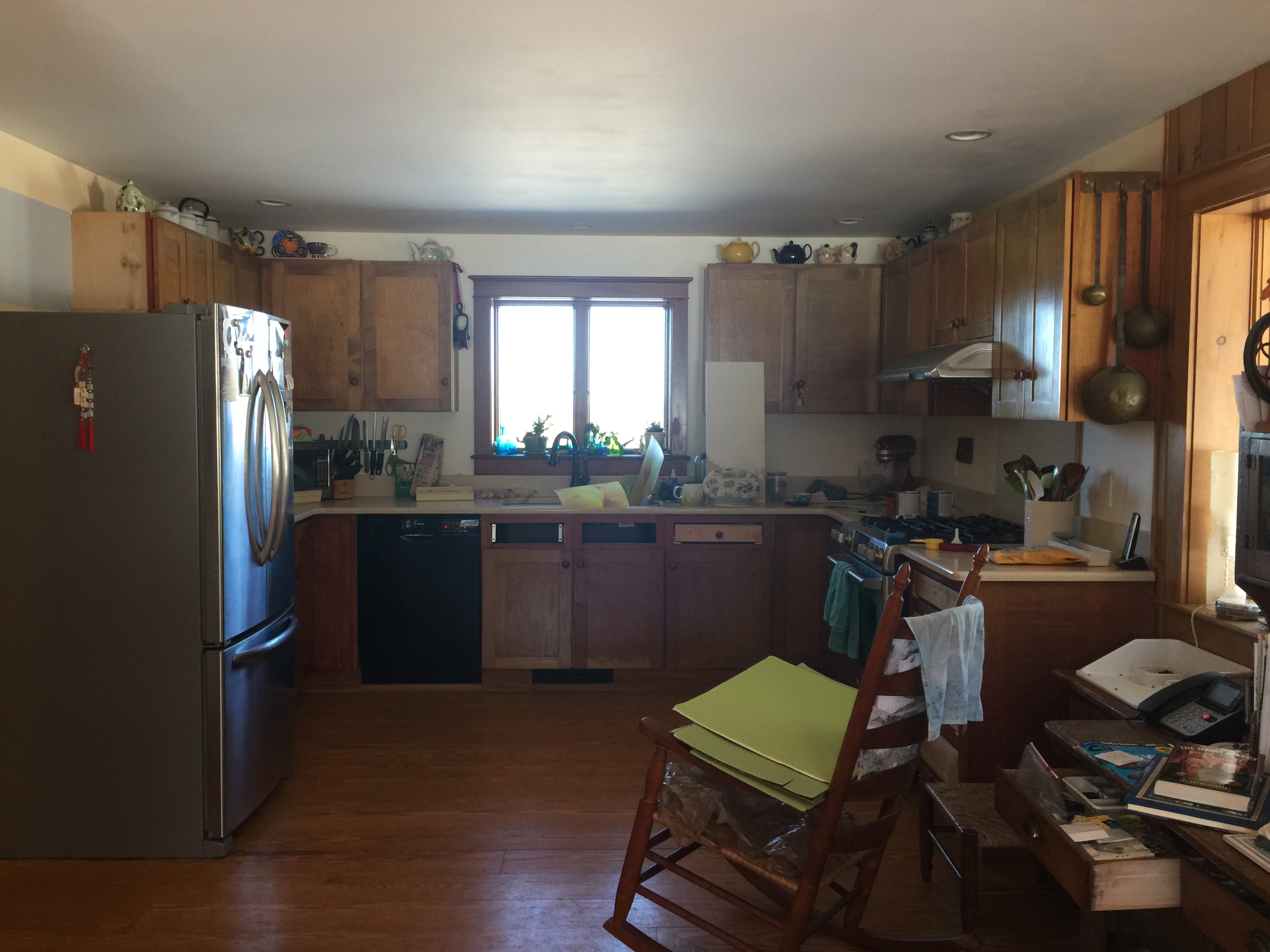
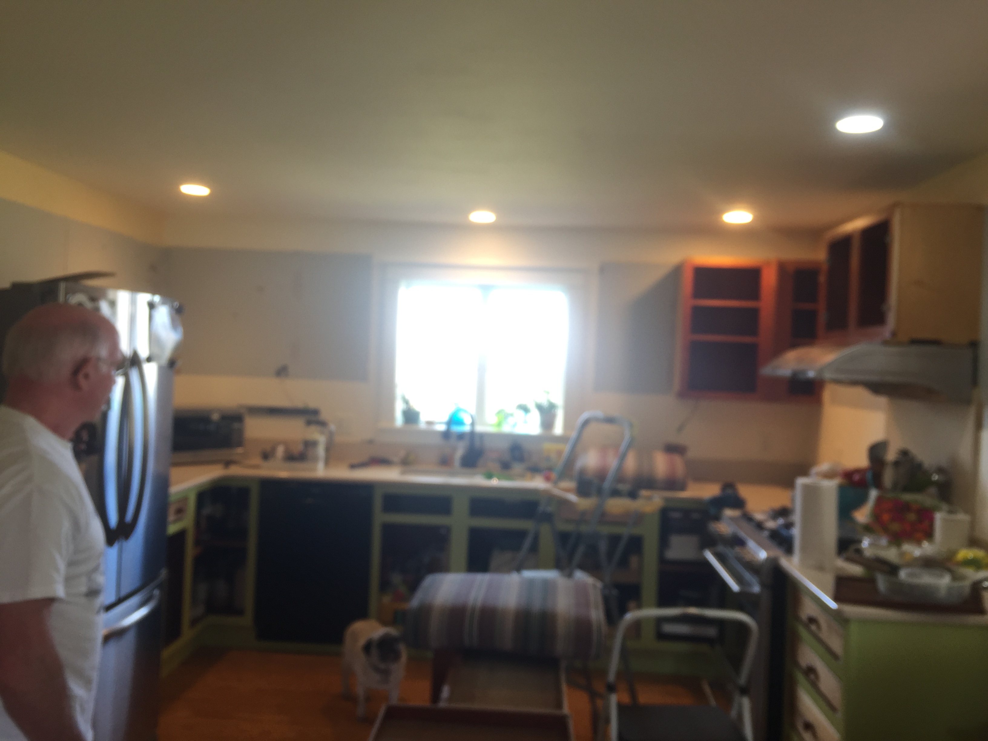
This is what the kitchen looked like for most of the past 7 years (I had already taken the drawer fronts off to start sanding in this photo). Dark. Ugh.
I looked and looked for years, and found some great semi-custom at EBS, the local hardware store. Finding an installer that would show up however was an issue. One guy came out, gave a bid, shook hands on it (how business is done in Maine), then decided it was “too far” for him to come (25 minute drive!). So I stopped in to Pine Ridge Carpentry a few miles from our house. They asked to bid on the project instead of installing the pre-fab cabinets. Their bid was $1000 above the cost of the pre-fab, but agreed to match the price because they had a sudden opening (in a week!) in their schedule and wanted to keep the crew working. So I got CUSTOM, exactly everything I wanted, for the same price. AND I ended up ordering new doors for the lower cabinets, sanded the frames and painted them myself, sanded the drawer fronts down to wood, and they painted the drawer fronts and new doors to my custom color. So for about $2000 more than the initial cost I got an almost entire new kitchen!
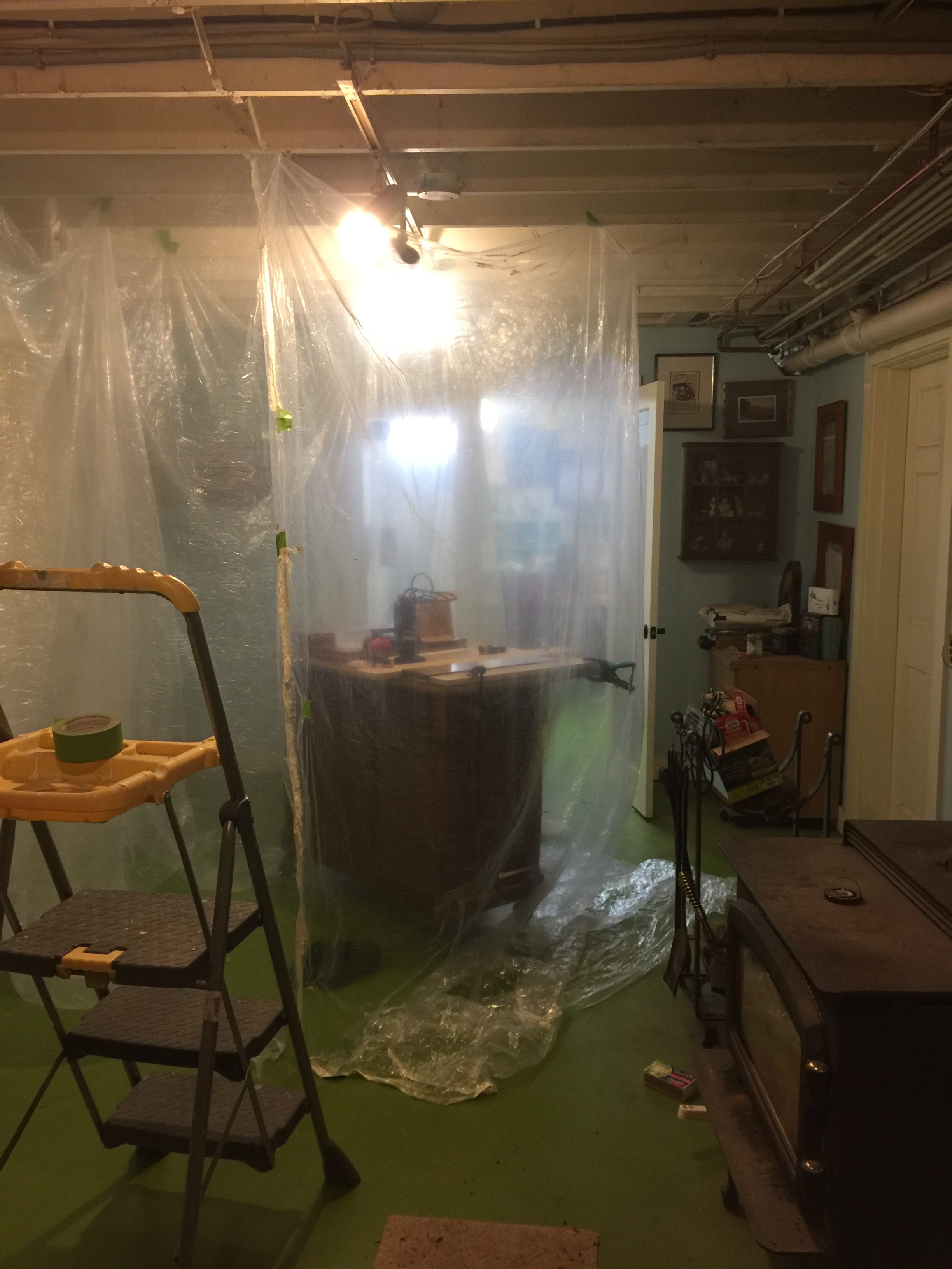
I hung plastic drop cloth in the basement to contain the dust when I sanded down the drawer fronts, which Pine Ridge painted along with the new lower cabinet doors.
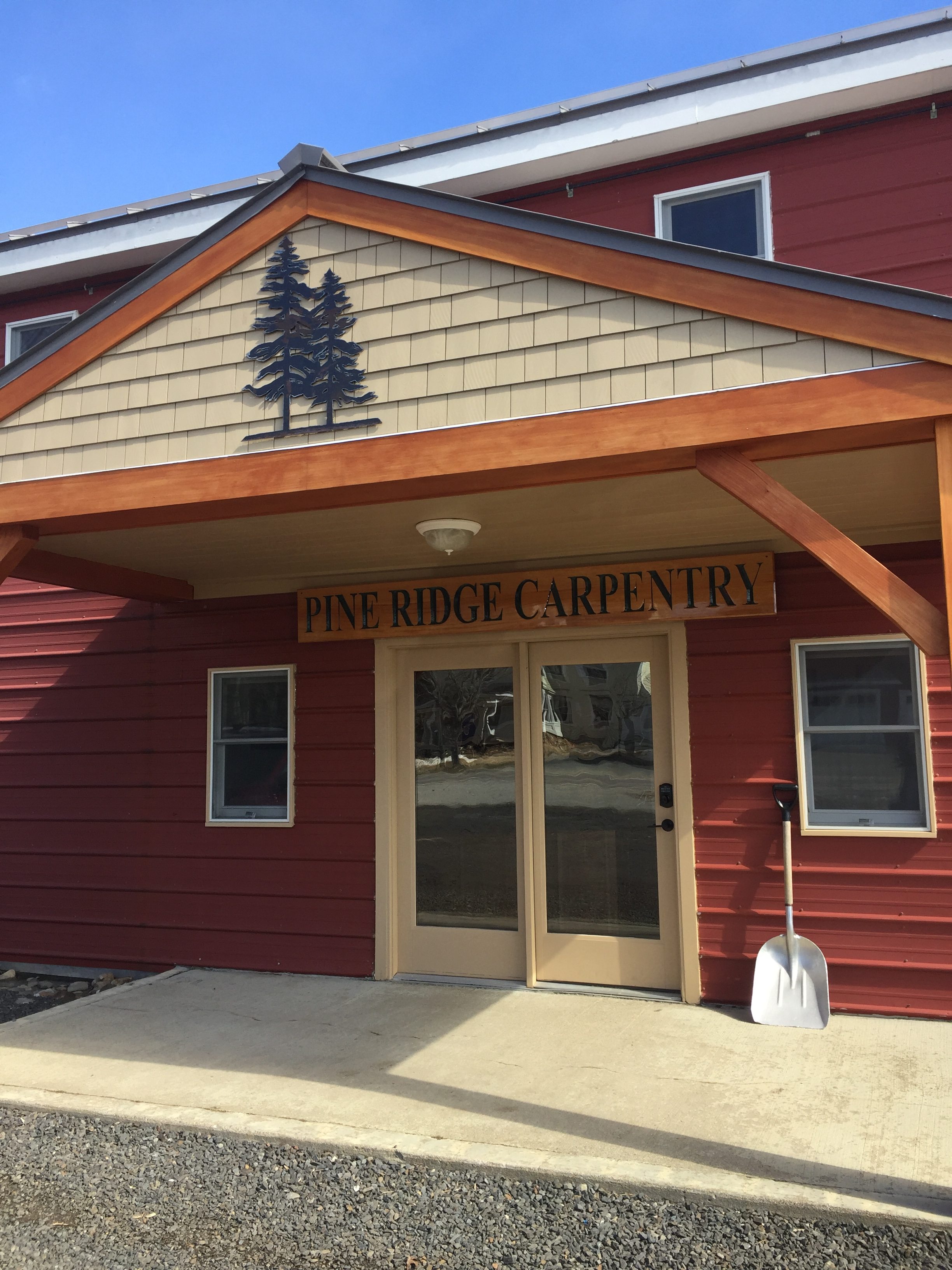
What a lucky day when I popped in here on the way home. I had driven past it for 7 years, but didn’t realize they build entire houses and are master carpenters. I LOVE that I was able to “buy local.”
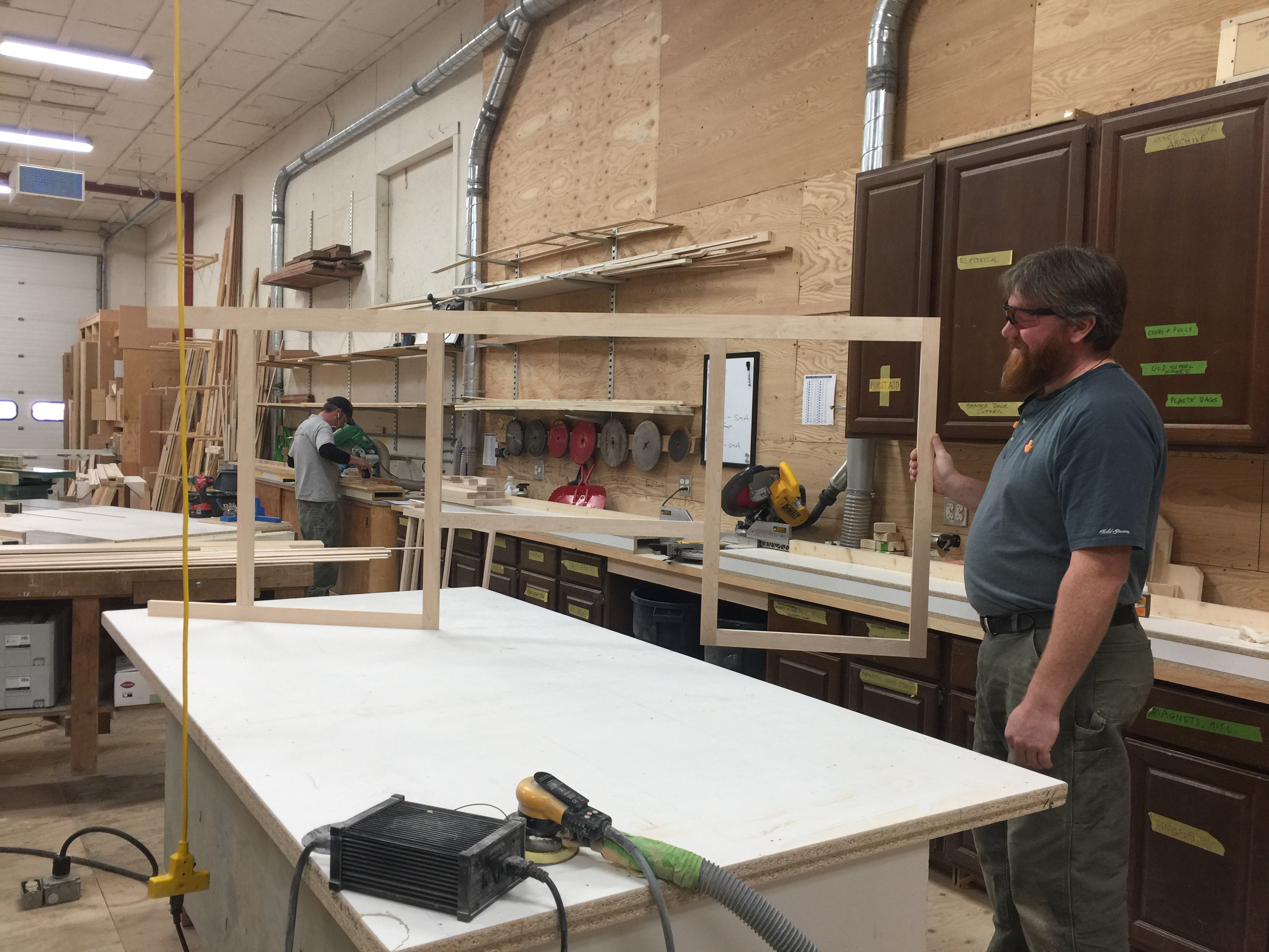
Pine Ridge is so cool–I stopped in to drop off a check, and got to see the workroom, and Nate showed me some of my new upper cabinet fronts–these are the ones over the stove. This place is so clean you could eat off the floor!
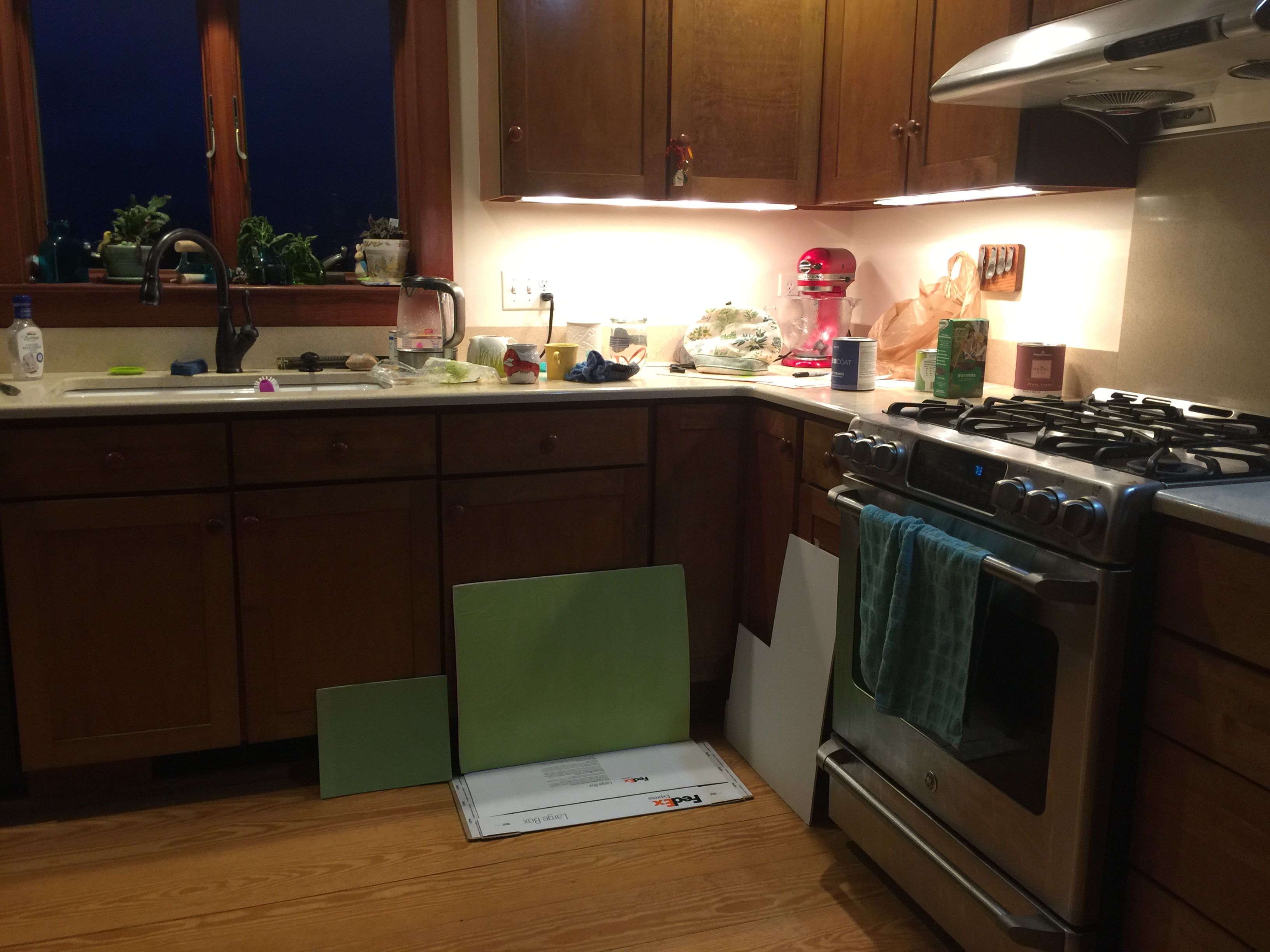
Test-driving various greens (painted on primed cardboard so I could move them around to see the colors at different angles/in different light)
I sanded the lower frames down to bare wood, then primed and painted with the same paint Pine Ridge used for an exact match. And boy did I test-drive a lot of samples to get the perfect-for-me green!
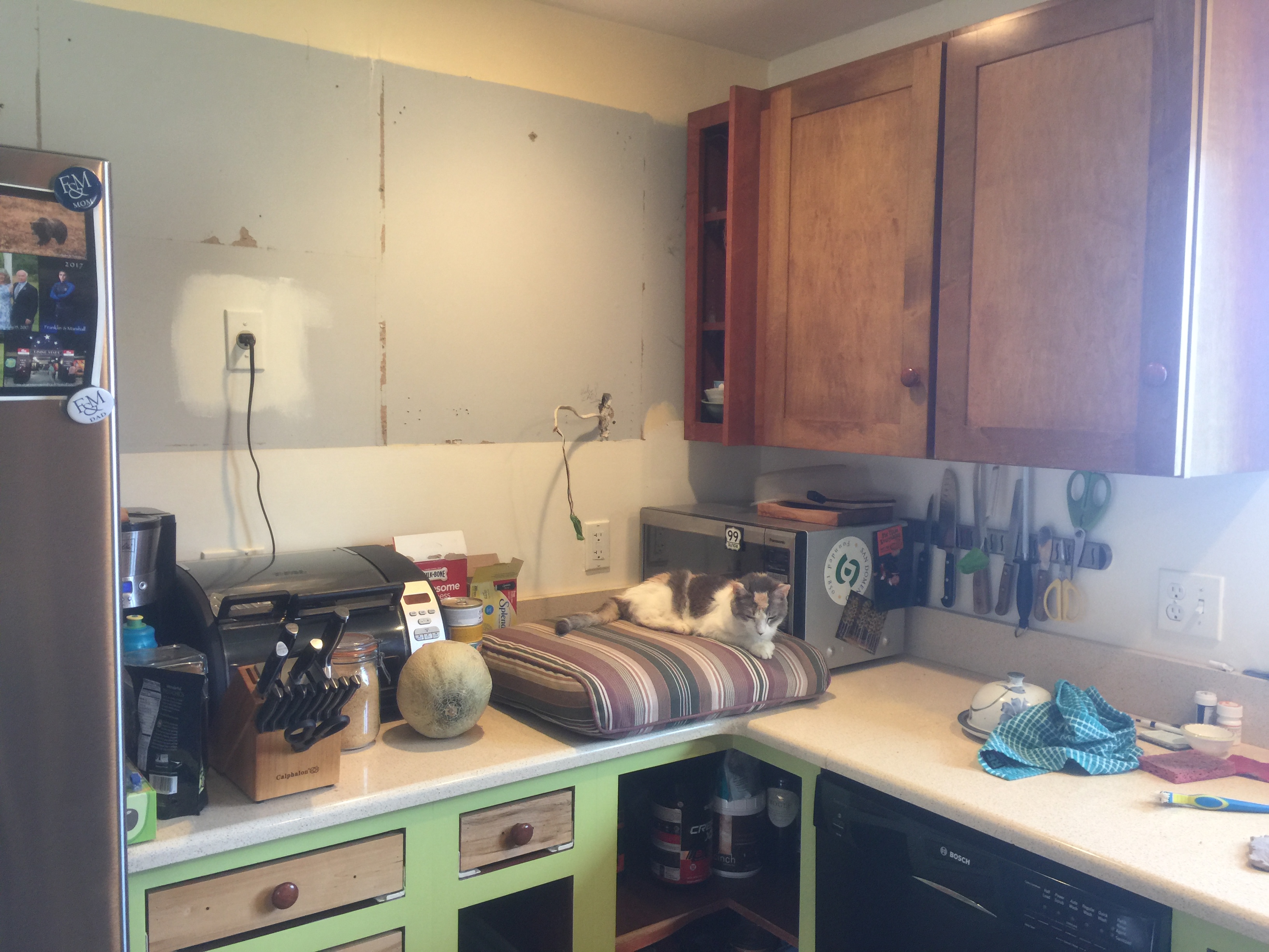
De-installation, by me with muscle from Paul. I wanted not to rip off the old cabinets. They are currently in the garage for future use out there, with a couple in our store/work room in the basement. Note the large bulky microwave plus toaster on the counter. The cushion was knee padding as I removed screws.
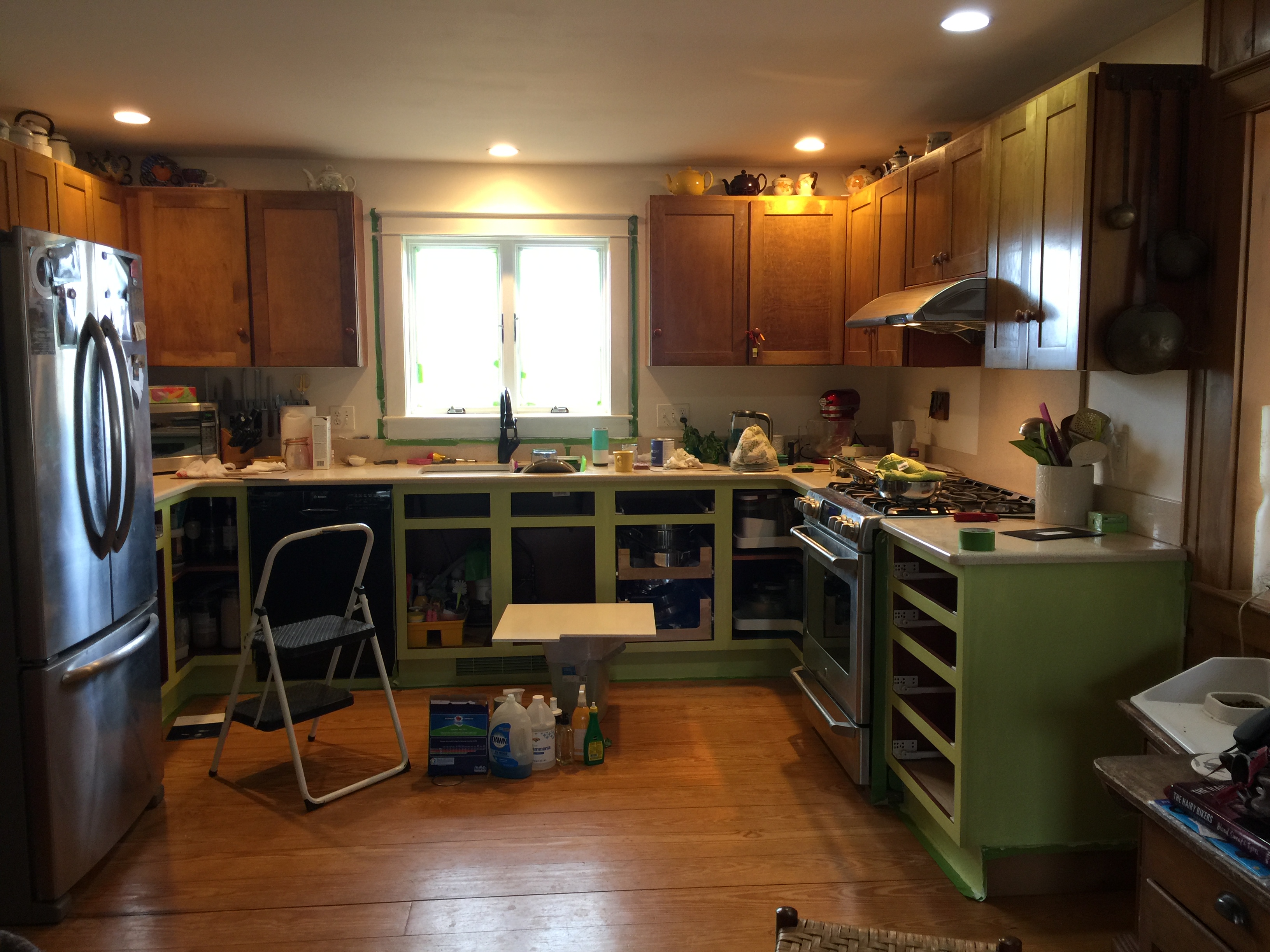
LOOK how much better it is without those awful dark cabinets closing in on the window!
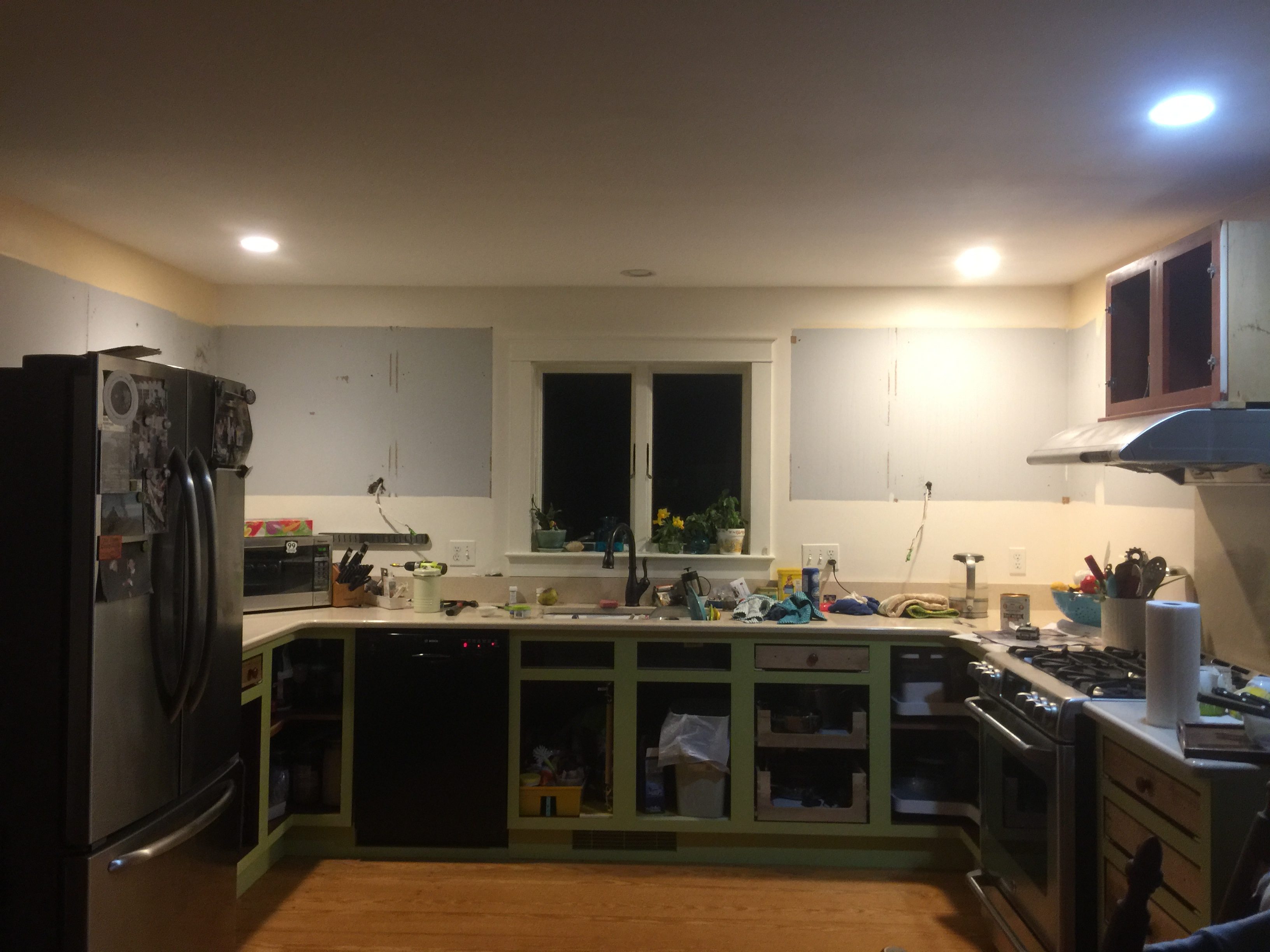
Voila! Mo’ bettah! Paul even admitted the kitchen looked SO much bigger and lighter already.
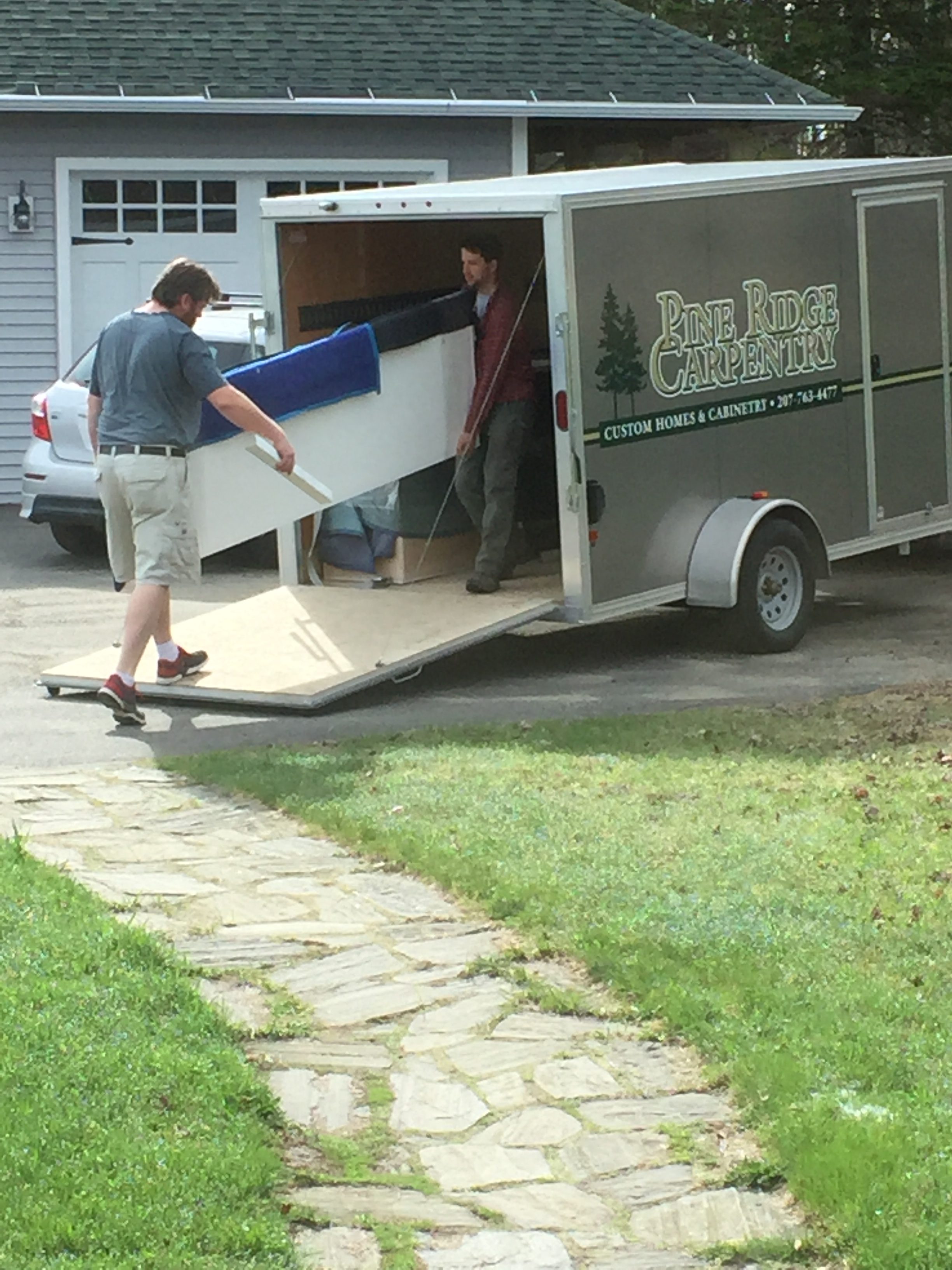
Installation day!
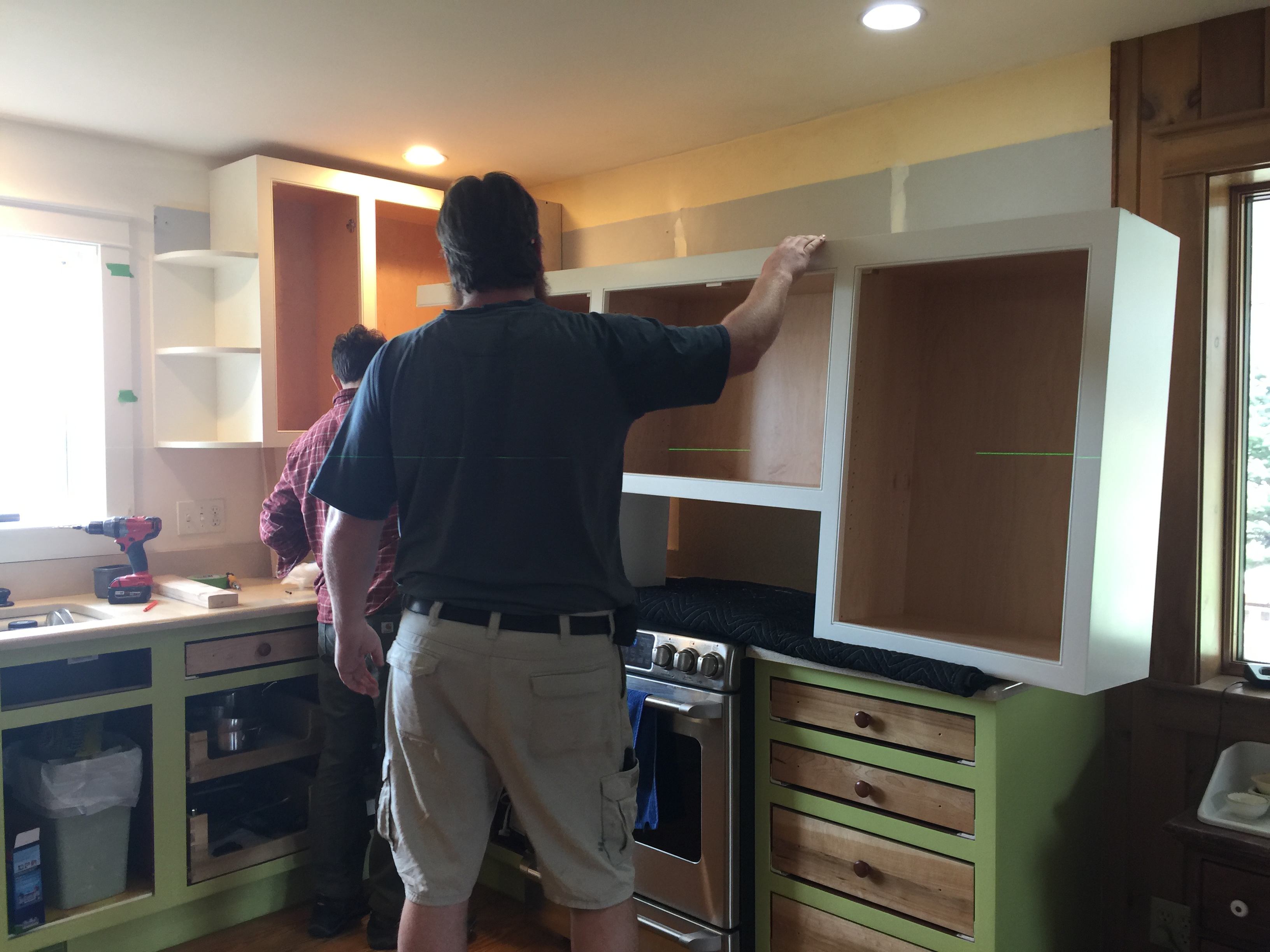
Nate really is that tall, about 6’5″…he could reach the crown moldings without a stepstool! He can also make ANYTHING. Impeccably!
Finished by Mother’s Day. I cannot tell you how pleased I am with the results, my design, and Pine Ridge Carpentry’s outstanding responsiveness and quality. They aren’t inexpensive, but they are worth EVERY SINGLE PENNY. I told them if I win the lottery, they are building my dream house!
The only thing left to do once I had **finally** selected the hardware and they installed it was to do the dishwasher. Thanks to Bosch and YouTube, I was able to repair the cracked handle and get the door panel off. Thanks to my friend Deirdre Abbotts for helpful hints on painting metal. I was disappointed that on a quality brand like Bosch the handle / panel cracked to the point of needing to be replaced, but glad that you could actually replace JUST the handle (not the whole door) and that they told me about good video tutorials on DIY on YouTube. As I was about to order the new handle, I realized I could order silver, not black! AND that I could order a new stainless steel full door panel. But that panel cost $180. Leftover paint: free. Help from Deirdre: free and appreciated!
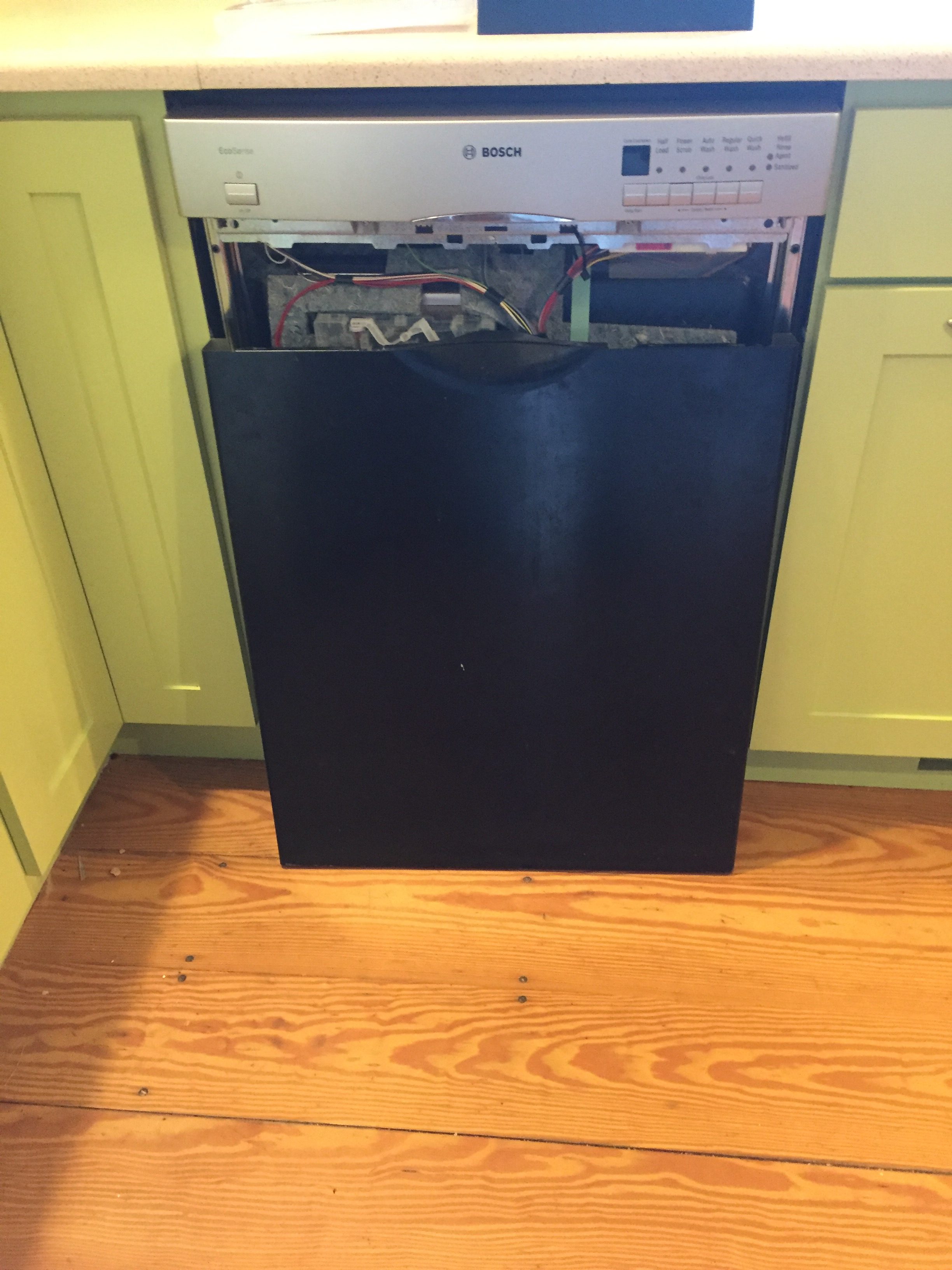
New handle and buttons installed, black panel removed for painting. It was literally plug and use! Like clicking in Legos!
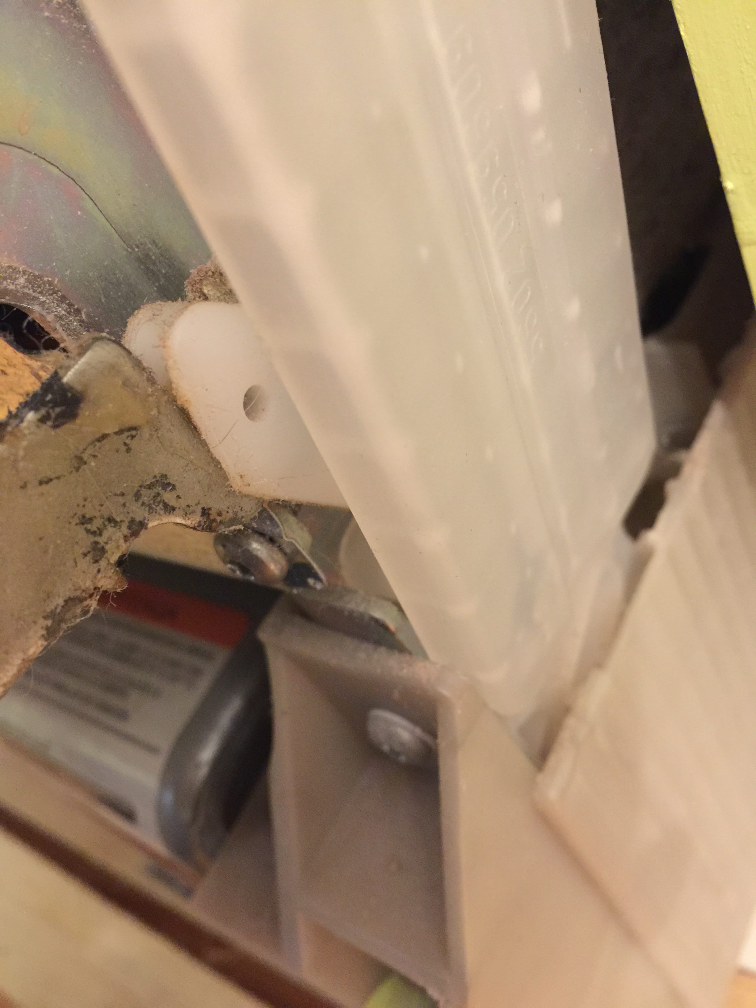
Before removing little stuff like this plastic panel, TAKE PICTURES so you can get it back exactly. The videos don’t do close-ups of all things.
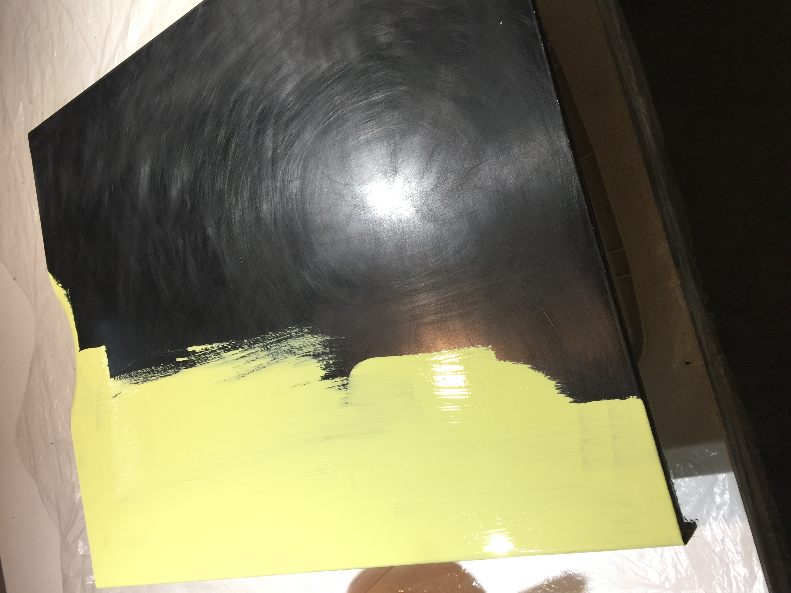
Painting the door panel in my utilities room, where I dye fabric. I figured it was the least dusty part of the house, but the floor joists permit air from the rest of the basement in. It is IMPOSSIBLE to paint in a dust-free, pet-hair-free environment in this house. Oh well. I did my best!
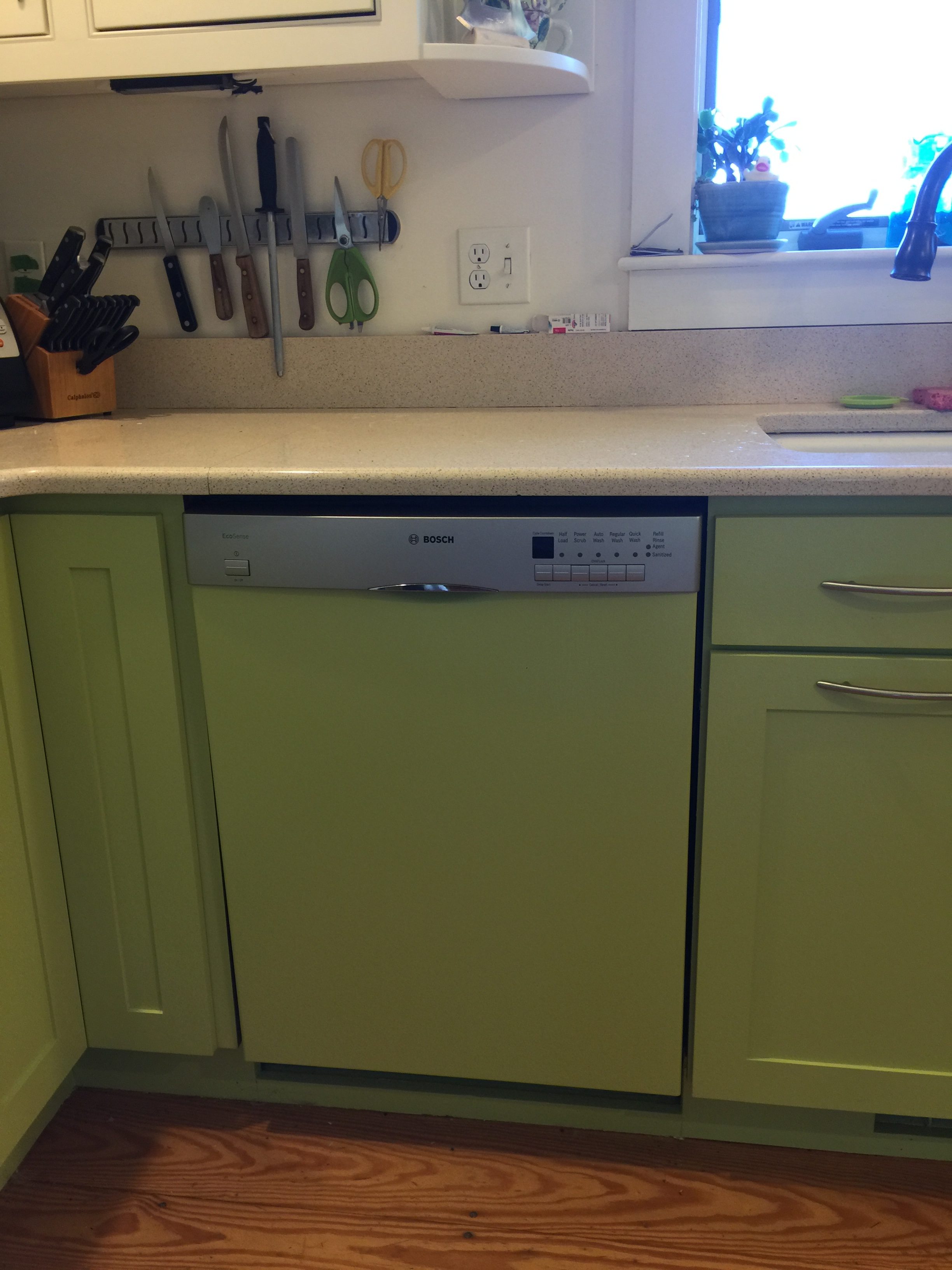
Installed this morning…I just about squealed I was so excited! The finish isn’t perfect, using Floetrol in the paint (thank you again Deirdre) was essential, and next time I will buy cheesecloth and strain the paint. But it is as good as I can get it in this environment, and I am thrilled with the final results.
The FINAL, all-fixed-up version… one more time.
Here are some of my FAVORITE things in the new kitchen:
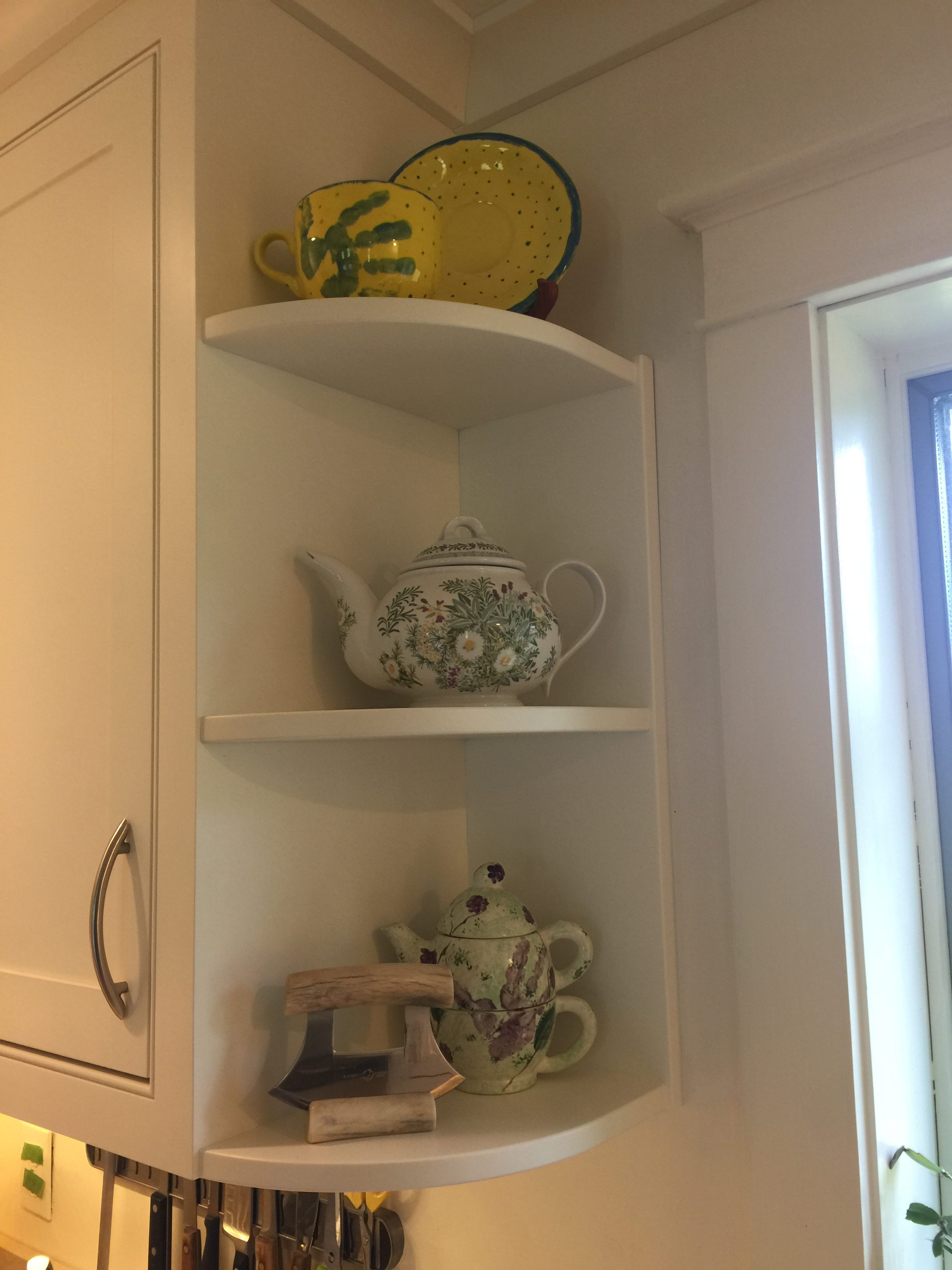
I LOVE these rounded shelves. My gramma had them in her Southern California bungalow home. I designed them into our dream home in Friday Harbor and loved them there. And I love them here. That is Joshua’s about 8-year-old hand on the yellow cup, a UK National Trust Teapot on the middle shelf I ordered while living in Gabon circa 1990, and Eli’s about age 4 hand on the cup/teapot thingie on the bottom shelf, with the Ulu bought in Alaska last year and used often.
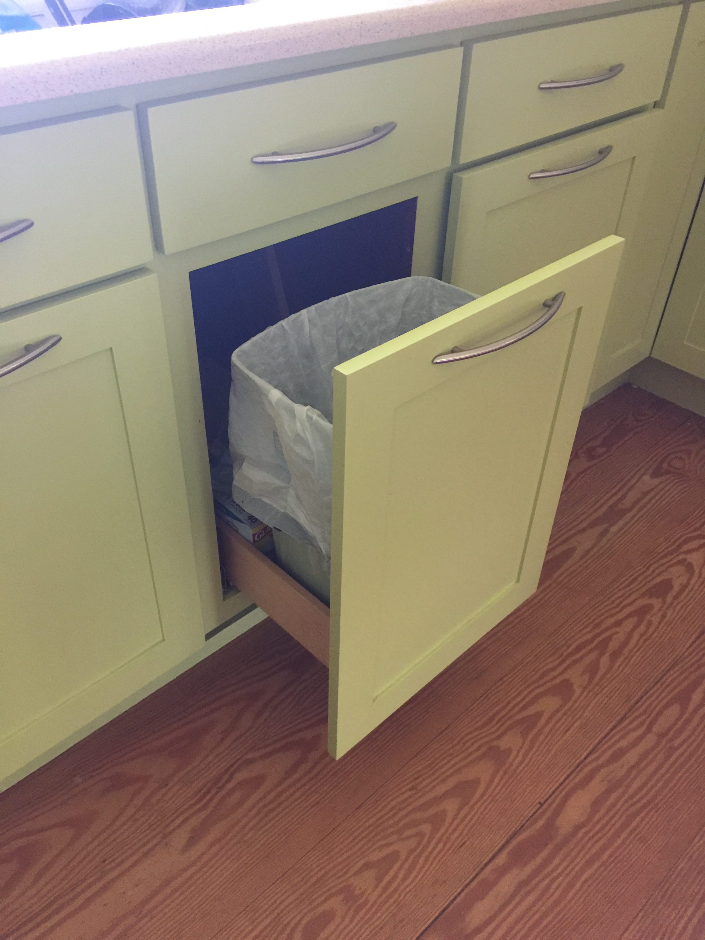
The Pine Ridge guys asked if I wanted a pullout for trash. Um yeah! I had initially looked at DIY options, but they wouldn’t work with the old cabinet base. They made a box to fit and installed bump out glides. I can use my toe or leg to open the garbage–ya know how you crack an egg then realize you didn’t get out the trash can? No longer an issue! Because of this feature, we opted to put the pulls horizontally on the three doors under the sink.
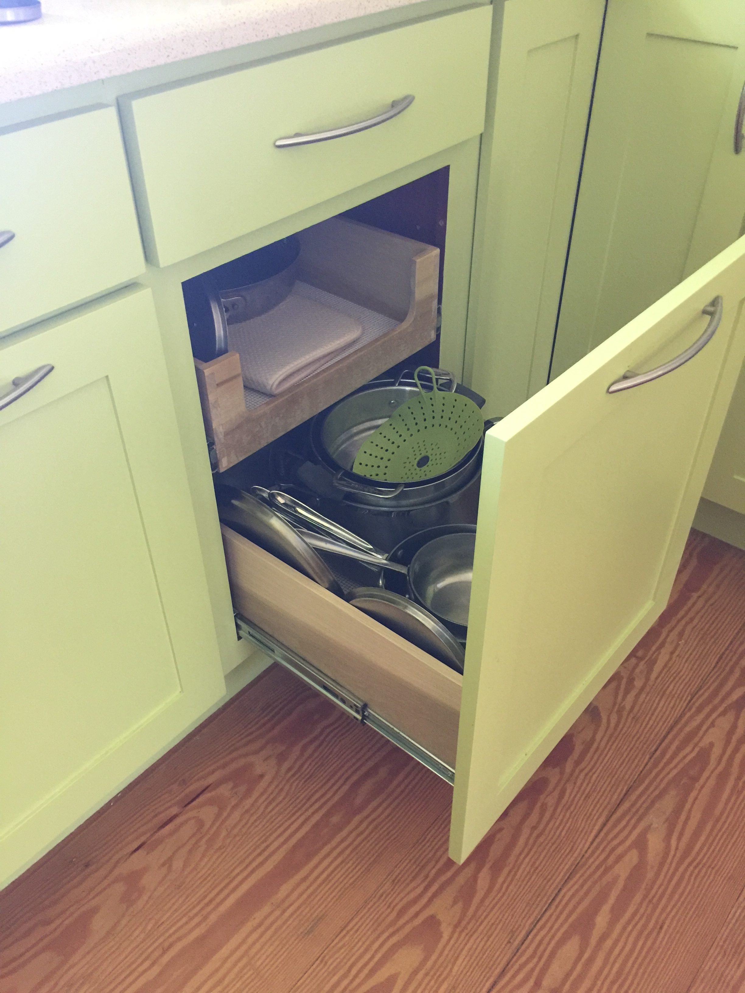
When JB retrofitted the cabinets to install a dishwasher in 2011, we had him build two pull-outs for the pan cupboard. We decided to screw the new door to the pull-out so it functions similarly to the trash, but because we used the existing hardware you pull it (not bump)…which you can do with one finger!
Speaking of retro-fitting….
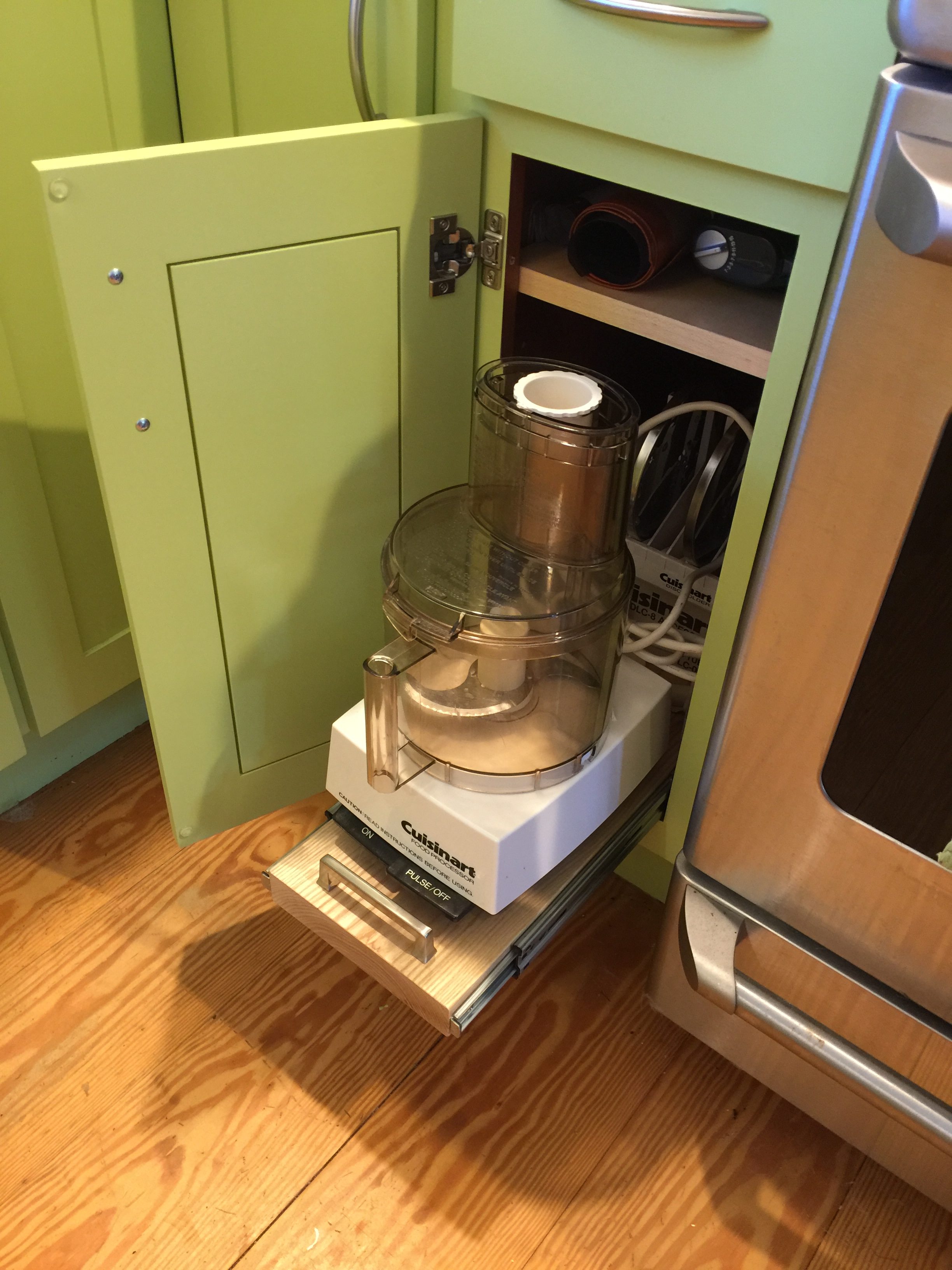
This cabinet opening is a skinny 8 1/2″. Useless for almost anything other than cookie sheets (which are on the other side of the kitchen in the mirror image cabinet). It originally had a half-deep shelf. Useless. So I asked them to make a pull-out for the bottom and a full depth shelf. The shelf is installed at the very top and my rolling pin, stick blender and rolled-up non stick cookie mats are in there. Easy to pull out and return. The guys found a slab of wood and installed it on the bottom with glides. We used a handle I had ordered but decided wasn’t the right style to pull it out. Now I can get the Cuisinart in and out easily without knuckle mashing.
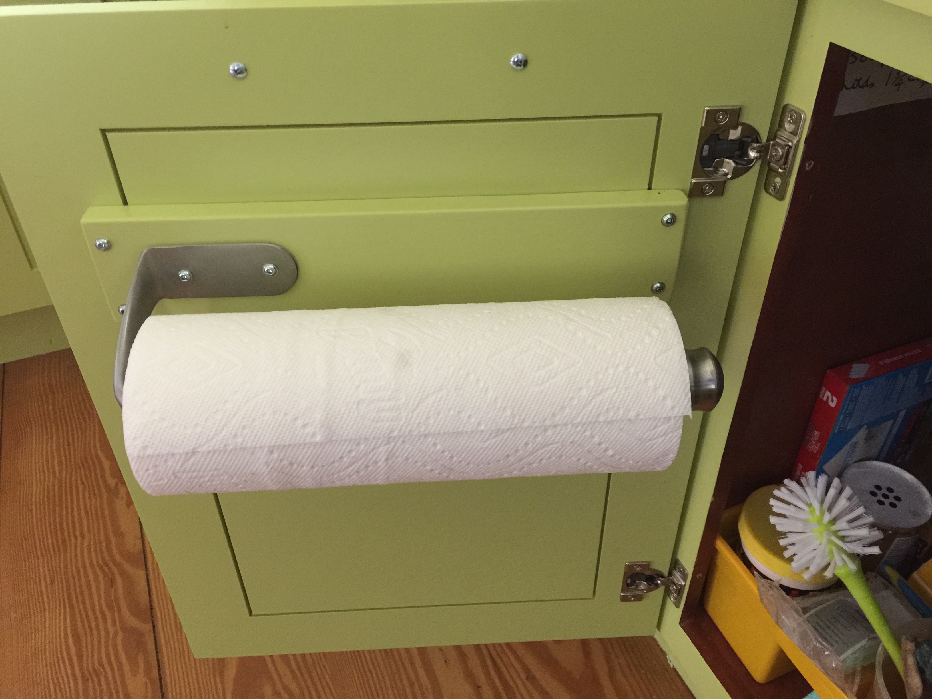
Hidden, accessible, perfect! You’d think I would want to take on something as easy as a paper towel holder installation. But I was leery of screwing through my new doors. Nate has a brilliant way to help with that: a brace of wood that extends to the thick frame part of the door, then apply the holder. The latter I ordered from amazon and has a ratchet so you can pull and tear off a single sheet one-handed. It really works. Link here. I painted the wood green to match before Nate installed it. LOVE!
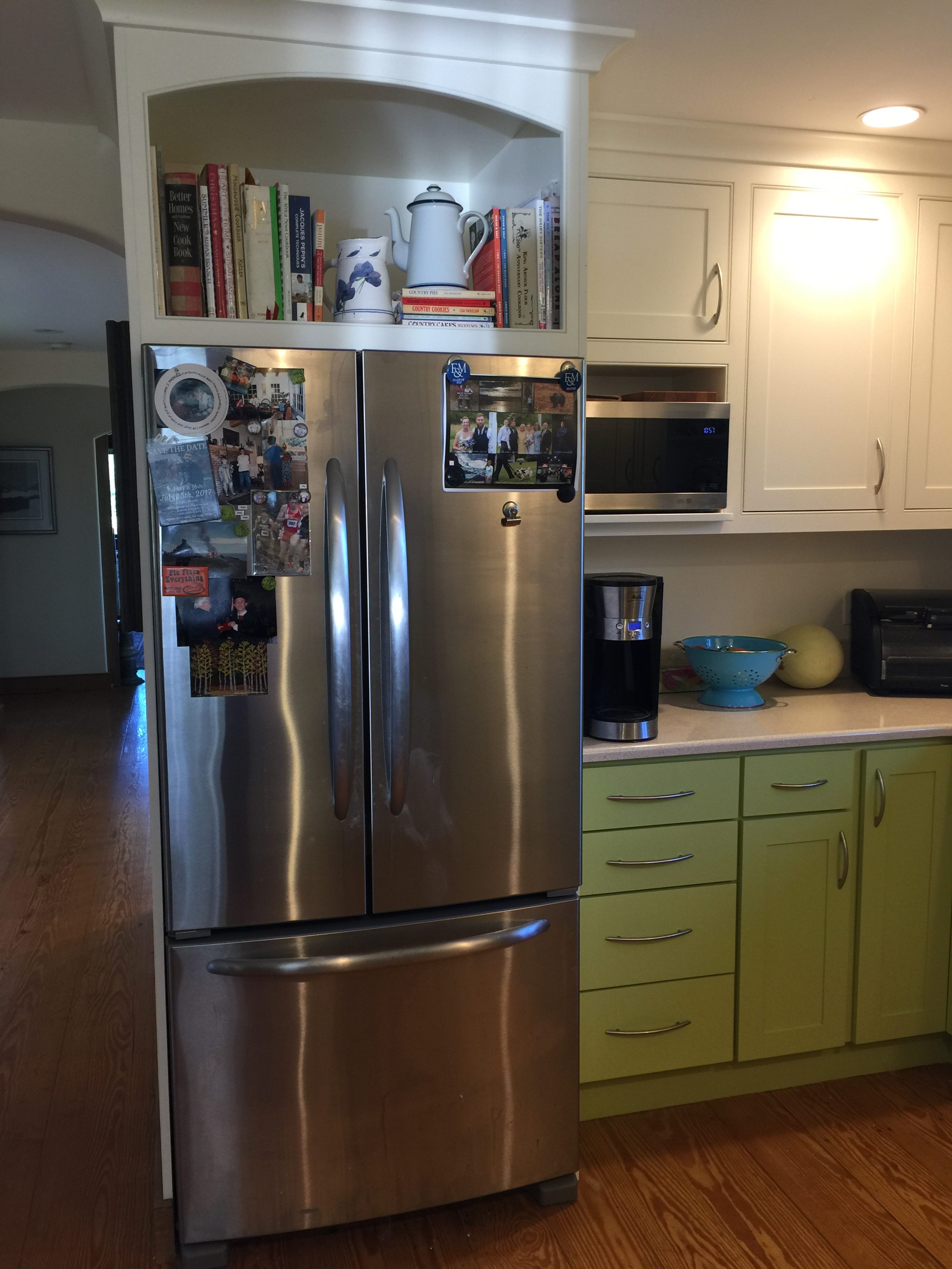
A “leg” on either side of the fridge makes it look like the fridge is built-in, extends the hallway visually. Before, it was just the side of the fridge next to the hall–not so attractive. Pine Ridge milled baseboard trim to match, I stained it, they installed it. I did drywall mud to join the new panel to the existing hall and when I painted this summer, it looks seamless.
I LOVE that they were able to match the curve on the top of the cabinet that I requested to the curve on the top of the hallway. We planned to ditch the old big microwave (which died shortly after installation of the cabinets), so had a smaller opening made to get a small microwave OFF the countertop. Cereal goes in the cupboard on top. And OH…all the hinges are soft-close. Didn’t think I needed them, but it is what Pine Ridge does standard. LOVE them.
So what was going to be a short post on painting the dishwasher panel has turned into a long, LONG post. But I hope that you find some ideas that you could use…some of the last “my favorite” bits especially can be done to an existing kitchen without too much fuss. To my local peeps, I can HIGHLY recommend Pine Ridge. They are fair in their pricing, honest, hard working, superior quality, responsive. Like I said: If I ever win the lottery, they are getting some of the proceeds whether I build a new house or do “pie in the sky” upgrades to this one. I am a HAPPY CAMPER!