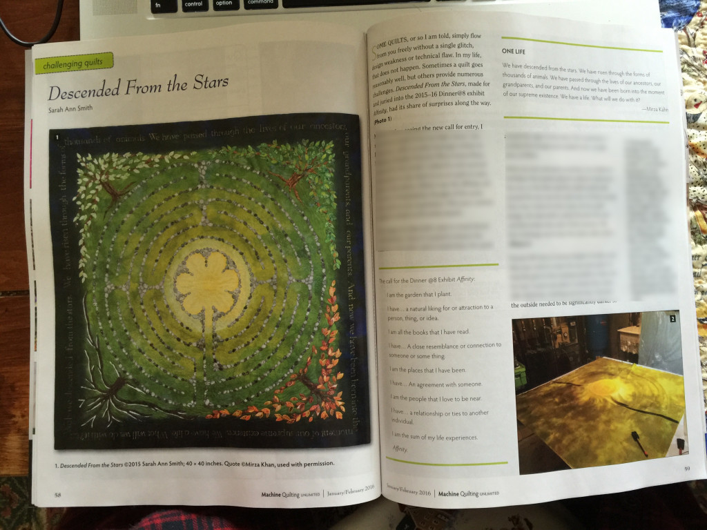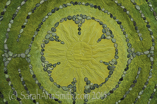
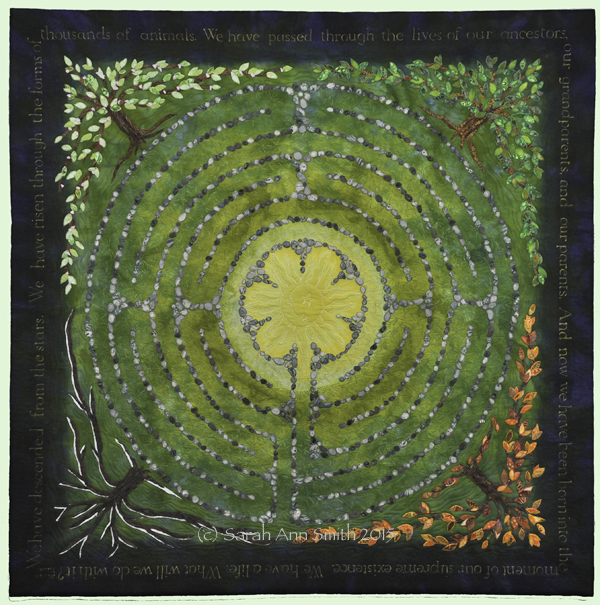
The sun in the center of Descended From the Stars
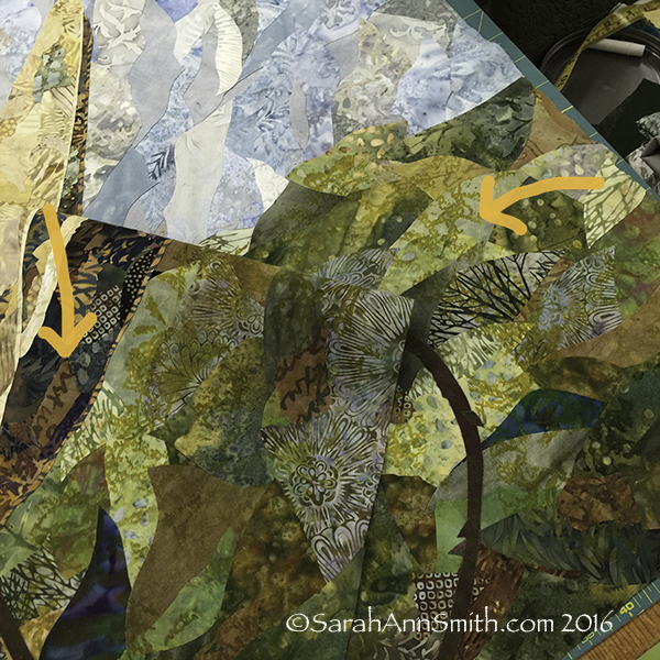
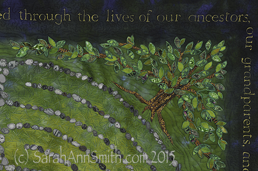
When I left on in my last post about this quilt, I had shared the dyeing process and the stones and lettering. Next, I fused trees in the four seasons into the corners. I distorted the shape so the tree canopy served as a frame. I had thought initially I might need an inner border, perhaps couched yarn or stitching of some sort, but the shape of the tree worked so well I didn’t need anything extra. As I did with the stones, I cut out leaves, LOTS of leaves, separating the colors into the ice cube tray so I could place them carefully.
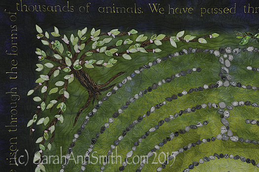
Detail, upper left corner, Spring Tree of Life. Each of the leaves is free-motion stitched with several rounds of thread on each leaf. The nice part about doing this at the top stage is that I could use the scissors on my Janome 15000. I didn’t have to bury thread tails!
Detail, top right, Summer Tree of Life.
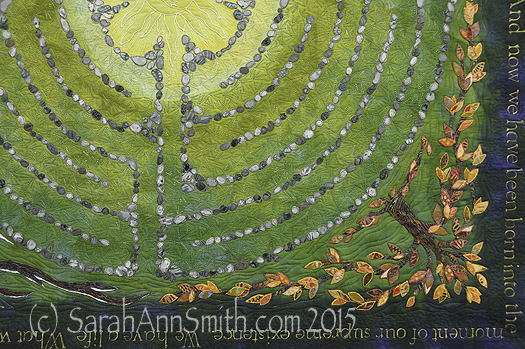
Detail of the lower right corner, showing the autumn tree of life.
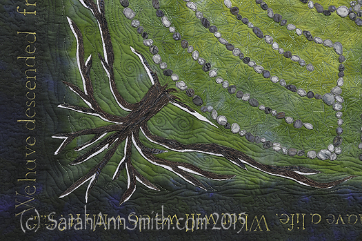
Detail of the lower left corner, with the winter tree kissed by snow.
I did the stitching around the stones and on the trees, including the leaves, at the top stage with stabilizer underneath. (See my post here to learn more about my current article for Machine Quilting Unlimited on the Fourth Layer–stabilizer– for densely thread painted quilts.) I removed the stabilizer everywhere except for under the center because I knew I would want to quilt that area more densely than the rest of the quilt.
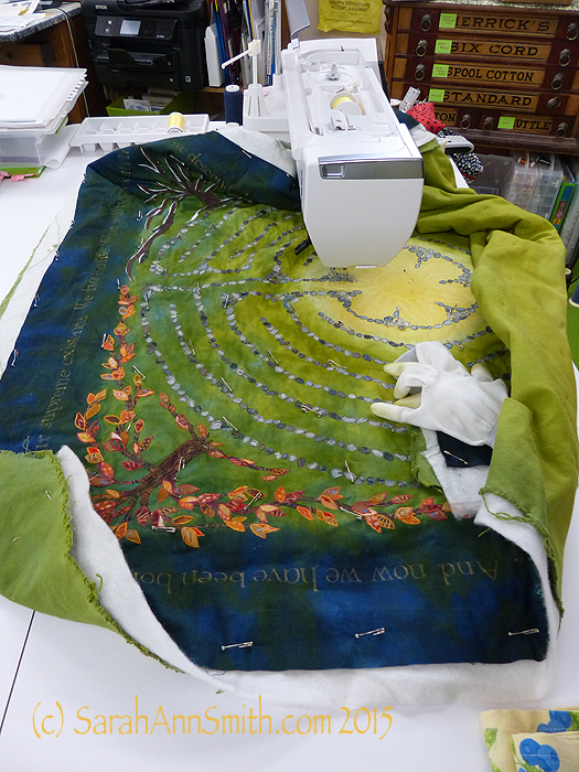
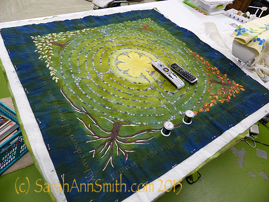
Here I have begun quilting. You can see the custom-dyed cotton duck on the back. The use of heavier cloth helps keep the quilt flat and stable; it also helps minimize shrinkage. The final piece had to be 40 x 40 inches, and I wanted to have a balanced amount of blue on both sides of the lettering, so I needed to control the shrinkage that happens with dense quilting.
Next,
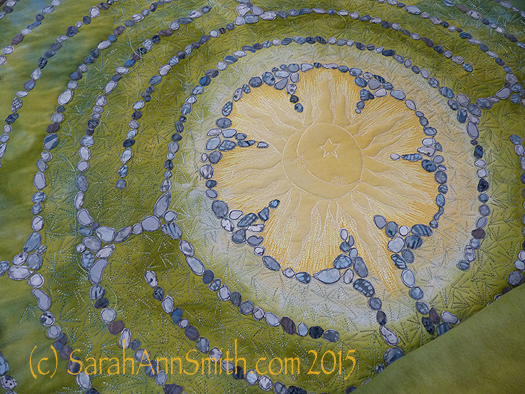
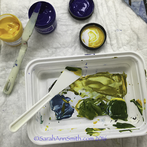
Superior Threads (Thank you Bob and Heather Purcell!) has come out with some tone-on-tone variegated threads. I have been pestering Bob for YEARS to make threads like these as I prefer blendy to contrasty. I ordered up all of the new earth-tone blendy variegateds in the Fantastico line and used them. I began with a light green blend in the first row around the sun, switched to another in the next to rings, and then a third in the fourth ring that you see here. If you look at the left, you can see how I snuck some of the current thread color into the next ring to get even more color blending.
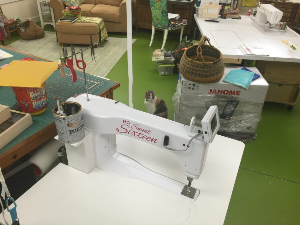
Then, I had to decide what threads to use in the dark areas. My sewing tables (two back to back) are each 24 inches, so I have a nice, HUGE flat surface to support the quilt as I work.
Choosing thread: dark, pine-y green and deep blue.
With all the manipulation, I realized that some of the ink had rubbed off, despite being REALLY careful to heat set it according to directions. I wrote immediately to friends Judy Coates Perez and Susan Brubaker Knapp to seek guidance. Judy had only used the regular colors, not the metallics. And Susan had an article in the just-out issue of Quilting Arts about lettering, including these inks! She too discovered that the metallics seem to “shed” a bit.
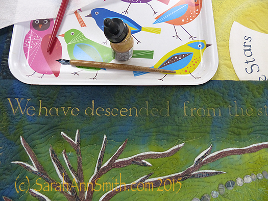
After quiting, some of the bling had rubbed off my quilt, so I had to do it AGAIN! You can see where I have inked over the letters and what is left to re-do.
After re-inking and heat setting, I tested on my scrap cloth several products to seal the ink including GAC 900 (a textile medium that one adds to paint), a UV Coating, matte gel medium, and Krylon Spray Fixative which says it is acid-free, archival and safe on fabric. Only the Krylon didn’t leave tell-tale signs that it had been used. So I carefully masked off the rest of the quilt, leaving only the lettering area exposed and sprayed the Krylon on it (stinky!) in hopes that will help prevent the mica flakes in the gold ink from coming off.
I was nearly done, except that I didn’t really care for the multiple layers of thread I had used stitching the sun. Picking it out did NOT appeal to me. So I trekked down to Clementine fabrics in Rockland and bought some perle cotton in the right color.
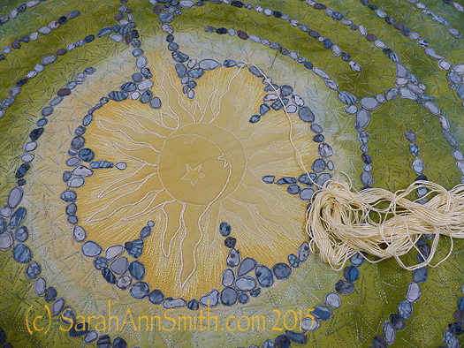
I wasn’t happy with the way the stitching looked, so I couched perle cotton on top of the outline of the sun. MUCH better! You can see the difference in this half-way-through shot.
At last, it was nearly DONE! Time for facings, sleeve and label.
The back side of the quilt. By dyeing the back to correspond with the front, the quilting design shows up on the back as it does on the front.
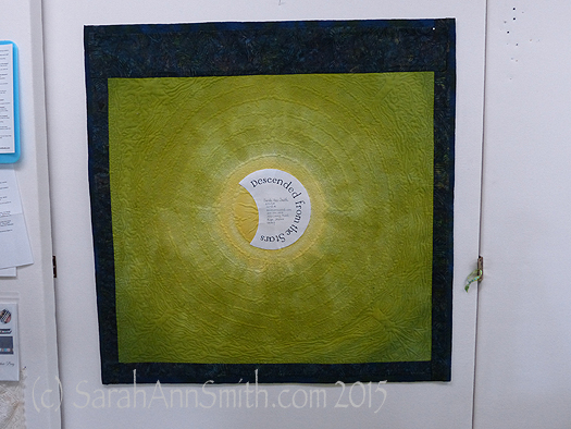
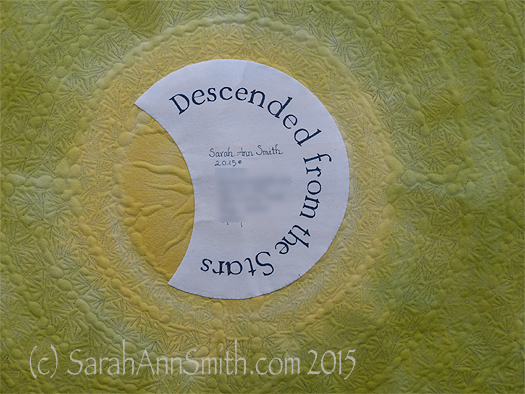
And I couldn’t resist the temptation to place a moon behind the sun as my label. One more time with the dip pen!
The End–the label is on, the sleeve is done, the facings are stitched!
(c)Sarah Ann Smith 2015; quote (c) Mirza Khan, used with permission
This quilt will be for sale–another reason I opted to not include a lot of personal details in the quilt. As I said before, I am happy!