email Youtube

Home
Galleries
Blog
Workshops & Calendar
Store
Resources
About
Contact

Archive for the ‘Surface Design’ Category

Photoshop–Finding the Stamp Tool, Thermofax screens

Tuesday, March 28th, 2017

WAHOOOO!   I’ve discovered something almost as cool as the holy grail!  At least if you want to make thermofax screens…..and yes, you may liberally share the link to this blogpost so that others may learn and play with paint.

If you want to find out how to do this the easy way, keep reading!

So I was on a quest for my next project:  creating thermofax screens using my new (to me) thermofax machine.  I remembered a tool I loved in Photoshop Elements (PSE), but it wasn’t in Photoshop (PS–full thing).  How could that be?  So I opened up my 2010 PSE software and discovered the tools I liked were called Stamp and Photocopy, in Sketches under Filters.   So I googled around to find out how to create actions in full PS to do what those tools did.  Turned out I didn’t need to–Adobe included those tools but then HID THEM.   So here is how to find and use these awesome tools.

Note:  I realize this will sound like gibberish unless you are into PSE or PS….if you aren’t, just skip!  But this is SO AWESOMELY COOL AND USEFUL for those of us who want to make Thermofax screens and use Photoshop! So if you are interested, read on!

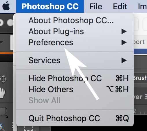
First, you need to install all of the Filters in the Filter Gallery.  Yeah right.  Not as hard as it sounds.  Under Photoshop, find and click on Preferences.

First you need to find Plug-Ins and load the Sketching filters.

That will cause a pop-out to appear; look for and click on Plug-Ins:

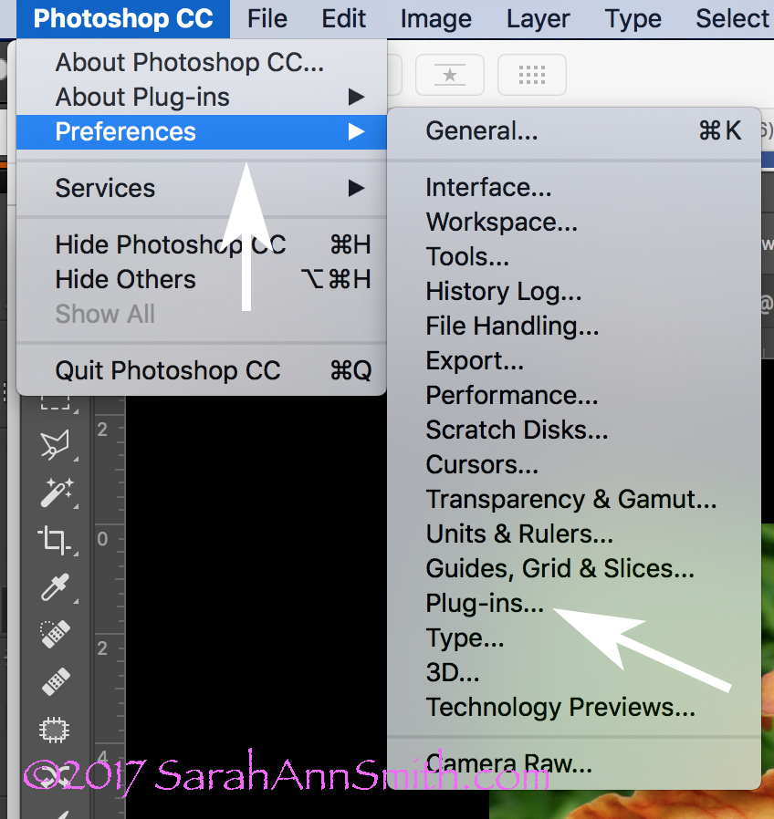
The flip-out widow reveals Plug-Ins. Click on it.

When you click on Plug Ins this window opens up.  Check the box to show ALL Filter Gallery Groups and names.  Sheesh….why was this not the default?????

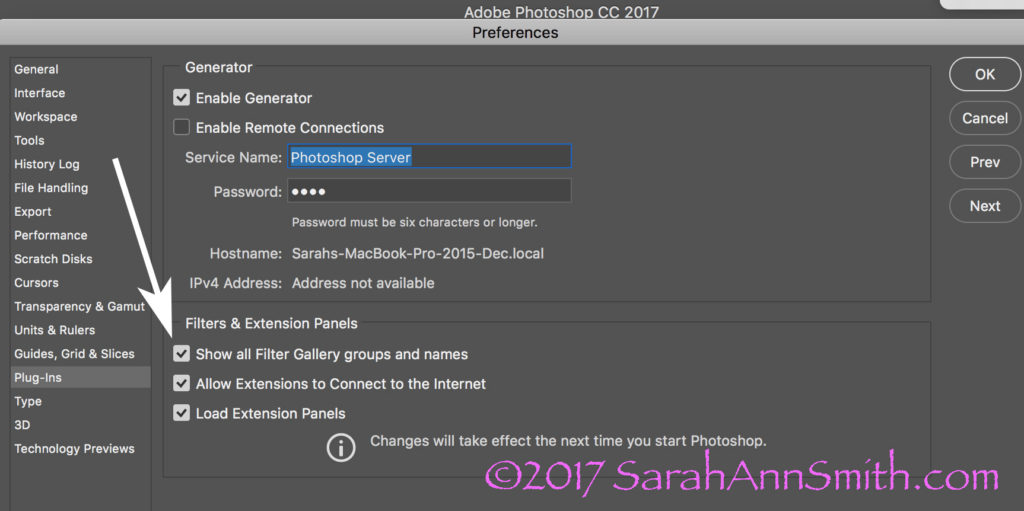
This window will pop up. The box at the bottom of the arrow will be blank. WHY Adobe? WHY? Check it and the wonder and joy of more filters will appear in your PS workspace.

Here’s a colorful photo I use in my Quilting the Garden workshops.  NOTICE the COLORS in the Foreground and Background boxes on the bottom left corner.

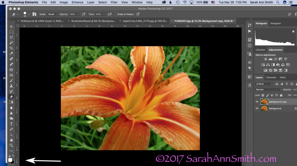
Let’s pretend I want to convert this image to black and white to create a Thermofax screen.  Take note of the little Foreground/Background boxes at the bottom left.  They are important.

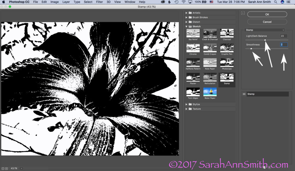
Boxes are important!   The next step is to USE the Stamp tool.  Look across the top of your PS window.  Click on Filter, then Sketch, then Stamp.

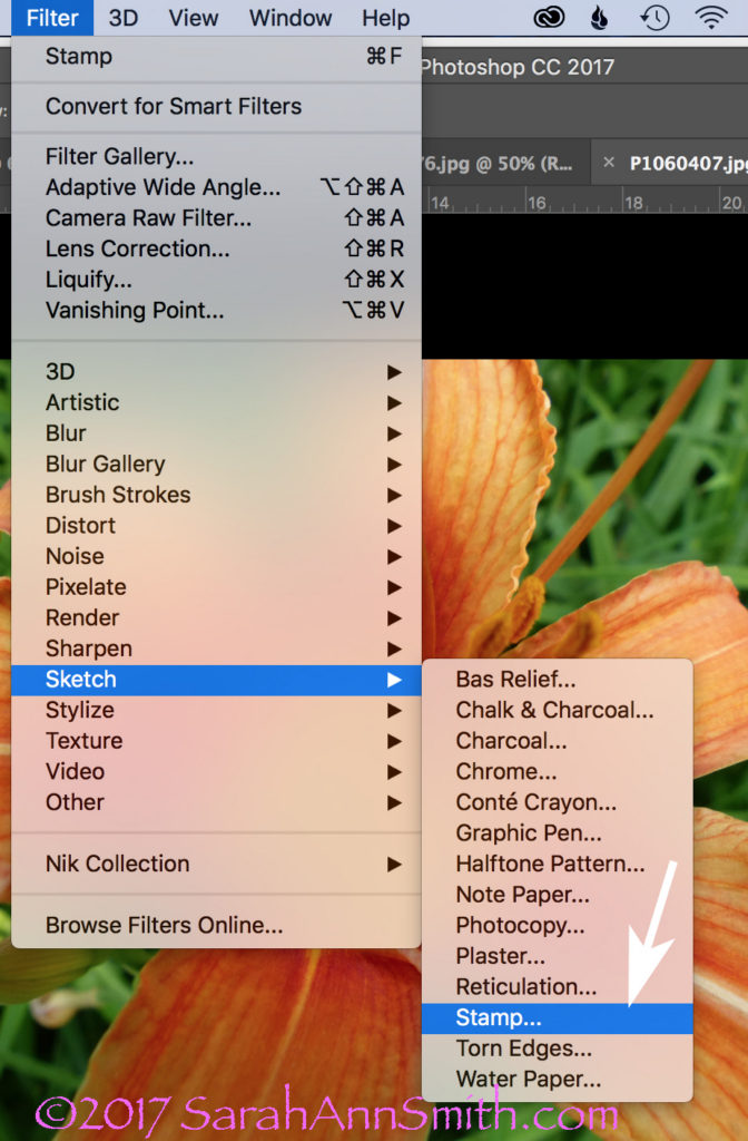
To use the Stamp tool, go to Filters (on the menu across the top), select Sketch, Then Stamp (see arrow).

When you click on Stamp, the following window opens.  But I ended up with Grey and Black.  WHY?  It used to be black and WHITE, right?  So what was I messing up?

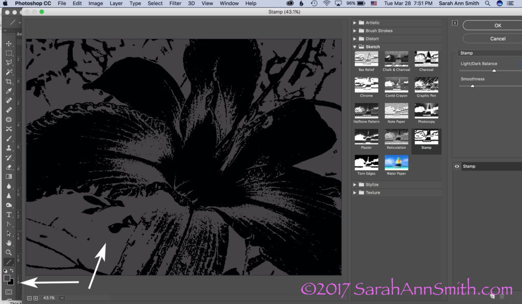
This was not what I had in mind. Then I had a lightbulb moment (who me? I know, rare, but it does happen sometimes). Remember those BOXES?

YEP…..the Foreground color, due to something I’d done not so long ago, was dark grey, not white.  Aha!  A glimmer of light (pun totally intended).  Groan.  Remember, Boxes are Important!  I switched the foreground color from dark gray (above) to WHITE.  And lookit what I got!

Drum roll……stamp is once again black and white!  Notice the arrows on the right:  use the sliders or the number boxes to adjust the level of black/white and the degree of detail.  Now isn’t it a whole lot easier to get to this point in a hurry, THEN fine tune with the eraser tool to clear out extraneous yuck?

Those arrows on the right point to fun things to play with to adjust the amount of black, white, detail, etc.  But the realization that the foreground/background colors could make a mess make me think….hmmmm……COLOR!  What would happen if….

BUT, one more tidbit about what you see in the window.  The one below looks like a lot of nothin’, right?  That’s because is it at 100 percent, which doesn’t fit.

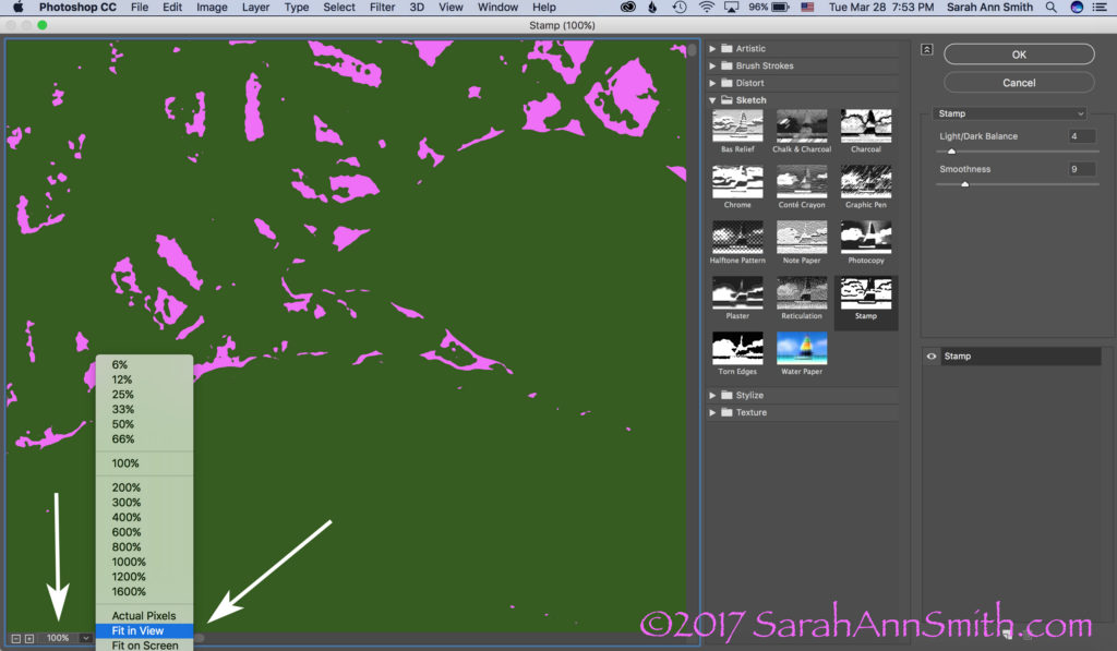
Then I realized I could play with COLOR. When you open this window, however, it opens at 100 percent. I prefer the “Fit In View” option, so check out the arrow once again.

If you click on the little down arrow to the right of 100%, you can switch it to Fit In View or whatever you like to use.  For my pea-brain, it’s a whole lot easier to figure out what I’m doing when I can see the entire picture, like this:

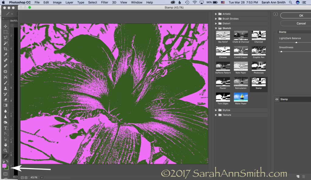
Then you can create a really bizarre two-tone hot pink and green image. Just what you always wanted, right? Not! But you can see the potential, right?

Let’s just say I am ridiculously happy.   I asked for help on FB today and got it…THANK YOU Lynn Krawczyk, Lyric Kinard and Leslie Tucker Jenison among others.   Then I — having learned this lesson before — googled around for online information, including the forum at Adobe, which is where I found the clue that the Sketch filters WERE in full PS.   But I didn’t know the terminology (like where to find the Line tool to create an arrow to illustrate these screen shots), so YouTube search box to the rescue.

SQUEEEEE!     I don’t need to use my antique PSE, I can use full PS and not have to move between the two, AND (best of all) I have my easy-peasy Stamp tool back!   Time to CELEBRATE!  Lynn, I may just have to fling some paint!  And now that I have written this up to share ASAP in thanks, I am going to celebrate, perhaps with chocolate! Or maybe Talenti.  Or some culinary Venn diagram that involves the intersection of Talenti, banana and chocolate.  SQUEEE!

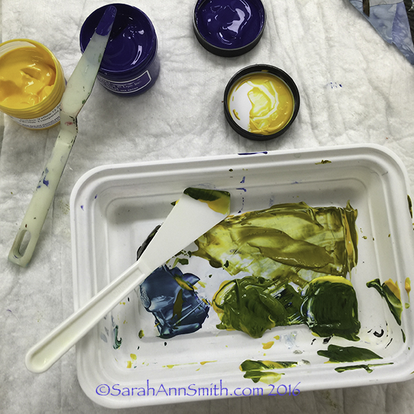
And a PS, thanks Whiskers for asking the questions:  Hi Whiskers!  Yes, I will do a blogpost eventually on thermofax screens.   Not sure when, so the quick response is the Thermofax machine is the predecessor to today’s photocopier.  They were used in the 50s/60s in the office to copy stuff.  They are no longer made (consequently they cost a fortune, it has taken me a decade to save up and make the purchase, $1350! If you buy one be sure you get one that works with the mesh, not just the purple ditto masters!)…but folks have figured out if you use an image with carbon in the ink (laser printer, some inkjet printers, carbon ink, lead pencil) and you run it through the machine with a plastic-backed mesh, the plastic melts where there is carbon.  When you separate the two sheets (paper and plastic mesh) you end up with a screen.  Tape up the edges, then push the paint through.  I actually just taped a segment for Quilting Arts TV on this!


Teaching at Quilt Festival Houston–sign up soon

Sunday, October 2nd, 2016

Online signups for classes at International Quilt Festival in Houston end on October 7th !!!!! I’d love to see you in one of my classes.  Here’s my very busy line up!

Screen Shot 2016-07-19 at 4.39.58 PM

I’m thrilled to be so busy and hope to meet many of you.  Here’s a blogpost about The Nest, a new and totally fun half-day (or full day if a guild wants a full day) class, it’s a blast and the extensive kit/materials provided make it easy to prep.  I’m also teaching my intermediate/advanced Tame Fussy, Fiddly Threads for Machine Quilting class for those of you who want to learn more about the “cranky” threads–that really aren’t cranky if you just learn how to use them!

Houston has revamped the catalog a little bit. There are now (yeah!) pictures in the catalog (not just online) and there are weblinks so you can go to my website for the FULL supply list and handouts.   To shorten the process, if any of the above look good to you, you can go to my class listings page here for info about my classes.  Each description has a hotlink to the pdf Supply list.  If I have blogged about a class, that also is in the description.  You can also find all my supply lists in one place on my Resources page.  If you click on “Resources,” Look at the jump links at the top.  Click on Class Supply Lists and it will jump you down the page (instead of having to scroll down).

Here are some more blogposts about the classes I’m offering in Houston:

Decorative Stitch Applique here and here

Easy-Peasy Inside-Out Bag here

Can’t wait to see you in Houston!


The Nest: a new approach to surface design

Saturday, July 30th, 2016

For most folks who are in to surface design, the surface design is the goal.  For me, the surface design is to create cloth to use in my collaged artwork.  Rather than hunt (and hunt and hunt) for fabric that works, I make my own, using both my own hand-dyed fabrics and commercial fabrics, especially batiks.  In my new class, The Nest, I teach this project as a way to learn several surface design techniques and get you started.  I’ll be teaching this class for the first time (officially) at International Quilt Festival, Houston (class link here) on Thursday afternoon, Class 496.

The main class project for my class The Nest:  a new approach to surface design.

The main class project for my class The Nest: a new approach to surface design.  Right click photo to view a bit larger.

I provide a kit (with a fee) with paint, brush; hand-dyed floss, perle cotton and cheesecloth; Sarah’s custom thermofax screen (yours to keep) and more.  You provide the fabric and willingness to play!  The class can be either half or full day; in Houston, it is a half day class.
Since Houston is THE big quilting event in the world, it pays to prepare, so thanks to my local peeps, I did a “test run” on the class to work out timing and make sure everything was clear.   THANK YOU to my Coastal Quilters for helping me out…you were great, and the class helped me immensely (like I can only fit two projects, not 3, in a 3-hour class!).

aside

A detail of the project, and some intermediate steps

Step one in the class is to get your paint!

Step one in the class is to get your paint!  You can see a thermofax screen soaking in the basin.

Step one is to print your plain cloth with my custom Queen Anne's Lace screen.

Step one is to print your plain cloth with my custom Queen Anne’s Lace screen.

You can go wild and make this project totally your own

You can go wild and make this project totally your own

Or you can follow the project.  This student is on her second layer, starting to create her nest.

Or you can follow the project. This student is on her second layer, starting to create her nest.

While the paint dries on the Nest, you work on a “free play” exercise, then switch back and forth as the layers dry.  You can make your own stamps (supplies provided), use materials I bring to share, or bring your own from home.

Student stamps.  I think I need to make a flying geese stamp!

Student stamps. I think I need to make a flying geese stamp!

I LOVE this student piece.  It would work perfectly as a background or cut and used in a naturescape.

I LOVE this student piece. It would work perfectly as a background or cut and used in a naturescape.

And another layer.  You can go as simple or as busy as you like.

And another layer. You can go as simple or as busy as you like.

Jim Vander Noot is an experienced art quilter and I LOVE this layered piece.  He began with writing, then added the thermofax screen of keys (from Lyric Kinard, LyricKinard.com, she also makes custom screens)

Jim Vander Noot is an experienced art quilter and I LOVE this layered piece. He began with writing, then added the thermofax screen of keys (from Lyric Kinard, LyricKinard.com, she also makes custom screens)

Jim added more layering, and here's the last time I saw this.  LOVE IT.

Jim added more layering, and 

here's the last time I saw this. LOVE IT.

here’s the last time I saw this. LOVE IT.

My thermofax screen designs are available at Fiber on a Whim, I’ll have some for sale in class, and Jan Girod and Kristin Rodriguez (who are Fiber on a Whim) will be vending in a booth on the show floor at Houston.  Artists have my complete permission to use my screens in their artwork, including works that will be sold or exhibited (but of course you can’t copy my designs and sell them…you know how it works!).

Student 1

Student 1, work in progress–if any of my CQ peeps remember whose work this is, please let me know so I can attribute it!

Student 2, work in progress

Student 2, work in progress

Student 3, Linda Satkowski finished her nest!

Student 3, Linda Satkowski finished her nest!I love the fluffy white wool bits that totally look like feathers.  One student even suggested you can BUY feathers–they are readily available at stores that supply fly fishermen.  COOL idea!  Thank you so much Linda for finishing this and letting me share it.  GREAT job!

So I hope you’ll be inspired by my local quilty friends–I sure am!   And I hope you’ll be able to join me in Houston (or have your guild hire me to come to teach YOU at home!).  See you in November!


Descended From the Stars, Part 3

Wednesday, July 20th, 2016
The sun in the center of Descended From the Stars

The sun in the center of Descended From the Stars

When I left on in my last post about this quilt, I had shared the dyeing process and the stones and lettering.   Next, I fused trees in the four seasons into the corners.  I distorted the shape so the tree canopy served as a frame.  I had thought initially I might need an inner border, perhaps couched yarn or stitching of some sort, but the shape of the tree worked so well I didn’t need anything extra.   As I did with the stones, I cut out leaves, LOTS of leaves, separating the colors into the ice cube tray so I could place them carefully.

Detail, upper left corner, Spring Tree of Life.

Detail, upper left corner, Spring Tree of Life.  Each of the leaves is free-motion stitched with several rounds of thread on each leaf.  The nice part about doing this at the top stage is that I could use the scissors on my Janome 15000.  I didn’t have to bury thread tails!

Detail, top right, Summer Tree of Life.

Detail, top right, Summer Tree of Life.

Detail of the lower right corner, showing the autumn tree of life.

Detail of the lower right corner, showing the autumn tree of life.

Detail of the lower left corner, with the winter tree kissed by snow.

Detail of the lower left corner, with the winter tree kissed by snow.

I did the stitching around the stones and on the trees, including the leaves, at the top stage with stabilizer underneath.  (See my post here to learn more about my current article for Machine Quilting Unlimited on the Fourth Layer–stabilizer– for densely thread painted quilts.)  I removed the stabilizer everywhere except for under the center because I knew I would want to quilt that area more densely than the rest of the quilt.

Here

Here I have begun quilting.  You can see the custom-dyed cotton duck on the back.  The use of heavier cloth helps keep the quilt flat and stable; it also helps minimize shrinkage.  The final piece had to be 40 x 40 inches, and I wanted to have a balanced amount of blue on both sides of the lettering, so I needed to control the shrinkage that happens with dense quilting.

Next,

asdfa

Superior Threads (Thank you Bob and Heather Purcell!) has come out with some tone-on-tone variegated threads.   I have been pestering Bob for YEARS to make threads like these as I prefer blendy to contrasty.  I ordered up all of the new earth-tone blendy variegateds in the Fantastico line and used them.  I began with a light green blend in the first row around the sun, switched to another in the next to rings, and then a third in the fourth ring that you see here.  If you look at the left, you can see how I snuck some of the current thread color into the next ring to get even more color blending.

Then, I had to decide what threads to use in the dark areas.  My sewing tables (two back to back) are each 24 inches, so I have a nice, HUGE flat surface to support the quilt as I work.

asdf

Choosing thread:  dark, pine-y green and deep blue.

With all the manipulation, I realized that some of the ink had rubbed off, despite being REALLY careful to heat set it according to directions.  I wrote immediately to friends Judy Coates Perez and Susan Brubaker Knapp to seek guidance.  Judy had only used the regular colors, not the metallics.  And Susan had an article in the just-out issue of Quilting Arts about lettering, including these inks!  She too discovered that the metallics seem to “shed” a bit.

After quiting, some of the bling had rubbed off my quilt, so I had to do it AGAIN!

After quiting, some of the bling had rubbed off my quilt, so I had to do it AGAIN!  You can see where I have inked over the letters and what is left to re-do.

After re-inking and heat setting, I tested on my scrap cloth several products to seal the ink including GAC 900 (a textile medium that one adds to paint), a UV Coating, matte gel medium, and Krylon Spray Fixative which says it is acid-free, archival and safe on fabric.  Only the Krylon didn’t leave tell-tale signs that it had been used.  So I carefully masked off the rest of the quilt, leaving only the lettering area exposed and sprayed the Krylon on it (stinky!) in hopes that will help prevent the mica flakes in the gold ink from coming off.

I was nearly done, except that I didn’t really care for the multiple layers of thread I had used stitching the sun.  Picking it out did NOT appeal to me.  So I trekked down to Clementine fabrics in Rockland and bought some perle cotton in the right color.

I wasn't happy with the way the stitching looked, so I couched perle cotton on top of the outline of the sun.  MUCH better!  You can see the difference in this half-way-through shot.

I wasn’t happy with the way the stitching looked, so I couched perle cotton on top of the outline of the sun. MUCH better! You can see the difference in this half-way-through shot.

At last, it was nearly DONE!  Time for facings, sleeve and label.

The back side of the quilt.  By dyeing the back to correspond with the front, the quilting design shows up on the back as it does on the front.

The back side of the quilt. By dyeing the back to correspond with the front, the quilting design shows up on the back as it does on the front.

And I couldn’t resist the temptation to place a moon behind the sun as my label.  One more time with the dip pen!

The End--the label is on, the sleeve is done, the facings are stitched!

The End–the label is on, the sleeve is done, the facings are stitched!

(c)Sarah Ann Smith 2015; quote (c) Mirza Khan, used with permission

(c)Sarah Ann Smith 2015; quote (c) Mirza Khan, used with permission

This quilt will be for sale–another reason I opted to not include a lot of personal details in the quilt.   As I said before, I am happy!

Milkweed No. 2, Part 2

Sunday, February 7th, 2016

A few days ago, I shared with you the happy news that Milkweed No. 2 is heading to Australia and New Zealand to be a part of “A Matter of Time,” and exhibit curated by Brenda Gael Smith.  Brenda is blogging sneak peeks on the blog.

Milkweed pod, seeds and silks detail

Milkweed pod, seeds and silks detail

SASmith.MilkweedNo2.Detail2_DSC3256 I thought I’d share a few more bits of my process, especially because I will be demoing and teaching a class at Houston that incorporate these techniques.

In an effort to reduce the labor-intensive process of quilting the surface of my works at 1/8" apart over nearly the entire surface, I've started adding some surface design.

In an effort to reduce the labor-intensive process of quilting the surface of my works at 1/8″ apart over nearly the entire surface, I’ve started adding some surface design.

A couple years ago, I designed some Thermofax screens and had them made by Jan and Kristen at Fiber on a Whim.  They asked if I would be interested in selling the designs, and I quickly said Yes!   Here are three of my favorites:

On the photo above, I have used textile paint and my "celery" screen to help blend the collaged batiks and hand-dyes

On the photo above, I have used textile paint and my “celery” screen to help blend the collaged batiks and hand-dyes.

My alphabet screen was used on some rather plain brown hand-dyed (by me) fabric then cut into bits to use in the quilt in addition to using batiks.

My alphabet screen was used on some rather plain brown hand-dyed (by me) fabric then cut into bits to use in the quilt in addition to using batiks.

I mixed up some transparent textile paints--I use both Jacquard and ProFab--to screen print over the already collaged/fused background pieces.

I mixed up some transparent textile paints–I use Versatex, Jacquard and ProFab–to screen print over the already collaged/fused background pieces.

Next came the second round of screen printing, using my Squiggles screen, putting a darker green over the yellow-green I used for the celery.

I simply adore this screen. Add this to the top of any fabric--a plain tone on tone, hand-dye or batik and you've got great texture that can be blend or contrasty as you need.

I simply adore this screen. Add this to the top of any fabric–a plain tone on tone, hand-dye or batik and you’ve got great texture that can be blend or contrasty as you need.

I’ll be teaching some of this process in the Saturday Sampler where I will demonstrate working on your own personalized cloth as well as in my “Nest” class (you can see a bit about that here).

I also did a bit of stenciling using freezer paper and two colors of white.

I also did a bit of stenciling using freezer paper and two colors of white.

If you’d like to order those screens, visit Fiber on a Whim! Better yet, if you can come play with me in my classes at Quilt Festival in Houston this coming autumn!

JAM-SASmith